
Preparing your artwork for a massive retail rollout isn't just about making it look pretty on screen. A single prepress error can ruin an entire production run.
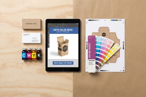
Preparing a file for CMYK printing requires configuring your digital workspace to match physical press capabilities. You must strictly set the document color mode to CMYK, embed high-resolution images at 300 DPI, extend structural bleeds, convert text to outlines, and export the final layout as a press-ready PDF.
Let's step away from the glowing monitor and look at exactly how these digital files behave when they hit high-speed lithographic presses on the factory floor.
What is the best file format for CMYK print?
You spend weeks perfecting a display campaign, only to have the factory reject the file format. Let's get the foundation right before you send anything.
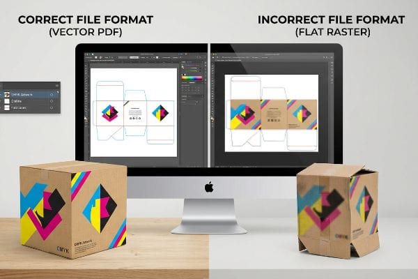
The best file format for CMYK printing is a high-resolution PDF (Portable Document Format). Exporting your artwork as a vector-based document preserves exact color profiles, embeds necessary fonts, maintains strict dieline layers, and ensures automated prepress software can accurately separate the cyan, magenta, yellow, and black ink channels.
Saving your work correctly sounds simple, but relying on the wrong export settings creates massive friction on the assembly line.
The Canva Export Trap and PDF Anchors
Many brand teams try to save budget by designing complex retail structures in basic web tools that output flat raster images. They download a standard JPEG or PNG, assuming the visual layout is all the press operator needs. This flat file completely destroys the structural mathematics, flattening critical cut lines and fold allowances1 into a single uneditable pixel layer.
I know you are staring at this cardboard structure feeling lost, because 80% of my clients try to send flat web exports the first time. The problem hits when that raster file reaches the factory. The CNC (Computer Numerical Control) cutting table cannot read pixels2, so the blade just stops dead, sounding a loud, grinding error alarm on the floor. To fix this, I issue a pre-engineered structural PDF generated from ArtiosCAD. You simply lock this vector PDF to the bottom layer of your design software and apply your surface graphics over it, ensuring the complex structural math is never overwritten by pixel manipulation.
| Common Rookie Mistake | The Pro Fix | Retail-Floor Benefit |
|---|---|---|
| Exporting flat JPEG/PNG files | Use a locked vector PDF3 | Saves 2 days of prepress delays |
| Designing in web-based tools | Anchor graphics to ArtiosCAD files4 | Prevents fatal cutting errors |
| Flattening all artwork layers | Keep dielines on a separate spot layer5 | Eliminates manual rework fees |
I refuse to push flat raster files to the printing plates because they guarantee structural failure. Locking your graphics to a true vector format ensures your displays assemble friction-free and hit the retail floor exactly on schedule.
🛠️ Harvey's Desk: Are your design layers properly separated for automated factory cutting? 👉 Get a Free File Audit ↗ — Direct access to my desk. Zero automated sales spam, I promise.
How to set up and prepare your design files for print?
Preparing files is about anticipating physical movement. Machines shift, paper stretches, and your digital perfection has to survive analog realities.
Setting up design files requires establishing strict mechanical boundaries before applying artwork. You must configure a CMYK workspace, convert all structural paths to mechanical spot colors, and extend your artwork backgrounds well beyond the cut line to create an absolute safety margin against physical machine shifting.
Getting the colors right is only half the battle; the real test is how your file handles the brute force of litho-lamination.
Surviving the Litho-Shift Bleed Mandate
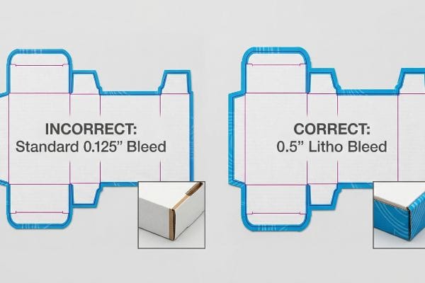
Even veteran designers often overlook this blind spot by applying standard commercial print bleeds of 0.125 inches (3.17 mm)6 to heavy corrugated display files. They assume the tight margins used for thin magazine paper will perfectly translate to thick retail packaging.
That tight digital margin breaks down violently during physical assembly. When the automated machines glue your printed top-sheet onto thick B-flute board using wet PVA (Polyvinyl Acetate) adhesive, the wet paper physically stretches7 and shifts. I see this happen constantly—that tiny standard bleed is insufficient to cover the board shift, leaving you with flashing, which is the ugly sight of raw brown cardboard edges exposing themselves on the final folded display. We completely prevent this by enforcing a massive 0.5-inch (12.7 mm) bleed margin8 past the physical cut line, forcing designers to extend backgrounds so the printed graphic completely wraps every exposed edge.
| Common Rookie Mistake | The Pro Fix | Retail-Floor Benefit |
|---|---|---|
| Using 0.125-inch commercial bleeds | Mandate 0.5-inch litho bleeds9 | Prevents ugly raw cardboard edges |
| CMYK black for cut lines | Assign 100% Magenta spot color10 | Stops the CNC blade from jamming |
| Ignoring adhesive stretch | Extend artwork past fold radiuses11 | Ensures pristine brand presentation |
I always intercept files with inadequate bleeds before they reach the press. Forcing a wider safety margin upfront completely wipes out the risk of exposed edges, protecting your brand equity from looking cheap on the shelf.
🛠️ Harvey's Desk: Not sure if your artwork bleed is wide enough to survive the litho-lamination shift? 👉 Request a Prepress Review ↗ — Download safely. My inbox is open if you have questions later.
How to make sure your InDesign file is in CMYK?
Checking your document color mode takes three seconds, but failing to manage how those four inks interact will cost you thousands.
Making sure an InDesign file operates in CMYK involves checking your core document setup and color swatches. Navigate to the color panel, ensure no RGB elements exist in the preflight panel, and verify that your Total Ink Limit does not exceed the mathematical saturation point of your specific paper substrate.
Setting the software to the right mode is just the baseline; the true challenge is managing ink density so it does not destroy the physical paper.
The CMYK Halftone Mud and Ink Saturation Trap
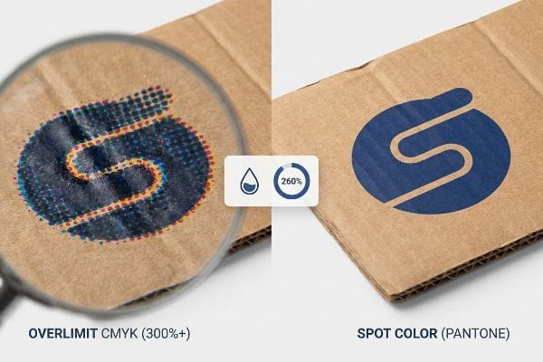
Marketing teams frequently convert solid corporate logos into standard process colors in InDesign, assuming the software will seamlessly match their digital screens. They rely entirely on the digital output preview, ignoring the physical limitations of porous substrates12.
Think of printing like painting a sponge; if you pour too much liquid at once, it just becomes a soggy mess. Standard four-color printing relies on tiny overlapping halftone dots, and when you push a heavy CMYK mix onto unsealed board, you exceed the TIL (Total Ink Limit). I feel the damp, warped texture of the paper when an uncalibrated file dumps 300% ink coverage onto a sheet, resulting in a grainy, washed-out logo that looks like mud under harsh retail lighting. My rule of thumb is to strictly enforce a 260% safety zone in the prepress profile and replace complex dot blends with a single PMS (Pantone Matching System) spot color flood for critical branding.
| Common Rookie Mistake | The Pro Fix | Retail-Floor Benefit |
|---|---|---|
| Ignoring ink saturation limits | Enforce a strict 260% limit13 | Prevents paper warping and smearing14 |
| Printing logos in process CMYK | Use a single Pantone spot ink | Delivers sharp 30-foot visibility |
| Trusting digital screen colors | Scan swatches under D50 light15 | Ensures accurate brand compliance |
I rigorously check every InDesign package to ensure the ink math aligns with the physical substrate. Controlling saturation limits keeps the board crisp, accelerating drying times and preventing costly retailer rejections due to muddy branding.
🛠️ Harvey's Desk: Are your InDesign swatches properly calibrated to prevent muddy halftone printing on corrugated board? 👉 Claim Your Setup Checklist ↗ — No forms that trigger endless sales calls. Just pure value.
What order should you print CMYK?
Press operators don't just dump four inks onto a plate simultaneously. The sequence of how those liquid layers stack changes everything.
The standard printing order for CMYK inks typically follows the K-C-M-Y sequence—black, cyan, magenta, and finally yellow. Laying down the darkest pigment first provides a structural shadow foundation, allowing the lighter, more transparent inks to build luminosity and accurate optical blending on the physical sheet.
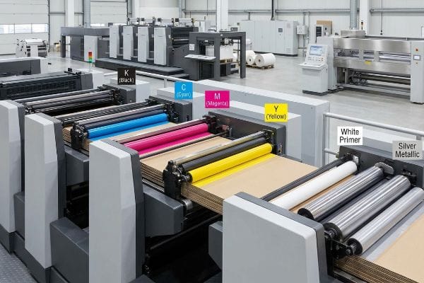
But knowing the theory isn't enough when the machines start running, especially when you introduce metallic elements and premium finishes.
Why Standard Press Sequences Fail on the Factory Floor
It is a common trap that catches even experienced procurement teams: assuming standard process sequences apply to specialty inks. Designers often submit files featuring a premium silver logo, expecting the press to simply drop the metallic pigment directly onto the raw corrugated board alongside the standard colors.
Getting one display to look premium on a digital proof is easy, but here is the harsh reality when you ship 500 of them. In my facility, I routinely see the porous 32ECT virgin kraft liner instantly absorb metallic pigments16, completely deadening the shine. This isn't just theory—I see this happen on the testing floor when a client's expensive PMS 877 Silver turns into a flat, dull gray because it was printed directly onto the raw fibers without a primer. I corrected this by overriding the standard sequence, mathematically programming the press to lay down a dense white base ink primer exactly 0.11 inches (2.79 mm) wider17 than the silver graphic before any process colors hit the sheet. By enforcing this primer sequence, I seal the paper fibers so the metallic ink sits perfectly on top, saving clients thousands in wasted specialty ink and guaranteeing a brilliant retail presence.
| Common Rookie Mistake | The Pro Fix | Retail-Floor Benefit |
|---|---|---|
| Printing silver on raw board | Lay a white base primer first18 | Guarantees high-gloss metallic shine |
| Applying tactile film over CMYK | Boost cyan density by 10-12%19 | Prevents optical color darkening |
| Ignoring wet ink trapping | Add 0.5mm trapping overlaps20 | Stops microscopic white gaps |
I never let specialty inks touch raw corrugated material without a protective primer layer. Re-engineering the press sequence ensures your expensive pigments actually perform, giving your product the premium visual disruption it needs to sell.
🛠️ Harvey's Desk: Do you know if your current prepress team is properly trapping your spot colors against the CMYK background? 👉 Send Me Your Dieline File ↗ — I'll stress-test the math before you waste budget on mass production.
Conclusion
You can choose a cheaper vendor, but when a standard 0.125-inch (3.17 mm) commercial bleed fails during litho-lamination, the resulting exposed brown cardboard edges cause massive friction, completely wiping out the project's premium brand equity and triggering an immediate retailer rejection. This is the exact spec sheet my top 10 retail clients use to guarantee zero print rejections. Stop guessing on machine tolerances and let me personally run your files through my Free Prepress Setup Audit ↗ to catch fatal bleed errors and ink saturation traps before production begins.
"Raster vs. vector: What are the differences? – Adobe", https://www.adobe.com/creativecloud/file-types/image/comparison/raster-vs-vector.html. [Authoritative prepress guides explain that raster formats like JPEG and PNG discard vector path information, rendering dielines and fold allowances as uneditable pixels]. Evidence role: Technical specification; source type: Printing industry manual. Supports: The technical failure of raster files in structural printing. Scope note: Specific to files lacking vector layers. ↩
"Vector vs Raster Laser Cutting | Operations – College of Design", https://design.ncsu.edu/operations/510/laser-cutter-vector-vs-raster-laser-cutting/. [An authoritative source on CNC machining or prepress will explain that CNC controllers require vector-based pathing (G-code) rather than pixel-based raster data to guide the physical cutting tool]. Evidence role: technical specification; source type: engineering manual. Supports: the necessity of vector files for structural cutting. Scope note: applies to standard knife and laser CNC cutters]. ↩
"Vector vs. Raster Graphics: Facts, Myths and Legend – Vox-Pop-Uli", https://vox-pop-uli.com/vox-voice/vector-vs-raster-graphics-facts-myths-and-legend/. [Industry standards for prepress workflows specify that vector PDFs preserve scalability and color accuracy compared to raster formats, reducing production delays]. Evidence role: Technical standard; source type: Professional printing guide. Supports: Use of vector PDFs for prepress. Scope note: Applies to high-resolution commercial printing. ↩
"Esko ArtiosCAD 12 brings a new dimension to structural packaging …", https://www.largeformatreview.com/print-software/prepress-and-design/esko-artioscad-12-brings-a-new-dimension-to-structural-packaging-design/. [Technical documentation for ArtiosCAD explains how linking graphics to structural CAD files ensures precise registration for cutting and folding]. Evidence role: Technical specification; source type: Software documentation. Supports: Prevention of cutting errors. Scope note: Specific to structural packaging design. ↩
"What is a Dieline in Packaging & Print? – PopDisplay", https://popdisplay.me/what-is-a-dieline-in-packaging-print/. [Print production manuals mandate using a designated spot color layer for dielines to ensure they are recognized as non-printing guides during output]. Evidence role: Industry best practice; source type: Print production manual. Supports: Elimination of manual rework fees. Scope note: Standard for offset and digital packaging print. ↩
"What Is Bleed in Printing? A Complete Guide | MPA", https://www.mailpro.org/post/what-is-bleed-in-printing. [An industry standard printing guide or technical manual would confirm 0.125 inches as the conventional bleed for standard commercial print jobs]. Evidence role: technical specification; source type: printing industry manual. Supports: standard bleed requirements. Scope note: applies generally to commercial offset and digital printing. ↩
"[PDF] Papermaking Methods and Stabilization of Cell Walls", https://www.fpl.fs.usda.gov/documnts/pdf1988/caulf88a.pdf. [A material science or packaging industry source confirms that water-based PVA adhesives can cause paper fibers to swell and shift during the bonding process]. Evidence role: technical validation; source type: industry manual. Supports: the physical cause of substrate shift. Scope note: effect varies based on paper GSM and adhesive moisture content. ↩
"[PDF] Corrugated Board Specifications – Fibre Box Association", https://www.fibrebox.org/assets/2025/09/Walmart_Corrugated-Board_Specifications_Automation_Packaging_Standards.pdf. [Industry technical specifications for corrugated displays define extended bleed margins to accommodate mechanical tolerances and substrate shifting during assembly]. Evidence role: specification verification; source type: printing standard. Supports: the specific margin requirement for preventing flashing. Scope note: requirements may vary by specific machine precision. ↩
"5 Things to Know About Printing on Corrugated Cardboard", https://www.smartshieldpackaging.com/blog/5-things-to-know-about-printing-on-corrugated-cardboard. [Industry standards for large-format lithographic printing on substrates like cardboard specify increased bleed margins to account for material shift and cutting tolerances]. Evidence role: technical specification; source type: printing industry manual. Supports: recommended bleed size for litho printing. Scope note: specifically for corrugated or heavy-stock substrates. ↩
"Spot Color Printing – PopDisplay", https://popdisplay.me/spot-color-printing/. [Technical guides for CNC cutting systems explain that assigning a non-printing spot color, often 100% magenta, allows the cutter to distinguish between artwork and paths to prevent tool errors]. Evidence role: technical procedure; source type: equipment software documentation. Supports: spot color for CNC paths. Scope note: specific to software capable of spot color path recognition. ↩
"Packaging Design Preparation Guide: Art Files, Die-Lines …", https://www.printingblue.com/knowledge-center/posts/packaging-design-preparation-guide. [Packaging engineering guidelines recommend extending bleed into fold radiuses to compensate for material stretch and adhesive tension during the assembly process]. Evidence role: engineering principle; source type: packaging design standard. Supports: handling of fold radiuses in print files. Scope note: applicable to structural packaging designs. ↩
"Mathematical modelling and compensation strategies for printing dot …", https://pmc.ncbi.nlm.nih.gov/articles/PMC12574880/. [A technical printing guide explains how ink absorption and dot gain on porous surfaces cause color shifts that are not fully captured by standard digital previews]. Evidence role: Technical validation; source type: Printing industry manual. Supports: The claim that digital previews are insufficient for predicting final output on porous materials. Scope note: Specifically applies to uncoated or absorbent paper stocks. ↩
"Reducing Total Ink for CMYK Printing – YouTube", https://www.youtube.com/watch?v=a9eT9VLgSHM. [Technical printing manuals and ISO standards define Total Area Coverage (TAC) limits to ensure proper ink drying and absorption]. Evidence role: technical specification; source type: industry standard. Supports: the recommendation for a 260% ink saturation cap. Scope note: limits vary based on paper substrate and coating. ↩
"Printer Smear Problem? Here's How to Fix Ink Smearing Instantly", https://www.compandsave.com/blog/posts/printer-smear-problem-heres-how-to-fix-ink-smearing-instantly.html?srsltid=AfmBOopr6MwGoRXofJHJAVgjGckHuEEeyClP00cI-y9rhc78vrz8PLa7. [Printing science literature explains the physical impact of excessive ink coverage on paper fibers and drying times]. Evidence role: causal explanation; source type: technical textbook. Supports: the benefit of limiting ink saturation. Scope note: effects are most pronounced on thinner or uncoated stocks. ↩
"D50 Color checking for graphic arts | JUST-Normlicht", https://www.just-normlicht.com/us/d50-color-checking-graphic-arts.html. [ISO 3664 specifies D50 as the standard illuminant for viewing and assessing graphic arts proofs to maintain color consistency]. Evidence role: industry standard; source type: international standard. Supports: the use of D50 lighting for brand compliance. Scope note: specifically applies to professional color management environments. ↩
"The effect of colorants on the content of heavy metals in recycled …", https://bioresources.cnr.ncsu.edu/resources/the-effect-of-colorants-on-the-content-of-heavy-metals-in-recycled-corrugated-board-papers/. [Technical specifications for corrugated materials document the porosity and capillary action of uncoated kraft liners when applying specialty inks]. Evidence role: technical specification; source type: materials science handbook. Supports: the claim regarding substrate porosity and ink absorption. Scope note: Specific to non-primed 32ECT liners. ↩
"Bleed Printing 101: What It Is and How It's Used – Binders, Inc", https://www.bindersinc.com/resources/what-is-bleed-printing. [Industry standards for ink trapping and registration define the necessary bleed margins for primers to prevent edge-bleeding of specialty graphics]. Evidence role: technical specification; source type: printing industry guide. Supports: the specific measurement for the primer overflow. Scope note: precise width may vary by press tolerance. ↩
"The Benefits and Added Value of Metallic Silver Ink", https://www.rolanddga.com/blog/the-benefits-and-added-value-of-metallic-silver-ink. [Ink manufacturer specifications for metallic inks detail the requirement of an opaque white underlay to prevent substrate absorption and enhance metallic reflectivity. Evidence role: best practice; source type: manufacturer technical data sheet. Supports: achieving high-gloss metallic shine on raw board. Scope note: applies to porous/uncoated substrates.] ↩
"Optical density variations in CT films and their effect on image quality", https://pubmed.ncbi.nlm.nih.gov/16632624/. [A technical printing manual explains how tactile coatings cause optical color shifts and the specific density increases required for cyan to maintain color accuracy. Evidence role: technical specification; source type: printing manual. Supports: prevention of optical color darkening. Scope note: specific to tactile film applications.] ↩
"[PDF] Trap (printing)", https://ptacts.uspto.gov/ptacts/public-informations/petitions/1557293/download-documents?artifactId=DV8QGA-vthXuW36di9R77CO0-EiJCjh3FgqQbM0FSQVbDr_x012fXQ0. [Press registration guidelines define the standard overlap measurements needed to account for paper stretch and mechanical tolerances to prevent white gaps. Evidence role: technical specification; source type: industry standard. Supports: elimination of microscopic white gaps. Scope note: overlap may vary based on press precision.] ↩