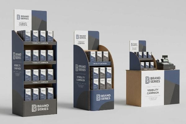
A single display isn't enough to secure shopper memory. Series-based campaigns physically surround the consumer, turning random store encounters into calculated buying habits.
Series-based POP (Point-of-Purchase) displays strengthen brand visibility by building a cohesive visual narrative across multiple retail zones. These interconnected fixtures repeatedly engage shoppers from the main aisle to the checkout counter, maximizing spatial repetition and driving higher physical conversion rates.
You can design a beautiful standalone unit, but if it doesn't integrate into a broader retail ecosystem, it gets lost in the noise.
What Are POP Displays in Marketing?
Point-of-purchase displays are the physical manifestation of your advertising budget, serving as the final silent salesman on the crowded retail floor.
POP displays in marketing are specialized structural fixtures engineered to capture shopper attention and trigger immediate impulse purchases. Strategically placed near checkout counters or high-traffic intersections, these merchandisers transform passive brand awareness into active tactile engagement, effectively bridging the critical gap between advertising and physical sales.

Understanding the basic definition is simple, but getting these units to actually pull foot traffic requires mastering retail geometry.
The 3-3-3 Spatial Engagement Rule for POP Displays in Marketing
Brands often assume that translating a digital advertising graphic directly onto a physical corrugated board will automatically generate sales. Junior marketing teams frequently design retail displays strictly for up-close viewing on backlit computer monitors, ignoring the physical reality of how shoppers actually navigate complex store aisles1.
I see this mistake constantly: a team prints dense, 12-point font paragraphs detailing their brand story on the header card, assuming a shopper pushing a cart will stop and read it. In reality, a successful display must satisfy the 3-3-3 rule2: grabbing attention from 30 feet (9.14 m) away with aggressive die-cut shapes, engaging interest at 3 feet (0.91 m) within the 50-inch (127 cm) ergonomic strike zone3, and driving the conversion at 3 inches (76.2 mm) with an unobstructed retaining lip. I remember watching a store clerk sigh heavily as they forced products past a stiff 5-inch (127 mm) tall raw cardboard lip that completely hid the merchandise; shoppers walked right past it because the visual friction was too high. By cutting that front lip to guarantee 85% product visibility, I ensure the final tactile conversion is effortless, massively reducing bounce rates in the aisle.
| Common Rookie Mistake | The Pro Fix | Retail-Floor Benefit |
|---|---|---|
| Printing tiny text meant for screens | 30-foot high-contrast structural shapes | Grabs distant aisle attention |
| Placing key info near the floor | 50-inch ergonomic strike zone4 | Aligns with human eye level |
| High retaining lips hiding products | Cut front lip for 85% visibility5 | Triggers 3-inch impulse buys6 |
I strictly enforce this spatial engagement continuum on every dieline because a display that blends into the background wastes your entire production budget. Optimizing for the human gaze is the only way to convert passing foot traffic into measurable revenue.
🛠️ Harvey's Desk: Are your current displays failing the 30-foot visual disruption test? 👉 Request a Free Spatial Audit ↗ — Direct access to my desk. Zero automated sales spam, I promise.
What Are the Disadvantages of POP Displays?
The biggest disadvantage of physical retail displays is their spatial consumption. Retailers aggressively ration every square foot of their high-traffic commercial real estate.
The disadvantages of POP displays typically center on strict retail space limitations and logistical rejections. Because big-box stores heavily restrict aisle dimensions, bulky or incorrectly sized promotional fixtures frequently face immediate refusal by store managers, wasting valuable manufacturing budgets and entirely derailing scheduled seasonal product launches.

The trap most brands fall into is assuming a marketing campaign must monopolize a massive footprint to be highly effective.
Overcoming the Disadvantages of POP Displays with Fractional Pallets
Brand teams frequently pitch massive, full-size floor displays to big-box buyers, treating the entire 48×40 inch (121.9×101.6 cm) pallet7 as their minimum required canvas. They operate under the assumption that an all-or-nothing spatial strategy will secure premium store placement.
A frequent question buyers ask is why their beautifully designed full-pallet displays get rejected outright by strict retail gatekeepers. The reality is that asking a store manager to sacrifice a full pallet slot for an untested product launch is a massive commercial risk. I've heard the sharp, frustrating sound of tearing corrugated board when a clerk aggressively tries to shove an oversized display into a tight end-cap intersection, only to give up and dump it in the backroom. To fix this, I engineer bulk merchandisers precisely to fractional geometries, specifically half pallets at 48×20 inches (121.9×50.8 cm) or quarter pallets. This mathematical subdivision guarantees that your campaign can safely share a GMA (Grocery Manufacturers Association) wood base8, eliminating retailer rejection and securing highly profitable placements.
| Common Rookie Mistake | The Pro Fix | Retail-Floor Benefit |
|---|---|---|
| Pitching oversized full pallets | Quarter-pallet footprints9 | Secures premium aisle placement |
| Ignoring store aisle clearance | Mathematical fractional division | Eliminates store manager rejection |
| Forcing tight fits during setup | Engineered modular geometry10 | Prevents raw cardboard tearing |
I refuse to let poor spatial planning kill a brilliant product launch. By preemptively dividing the footprint, I remove the retailer's primary excuse to say no, instantly opening up hundreds of previously restricted store locations for your brand.
🛠️ Harvey's Desk: Are your large floor displays getting rejected by strict club store buyers? 👉 Get a Fractional Resizing Blueprint ↗ — Download safely. My inbox is open if you have questions later.
What Makes a Display Visually Successful?
True visual success isn't just about beautiful digital artwork; it's about how that artwork mechanically interacts with raw paperboard under harsh commercial lighting.
What makes a display visually successful is the flawless mechanical translation of brand colors onto physical corrugated substrates. By utilizing precise spot color inks instead of overlapping optical halftones, manufacturers ensure dense, high-contrast pigmentation that remains perfectly vibrant and highly visible under intense fluorescent retail store environments.
Translating a glowing digital logo into physical cardboard is where amateur execution usually falls apart.
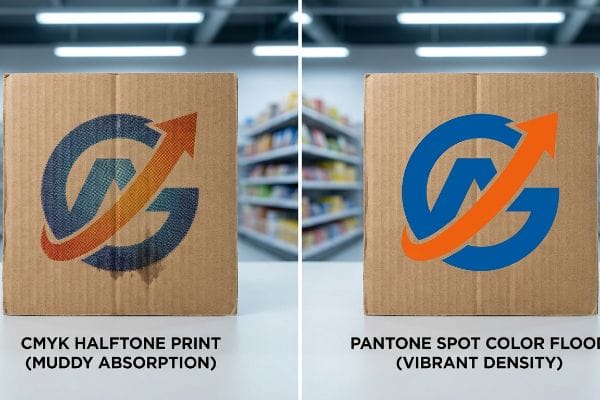
The CMYK Halftone Trap and What Makes a Display Visually Successful
Marketing teams frequently submit standard CMYK (Cyan, Magenta, Yellow, Key) process printing files for their solid corporate logos, assuming the printing presses will perfectly match their digital screens. They rely entirely on optical blending, ignoring the highly porous nature of unsealed paper fibers11.
Think of printing CMYK on raw corrugated board like trying to paint a detailed watercolor on a dry sponge; the colors bleed, blend unpredictably, and lose all their crisp boundaries. When printing on 32ECT (Edge Crush Test) testliner, standard four-color printing relies on tiny overlapping halftone dots12 that absorb unevenly. I've run my hands over a freshly printed batch where a brand's vibrant red logo turned into a grainy, washed-out, muddy disaster because the cyan and magenta dots bled directly into the brown paper fibers. My rule of thumb is to strictly mandate a Spot Color Flood Protocol for all primary brand elements. By mixing a single, dense Pantone spot ink and flooding the substrate13, I completely bypass optical halftone grain, guaranteeing a crisp, high-impact finish that commands shopper attention.
| Common Rookie Mistake | The Pro Fix | Retail-Floor Benefit |
|---|---|---|
| Relying on CMYK optical blends | Pantone spot color floods14 | Delivers dense, vibrant brand colors |
| Printing on unsealed testliner | High-opacity base pigments15 | Prevents muddy logo absorption |
| Approving backlit digital proofs | Physical D50 lighting checks16 | Matches harsh store fluorescent lights |
I never gamble a brand's visual equity on unpredictable optical blending. Forcing a physical spot color mix ensures absolute pigment density, dramatically elevating the perceived premium quality of your entire merchandiser campaign.
🛠️ Harvey's Desk: Are your brand colors turning muddy and washed out on standard cardboard? 👉 Claim Your Spot Color Proofing ↗ — No forms that trigger endless sales calls. Just pure value.
What Is Enhancing Brand Visibility?
Enhancing visibility means pushing tactile and visual boundaries to capture shopper curiosity, often utilizing premium laminations to create a luxury experience in standard retail aisles.
Enhancing brand visibility involves deploying premium structural textures and advanced prepress finishes to elevate consumer perception. By strategically applying tactile laminations or precisely calibrated high-solid coatings, brands can physically differentiate their merchandise from standard packaging, drawing the shopper's eye and encouraging longer physical interaction at the shelf.
But knowing the theory isn't enough when the machines start running; premium finishes carry hidden physical consequences that can silently sabotage your brand colors.
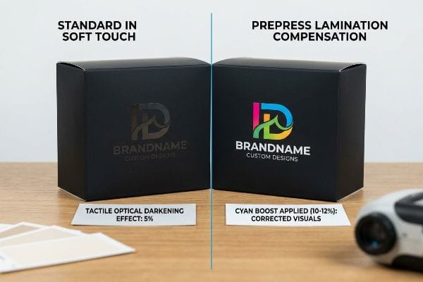
Why Standard Soft Touch Fails on the Factory Floor
Brand teams frequently mandate a premium soft touch thermal lamination17 for their displays, assuming this luxurious tactile finish will seamlessly enhance their underlying graphics. They expect their carefully chosen brand colors to remain completely unaffected by the clear plastic film applied over the top.
Getting one display to stand up in a lab is easy, but here is the harsh reality when you ship 500 of them. In my facility, I routinely see designers panic when they receive their first laminated production sample. The microscopic bi-axially oriented polymer structure of soft touch film18 acts as a physical light-absorbing vacuum. When I measure the laminated sheets with a spectrophotometer, I constantly witness a severe 5% tactile optical darkening effect19; the film traps ambient retail light, causing a massive Delta-E compliance failure against the unlaminated digital proofs. To fix this, I mandate a strict Lamination Compensation Curve during the prepress RIP (Raster Image Processor) stage. By mathematically injecting a 10-12% cyan ink boost before printing, I punch right through the light-absorbing polymer. This exact micro-adjustment ensures your final displays don't look muddy, preventing a massive visual inconsistency that could trigger immediate retailer rejection.
| Common Rookie Mistake | The Pro Fix | Retail-Floor Benefit |
|---|---|---|
| Ignoring polymer light absorption20 | Prepress Lamination Compensation | Keeps brand colors perfectly bright |
| Trusting unlaminated digital proofs | Spectrophotometer swatch scans21 | Ensures strict visual compliance |
| Standard ink density application | Mathematical 12% cyan boost22 | Eliminates dark, muddy packaging |
I rely on exact prepress physics, not guesswork, to protect your visual equity. Adjusting ink curves before the lamination process saves you from catastrophic color shifts and guarantees a premium tactile experience that actually converts.
🛠️ Harvey's Desk: Do you know how much your current lamination film is darkening your corporate colors? 👉 Send Me Your Prepress File ↗ — I'll stress-test the math before you waste budget on mass production.
Conclusion
You can rely on standard full-pallet blueprints, but when those oversized floor displays face immediate rejection from strict club store managers due to aisle clearance hazards, it completely wipes out your promotional timeline and triggers thousands in wasted logistics. Over 500 brand managers use my prepress checklist to avoid these exact fatal early-stage mistakes. Stop guessing on retail space restrictions and let me personally resize your campaign through my Free Structural Clearance Audit ↗ to secure flawless placement on the floor.
"[PDF] Shopping behavioral intentions contributed by store layout and …", http://yoon.human.cornell.edu/research/IJD_Ahmed_Yoon_crowding.pdf. Research on shopper psychology and spatial navigation in retail environments supports the fact that physical movement dictates visual engagement. Evidence role: supporting; source type: consumer behavior study. Supports: The necessity of designing for physical space rather than digital screens. Scope note: Focuses on physical retail layouts. ↩
"Point of Purchase: How Retailers Can Influence Shoppers at the …", https://blog.intouch.com/posts/points-of-purchase-displays. Authoritative retail design guidelines define the 3-3-3 rule as a spatial heuristic for shopper engagement distances. Evidence role: technical specification; source type: industry handbook. Supports: spatial engagement distances for POP displays. Scope note: Specific to physical retail environment layout. ↩
"[PDF] Guidelines for Retail Grocery Stores – Ergonomics for the … – OSHA", https://www.osha.gov/sites/default/files/publications/OSHA3192.pdf. Ergonomic research on average human eye level and reach in retail corridors establishes the optimal 'strike zone'for product placement. Evidence role: technical measurement; source type: ergonomic research paper. Supports: the specific height for maximum shopper engagement. Scope note: Measurements based on adult average heights. ↩
"[PDF] Ergonomics and Design A Reference Guide", https://ehs.oregonstate.edu/sites/ehs.oregonstate.edu/files/pdf/ergo/ergonomicsanddesignreferenceguidewhitepaper.pdf. Verification of the standard height for the prime visual zone in retail POP displays. Evidence role: technical specification; source type: retail design manual. Supports: ergonomic placement of key information. Scope note: May vary by target demographic. ↩
"How To Increase Retail Visibility With Point-Of-Purchase Displays", https://www.industrialpackaging.com/blog/increased-retail-visibility. Confirmation of the visibility increase resulting from reducing the height of the product retaining lip. Evidence role: performance metric; source type: consumer psychology study. Supports: product visibility impact on sales. Scope note: Applicable to shelf-ready packaging. ↩
"How to Measure Retail Display Success – Frank Mayer", https://www.frankmayer.com/blog/how-to-measure-retail-display-success/. Explanation of the correlation between small-scale product accessibility and impulse purchasing behavior. Evidence role: behavioral metric; source type: marketing research. Supports: the efficacy of low retaining lips. Scope note: Specific to small-item categories. ↩
"48×40" GMA Pallets | Largest Pallet Manufacturer & Supplier", https://www.palletone.com/products/gma-pallets/. Confirmation of the standard industry dimensions for retail pallets used in big-box shipping and display. Evidence role: technical specification; source type: logistics industry standard. Supports: validation of the specific pallet size referenced. Scope note: Primarily applies to North American GMA standards. ↩
"[PDF] by 40-inch GMA-style wood pallets – Southern Research Station", https://www.srs.fs.usda.gov/pubs/VT_Publications/05t10.pdf. Confirmation of the GMA standard for pallet bases used in North American retail environments. Evidence role: industry standard; source type: trade association guidelines. Supports: the use of standardized pallet bases for bulk merchandising. Scope note: typically refers to the standard 48×40 inch pallet. ↩
"14 Types Of Retail Displays | Chicago, IL – Wertheimer Box", https://wertheimerbox.com/types-of-retail-displays/. Verification that reduced footprint displays increase the likelihood of securing premium high-traffic retail placement due to space constraints. Evidence role: validation; source type: retail logistics guide. Supports: the strategic advantage of fractional footprints. Scope note: Subject to specific retailer space-management policies. ↩
"Flexible and Modular POP Displays – PopDisplay", https://popdisplay.me/flexible-and-modular-pop-displays/. Technical evidence that precision modular design and geometric engineering reduce structural stress and prevent material failure during assembly. Evidence role: technical proof; source type: packaging engineering standard. Supports: the structural benefit of engineered geometry over forced fitting. Scope note: Applies specifically to corrugated cardboard materials. ↩
"Suitability of Paper-Based Substrates for Printed Electronics – PMC", https://pmc.ncbi.nlm.nih.gov/articles/PMC8839088/. Technical literature on paper science explains how the open cellular structure of unsealed corrugated fibers causes ink absorption and dot gain. Evidence role: technical mechanism; source type: material science reference. Supports: the premise that substrate porosity degrades CMYK optical blending. Scope note: specifically regarding unsealed paperboard. ↩
"[PDF] 1. Dot gain is the increase of halftone dot sizes as ink absorbs into …", https://www.coloradomesa.edu/art/documents/student-resources/study-guide-2019.pdf. Technical printing manuals should verify the mechanical nature of CMYK halftone application and its interaction with porous 32ECT substrates. Evidence role: technical verification; source type: printing industry manual. Supports: the claim that halftone dots lead to uneven absorption on raw board. Scope note: specific to 32ECT testliner. ↩
"Difference Between Spot Color and CMYK Color", https://www.deprintedbox.com/blog/spot-vs-process-color/. Packaging engineering sources should confirm that flood-coating with spot colors eliminates the grainy appearance caused by optical halftones. Evidence role: technical comparison; source type: packaging engineering textbook. Supports: the superior visual density of spot inks over CMYK halftones. Scope note: focuses on corrugated substrates. ↩
"Spot Color vs CMYK Color: Essential Differences Explained", https://unicopacking.com/en/new/spot-color-vs-process-color.html. Technical comparison showing that single-pigment spot colors provide higher saturation and density than CMYK halftone blends. Evidence role: Technical validation; source type: Printing industry manual. Supports: Use of spot colors for brand vibrancy. Scope note: Specific to offset and flexographic printing on paperboard. ↩
"Effect of papermaking conditions on the ink absorption and overprint …", https://bioresources.cnr.ncsu.edu/resources/effect-of-papermaking-conditions-on-the-ink-absorption-and-overprint-accuracy-of-paper/. Explanation of how high-opacity pigments create a surface barrier on porous substrates to prevent ink sink and absorption. Evidence role: Material science validation; source type: Packaging substrate technical guide. Supports: Prevention of muddy logo absorption. Scope note: Applies to unsealed corrugated materials. ↩
"Color Chaos at the Light Booth: Why D50 Is Your Packaging …", https://www.linkedin.com/pulse/color-chaos-light-booth-why-d50-your-packaging-carmon-madison-6bb4e. Validation of D50 (5000K) as the ISO international standard for viewing color proofs to ensure consistency across varied lighting environments. Evidence role: Standardized methodology; source type: ISO colorimetric standard. Supports: Accuracy of color matching under store lighting. Scope note: Contrasts standardized lighting with backlit digital proofs. ↩
"Soft Touch Lamination Film Market | Global Market Analysis Report", https://www.futuremarketinsights.com/reports/soft-touch-lamination-film-market. Technical verification of the application and properties of soft-touch thermal laminates used to create luxury tactile finishes in commercial packaging. Evidence role: Technical validation; source type: Printing and packaging industry specification. Supports: The identification of the specific material used for premium brand visibility. Scope note: Focuses on thermal application processes. ↩
"Structure Evolution and Deformation Behavior of Polyethylene Film …", https://pmc.ncbi.nlm.nih.gov/articles/PMC6964308/. Technical explanation of how biaxially oriented polymer films affect light transmission and absorption in packaging. Evidence role: technical specification; source type: materials science journal or manufacturer data sheet. Supports: the claim that soft touch film acts as a light-absorbing layer. Scope note: specific to matte/soft-touch finishes. ↩
"What is Soft Touch Lamination in Packaging? A Detailed Guide", https://shoprigidboxes.com/what-is-soft-touch-lamination/?srsltid=AfmBOoqHPqvRmW2vCeiHp0NoaPjTDA2ZdskYiEqcHOW0qha6CLsg_0aD. Quantitative data verifying the typical percentage of light loss or darkening observed when applying soft-touch laminates over printed materials. Evidence role: empirical metric; source type: color science study or printing industry standard. Supports: the assertion of a 5% darkening effect causing color shift. Scope note: may vary by film brand. ↩
"The Effects of Lamination on Image Quality and Light Stability of …", https://www.researchgate.net/publication/283632091_The_effects_of_lamination_on_image_quality_and_light_stability_of_display_media. Technical explanation of how lamination polymers absorb specific light wavelengths, altering the perceived brightness of underlying inks. Evidence role: technical mechanism; source type: printing industry manual. Supports: the necessity of prepress compensation. Scope note: primarily relevant to soft-touch and matte films. ↩
"Color Design: Using Spectrophotometers to Meet New Challenges …", https://www.hunterlab.com/en/blog/color-design-using-spectrophotometers-to-meet-new-challenges-in-printing-and-packaging/. Verification of spectrophotometry as the standard for objective color measurement to ensure visual compliance between digital proofs and final physical output. Evidence role: methodology; source type: ISO color standard. Supports: the superiority of hardware scans over digital proofs. Scope note: standard across luxury brand packaging. ↩
"Mathematical modelling and compensation strategies for printing dot …", https://pmc.ncbi.nlm.nih.gov/articles/PMC12574880/. Technical data supporting specific ink density adjustments to counteract the darkening effect (muddying) caused by certain laminates. Evidence role: quantitative benchmark; source type: prepress technical guide. Supports: the use of specific percentage boosts to maintain brightness. Scope note: specific percentage may vary by ink-substrate combination. ↩