Brands pour millions into digital advertising, but the final retail mile is where real conversions happen. Physical display structures anchor those campaigns directly onto the crowded sales floor.
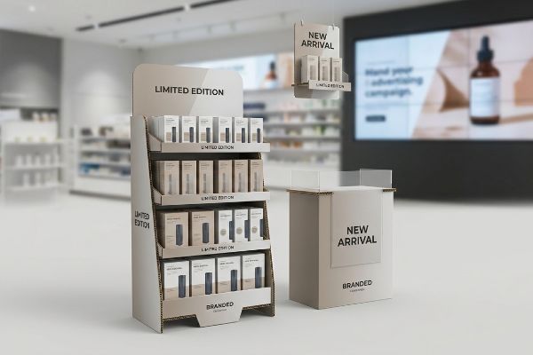
Point of purchase pop displays are physical marketing structures placed within retail environments to drive impulse purchases and reinforce broader advertising campaigns. By converting brand awareness from digital or print media into tangible in-store visibility, these structures capture shopper attention at the exact moment of buying decision.
But knowing the theory behind omnichannel marketing isn't enough when the die-cutter starts running and physical materials come into play.
What is the primary purpose of point of purchase pop displays in retail environment?
A beautiful digital ad campaign completely falls apart if the customer cannot physically spot your product while rushing down a crowded big-box store aisle.
The primary purpose of point of purchase pop displays is to disrupt shopper traffic patterns and secure immediate sales. These freestanding fixtures elevate products out of standard inline shelving, placing inventory directly in the consumer's line of sight to trigger impulse buying behavior.
Securing that split-second attention relies entirely on executing the correct physical structural geometry.
The Physical Geometry of the Retail Strike Zone
Marketing teams frequently assume that simply printing a bright logo on a floor unit will automatically grab attention. They draft beautiful two-dimensional graphics on a screen, completely ignoring the physical biomechanics of how a shopper actually walks1 down an aisle.
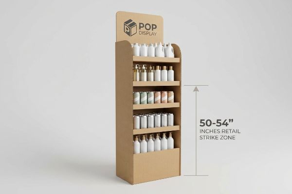
I regularly see beautifully printed campaigns fail because the core product sits too close to the ground. Even experienced procurement teams often approve designs where the primary merchandise rests below knee level, forcing shoppers to physically bend down. I can hear the dull scrape of the cardboard base as a store clerk tries to shove these ineffective, bottom-heavy bins out of the way. To actually capture attention, I strictly enforce the "Strike Zone" map, engineering the primary shelves exactly 50 to 54 inches (1270 to 1371.6 mm) from the floor. Hitting this natural eye-line directly translates to increased basket sizes, preventing your physical display from becoming a costly, invisible hurdle.
| Common Rookie Mistake | The Pro Fix | Retail-Floor Benefit |
|---|---|---|
| Placing products near the floor | Elevate shelves to 50-54 inches2 | Captures immediate eye-level attention |
| Ignoring natural walking angles | Angle shelves upward by 15 degrees3 | Reduces neck strain for shoppers |
| Hiding core brand messages | Position logo above the strike zone | Increases aisle visibility from afar |
I never let a client approve a dieline without plotting the human eye-line first. Putting your best product in the dark bottom tray just wastes your retail footprint and kills your impulse conversion rates.
🛠️ Harvey's Desk: Are your primary products sitting safely inside the retail strike zone? Send me your flat dieline file, and I'll plot the visual geometry before you print. 👉 Request a Free Dieline Audit ↗ — Direct access to my desk. Zero automated sales spam, I promise.
What are the advantages and disadvantages of pop displays?
The massive sales lift these fixtures provide often masks a hidden vulnerability: their physical survival through complex global supply chains.
The advantages and disadvantages of pop displays involve significant brand visibility increases weighed against severe logistical vulnerabilities. While these temporary structures drastically improve retail product placement, they demand precise spatial engineering to survive complex overseas shipping routes without suffering catastrophic structural compression failures.
The biggest operational disadvantage only reveals itself when the shipping container doors open at the receiving dock.
Mitigating the Logistical Vulnerabilities of Mass Transit
Procurement managers usually expand their master carton dimensions to maximize shipping density, viewing the advantages of bulk transit as a cost-saver. They look at the raw test specifications of heavy-duty corrugated board4 and assume the material will inherently protect the delicate pre-filled merchandisers inside.
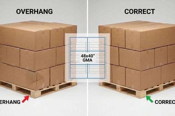
This overpacking completely ignores the physics of pallet stacking. If a master carton overhangs a standard 48×40 inch (1219×1016 mm) GMA (Grocery Manufacturers Association) pallet by even a fraction of an inch, those structural corners carry zero downward load. I have touched the damp, fatigued paper of crushed bottom tiers that bowed outward because they lacked solid wood deck support. To eliminate this massive disadvantage, I artificially shrink the maximum allowable carton footprint in our CAD (Computer-Aided Design) software by exactly 0.5 inches (12.7 mm). Keeping the corners fully supported by the wood restores 60% of the box's compressive strength, entirely preventing transit damages and massive retailer chargebacks.
| Common Rookie Mistake | The Pro Fix | Retail-Floor Benefit |
|---|---|---|
| Maximizing box size over the pallet | Apply a 0.5-inch zero-overhang rule5 | Stops bottom-tier carton crushing |
| Relying on raw material strength alone | Align structural corners vertically6 | Prevents double-stacked freight damage |
| Overpacking the master shipper | Engineer for precise fractional geometries | Smooths out warehouse handling |
I refuse to let an amazing promotional campaign get ruined in transit just to save a few pennies on container density. Controlling the pallet geometry is how you turn a logistical liability into a massive retail advantage.
🛠️ Harvey's Desk: Are your master cartons hanging dangerously over the edge of their shipping pallets? 👉 Get a Free Logistics Risk Assessment ↗ — Download safely. My inbox is open if you have questions later.
Why do merchandisers use pop displays?
Retail floor space is fiercely guarded real estate, and convincing a store manager to give up a portion of their main aisle requires strict mathematical precision.
Merchandisers use pop displays to secure secondary retail placements away from standard aisles, effectively breaking visual monotony. By deploying customized, freestanding cardboard structures, brands can command premium high-traffic intersections, intercepting shoppers with disruptive visuals right before they reach the checkout registers.
Securing that coveted floor space requires negotiating with store managers who strictly ration every square inch of their layout.
The Spatial Math Behind Winning Secondary Placements
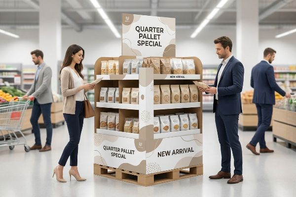
Brands frequently pitch massive, full-size floor campaigns to big-box buyers, assuming that a larger physical footprint automatically generates a higher sales volume. They fail to understand how merchandisers actually plan their seasonal layouts: slipping smaller units into tight, high-traffic intersections7 without blocking shopping carts.
Pitching a giant 48×40 inch (1219×1016 mm)8 behemoth for a minor product launch often triggers an immediate retailer rejection. I have watched store clerks physically shove oversized displays into hidden back corners because the rigid edges snagged passing carts. The friction of thick corrugated board scraping against linoleum is the sound of lost sales. Instead, I engineer bulk merchandisers precisely to standard fractional dimensions, like Quarter Pallets at 24×20 inches (609.6×508 mm)9. This geometric subdivision guarantees your unit perfectly shares a wood base with other campaigns, making it mathematically frictionless for retail buyers to approve your placement and maximize floor density.
| Common Rookie Mistake | The Pro Fix | Retail-Floor Benefit |
|---|---|---|
| Pitching oversized floor units | Design quarter-pallet footprints10 | Secures approval from tight retail stores |
| Ignoring aisle clearance rules | Map the rotational turning radius11 | Stops shopping carts from hitting the unit |
| Forcing one brand per pallet | Engineer for modular shared pallets12 | Maximizes retailer floor density |
I build displays to solve problems for the store manager, not just the brand. When you respect the fractional floor math, merchandisers will gladly give your products the spotlight.
🛠️ Harvey's Desk: Keep getting your large floor promotions rejected by big-box retail buyers? Let me restructure your footprint. 👉 Claim Your Free Footprint Audit ↗ — No forms that trigger endless sales calls. Just pure value.
What are Pops in advertising?
An entire advertising funnel is wasted if the final physical touchpoint in the store looks cheap, grainy, or color-shifted.
Pops in advertising are specialized physical marketing touchpoints that translate broader digital and print campaigns directly into the retail environment. These three-dimensional corrugated structures act as the final conversion mechanism, ensuring brand messaging remains visually consistent and compelling right at the critical consumer purchase point.
Taking an advertising concept from a glowing computer screen and putting it onto porous raw paperboard is a violent mechanical translation.
Translating Digital Advertising Colors to Physical Corrugated Board
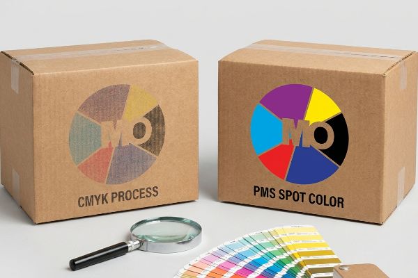
Graphic designers frequently convert solid corporate logos into standard CMYK (Cyan, Magenta, Yellow, and Key/Black) formats13, assuming the printing press will seamlessly match their digital advertising screens. They expect the smooth, glowing colors of a TV commercial to perfectly port over to an unsealed cardboard surface14.
When standard four-color printing hits unsealed, porous testliner, the tiny overlapping halftone dots absorb unevenly into the raw paper fibers. The result is a muddy, washed-out logo that completely undermines the premium advertising spend. I can smell the heavy solvent of wet ink when a press operator has to stop the Heidelberg machine because the dot grain looks terrible under harsh fluorescent lights. To guarantee brand integrity, I mandate a "Spot Color Flood Protocol," replacing optical dot blending with a single, precisely mixed PMS (Pantone Matching System) ink. This ensures a dense, perfectly smooth flood of pigment that hits the shopper's eye with razor-sharp contrast.
| Common Rookie Mistake | The Pro Fix | Retail-Floor Benefit |
|---|---|---|
| Printing logos in standard CMYK | Mandate a PMS Spot Color Flood | Eliminates muddy halftone grain on logos15 |
| Ignoring paperboard absorption | Use an unsealed profile cutback16 | Keeps artwork sharp and high-contrast |
| Relying strictly on screen proofs | Scan swatches with a spectrophotometer17 | Ensures brand colors match under store lights |
I never trust a glowing screen to dictate how ink behaves on raw paper. Controlling the physical pigment is the only way to ensure your expensive advertising campaigns actually pop in the aisle.
🛠️ Harvey's Desk: Are your brand colors turning muddy and grainy on unsealed corrugated board? 👉 Request a Prepress Color Check ↗ — Direct access to my desk. Zero automated sales spam, I promise.
What is the point of purchase pop material?
Choosing the right raw paperboard is only the first step; understanding how these organic fibers react to adhesives determines whether your display stands up or collapses.
The point of purchase pop material is predominantly engineered corrugated paperboard, prized for its exceptional strength-to-weight ratio and cost-effectiveness. By laminating high-quality printed top-sheets onto thick fluted bases, manufacturers create highly rigid, lightweight structural merchandisers that can support massive product payloads while remaining recyclable.
But knowing the theory behind these materials isn't enough when the machines start running and chemical reactions take over.
Why Standard Laminated POP Material Fails on the Factory Floor
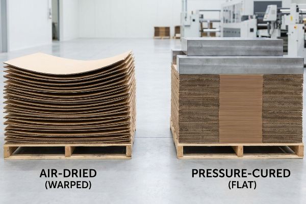
Clients assume that mounting a high-quality printed top-sheet to a rigid B-flute corrugated board inherently results in a perfectly flat display panel. They view the point of purchase material as inert plastic, completely ignoring the volatile chemical reality of the automated lamination process.
In my facility, I routinely see beautifully printed runs destroyed by the physical nature of water-based PVA (Polyvinyl Acetate) adhesive. When this wet glue hits large surface areas of porous paperboard, the material rapidly absorbs the moisture, and as it dries in ambient factory air, immense surface tension causes the entire panel to bow18 inward like a potato chip. I can feel the stiff, distorted tension of a 60-inch (1524 mm) side panel that has completely lost its structural integrity. By enforcing a strict "Cure Weight Protocol," stacking the wet boards under exact dead-weight pressure for 24 hours19, I mathematically neutralize the drying tension. This simple manufacturing adjustment guarantees the display stands perfectly plumb, completely eliminating wonky structural assembly and preventing immediate retailer rejection.
| Common Rookie Mistake | The Pro Fix | Retail-Floor Benefit |
|---|---|---|
| Letting wet litho-boards air dry | Enforce a 24-hour dead-weight cure20 | Ensures side panels stand perfectly straight |
| Using single-sided lamination on large walls | Specify a balanced duplex back-liner21 | Stops structural bowing and warping |
| Ignoring ambient factory humidity | Measure PVA moisture absorption rates22 | Prevents tab slots from swelling shut |
I never let chemical physics dictate the quality of my output. Forcing the material to cure perfectly flat under immense pressure is the absolute difference between a structurally sound fixture and a wobbly retail disaster.
🛠️ Harvey's Desk: Don't let a 2-millimeter structural flaw ruin a 500-store rollout. 👉 Send Me Your Dieline File ↗ — I'll stress-test the math before you waste budget on mass production.
Conclusion
You can choose a cheaper vendor, but when those giant litho-laminated side panels aggressively warp like potato chips under humid warehouse conditions, the distorted structure will trigger an immediate retailer rejection that completely wipes out your project's profit margin. Over 500 brand managers use my prepress checklist to avoid these exact fatal early-stage mistakes. Stop guessing on chemical tolerances and let me personally run your files through my Free Dieline Audit ↗ to catch these hidden physical flaws before you begin mass production.
"(PDF) Identifying the Drivers of Shopper Attention, Engagement, and …", https://www.researchgate.net/publication/285954295_Identifying_the_Drivers_of_Shopper_Attention_Engagement_and_Purchase. [Academic research in environmental psychology and consumer behavior explains how gait and head-turning patterns affect visual engagement with retail displays]. Evidence role: technical foundation; source type: peer-reviewed journal. Supports: the claim that physical movement dictates display visibility. Scope note: limited to physical retail environments. ↩
"Chapter 2: Choosing a Display Height for Your Customers", https://www.creativedisplaysnow.com/guides/understanding-the-retail-customer/chapter-2-how-to-choose-the-right-display-height-for-your-customers/. [Industry standards for consumer ergonomics and visual merchandising specify the optimal eye-level height for average adults in a retail setting]. Evidence role: technical specification; source type: retail design manual. Supports: optimal product placement height. Scope note: Measurements may vary based on target demographic height. ↩
"[PDF] Guidelines for Retail Grocery Stores – Ergonomics for the … – OSHA", https://www.osha.gov/sites/default/files/publications/OSHA3192.pdf. [Human factors research and retail psychology studies indicate that a slight upward tilt reduces neck strain and improves product visibility]. Evidence role: ergonomic standard; source type: human factors study. Supports: reduction of shopper physical strain. Scope note: effectiveness depends on the total height of the display. ↩
"[PDF] Mullen Test vs. Edge Crush Test Boxes – Crown Packaging Corp.", https://crownpack.com/wp-content/uploads/2023/11/Crown-Packaging-Mullen-vs-ECT-Whitepaper.pdf. [An authoritative source on packaging engineering would explain how standardized metrics like Edge Crush Test (ECT) and Mullen Burst tests are used to evaluate the load-bearing capacity of corrugated materials]. Evidence role: technical verification; source type: engineering standard; Supports: the reliance on material specifications to determine shipping safety. Scope note: limited to industry-standard corrugated testing metrics. ↩
"[PDF] GENERAL REQUIREMENTS FOR BOX AND PALLET LOADING", https://www.snapon.com/Snap-on-Files/Suppliers/Packaging-and-Labeling-Guidelines/StandardforPalletandUnitLoads.pdf. [An industry standard for palletization specifies that minimizing overhang prevents the compression and structural failure of bottom-tier cartons]. Evidence role: technical specification; source type: logistics manual. Supports: Prevention of shipping damage. Scope note: Specifically applies to corrugated shipping containers. ↩
"Reducing Freight Damage in LTL Shipping", https://armorfreight.com/reducing-freight-damage-ltl-shipping/. [Aligning the vertical corners of stacked displays ensures that the load weight is transferred directly through the strongest points of the packaging]. Evidence role: engineering principle; source type: packaging engineering guide. Supports: Prevention of double-stacked freight damage. Scope note: Applies to load-bearing structural supports in POP displays. ↩
"The Art of Visual Merchandising: Strategies for – T-ROC", https://trocglobal.com/visual-merchandising/. [Industry standards for retail planograms and store layout optimization explain the strategic use of small-footprint secondary displays to capture impulse buys without obstructing shopper traffic.] Evidence role: professional practice; source type: industry whitepaper or retail management guide. Supports: the spatial efficiency of small-scale secondary placements. Scope note: focused on big-box retail environments. ↩
"48×40" GMA Pallets | Largest Pallet Manufacturer & Supplier", https://www.palletone.com/products/gma-pallets/. [An industry standard for North American pallet sizes ensures compatibility with warehouse racking and retail floor layouts]. Evidence role: technical specification; source type: industry standard. Supports: baseline dimensions for retail displays. Scope note: Primarily applies to North American logistics. ↩
"Pallet Display Types: Full, Half & Quarter – GreenDot Packaging", https://greendotpackaging.com/understanding-pallet-display-types-full-half-and-quarter-pallet-displays/. [Technical specifications for fractional pallet displays facilitate higher floor density by allowing multiple units to occupy a single standard pallet base]. Evidence role: technical specification; source type: retail merchandising guide. Supports: spatial efficiency of secondary placements. Scope note: Focuses on secondary placement optimization. ↩
"14 Types Of Retail Displays | Chicago, IL – Wertheimer Box", https://wertheimerbox.com/types-of-retail-displays/. [An authoritative source on retail logistics would specify the standard dimensions and industry acceptance of quarter-pallet footprints. Evidence role: factual verification; source type: industry standard; Supports: technical specifications for floor units; Scope note: Dimensions may vary slightly by region or retailer.] ↩
"How Wide Should Grocery Aisles Be When You're Planning …", https://displayconn.com/how-wide-should-grocery-aisles-be-when-youre-planning-gondola-shelving/. [Retail facility management guidelines and ADA standards define the necessary rotational turning radius for shopping carts to ensure safe passage. Evidence role: compliance verification; source type: retail facility management guide; Supports: aisle clearance rules; Scope note: Specifics depend on shopping cart model and local accessibility laws.] ↩
"Custom Retail Pallet Displays | Easy Set-Up", https://blingblingpackaging.com/products/custom-pop-displays/custom-pallet-displays/. [Industry white papers on merchandising efficiency detail how modular shared pallet systems optimize retail floor density and SKU distribution. Evidence role: strategic validation; source type: retail merchandising study; Supports: maximization of retailer floor density; Scope note: Effectiveness depends on product compatibility.] ↩
"CMYK color model – Wikipedia", https://en.wikipedia.org/wiki/CMYK_color_model. [Technical documentation on color theory explains the subtractive CMYK model used in professional printing to create a wide gamut of colors]. Evidence role: Technical definition; source type: Design manual. Supports: The standard process for preparing logos for physical print. Scope note: General printing standard. ↩
"Halochromic Inks Applied on Cardboard for Food Spoilage … – PMC", https://pmc.ncbi.nlm.nih.gov/articles/PMC9502810/. [Materials science sources detail how porous, unsealed substrates absorb ink, leading to lower color saturation and shifts compared to coated surfaces]. Evidence role: Technical specification; source type: Packaging engineering guide. Supports: The reason for the visual discrepancy between digital screens and retail pops. Scope note: Specific to unsealed substrates. ↩
"Difference Between Spot Color and CMYK Color", https://www.deprintedbox.com/blog/spot-vs-process-color/. [Printing manuals contrast the solid ink deposition of Pantone Matching System (PMS) colors with the dot patterns of CMYK to demonstrate the removal of halftone grain]. Evidence role: technical explanation; source type: printing guide. Supports: PMS spot color advantage. Scope note: Applicable to logo printing on physical substrates. ↩
"Fully circular shapable transparent paperboard with closed-loop …", https://pmc.ncbi.nlm.nih.gov/articles/PMC11980830/. [Packaging manufacturing specifications detail how specific cutback profiles and substrate treatments mitigate ink absorption to maintain artwork sharpness]. Evidence role: technical specification; source type: manufacturing guide. Supports: combating paperboard absorption. Scope note: Specific to corrugated board materials. ↩
"How Light Sources Influence Color Perception: Why Controlled …", https://sensing.konicaminolta.us/us/blog/how-light-sources-influence-color-perception/. [Technical documentation on colorimetry explains how spectrophotometers measure light reflectance to ensure brand color accuracy across different lighting environments]. Evidence role: technical verification; source type: technical standard. Supports: use of spectrophotometers for color matching. Scope note: Focuses on lighting-dependent color shifts. ↩
"Packaging water-based adhesives", https://next.henkel-adhesives.com/us/en/articles/packaging-water-based-adhesives.html. [A materials science source would explain how moisture absorption and differential shrinkage in PVA glues create surface tension that warps porous substrates]. Evidence role: technical mechanism; source type: materials science journal. Supports: the cause of structural failure in laminated POP materials. Scope note: applies specifically to water-based adhesives on porous organic fibers. ↩
"How to Prevent Warping in Paper & Bookbinding – YouTube", https://www.youtube.com/watch?v=WV8b6IbQKx8. [Industrial manufacturing standards for corrugated displays specify the use of weighted curing to counteract drying tension and ensure flatness]. Evidence role: industrial best practice; source type: manufacturing technical guide. Supports: the efficacy of the Cure Weight Protocol. Scope note: curing time may vary based on ambient humidity and glue volume. ↩
"An Overview of Drying Hardwood Lumber | Ohioline", https://ohioline.osu.edu/factsheet/F-73-12. Technical manufacturing standards for lithographed paperboard specify mandatory curing durations to ensure structural flatness and prevent residual stress. Evidence role: technical specification; source type: manufacturing manual. Supports: the necessity of a 24-hour cure for stability. Scope note: specific to wet litho-boards. ↩
"How to Laminate only one side of your paper – YouTube", https://www.youtube.com/watch?v=PHRYRWopbLs. Structural engineering principles for laminated substrates require balanced tension on both sides of the board to counteract curling and warping. Evidence role: structural principle; source type: materials science guide. Supports: use of duplex liners to stop structural bowing. Scope note: applies primarily to large-scale displays. ↩
"The effects of using different adhesive on the thickness swelling ratio …", https://bioresources.cnr.ncsu.edu/resources/the-effects-of-using-different-adhesive-on-the-thickness-swelling-ratio-of-lvl-produced-from-scotch-pine/. Polyvinyl acetate (PVA) adhesives are hygroscopic, meaning they absorb moisture from the air, which can lead to dimensional expansion in organic fibers. Evidence role: chemical property; source type: adhesives technical data sheet. Supports: the link between PVA moisture absorption and tab slot swelling. Scope note: specific to high-humidity factory environments. ↩