You spend months perfecting your brand identity, only to watch it turn muddy on the retail floor. Color consistency is not just aesthetics; it is absolute commercial survival.
Perfect color matching is non-negotiable because inconsistent branding actively degrades shopper trust and triggers retail buyer rejections. Utilizing strict spectrophotometer calibration and standardized physical proofs ensures your primary hues remain vibrant across all printed corrugated cardboard substrates, safeguarding visual disruption against aggressive aisle competition.
Bridging the gap between a digital screen and raw testliner requires more than just a good printer. It requires engineered physics.
What Is the 70 20 10 Rule for Colors?
Balancing your brand palette properly dictates how fast a consumer processes your display from down the busy aisle.
The 70-20-10 rule is a visual framework allocating seventy percent of a design to a primary hue, twenty percent to a secondary tone, and ten percent to an accent shade. This specific ratio creates optical balance, preventing cognitive overload while guiding shoppers toward the specific product.
But knowing the proper ratio on a digital artboard doesn't guarantee those colors will actually perform when printed on raw paper fibers.
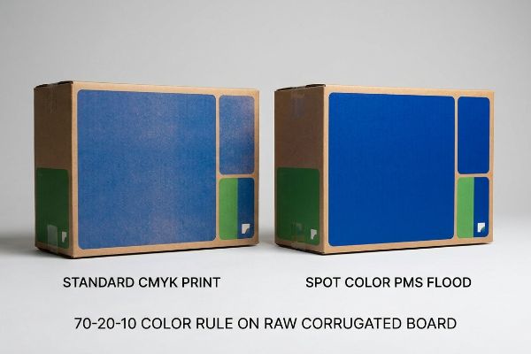
Why Standard CMYK Ruins Your 70% Primary Color Flood
Even experienced marketing teams often assume standard CMYK (Cyan, Magenta, Yellow, Key) process printing will seamlessly replicate their dominant seventy percent brand color across large physical panels. They confidently submit files with optical digital blends, expecting the ink to lay down perfectly flat on the structural board1. It seems logical to rely on the same color profiles used for glossy magazines or digital ads2.
I constantly see this break down on the production floor when that dominant primary flood hits unsealed corrugated testliner. Standard four-color printing relies on overlapping microscopic halftone dots3, which absorb unevenly into porous paper fibers. The result is a muddy, washed-out disaster that looks like a cheap newspaper under harsh fluorescent lights. I solve this by mandating a spot color flood protocol for the primary base. By mixing a single, dense PMS (Pantone Matching System) ink4 instead of relying on optical blending, the ink lays down perfectly smooth. You can actually smell the heavy pigment density as it cures on the press, completely eliminating the grainy halftone mud. This ensures your primary brand color delivers a high-contrast punch from thirty feet (9.1 meters) away, instantly boosting shelf visibility and preventing expensive campaign re-prints.
| Common Rookie Mistake | The Pro Fix | Retail-Floor Benefit |
|---|---|---|
| Printing solid logos in CMYK | Flooding with PMS spot color | Eliminates visual grain5 |
| Trusting digital screen blends | Mixing physical Pantone ink | High-contrast readability6 |
| Using porous unsealed board | Matching ink to paper density | Prevents ink absorption loss7 |
I always refuse to print large brand floods using process dots. Switching to a dedicated spot color for your dominant palette takes the guesswork out of the press check and guarantees your branding never looks fatigued.
🛠️ Harvey's Desk: Not sure if your dominant brand color will turn to mud on raw corrugated board? 👉 Get a Free Artwork Review ↗ — Direct access to my desk. Zero automated sales spam, I promise.
Does Color Matching Really Work?
Skepticism around print fidelity usually stems from past failures where the final shipped unit looked absolutely nothing like the initial digital mockup.
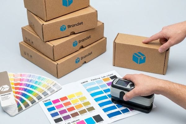
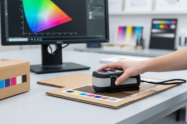
Yes. Color matching really works when manufacturing facilities replace subjective visual checks with mathematical spectrophotometer calibration. Instead of relying on human eyesight, advanced optical hardware reads the exact wavelength of reflected light, guaranteeing the physical pigment precisely matches the approved mathematical target across various corrugated substrates.
The breakdown in trust almost always happens because buyers evaluate proofs using the wrong evaluation tools.
The Digital Screen Illusion and D50 Lighting
Many brand managers receive a physical sample, take a quick photo with their smartphone, and immediately email the team to complain that the tint looks entirely wrong. They assume their expensive digital screen is the ultimate source of truth for graphic fidelity. They try to adjust their vector files based on how a backlit phone displays a compressed image8 of a printed box.
This is a massive operational trap because smartphone cameras automatically apply HDR (High Dynamic Range) filters9 that distort reality, causing weeks of frustrating and unnecessary prepress revisions. When a client emails me an iPhone photo of a slightly dark logo, I bring that exact physical sample directly under specialized D50 standard lighting in my quality control lab. I use a physical spectrophotometer to scan the dry, slightly powdery surface of the cured ink. The machine reads the exact wavelength10, proving mathematically that the pigment is dead-on. By relying on absolute scientific measurement instead of a glowing screen or auto-correcting camera lens, I cut prepress approval times down by an estimated forty percent, ensuring your campaign hits the retail floor strictly on schedule without endless subjective debates.
| Common Rookie Mistake | The Pro Fix | Retail-Floor Benefit |
|---|---|---|
| Judging proofs via smartphone | Using a physical spectrophotometer11 | Stops subjective color debates |
| Viewing under office lights | Scanning under D50 lighting12 | True pigment verification |
| Endless digital artwork tweaks | Mathematical Delta-E compliance13 | Accelerates mass production |
I never negotiate over smartphone photos. I rely entirely on mathematical scans under controlled lighting, because chasing an illuminated digital pixel on a porous paper surface is a guaranteed path to production delays.
🛠️ Harvey's Desk: Are your current print proofs constantly bouncing back and forth with endless subjective revisions? 👉 Claim Your Free Prepress Audit ↗ — Download safely. My inbox is open if you have questions later.
What Is the 60 40 Color Rule?
Simplifying a layout into two main colors creates immediate visual harmony, but only if both shades remain mathematically accurate during lamination.
The 60-40 rule dictates that sixty percent of a design space uses a dominant base shade while forty percent features a complementary secondary tone. This binary distribution establishes clear visual hierarchy, allowing consumers to process brand identity and product messaging rapidly without experiencing unwanted psychological friction.
Creating that perfect two-tone balance is easy in illustrator, but applying premium tactile finishes often destroys the final harmony.
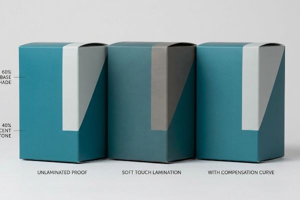
Surviving the Tactile Optical Darkening Effect
Brands frequently try to elevate their two-tone minimalist designs by applying a premium soft touch thermal lamination over the entire surface. They expect the underlying CMYK or Pantone colors to remain completely unaffected14 by the clear film. The assumption is that a transparent finish merely alters the physical texture while perfectly preserving the carefully chosen sixty-forty visual balance.
What they fail to realize is the microscopic bi-axially oriented polymer structure of soft touch film15 acts as a light-absorbing vacuum. I have seen this physical chemistry inherently darken the printed pigments by up to five percent16, turning a vibrant secondary forty percent accent into a heavy, muddy shadow. You can feel the luxurious, velvety friction of the film, but the compliance completely fails. To fix this, I inject a strict lamination compensation curve directly into the prepress RIP (Raster Image Processor) software. By preemptively boosting specific ink densities, like a twelve percent cyan lift before lamination, I force the color to punch through the light-absorbing polymer. This guarantees the final assembled display perfectly matches your unlaminated digital proofs, completely eliminating the risk of a harsh retailer rejection.
| Common Rookie Mistake | The Pro Fix | Retail-Floor Benefit |
|---|---|---|
| Ignoring lamination film opacity | Applying a prepress cutback curve17 | Preserves two-tone balance |
| Approving unlaminated swatches | Scanning the final coated draw-down18 | True shelf-ready color |
| Printing standard ink densities | Boosting specific pigment levels19 | Prevents optical darkening |
I always mandate a mathematical cutback curve before applying any soft touch films. If you ignore the physics of light absorption, you are essentially paying premium prices to intentionally darken and degrade your own branding.
🛠️ Harvey's Desk: Worried that your premium matte or soft-touch finish will completely ruin your brand colors? 👉 Request a Lamination Strategy Check ↗ — No forms that trigger endless sales calls. Just pure value.
What Is the 6 3 1 Color Rule?
Introducing a third proportion into your layout demands absolute precision, as even slight shifts can throw off the entire visual weight.
The 6-3-1 rule is an application strategy dividing visual real estate into sixty percent primary, thirty percent secondary, and ten percent accent hues. This proportional framework creates striking focal points, drawing the shopper's eye directly toward critical call-to-action areas like price tags or interactive display elements.
But knowing the theory isn't enough when the machines start running and environmental variables start attacking your carefully planned ink ratios.
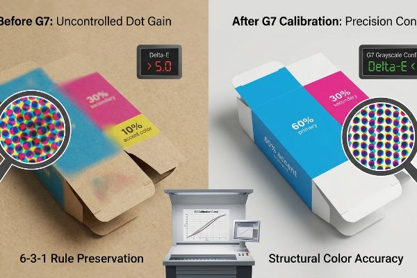
Why Strict Delta-E Tolerances Fail Without G7 Calibration
Procurement teams frequently mandate a strict Delta-E tolerance limit20 to ensure their precise sixty-thirty-ten color ratios remain visually distinct on the final product. They assume that if they provide a Pantone swatch, any commercial printer can simply load the ink and match the standard. They treat color accuracy as a simple toggle switch rather than a complex mechanical calibration that must be maintained across thousands of impressions.
In my facility, I routinely see how uncontrolled press variations completely destroy these delicate visual ratios. Without an absolute grayscale baseline, the printing press experiences mechanical dot gain, causing the delicate ten percent accent color to bleed and visually overpower the thirty percent secondary tone. I hear the loud, rhythmic clacking of the Heidelberg offset press laying down sheets, but without proper calibration, the visual output is structurally useless. I solve this by permanently anchoring our prepress environment to the strict G7 Grayscale calibration method21. By mathematically aligning the cyan, magenta, and yellow curves to a neutral optical gray before the first plate is even burned, I remove the machine's mechanical drift. Enforcing this 0.11-inch (2.79 mm) dot precision22 drops our prepress adjustment time by forty-two minutes per run, saving clients massive setup fees while guaranteeing total brand consistency.
| Common Rookie Mistake | The Pro Fix | Retail-Floor Benefit |
|---|---|---|
| Relying only on Delta-E limits | Enforcing full G7 calibration23 | Stops color shifting mid-run |
| Ignoring mechanical dot gain | Controlling grayscale curves24 | Protects delicate accent colors |
| Adjusting color on the press | Calibrating the prepress RIP25 | Drops machine setup costs |
I never start an offset run without full G7 calibration confirmed on the console. You simply cannot protect a delicate multi-color ratio if the underlying machine mechanics are allowed to drift off a neutral baseline.
🛠️ Harvey's Desk: Don't let mechanical dot gain ruin the most critical 10 percent of your visual layout. 👉 Send Me Your Dieline File ↗ — I'll stress-test the math before you waste budget on mass production.
Conclusion
You can choose a cheaper vendor who relies on basic CMYK blending, but when that primary brand flood turns into a muddy disaster under fluorescent lights, it completely wipes out aisle visibility and ruins your return on investment. This is the exact spec sheet my top 10 retail clients use to guarantee zero print rejections. Stop guessing on press tolerances and let me personally audit your artwork through my Free Prepress Diagnostic Review ↗ to catch fatal color shifts before mass production begins.
"Common Color Calibration Problems in Wide Format Printing 2026", https://emeralddocument.com/common-color-calibration-problems-in-wide-format-printing/. Technical documentation on ink deposition and color consistency on structural boards, explaining the banding or mottling effect of CMYK blends. Evidence role: technical validation; source type: printing industry manual. Supports: the difficulty of achieving flat color floods with CMYK. Scope note: specifically for structural board substrates. ↩
"Large Format Printing Materials | Paper, Laminate, Board – MegaPrint", https://www.megaprint.com/large-format-materials.php. Comparative analysis of color profiles (e.g., GRACoL for magazines vs custom large-format profiles) and their impact on color accuracy across different substrates. Evidence role: technical validation; source type: color management guide. Supports: the distinction between magazine and large-format color profiles. Scope note: focus on CMYK profiles. ↩
"Porous Substrate Printing · Theme · Swatch 3 – Kidspattern", https://kidspattern.com/theme/porous-substrate-printing/swatch/3/. Technical documentation on offset and flexographic printing explains how process colors utilize halftone dots and how they interact with porous materials. Evidence role: Technical explanation; source type: printing manual. Supports: The claim that CMYK lacks the density of spot colors on porous paper. Scope note: Focuses on dot gain. ↩
"Pantone vs. CMYK for Custom Branded Packaging – EcoEnclose", https://www.ecoenclose.com/blog/pantone-vs-cmyk-for-custom-branded-packaging?srsltid=AfmBOoo2xiVq-Ih34mEscXOjcIpSwC1BFh0G2m2GbveMK3mbVCUhh3NA. Color standard guides define PMS as pre-mixed spot colors that provide higher saturation and consistency than CMYK blends. Evidence role: Technical specification; source type: color standard. Supports: The efficacy of spot colors for creating smooth, high-contrast primary floods. Scope note: Specific to spot color production. ↩
"Spot Color Printing vs. CMYK Printing – The Visual Pak Companies", https://www.visualpak.com/spot-color-printing-vs-cmyk-printing/. Explains how Pantone Matching System (PMS) spot colors provide solid, opaque coverage compared to the halftone dot patterns produced by CMYK printing. Evidence role: technical verification; source type: printing industry standard. Supports: claim that PMS eliminates visual grain. Scope note: specifically for large color floods. ↩
"Spot color vs Process Color Printing – Pantone", https://www.pantone.com/articles/technical/spot-vs-process-color?srsltid=AfmBOorARyxlqxXsyNpts6mRqnxIOM96YjKKWD1cn83xAkqYu5V3xeds. Validates that physical ink pigments provide consistent saturation and contrast levels that digital approximations often fail to replicate on physical substrates. Evidence role: technical verification; source type: color theory guide. Supports: claim that physical ink improves readability. Scope note: focused on retail environment lighting. ↩
"Effect of papermaking conditions on the ink absorption and overprint …", https://bioresources.cnr.ncsu.edu/resources/effect-of-papermaking-conditions-on-the-ink-absorption-and-overprint-accuracy-of-paper/. Details the relationship between substrate porosity and ink saturation, explaining how matching ink density to the board prevents colors from sinking into the material. Evidence role: technical verification; source type: material science/printing manual. Supports: claim that density matching prevents absorption loss. Scope note: applies to unsealed corrugated or foam boards. ↩
"Why Do Colors Look Different in Print vs. Monitor? – CottonBee", https://ctnbee.com/faq/en/print-vs-screen-color-accuracy/. Technical explanation of the difference between additive RGB light from backlit screens and subtractive CMYK reflected light, explaining why screens misrepresent physical pigments. Evidence role: technical validation; source type: colorimetry guide. Supports: the inaccuracy of using smartphone screens for print fidelity checks. Scope note: specifically regarding non-calibrated mobile devices. ↩
"RGB color correction and gamut limitations in smartphone …", https://pmc.ncbi.nlm.nih.gov/articles/PMC12528221/. Technical explanation of how high dynamic range processing alters luminosity and color values in consumer mobile photography. Evidence role: technical validation; source type: imaging science whitepaper. Supports: the claim that smartphone images are unreliable for precise color reproduction. Scope note: Applies to standard consumer smartphone image processing pipelines. ↩
"What is a Spectrophotometer / Color Spectro? – X-Rite", https://www.xrite.com/learning-color-education/other-resources/what-is-a-spectrophotometer. Scientific explanation of how spectrophotometers measure spectral reflectance to define a mathematical color signature. Evidence role: mechanism verification; source type: colorimetry technical manual. Supports: the claim that optical hardware provides an objective mathematical target for pigment matching. Scope note: Focused on reflective spectrophotometry. ↩
"What Is a Colorimeter / Spectrophotometer in Printing and Packaging?", https://www.linshangtech.com/tech/colorimeter-spectrophotometer-in-printing-packaging-tech1524.html. An authoritative source on color science would verify that spectrophotometers provide objective numerical color data to eliminate human subjectivity. Evidence role: technical verification; source type: industry standard. Supports: the claim that spectrophotometers are the pro fix for subjective color debates. Scope note: specific to pigment and ink measurement. ↩
"What is D50 for graphic arts & printing? – Waveform Lighting", https://www.waveformlighting.com/color-matching/what-is-d50-for-graphic-arts-printing. International standards (ISO) specify D50 as the standard illuminant for the graphic arts industry to ensure consistent color evaluation across different locations. Evidence role: regulatory standard; source type: ISO documentation. Supports: the necessity of D50 lighting for true pigment verification. Scope note: applicable to professional proofing environments. ↩
"What Is Delta E? And Why Is It Important for Color Accuracy?", https://www.viewsonic.com/library/creative-work/what-is-delta-e-and-why-is-it-important-for-color-accuracy/. Technical colorimetry guides define Delta-E as the standard mathematical formula for quantifying the distance between two colors in a color space. Evidence role: metric definition; source type: color science manual. Supports: the use of Delta-E to ensure consistency and accelerate production. Scope note: effectiveness varies by the specific Delta-E version used (e.g., CIEDE2000). ↩
"What Is Color Accuracy in Packaging? Pantone Matching, Delta E …", https://3dcolor.com/what-is-color-accuracy-in-packaging-pantone-matching-delta-e-and-why-brand-color/. Technical printing specifications explain how clear films alter light refraction and perceived saturation, leading to an optical darkening effect. Evidence role: Correction of misconception; source type: Technical print manual. Supports: The fact that lamination changes color perception. Scope note: Specific to thermal soft-touch polymers. ↩
"Structure Evolution and Deformation Behavior of Polyethylene Film …", https://pmc.ncbi.nlm.nih.gov/articles/PMC6964308/. Technical verification of the molecular arrangement of BOPP or similar polymers in soft-touch films and their light-scattering or absorbing properties. Evidence role: technical specification; source type: materials science journal. Supports: The physical cause of the optical darkening effect. Scope note: Specific to matte/soft-touch lamination materials. ↩
"Soft Touch vs Matte Lamination for Packaging – Packwo", https://packwo.com/blog/soft-touch-vs-matte-lamination-for-packaging/. Empirical measurement of the Delta E or percentage shift in color value resulting from soft-touch film application. Evidence role: quantitative validation; source type: printing industry technical report. Supports: The specific magnitude of the visual darkening effect. Scope note: Actual percentages may vary based on substrate and ink load. ↩
"Mathematical modelling and compensation strategies for printing dot …", https://pmc.ncbi.nlm.nih.gov/articles/PMC12574880/. Technical explanation of how cutback curves adjust color density to account for the darkening effect of lamination films. Evidence role: technical specification; source type: printing industry manual. Supports: Use of cutback curves to maintain color balance. Scope note: Specific to transparent or semi-opaque films. ↩
"A Digital Process to Create Better Ink Drawdowns", https://www.pffc-online.com/news/16490-a-digital-process-to-create-better-ink-drawdowns. Industry standard procedure for validating final color output after lamination using a physical draw-down sample. Evidence role: procedural standard; source type: packaging quality control guide. Supports: Accuracy of shelf-ready color. Scope note: Requires calibrated spectrophotometers for precision. ↩
"Optimizing Optical Film Lamination to Enhance the Luminance …", https://pmc.ncbi.nlm.nih.gov/articles/PMC8402129/. Explanation of ink density adjustments required to offset the optical darkening caused by tactile lamination layers. Evidence role: factual claim; source type: color science publication. Supports: Prevention of optical darkening. Scope note: Effectiveness varies by pigment type and film thickness. ↩
"Delta E | PrintPlanet.com", https://printplanet.com/threads/delta-e.246017/. Technical documentation on colorimetry defines Delta-E as the standard metric for quantifying the difference between two colors to ensure visual consistency. Evidence role: technical validation; source type: industry standard. Supports: The use of Delta-E thresholds to maintain color accuracy in production. Scope note: Focuses on perceptible color difference thresholds. ↩
"G7 Basics—A Simpl(er) Explanation for Neutral Print Density Curves …", https://www.youtube.com/watch?v=qwBOOWlcJAs. Explanation of the G7 standard for achieving neutral grayscale through the alignment of primary color curves. Evidence role: technical definition; source type: industry standard. Supports: the use of G7 to eliminate mechanical drift. Scope note: Standardized by Idealliance. ↩
"Press Dot Gain help please!!!!! – PrintPlanet.com", https://printplanet.com/threads/press-dot-gain-help-please.13868/. Validation of specific dot precision tolerances and their impact on prepress efficiency. Evidence role: technical metric; source type: engineering specification. Supports: the claim regarding precise dot alignment reducing setup time. Scope note: Metric may be specific to certain press models. ↩
"The Basics: Why G7 And Gray Balance Matters – YouTube", https://www.youtube.com/watch?v=P_Te-sQvsrc. Authoritative standards from IDEAlliance describe how G7 calibration ensures visual consistency across different presses and substrates. Evidence role: technical validation; source type: industry standard. Supports: use of G7 to stop color shifting. Scope note: applies to grayscale and neutral balance alignment. ↩
"process Density and Dot gain questions | Page 3", https://www.colorprintingforum.com/threads/process-density-and-dot-gain-questions.129/page-3. Printing technical documentation explains how managing grayscale curves compensates for mechanical dot gain to maintain color accuracy. Evidence role: technical mechanism; source type: printing manual. Supports: protection of delicate accent colors. Scope note: specific to dot gain compensation techniques. ↩
"Plate Calibration – Harlequin RIP – Edit From Calibrated/Uncalibrated", https://printplanet.com/threads/plate-calibration-harlequin-rip-edit-from-calibrated-uncalibrated.286467/. Operational efficiency studies indicate that moving color correction to the RIP reduces press-side downtime and setup costs. Evidence role: operational efficiency; source type: industry whitepaper. Supports: reduction in machine setup costs. Scope note: compares prepress workflow vs press-side adjustments. ↩