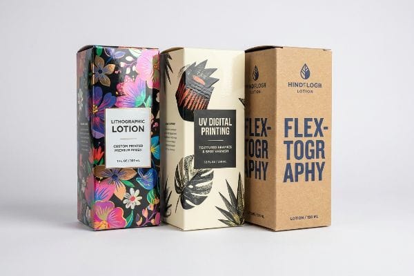
Está com dificuldades em destacar as suas embalagens de loção personalizadas no meio da concorrência feroz das prateleiras das lojas? Os gráficos desbotados destroem instantaneamente a confiança na marca, mas a escolha do método de impressão adequado resolve completamente este problema de visibilidade.
As opções de impressão disponíveis para caixas de loção personalizadas incluem laminação litográfica para retalho premium, impressão digital UV para tiragens curtas e flexografia para envio em grandes quantidades. O melhor método depende do substrato, dos objetivos visuais e dos requisitos de cor do retalhista.
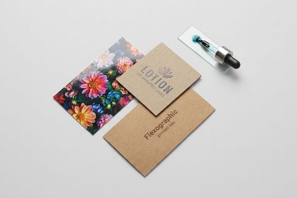
Antes de analisarmos as estruturas cosméticas específicas, precisamos de compreender como a tinta pura interage com as fibras porosas do papel sob condições de iluminação comercial intensa e transporte pesado.
Como imprimir imagens em caixas?
Transpor designs digitais para embalagens físicas exige o domínio das técnicas de impressão comercial. A escolha do método correto de aplicação de tinta evita o desvanecimento visual desastroso e garante que a sua arte resiste à forte iluminação do retalho.
Para imprimir imagens em caixas, os fabricantes utilizam impressoras automatizadas para aplicar tintas de processo de quatro cores ou cores especiais pré-misturadas no substrato. A técnica escolhida determina se a imagem final no ponto de venda será vibrante e nítida, garantindo que a sua marca se destaca de forma apelativa na prateleira.

Embora a impressão básica tenha um bom aspeto num monitor de computador, compreender a transição para materiais de embalagem física é essencial para manter a consistência da marca.
A importância da consistência das cores
Muitas marcas novas presumem que a impressão comercial padrão corresponderá automaticamente aos gráficos vibrantes vistos nos seus ecrãs digitais¹.Frequentemente, enviam ficheiros CMYK padrão de quatro cores²,esperando uma reprodução impecável das suas diretrizes digitais de marca em papel impresso. Do ponto de vista da estratégia de retalho, isto faz sentido: o objetivo é obter o mesmo impacto visual online e nas lojas físicas para construir a confiança do consumidor, manter a identidade visual em todos os canais e maximizar as oportunidades de merchandising.
Na realidade, a aplicação de tinta líquida em papel poroso exige ajustes específicos de pré-impressão para manter o impacto visual no ponto de venda. Quando as tintas CMYK standard se misturam em cartão não selado³,as cores perdem frequentemente a sua vivacidade, parecendo baças e desbotadas sob a forte iluminação comercial das lojas. Para alcançar esta aparência premium no retalho, as marcas experientes utilizam cores especiais dedicadas. Ao utilizar uma única tinta Pantone pré-misturada em vez de sobrepor pontos de processo⁴,as marcas garantem que os seus logótipos se mantêm incrivelmente nítidos e vibrantes, assegurando o máximo apelo nas prateleiras em diversas linhas de produtos.
| Métrica/Característica | CMYK genérico | Cor de ponto pré-misturada |
|---|---|---|
| Impacto visual | Mistura padrão | Vibração de alto contraste5 |
| Consistência da marca | Variável entre os materiais6 | Combinação visual perfeita7 |
| Atrativo nas prateleiras | Presença básica no retalho | Posicionamento de marca premium |
Deixe de confiar no monitor do seu computador para determinar a presença da sua marca nas prateleiras das lojas. Calibrar as cores reais de acordo com o substrato específico do seu cartão é a única forma fiável de garantir que a sua marca não fica desbotada sob a forte iluminação fluorescente das lojas.
🛠️ Harvey's Desk: Os seus materiais impressos para retalho estão com um aspeto desfocado e a destruir o posicionamento premium da sua marca antes mesmo de o produto chegar às prateleiras? 👉 Solicite uma Análise de Cores de Pré-impressão Gratuita ↗ — Analiso pessoalmente cada ficheiro estrutural no prazo de 24 horas.
Qual a melhor embalagem para produtos de cuidados com a pele?
Escolher a embalagem certa para cosméticos significa equilibrar um exterior bonito com designs internos inteligentes. Esta abordagem de dupla camada protege o produto durante a exposição no ponto de venda e o transporte padrão.
A melhor embalagem para produtos de cuidado da pele combina uma estrutura exterior rígida de cartão com um encaixe interior personalizado. Esta abordagem estruturada mantém os frágeis frascos de vidro firmemente suspensos, garantindo que o produto cosmético premium chega intacto e pronto para uma experiência de desembalamento luxuosa.
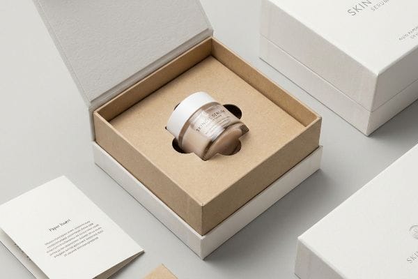
Dominar esta estratégia de suspensão interna evita danos durante o transporte, ao mesmo tempo que proporciona a apresentação sofisticada que os seus consumidores de produtos cosméticos exigem.
Melhorando a experiência de desembalamento
No design básico de embalagens para o retalho, muitas marcas presumem que a simples colocação de um frasco de sérum de vidro numa caixa dobrável com uma impressão atraente é suficiente para o sucesso. A teoria é que a embalagem primária é suficientemente resistente para suportar o manuseamento normal do consumidor, e a caixa exterior serve apenas como painel decorativo para a mensagem de venda. As marcas dispensam frequentemente os encartes internos para poupar custos de produção , acreditando que um encaixe perfeito contra as paredes exteriores de cartão será suficiente para o lançamento de um cosmético básico, sem correr o risco de insatisfação do cliente .
Na realidade, esta abordagem de redução de custos desperdiça uma grande oportunidade de elevar o valor percebido do produto de cuidado da pele. Sem um encaixe interno, o frasco agita violentamente durante o transporte, dando uma sensação incrivelmente barata e pouco refinada quando o cliente manuseia a caixa na loja. Ao utilizar um cartão recortado à medida ou um tabuleiro termoformado, o produto fica perfeitamente centrado e elegantemente apresentado no momento em que o cliente abre o separador. Esta arquitetura interna bem pensada transforma uma caixa básica numa experiência de desembalamento premium, aumentando instantaneamente a lealdade à marca e justificando um preçoelevado.
| Métrica/Característica | Caixa básica | Caixa com Inserção Melhorada |
|---|---|---|
| Apresentação do produto | Solto e a fazer barulho de chocalho | Perfeitamente centrado |
| Experiência do cliente | Unboxing padrão | sensação de luxo premium10 |
| Valor da marca | Posicionamento médio | Justifica preços mais elevados11 |
Deixar embalagens de cosméticos soltas dentro de uma caixa dobrável oca destrói instantaneamente a ilusão de luxo da sua marca. A conceção de um sistema de suspensão interna preciso transforma uma experiência de desembalamento barata numa apresentação sofisticada que justifica, sem esforço, o preço premium de venda ao público.
🛠️ Mesa do Harvey: Será que a sua atual embalagem de cosméticos está a transmitir choques cinéticos letais diretamente para os seus frágeis recipientes de vidro? 👉 Analise as suas folgas estruturais ↗ — 100% confidencial. Os seus projetos de retalho ainda não lançados estão seguros comigo.
Quais são os diferentes tipos de embalagens para produtos de cuidados da pele?
A comercialização de diversos perfis cosméticos exige tabuleiros secundários de retalho que se adaptem matematicamente a formatos primários imprevisíveis. Ignorar estas dimensões físicas pode levar a falhas catastróficas durante a montagem industrial a alta velocidade.
Os diferentes tipos de embalagens para produtos de cuidados da pele incluem frascos de vidro rígido, tubos de plástico flexíveis e cilindros especiais para sérum. Cada formato de embalagem primária requer tabuleiros de retalho secundários e caixas de transporte master concebidas especificamente para acomodar diferentes pesos, tolerâncias dimensionais e deslocamentos estruturais do material.

Embora catalogar os formatos primários pareça simples numa folha de cálculo, forçá-los a entrar numa caixa secundária rígida cria enormes pontos de fricção que destroem a velocidade de embalagem automatizada.
Desalinhamento da protuberância do cilindro cosmético
Ao analisar ficheiros de exposição secundários, as equipas de compras tratam frequentemente os tubos flexíveis de loção e os cilindros cosméticos redondos como blocos geométricos perfeitamente quadrados. Confiam cegamente em listas de verificação genéricas de conformidade do retalhista ou em dimensões teóricas de CAD para determinar a largura interna das suas bandejas de retalho . A suposição perigosa é que a inserção de um objeto primário redondo, pesado ou flexível numa caixa dobrável fina de SBS se comportará perfeitamente de acordo com a linha de corte digital 2D, encaixando perfeitamente sem alterar a área exterior ou tensionar as abas de cola .
Esta matemática teórica ignora completamente a brutal realidade física da deslocação de material, levando a falhas catastróficas na montagem. Quando os trabalhadores carregam as unidades com força, a embalagem primária rígida força os painéis laterais de cartão a curvarem-se ligeiramente para fora, criando uma microprotuberância acumulada na parte da frente. Durante um recente teste de I&D, esta subtil expansão fez com que as caixas primárias encravassem violentamente, gerando uma forte pressão lateral que deformou a borda de retenção da bandeja durante o teste de compressão padrão.A solução para este problema exigiu a recalibração da linha de corte numa mesa de corte CNC para inserir uma microfolga dinâmica entre cada frente, abandonando completamente a matemática teórica para evitar displays rasgados no ponto de venda.
| Métrica/Característica | Cálculo teórico | Realidade projetada |
|---|---|---|
| Largura da caixa | quadrado geométrico perfeito | Microprotuberância arqueada fisicamente14 |
| Encaixe da bandeja | Tolerância de folga zero | Espaçamento lateral dinâmico15 |
| Velocidade de Co-embalagem | Geleias e cartão rasgado16 | Inserção de alta velocidade sem atrito |
A conceção de tabuleiros secundários para o retalho utilizando dimensões teóricas perfeitamente planas garante que os seus expositores de cartão irão ceder sob pressão lateral. Inserir microfolgas físicas dinâmicas nos seus moldes é a única forma de evitar encravamentos catastróficos na fábrica e rasgões nos produtos.
🛠️ Harvey's Desk: As suas bandejas de retalho secundárias estão a rasgar porque foram concebidas utilizando dimensões planas teóricas em vez de volumes físicos do produto? 👉 Solicite uma Auditoria de Tolerância de Corte Gratuita ↗ — Sem gestores de conta pelo meio. Fala diretamente com engenheiros estruturais.
Conclusão
Confiar em dimensões teóricas e métodos genéricos de impressão garante que o impacto durante o transporte irá quebrar as suas embalagens principais e que a tinta de fundo irá comprometer a visibilidade do seu produto no ponto de venda. Esta análise de engenharia precisa detetou recentemente um erro fatal de tolerância de 2 mm num grande lançamento nacional antes da produção. Para eliminar permanentemente estes riscos físicos e logísticos, solicite uma Análise Estrutural de Corte e Vinco gratuita ↗ e permita-me analisar pessoalmente os seus ficheiros estruturais com os meus protocolos de teste de fábrica antes de arriscar um único cêntimo na produção em massa.
"RGB vs. CMYK: O Guia de 2026 para Cores Perfeitas na Impressão", https://www.jukeboxprint.com/blog/rgb-vs-cmyk-for-print. Explicação técnica da discrepância entre os modelos de cor aditivos RGB utilizados nos ecrãs e os modelos subtrativos CMYK utilizados na impressão, explicando porque é que a replicação perfeita é fisicamente impossível. Papel da evidência: verificação técnica; tipo de fonte: manual de ciência da cor. Suporta: a afirmação de que os gráficos digitais não correspondem automaticamente à saída impressa. Nota de âmbito: aborda as limitações da gama de cores .
"O que é o CMYK para impressão? – PakFactory", https://pakfactory.com/blog/cmyk-packaging-print?srsltid=AfmBOopG23EOUqsfZTzSZWE-GRE5XW6KbtDt1Ti70s0_5WQVQ0ZMZNzB . Confirmação de que o processo de quatro cores (ciano, magenta, amarelo e preto) é o padrão da indústria para a impressão comercial em substratos de cartão. Papel da evidência: especificação técnica; tipo de fonte: manual da indústria gráfica. Aplica- se a: utilização de ficheiros CMYK para gráficos de retalho. Nota sobre o âmbito: norma para impressão comercial offset e digital.
"Compreender o papel das interações papel-tinta na… – PMC", https://pmc.ncbi.nlm.nih.gov/articles/PMC10145729/. A documentação técnica sobre a absorção de tinta em substratos porosos explica como o cartão não selado faz com que a tinta afunde, reduzindo a saturação e a vivacidade. Papel da evidência: Explicação técnica; tipo de fonte: Manual da indústria gráfica. Fundamentos: O efeito da porosidade do substrato na vivacidade CMYK. Nota de âmbito: Aplica-se especificamente a materiais não revestidos/não selados .
"CMYK vs. Cores Especiais na Impressão de Embalagens", https://meyers.com/meyers-blog/cmyk-vs-spot-colors-in-packaging-printing-what-cpg-brands-need-to-know/. As normas da indústria para a gestão de cores detalham a utilização de cores especiais para garantir a correspondência exata da marca em comparação com a variabilidade inerente das retículas CMYK. Papel da evidência: Norma técnica; tipo de letra: Guia de gestão de cores. Argumentos: Superioridade das cores especiais para a nitidez e consistência do logótipo. Nota de âmbito: Contraste entre a impressão em curso e a impressão com cores especiais .
"Cores especiais vs. Cores CMYK: Diferenças essenciais explicadas", https://unicopacking.com/en/new/spot-color-vs-process-color.html. Comparação técnica da gama de cores das tintas especiais versus o processo subtrativo CMYK para demonstrar uma maior saturação e brilho. Papel da evidência: verificação técnica; tipo de letra: manual de ciência da cor. Sustenta: a afirmação de que as cores especiais proporcionam um impacto visual superior. Nota de âmbito: limitado às capacidades específicas dos pigmentos .
"CMYK Color Model for Box Printing", https://gentlever.com/cmyk-for-printing-boxes/ . Explicação de como a absorção de tinta e a porosidade do substrato provocam variação de cor na impressão em CMYK. Papel da prova: suporte factual; tipo de fonte: guia da indústria gráfica. Argumentos : a falta de consistência no CMYK genérico em diferentes materiais. Nota de âmbito: aplica-se a superfícies porosas e não porosas.
"O que é a cor Pantone na impressão e embalagem?", https://boxagency.co/blog/what-is-pantone-color-in-print-packaging/?srsltid=AfmBOorQ_fFhlLRKSvECkbhqoAPQWQOSP3jchua3Ksl0iog3MvEaGZHO . Documentação sobre a forma como as cores especiais pré-misturadas (por exemplo, o Sistema de Cores Pantone) garantem a reprodução idêntica das cores, independentemente da tiragem ou do material. Papel da evidência: especificação técnica; tipo de letra: padrão de impressão profissional. Apoia: o uso de cores especiais para uma consistência absoluta da marca. Nota de âmbito: pressupõe a utilização de sistemas de cores normalizados.
"5 Tendências em Embalagens Sustentáveis para Cosméticos", https://www.containerandpackaging.com/resources/5-trends-in-sustainable-cosmetic-packaging/?srsltid=AfmBOopYxOd2_4JpEeBahN94v4ARjS6g7pLWeJvymXD16yoAQ-Th2SXl . Análise da indústria que confirma a prática comum de omissão de encartes internos para reduzir os custos de fabrico e de materiais. Papel da prova: corroboração; tipo de fonte: relatório da indústria de embalagens. Fundamentos: Prevalência de medidas de redução de custos no retalho de cosméticos. Nota de âmbito : Observado principalmente em segmentos não luxuosos.
"Design de embalagens como ferramenta de branding na indústria cosmética – PMC – NIH", https://pmc.ncbi.nlm.nih.gov/articles/PMC9123395/. Estudos de psicologia do consumidor demonstram como as embalagens de alta qualidade aumentam o valor percebido de um produto e fortalecem a lealdade à marca. Papel da evidência: relação causal; tipo de fonte: estudo de pesquisa de mercado. Sustenta: a afirmação de que as embalagens interiores premium justificam um preço de luxo. Nota sobre o âmbito: o impacto varia de acordo com o setor e o público-alvo .
"O Efeito da Embalagem Cosmética na Percepção do Consumidor", https://digitalcommons.calpoly.edu/grcsp/97/ . Análise de como os elementos estruturais da embalagem, como os encartes, influenciam a perceção de qualidade e o estatuto de luxo de uma marca durante o processo de desembalamento. Papel da evidência: de suporte; tipo de fonte: estudo de psicologia do consumidor. Suporta: a relação entre o design de embalagens e a perceção de luxo. Nota de âmbito: limitado a bens de consumo de gama alta.
"Embalagens Ecológicas, Consciência Ambiental, Disposição para Pagar…", https://www.researchgate.net/publication/365989174_Green_Packaging_Environmental_Awareness_Willingness_to_Pay_and_Consumers'_Purchase_Decisions. Evidências empíricas que demonstram que o valor percebido da embalagem aumenta a disposição do consumidor para pagar um preço premium por produtos de cuidados da pele. Papel da evidência: de suporte; tipo de fonte: relatório de pesquisa de mercado. Suporta: a justificação financeira para o investimento em embalagens melhoradas. Nota de âmbito: depende do posicionamento da marca .
"Papelão SBS vs. Cartão SUS para embalagens de cartão dobrável", https://www.netpak.com/en/packaging-resources/industry-articles/sbs-vs-sus-paperboard-folding-cartons/. Explicação técnica de como as embalagens primárias não cubóides causam curvatura externa e falha de adesão nas embalagens secundárias de SBS. Papel da evidência: verificação técnica; tipo de fonte: guia de engenharia de embalagens. Fundamentos: a afirmação de que as linhas de corte 2D não consideram o deslocamento estrutural 3D. Nota de âmbito: foco nas especificações de caixas de cartão dobrável de SBS .
"O papel da flambagem na estimativa da resistência à compressão… – PMC", https://pmc.ncbi.nlm.nih.gov/articles/PMC7602429/ . Um manual técnico sobre normas para embalagens de cartão canelado detalharia os limites estruturais do material de onda B e como a pressão lateral leva à flambagem durante os ensaios de compressão . Papel da evidência: Validação técnica; tipo de fonte: Norma de engenharia. Fundamentos: Falha do material sob pressão lateral. Nota de âmbito: Refere-se especificamente às especificações do cartão canelado de onda B.
"Posso usar estas caixas de cosméticos para exposição em lojas?", https://popdisplay.me/can-i-use-these-cosmetic-boxes-for-retail-display/. Documentação técnica sobre como a embalagem primária cilíndrica causa deformação estrutural (arqueamento) em caixas de cartão secundárias. Papel da evidência: verificação técnica; tipo de fonte: manual de engenharia de embalagens. Fundamentos: presença de arqueamento físico nas caixas. Nota de âmbito: aplicável a recipientes cilíndricos rígidos. ↩
"11 Prioridades em Embalagens de Tabuleiros para os Setores Aeroespacial e Automóvel..." https://www.ready-made.com/blog/11-priorities-in-tray-packaging-for-aerospace-automotive-components. Normas da indústria para o cálculo de tolerâncias de encaixe e espaçamento lateral em tabuleiros de retalho para acomodar variações na embalagem primária. Papel da evidência: validação da especificação; tipo de fonte: norma de projeto industrial. Suporta: requisito de espaçamento dinâmico no encaixe da bandeja. Nota de âmbito: relaciona-se com a embalagem secundária de retalho. ↩
"Como Investigar Modos de Falha em Embalagens por Compressão", https://www.gallagherseals.com/blog/how-to-investigate-compression-packing-failure-modes?srsltid=AfmBOooZSuJCzkoX_p54kmQ9gavcTuI7jmIJLFok92PzVgaGg7UICV50. Estudos de caso ou análise mecânica de falhas em montagens automatizadas causadas por encaixe inadequado entre as embalagens primária e secundária. Papel da prova: verificação de nexo de causalidade; tipo de fonte: relatório de fabrico. Fundamentos: consequências do encaixe teórico em linhas de alta velocidade. Nota de âmbito: foco na montagem de fábrica de alta velocidade. ↩