
Sua próxima campanha de vendas no varejo está disputando a atenção do público em meio a corredores lotados, e depender de displays desatualizados significa que seu produto será completamente ignorado. Veja como você pode vencer.
As técnicas de merchandising visual de 2026 focam em layouts estruturais hiper-eficientes, impressão em cores de alto contraste e alinhamento rigoroso com a estrutura do varejo. Essas estratégias reduzem drasticamente a sobrecarga cognitiva, maximizam as compras por impulso e garantem a conformidade perfeita com os rigorosos requisitos das grandes redes varejistas, visando a máxima lucratividade mensurável em todas as lojas da região.

Conhecer os termos técnicos não basta; vamos analisar exatamente como esses conceitos se traduzem em produtos físicos de papelão no ponto de venda.
Quais são as tendências de merchandising em 2026?
As grandes redes varejistas estão reduzindo drasticamente o espaço disponível em suas lojas, forçando as marcas a repensarem toda a sua presença física.
As tendências de merchandising em 2026 giram em torno de configurações fracionárias de paletes, em vez de paletes de tamanho normal. Essa subdivisão estrutural permite que várias campanhas promocionais compartilhem uma única base de madeira padronizada, possibilitando instalações ágeis no varejo, ao mesmo tempo que respeita rigorosamente as restrições logísticas do armazém e maximiza a densidade de áreas de alto tráfego.
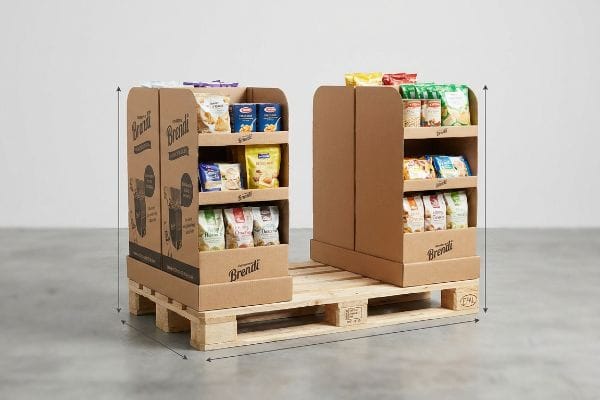
Uma área menor parece ótima em uma sala de reuniões, mas executá-la exige cálculos espaciais impecáveis.
Como as dimensões reduzidas dos paletes dominam os corredores do varejo
A maioria dos gerentes de marca presume que garantir espaço em grandes lojas de varejo exige um display de chão POP 1 (Ponto de Venda) enorme, de tamanho padrão (48×40 polegadas), com 1219×1016 mm (1219×1016 mm) . Eles projetam estruturas gigantescas e monopolizantes que impressionam em imagens digitais, mas não percebem que os compradores do varejo racionam rigorosamente cada centímetro quadrado de interseção de corredores premium.
É uma armadilha comum que pega até mesmo equipes de compras experientes. Frequentemente vejo marcas insistindo nessas estruturas monolíticas gigantescas, apenas para receberem uma rejeição imediata do varejista porque a loja simplesmente não tem espaço para um palete. Para resolver isso, eu exijo expositores a granel projetados com geometrias fracionárias precisas, como meio palete de 1219 x 508 mm (48 x 20 polegadas) ou um quarto de palete. Quando ouço o baque alto e pesado de quatro expositores distintos de um quarto de palete se encaixando perfeitamente em uma única base de madeira GMA (Associação de Fabricantes de Alimentos), sei que os cálculos funcionaram. Essa agilidade espacial permite que os compradores maximizem a densidade de exposição sem sacrificar a integridade estrutural, reduzindo a barreira de entrada para sua campanha.
| Erro comum de iniciantes | A solução profissional | Benefício do piso de vendas |
|---|---|---|
| Apresentação de displays de chão em tamanho real | Projetando paletes fracionários de um quarto ou metade | Garante facilmente espaço privilegiado nos corredores |
| Ignorando as métricas de densidade de lojas | Subdividindo geometrias de base de madeira padrão | Permite campanhas compartilhadas entre várias marcas |
| Desperdício de volume de papelão não alocado | Alinhando-se à matemática estrutural fracionária precisa | Reduz as taxas de rejeição logística |
Eu nunca apresento uma proposta de construção monolítica gigantesca sem oferecer uma alternativa subdividida. Construir estruturas modulares fracionadas garante que o comprador do varejo possa aprovar a instalação com confiança, reduzindo drasticamente as taxas de rejeição e, ao mesmo tempo, gerando um volume enorme em um espaço mais compacto.
🛠️ Mesa do Harvey: Seus displays de chão atuais são muito volumosos para serem aprovados pelos compradores rigorosos de lojas de atacado? 👉 Faça uma Análise de Otimização Espacial ↗ — Acesso direto à minha mesa. Zero spam de vendas automatizado, eu prometo.
Quais são as tendências de design visual para 2026?
Os consumidores estão sobrecarregados pela poluição visual, o que significa que sua estratégia de impressão precisa evoluir além dos gráficos digitais padrão.
As tendências de design visual para 2026 priorizam a impressão com cores especiais de alto contraste em vez da impressão tradicional em quadricromia. Ao utilizar pigmentos específicos pré-misturados em vez de pontos ópticos sobrepostos, as marcas conseguem superfícies de embalagens perfeitamente lisas e vibrantes que capturam a atenção do consumidor de forma impactante, mesmo em meio às prateleiras lotadas e com iluminação fluorescente intensa das lojas em todo o mundo.
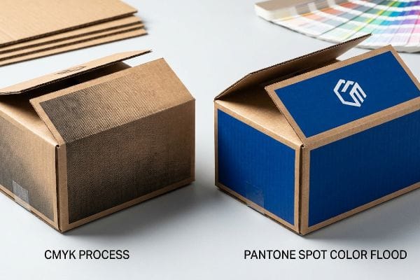
Você pode adorar o gradiente complexo no seu monitor, mas traduzir isso para o papelão cru é uma realidade física diferente.
Por que a aplicação de cores sólidas substitui os gradientes digitais padrão?
As equipes de marketing frequentemente convertem logotipos corporativos sólidos e fundos vibrantes em formatos CMYK padrão (ciano, magenta, amarelo, preto). Elas presumem que esse processo de impressão tradicional corresponderá perfeitamente às suas telas digitais2 quando transferido para o chão de fábrica.
Até mesmo designers experientes muitas vezes ignoram a natureza porosa do papelão ondulado cru. Quando inspeciono a impressão padrão em quatro cores sob uma forte luz de inspeção de fábrica, os minúsculos pontos de meio-tom sobrepostos são absorvidos de forma irregular pelas fibras do papel³,criando um logotipo borrado e desbotado com uma aparência terrível. Para resolver isso, substituo a mistura óptica de pontos por uma aplicação precisa de tinta Pantone (PMS) em cores especiais. O cheiro característico do pigmento denso e pesado secando no papelão confirma que alcançamos um acabamento suave e de alta visibilidade. Esse protocolo exato de cores especiais elimina completamente a granulação do meio-tom⁴, garantindo que sua marca se destaque vividamente a 6 metros de distância, evitando rejeições de impressão dispendiosas.
| Erro comum de iniciantes | A solução profissional | Benefício do piso de vendas |
|---|---|---|
| Baseando-se inteiramente na mistura CMYK | Especificar cores Pantone exatas | Elimina o aspecto visual desbotado da marca |
| Impressão de gradientes digitais complexos | Utilizando inundações densas de tinta sólida | Capta a atenção do comprador instantaneamente |
| Ignorando a capacidade de absorção do papel bruto | Mistura de pigmentos para testliner poroso | Impede a reprodução gráfica desfocada |
Recuso-me a deixar que um ótimo projeto estrutural fracasse por causa de pontos de meio-tom borrados. A transição para cores sólidas e densas é a maneira mais rápida de garantir que seus expositores de papelão ondulado se destaquem intensamente sob a iluminação ruim da loja.
🛠️ Mesa do Harvey: As cores da sua marca estão ficando granuladas ou desbotadas quando impressas em papelão ondulado cru? 👉 Solicite uma verificação prévia de impressão ↗ — Baixe com segurança. Minha caixa de entrada está aberta caso tenha alguma dúvida posteriormente.
O que é a regra 80/20 no merchandising?
Para gerar conversões rápidas, é preciso entender exatamente o que chama a atenção do comprador em diferentes distâncias físicas.
A regra 80/20 no merchandising determina que 80% do envolvimento do consumidor depende da configuração estrutural inicial de 9 metros (30 pés), enquanto os 20% restantes dependem da acessibilidade tátil do produto. Essa estratégia espacial força os designers a priorizarem o impacto visual massivo antes de se concentrarem na leitura atenta dos textos.
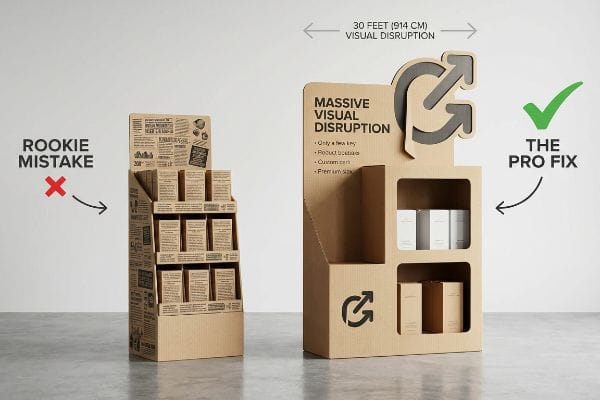
Conhecer essa proporção é útil, mas aplicá-la a uma peça plana de papelão recortado exige uma disciplina espacial rigorosa.
Dominando o Continuum de Engajamento Espacial 3-3-3
As equipes de marketing júnior frequentemente projetam displays de varejo estritamente para visualização de perto em monitores de computador retroiluminados. Elas preenchem todos os painéis disponíveis com textos minúsculos, presumindo que o comprador ficará ali parado e lerá toda a história da marca como se fosse um folheto.
É uma armadilha comum que congestiona os corredores e acaba com a compra por impulso. Quando vejo um cliente passar por uma embalagem repleta de texto, percebo uma sobrecarga cognitiva enorme; ele simplesmente ignora o produto porque exige muito esforço. Em vez disso, eu aplico a regra de engajamento espacial 3-3-3⁵,focando primeiro em um elemento recortado grande para chamar a atenção do cliente a 914 cm de distância. Uma vez que ele esteja a 91 cm de distância, garanto que o produto esteja perfeitamente posicionado na zona de impacto vertical de 1270 mm⁶.É possível ouvir o estalo satisfatório da embalagem quando o cliente pega o produto, comprovando que eliminar o excesso de texto para focar na ergonomia estrutural acelera diretamente o giro de estoque.
| Erro comum de iniciantes | A solução profissional | Benefício do piso de vendas |
|---|---|---|
| Impressão de texto denso em cabeçalhos | Utilizando formas focais recortadas em grande escala | Capta a atenção de todos os lados do corredor |
| Colocar itens muito baixos nas prateleiras | Visando a zona de impacto vertical de 50 polegadas7 | Aumenta o acesso fácil ao produto |
| Partindo do pressuposto de que os compradores lerão os detalhes | Projetando para um impacto visual rápido de 3 segundos8 | Elimina a sobrecarga cognitiva do comprador |
Sempre lembro aos meus clientes que uma vitrine de loja não é um manual. Se você eliminar impiedosamente o supérfluo e projetar o espaço para atrair clientes, sua vitrine se transforma de um mero elemento invisível no corredor em uma máquina de conversão de alta velocidade.
🛠️ Mesa do Harvey: Seu merchandising atual está tão cheio de texto que não consegue captar a atenção de um comprador por impulso? 👉 Solicite uma Auditoria Estrutural Gratuita ↗ — Sem formulários que geram ligações intermináveis de vendas. Apenas valor puro.
Quais são os 4 Ps do merchandising visual?
Produto, preço, praça e promoção são estruturas comerciais fundamentais, mas traduzi-las em estruturas físicas exige uma disciplina operacional rigorosa.
Os 4 Ps do merchandising visual alinham produto, preço, praça e promoção com os ambientes físicos de varejo. Especificamente, o fator "praça" exige estrita conformidade logística, separando as métricas de paletes de grandes armazéns dos limites compactos dos caixas para garantir uma integração perfeita na loja e evitar rejeições dispendiosas por parte do varejista durante grandes implementações.
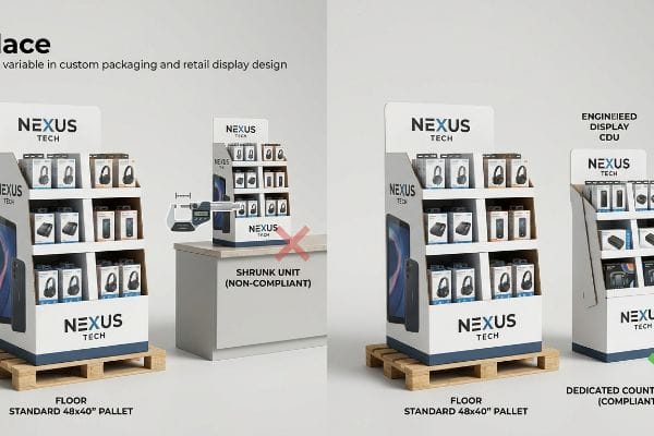
Montar um único monitor em pé em um laboratório é fácil, mas eis a dura realidade quando você precisa enviar 500 deles para diferentes zonas de varejo.
Por que a variável "Local" prejudica os designs que se ajustam por encolhimento?
As equipes de compras frequentemente propõem um design escalável onde um grande expositor de chão pode ser simplesmente reduzido em 50% para servir como uma unidade de balcão. Elas presumem que isso economiza custos de ferramentale mantém a consistência da marca em diferentes zonas da loja de grande porte.
Na minha empresa, vejo rotineiramente empresas comerciais tentando essa adaptação genérica por redução, ignorando completamente as rigorosas normas legais e logísticas que ditam essas duas zonas separadas. Quando consulto as leituras do micrômetro e os guias de conformidade com a ADA (Lei dos Americanos com Deficiências), frequentemente constato que uma base de piso reduzida viola gravemente a faixa de alcance frontal de 381 a 1219 mm (15 a 48 polegadas)exigida para caixas registradoras de PDV (Ponto de Venda). Para corrigir isso, separo permanentemente as linhas de produção, fixando firmemente as unidades de piso em paletes padrão de 1219 a 1016 mm (48 a 40 polegadas)os cálculos estruturais para as unidades de balcão. Ao impor essas tolerâncias espaciais exatas, garanto a redução do tempo de montagem, evitando grandes prejuízos com gerentes de loja que rejeitam imediatamente as unidades de caixa registradora não conformes.
| Erro comum de iniciantes | A solução profissional | Benefício do piso de vendas |
|---|---|---|
| Unidades de piso reduzidas para balcões | Isolar completamente os oleodutos de engenharia | Evita rejeições imediatas por parte do gerente da loja |
| Ignorando os limites legais de alcance frontal | Fixação em janelas verticais rigorosamente conforme as normas da ADA12 | Garante total conformidade com as normas legais |
| Fusão de matemática de zonas de varejo distintas | Pegadas específicas de engenharia por localização | Elimina custos adicionais de armazenagem13 |
Recuso-me a deixar que um truque preguiçoso de escalonamento desencadeie um evento de rejeição em várias lojas. Separar seus fluxos de trabalho de engenharia garante que suas estruturas sobrevivam naturalmente aos rigorosos filtros logísticos de cada zona de varejo distinta.
🛠️ Mesa do Harvey: Não deixe que uma falha estrutural de 2 milímetros arruine o lançamento em 500 lojas. 👉 Envie-me seu arquivo de corte ↗ — Vou testar os cálculos antes que você desperdice seu orçamento com produção em massa.
Conclusão
Você pode tentar forçar um display genérico retrátil em um balcão de caixa, mas quando essa estrutura inadequada viola os limites de alcance frontal, ela provoca uma rejeição imediata por parte do varejista e elimina completamente a margem de lucro do projeto. Mais de 500 gerentes de marca usam meu checklist de pré-impressão para evitar exatamente esses erros fatais no estágio inicial. Pare de adivinhar as complexas tolerâncias espaciais e deixe-me auditar pessoalmente sua campanha por meio da minha Análise de Engenharia Gratuita ↗ para detectar esses riscos estruturais invisíveis antes da produção em massa.
"Tamanhos padrão de paletes — 48×40 GMA e outras 6 dimensões comuns", https://www.wearewarp.com/standard-pallet-sizes. [Um padrão oficial da indústria logística ou varejista confirmaria que 48×40 polegadas é a dimensão padrão de palete GMA usada para displays de ponto de venda]. Papel da evidência: verificação factual; tipo de fonte: padrão da indústria. Suporte: dimensionamento padrão de displays. Observação de escopo: Aplicável principalmente aos mercados varejistas da América do Norte .
"RGB vs. CMYK: O Guia de 2026 para Cores de Impressão Perfeitas", https://www.jukeboxprint.com/blog/rgb-vs-cmyk-for-print?srsltid=AfmBOooYMYf7PA8Dn4NuPCXX8_AfCBIn6rA9zvAMRqA8N1EFftYWlyvy. [Guias profissionais de impressão e teoria das cores explicam a incapacidade inerente do modelo de cores subtrativo CMYK de replicar a gama mais ampla de cores aditivas RGB usadas em telas digitais]. Papel da evidência: verificação técnica; tipo de fonte: manual padrão da indústria. Apoia: a premissa de que a conversão de digital para impressão frequentemente resulta em perda ou alteração de cores. Nota de escopo: foco na impressão em quadricromia padrão .
"Por que o RGB não é ideal para impressão e embalagem? – Papelão personalizado…", https://popdisplay.me/why-is-rgb-not-ideal-for-printing-packaging/. [Um guia técnico confiável sobre substratos explicaria como a alta porosidade do papelão ondulado bruto causa sangramento de tinta e absorção irregular dos pontos de impressão.] Papel da evidência: Verificação técnica; tipo de fonte: Manual técnico da indústria gráfica. Argumentos: A causa da aparência turva na impressão em quatro cores em papelão. Nota de escopo: Refere-se especificamente a materiais de papelão ondulado não revestidos. ↩
"Diferença entre cores especiais e cores CMYK", https://www.deprintedbox.com/blog/spot-vs-process-color/. [Especificações técnicas de fabricantes de tinta confirmam que a aplicação de cores especiais sólidas elimina o padrão de pontos ópticos associado à impressão em quadricromia.] Papel da evidência: Verificação técnica; tipo de fonte: Especificação de artes gráficas. Argumenta: A superioridade visual das cores especiais em relação aos meios-tons CMYK. Nota de escopo: Aplica-se a aplicações de cores sólidas .
"A Regra 80/20 do Merchandising – Bloomreach", https://www.bloomreach.com/en/library/guides/80-20-rule-of-merchandising. [Um manual de design de varejo ou estrutura de marketing de referência definiria a regra 3-3-3 como uma estratégia para atrair compradores a diferentes distâncias]. Papel da evidência: definição; tipo de fonte: padrão da indústria; suporte: a estrutura conceitual para engajamento espacial. Nota de escopo: pode variar conforme o setor de varejo .
"Zona de Strike | Glossário – MLB.com", https://www.mlb.com/glossary/rules/strike-zone. [Pesquisas ergonômicas ou diretrizes de merchandising visual especificariam a faixa de altura vertical ideal para o posicionamento do produto, a fim de maximizar o alcance e a visibilidade para o consumidor]. Papel da evidência: especificação técnica; tipo de fonte: estudo ergonômico; Fundamentos: a medição específica para a acessibilidade ideal do produto. Observação sobre o escopo: as métricas de altura podem variar de acordo com a altura média do público-alvo .
"Projeto de espaços comerciais para exibição eficaz e fluxo de clientes", https://www.business.qld.gov.au/industries/manufacturing-retail/retail-wholesale/retail-displays. [Uma fonte confiável sobre ergonomia no varejo ou planogramas validaria a faixa de altura específica que maximiza a visibilidade e a acessibilidade do produto para o consumidor adulto médio]. Papel da evidência: verificação da especificação técnica; tipo de fonte: norma do setor ou estudo de ergonomia. Argumentos: altura ideal para posicionamento do produto. Observação sobre o escopo: Pode variar de acordo com a altura do público-alvo .
"Explorando o comportamento de navegação e o nível de atenção do comprador com um…", https://pmc.ncbi.nlm.nih.gov/articles/PMC6895988/. [Pesquisas sobre comportamento do consumidor em ambientes de varejo normalmente quantificam o curto período de tempo que um comprador passa avaliando uma vitrine antes de decidir interagir com ela ou ignorá-la]. Papel da evidência: validação de métrica comportamental; tipo de fonte: estudo de psicologia do consumidor. Apoia: a necessidade de comunicação visual rápida para evitar sobrecarga cognitiva. Nota de escopo: Aplica-se especificamente a zonas de impulso de alto fluxo de pessoas .
"Qual é o processo de design para displays de varejo? – Frank Mayer", https://www.frankmayer.com/blog/what-is-the-design-process-for-retail-displays/ . [Documentação da indústria sobre corte e fabricação de moldes explica como a reutilização de recursos de design ou o escalonamento de dimensões podem reduzir os custos iniciais de ferramental] . Papel da evidência: verificação técnica; tipo de fonte: especificação de fabricação. Apoia: a justificativa de aquisição para designs escaláveis. Nota de escopo: específico para tipos de materiais como papelão ondulado ou plástico.
"Normas de Acessibilidade da ADA – Access-Board.gov", https://www.access-board.gov/ada/. [As Normas da ADA para Design Acessível especificam os alcances permitidos para partes operáveis de balcões de atendimento e terminais de ponto de venda (PDV)]. Função da evidência: especificação técnica; tipo de fonte: regulamentação governamental. Apoia: conformidade com a ADA para alcance de caixas registradoras de PDV. Nota de escopo: específico para as diretrizes da ADA dos EUA .
"Palete de madeira tratada termicamente GMA – 48 x 40" H-1260 – ULINE", https://www.uline.com/Product/Detail/H-1260/Pallets/Heat-Treated-Wood-GMA-Pallet-48-x-40. [Os padrões da indústria para logística na América do Norte definem o palete da Grocery Manufacturers Association (GMA) como tendo 48 por 40 polegadas]. Papel da evidência: padrão da indústria; tipo de fonte: manual de logística. Suportes: dimensões padrão de paletes. Nota de escopo: padrão primário para transporte na América do Norte. ↩
"Normas da ADA para Design Acessível, Título III, Regulamento 28 CFR…", https://www.ada.gov/law-and-regs/design-standards/1991-design-standards/. [As normas oficiais da ADA definem as faixas específicas de altura e profundidade necessárias para alcance acessível em ambientes comerciais]. Papel da evidência: norma regulatória; tipo de fonte: regulamentação governamental. Fundamenta: a necessidade de ancorar os projetos aos requisitos de alcance vertical da ADA. Nota de escopo: aplicável principalmente a instalações comerciais nos EUA .
"Como funcionam os estornos no varejo e o que você pode fazer a respeito", https://www.weberlogistics.com/blog/california-logistics-blog/how-retail-chargebacks-work-and-what-you-can-do-about-them. [Manuais de operações de cadeia de suprimentos e varejo detalham como discrepâncias entre as dimensões dos equipamentos entregues e as plantas específicas do local levam a penalidades financeiras ou estornos]. Papel da evidência: impacto operacional; tipo de fonte: white paper do setor. Apoia: o risco financeiro da fusão de cálculos de zonas de varejo. Observação sobre o escopo: depende dos acordos contratuais entre fornecedor e varejista .