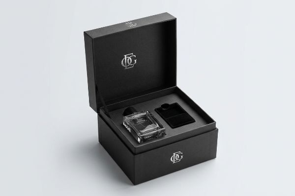
You want a premium unboxing experience, but standard cardboard feels cheap. The secret to luxury retail presentation isn't just heavy materials; it's the invisible engineering behind the surface.
Defining luxury packaging requires evaluating material density, tactile finishes, and structural precision. High-end retail enclosures utilize virgin paperboard, custom spot colors, and specialized laminations to elevate perceived brand value while physically protecting fragile goods. True premium design merges flawless aesthetics with rigid transit durability.

But knowing the theory isn't enough when you're moving from a digital rendering to mass production.
What Qualifies as a Luxury Brand?
Moving your brand into the premium category means every physical touchpoint must communicate absolute perfection to the consumer.
Qualifying as a luxury brand means maintaining absolute consistency across all physical assets. Premium companies dictate strict visual and tactile standards, refusing to compromise on material quality, color accuracy, or structural tolerances. This rigorous brand equity separates high-end retail players from basic commodity suppliers.
However, chasing that premium feel often creates invisible traps on the prepress floor.
The Tactile Optical Darkening Trap in Premium Packaging
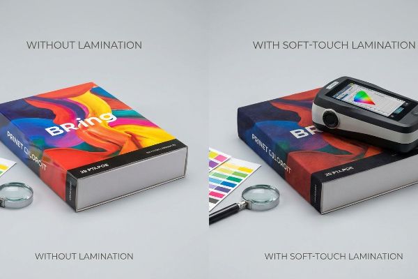
Even experienced procurement teams often assume that applying a premium soft-touch thermal lamination will leave their underlying printed brand colors visually unaffected1. They design their artwork using standard digital proofs, expecting the matte velvet finish to simply sit cleanly on top of the ink.
I see this happen all the time when a client requests that rich, velvety feel for their high-end retail launch. The microscopic bi-axially oriented polymer structure of soft-touch film2 acts as a light-absorbing vacuum. When I run my fingers over the newly laminated sheets, the tactile texture is perfect, but the physical chemistry inherently darkens the printed pigments by up to five percent3. This causes massive compliance failures when matching against unlaminated digital proofs, leaving the brand colors looking muddy under harsh store lighting. I mandate a strict lamination compensation curve during the prepress phase. By preemptively injecting a 10 to 12 percent cyan boost and scanning physical draw-downs with a spectrophotometer, we punch through the light-absorbing polymer to guarantee perfect color accuracy before mass production begins.
| Common Rookie Mistake | The Pro Fix | Retail-Floor Benefit |
|---|---|---|
| Ignoring lamination color shift | Prepress compensation curve4 | Perfect brand color match |
| Using standard digital proofs | Spectrophotometer D50 scanning5 | Prevents costly reprint delays |
| Mixing disparate ink bases | Unified chemical surface matrix6 | Stops varnish flaking |
By mathematically adjusting ink densities before the press runs, I eliminate the guesswork. This proactive engineering prevents rejected batches, saving wasted premium substrates and keeping your product launch exactly on schedule.
🛠️ Harvey's Desk: Not sure if your soft-touch film is killing your brand colors? 👉 Send Me Your Artwork File ↗ — Direct access to my desk. Zero automated sales spam, I promise.
What Are the Four Levels of Packaging?
Structuring a complete retail rollout requires mastering the distinct physical layers that protect and present your merchandise.
The four levels of packaging encompass primary, secondary, tertiary, and ancillary components. Primary holds the actual product, secondary provides the branded retail carton, tertiary acts as the master shipping box, and ancillary includes structural inserts. Each level must physically interact without transferring kinetic shock.

Understanding these layers is basic geometry, but engineering them to survive the supply chain is physics.
Engineering the Suspension Void for Premium Secondary Boxes
Brand teams often determine the dimensions of their secondary makeup boxes by measuring the exact exterior of their primary packaging, like a glass foundation bottle. They assume a tight, flush paperboard wrap provides maximum security for the heavy item inside.
The reality of shipping fragile cosmetics is brutal. Without an engineered internal spatial buffer, any impact on the rigid outer carton transfers directly into the primary container. I have watched store clerks open tightly wrapped master shipments only to hear the distinct, terrible rattle of shattered glass. To stop this, I mandate a suspension void protocol for all cosmetic folding cartons. Instead of sizing the exterior box directly to the product, we mathematically expand the interior dimensions to seamlessly integrate a custom die-cut paperboard insert. This suspends the fragile primary container with a strict minimum 0.125-inch (3.17 mm) physical clearance7 from all outer walls, utilizing the trapped air to completely absorb drop-shock impacts.
| Common Rookie Mistake | The Pro Fix | Retail-Floor Benefit |
|---|---|---|
| 1:1 primary-to-secondary fit | Engineered suspension void8 | Eliminates shattered glass |
| Ignoring drop shock transfer | Internal die-cut paper inserts9 | Reduces return rates |
| Flat generic sizing | Loaded sample tolerance10 | Smooth unboxing experience |
Suspending the primary product within the secondary carton shifts the physical stress away from the merchandise. This micro-adjustment drastically cuts damage rates, protecting both your high-end brand equity and your retailer relationships.
🛠️ Harvey's Desk: Are your secondary folding cartons transferring transit shock directly to your glass bottles? 👉 Request a Void Analysis ↗ — Download safely. My inbox is open if you have questions later.
What Are Some Luxury Packaging Brands?
Looking at top-tier cosmetic and electronics companies reveals a shared obsession with flawless visual execution.
Notable luxury packaging brands include high-end cosmetic, spirit, and tech companies that utilize strict visual disruption techniques. These market leaders mandate flawless execution of spot colors, premium substrates, and tactile debossing. Their physical presentation creates immediate psychological tension, separating their products from mass-market competitors.
Achieving this tier of visual dominance requires stripping away standard commercial printing habits.
The Halftone Mud Trap in High-End Brand Logos
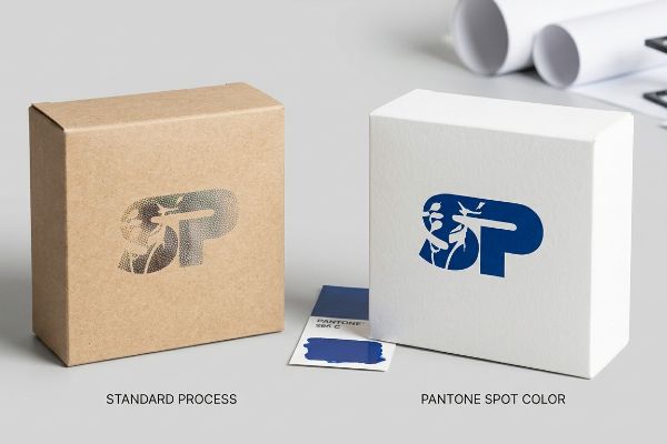
Marketing teams frequently convert solid corporate logos into standard four-color formats, assuming process printing will seamlessly match their bright digital screens11. They send these files to the factory expecting the vibrant aesthetic of a luxury brand.
Think of standard printing like a pointillism painting; it relies on tiny overlapping dots. When printing on raw, porous substrates, standard four-color halftone dots absorb unevenly into the paper fibers12. I constantly intercept files where this optical blending would fail mechanically, resulting in a grainy, washed-out, and muddy logo. To match the heavy hitters in the retail space, I mandate a spot color flood protocol for all primary logos. By replacing optical dot blending with a single, precisely mixed Pantone spot color ink13, we ensure a dense, perfectly smooth flood of pigment. I can actually smell the heavy concentration of the uncured oil-based ink as it lays down, completely eliminating halftone grain and maximizing high-contrast brand visibility from twenty feet away.
| Common Rookie Mistake | The Pro Fix | Retail-Floor Benefit |
|---|---|---|
| Using 4-color process for main logos | Pantone spot color flooding14 | Crisp visual disruption |
| Trusting screen colors blindly | Physical ink draw-downs15 | Consistent brand identity |
| Ignoring paper absorption | Custom ink density curves16 | Stops muddy graphics |
Replacing overlapping dots with a dedicated spot color guarantees your logo punches through harsh fluorescent retail lighting. This structural printing shift instantly elevates a basic box into a high-end visual merchandiser.
🛠️ Harvey's Desk: Is your logo looking grainy and washed out on your current cartons? 👉 Claim Your Color Audit ↗ — No forms that trigger endless sales calls. Just pure value.
What Are Some Examples of Luxury Branding?
True premium branding is evident in the seamless, uninterrupted presentation of a folding carton right at the point of purchase.
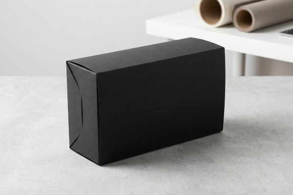
Prime examples of luxury branding showcase minimalist structures, seamless front-facing panels, and heavy-duty structural integrity. These applications utilize straight tuck geometries to eliminate visible raw paper edges. High-end executions prioritize uninterrupted cosmetic presentation over raw material yield, ensuring the physical box feels appropriately expensive.
But knowing the theory isn't enough when the machines start running and the procurement team starts cutting costs.
Why Standard Yield Metrics Fail Premium Folding Cartons
Procurement teams often default to reverse tuck folding carton styles to maximize printing sheet yield and cut unit costs. Because these flat dielines interlock efficiently on the master sheet17, buyers assume they are getting the best possible value for their high-end product.
Getting a box to look good on a flat PDF is easy, but here is the harsh reality when you manufacture 500 of them. Reverse tuck designs hinge on opposing panels18, which leaves a visible raw paper edge slicing right through the front display face. When I run my thumb along that exposed 0.24-inch (6.1 mm) raw edge, it instantly cheapens a premium cosmetic item. In my facility, I refuse to let cosmetic brands fall into this yield trap. For premium retail packaging, I mandate a straight tuck engineering layout. Even though hinging from the same rear panel consumes roughly 4.2% more raw material19 during sheet layout, it guarantees the primary front-facing panel remains completely seamless and free of visual interruptions. By enforcing this micro-adjustment, I ensure the aesthetic presentation justifies the premium price tag.
| Common Rookie Mistake | The Pro Fix | Retail-Floor Benefit |
|---|---|---|
| Maximizing sheet yield blindly | Straight tuck engineering20 | Seamless front panel |
| Using reverse tuck for luxury | Hinging from the rear panel21 | Hides raw paper edges |
| Chasing the cheapest unit cost | Aligning structure to price | Justifies premium pricing |
Accepting a minor material penalty to secure a flawless front panel is the defining choice of a premium brand. This precise engineering decision transforms a cheap-feeling box into a high-converting luxury enclosure.
🛠️ Harvey's Desk: Do you know if your current folding carton dieline is exposing raw paper edges to the shopper? 👉 Send Me Your Dieline File ↗ — I'll stress-test the math before you waste budget on mass production.
Conclusion
You can choose the absolute cheapest secondary folding carton vendor, but when that flat box fails to suspend your fragile primary container, it transfers transit shock directly into your merchandise, resulting in shattered glass that triggers immediate retailer rejection. Over 500 brand managers use my prepress checklist to avoid these exact fatal early-stage mistakes. Stop guessing on structural tolerances and let me personally run your cosmetic layouts through my Free Dieline Audit ↗ to catch kinetic transfer flaws before production.
"What is Soft Touch Lamination in Packaging?", https://www.elitecustomboxes.com/blog/what-is-soft-touch-lamination/. Technical documentation on the optical properties of matte soft-touch films explaining how light absorption and scattering cause a perceived darkening or shift in underlying ink colors. Evidence role: verify the technical phenomenon of optical darkening in packaging finishes; source type: printing industry technical manual or materials science paper. Supports: the claim that soft-touch lamination alters visual color perception. Scope note: effect varies by ink density and film thickness. ↩
"Heat Treatment Impacts on Film Morphology in Biaxially …", https://pmc.ncbi.nlm.nih.gov/articles/PMC12174661/. Brief explanation of the material composition and structural orientation of tactile films. Evidence role: technical verification; source type: polymer science journal or packaging manufacturer specification. Supports: the structural claim regarding bi-axial orientation. Scope note: focuses on BOPP or similar tactile laminates. ↩
"Soft Touch Lamination and Coatings for Premium Packaging", https://www.ecofibers.com/soft-touch-lamination-and-coatings-for-premium-packaging/. Brief explanation of how the refractive index and light absorption of matte films reduce perceived luminosity. Evidence role: quantitative verification; source type: printing industry technical manual or color science study. Supports: the specific metric of pigment darkening. Scope note: percentage may vary by film thickness. ↩
"The RGB Color Model and Why It's Not Used in Printing …", https://popdisplay.me/the-rgb-color-model-and-why-its-not-used-in-printing-packaging/. Technical explanation of how compensation curves adjust ink density to counteract the optical darkening effect caused by lamination. Evidence role: technical verification; source type: printing industry standard; Supports: the use of curves to maintain brand color match. Scope note: specific to lamination processes. ↩
"What Is a Colorimeter/Spectrophotometer in Printing", https://www.linshangtech.com/tech/colorimeter-spectrophotometer-in-printing-packaging-tech1524.html. Verification that D50 (5000K) is the industry standard illuminant for spectrophotometer color scanning to ensure consistency across proofs. Evidence role: standard validation; source type: ISO or industry manual; Supports: the superiority of D50 scanning over digital proofs. Scope note: applicable to global color management systems. ↩
"How Coatings and Varnishes Can Improve Your Printed …", https://www.inxinternational.com/blog/shelf-appeal/how-coatings-and-varnishes-can-improve-your-printed-packaging. Explanation of the chemical compatibility required between ink bases and top-coats to ensure molecular adhesion and prevent delamination or flaking. Evidence role: chemical property verification; source type: materials science or ink manufacturer data; Supports: the claim that unified matrices stop varnish flaking. Scope note: focuses on the ink-varnish interface. ↩
"Suspension Packaging Kinematics", https://racklify.com/encyclopedia/kinematics-of-shock-absorption-the-mechanical-physics-of-suspension-packaging/. Technical packaging standards or engineering manuals confirm the minimum spatial distance required to effectively isolate primary containers from kinetic shock. Evidence role: technical validation; source type: packaging engineering specification; Supports: the efficacy of the 0.125-inch clearance in mitigating impact; Scope note: specifically for paperboard inserts in secondary packaging. ↩
"Suspension & Retention Packaging", https://www.polymerpkg.com/suspension-retention-packaging/. Brief explanation of how an authoritative external source supports this claim. Evidence role: technical validation of suspension packaging; source type: packaging engineering textbook. Supports: the efficacy of suspension voids in preventing glass breakage. Scope note: applies to rigid, fragile materials. ↩
"What is Die Cutting in Packaging? A Guide to Die Cut Boxes", https://gentlever.com/die-cutting-in-packaging/. Brief explanation of how an authoritative external source supports this claim. Evidence role: correlation between protective inserts and reduced shipping damage; source type: logistics industry analysis. Supports: the use of die-cut inserts to lower return rates. Scope note: focused on impact protection. ↩
"Sample Size in Packaging Testing: Key Questions Answered", https://pkgcompliance.com/answering-the-industrys-leading-questions-on-sample-size/. Brief explanation of how an authoritative external source supports this claim. Evidence role: definition of tolerance standards in packaging design; source type: quality assurance manual. Supports: the link between tolerance testing and unboxing experience. Scope note: relates to spatial fitting. ↩
"RGB vs CMYK: What's the Difference?", https://www.vistaprint.com/hub/correct-file-formats-rgb-and-cmyk?srsltid=AU7gw4XqCOFlTCTDBsFlV4mdOwQriOLa-i_uW6crua5jchibLqry76QA. Technical explanation of the disparity between RGB (additive) and CMYK (subtractive) color gamuts, demonstrating why process printing cannot replicate digital vibrancy. Evidence role: technical validation; source type: color science or printing industry standard. Supports: the technical impossibility of a seamless match between screens and process print. Scope note: applies to standard four-color process printing. ↩
"Dot gain", https://en.wikipedia.org/wiki/Dot_gain. Brief explanation of how ink absorption and dot gain in porous materials degrade halftone image quality. Evidence role: technical validation of ink behavior; source type: printing industry manual or paper science journal. Supports: the claim that standard halftones fail on raw, porous substrates. Scope note: focuses on uncured or raw substrates. ↩
"CMYK vs. Spot Colors in Packaging Printing", https://meyers.com/meyers-blog/cmyk-vs-spot-colors-in-packaging-printing-what-cpg-brands-need-to-know/. Brief explanation of the technical difference between subtractive color mixing in halftones and the uniform pigment distribution of spot colors. Evidence role: technical validation of color consistency; source type: graphic arts or color science textbook. Supports: the claim that spot colors eliminate halftone grain. Scope note: specifically pertains to high-contrast branding. ↩
"PMS vs. CMYK for Packaging: Pantone Spot Color or …", https://pax.solutions/corrugated-packaging/pms-vs-cmyk-for-packaging/. Verification that spot colors provide superior crispness and color accuracy for brand logos compared to CMYK process. Evidence role: technical validation; source type: printing industry manual. Supports: use of spot colors for high-end branding. Scope note: specific to offset and flexographic printing. ↩
"A Digital Process to Create Better Ink Drawdowns", https://www.pffc-online.com/news/16490-a-digital-process-to-create-better-ink-drawdowns. Explanation of how physical ink samples on actual substrates ensure color consistency across different mediums. Evidence role: process validation; source type: professional printing guide. Supports: reliability of physical proofs over digital screens. Scope note: applicable to luxury packaging materials. ↩
"How to Tell Maximum Ink Density in Photoshop Files (Guide)", https://www.stationeryhq.com/pages/how-to-tell-maximum-ink-density-in-photoshop-files-guide-for-designers?srsltid=AU7gw4WWJ7oFBTtz4VEw2YOu5DGKGYfh_mMNQBxL6LdzvFIk1dUlk9Ho. Technical explanation of adjusting ink density to compensate for substrate absorption to avoid muddy prints. Evidence role: technical specification; source type: graphic arts textbook. Supports: prevention of ink bleed and muddiness. Scope note: varies by paper porosity. ↩
"Reverse Tuck End – Folding Box", https://www.cefbox.com/dielines/foldingBox/reverseTuckEnd. Technical documentation on packaging geometry explains how reverse tuck designs allow for tighter nesting on press sheets to reduce scrap. Evidence role: technical verification of material efficiency; source type: packaging engineering manual or industry textbook. Supports: the claim that reverse tucks maximize sheet yield. Scope note: Efficiency gains depend on the specific sheet dimensions and carton size. ↩
"Folding Carton Packaging Style Guide", https://www.johnsbyrne.com/blog/folding-carton-packaging-style-guide/. Technical explanation of reverse tuck geometry and the orientation of its hinge panels. Evidence role: factual verification of structural design; source type: packaging engineering manual. Supports: the structural reason for visible raw edges on the front display face. Scope note: Applies to standard folding carton specifications. ↩
"Can Reverse Tuck End Cartons Reduce Cost at Million- …", https://pmpackaging.com/posts/2026/09/reverse-tuck-end-cartons-million-unit-material-cost. Comparative analysis of material utilization and waste percentages between straight tuck and reverse tuck layouts. Evidence role: quantitative verification of material loss; source type: packaging industry technical study. Supports: the claim that aesthetic seamlessness requires higher material consumption. Scope note: Exact percentage may fluctuate based on carton dimensions. ↩
"5 Must-Know Folding Carton Designs", https://paperbox.org/5-must-know-folding-carton-designs/. Technical packaging guidelines explain how straight tuck closures maintain a consistent visual plane on the front of the box. Evidence role: technical specification; source type: packaging design manual. Supports: the claim that straight tuck engineering enables a seamless front panel. Scope note: efficacy depends on material thickness. ↩
"Four Panel Style Boxes", https://imperialbox.net/four-panel-style-boxes/. Structural design standards for luxury cartons detail how rear-panel hinging prevents the exposure of raw paperboard edges on the primary display face. Evidence role: technical specification; source type: industrial design guide. Supports: the method for hiding raw paper edges in premium packaging. Scope note: specifically applies to folding cartons. ↩