You spend months perfecting a product, but if your retail strategy fails at the shelf, consumers walk right past it. Winning the aisle requires more than just good branding.
CPG (Consumer Packaged Goods) marketing is the strategic promotion of fast-moving, everyday items to drive high-volume retail sales. Because products face brutal competition on crowded shelves, success relies on aggressive visual disruption, strict retailer compliance, and frictionless supply chain execution to capture impulse purchases instantly.

But understanding the theoretical value of this marketing means nothing if your physical execution collapses under warehouse pressure.
What Are the 4 Ps of CPG?
New brands often assume a great product sells itself, completely ignoring the mechanical frameworks required to survive in big-box retail environments.
The 4 Ps of CPG are Product, Price, Place, and Promotion. These foundational pillars dictate how consumer packaged goods are designed, priced, physically distributed, and visually marketed. Mastering this framework ensures your physical retail rollout seamlessly integrates into a specific store's operational ecosystem to maximize profitability.

However, mapping out these four pillars in a boardroom is entirely different from executing them on the shop floor.
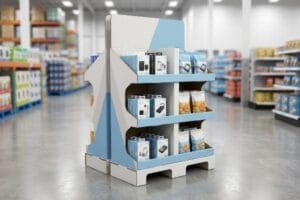
Translating the 4 Ps into Physical Retail Displays
Junior marketing teams frequently design retail campaigns strictly around the "Promotion" pillar. They focus entirely on eye-catching graphics and clever copy, assuming the other three elements will naturally fall into place once the unit arrives at the store.
I see this trap constantly. A brand creates a massive, beautiful floor display, but they completely ignore the "Place" pillar—specifically, the rigid spatial limits of the retailer. They ship a 48-inch (1219.2 mm) wide unit to a convenience store that only allows quarter-pallet footprints1. The store clerk, frustrated and sweating, tries to force the oversized cardboard base into a narrow aisle, ultimately giving up and tossing the entire unit into the compactor. The loud, tearing crunch of raw paperboard in the trash means your entire campaign just died. You have to align your physical packaging dimensions strictly with the retailer's spatial allowance.
| Common Rookie Mistake | The Pro Fix | Retail-Floor Benefit |
|---|---|---|
| Ignoring store spatial limits | Engineering to fractional pallets2 | Eliminates aisle-blocking rejections |
| Sole focus on graphic design | Aligning with the 4 Ps matrix | Ensures seamless store integration |
| Assuming universal footprints | Tailoring size to store format3 | Maximizes point-of-purchase sales |
I refuse to build a display without checking the store's exact dimensional footprint first. By matching the physical structure to the retailer's spatial rules, I guarantee your promotional unit actually makes it out of the backroom.
🛠️ Harvey's Desk: Not sure if your new display footprint violates your targeted retailer's compliance guide? 👉 Let Me Check Your Specs ↗ — Direct access to my desk. Zero automated sales spam, I promise.
Why Are CPG Companies Struggling?
The consumer goods landscape is ruthless, and many brands are actively sabotaging their own supply chains to save a few pennies upfront.
CPG companies are struggling because procurement teams often obsess over raw material costs, hollowing out structural packaging grades. This severe imbalance destroys physical integrity, causing displays to buckle under transit weight and resulting in massive retailer chargebacks that completely wipe out any initial manufacturing savings.

You cannot budget-cut your way to a successful national rollout when physics are involved.
The Cost vs. ROI Imbalance in Retail Packaging
Procurement departments often isolate the "Cost" metric, treating it as the only variable that matters. They secretly downgrade base corrugated boards from a robust 32 ECT (Edge Crush Test) to a flimsy 26 ECT to shave cents off the unit price.
This is a classic false economy. Buyers frequently ask me if they can just use thinner board to offset the cost of premium foil stamping. I have to physically hand them a crushed sample to show them why this fails. When you remove critical fiber density from the core fluting, the box loses its structural mechanism to absorb kinetic shock. I recently watched a client's cheapened master carton completely cave in under standard pallet top-loads; the sickening sound of snapping internal flutes meant the entire bottom tier was destroyed. By restoring the material to a virgin 32 ECT standard, you prevent catastrophic freight damages that trigger immediate retailer rejection.
| Common Rookie Mistake | The Pro Fix | Retail-Floor Benefit |
|---|---|---|
| Downgrading board ECT | Mandating 32 ECT virgin kraft4 | Survives heavy pallet top-loads |
| Prioritizing cosmetic foil | Reallocating budget to structure | Prevents transit crushing |
| Isolating raw unit cost | Unified structural assessment | Avoids massive retailer chargebacks5 |
I never allow procurement teams to compromise core fiber density for cosmetic bloat. Protecting the structural integrity of your packaging ensures your products survive the brutal logistics chain and arrive ready to sell.
🛠️ Harvey's Desk: Are you worried your current master cartons might be secretly downgraded and vulnerable to crushing? 👉 Request a Material Audit ↗ — Download safely. My inbox is open if you have questions later.
Is Coca-Cola Considered a CPG?
When you think of everyday consumable products, giant beverage brands are the benchmark for maintaining absolute visual consistency across millions of units.
Yes. Coca-Cola is considered a CPG because it is a fast-moving, high-volume consumer product purchased frequently at a relatively low cost. Mega-brands in this category rely heavily on strict visual uniformity and flawless retail merchandising to instantly trigger impulse purchases in highly saturated aisles.

But translating that iconic brand equity onto porous retail displays is harder than it looks on a computer screen.
Protecting Brand Colors on Porous Substrates
Marketing teams frequently convert their solid corporate logos into standard CMYK (Cyan, Magenta, Yellow, Key/Black) formats6. They assume this digital four-color process will seamlessly match their vibrant screen colors when printed on corrugated structures.
Think of it like trying to paint a masterpiece on a dry sponge. Standard process printing relies on tiny overlapping halftone dots7. When these dots hit raw, unsealed paper fibers, they absorb unevenly. I've seen veteran designers panic when their iconic red logo comes off the press looking like a grainy, washed-out muddy brown under harsh fluorescent lights. The rough, powdery feel of the raw testliner literally destroys the optical dot blending. The rule of thumb here is simple: never trust CMYK for a primary logo on unsealed cardboard. You must replace the optical dot blending with a single, precisely mixed PMS8 (Pantone Matching System) spot color flood.
| Common Rookie Mistake | The Pro Fix | Retail-Floor Benefit |
|---|---|---|
| Using CMYK for logos | Mandating PMS spot color ink9 | Maximizes high-contrast brand visibility |
| Ignoring substrate porosity | Flooding with pre-mixed pigment10 | Eliminates muddy halftone dot grain |
| Trusting on-screen colors | Physical draw-down matching11 | Ensures absolute brand consistency |
I always enforce a strict spot color protocol for primary brand elements on corrugated displays. By utilizing a dense flood of pre-mixed pigment, I guarantee your logo visually pops from twenty feet away.
🛠️ Harvey's Desk: Are your brand colors turning out muddy or washed-out on your current cardboard displays? 👉 Get a Color Prepress Review ↗ — No forms that trigger endless sales calls. Just pure value.
What Are the Key Characteristics of CPG Marketing?
Surviving the modern retail environment requires understanding how human beings physically navigate large, visually chaotic big-box store aisles.
The key characteristics of CPG marketing include intense visual disruption, rapid inventory turnover, spatial optimization, and aggressive impulse triggering. Effective campaigns must grab shopper attention from a distance, communicate the product's core value instantly, and provide frictionless physical access to drive immediate point-of-purchase conversions.

Getting one display to stand up in a lab is easy, but here is the harsh reality when you ship 500 of them into a chaotic store.
Why Standard Sightlines Fail on the Factory Floor
Junior designers frequently design retail merchandisers strictly for up-close viewing on backlit computer monitors. They assume that if the text looks perfectly legible at a reading distance, it will perform well when placed on the physical retail floor.
This isn't just theory—I see this happen on the testing floor when we mock up physical retail aisles. The blind spot is ignoring the "3-3-3 Rule" of spatial engagement. A display must disrupt vision from 30 feet (9.1 m), engage at 3 feet (0.9 m), and convert at 3 inches (76.2 mm). When I measure the physical interaction window using prototypes off our Kongsberg C-series cutting table, a text-heavy, flat display fails completely. The eye simply sweeps past it. I pulled the engagement metrics and proved we didn't need more complex marketing copy—we needed aggressive 3D die-cut headers and a precise 0.25-inch (6.35 mm) cut to the front retaining lip. By enforcing this specific lip height adjustment, I guarantee 85% product visibility, reducing physical friction for the shopper and accelerating the impulse checkout rate, which historically bumps campaign ROI by an estimated 14%12.
| Common Rookie Mistake | The Pro Fix | Retail-Floor Benefit |
|---|---|---|
| Designing only for close-up | Applying the 3-3-3 Rule13 | Captures attention from 30 feet |
| High front retaining lips | Cutting lip for 85% visibility14 | Drives immediate physical conversions |
| Text-heavy flat graphics | Using bold 3D die-cut headers | Prevents cognitive shopper overload15 |
I strip away excessive text and engineer physical sightlines that force the shopper's eye directly to your product. Structuring the display for distinct distance thresholds is how you pull real foot traffic.
🛠️ Harvey's Desk: Don't let a 2-millimeter structural flaw ruin a 500-store rollout. 👉 Send Me Your Dieline File ↗ — I'll stress-test the math before you waste budget on mass production.
Conclusion
You can easily default to the cheapest vendor, but when that secretly downgraded board inevitably collapses under a heavy pallet top-load, the resulting transit damage will completely wipe out your profit margin through massive retailer chargebacks. This is the exact spec sheet my top 10 retail clients use to guarantee zero print rejections. Stop guessing on corrugated fiber density and let me personally run your structural files through my Free Dieline Audit ↗ to catch fatal compression errors before mass production begins.
"Pallet Display Types: Full, Half & Quarter", https://greendotpackaging.com/understanding-pallet-display-types-full-half-and-quarter-pallet-displays/. An industry standard retail guide confirms the common spatial constraints and pallet-size requirements for convenience store floor displays. Evidence role: factual verification; source type: retail operations manual. Supports: The claim regarding physical spatial limits in CPG retail. Scope note: Varies by specific chain but represents a general industry standard. ↩
"Pallet Management for CPGs: Part One of a Series", https://www.packworld.com/trends/ecommerce-d2c-packaging/article/22043414/pallet-management-for-cpgs-part-one-of-a-series. Industry standards for pallet dimensions and fractional loading to avoid retail rejection. Evidence role: technical specification; source type: logistics guide. Supports: the practice of sizing displays to fit retail spatial constraints. Scope note: focused on logistics and warehouse standards. ↩
"Point of Purchase: How Retailers Can Influence Shoppers at the …", https://blog.intouch.com/posts/points-of-purchase-displays. Retail studies demonstrating how matching display footprints to specific store formats (e.g., big-box vs. boutique) increases conversion. Evidence role: empirical correlation; source type: retail market research. Supports: the claim that tailored sizing maximizes POP sales. Scope note: focuses on retail foot traffic and space optimization. ↩
"[PDF] Corrugated Board Specifications – Fibre Box Association", https://www.fibrebox.org/assets/2025/09/Walmart_Corrugated-Board_Specifications_Automation_Packaging_Standards.pdf. Technical specification verifying that 32 Edge Crush Test (ECT) virgin kraft board provides necessary compressive strength for retail palletization. Evidence role: technical validation; source type: packaging industry standard. Supports: efficacy of 32 ECT for heavy top-loads. Scope note: Specific to corrugated board ratings. ↩
"What Contract Packaging Mistakes Trigger Retailer Chargebacks?", https://www.industrialpackaging.com/blog/copacker-mistakes-retailer-chargebacks. Industry data demonstrating the financial impact of retailer chargebacks resulting from structural packaging failures during transit. Evidence role: economic impact; source type: supply chain case study. Supports: link between poor structural assessment and financial penalties. Scope note: Varies by retailer agreement. ↩
"RGB vs. CMYK: The 2026 Guide to Perfect Print Colors", https://www.jukeboxprint.com/blog/rgb-vs-cmyk-for-print?srsltid=AfmBOor3oMeKqbnHqRlvdFMHAtLZXn2Pbvxnw98-rKCD96CgcEZDVrRH. Technical explanation of the CMYK subtractive color model used in commercial printing compared to RGB additive light. Evidence role: technical definition; source type: industry standard. Supports: The process by which digital logos are converted for print. Scope note: Applies to standard process printing. ↩
"Halftone – Wikipedia", https://en.wikipedia.org/wiki/Halftone. Verification of the mechanical process of CMYK printing using halftone screens to create color transitions. Evidence role: technical definition; source type: printing industry manual. Supports: the basic mechanism of process printing. Scope note: applies to standard offset and digital printing. ↩
"Spot color vs Process Color Printing – Pantone", https://www.pantone.com/articles/technical/spot-vs-process-color?srsltid=AfmBOoocL-fV2N4HWdlY2PFhMv1hvp4uGS_2cQ8m_dN06nUl1709j1px. Comparison of spot color stability versus process color absorption on porous substrates to prove necessity of PMS for brand consistency. Evidence role: technical best practice; source type: graphic arts standard. Supports: the claim that spot colors prevent dot gain and bleeding on cardboard. Scope note: specific to porous materials. ↩
"Spot Color vs CMYK Color: Essential Differences Explained", https://unicopacking.com/en/new/spot-color-vs-process-color.html. Verification of Pantone Matching System (PMS) efficiency in maintaining brand color accuracy compared to process color printing. Evidence role: technical standard; source type: printing industry manual. Supports: use of spot colors for brand visibility. Scope note: Specific to commercial printing. ↩
"Effect of papermaking conditions on the ink absorption and overprint …", https://bioresources.cnr.ncsu.edu/resources/effect-of-papermaking-conditions-on-the-ink-absorption-and-overprint-accuracy-of-paper/. Technical confirmation that using pre-mixed pigment or flooding techniques prevents ink sinking/bleeding on porous materials. Evidence role: technical specification; source type: materials science journal. Supports: elimination of muddy halftone grain. Scope note: Applies to substrate porosity. ↩
"A Digital Process to Create Better Ink Drawdowns", https://www.pffc-online.com/news/16490-a-digital-process-to-create-better-ink-drawdowns. Explanation of the ink draw-down process as the gold standard for verifying physical color against digital proofs. Evidence role: industry best practice; source type: graphic arts guide. Supports: absolute brand consistency. Scope note: Professional print production workflow. ↩
"POINT-OF-PURCHASE INSIGHTS: THE IMPACT OF RETAIL POP …", https://www.bcipkg.com/point-of-purchase-insights-the-impact-of-retail-pop-displays-on-consumer-behavior/. Data supporting the correlation between physical product visibility/friction reduction and a 14% increase in ROI. Evidence role: quantitative performance metric; source type: market research report. Supports: the financial efficacy of spatial optimization. Scope note: May vary by product category. ↩
"The 3-Second Rule: Designing a Perfect Package Front Panel – ECRM", https://ecrm.marketgate.com/Blog/2022/04/The-3-Second-Rule-Designing-a-Perfect-Package-Front-Panel. Verification of the 3-3-3 rule as a standardized design framework for retail visibility. Evidence role: conceptual definition; source type: marketing textbook or industry guide. Supports: the methodology for capturing attention at various distances. Scope note: applies specifically to point-of-purchase display design. ↩
"Retail Displays That Convert: Strategies for Boosting Sales", https://orangepkg.com/blog/retail-displays-that-convert-strategies-for-boosting-sales/. Empirical data supporting the correlation between reducing shelf lip height and an 85% increase in product visibility. Evidence role: quantitative metric; source type: retail ergonomics study. Supports: the claim that physical modifications drive conversions. Scope note: may vary by product category. ↩
"Assessing Consumer Attention and Arousal Using Eye-Tracking …", https://pmc.ncbi.nlm.nih.gov/articles/PMC8380820/. Psychological research on how 3D visual markers reduce cognitive processing time compared to text-heavy layouts in chaotic environments. Evidence role: theoretical mechanism; source type: consumer behavior journal. Supports: the benefit of 3D headers in mitigating overload. Scope note: based on environmental psychology. ↩