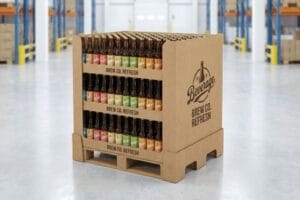
Choosing the perfect shade for a retail rollout isn't just about brand identity; it's a structural and psychological decision that dictates shelf presence and consumer engagement.
Choosing color for a display involves aligning visual psychology with physical printing constraints. The right palette directly impacts consumer attention, brand recall, and material performance under commercial lighting. High-contrast combinations paired with precise color-matching systems ensure your merchandising stands out in competitive, crowded retail environments.
Before you finalize your dielines, let me walk you through the physical realities of translating digital palettes onto raw corrugated board.
What is the best color for a retail store?
Many designers ask for a universal shade, but the truth relies entirely on how pigment interacts with unsealed paper substrates.
The best color for stores depends on high-contrast, spot-color application. Rather than relying on generic digital shades, effective retail spaces utilize dense pigment floods that eliminate visual grain. Solid, bright tones printed on quality substrates capture attention faster and maintain brand integrity under harsh commercial lighting conditions.
Let's move past digital mockups and look at how ink actually dries on the factory floor.
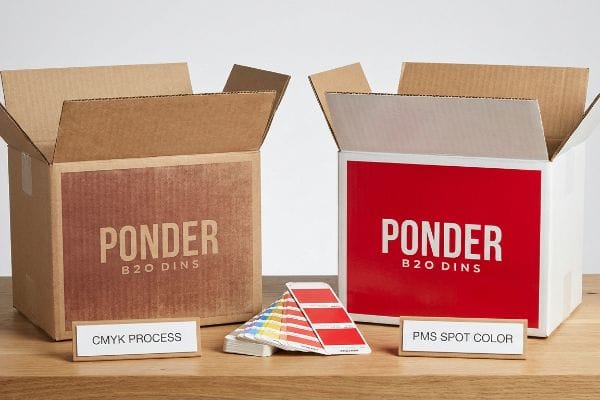
Why CMYK (Cyan, Magenta, Yellow, Key/Black) Mud Ruins Retail Color
Most creative teams start by converting their solid brand logos into standard process formats. They assume four-color printing will seamlessly match the brilliant shades glowing on their expensive office monitors. This is a standard practice for glossy brochures, but it completely ignores the porous nature of retail-ready shippers.
I know you're staring at your printed sample feeling frustrated, because 80% of my clients see their vibrant red logo turn into a dirty brown stain on the first run. The issue is halftone dot blending on unsealed testliner; the tiny dots absorb unevenly into the raw fibers. I constantly catch this rookie trap during prepress, where a designer tries to print a solid background using process inks, resulting in a muddy, washed-out look that feels rough and powdery to the touch. Instead, I enforce a strict Spot Color Flood Protocol, replacing digital dots with a single, precisely mixed PMS (Pantone Matching System) ink bucket. This physically floods the board with dense pigment, completely eliminating grain and ensuring your brand pops from 20 feet (609.6 cm) away, drastically reducing the risk of retailer rejection for poor print quality.
| Common Rookie Mistake | The Pro Fix | Retail-Floor Benefit |
|---|---|---|
| Printing logos in process CMYK | Flooding with PMS spot ink1 | Sharp visibility from 20 feet |
| Ignoring paper porosity | Using sealed white top-liner2 | Prevents muddy, washed-out shades |
| Relying on monitor screens | Matching physical ink swatches3 | Eliminates retail chargebacks |
I never let a client push a muddy process logo to mass production. Flooding your headers with a true spot ink guarantees the contrast needed to pull a shopper from the main aisle straight to your merchandiser.
🛠️ Harvey's Desk: Not sure if your brand colors will look muddy on raw paperboard? 👉 Request a Free File Audit ↗ — Direct access to my desk. Zero automated sales spam, I promise.
What color is associated with retail?
Certain shades instantly trigger buyer recognition, but maintaining that exact recognizable hue across different continents is a massive logistical hurdle.
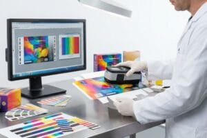
Colors associated with retail environments typically include high-energy reds, reassuring blues, and premium blacks. These distinct hues trigger specific psychological shopping responses. However, maintaining the exact visual association requires standardized spectrophotometer measurements, ensuring the corporate hue remains visually consistent across different manufacturing batches and diverse packaging materials.
You can pick the perfect shade of 'buy-me red', but translating it from a PDF to a physical pallet is where things get messy.
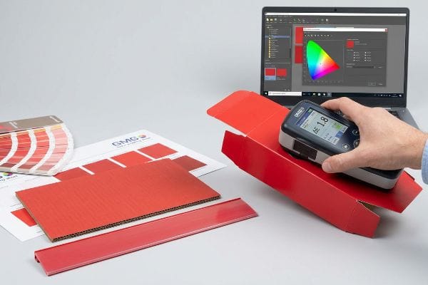
The Delta-E Color Variance Trap
It is completely standard for procurement teams to send a single digital file to three different global suppliers. They expect the iconic brand red to match perfectly across the folding cartons, the floor merchandisers, and the plastic shelf strips. This assumes all machinery reads digital data identically4.
But knowing the theory isn't enough when you're managing a 500-store rollout. I see this headache constantly: a brand manager opens a container and realizes their corrugated base is a dark maroon while the header card is bright pink. I test this variance using a GMG Color Proofing system and a spectrophotometer, measuring the exact Delta-E tolerance of the dried ink. If you just email a hex code to a printer without measuring the physical light reflection, you get a Frankenstein display that looks cheap. By enforcing a strict Delta-E limit under 2.05, I lock in the exact pigment chemistry across all substrates, saving you from a massive branding disaster and ensuring your co-packing assembly line never halts due to mismatched parts.
| Common Rookie Mistake | The Pro Fix | Retail-Floor Benefit |
|---|---|---|
| Sending RGB hex codes | Enforcing Delta-E tolerances6 | Uniform brand presentation |
| Approving proofs on screens | Using spectrophotometer scans7 | Prevents mismatched components |
| Ignoring substrate types | GMG color profile matching8 | Smooth multi-vendor rollouts |
I reject any batch that drifts beyond strict optical tolerances. Locking down your exact retail hue with scientific measurement is the only way to protect your brand equity across a nationwide campaign.
🛠️ Harvey's Desk: Are your current floor merchandisers matching the exact shade of your primary packaging? 👉 Get a Free Color Match Review ↗ — Download safely. My inbox is open if you have questions later.
What is the color theory of retail?
Applying contrast and harmony to attract shoppers is just the first step. The surface finish of those colors dictates the actual physical stability of the unit.
The color theory of retail applies contrasting shades and strategic surface finishes to guide shopper attention. This visual hierarchy relies on bright accents against matte backgrounds. Strategically balancing these visual elements dictates consumer traffic flow while subtly communicating brand value and product pricing within the merchandising aisle.
When you move from digital layouts to physical assembly, the way your colors are coated changes everything.
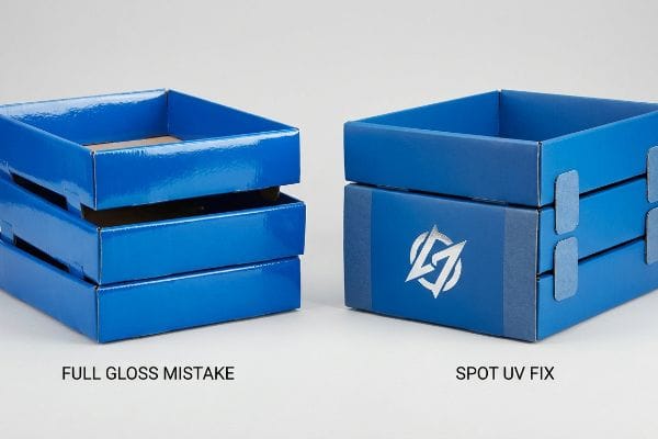
The Full Gloss Coating Friction Disaster
Designers love to apply a heavy, full-coverage gloss UV (Ultraviolet) coating to make their vibrant colors pop. They assume a high-shine finish makes the cardboard look more premium and protects the ink from scuffing during transit.
Getting one glossy box to look great on a desk is easy, but it's a completely different story when a store clerk tries to stack trays. I have watched co-packers sweat in frustration because a fully UV-coated interlocking tab becomes so slippery9 it completely loses its friction coefficient. The smooth, glass-like surface causes the heavy tiers to physically slide apart, and the loud 'pop'of a failing locking tab is a sound I hate. To fix this, I strictly engineer a Spot UV protocol: we only gloss the specific color logos for branding, while leaving the structural tabs and base areas with a raw matte finish. This precise adjustment completely restores structural friction, cutting assembly time by roughly 25%10 and preventing the entire 50-lbs (22.6 kg) unit from collapsing in the aisle.
| Common Rookie Mistake | The Pro Fix | Retail-Floor Benefit |
|---|---|---|
| Full UV gloss on all panels | Spot UV on logos only | Safe, stable stacking11 |
| Coating interlocking tabs | Leaving joints raw/matte | Faster co-packer assembly12 |
| Sacrificing grip for shine | Targeted gloss for contrast | Stops sliding trays13 |
I always remind clients that paint and coatings are structural elements. You need high friction where the cardboard locks, and high gloss only where the shopper's eye lands.
🛠️ Harvey's Desk: Is your heavy-duty coating causing your trays to slide during shipping? 👉 Claim a Free Structural Audit ↗ — No forms that trigger endless sales calls. Just pure value.
What is the best color to attract customers?
To stand out in a cluttered aisle, many brands turn to metallic shades. But getting a true metallic sheen on raw paper is a chemical challenge.
The best color to attract customers typically involves high-impact metallic accents like silver or gold. These reflective shades signal premium quality and immediately capture ambient light. To achieve true metallic brilliance, printers must use specialized base primers that prevent the reflective pigments from sinking into the porous paperboard.
Hitting that perfect metallic shine requires more than just picking a silver swatch from a catalog.
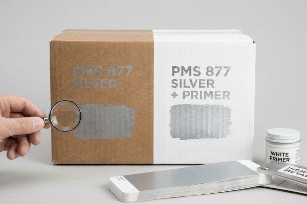
The PMS 877 Silver Contamination Trap
A standard approach for tech and beauty brands is selecting PMS 877 Silver to give their corrugated shippers14 a high-end, futuristic look. They send the file to print, assuming metallic ink behaves exactly like standard cyan or magenta.
It is a painful rookie trap that catches even experienced procurement teams. Metallic inks contain actual metal flakes, and when you print them directly onto a dark brown or gray recycled board, the porous fibers absorb the binder, leaving a dull, chalky gray smudge. I've run my thumb over these failed prints, feeling the rough, oxidized metal dust rubbing right off the paper. To guarantee that customer-attracting shine, I enforce a strict White Base Primer protocol before the silver ever hits the press. By laying down an opaque, sealed white foundation first, the metallic flakes sit cleanly on top, reflecting maximum light and boosting your shelf presence without requiring expensive foil stamping.
| Common Rookie Mistake | The Pro Fix | Retail-Floor Benefit |
|---|---|---|
| Printing silver on raw board | Applying white base primer15 | Brilliant metallic reflection |
| Using standard ink binders | High-viscosity metallic ink16 | Prevents chalky smudging |
| Overspending on foil stamps | Primer-backed PMS silver17 | High-end look, lower cost |
I refuse to let metallic designs fall flat on the press. Engineering the ink layering properly gives your merchandiser that premium glow, stopping foot traffic instantly.
🛠️ Harvey's Desk: Are your metallic accents looking dull and gray on your current shippers? 👉 Request a Print Method Review ↗ — Direct access to my desk. Zero automated sales spam, I promise.
What color stimulates shopping?
Bright yellows and vibrant oranges are proven to accelerate impulse buying. However, approving these stimulating hues on a mobile phone screen leads to disastrous physical results.
Colors that stimulate shopping include vibrant warm tones like orange, red, and yellow, which create a sense of urgency. Selecting these stimulating hues requires physical proofing under standard lighting conditions. Precise physical evaluation ensures the intended psychological impact translates perfectly from the digital design to the retail aisle.
But knowing the theory isn't enough when the machines start running and the pallets hit the loading dock.
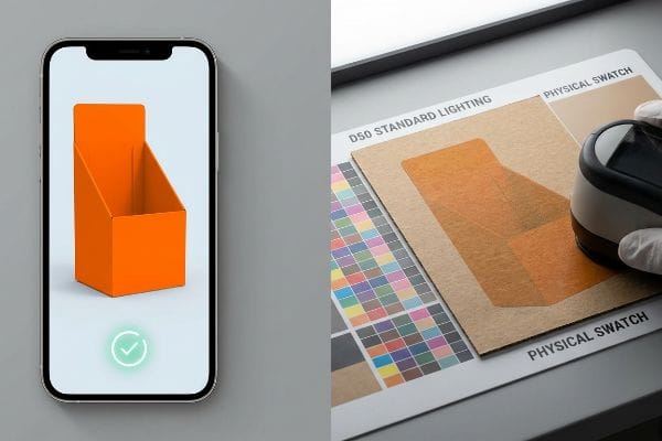
The Smartphone Auto-Correct Camo Failure
The standard practice for rushing a project is for buyers to review pre-production samples via smartphone photos18 sent by their overseas vendor. They look at the bright orange proof on an OLED screen, assume it matches their vision, and quickly approve the mass production run.
In my facility, I routinely see the disastrous aftermath of this exact blind spot. Smartphone cameras use AI auto-correction that artificially boosts saturation, making a muddy, contaminated yellow look like a brilliant, shopping-stimulating neon hue. When I measure the actual printed board coming off the press under a controlled D50 lighting booth, the reality is starkly different; the true color is often heavily tinted by the 32ECT virgin kraft liner underneath19. To fix this, I strictly enforce a physical swatch scanning protocol, requiring physical proofs to be overnighted and viewed under standard 5000K retail lighting20 rather than a backlit screen. By eliminating digital color distortion, I ensure your promotional bins look exactly as intended, preventing a scenario that triggers an immediate retailer rejection and completely wipes out your project's profit margin.
| Common Rookie Mistake | The Pro Fix | Retail-Floor Benefit |
|---|---|---|
| Approving proofs via photos | Physical D50 light review | True color representation |
| Ignoring OLED screen bias | Spectrophotometer data logs | Eliminates visual surprises |
| Guessing retail lighting | 5000K standardized testing | Protects impulse buy metrics |
I never accept a thumbs-up emoji on a WhatsApp photo as a color approval. Forcing a physical, light-controlled review is the only defense against a devastating visual misfire.
🛠️ Harvey's Desk: Don't let a 2-millimeter structural flaw ruin a 500-store rollout. 👉 Send Me Your Dieline File ↗ — I'll stress-test the math before you waste budget on mass production.
Conclusion
You can choose a cheaper vendor who relies on smartphone approvals, but when those displays arrive with mismatched Delta-E variances, it results in a devastating visual failure that triggers an immediate retailer rejection. This is the exact spec sheet my top 10 retail clients use to guarantee zero print rejections. Stop guessing on ink chemistry and let me personally review your prepress files through my Free Dieline Pre-Flight Audit ↗ to catch fatal color translation errors before they hit the press.
"CMYK vs. Spot Color: Which is Process is Best | Prime Line Packaging", https://www.primelinepackaging.com/blog/cmyk-spot-color/. [An authoritative printing guide would explain why Pantone Matching System (PMS) spot colors provide higher saturation and consistency than CMYK process blends, enhancing long-distance visibility]. Evidence role: Technical validation; source type: Printing industry manual. Supports: The superiority of spot inks for brand visibility. Scope note: Applies primarily to high-contrast logos. ↩
"Comparison of the effects of two biodegradable coatings on the …", https://bioresources.cnr.ncsu.edu/resources/comparison-of-the-effects-of-two-biodegradable-coatings-on-the-characteristics-of-white-top-linerboard-used-in-packaging-food-materials-in-cold-environments/. [Technical documentation on paper substrates would confirm that sealed liners prevent ink from penetrating deep into the paper fibers, thereby preventing the 'muddy'look caused by excessive absorption]. Evidence role: Technical validation; source type: Materials science or paper manufacturing guide. Supports: The role of substrates in color brightness. Scope note: Focuses on the interaction between ink and paper porosity. ↩
"Monitor Color Accuracy Explained: Delta E, Gamut & More – KTC", https://us.ktcplay.com/blogs/technology-hub/monitor-color-accuracy-explained?srsltid=AfmBOopnSG2uP1eTYQcR6mwC1Ey_j2srkALiy447Tne0yyVoTUs9fyVo. [Industry standards for color management would validate that RGB monitor approximations differ from physical ink pigments, and that physical proofing is the standard for avoiding costly production errors]. Evidence role: Process validation; source type: Color management standard. Supports: The necessity of physical swatches to eliminate retail chargebacks. Scope note: General industry practice for brand consistency. ↩
"Why is Color more Consistent with Digital Printing? – Nosco", https://www.nosco.com/news/why-is-color-more-consistent-with-digital-printing/. [Authoritative texts on color management detail how different Raster Image Processors (RIPs) and hardware calibrations cause variance in the interpretation of digital color values]. Evidence role: Technical validation; source type: Industry standard. Supports: The claim that digital files are not processed identically across diverse machinery. Scope note: Specific to commercial printing and color reproduction workflows. ↩
"Mastering Color Consistency with Quality Control Software – X-Rite", https://www.xrite.com/blog/mastering-color-consistency-with-quality-control-software. [Technical guides on colorimetry and ISO standards define the Delta-E threshold for perceptible color difference, typically citing values under 2.0 as visually acceptable for commercial branding]. Evidence role: technical specification; source type: industry standard. Supports: the use of a 2.0 Delta-E limit to ensure visual consistency. Scope note: thresholds can vary based on the specific color space used (e.g., CIELAB). ↩
"What Is Delta E? And Why Is It Important for Color Accuracy?", https://www.viewsonic.com/library/creative-work/what-is-delta-e-and-why-is-it-important-for-color-accuracy/. [An authoritative source on colorimetry would explain how Delta-E values quantify the perceived difference between two colors to maintain strict brand uniformity]. Evidence role: technical specification; source type: industry standard. Supports: use of Delta-E for uniform brand presentation. Scope note: focuses on the mathematical Delta-E formula for color difference. ↩
"What Is a Colorimeter / Spectrophotometer in Printing and Packaging?", https://www.linshangtech.com/tech/colorimeter-spectrophotometer-in-printing-packaging-tech1524.html. [Technical documentation on color measurement tools describes how spectrophotometers provide objective spectral data to eliminate the subjective variance of screen proofs]. Evidence role: tool validation; source type: technical manual. Supports: prevention of mismatched components. Scope note: compares objective spectral measurement against RGB screen approximations. ↩
"Products for Color Management", https://gmgcolor.com/products. [Software specifications from GMG Color detail how standardized color profiles ensure chromatic consistency across diverse vendors and substrates]. Evidence role: tool efficacy; source type: software documentation. Supports: smooth multi-vendor rollouts. Scope note: specific to GMG color management workflows. ↩
"Slip Coefficient | Paper Testing Physical Properties – Smithers", https://www.smithers.com/industries/packaging/manufacturers-and-users/packaging-materials-testing/paper-testing-surface-properties/paper-slip-coefficient. [Technical documentation on material science explains how non-porous UV coatings reduce the coefficient of friction on paperboard substrates, leading to structural instability]. Evidence role: technical verification; source type: material science study. Supports: the claim that full gloss finishes compromise structural grip. Scope note: limited to cellulose-based packaging materials. ↩
"How Accurate Surface Finish Measurement Improves Product Life …", https://www.qualitymag.com/articles/98054-how-accurate-surface-finish-measurement-improves-product-life-and-performance. [Industry benchmarks or operational case studies in packaging engineering quantify the time savings achieved when removing surface slippage from assembly processes]. Evidence role: quantitative validation; source type: industrial engineering report. Supports: the efficiency gains attributed to Spot UV protocols. Scope note: result may vary based on display complexity. ↩
"The Ultimate Guide to UV Coating: Benefits, Types & Uses", https://www.epackprinting.com/support/the-ultimate-guide-to-uv-coating-benefits-and-applications/. [An authoritative source on material science would demonstrate how full UV gloss reduces the coefficient of friction between surfaces, whereas limited spot UV maintains higher surface grip for stability]. Evidence role: technical verification; source type: materials science journal; Supports: the claim that limiting gloss improves stacking stability. Scope note: results may vary based on the underlying substrate material.] ↩
"How Packaging Shapes Retail Display Program Success", https://www.frankmayer.com/blog/how-packaging-shapes-retail-display-program-success/. [Industrial engineering data on co-packing efficiency would show that coatings on interlocking joints increase resistance or cause slippage, slowing down manual assembly compared to raw edges]. Evidence role: process validation; source type: manufacturing best practices manual; Supports: the claim that raw joints facilitate faster assembly. Scope note: specifically applies to folding carton and corrugated retail units.] ↩
"Matte vs Gloss Finishes: Which Is Best for Your Packaging?", https://oxopackaging.com/blog/matte-vs-gloss.html?srsltid=AfmBOopt9Xr3M-WeUo8O4kfUHGwU_KiL1KPWn-1vBHm2mQOdrG7PEuzZ. [Technical specifications for surface finishes would confirm that high-gloss UV coatings lower the static friction coefficient, leading to instability in trays compared to targeted gloss or matte finishes]. Evidence role: technical verification; source type: surface engineering study; Supports: the claim that reducing gloss prevents tray sliding. Scope note: applies primarily to horizontal contact surfaces.] ↩
"Pantone Metallic Ink Printing Guide for Custom Packaging – BrillPack", https://brillpack.com/pantone-metallic-colors-and-metallic-ink-printing/. [An industry report or packaging design guide would confirm the prevalence of PMS 877 Silver in tech and beauty packaging to convey premium quality]. Evidence role: corroboration; source type: industry standard. Supports: brand color trends. Scope note: applies to corrugated shipping materials. ↩
"Black & White Inkjet Printing Primer – Red River Paper", https://www.redrivercatalog.com/rr/black-white-printing-primer.html?srsltid=AfmBOop4-2E4o8gNfHhpzUsmterQDHhWeeQwIMTeM_1E3lfB1NjT51Z5. Technical guides for commercial printing explain how white primers prevent substrate absorption to maximize the reflective properties of metallic inks. Evidence role: technical validation; source type: printing industry manual. Supports: the use of primers for brilliant metallic reflection. Scope note: specifically for raw board substrates. ↩
"5 TIPS to Help You Avoid Smudging Your Graphite Drawings", https://www.youtube.com/watch?v=SLijWZKYz2w. Ink chemistry specifications detail how high-viscosity binders improve pigment adhesion and reduce the risk of surface rubbing or chalking. Evidence role: technical specification; source type: ink manufacturer data sheet. Supports: prevention of chalky smudging. Scope note: limited to metallic ink formulations. ↩
"Gold Foil Printing vs Pantone Metallic Ink vs Foil Paper vs … – YouTube", https://www.youtube.com/watch?v=pTRPX9oH5u0. Packaging cost analyses compare the per-unit expense of hot foil stamping against high-opacity silver inks applied over primers. Evidence role: economic comparison; source type: packaging cost analysis. Supports: lower cost alternative to foil stamps. Scope note: effectiveness depends on production volume. ↩
"Pre-Production Sample Order Terms: A Complete Guide – Techpacker", https://techpacker.com/blog/manufacturing/pre-production-sample-order-terms-a-complete-guide/. Industry guides on supply chain quality assurance document the prevalence and risks of using digital images for rapid sample approval in overseas manufacturing. Evidence role: corroboration; source type: industry report. Supports: procurement risks in rushed projects. Scope note: limited to global sourcing contexts. ↩
"why do printed colors look different on kraft vs white boxes – Upack", https://www.upack.in/blog/post/why-do-printed-colors-look-different-on-kraft-vs-white-boxes?srsltid=AfmBOooRWTe5780JHQXgh-fdJnRJr1Tiif4tj3-6u80dn2mCMge2pNi9. [Technical manuals on corrugated packaging explain how the inherent brown hue of a kraft liner shifts the final printed ink color]. Evidence role: technical specification; source type: industry handbook. Supports: why digital previews fail on kraft substrates. Scope note: specific to 32ECT grade corrugated board. ↩
"Choose The Ideal Color Temperature For Your Commercial Or …", https://www.ikioledlighting.com/blogs/cct_led_lights. [Industry standards for commercial lighting specify 5000K Correlated Color Temperature (CCT) to provide neutral white light for color accuracy in retail]. Evidence role: technical standard; source type: lighting engineering guide. Supports: the requirement for 5000K physical proofing. Scope note: applies to general retail environments. ↩