I meet shoppers where their eyes go first. I use color to set mood, show value, and guide action. I start simple. I test fast.
The best way to choose display colors is to match category cues, set a clear focal color, keep a calm base, and test contrast in real lighting; warm accents drive action, cool bases extend dwell time, and strict color standards prevent mismatch.
I will connect emotion to function. I will explain quick rules you can use today. I will add simple tests you can run this week.
What is the best color for a retail store?
Shoppers come in with a goal. I use color to match that goal. I avoid one-size-fits-all advice.
There is no single best color; use a neutral base for calm, add one bold brand color for focus, and use warm accents for action or cool accents for comfort based on your category and season.
Why "best" depends on goals
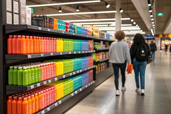
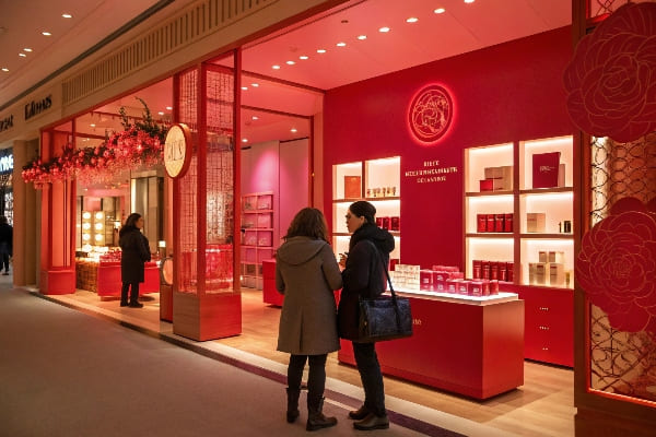
I sell different stories in different aisles. A grocery endcap needs speed. A cosmetics bay needs trust. I set a base first. I choose light gray, white, or soft beige. These keep the space clean. Then I add one brand color to anchor sight lines. I avoid mixing many bright hues because that splits attention. For action zones1, I add small red or orange bursts on headers or price flags. For premium zones, I add black or deep navy for edge and space. I run A/B tests2 over two weekends and track lift by SKU and time of day.
Quick guide by mission
| Mission/Zone | Base | Accent | Why |
|---|---|---|---|
| Fast sell (promo)3 | Light neutral | Red/Orange | Speed and urgency |
| Explore (lifestyle) | Warm neutral | Teal/Green | Calm scan and trust |
| Premium (flagship)4 | Deep gray/Black | Gold/White | Luxury and space |
| Family value | White/Soft gray | Yellow/Blue | Friendly and clear |
What color is associated with retail?
Price signs push action. I use colors that shoppers already link with deals and news.
Red signals sales and urgency, yellow signals price and visibility, black signals premium, white signals clarity, and blue signals trust; I combine them with neutrals so messages stay clear and legible.
Common retail color codes5 I use
Shoppers learn color codes over years. I do not fight that. I use red for markdowns and deadlines. I use yellow for price visibility6 in busy aisles. I pick blue for services and policies because it feels steady. I keep black for premium lines and limited drops. I hold white for clarity and hygiene in health or beauty. I test legibility with real fonts and distances. I avoid large yellow text on white because it fades under LED light. I print swatches and check them at 3 meters to see if they hold.
Association cheat sheet
| Meaning | Color | Typical Use | Note |
|---|---|---|---|
| Sale/Urgency7 | Red | Price flags, headers | Use sparingly to keep power |
| Value/Price | Yellow | Shelf talkers | Pair with black text |
| Trust/Service8 | Blue | Returns, warranty | Works for tech and pharmacy |
| Premium | Black | Plinths, borders | Add matte for glare control |
| Clean/Clarity | White | Backgrounds | Watch soil in high-touch areas |
What is the color theory of retail?
I design for the eye first. Then I design for action. I use simple rules and I measure.
Retail color theory balances contrast, temperature, saturation, and value; I set a neutral base (60), a brand secondary (30), and an action accent (10) to guide attention without noise and to support fast decisions.
Core principles I apply
Contrast directs the first fix. Value (light vs dark) matters more than hue across distance. Warm colors advance and pull eyes; cool colors recede and calm. High saturation feels loud, so I reserve it for small areas. I use the 60–30–10 rule9 to keep order. I also respect simultaneous contrast10. A color changes look beside another color, so I test final art on the actual substrate. Corrugated board can mute blues and oversaturate reds. I run prepress with device profiles. I align print targets across sample and mass run, so color holds.
Principles at a glance
| Principle | What it means | How I use it |
|---|---|---|
| Contrast11 | Difference in value/hue | Dark text on light base; bright accents small |
| Temperature | Warm vs cool | Warm for action; cool for comfort |
| Saturation12 | Intensity | Keep accents high, bases low |
| Value | Lightness | Lift readability at distance |
| Harmony | Palette fit | 60–30–10 keeps order |
What is the best color to attract customers?
I stop the scroll of the aisle. I use color to create one clear hook. I avoid clutter.
High-contrast warm accents like red, orange, or yellow attract first attention best, especially on clean neutral bases; I place them at eye level and near price or benefit claims.
How I build the first-second hook
I plan for two seconds. First, I pull the eye with a warm accent panel or burst. Second, I hold the eye with a simple claim and a strong product image13. I keep backgrounds calm so the accent pops. I add a small motion cue, like a diagonal stripe or chevron, to push flow toward the product. For one US hunting gear launch, my team used a charcoal base and a bold blaze-orange arrow near "New." Foot traffic paused more, and unit sales14 rose on weekend peaks. We measured a clear lift versus a flat gray control.
Placement and palette guide
| Situation | Best Hook Color15 | Base | Placement Tip16 |
|---|---|---|---|
| New launch | Red/Orange | Light neutral | Put at eye level |
| Value endcap | Yellow | White/Gray | Pair with bold price |
| Premium drop | Gold/White | Black | Use small, crisp shapes |
| Family promo | Bright Blue | White | Add friendly icon |
What color stimulates shopping?
Shoppers buy when they feel ready. I use color to lower friction and to create timely push.
Warm accents (red/orange) stimulate urgency for quick buys, while cool bases (blue/green) reduce stress and extend browsing; I combine both so shoppers feel calm first and then act fast at the final prompt.
Calm to action path I use
I want people to stay and then decide. I build calm with cool bases17 in aisles and bays. I use blue or green on fixture panels and headers. People breathe. They read more. Near the decision point, I introduce a warm accent18. I place it on the price, offer, or comparison badge. This shift in temperature adds energy without chaos. In one seasonal test, a green base with orange price tabs grew basket size, while an all-red bay pushed quick grabs but hurt browsing. I use data to choose the right mix by category and margin goals.
Mix and match plan
| Zone | Base Color | Accent | Shopper Effect19 |
|---|---|---|---|
| Aisle browse | Blue/Green | Soft white | Longer dwell, lower stress |
| Decision shelf | Neutral | Red/Orange | Faster pick, higher urgency |
| Service desk | Blue | White | Trust and clarity |
| Premium wall20 | Black | Gold | Fewer touches, higher ASP |
Conclusion
Color sets mood, focus, and action. I keep bases calm, accents clear, and tests simple. I let data pick winners, not taste.
Discover insights on creating impactful action zones that drive customer engagement and boost sales. ↩
Explore this link to learn how A/B tests can optimize your retail strategies and improve sales performance. ↩
Explore this link to discover proven strategies that can enhance your promotional sales and create a sense of urgency. ↩
This resource will guide you in crafting a luxurious product experience that resonates with high-end consumers. ↩
Understanding effective retail color codes can enhance your marketing strategy and improve customer engagement. ↩
Exploring price visibility can provide insights into consumer behavior and help optimize your retail strategies. ↩
Understanding the meaning of Sale/Urgency can help you effectively use color in marketing strategies. ↩
Exploring Trust/Service can enhance your knowledge of building customer loyalty through effective branding. ↩
Understanding the 60–30–10 rule can enhance your design skills, ensuring a balanced and visually appealing color scheme. ↩
Exploring simultaneous contrast will deepen your knowledge of color interactions, crucial for effective visual communication. ↩
Understanding contrast is crucial for effective design, enhancing readability and visual appeal. ↩
Exploring saturation can help you create visually striking designs that capture attention and convey the right mood. ↩
Understanding the impact of a strong product image can enhance your marketing strategies and boost sales. ↩
Exploring effective strategies to increase unit sales can lead to significant revenue growth for your business. ↩
Discover the psychology behind color choices in marketing to enhance your product visibility. ↩
Learn expert strategies for product placement that can significantly boost sales and customer engagement. ↩
Explore how calm with cool bases can enhance customer experience and encourage longer browsing times. ↩
Discover the impact of warm accents on consumer decisions and how they can drive sales effectively. ↩
Understanding the Shopper Effect can help retailers optimize their store layouts and improve customer experience. ↩
Exploring the concept of a Premium wall can reveal strategies for enhancing product visibility and increasing sales. ↩


