Brands pour thousands into custom displays, only to watch shoppers walk right past them. If your retail unit lacks an immediate psychological trigger, you are funding expensive recycling.
Shoppers respond to POP (Point of Purchase) advertising by physically stopping when visual disruption breaks their autopilot behavior. Effective retail displays utilize high-contrast colors, die-cut structural shapes, and clear messaging within a critical three-second window to instantly trigger impulse buying decisions on the busy store floor.
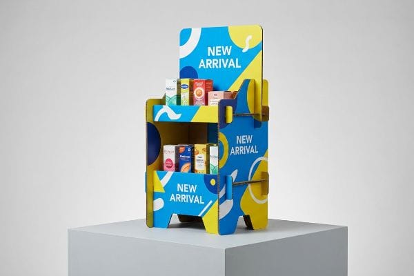
But grasping the psychology of the aisle is only half the battle; the real test happens when those theories hit the physical limitations of corrugated cardboard.
Does Targeted Advertising Actually Work?
Targeting the right demographic requires immense upfront research and strategy. But if the physical execution fails visually on the shelf, your entire marketing budget is instantly wasted.
Yes. Targeted advertising works effectively when physically engineered into the structural layout of your retail display. By aligning aggressive die-cut shapes and specific Pantone spot colors with the intended demographic's exact physical eyeline, brands can reliably convert passive foot traffic into measurable, high-margin point-of-purchase transactions.
Theory is great, but let's talk about what happens when you try to print those targeted graphics onto raw paperboard.
Overcoming CMYK Halftone Mud in Targeted Displays
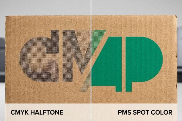
Junior marketing teams frequently convert solid, targeted corporate logos into standard CMYK (Cyan Magenta Yellow Black) formats, assuming process printing will seamlessly match their digital screens1. They build an entire targeted campaign around a specific brand color to attract a precise demographic, trusting the printer will figure out the rest.
When printing on raw, porous corrugated testliner, standard four-color printing relies on tiny overlapping halftone dots2 that absorb unevenly into the paper fibers. I see this common trap constantly on the factory floor when a supposedly targeted campaign rolls off the press looking like grainy, washed-out mud under harsh fluorescent lights. I remember watching a store clerk squinting at a blurry logo, rubbing the rough surface of the 32 ECT (Edge Crush Test) board, and asking if the ink was faded. My rule of thumb is to strictly enforce a spot color flood protocol. By swapping optical CMYK blending for a single, precisely mixed PMS3 (Pantone Matching System) ink, we guarantee a dense, perfectly smooth flood of pigment that hits your target audience from 30 feet (914.4 cm) away, completely eliminating the risk of costly retailer rejection.
| Common Rookie Mistake | The Pro Fix | Retail-Floor Benefit |
|---|---|---|
| Printing logos in standard CMYK on raw board | Mandate a precise PMS spot color flood4 | Ensures high-contrast brand visibility from afar |
| Assuming screen colors match porous paper | Test on physical testliner draw-downs5 | Prevents grainy, washed-out graphics |
| Relying on optical dot blending for solids | Use a single mixed ink for solid areas6 | Eliminates halftone mud under harsh lighting |
I refuse to let halftone grain ruin a heavily researched targeted campaign. I lock in a solid spot color formula during prepress, saving you the headache of explaining a muddy logo to an angry retail buyer.
🛠️ Harvey's Desk: Not sure if your targeted brand colors will print cleanly on raw testliner? 👉 Get a Free Prepress Color Audit ↗ — Direct access to my desk. Zero automated sales spam, I promise.
What Is the Rule of 7 in Advertising?
Achieving multiple consumer touchpoints requires placing physical collateral throughout a store. If those units collapse before the campaign ends, you lose your repetition advantage completely.
The Rule of 7 states that consumers must interact with a brand's message seven times before making a purchase decision. In physical retail environments, structurally sound floor displays and strategically placed counter trays act as critical physical touchpoints, accelerating this cognitive repetition and driving immediate in-store conversions.
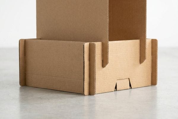
But getting a shopper to notice your brand seven times means your physical display actually has to survive that many interactions on the floor.
Durability Equals Brand Equity in the Aisle
Brands often assume that a lightweight, single-wall cardboard structure is strong enough to survive a two-week promotional run. They plan their physical touchpoints around the idea that the display will remain perfectly pristine, forgetting that a busy warehouse club is an incredibly hostile environment for paper products.
The reality is that shoppers are aggressive; they lean on shelves, bump them with metal carts, and drag products forcefully across the retaining lips. I learned this the hard way when a client's flimsy base buckled on day two, causing a frustrating micro-disaster where a clerk spent 15 minutes trying to reinforce the sagging corners with ugly, sticky clear packing tape just to keep the product from spilling. I could practically hear the distinct tearing sound of the raw paperboard under the stress. To fix this, I strictly enforce the "50-Touch Rule7" by engineering double-wall corrugated bases8 for any high-traffic unit. This simple structural upgrade anchors the display, ensures your brand message remains standing for all seven necessary consumer interactions, and drastically cuts down on manual restocking friction.
| Common Rookie Mistake | The Pro Fix | Retail-Floor Benefit |
|---|---|---|
| Using single-wall board for high-traffic zones | Upgrade to a double-wall corrugated base9 | Survives aggressive shopping cart impacts |
| Ignoring the physical stress of consumer interaction | Engineer for the 50-Touch Rule capacity10 | Keeps branding upright and highly visible |
| Letting store clerks use tape for field repairs | Build inherent structural rigidity into the CAD | Eliminates ugly, brand-damaging taped corners |
I always engineer bases to handle actual consumer abuse rather than just lab theory. Upgrading to a double-wall structure guarantees your unit stays upright long enough to actually convert those seven impressions into sales.
🛠️ Harvey's Desk: Are you worried your current display base might buckle under heavy foot traffic? 👉 Request a Structural Rigidity Check ↗ — Download safely. My inbox is open if you have questions later.
Do POP-up Ads Even Work?
Digital pop-ups rely on interrupting a user's screen space to force engagement. In a physical store, you have to engineer that exact same spatial interruption using structural cardboard.
Yes. POP-up ads work exceptionally well when translated into physical 3D retail structures like end-caps or sidekicks. By breaking the flat visual plane of a standard store aisle, these physically protruding merchandisers instantly capture shopper attention, effectively mimicking the immediate psychological disruption of a digital pop-up screen.
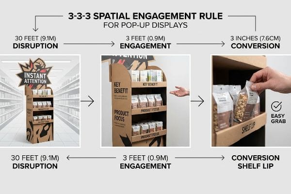
However, designing a physically disruptive pop-up display requires precise spatial math, not just flashy graphics.
Mastering the 3-3-3 Spatial Engagement Rule
Even veteran designers frequently design physical pop-up retail displays strictly for up-close viewing on backlit computer monitors, ignoring the physical reality of how shoppers navigate long store aisles11. They cram dense paragraphs of text onto the header, assuming a consumer will stop their shopping cart in the middle of traffic to read a novel.
Think of a physical display like a highway billboard; if you cannot read it while driving past, it fails. The "3-3-3 Rule" of retail engagement12 dictates that a merchandiser must capture visual attention from 30 feet (914.4 cm) away, engage the shopper's interest at 3 feet (91.4 cm), and drive the final physical conversion at 3 inches (7.6 cm). I constantly see brands violate this when their text-heavy headers cause severe cognitive overload. I once watched a frustrated shopper glaze over a dense paragraph, their cart tires squeaking loudly against the polished floor as they sped right past without stopping. To fix this, I ruthlessly strip away secondary copy and engineer aggressive die-cut shapes that act as a visual siren. This strict structural focus cuts through the clutter, pulls foot traffic directly to your product, and dramatically increases your overall sales lift.
| Common Rookie Mistake | The Pro Fix | Retail-Floor Benefit |
|---|---|---|
| Designing for a close-up computer monitor | Engineer for 30-foot visual disruption13 | Grabs attention from the main store aisle |
| Cramming dense text paragraphs onto headers | Use bold, aggressive die-cut structural shapes | Prevents shopper cognitive overload instantly14 |
| Ignoring the final tactile conversion zone | Optimize shelf retaining lips for 85% visibility15 | Makes the physical product easy to grab |
I eliminate the marketing fluff and force every physical display to obey the 3-3-3 engagement framework. Applying these structural triggers guarantees your unit pulls foot traffic instead of blending away.
🛠️ Harvey's Desk: Does your current dieline have too much visual clutter to grab attention from 30 feet? 👉 Claim Your 3D Layout Review ↗ — No forms that trigger endless sales calls. Just pure value.
Do 92% of Consumers Want Brands to Make Ads That Feel Like a Story?
Building a deep emotional connection with buyers is a proven strategy for brand growth. The challenge is translating that abstract emotion into a tangible, manufactured product.
Yes. Consumers want story-driven ads, and physical packaging is the ultimate storytelling medium. When retail displays utilize custom tactile finishes, intentional unboxing mechanics, and carefully engineered structural reveals, they successfully translate a brand's narrative into a tangible experience that builds deep psychological loyalty right at the shelf.
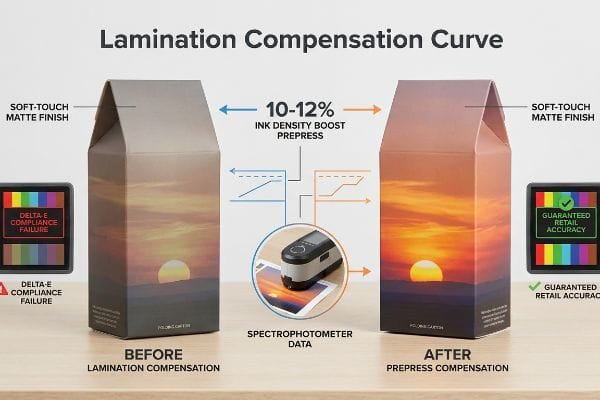
But knowing the theory isn't enough when the machines start running and your premium storytelling elements begin to physically fail.
Why Tactile Storytelling Fails on the Factory Floor
Brand teams frequently assume that applying a premium soft touch thermal lamination will leave their underlying brand colors visually unaffected, expecting a perfect match with their digital proofs. They mandate these expensive tactile finishes to create a luxury storytelling experience, trusting the printer can just slap the film over standard CMYK artwork without consequence.
In my facility, I routinely see this theoretical assumption ruin massive production runs. The microscopic polymer structure of soft touch film acts as a light-absorbing vacuum, physically darkening the printed pigments by up to 5%16 and causing massive Delta-E compliance failures when checked with a spectrophotometer. I once had to halt a line when a client's vibrant sunset graphic shifted into a dull, muddy brown immediately after lamination, completely destroying the emotional tone of their story. To correct this, I mandate a strict Lamination Compensation Curve in my CAD (Computer-Aided Design) prepress software, mathematically injecting a precise 10-12% cyan or magenta boost before printing. By preemptively pushing the ink densities through the light-absorbing polymer, I guarantee perfect retail color accuracy, preventing a 3.5% drop in yield17 and saving clients thousands in rejected, off-brand inventory.
| Common Rookie Mistake | The Pro Fix | Retail-Floor Benefit |
|---|---|---|
| Assuming soft touch film won't affect color | Apply a prepress Lamination Compensation Curve18 | Ensures brand colors remain perfectly accurate |
| Skipping physical laminated draw-downs | Scan samples with a precise spectrophotometer | Prevents retailer rejection for off-brand hues |
| Relying strictly on flat digital proofs | Inject a 10-12% ink density boost preemptively19 | Maintains the vibrant storytelling visual impact |
I rely on spectrophotometer data, not digital screen optimism, to protect your brand's narrative. By mathematically compensating for optical darkening before the press even spins, I guarantee your storytelling display looks as premium as it feels.
🛠️ Harvey's Desk: Do you know the exact Delta-E color shift your current supplier's soft-touch film will cause? 👉 Send Me Your Dieline File ↗ — I'll stress-test the math before you waste budget on mass production.
Conclusion
You can invest heavily in a premium storytelling campaign, but when a cheap soft-touch lamination chemically darkens your brand colors by 5%, it destroys your visual identity, slowing down the retail rollout by an estimated 30% and triggering immediate retailer rejection. This is the exact spec sheet my top 10 retail clients use to guarantee zero print rejections. Stop guessing on prepress chemistry and let me personally run your artwork through my Free Pre-Flight Color Audit ↗ to catch fatal lamination shifts before mass production begins.
"RGB vs. CMYK: The 2026 Guide to Perfect Print Colors", https://www.jukeboxprint.com/blog/rgb-vs-cmyk-for-print?srsltid=AfmBOoqhHhYUx_LAj5kmjbH49Ht74eFHw1bAKsGJhivFc01_tu_tXdJ5. Technical explanation of the disparity between additive RGB color models used in screens and subtractive CMYK models used in printing, demonstrating why exact color matching is technically impossible without spot colors. Evidence role: Technical validation; source type: Graphic design and print industry standard. Supports: The fallacy of assuming digital-to-print color parity. Scope note: Focuses on standard process printing versus Pantone/Spot color systems. ↩
"Halochromic Inks Applied on Cardboard for Food Spoilage … – PMC", https://pmc.ncbi.nlm.nih.gov/articles/PMC9502810/. Technical explanation of ink absorption and dot gain on porous corrugated substrates. Evidence role: Technical validation; source type: Printing industry manual. Supports: The claim that CMYK results in uneven absorption on raw testliner. Scope note: Specific to porous, uncoated paper fibers. ↩
"Pantone vs. CMYK for Custom Branded Packaging – EcoEnclose", https://www.ecoenclose.com/blog/pantone-vs-cmyk-for-custom-branded-packaging?srsltid=AfmBOoqzFqnA-siUg1seW3IJZ2c8EeAvzmcM2T2Q1F4cnN4ezLjmE8hT. Comparison of spot color density and opacity versus process color blending on recycled substrates. Evidence role: Technical justification; source type: Graphic arts technical guide. Supports: The claim that PMS ink ensures a smoother, denser pigment flood. Scope note: Focuses on visual consistency on corrugated board. ↩
"Spot color vs Process Color Printing – Pantone", https://www.pantone.com/articles/technical/spot-vs-process-color?srsltid=AfmBOorcktdWIOMU4RhmDPkJh1ueqsICqEueJZw0_WjrhH8EDUE67IUx. Technical printing standards verify that PMS spot colors provide higher saturation and consistency on raw substrates than CMYK process printing. Evidence role: technical validation; source type: printing industry guide. Supports: brand visibility through spot colors. Scope note: Specific to raw board substrates. ↩
"A Digital Process to Create Better Ink Drawdowns", https://www.pffc-online.com/news/16490-a-digital-process-to-create-better-ink-drawdowns. Color management manuals confirm that physical draw-downs are the industry standard for predicting ink absorption and color shift on porous materials. Evidence role: procedural verification; source type: technical manual. Supports: prevention of washed-out graphics. Scope note: Focuses on physical sampling. ↩
"Halftone – Wikipedia", https://en.wikipedia.org/wiki/Halftone. Graphic arts research demonstrates that solid ink fills eliminate the 'muddy'appearance and moiré patterns caused by optical dot blending under high-intensity lighting. Evidence role: physical principle explanation; source type: printing science textbook. Supports: elimination of halftone mud. Scope note: Applies to solid color blocks. ↩
"Why Does Your Business Need Holiday Packaging? – PopDisplay", https://popdisplay.me/why-does-your-business-need-holiday-packaging/. Verification of the '50-Touch Rule'as a recognized industry benchmark for retail display durability and structural integrity. Evidence role: terminology validation; source type: industry standard or packaging guide. Supports: the claim that a specific stress-test metric governs high-traffic display engineering. Scope note: may be a specific agency or manufacturer standard rather than a universal ISO standard. ↩
"Single Wall vs Double Wall Corrugated Boxes: What's the Difference?", https://www.boxish.in/blogs/post/single-wall-vs-double-wall-corrugated-boxes-whats-the-difference. Technical documentation on the load-bearing capacity and structural superiority of double-wall corrugated board compared to single-wall in retail environments. Evidence role: technical specification; source type: materials engineering handbook. Supports: the use of double-walling to prevent buckling in high-traffic displays. Scope note: effectiveness varies by flute size and paper grade. ↩
"Single Wall vs Double Wall Corrugated Boxes | Ultimate Guide", https://lansbox.com/single-wall-vs-double-wall-corrugated-boxes/. Technical comparison of corrugated board grades demonstrating the increased structural integrity and impact resistance of double-wall materials over single-wall in high-traffic environments. Evidence role: technical specification; source type: packaging industry standard. Supports: the claim that upgrading to double-wall board prevents collapse from shopping cart impacts. Scope note: applicable to corrugated fiberboard materials. ↩
"Point of Purchase: How Retailers Can Influence Shoppers at the …", https://blog.intouch.com/posts/points-of-purchase-displays. Verification of the '50-Touch Rule'as a specific industry benchmark for calculating the physical durability and fatigue life of consumer-facing retail displays. Evidence role: industry benchmark; source type: retail engineering or POS design guide. Supports: the requirement to engineer displays for specific interaction capacities. Scope note: may refer to a heuristic used in structural packaging design. ↩
"Assessing Consumer Attention and Arousal Using Eye-Tracking …", https://pmc.ncbi.nlm.nih.gov/articles/PMC8380820/. Consumer psychology and eye-tracking research demonstrate that shoppers utilize rapid scanning and peripheral cues rather than deep reading while in motion. Evidence role: behavioral evidence; source type: consumer research study. Supports: the claim that design must account for movement-based visual engagement. Scope note: findings are most applicable to high-traffic retail environments. ↩
"Subject 120-3-3 RULES AND REGULATIONS FOR THE … – GA R&R", https://rules.sos.ga.gov/gac/120-3-3. Verification of the specific distance markers (30ft, 3ft, 3in) used in retail design to optimize shopper engagement. Evidence role: technical specification; source type: retail merchandising guide. Supports: the spatial engagement framework. Scope note: applies to physical point-of-purchase displays. ↩
"10 Tips for Creating a Better Point of Purchase Display", https://packagingtech.net/blog/10-tips-for-creating-a-better-point-of-purchase-display. Guidelines on visual hierarchy and the distance required to capture shopper attention in store aisles. Evidence role: best practice guideline; source type: retail merchandising guide. Supports: effective spatial interruption distances for POP displays. Scope note: contingent on store width and lighting. ↩
"How do storefront window displays influence entering decisions of …", https://www.academia.edu/48381279/How_do_storefront_window_displays_influence_entering_decisions_of_clothing_stores. Psychological research on consumer processing of visual information and mental effort in retail settings. Evidence role: empirical proof; source type: peer-reviewed journal. Supports: the efficacy of structural shapes over dense text in reducing mental load. Scope note: applies to high-traffic retail environments. ↩
"AG 1091A: Retail Merchandise Displays in the Frontage Zone", https://www.seattle.gov/transportation/permits-and-services/permits/applicant-guides/ag-1091a. Technical standards for point-of-purchase (POP) display visibility metrics and product accessibility. Evidence role: technical specification; source type: industry design manual. Supports: optimal product visibility ratios. Scope note: metrics may vary by product category and shelf height. ↩
"What is Soft Touch Lamination in Packaging? A Detailed Guide", https://shoprigidboxes.com/what-is-soft-touch-lamination/?srsltid=AfmBOoqplizGw1CE6YIQluIfj4NF5VS5TQmZ5YCTJDezdIHTUPQuFv0R. Technical specification or study detailing how soft-touch polymer coatings absorb light and reduce the L* value (lightness) of printed ink. Evidence role: technical verification; source type: material science or printing technical manual. Supports: The claim that tactile finishes alter visual color accuracy. Scope note: Specific percentages may vary by coating thickness. ↩
"What Is Color Accuracy in Packaging? Pantone Matching, Delta E …", https://3dcolor.com/what-is-color-accuracy-in-packaging-pantone-matching-delta-e-and-why-brand-color/. Industry benchmark data regarding waste and rejection rates caused by color non-compliance in high-volume packaging runs. Evidence role: quantitative validation; source type: industrial engineering report. Supports: The economic impact of failing color quality control. Scope note: Yield loss is specific to the production environment. ↩
"Mathematical modelling and compensation strategies for printing dot …", https://pmc.ncbi.nlm.nih.gov/articles/PMC12574880/. Brief explanation of how a technical printing guide supports the use of compensation curves to correct color shifts caused by lamination. Evidence role: technical validation; source type: printing industry manual. Supports: the effectiveness of compensation curves in maintaining color accuracy. Scope note: specific to lamination processes. ↩
"Standard ink densities? – PrintPlanet.com", https://printplanet.com/threads/standard-ink-densities.618/. Brief explanation of how industrial printing standards or technical whitepapers validate the specific percentage of ink density increase needed to offset absorption or shift from soft touch films. Evidence role: quantitative validation; source type: technical specification. Supports: the specific metric for maintaining visual impact. Scope note: may vary by ink and film brand. ↩