
You approved a vibrant digital proof, but the final cardboard display arrived looking dull and grainy. It happens constantly. Let's break down the mechanics of commercial color reproduction.
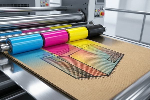
Understanding how CMYK (Cyan, Magenta, Yellow, Key) works requires knowing that offset printing presses layer four transparent inks. These combine through microscopic overlapping halftone dots to visually reproduce millions of distinct color variations directly onto the physical substrate during the high-speed commercial manufacturing process.
Bridging the gap between digital artwork and physical paperboard is where most packaging projects either succeed or require costly reprints.
Does offset printing use CMYK?
When you send files to a commercial factory, four-color process is the baseline standard, but it behaves very differently on unsealed paperboard compared to glossy magazine pages.
Yes. Offset printing uses CMYK to create full-color images. Standard commercial presses run these four base inks through separate metal plates. However, relying solely on this process for solid brand logos often results in optical blending failures, making spot colors necessary for consistent, high-contrast retail packaging.
Knowing the baseline process is helpful, but the reality of pushing wet ink into porous testliner changes everything.
The Halftone Dot Reality in Corrugated Manufacturing
Even experienced brand teams frequently export solid corporate logos into standard four-color formats, assuming the factory press will seamlessly match their digital screens. They build their files relying entirely on the theoretical blending of cyan, magenta, yellow, and black. In a standard commercial environment printing on coated stock, this approach usually works fine, but structural packaging introduces a completely different physical substrate1.
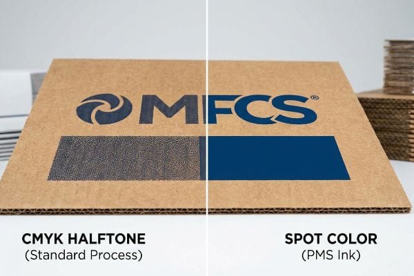
I see this exact trap when clients try to print large, solid background elements on raw, porous corrugated testliner. Standard four-color printing relies on tiny overlapping halftone dots2 that absorb unevenly into the paper fibers. I once watched a beautiful dark blue logo turn into a grainy, muddy mess on the factory floor because the wet ink wicked aggressively into the unsealed board. You can literally hear the tacky ink pulling at the paper fibers as the sheet passes through the press cylinders. To fix this, I mandate a spot color flood protocol for primary logos, utilizing a specifically mixed PMS (Pantone Matching System) ink instead of optical dot blending. This simple shift replaces the muddy halftone grain with a dense, perfectly smooth flood of pigment, ensuring your brand stands out from 20 feet (6 m) away while cutting make-ready waste by an estimated 15%3.
| Common Rookie Mistake | The Pro Fix | Retail-Floor Benefit |
|---|---|---|
| Relying on four-color process for logos | Mandate specific Pantone spot color inks4 | Ensures high-contrast brand visibility |
| Printing directly on unsealed testliner | Add an aqueous primer layer first5 | Prevents ink wicking and muddy graphics |
| Ignoring paper substrate absorbency | Calibrate prepress profiles to the paper type6 | Eliminates costly full-batch reprints |
I refuse to run a heavy four-color logo on raw testliner without warning my clients first. Swapping to a solid spot color takes five minutes in prepress but saves you from a massive brand equity disaster in stores.
🛠️ Harvey's Desk: Not sure if your logo will turn to mud on a physical box? 👉 Send Me Your Flat Dieline File ↗ — Direct access to my desk. Zero automated sales spam, I promise.
Why does CMYK look washed out on screen?
Your monitor uses light to create bright visuals, while printing presses use physical pigments that absorb light. This mechanical difference causes the dreaded dulling effect.
CMYK looks washed out on screen because computer monitors emit light using RGB (Red, Green, Blue) profiles, achieving a much wider color gamut. When conversion software simulates the narrower four-color ink spectrum used for physical printing, the vivid neon and highly saturated tones naturally appear muted and flat.
But acknowledging this color shift on your office monitor is only the first hurdle in the packaging supply chain.
Beating the Light-Absorbing Physics of Retail Environments
Even veteran designers often trust the automated color conversion settings in their graphic software, assuming what they see on their calibrated office screen is exactly what the factory will output. They try to digitally boost the saturation to compensate for the muted tones, effectively guessing at the final physical result. This creates a dangerous false confidence leading into mass production.
In my facility, I constantly intercept files where the art director tried to "fix" the washout effect by over-saturating the digital file. The reality is that your smartphone and office monitor have auto-correct features that completely mask the physical chemistry of ink on board. I remember a client rejecting a master sample because it looked darker than her screen under the harsh, buzzing fluorescent store lighting. The physical friction of a spectrophotometer scanning a real printed swatch under standard D50 lighting7 is the only truth I trust. We physically scan a draw-down sample and measure the mathematical Delta-E variance8, completely bypassing the digital screen illusion. By trusting physical light measurement over screen brightness, we prevent the entire batch from being rejected by strict retail compliance teams.
| Common Rookie Mistake | The Pro Fix | Retail-Floor Benefit |
|---|---|---|
| Trusting a digital screen for color | Using a spectrophotometer under D50 lighting9 | Guarantees exact brand matching in aisles |
| Boosting saturation digitally to compensate | Scanning physical ink draw-down samples10 | Eliminates subjective retail buyer rejections |
| Reviewing proofs under office lighting | Checking proofs under actual store fluorescents11 | Prevents harsh lighting from ruining graphics |
Stop trying to outsmart the physics of light with graphic software sliders. I rely exclusively on physical swatch data, because the retail buyer walking the aisle doesn't care what your office computer screen looked like.
🛠️ Harvey's Desk: Are you approving your packaging proofs on an uncalibrated smartphone screen? 👉 Request A Physical Draw-Down ↗ — Download safely. My inbox is open if you have questions later.
Is it better to print in RGB or CMYK?
The short answer depends entirely on your final destination. Digital assets thrive on emitted light, but physical packaging demands a strict adherence to ink limits.
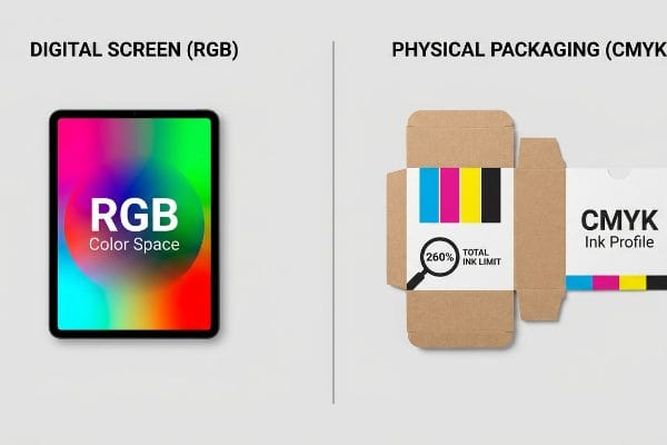
Printing in CMYK is better for physical packaging, while RGB is strictly for digital screens. Submitting screen-based files to a commercial factory forces the RIP (Raster Image Processor) software to auto-convert the data, often leading to unpredictable color shifts, muddy shadows, and heavy ink saturation on the press.
While setting your software to the correct color space is a good start, the hidden danger lies in the total ink volume.
Managing the Total Ink Limit Safety Zone
Procurement teams and graphic artists routinely submit beautiful, high-contrast files that look stunning in their native design programs. They assume that as long as the document color mode is set correctly, the factory machinery will handle the rest seamlessly. They completely overlook the physical volume of wet ink being deposited onto the paperboard12.
This is a classic trap where digital design ignores mechanical limits. When you convert highly saturated screen colors into printable formats, dark areas often require maximum values of cyan, magenta, yellow, and black simultaneously. I once ran a job where the designer's deep black background demanded a 340% TIL (Total Ink Limit). When that much wet fluid hit the 0.12 inches (3 mm) thick 32 ECT (Edge Crush Test) testliner13, the paper immediately buckled, and the pungent smell of uncured ink flooded the pressroom as the sheets stuck together in the stack. To prevent this, I mathematically enforce a strict 260% TIL prepress profile14 on all incoming files. By pulling back the shadow densities before the plates are ever burned, we stop the paper from warping, keeping the automated assembly line moving smoothly and saving days of costly machine downtime.
| Common Rookie Mistake | The Pro Fix | Retail-Floor Benefit |
|---|---|---|
| Submitting files with 300%+ ink coverage | Enforcing a strict 260% Total Ink Limit | Stops paperboard from warping and buckling |
| Letting factory software auto-convert files | Manually adjusting shadow profiles in prepress | Prevents muddy and unpredictable dark tones |
| Ignoring wet ink drying times | Calibrating volume to the specific substrate | Speeds up final co-packing assembly |
You cannot just dump endless amounts of ink onto porous paper and expect it to stay flat. I always check the total ink volume first, because a structurally warped display will never survive a high-traffic retail environment.
🛠️ Harvey's Desk: Has your printer ever complained that your artwork is too heavy on ink? 👉 Get A Prepress Ink Audit ↗ — No forms that trigger endless sales calls. Just pure value.
Is CMYK 8 bit or 16 bit?
The depth of your data file determines how many color variations are possible, but factory machinery operates within very specific physical tolerances.
CMYK can be 8-bit or 16-bit, depending on the software settings. An 8-bit file provides 256 tonal levels per channel, which is the standard baseline for commercial presses. While a 16-bit file contains vastly more data, standard offset machinery cannot physically reproduce those microscopic digital gradients on cardboard.
But knowing the theory isn't enough when the machines start running and digital gradients turn into physical dot gain problems.
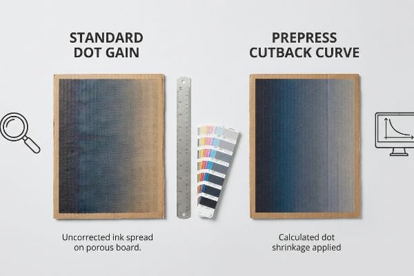
Why Standard Dot Gain Fails on the Factory Floor
It is a common trap for procurement teams to demand extremely high-resolution, data-heavy files, assuming that more digital information automatically equals a better physical print. They supply massive files with deep gradients, expecting the factory's plate-making equipment to perfectly mirror the smooth transitions seen on their monitors. They fail to account for the physical expansion of wet ink dots15 as they hit the board.
In my facility, I routinely see beautifully smooth digital gradients turn into harsh, banded steps during the first press run. This happens because high-data files don't account for mechanical dot gain—the physical reality where a liquid halftone dot spreads as it absorbs into the corrugated fibers16. I test this using a high-magnification loupe, and when I measure a theoretical 50% dot, it often hits the paper and swells to 65%. I recall feeling the rough, damp texture of an over-inked sheet right off the press, watching the mid-tones completely plug up and ruin the visuals. The fix is a mathematical cutback curve applied directly in the prepress software17 before plate creation. By calculating and artificially shrinking the digital dots by exactly 15% to compensate for the physical swell, I ensure the final printed gradient is perfectly smooth, preventing a massive aesthetic failure and keeping your brand looking premium on the shelf.
| Common Rookie Mistake | The Pro Fix | Retail-Floor Benefit |
|---|---|---|
| Supplying massive files without dot gain math | Applying a mathematical cutback curve18 | Keeps gradients smooth and professional |
| Ignoring liquid ink expansion on paper | Pre-calculating a 15% dot shrinkage factor19 | Eliminates dark and muddy mid-tones |
| Relying on generic machine profiles | Customizing prepress software for board porosity20 | Stops expensive batch rejections |
Sending me a massive, high-data file doesn't magically bypass the laws of physics. I always engineer a strict cutback curve to control how the ink spreads, because precision in the software prevents disasters on the heavy machinery.
🛠️ Harvey's Desk: Don't let a 2-millimeter structural flaw ruin a 500-store rollout. 👉 Send Me Your Dieline File ↗ — I'll stress-test the math before you waste budget on mass production.
Conclusion
When a designer pushes a massive 340% Total Ink Limit file without checking board porosity, the resulting moisture warp causes severe base buckling that triggers an immediate retailer rejection and costly manual rework. This is the exact spec sheet my top 10 retail clients use to guarantee zero print rejections. Stop guessing on prepress tolerances and let me personally run your artwork through my Free Dieline Pre-Flight Audit ↗ to catch fatal errors before mass production.
"[PDF] Producing premium products on synthetic substrates through the …", https://repository.rit.edu/cgi/viewcontent.cgi?article=9060&context=theses. [Technical documentation on printing substrates explains how the absorbency and surface energy of structural packaging materials differ from coated stocks, altering ink dot gain and color consistency]. Evidence role: Technical validation; source type: Industry printing guide. Supports: The distinction between coated and structural substrates in color reproduction. Scope note: Focuses on offset lithography. ↩
"What Is Spot Color For Packaging Printing? – PopDisplay", https://popdisplay.me/what-is-spot-color-for-packaging-printing/. [Technical printing manuals explain how the four-color process uses halftones to simulate continuous tones and how porous substrates cause uneven ink absorption and dot gain]. Evidence role: technical specification; source type: printing industry manual. Supports: why CMYK produces grainy results on raw board. Scope note: effects vary based on the specific GSM and porosity of the linerboard. ↩
"What Is Spot Color For Packaging Printing?", https://bpkc.com/blogs/blog/what-is-spot-color-for-packaging-printing. [Industrial case studies on press efficiency compare the setup time and substrate waste of single-color spot runs versus multi-color CMYK registration on corrugated materials]. Evidence role: metric; source type: industrial case study. Supports: the operational efficiency of using PMS inks for primary logos. Scope note: actual waste reduction depends on press automation levels. ↩
"What is the difference between 4 color process & spot color printing …", https://www.instagram.com/reel/DWPCe9sjizJ/. [An authoritative source on color management would confirm that spot colors provide greater consistency and vibrancy for corporate logos compared to the four-color CMYK process]. Evidence role: technical standard; source type: printing industry manual. Supports: the preference for spot colors in branding. Scope note: specific to offset and commercial printing. ↩
"Corrugated Box Printing Evolution with Aqueous Inks", https://splashjet-ink.com/evolution-of-aqueous-packaging-inks-a-smarter-approach-to-corrugated-box-printing/. [Technical documentation on corrugated materials would explain how primer coatings reduce ink penetration and prevent dot gain on porous testliner]. Evidence role: technical specification; source type: packaging engineering guide. Supports: prevention of ink wicking on unsealed paperboard. Scope note: applies to porous substrates. ↩
"Suitability of Paper-Based Substrates for Printed Electronics – PMC", https://pmc.ncbi.nlm.nih.gov/articles/PMC8839088/. [Industry standards for prepress workflow would describe the necessity of adjusting ink limits and dot gain based on the substrate's specific absorbency]. Evidence role: process standard; source type: graphic arts textbook. Supports: the requirement for substrate-specific calibration. Scope note: general to offset printing workflow. ↩
"D50 Color checking for graphic arts | JUST-Normlicht", https://www.just-normlicht.com/us/d50-color-checking-graphic-arts.html. [An industry standard source would define D50 as the standardized illuminant used in the graphic arts to ensure consistent color evaluation]. Evidence role: technical specification; source type: industry standard. Supports: the validity of using D50 for objective color measurement. Scope note: Applies specifically to the viewing and measurement of printed materials. ↩
"Color difference – Wikipedia", https://en.wikipedia.org/wiki/Color_difference. [A technical source on colorimetry would define Delta-E as the standard mathematical formula used to quantify the difference between two colors]. Evidence role: technical metric; source type: scientific standard. Supports: the use of Delta-E as an objective measure of color accuracy. Scope note: Different versions of the formula, such as CIE76 or CIEDE2000, exist for varying levels of precision. ↩
"Color Chaos at the Light Booth: Why D50 Is Your Packaging …", https://www.linkedin.com/pulse/color-chaos-light-booth-why-d50-your-packaging-carmon-madison-6bb4e. [An authoritative source on ISO standards for graphic arts would confirm D50 as the standardized illuminant for viewing and measuring color to ensure consistency. Evidence role: Technical standard validation; source type: Industry Standard/ISO. Supports: The use of specific lighting for accurate color measurement. Scope note: Applies primarily to print and graphic arts.] ↩
"A Digital Process to Create Better Ink Drawdowns", https://www.pffc-online.com/news/16490-a-digital-process-to-create-better-ink-drawdowns. [Professional printing guides explain that draw-downs provide a physical ink reference on a specific substrate that bypasses the inaccuracies of screen-based color. Evidence role: Process validation; source type: Technical Manual. Supports: Accuracy of physical samples over digital saturation. Scope note: Specific to physical ink printing processes.] ↩
"Metamerism: Same Color, Different Appearances – ColorCo Global", https://www.colorcoglobal.com/en/post/metamerism-same-color-different-appearances. [Scientific literature on metamerism demonstrates how the spectral power distribution of different light sources, such as fluorescent tubes, alters the perceived color of physical pigments. Evidence role: Scientific principle; source type: Academic Journal. Supports: The necessity of testing proofs in target environments to prevent color shift. Scope note: Limited to lighting environments with distinct spectral peaks.] ↩
"Managing Ink Coverage in Print Design: A Guide to Selective Color …", https://www.printing.org/content/2024/04/23/adjustinginklimits.april2024. [Industry technical guides explain how the Total Area Coverage (TAC) determines the physical volume of ink, which can lead to drying issues or set-off if limits are exceeded]. Evidence role: technical verification; source type: printing industry handbook. Supports: the impact of ink volume on physical substrates. Scope note: limits vary based on paperboard absorption rates. ↩
"Understanding Shipping Box Strength", https://www.ecoenclose.com/blog/understanding-shipping-box-strength/?srsltid=AfmBOor1roKu5xH3vv-CjJXQR_XkopJKALGWKN6mB4YypBXKua0F7iLd. [Technical specifications for corrugated board grades define the relationship between Edge Crush Test (ECT) ratings and the material's physical capacity to handle ink saturation]. Evidence role: technical specification; source type: industry standard. Supports: the physical limits of packaging substrates. Scope note: Actual thickness can vary slightly by manufacturer.] ↩
"Reducing Total Ink for CMYK Printing – YouTube", https://www.youtube.com/watch?v=a9eT9VLgSHM. [Commercial printing and prepress guidelines establish maximum Total Ink Limits (TIL) to prevent ink set-off and substrate warping on porous materials]. Evidence role: technical standard; source type: prepress manual. Supports: industry best practices for preventing paper buckling. Scope note: Optimal TIL depends on specific paper porosity and ink type.] ↩
"Mathematical modelling and compensation strategies for printing dot …", https://pmc.ncbi.nlm.nih.gov/articles/PMC12574880/. [A technical manual on printing physics would explain dot gain as the phenomenon where ink spreads upon contact with a substrate, increasing the dot size]. Evidence role: technical definition; source type: printing industry textbook. Supports: the physical limitation of print reproduction. Scope note: applies primarily to offset and liquid ink processes. ↩
"[PDF] 1. Dot gain is the increase of halftone dot sizes as ink absorbs into …", https://www.coloradomesa.edu/art/documents/student-resources/study-guide-2019.pdf. [An authoritative source on printing physics would explain the mechanism of ink spread and absorption on porous substrates like corrugated cardboard]. Evidence role: Technical definition; source type: Printing industry manual. Supports: The physical cause of dot gain. Scope note: Effect varies by ink viscosity and substrate porosity. ↩
"Dot Gain Correction Curve – PrintFactory", https://support.printfactory.cloud/portal/en/kb/articles/dot-gain-correction-curve. [Industry standards for prepress would describe how compensation curves are used to adjust dot size to counteract physical dot gain during the printing process]. Evidence role: Technical process validation; source type: Prepress technical guide. Supports: The method for correcting dot gain. Scope note: Specific curve values are press-dependent. ↩
"Dot gain | PrintPlanet.com", https://printplanet.com/threads/dot-gain.12998/. [An authoritative guide on prepress printing should explain how cutback curves are used to compensate for dot gain to maintain gradient smoothness]. Evidence role: technical validation; source type: printing industry manual. Supports: the use of cutback curves to prevent gradient degradation. Scope note: effectiveness varies by press and ink type. ↩
"How to Tackle Dot Gain in Flexo Printing – Paper Bag Making Machine", https://www.mtdpack.com/how-to-tackle-dot-gain-in-flexo-printing-a-practical-guide-to-optimizing-print-quality/. [A technical specification on ink behavior should verify if a 15% shrinkage factor is a recognized industry benchmark for compensating for ink expansion on specific substrates]. Evidence role: quantitative verification; source type: technical specification. Supports: the specific numerical value for dot gain compensation. Scope note: percentage is dependent on substrate porosity. ↩
"What is Packaging PrePress? A Complete Overview – Esko", https://www.esko.com/en/blog/the-complete-overview-of-packaging-prepress. [Material science or printing journals should detail how substrate porosity affects ink spread and why software customization is required to prevent batch rejections]. Evidence role: technical justification; source type: material science journal. Supports: the necessity of porosity-based prepress adjustments. Scope note: specifically applicable to absorbent board materials. ↩