Struggling with your retail marketing returns? Point-of-purchase displays are not just cardboard boxes. They are engineered sales engines that intercept shopper traffic and force immediate impulse conversions.
Improving your sales with material POP displays demands strategic structural engineering and immediate visual disruption. High-quality corrugated merchandisers actively guide shopper psychology, protect product integrity during transit, and optimize prime retail space, ensuring your brand commands attention in competitive big-box environments to maximize conversions.
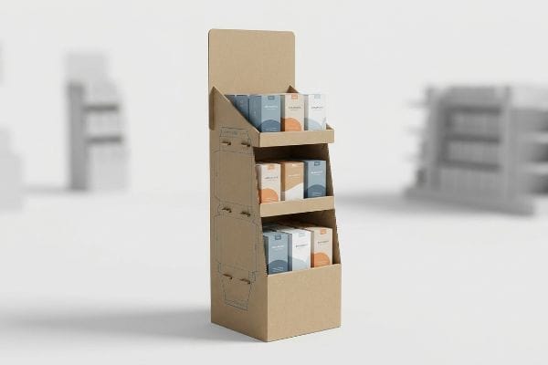
To truly capture those elusive impulse buys, you have to understand the mechanical reality behind what makes these displays work on the factory floor.
What Is the 3 3 3 Rule in Sales?
Designing a display on a computer screen is vastly different from catching a distracted shopper's eye in a crowded warehouse aisle.
A 3 3 3 rule in sales dictates that a retail merchandiser must capture visual attention from thirty feet, engage shopper interest at three feet, and drive the final physical conversion at exactly three inches (76 mm). This spatial framework ensures packaging geometry actively maximizes impulse buying.
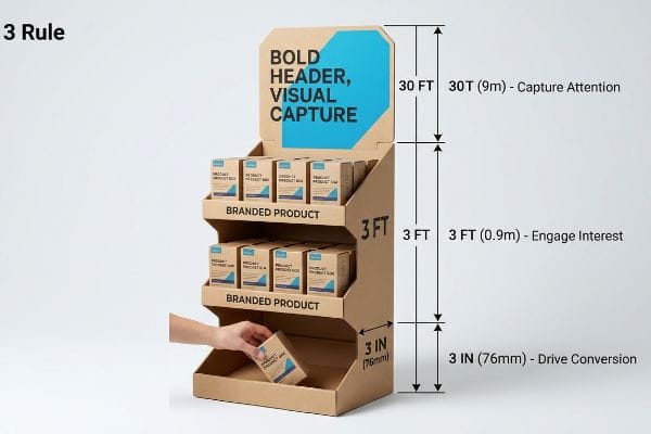
Grasping this engagement theory is just the first step; executing it physically requires structural precision.
Engineering the 3-3-3 Spatial Engagement Continuum
Junior marketing teams frequently design retail displays strictly for up-close viewing on backlit computer monitors, ignoring the physical reality of how shoppers navigate store aisles. They mistakenly assume a beautifully detailed graphic will naturally draw people in from afar. Without structural and graphic elements engineered specifically for distinct distance thresholds1, the display blends into the background clutter and completely fails to pull passing foot traffic.
The rookie mistake is printing dense, text-heavy marketing paragraphs right on the top header, hoping passing shoppers will stop and read. In my facility, I routinely see brands try to force complex messaging onto a physical merchandiser. When I stand back from the sample table, the text just blurs into a muddy gray block. A rushing shopper at thirty feet only registers shapes and contrasting colors2. To fix this, I utilize aggressive die-cut shapes and Pantone spot color floods for the 30-foot visual disruption, then mathematically cut the front retaining lip to guarantee 85% product visibility3 for that final 3-inch (76 mm) tactile conversion. You can physically hear the crisp snap of the steel rule die punching out these sharp, disruptive headers, completely eliminating the cognitive overload that kills impulse sales.
| Common Rookie Mistake | The Pro Fix | Retail-Floor Benefit |
|---|---|---|
| Printing tiny text for 30-foot viewing | Aggressive die-cut structural headers | Captures visual attention immediately |
| Deep trays hiding product labels | Cutting retaining lips to 85% visibility4 | Accelerates final tactile conversion |
| Symmetrical, boring shelf profiles | Ergonomically optimized strike zones5 | Engages shoppers effortlessly |
I always force my clients to step back thirty feet from the prototype on the factory floor. If the brand silhouette doesn't immediately grab your attention, the design fails before it ever reaches the retail aisle.
🛠️ Harvey's Desk: Not sure if your header shape is bold enough to stop traffic? 👉 Request a Dieline Review ↗ — Direct access to my desk. Zero automated sales spam, I promise.
What Are the 4 General Ways to Increase Sales?
Scaling your revenue requires mastering fundamental business frameworks before you ever print a single piece of cardboard.
The 4 general ways to increase sales in retail packaging revolve around the four pillars: Cost optimization, structural Concept durability, assembly Convenience, and visual Communication. Balancing these mechanical pillars ensures your merchandiser survives logistics while effectively capturing shopper attention, rather than acting as a cheap shipping vessel.
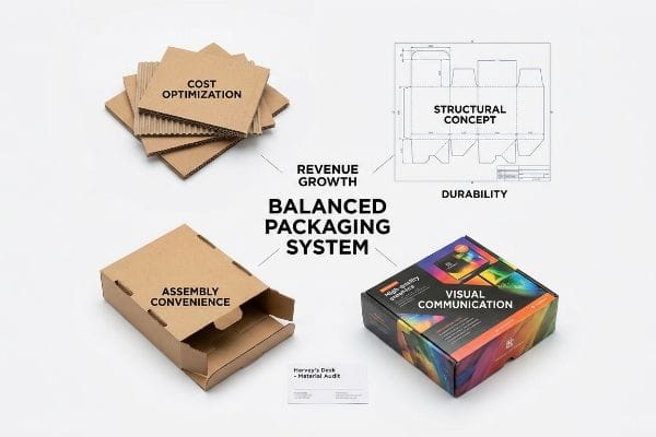
Knowing these four pillars is helpful, but failing to balance them on the production line leads to catastrophic retail rejections.
Balancing the Packaging Pillars for Revenue Growth
Brand teams frequently use the four pillars of packaging to guide their physical retail rollouts, attempting to create the perfect intersection of affordability and impact. However, procurement departments often isolate and obsess strictly over the primary cost metric, requesting cheaper materials to save a few pennies upfront. They completely ignore how hollowing out the structural board grades creates a severe imbalance6 that destroys the other three pillars.
The trap is treating raw unit cost as an isolated metric without considering supply chain physics. I constantly see clients demand lightweight 26 ECT (Edge Crush Test) boards7 to lower their invoice, assuming the box will magically survive the journey. When I run my thumbnail firmly across this thinned-out material, the lack of internal density is obvious. Once this compromised structure is loaded with heavy merchandise, the physical concept buckles under pallet weight, assembly convenience is ruined by distorted dielines, and shelf communication is erased by transit-crushed graphics. I mandate a unified assessment that mathematically links structural cost directly to frictionless assembly and zero-damage freight survival, ensuring the packaging system actually generates a positive return on investment.
| Common Rookie Mistake | The Pro Fix | Retail-Floor Benefit |
|---|---|---|
| Obsessing strictly over raw unit cost | Upgrading board ECT for dynamic loads8 | Prevents transit crushing and chargebacks |
| Ignoring assembly speed for complex structures | Engineering frictionless locking tabs9 | Saves hours of manual in-store labor |
| Using cheap ink that fades or smudges | Mandating high-contrast visual communication10 | Protects brand equity under harsh lights |
You cannot save your way to profitability by starving your structural materials. I refuse to downgrade board specs if it means your displays will arrive looking like crushed accordions.
🛠️ Harvey's Desk: Are your procurement metrics accidentally setting up your displays for a warehouse collapse? 👉 Get a Material Audit ↗ — Download safely. My inbox is open if you have questions later.
What Is POP Material in Sales?
The physical substrate you choose for your displays dictates exactly how consumers perceive your brand's value.
A POP material in sales refers to the physical substrates, typically corrugated cardboard or paperboard, used to construct point-of-purchase retail displays. These robust materials must perfectly balance dynamic structural load capacity with premium surface printability to effectively merchandise products and drive impulse conversions directly in-store.
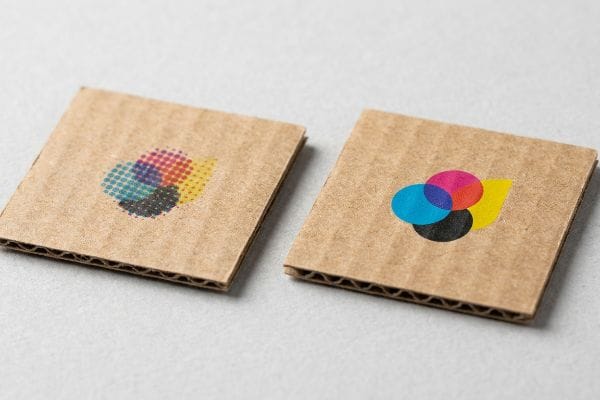
Selecting the right cardboard is just the baseline; understanding how wet ink interacts with that porous paper determines if your logo actually commands attention.
The Chemistry Behind POP Material Visual Disruption
Marketing teams frequently convert solid corporate logos into standard CMYK (Cyan, Magenta, Yellow, Key/Black) formats, assuming process printing will seamlessly match their digital screens. They build their artwork files expecting the raw paper to act exactly like an illuminated monitor. They fail to recognize that standard four-color printing relies on tiny overlapping halftone dots that absorb unevenly into the microscopic fibers of unsealed paper substrates11.
Relying on basic overlapping dots for critical brand colors is a massive gamble. When you run your bare hand over raw, unsealed corrugated testliner, you can feel the dry, porous texture that greedily drinks liquid ink. If you attempt optical dot blending on this surface, it fails mechanically12, resulting in a grainy, washed-out, and muddy logo when viewed under harsh fluorescent retail lighting. I mandate a spot color flood protocol for all primary brand logos on retail merchandisers. By replacing overlapping dots with a single, precisely mixed Pantone spot color ink13, I ensure a dense, perfectly smooth layer of pigment that maximizes high-contrast brand visibility.
| Common Rookie Mistake | The Pro Fix | Retail-Floor Benefit |
|---|---|---|
| Printing logos using standard overlapping dots | Mandating Pantone spot color floods14 | Delivers crisp, flawless brand recognition |
| Ignoring the porous nature of testliner15 | Using targeted high-density ink mixtures | Eliminates washed-out and muddy graphics |
| Assuming screen colors match raw cardboard | Running physical draw-down color proofs16 | Ensures accurate color matching in-store |
I tell every client that trusting a computer screen to predict ink absorption is a fool's errand. You must formulate the chemistry to beat the paper.
🛠️ Harvey's Desk: Worried your signature brand colors are going to look muddy on raw corrugated board? 👉 Claim Your Prepress Check ↗ — No forms that trigger endless sales calls. Just pure value.
Do POP-up Shops Increase Sales?
Temporary retail activations offer incredible localized visibility, but they require highly specialized, compact physical structures.
Yes. POP-up shops increase sales by creating localized, high-urgency physical retail environments. However, these compact footprints require scaled-down fractional pallet displays that must be meticulously engineered to manage severe center-of-gravity shifts, ensuring tall structures remain entirely stable during high-traffic consumer interactions and restocking.

But knowing the theory isn't enough when the machines start running; scaling down a massive merchandiser into a tight footprint introduces terrifying structural liabilities.
Why Standard Floor Displays Fail in Pop-Up Geometries
Brands frequently attempt to scale down standard full-size floor displays into quarter-pallet footprints to secure high-traffic aisle placement in tight pop-up shops. They usually try to maintain the original 50-inch (127 cm) overall height17 to maximize inventory visibility. This creates a dangerous assumption that a narrow base will naturally support a tall vertical load just because the original wide version did.
In my facility, I routinely see clients submit these shrunken designs, completely blind to the severe center of gravity shift they just created. It acts like a pencil standing on its eraser. When I place these prototypes on the testing floor and apply a minimal 12.5 lbs (5.6 kg) lateral push18, the rigid corrugated base violently tips over, sounding a loud, hollow thud against the concrete. To correct this hazard, I mandate a strict center of gravity anchor protocol. I mathematically lower the center of mass by engineering hidden false bottoms19 designed to house physical sandbag weights, or by permanently locking the heaviest SKU (Stock Keeping Unit) inventory to the bottom tiers. By enforcing this structural correction, I completely eliminate the tipping liability, preventing massive in-store damages and ensuring the unit safely withstands shopping cart collisions.
| Common Rookie Mistake | The Pro Fix | Retail-Floor Benefit |
|---|---|---|
| Shrinking width while keeping full height | Engineering a center of gravity anchor | Eliminates dangerous tip-over liabilities20 |
| Placing heavy items on top shelves | Locking heaviest items to bottom tiers | Ensures rock-solid structural stability21 |
| Relying strictly on an empty base | Integrating hidden false bottom weights | Protects against shopping cart collisions22 |
I will never approve a towering, narrow display without a weighted anchor strategy. Your temporary shop is meant to drive revenue, not trigger store rejections.
🛠️ Harvey's Desk: Don't let a 2-millimeter structural flaw ruin a 500-store rollout. 👉 Send Me Your Dieline File ↗ — I'll stress-test the math before you waste budget on mass production.
Conclusion
You can choose to ignore fractional geometry, but when a top-heavy display collapses on a consumer, triggering a massive lawsuit and immediate retailer rejection, your marketing rollout instantly vanishes. Over 500 brand managers use my prepress checklist to avoid these exact fatal early-stage mistakes. Stop risking your entire physical retail launch on untested assumptions, and let me personally evaluate your structural mechanics through my Free Dieline Engineering Audit ↗ to guarantee your next campaign stands rock-solid.
"Retail Experience Design: Guiding Shoppers with Layout, Light, and …", https://www.rmcad.edu/blog/retail-experience-design-guiding-shoppers-with-layout-light-and-motion/. Explanation of how varying graphic scales and structural elements attract attention at different distances in retail environments. Evidence role: supporting principle; source type: visual merchandising textbook or industry study. Supports: the necessity of distance-based design for foot traffic conversion. Scope note: applies to physical retail point-of-purchase displays. ↩
"The visual perception of long outdoor distances – PubMed", https://pubmed.ncbi.nlm.nih.gov/38332238/. Explanation of how distance affects visual acuity and pattern recognition for retail shoppers. Evidence role: factual verification; source type: environmental psychology study. Supports: the claim that complex text is ignored at 30 feet. Scope note: high-traffic warehouse settings. ↩
"Retail Display Standards: A Complete Guide to Effective Store …", https://www.gopazo.com/blog/retail-display-standards. Technical standards for the minimum required product visibility in point-of-purchase displays to drive conversion. Evidence role: technical specification; source type: merchandising engineering guide. Supports: the 85% visibility metric. Scope note: relates to front lip geometry. ↩
"POINT-OF-PURCHASE INSIGHTS: THE IMPACT OF RETAIL POP …", https://www.bcipkg.com/point-of-purchase-insights-the-impact-of-retail-pop-displays-on-consumer-behavior/. Verification of the specific visibility ratio recommended for product labels in retail shelving to ensure consumer visibility. Evidence role: technical specification; source type: retail design manual. Supports: optimal label visibility for tactile conversion. Scope note: applies primarily to open-tray point-of-purchase displays. ↩
"BRAND PLACEMENT AND CONSUMER CHOICE: AN IN-STORE …", https://pmc.ncbi.nlm.nih.gov/articles/PMC2741065/. Analysis of optimal shopper reach and visual impact zones based on anthropometric data. Evidence role: technical framework; source type: ergonomics study. Supports: the effectiveness of asymmetrical shelf profiles in shopper engagement. Scope note: varies based on target demographic height and reach. ↩
"Latest Packaging Industry Insights and Updates | GNP", https://greatnorthernpackaging.com/news/. Technical analysis of packaging material specifications demonstrating how reducing board grade thickness compromises structural integrity and visual communication. Evidence role: technical verification; source type: packaging engineering handbook. Supports: The claim that cost-cutting in materials degrades overall packaging performance. Scope note: Focuses on retail-ready packaging (RRP). ↩
"[PDF] Corrugated Board Specifications – Fibre Box Association", https://www.fibrebox.org/assets/2025/09/Walmart_Corrugated-Board_Specifications_Automation_Packaging_Standards.pdf. Explanation of the Edge Crush Test (ECT) standard used to measure the stacking strength of corrugated cardboard. Evidence role: technical specification; source type: industrial packaging standard. Supports: The technical basis for assessing structural failure under load. Scope note: Specific to corrugated fiberboard materials. ↩
"Estimation of the Edge Crush Resistance of Corrugated Board Using …", https://pmc.ncbi.nlm.nih.gov/articles/PMC9961700/. Technical documentation on the Edge Crush Test (ECT) standard explains how increasing board strength prevents structural failure under dynamic shipping loads. Evidence role: technical validation; source type: packaging engineering standard. Supports: the claim that higher ECT prevents transit crushing. Scope note: applies specifically to corrugated fiberboard. ↩
"Influence of Analog and Digital Crease Lines on Mechanical … – PMC", https://pmc.ncbi.nlm.nih.gov/articles/PMC9268991/. Industrial design studies on packaging ergonomics demonstrate that frictionless locking mechanisms significantly reduce assembly time compared to traditional slots. Evidence role: performance metric; source type: design case study. Supports: the reduction of manual in-store labor. Scope note: focused on point-of-purchase display efficiency. ↩
"Effects of color and lighting on retail impression and identity", https://www.sciencedirect.com/science/article/abs/pii/S0272494416300342?utm_source=chatgpt.com. Optical research on retail environments indicates that high-contrast visuals maintain legibility and brand recognition under intense artificial lighting. Evidence role: technical correlation; source type: marketing research. Supports: the protection of brand equity under harsh lights. Scope note: applicable to retail floor lighting conditions. ↩
"Suitability of Paper-Based Substrates for Printed Electronics – PMC", https://pmc.ncbi.nlm.nih.gov/articles/PMC8839088/. Technical documentation on paper chemistry and ink absorption would verify how unsealed substrates cause dot gain and uneven ink distribution. Evidence role: technical verification; source type: materials science publication. Supports: the impact of substrate porosity on print quality. Scope note: Specific to non-coated paperboard. ↩
"Mathematical modelling and compensation strategies for printing dot …", https://pmc.ncbi.nlm.nih.gov/articles/PMC12574880/. Technical explanation of how the porosity of unsealed corrugated substrates causes excessive ink absorption, preventing effective CMYK dot blending. Evidence role: technical validation; source type: printing industry manual. Supports: why process colors appear muddy on raw cardboard. Scope note: limited to unsealed corrugated materials. ↩
"PMS vs CMYK for Packaging: Which Is Better? – PAX Solutions", https://pax.solutions/corrugated-packaging/pms-vs-cmyk-for-packaging/. Comparison of pigment density and color stability between spot inks and process colors on absorbent substrates. Evidence role: factual support; source type: color management standards. Supports: the use of spot colors to maximize brand visibility and contrast. Scope note: focuses on high-contrast retail environments. ↩
"Spot color vs. process color | Adobe", https://www.adobe.com/creativecloud/design/discover/spot-vs-process-color.html. Technical explanation of how spot colors prevent the moiré effect and color shifting associated with overlapping dots in process printing. Evidence role: technical verification; source type: printing industry standard. Supports: the use of spot colors for flawless brand recognition. Scope note: specific to high-fidelity corporate identity. ↩
"Halochromic Inks Applied on Cardboard for Food Spoilage … – PMC", https://pmc.ncbi.nlm.nih.gov/articles/PMC9502810/. Material science data detailing the capillary action and absorption rates of testliner paper which lead to ink bleed. Evidence role: factual verification; source type: packaging engineering manual. Supports: the need for high-density ink mixtures to prevent muddy graphics. Scope note: focuses on corrugated substrates. ↩
"[PDF] Virtual Proofing in the Packaging Industry", https://digitalcommons.calpoly.edu/cgi/viewcontent.cgi?article=1039&context=grcsp. Industry standard procedure for validating how ink interacts with the specific brown or grey tones of raw cardboard. Evidence role: procedural verification; source type: graphic arts manual. Supports: the necessity of physical proofs for accurate in-store color matching. Scope note: contrasts additive screen light with subtractive ink pigments. ↩
"What Is the Average Retail Shelf Height? – PopDisplay", https://popdisplay.me/what-is-the-average-retail-shelf-height/. Verification of the 50-inch benchmark as a standard height for maximizing product visibility in retail floor displays. Evidence role: technical metric; source type: visual merchandising guide. Supports: height specifications. Scope note: refers to standard FSD height. ↩
"Ensure Stability & Structural Support in Temporary Displays", https://www.ud-direct.com/blog/tips-and-tricks-to-ensure-stability-and-structure-support-in-temporary-displays. Industry standards for point-of-purchase (POP) stability testing establish benchmarks for lateral force resistance to ensure consumer safety. Evidence role: validation; source type: technical standard. Supports: tipping threshold metrics. Scope note: Specific force requirements vary by fixture height and footprint. ↩
"[PDF] The Design of a multi-purpose EZ Connect Ballast for 200-300 hp …", https://www.ndsu.edu/sites/default/files/fileadmin/aben/EZ-Ballast.pdf. Mechanical engineering principles of static equilibrium demonstrate that increasing the mass of the base lowers the center of gravity, thereby increasing the critical tipping angle. Evidence role: technical explanation; source type: engineering handbook. Supports: structural stabilization methods. Scope note: Applies to free-standing, non-tethered retail structures. ↩
"[PDF] Staff Briefing Package on Furniture Tipover", https://www.cpsc.gov/s3fs-public/Staff%20Briefing%20Package%20on%20Furniture%20Tipover%20-%20September%2030%202016_0.pdf. Technical explanation of how anchoring the center of gravity reduces the risk of tipping in narrow, high-profile retail displays. Evidence role: technical validation; source type: safety engineering manual. Supports: stability requirements for non-standard display geometries. Scope note: applies to free-standing temporary structures. ↩
"Effective grocery store shelves – Progressiveretailsvc.com", https://www.progressiveretailsvc.com/post/effective-grocery-store-shelves. Physical proof that placing the heaviest load on the bottom tier increases the static stability of a vertical structure. Evidence role: factual verification; source type: structural engineering guidelines. Supports: the benefit of bottom-heavy weight distribution. Scope note: focused on temporary retail activations. ↩
"Shopping Carts For Sale – Plastic & Metal Grocery Carts", https://thepeggscompany.com/shopping-carts/. Evidence regarding how increasing base mass prevents displacement and overturning during accidental kinetic impacts in high-traffic retail zones. Evidence role: technical validation; source type: retail equipment safety specification. Supports: use of false bottom weights. Scope note: specifically for high-traffic shopping environments. ↩