एक अनुकूलित रिटेल डिस्प्ले आपकी मार्केटिंग रणनीति और स्टोर के वास्तविक स्वरूप को जोड़ता है। आपको एक ऐसी रिटेल-रेडी ज्योमेट्री की आवश्यकता है जो सप्लाई चेन में भी टिकाऊ हो और आने-जाने वाले ग्राहकों को आकर्षित कर सके।.
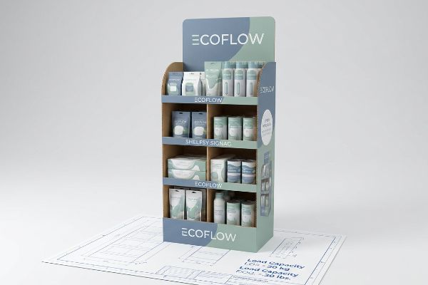
कस्टम रिटेल डिस्प्ले आर्किटेक्चर में प्रीमियम स्टोर प्लेसमेंट सुनिश्चित करने, उत्पादों की तत्काल बिक्री बढ़ाने और ब्रांड की दृश्यता को अधिकतम करने के लिए भौतिक पॉइंट-ऑफ-परचेस मर्चेंडाइज़र का इंजीनियरिंग शामिल है। इन नालीदार संरचनाओं को कठोर रिटेल वातावरण और सख्त वेयरहाउस अनुपालन मानकों का पालन करने के लिए सौंदर्यपूर्ण ग्राफिक डिज़ाइन और सख्त गतिशील भार वहन क्षमता के बीच संतुलन बनाए रखना आवश्यक है।.
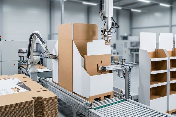
एक सपाट पीडीएफ फाइल पर सिद्धांत तो बहुत अच्छा लगता है, लेकिन जब ये आयामी फाइलें वास्तव में विनिर्माण लाइन पर पहुंचती हैं तो क्या होता है, यह देखिए।.
रिटेल डिस्प्ले का क्या अर्थ है?
डिस्प्ले सिर्फ आपके उत्पाद को रखने वाला एक मुद्रित बॉक्स नहीं है। यह एक अत्यधिक विनियमित संरचनात्मक संपत्ति है जो बड़े रिटेलरों की स्थान संबंधी आवश्यकताओं की जटिल चुनौतियों का सामना करती है।.
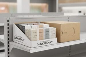
रिटेल डिस्प्ले का अर्थ है स्टोर में मौजूद FMCG (फास्ट-मूविंग कंज्यूमर गुड्स) उत्पादों को प्रदर्शित करने के लिए डिज़ाइन किए गए भौतिक उपकरण, नालीदार डिब्बे और अस्थायी शेल्फ इकाइयाँ। ये रणनीतिक संरचनाएँ ग्राहकों को सामान्य गलियारों से बाहर आकर्षित करती हैं, जिससे वे अधिक मुनाफ़े वाले आवेगपूर्ण खरीदारी के लिए प्रेरित होते हैं और उत्पाद स्टॉक का टर्नओवर तेज़ होता है।.
इन इकाइयों के कार्य को सही मायने में समझने के लिए, हमें कलाकृति से परे देखना होगा और इस बात पर ध्यान केंद्रित करना होगा कि वे वास्तव में खुदरा वातावरण के भीतर कहाँ स्थित हैं।.
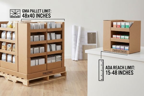
स्थानिक विभाजन: एडीए बनाम जीएमए भौतिक सीमाएँ
कई नई मार्केटिंग टीमें यह मान लेती हैं कि रिटेल स्टोर एक अत्यधिक स्केलेबल कैनवास है। वे एक विशाल पीओपी (पॉइंट-ऑफ-परचेस) फ्लोर डिस्प्ले डिज़ाइन करते हैं और फिर अपनी ट्रेडिंग कंपनी से उसी डाइलाइन को 50% तक छोटा करके एक काउंटरटॉप रजिस्टर यूनिट बनाने के लिए कहते हैं । यह कॉपी-पेस्ट दृष्टिकोण इन दो पूरी तरह से अलग रिटेल ज़ोन को नियंत्रित करने वाले सख्त कानूनी और लॉजिस्टिकल नियमों की अनदेखी करता है ।
स्ट्रक्चरल फाइलों की समीक्षा करते समय मुझे यह समस्या अक्सर देखने को मिलती है। कोई ब्रांड "सिकुड़कर फिट करने" की कोशिश करता है, यह समझे बिना कि फ्लोर यूनिट्स को डायनामिक लोड के लिए 48×40 इंच (1219.2×1016 मिमी) GMA (ग्रोसरी मैन्युफैक्चरर्स एसोसिएशन) पैलेट लिमिट 2 का सख्ती से पालन करना होता है । इसके विपरीत, POS (पॉइंट-ऑफ-सेल) काउंटरटॉप यूनिट्स को 15 से 48 इंच (381 से 1219.2 मिमी) ADA (अमेरिकन्स विद डिसेबिलिटीज एक्ट) फॉरवर्ड रीच कंप्लायंस विंडो 3 का पालन करना होता है । जब आप फाइल को छोटा कर देते हैं, तो स्ट्रक्चरल गणित गड़बड़ा जाता है। मैंने एक बार एक परेशान स्टोर मैनेजर को देखा था जिसने एक गैर-अनुरूप रजिस्टर यूनिट को इसलिए अस्वीकार कर दिया क्योंकि उसका बेस बहुत चौड़ा था, और उसे लैमिनेट पर जोर से रगड़ते हुए काउंटर से हटा दिया। फ्लोर और काउंटर यूनिट्स के लिए इंजीनियरिंग पाइपलाइनों को स्थायी रूप से अलग करके, हम अनुपालन की गारंटी देते हैं, जिससे खुदरा विक्रेताओं द्वारा भारी भरकम चार्जबैक को रोका जा सकता है और आपका अभियान सक्रिय रूप से चलता रहता है।
| नौसिखियों की आम गलती | प्रो फिक्स | रिटेल-फ्लोर लाभ |
|---|---|---|
| काउंटरों के लिए सिकुड़ती हुई फ्लोर डाईलाइन | एडीए और जीएमए इंजीनियरिंग पाइपलाइनों को अलग करें | खुदरा विक्रेताओं द्वारा स्थान अस्वीकृति को रोकता है |
| आगे बढ़ने की अनुपालन की अनदेखी करना | POS फ़ाइलों को 15-48 इंच (381-1219.2 मिमी) तक लॉक करें | कानूनी रूप से सुलभ इकाइयों को सुनिश्चित करता है |
| पैलेट ओवरहैंग सीमाओं की अनदेखी करना | एंकर पीओपी फाइलों को 48×40 इंच के आधार पर ही लगाएं। | गतिशील भार के कारण होने वाले कुचलने को समाप्त करता है |
मैं ग्राहकों को चेकआउट काउंटर के लिए पुराने फ्लोर डिज़ाइन को रीसायकल करने की अनुमति नहीं देता। प्रत्येक विशिष्ट रिटेल ज़ोन के लिए समर्पित, गणितीय रूप से सटीक संरचनाएँ बनाना ही एकमात्र तरीका है जिससे मैं यह सुनिश्चित करता हूँ कि आपका डिस्प्ले वास्तव में उपयोग में लाया जाए, न कि कचरे के ढेर में फेंक दिया जाए।.
🛠️ हार्वे का डेस्क: क्या आप सुनिश्चित नहीं हैं कि आपका फ्लोर डिस्प्ले चेकआउट काउंटर के लिए कानूनी रूप से उपयुक्त है? 👉 मुझे अपने स्पेसिफिकेशन्स की समीक्षा करने दें ↗ — सीधे मेरे डेस्क से संपर्क करें। मैं वादा करता हूँ, स्वचालित बिक्री संबंधी कोई स्पैम नहीं होगा।
मैं अपने प्रदर्शन से ग्राहकों को कैसे आकर्षित करूं?
किसी वेयरहाउस क्लब में प्रवेश करना इंद्रियों पर एक तरह का हमला होता है। दृश्य शोर के बीच अपनी पहचान बनाने के लिए, आपकी संरचना को एक साथ कई दृष्टिकोणों से ध्यान आकर्षित करना होगा।.
ग्राहकों को आकर्षित करने के लिए, विभिन्न भौतिक दूरियों पर दृश्य व्यवधान उत्पन्न करने वाली तकनीक का उपयोग करके खरीदारों का ध्यान आकर्षित करना आवश्यक है। आक्रामक डाई-कट आकृतियों, उच्च-विपरीत स्पॉट कलर फ्लड और कोणीय शेल्फिंग एर्गोनॉमिक्स को मिलाकर, एक ब्रांड सक्रिय रूप से ग्राहकों को मर्चेंडाइज़र की ओर आकर्षित करता है और निष्क्रिय रूप से गलियारे में चलने वालों को सक्रिय आवेगपूर्ण खरीदारों में परिवर्तित करता है।.
किसी ग्राहक का ध्यान आकर्षित करना भौतिक दूरी का विज्ञान है, न कि केवल अपने लोगो को भौतिक रूप से बड़ा करने का मामला।.
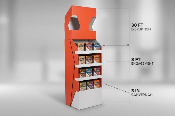
3-3-3 स्थानिक सहभागिता नियम
जूनियर डिज़ाइन टीमें अक्सर खुदरा ग्राफ़िक्स को विशेष रूप से अपने बैकलिट, उच्च-रिज़ॉल्यूशन वाले कंप्यूटर मॉनिटर पर नज़दीक से देखने के लिए बनाती हैं। वे हेडर और साइड पैनल को सावधानीपूर्वक छोटे बुलेट पॉइंट्स, क्यूआर कोड और सूक्ष्म रंग ग्रेडिएंट से भर देते हैं, यह मानते हुए कि उपभोक्ता स्वाभाविक रूप से यूनिट के ठीक सामने खड़ा होकर इसे पत्रिका की तरह पढ़ेगा।.
फ्लैट स्क्रीन वाली यह मानसिकता इस बात को पूरी तरह से नज़रअंदाज़ करती है कि ग्राहक भीड़भाड़ वाली दुकानों में कैसे खरीदारी करते हैं। अगर आपका मर्चेंडाइज़र 30 फीट की दूरी से ही ग्राहक की नज़र को आकर्षित नहीं करता, तो कोई भी आपके सेकेंडरी बुलेट पॉइंट्स को पढ़ने के लिए पास नहीं आएगा। मैं अक्सर फ्लैट, बॉक्सी फाइलों को देखता हूँ और तुरंत रिटेल एंगेजमेंट के "3-3-3 नियम"4बेहतर बनाता हूँ। हम आक्रामक, घुमावदार डाई-कट शेप और PMS (पैंटोन मैचिंग सिस्टम) स्पॉट कलर का इस्तेमाल करते हैं ताकि दूर से देखने पर भी ग्राहक की नज़र में बदलाव आए। फिर, हम शेल्फ की एर्गोनॉमिक्स को इस तरह से ऑप्टिमाइज़ करते हैं कि वह 50 इंच (1270 मिमी) के ह्यूमन स्ट्राइक ज़ोन5 को , जिससे तीन फीट की दूरी से ही ग्राहक का ध्यान आकर्षित हो सके। आखिर में, मैं अपने कोंग्सबर्ग सी-सीरीज़ सीएनसी (कंप्यूटर न्यूमेरिकल कंट्रोल) कटिंग टेबल को निर्देश देता हूँ कि वह सामने की रिटेनिंग लिप को नीचे कर दे, जिससे प्राइमरी पैकेजिंग का 85% हिस्सा दिखाई दे। ऑटोमेटेड कटर द्वारा उस लो-लिप प्रोफाइल को अंतिम रूप देने की तेज़ आवाज़ सुनकर मुझे पता चलता है कि उत्पाद अंतिम तीन इंच के स्पर्शनीय रूपांतरण के लिए तैयार है, जिससे ग्राहक की डायरेक्ट सेल्स में ज़बरदस्त बढ़ोतरी होती है।
| नौसिखियों की आम गलती | प्रो फिक्स | रिटेल-फ्लोर लाभ |
|---|---|---|
| केवल नज़दीक से पढ़ने के लिए डिज़ाइन किया गया है | 3-3-3 स्थानिक दूरी नियम लागू करें | यह 30 फीट दूर से भी ट्रैफिक खींच लेता है।6 |
| सपाट, चौकोर आकार के शीर्ष पैनल | आक्रामक डाई-कट संरचनात्मक आकृतियाँ जोड़ें | तत्काल दृश्य व्यवधान उत्पन्न करता है |
| लंबे समय तक टिकने वाला होंठों को छुपाने वाला उत्पाद | उत्पाद की 85% दृश्यता के लिए सामने के किनारे को काटें7 | यह तत्काल स्पर्श संबंधी रूपांतरण को प्रेरित करता है। |
मैं हर भौतिक संपर्क बिंदु को इस तरह से डिज़ाइन करता हूँ कि ग्राहक का ध्यान कमरे के दूसरी ओर से ही सीधे आपके मुख्य पैकेजिंग पर केंद्रित हो जाए। यदि आपका उत्पाद तीस फीट की दूरी से पृष्ठभूमि में घुलमिल जाता है, तो आपका पूरा मार्केटिंग बजट अदृश्य कार्डबोर्ड पर बर्बाद हो जाता है।.
🛠️ हार्वे का डेस्क: क्या आपके हेडर पैनल इतने सपाट हैं कि तीस फीट दूर से भी ट्रैफ़िक बाधित हो रहा है? 👉 अपनी संरचनात्मक दृश्यता का ऑडिट करें ↗ — सुरक्षित रूप से डाउनलोड करें। बाद में कोई प्रश्न होने पर मेरा इनबॉक्स खुला है।
अपने रिटेल स्टोर को दूसरों से अलग कैसे बनाएं?
दुकानों का लेआउट अक्सर अंतहीन, एकसमान गलियारों की नीरस लय में ढल जाता है। रणनीतिक दृश्य तनाव के माध्यम से इस लय को तोड़ना ही जल्दबाजी में भाग रहे ग्राहकों को धीमा करने का रहस्य है।.
अपने रिटेल स्टोर को अलग दिखाने के लिए, विज़ुअल एकरसता को तोड़ने हेतु असममित मर्चेंडाइजिंग लेआउट और मॉड्यूलर एसकेयू (स्टॉक कीपिंग यूनिट) डिवाइडर का उपयोग करें। रणनीतिक रूप से व्यवस्थित उत्पाद समूहों को एकीकृत करने से एक मनोवैज्ञानिक व्यवधान उत्पन्न होता है जो निष्क्रिय खरीदारों को रुकने, फिक्स्चर से जुड़ने और आसानी से दिखाई देने वाले स्थानीयकृत इन्वेंट्री का पता लगाने के लिए मजबूर करता है।.

आप केवल एक नालीदार ट्रे को जितना संभव हो उतना कसकर पैक करके यह उम्मीद नहीं कर सकते कि प्रतिस्पर्धी खुदरा बाजार में यह प्रीमियम दिखेगी।
3-5-7 विषमता नियम के साथ ग्रिड को तोड़ना
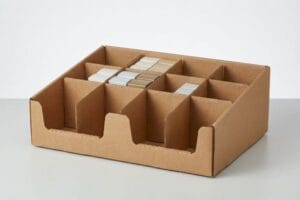
खरीद टीमें अक्सर उत्पादों की एक सघन, पूर्णतः सममित ग्रिड को एक ही डिस्प्ले शेल्फ पर फ्लैट-पैक करने का प्रयास करती हैं, इस धारणा के तहत कि अधिकतम सामग्री घनत्व से अधिक बिक्री होती है8।वे एक ही पेपरबोर्ड टियर पर जितनी संभव हो उतनी बोतलें या बक्से ठूंसने के लिए सटीक पंक्ति संरेखण की मांग करते हैं।
कंप्यूटर-एडेड डिज़ाइन सॉफ़्टवेयर में यह सममित भीड़भाड़ देखने में तो अच्छी लगती है, लेकिन असल रिटेल शिफ्ट के दौरान इससे भारी परेशानी होती है। इसे एक कसकर बनी ईंट की दीवार की तरह समझें; इंसान की नज़र बिना रुके इसके ऊपर से गुज़र जाती है। इसके अलावा, सामान भरते समय क्लर्कों को बिल्कुल भी जगह नहीं मिलती। मैंने देखा है कि जब कोई जल्दबाज़ी में स्टोर कर्मचारी किसी तंग चीज़ को भीड़भाड़ वाली 32ECT (एज क्रश टेस्ट) ट्रे पर ज़बरदस्ती रखता है, तो कच्चे कागज़ के फटने की तेज़, कर्कश आवाज़ आती है, जिससे ट्रे का किनारा फट जाता है और ब्रांड की प्रीमियम छवि तुरंत खराब हो जाती है। इसे रोकने के लिए, मैं डाईलाइन में मॉड्यूलर फ्लोटिंग डिवाइडर लगाकर " 3-5-7 नियम 9 " को अनिवार्य करता हूँ। ये डिवाइडर सामान को विषम संख्या वाले समूहों में स्वाभाविक रूप से बाँट देते हैं, जिससे मनोवैज्ञानिक दृश्य तनाव पैदा होता है जो खरीदार को रोक देता है, साथ ही सामान भरते समय होने वाली टूट-फूट को रोकने के लिए ज़रूरी 0.25 इंच (6.35 मिमी) की सटीक जगह भी सुनिश्चित करते हैं। इस सरल संरचनात्मक बदलाव से शारीरिक श्रम की कठिनाई कम हो जाती है और पूरे प्रचार अभियान के दौरान डिस्प्ले का मूल सौंदर्य बरकरार रहता है।
| नौसिखियों की आम गलती | प्रो फिक्स | रिटेल-फ्लोर लाभ |
|---|---|---|
| पूर्णतया सममित, तंग ग्रिड | विषम संख्याओं के समूहीकरण के लिए 3-5-7 नियम का प्रयोग करें। | खरीदारों को रोकने के लिए दृश्य तनाव पैदा करता है |
| उत्पादों के लिए शून्य भौतिक क्लीयरेंस | इंजीनियर मॉड्यूलर नालीदार एसकेयू डिवाइडर | पुनः स्टॉक करते समय कार्डबोर्ड को फटने से रोकता है |
| सौंदर्यशास्त्र की तुलना में घनत्व को अधिकतम करना | 0.25 इंच (6.35 मिमी) के अंतराल में निर्माण करें | ब्रांड की प्रीमियम छवि की रक्षा करता है |
मैं ब्रांडों को अलमारियों को इस हद तक भरने की अनुमति नहीं देता कि वे संरचनात्मक रूप से विफल हो जाएं। गणितीय रूप से सटीक विभाजक बनाने से आवश्यक जगह मिलती है जो आपके उत्पाद की दृश्यता और ट्रे की भौतिक अखंडता दोनों की रक्षा करती है।.
🛠️ हार्वे का डेस्क: क्या आपके मौजूदा ट्रे लेआउट में इतनी जगह कम है कि सामने का किनारा फटने का खतरा है? 👉 मॉड्यूलर डिवाइडर डाइलाइन का अनुरोध करें ↗ — कोई फॉर्म नहीं जो बार-बार सेल्स कॉल को बढ़ावा दें। बस शुद्ध मूल्य।
विजुअल मर्चेंडाइजिंग के 4 P क्या हैं?
व्यापार संबंधी सिद्धांत उत्पाद, मूल्य, स्थान और प्रचार पर बहुत अधिक निर्भर करता है। लेकिन अपनी विपणन रणनीति के हर पहलू को एक ही भौतिक वस्तु में समाहित करने का प्रयास संज्ञानात्मक विफलता की गारंटी देता है।.
दृश्य सामग्री प्रबंधन के चार मुख्य स्तंभ हैं: उत्पाद, मूल्य, स्थान और प्रचार। खुदरा दुकानों में, ये मूलभूत स्तंभ तय करते हैं कि भौतिक सामान को कैसे रखा जाए, साइनबोर्ड के माध्यम से मूल्य निर्धारण संरचनाओं को कैसे संप्रेषित किया जाए, उत्पाद ग्राहकों की आवाजाही को कहाँ आकर्षित करे, और आकर्षक संरचनात्मक डिज़ाइन किस प्रकार उपभोक्ताओं के खरीदारी निर्णयों को गति प्रदान करे।.
लेकिन जब स्वचालित मशीनें चलने लगती हैं और पैलेट बड़े-बड़े स्टोरों के फर्श पर पहुँच जाते हैं, तो उच्च-स्तरीय विपणन सिद्धांत का ज्ञान होना ही पर्याप्त नहीं होता है।.
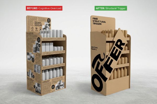
"7 O" का संज्ञानात्मक अतिभार जाल पदोन्नति के स्तंभ में विफल क्यों हो जाता है?
ब्रांड विपणक अक्सर गहन उपभोक्ता व्यवहार ढाँचे11 , एक ही रचनात्मक संक्षिप्त विवरण में प्रत्येक जनसांख्यिकीय लक्ष्य और मौसमी अवसर को संतुष्ट करने का प्रयास करते हैं। वे इस विस्तृत दस्तावेज़ को अपने ग्राफिक डिज़ाइनरों को सौंपते हैं, जो इस बारीक, बहुस्तरीय संदेश को नालीदार डिस्प्ले।
पीडीएफ पर एक व्यापक मार्केटिंग संदेश को सुसंगत रूप देना आसान है, लेकिन जब आप ऐसी 500 प्रतियां किसी व्यस्त गोदाम। मेरी फैक्ट्री में, मैं अक्सर देखता हूं कि आर्टवर्क फाइलें बड़े-बड़े पैराग्राफों से भरी होती हैं, जिनमें 6-कलर हाइडेलबर्ग ऑफसेट प्रेस के चालू होने से पहले ही हर प्रमोशनल पहलू को एक साथ समेटने की कोशिश की जाती है। इससे ग्राहकों पर बहुत अधिक दबाव पड़ता है; जल्दबाजी में खरीदारी करने वाले ग्राहक तेज फ्लोरोसेंट रोशनी में इस घने टेक्स्ट को समझ नहीं पाते, जिसके कारण वे उस यूनिट को पूरी तरह से अनदेखा कर देते हैं। जब मैं इन अव्यवस्थित प्रिंटों पर ग्राहकों के ध्यान देने का समय मापता हूं, तो यह लगभग शून्य होता है। मैं फैक्ट्री में एक उद्देश्य-अलगाव प्रोटोकॉल लागू करता हूं, जिसमें अतिरिक्त टेक्स्ट को हटाकर एक बड़ा, हाई-कॉन्ट्रास्ट 3D पॉप-आउट एलिमेंट बनाया जाता है, जो पूरी तरह से खरीदारी के मुख्य अवसर को लक्षित करता है। एक ही प्रभावशाली दृश्य ट्रिगर तैयार करके, मैं यह सुनिश्चित करता हूं कि संरचनात्मक डिजाइन तीन सेकंड की सीमित समय सीमाके, जिससे ग्राहक के स्थानीय स्टॉक टर्नओवर में काफी सुधार होता है।
| नौसिखियों की आम गलती | प्रो फिक्स | रिटेल-फ्लोर लाभ |
|---|---|---|
| मार्केटिंग सामग्री के पैराग्राफ प्रिंट करना | टेक्स्ट को हटाकर एक 3डी संरचनात्मक हुक तैनात करें | खरीदारी के दौरान संज्ञानात्मक अतिभार को रोकता है13 |
| एक साथ कई जनसांख्यिकीय समूहों को लक्षित करना | खरीदारी के एकमात्र प्राथमिक अवसर को अलग करें | तत्काल आवेगपूर्ण खरीदारी को प्रेरित करता है14 |
| सघन, सपाट पाठ पैनलों पर निर्भर रहना | उच्च-कंट्रास्ट, डाई-कट फोकल पॉइंट्स को इंजीनियर करें | तीन सेकंड के भीतर ही ध्यान आकर्षित कर लेता है15 |
अनावश्यक संदेशों को हटाकर आप अपने अभियान को दृश्य शोर से बचा सकते हैं। एक प्रमुख संरचनात्मक कारक तैयार करके, डिस्प्ले अदृश्य और महंगी जगह को किराए पर लेने के बजाय तत्काल स्पर्शनीय रूपांतरण को बढ़ावा देता है।.
🛠️ हार्वे का डेस्क: क्या आपके हेडर पैनल टेक्स्ट की अधिकता के कारण संज्ञानात्मक बोझ से ग्रस्त हैं? 👉 मुझे अपनी डाइलाइन फ़ाइल भेजें ↗ — बड़े पैमाने पर उत्पादन पर बजट बर्बाद करने से पहले मैं गणितीय गणनाओं का गहन परीक्षण करूँगा।
निष्कर्ष
किसी चेकआउट काउंटर पर फिट करने के लिए फ्लोर डाईलाइन को छोटा करने से शायद आपको मामूली डिज़ाइन शुल्क की बचत हो जाए, लेकिन जब कोई नाराज़ स्टोर मैनेजर उस संरचनात्मक रूप से असंगत यूनिट को काउंटर से ज़बरदस्ती हटा देता है, तो रिटेलर तुरंत उसे अस्वीकार कर देता है और आपके प्रोजेक्ट का सारा लाभ खत्म हो जाता है। यह वही सटीक स्पेसिफिकेशन शीट है जिसका उपयोग मेरे शीर्ष 10 रिटेल ग्राहक प्रिंट रिजेक्शन को रोकने के लिए करते हैं। ADA अनुपालन सीमाओं के बारे में अनुमान लगाना बंद करें और मुझे व्यक्तिगत रूप से आपकी संरचनात्मक फाइलों को मेरे मुफ़्त डाईलाइन ऑडिट ↗ ताकि बड़े पैमाने पर उत्पादन शुरू होने से पहले ही घातक आयामी त्रुटियों का पता चल सके।
"ADA अभिगम्यता मानक – Access-Board.gov", https://www.access-board.gov/ada/। [एक आधिकारिक स्रोत फर्श पर रखे जाने वाले उपकरणों और बिक्री काउंटर इकाइयों के बीच भिन्न-भिन्न ADA अभिगम्यता आवश्यकताओं और खुदरा विक्रेता-विशिष्ट स्थानिक दिशानिर्देशों का विस्तृत विवरण देगा]। साक्ष्य की भूमिका: सत्यापन; स्रोत का प्रकार: नियामक दिशानिर्देश। समर्थन: विभिन्न प्रदर्शन क्षेत्रों के लिए अलग-अलग नियमों का अस्तित्व। कार्यक्षेत्र संबंधी टिप्पणी: उत्तरी अमेरिकी खुदरा मानकों पर केंद्रित। ↩
"48" x 40" जीएमए पैलेट | सबसे बड़ा पैलेट निर्माता और आपूर्तिकर्ता", https://www.meridianpkg.com/feeds/category/gma-pallets। [उद्योग लॉजिस्टिक्स मानक पुष्टि करते हैं कि स्थिरता और गोदाम उपकरणों के साथ अनुकूलता सुनिश्चित करने के लिए जीएमए पैलेट का 48×40 इंच का फुटप्रिंट मानक है]। साक्ष्य भूमिका: तकनीकी विनिर्देश; स्रोत प्रकार: उद्योग मानक। समर्थन: फर्श पर रखे जाने वाले डिस्प्ले यूनिटों के लिए आयामी आवश्यकताएँ। कार्यक्षेत्र नोट: मुख्य रूप से उत्तरी अमेरिकी खुदरा लॉजिस्टिक्स पर लागू होता है। ↩
"अध्याय 9: अंतर्निर्मित तत्व – Access-Board.gov", https://www.access-board.gov/ada/chapter/ch09/। [ADA अभिगम्यता दिशानिर्देश यह सुनिश्चित करने के लिए अधिकतम पहुँच गहराई और ऊँचाई निर्दिष्ट करते हैं कि खुदरा प्रदर्शनियाँ व्हीलचेयर का उपयोग करने वाले व्यक्तियों के लिए सुलभ हों]। साक्ष्य भूमिका: कानूनी अनुपालन; स्रोत प्रकार: सरकारी विनियमन। समर्थन: पीओएस काउंटरटॉप इकाइयों के लिए स्थानिक बाधाएँ। कार्यक्षेत्र टिप्पणी: अमेरिकी संघीय कानूनी आवश्यकता। ↩
"कस्टम स्टोर डिस्प्ले के लिए 3 के नियम का महत्व", https://mcintyredisplays.com/blog/custom-store-displays/। [प्वाइंट-ऑफ-परचेज़ (पीओपी) डिज़ाइन पर उद्योग गाइड, ग्राहक को जागरूकता से खरीद तक ले जाने के लिए विशिष्ट दूरी सीमा के आधार पर खरीदार को आकर्षित करने के चरणों को परिभाषित करते हैं। साक्ष्य भूमिका: फ्रेमवर्क सत्यापन; स्रोत प्रकार: खुदरा विपणन पाठ्यपुस्तक। समर्थन: खरीदार का ध्यान आकर्षित करने का स्तरीय दृष्टिकोण। स्कोप नोट: विशिष्ट दूरी सीमाएँ विभिन्न खुदरा प्रारूपों के बीच थोड़ी भिन्न हो सकती हैं।] ↩
"अध्याय 2: अपने ग्राहकों के लिए डिस्प्ले की ऊंचाई का चयन", https://www.creativedisplaysnow.com/guides/understanding-the-retail-customer/chapter-2-how-to-choose-the-right-display-height-for-your-customers/। [औसत वयस्क नेत्र स्तर और पहुंच ऊंचाई से संबंधित मानवमितीय डेटा उत्पाद दृश्यता के लिए एक इष्टतम अंतःक्रिया क्षेत्र की पहचान का समर्थन करता है। साक्ष्य भूमिका: तकनीकी सत्यापन; स्रोत प्रकार: एर्गोनोमिक अध्ययन। समर्थन: अधिकतम सहभागिता के लिए शेल्फ प्लेसमेंट का अनुकूलन। स्कोप नोट: औसत वयस्क ऊंचाई पर आधारित है और जनसांख्यिकी के अनुसार भिन्न हो सकता है।] ↩
"विषय 120-3-3 … के लिए नियम और विनियम – GA R&R", https://rules.sos.ga.gov/gac/120-3-3। दृश्य मर्चेंडाइजिंग के लिए उद्योग मानक उन दूरियों को निर्दिष्ट करते हैं जिन पर उपभोक्ता विभिन्न स्तरों के साइनेज विवरण को समझ पाते हैं, ताकि ग्राहकों की आवाजाही को बढ़ावा मिल सके। साक्ष्य की भूमिका: सत्यापन; स्रोत प्रकार: खुदरा डिजाइन दिशानिर्देश। समर्थन: 3-3-3 स्थानिक जुड़ाव नियम। कार्यक्षेत्र संबंधी टिप्पणी: प्रभावशीलता परिवेश प्रकाश और गलियारे की चौड़ाई पर निर्भर करती है। ↩
"POP डिस्प्ले डिज़ाइन: सर्वोत्तम अभ्यास", https://www.felbrodisplays.com/mastering-point-of-purchase-displays-essential-dos-and-donts-for-effective-design/। उपभोक्ता व्यवहार अनुसंधान से पता चलता है कि उत्पाद की दृश्य सतह के प्रतिशत और स्पर्श संबंधी अंतःक्रिया की दर के बीच सीधा संबंध है। साक्ष्य की भूमिका: मात्रात्मक प्रमाण; स्रोत प्रकार: विपणन अध्ययन। सहायक: लिप हाइट के लिए तकनीकी विनिर्देश। स्कोप नोट: परिणाम उत्पाद श्रेणी और पैकेजिंग प्रकार के अनुसार भिन्न होते हैं। ↩
"[PDF] मादक पेय पदार्थों की खुदरा बिक्री में शेल्फ स्पेस रणनीति – IRL @ UMSL", https://irl.umsl.edu/cgi/viewcontent.cgi?article=2548&context=dissertation. [उपभोक्ता मनोविज्ञान और खुदरा व्यापार पर एक शोध अध्ययन यह विश्लेषण करेगा कि क्या उच्च उत्पाद घनत्व, सुनियोजित स्थान व्यवस्था की तुलना में रूपांतरण दरों को बढ़ाता है या घटाता है]। साक्ष्य की भूमिका: उद्योग की एक मान्यता का सत्यापन; स्रोत प्रकार: अकादमिक पत्रिका या बाजार अनुसंधान रिपोर्ट। समर्थन: बिक्री पर उत्पाद घनत्व का मनोवैज्ञानिक प्रभाव। स्कोप नोट: प्रभाव लक्जरी बनाम डिस्काउंट खुदरा वातावरण के आधार पर भिन्न हो सकता है। ↩
"इंटीरियर डिज़ाइन में 3-5-7 नियम क्या है?", https://www.igateinteriors.ie/blog/what-is-the-3-5-7-rule-in-interior-design/। [विज़ुअल मर्चेंडाइजिंग या उपभोक्ता मनोविज्ञान पर एक अध्ययन यह प्रमाणित करेगा कि विषम संख्या वाले उत्पाद समूह किस प्रकार दृश्य तनाव पैदा करते हैं जिससे खरीदारों की सहभागिता बढ़ती है]। साक्ष्य की भूमिका: सैद्धांतिक ढांचा; स्रोत का प्रकार: अकादमिक अध्ययन। समर्थन: असममित समूहीकरण की प्रभावशीलता। कार्यक्षेत्र संबंधी टिप्पणी: खुदरा क्षेत्र के अनुसार प्रयोज्यता भिन्न हो सकती है। ↩
"[PDF] नालीदार पैकेजिंग सामग्री का भंडारण और हैंडलिंग", https://www.fibrebox.org/assets/2025/07/B155_TR2-3_Storage_and_Handling_2018_Edition.pdf। [नालीदार सामग्रियों के लिए पैकेजिंग इंजीनियरिंग मानक, मैन्युअल हैंडलिंग के दौरान सामग्री पर तनाव और फटने से बचने के लिए आवश्यक न्यूनतम क्लीयरेंस टॉलरेंस प्रदान करेंगे]। साक्ष्य भूमिका: तकनीकी मीट्रिक; स्रोत प्रकार: इंजीनियरिंग विनिर्देश। समर्थन: क्षति निवारण के लिए भौतिक आवश्यकता। कार्यक्षेत्र नोट: विशेष रूप से ECT-रेटेड नालीदार ट्रे के लिए। ↩
"उपभोक्ता व्यवहार: रुझान, प्रकार और रणनीतियाँ – एनआईक्यू", https://nielseniq.com/global/en/info/consumer-behavior/। [अकादमिक विपणन साहित्य और उद्योग मार्गदर्शिकाएँ उन विशिष्ट मनोवैज्ञानिक और व्यवहारिक मॉडलों का विस्तृत विवरण देती हैं जिनका उपयोग विपणक दर्शकों को विभाजित करने और प्रचार तैयार करने के लिए करते हैं]। साक्ष्य की भूमिका: पुष्टि; स्रोत प्रकार: अकादमिक पत्रिका/पाठ्यपुस्तक। समर्थन: रणनीति के लिए व्यवहारिक ढाँचों का उपयोग करने की मानक उद्योग प्रथा। कार्यक्षेत्र संबंधी टिप्पणी: उपभोक्ता निर्णय यात्रा या एसटीपी ढाँचे जैसे मॉडलों को संदर्भित करता है। ↩
"दृश्य सामग्री का महत्व पहले से कहीं अधिक क्यों है", https://www.intelligencenode.com/blog/visual-merchandising-matters-ever/। [खुदरा मनोविज्ञान और उपभोक्ता व्यवहार पर सहकर्मी-समीक्षित शोध एक महत्वपूर्ण, संक्षिप्त समय सीमा—अक्सर तीन सेकंड के रूप में उद्धृत—की पहचान करता है, जिसके द्वारा खरीदारी के स्थान पर प्रदर्शित वस्तुएं खरीदार का ध्यान आकर्षित कर सकती हैं।] साक्ष्य की भूमिका: तकनीकी मानदंड; स्रोत प्रकार: अकादमिक अध्ययन। समर्थन: संज्ञानात्मक अतिभार को रोकने के लिए उच्च-विपरीत दृश्य संकेतों की आवश्यकता। कार्यक्षेत्र संबंधी टिप्पणी: गोदाम क्लब जैसे उच्च-यातायात वाले खुदरा वातावरण के लिए विशिष्ट। ↩
"क्या दृश्य विपणन के प्रकारों के प्रति उपभोक्ता की तंत्रिका प्रतिक्रिया भिन्न होती है...?", https://pmc.ncbi.nlm.nih.gov/articles/PMC7757867/। [कार्यशील स्मृति पर मनोवैज्ञानिक शोध बताता है कि खुदरा वातावरण में अत्यधिक पाठ्य जानकारी संज्ञानात्मक अतिभार और निर्णय लेने में असमर्थता का कारण कैसे बनती है]। साक्ष्य की भूमिका: सैद्धांतिक समर्थन; स्रोत प्रकार: सहकर्मी-समीक्षित पत्रिका। समर्थन: यह दावा कि विपणन सामग्री को कम करने से संज्ञानात्मक भार कम होता है। विषय-सूची: विशेष रूप से खरीद के स्थान पर प्रदर्शित सामग्री से संबंधित है। ↩
"कोविड-19 महामारी का उपभोक्ताओं की आवेगपूर्ण खरीदारी पर प्रभाव", https://pmc.ncbi.nlm.nih.gov/articles/PMC8583521/। [उपभोक्ता मनोविज्ञान पर किए गए विपणन अध्ययनों से पता चलता है कि प्रचार को किसी एक उपयोग-मामले पर केंद्रित करने से घर्षण कम होता है और अनियोजित खरीदारी की संभावना बढ़ जाती है]। साक्ष्य की भूमिका: कारण संबंध; स्रोत प्रकार: विपणन पाठ्यपुस्तक। समर्थन: प्राथमिक खरीदारी के अवसर को अलग करने का लाभ। कार्यक्षेत्र संबंधी टिप्पणी: आवेग-प्रेरित खुदरा श्रेणियों पर लागू होता है। ↩
"आँखों की निगरानी का उपयोग करके उपभोक्ता ध्यान और उत्तेजना का आकलन ...", https://pmc.ncbi.nlm.nih.gov/articles/PMC8380820/। [खुदरा प्रतिष्ठानों में आँखों की निगरानी का डेटा इस बात का अनुभवजन्य प्रमाण प्रदान करता है कि खरीदार आगे बढ़ने से पहले फिक्स्चर को स्कैन करने में सीमित समय व्यतीत करते हैं।] प्रमाण की भूमिका: मात्रात्मक मीट्रिक; स्रोत प्रकार: उद्योग अनुसंधान रिपोर्ट। समर्थन: 3-सेकंड की ध्यान अवधि के दावे का। कार्यक्षेत्र संबंधी टिप्पणी: स्टोर की भीड़ और लेआउट के आधार पर भिन्न हो सकता है। ↩