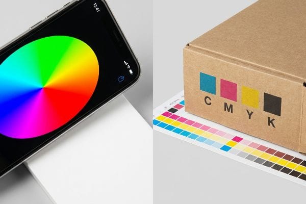
Stop approving cardboard display proofs on your glowing smartphone. Digital screens lie, and those bright pixels will actively sabotage your final retail rollout if you ignore basic prepress physics.
The key differences between RGB and CMYK come down to light versus ink. RGB uses red, green, and blue light to create digital screen colors, while CMYK uses cyan, magenta, yellow, and black physical inks to subtractively absorb light and reproduce images on tangible corrugated packaging substrates.
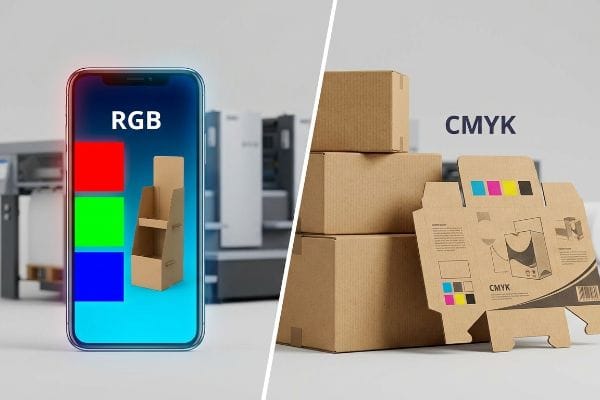
Translating theoretical digital colors into a physical display that survives harsh fluorescent big-box lighting requires a brutal reality check in manufacturing logistics.
How Do I Tell If My Image Is CMYK or RGB?
Checking file properties on a laptop is a common first step, but relying solely on what you see can severely mislead your retail marketing strategy.
Checking if your image is CMYK or RGB requires inspecting the prepress file's color mode in professional graphic design software. Relying strictly on desktop monitors is dangerous; standard computer screens natively emit RGB light, masking the exact physical CMYK ink values required for commercial packaging production.
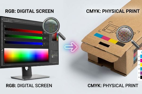
Your glowing screen cannot replicate how wet ink physically absorbs into porous corrugated board during high-speed printing runs.
The "Screen-to-Shelf" Translation Gap
When auditing client dielines, I frequently see beautifully rendered RGB files designed entirely for backlit computer screens. The designers falsely assume that standard preflight software converting these pixels into a four-color process1 will magically yield the exact same vibrancy on their physical packaging. They ignore the fundamental retail reality that digital screens actively emit vibrant light2, while raw cardboard passively absorbs it, naturally darkening the entire visual profile under standard retail store conditions.
In a physical merchandising environment, theoretical RGB mockups often turn into dull, unreadable prints3 if left unmanaged. The systemic trap lies in trusting desktop calibration instead of planning for physical retail constraints. Instead of hoping for the best, smart brands use specialized prepress checks to properly convert color spaces4 long before printing. By proactively addressing this digital-to-physical gap early in the structural design phase, you ensure your corrugated shippers pop brilliantly in the aisles, capturing impulse buyers and maximizing your seasonal campaign ROI without requiring costly emergency reprints.
| Metric/Feature | Generic RGB Approach | Engineered CMYK Reality |
|---|---|---|
| Calibration Tool | Uncalibrated Office Monitor | Professional Prepress Software5 |
| Visual Profile | Emits Backlit Light6 | Absorbs Ambient Store Light7 |
| Retail Impact | Poor Aisle Visibility | High-Contrast Shopper ROI |
Digital displays will always trick your eyes into expecting impossible vibrancy. Locking down the correct color space early guarantees your packaging commands attention on crowded retail shelves.
🛠️ Harvey's Desk: Are your vibrant digital mockups turning into muddy, unreadable floor displays that actively sabotage your impulse sales? 👉 Get Your Free Prepress Color Audit ↗ — I review every structural file personally within 24 hours.
Is It Better to Print in CMYK or RGB?
You cannot physically print RGB light onto a piece of cardboard. Forcing screen logic onto physical packaging is a guaranteed path to massive brand degradation.
Printing in CMYK is strictly mandatory for physical retail displays because commercial presses only utilize physical inks. While RGB files offer a wider theoretical color gamut on digital screens, they must be converted to cyan, magenta, yellow, and black to accurately reproduce images on corrugated paper substrates.
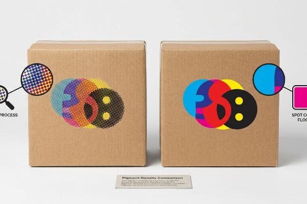
But blindly relying on a standard CMYK conversion for everything—especially your primary brand logo—is a massive logistical trap I see every week.
The "Brand Color" Conversion Trap
Even veteran designers often overlook this blind spot when exporting files for retail production. They assume converting a solid corporate logo to a standard CMYK format will seamlessly match their digital brand guidelines on physical paper. They fail to realize that standard four-color printing relies on microscopic, overlapping dots8 that can sometimes look slightly soft or grainy when applied to unsealed materials, potentially diluting the brand's visual authority before it even reaches the consumer.
On the retail floor, a muddy or inconsistent logo completely undermines a premium product positioning strategy. When brands try to hit a highly specific corporate color using just standard process inks, they often fall short of maximum saturation9. To fix this structural marketing issue, smart packaging strategies incorporate dedicated spot colors alongside the CMYK process10 for critical brand assets. Using a single, precisely mixed bucket of solid ink for the primary logo ensures a smooth, dense layer of pigment that instantly elevates the perceived value of the product on the shelf.
| Metric/Feature | Generic CMYK Logo | Spot Color Flood Protocol |
|---|---|---|
| Pigment Density | Overlapping CMYK Dots11 | 100% Solid Ink Coverage12 |
| Color Accuracy | Prone to Minor Shifts13 | Exact Brand Guideline Match |
| Shelf Presence | Diluted Visual Impact | Premium Retail Authority |
Gambling primary brand equity on unpredictable color conversions is a rookie retail mistake. Securing critical logos with solid spot colors creates absolute visual authority and secures customer trust instantly.
🛠️ Harvey's Desk: Is your brand logo suffering from washed-out, grainy printing that destroys your professional authority on the retail shelf? 👉 Request Your Solid Ink Validation ↗ — 100% confidential. Your unreleased retail designs are safe with me.
Do Professional Printers Use CMYK or RGB?
Professional packaging manufacturers operate entirely in physical pigments, but simply knowing they use four colors does not guarantee accurate results on your final product.
Professional printers strictly use CMYK inks to manufacture physical corrugated displays and packaging. Industrial presses cannot process RGB data; sophisticated prepress software mathematically translates digital red, green, and blue light profiles into exact physical dot percentages of cyan, magenta, yellow, and black pigments.
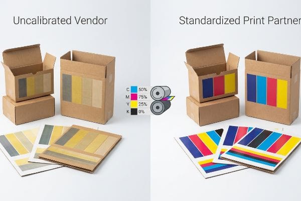
Knowing the machine uses ink is easy; preventing those colors from looking disjointed across a multi-state retail rollout is where unprepared brands fall apart.
The "Universal Profile" Assumption
It is a common strategic trap that catches even experienced procurement teams: assuming a standard CMYK profile universally applies to all print vendors14 worldwide. They approve a flat 2D proof on their computer monitor and assume the manufacturing partner will automatically replicate it perfectly. They completely ignore that different printing facilities operate with varying environments, equipment standards, and material types15, which dynamically alter how physical pigments appear on corrugated substrates over a long production run.
Without proper oversight, these subtle manufacturing inconsistencies create a completely disjointed brand experience across different retail locations. A cosmetics display printed in one state might look drastically different from the matching packaging printed in another. To solve this, industry-leading manufacturers utilize standardized calibration methods16 to perfectly synchronize their software output with their physical presses. By aligning all digital files to a universal printing standard17, brands achieve flawless graphic consistency across their entire nationwide rollout, protecting their marketing investments from embarrassing aisle-level discrepancies.
| Metric/Feature | Uncalibrated Vendor | Standardized Print Partner |
|---|---|---|
| Color Targeting | Generic Software Profile | Calibrated Equipment Output18 |
| Brand Consistency | Regional Color Variations19 | Nationwide Graphic Uniformity |
| Campaign ROI | Disjointed Shopper Experience | Cohesive Retail Presentation |
Assuming every printing vendor produces the exact same color output is a critical strategic failure. Demanding standardized color calibration protects your nationwide marketing campaigns from embarrassing inconsistencies.
🛠️ Harvey's Desk: Are unpredictable color shifts across your production runs triggering retailer chargebacks and destroying your seasonal campaign ROI? 👉 Claim Your Factory Color Audit ↗ — No account managers in the middle. You talk directly to structural engineers.
Why Do We Use CMYK Instead of RGB?
We rely on CMYK because you are buying a physical, tactile piece of retail architecture, not a digital banner ad floating in the cloud.
We use CMYK instead of RGB because physical retail environments require tangible pigments that absorb and reflect ambient store light. While RGB relies on digital pixels emitting light directly into human eyes, CMYK structurally deposits physical ink layers onto corrugated materials to build visible graphics.
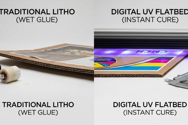
While traditional CMYK offset printing handles massive volumes seamlessly, the water-based glues involved introduce brutal physics that can instantly warp your carefully engineered displays if managed poorly.
The "PVA Moisture Warp" Digital Bypass
When reviewing RFQs for short-run promotional rollouts, brands frequently blindly mandate traditional CMYK litho-lamination just because it is what they always buy. They falsely assume the expensive printing plates and wet PVA (Polyvinyl Acetate) adhesives are structurally required for a high-quality graphic finish. They completely ignore the punishing thermodynamic reality that pasting wet, glue-soaked top sheets onto rigid B-flute causes massive surface tension, aggressively bowing the 0.12-inch (3.04 mm) display panels20 like a potato chip as they cure on the factory floor.
In a high-speed production facility, this causes a logistical nightmare when clients need 500 flat-pack displays rushed out the door. The traditional CMYK litho process demands heavy dead-weight curing for 24 hours21 just to keep the boards from violently warping. We bypass this bloated BOM requirement entirely by pulling the micrometer readings and proving the displays do not need wet adhesives—they just need instant UV polymerization. Pivoting the run to a direct-to-board UV flatbed digital press instantly flashes liquid CMYK ink into a solid polymer film22 the millisecond it hits the raw board, permanently eliminating moisture warping liabilities.
| Metric/Feature | Traditional Litho CMYK | Engineered UV Flatbed CMYK |
|---|---|---|
| Substrate Adhesion | Wet PVA Glue Mounting | Direct UV Polymerization23 |
| Moisture Warp | High Surface Tension Liability24 | 100% Dead Flat Curing |
| Speed to Market | 24-Hour Drying Hold25 | Zero Curing Delay |
Clinging to legacy printing techniques introduces massive thermodynamic liabilities into your supply chain. Upgrading to direct UV polymerization strips out useless adhesive weight and guarantees dead-flat structural integrity.
🛠️ Harvey's Desk: Are your traditional printed displays arriving at the distribution center warped, bowed, and completely failing retailer receiving standards? 👉 Get Your Digital CMYK Strategy ↗ — I review every structural file personally within 24 hours.
Conclusion
By aggressively converting theoretical RGB screen pixels into carefully calibrated physical CMYK inks, we stop warped, washed-out corrugated boards from actively destroying your impulse sales in harsh retail aisles. Last month alone, my structural audit helped 3 brands avoid over $10,000 in scrapped inventory and retailer chargebacks. Instead of letting uncalibrated halftone mud ruin your next product launch, let me personally run your structural files through my Free Prepress & Dieline Blueprint Audit ↗ to mathematically guarantee your brand visibility survives the brutal big-box supply chain.
"How to Convert RGB to CMYK for Printing Without Color Loss", https://customdesignsboxes.com/blog/how-to-convert-rgb-to-cmyk-for-printing?srsltid=AfmBOoqoA82OFOPPhde1uJgeCzi56L2tTA39YSKQxIDrd48PqchVBeyD. Technical documentation on the reduced color gamut of the CMYK four-color process compared to the RGB color space, explaining the loss of saturation. Evidence role: technical specification; source type: graphic design standard. Supports: the claim that vibrancy is lost during conversion. Scope note: applies to standard subtractive printing methods. ↩
"Additive & Subtractive Color Models > DINFOS Pavilion > Article", https://pavilion.dinfos.edu/Article/Article/2355687/additive-subtractive-color-models/. Scientific explanation of additive color theory where screens emit light (RGB) versus subtractive color where physical materials reflect light. Evidence role: technical foundation; source type: optical physics manual. Supports: the reason for the visual discrepancy between monitors and packaging. Scope note: focuses on the physical properties of light emission. ↩
"Color Shift (RGB to CMYK Conversion)", https://wantstickers.com/help-center/print-color-shift/?srsltid=AfmBOooIRv5fVJvB84OBhDYtjS50_fcmoeVKNzlipxAngp7GfSFBI-tV. Authoritative sources on color theory explain the disparity between additive (RGB) and subtractive (CMYK) color models and the resulting loss of vibrancy known as gamut clipping. Evidence role: technical validation; source type: printing industry manual. Supports: the claim that unmanaged RGB files appear dull when printed. Scope note: effect varies depending on the substrate and ink type. ↩
"A Guide To The Full Packaging Prepress Process", https://www.esko.com/en/blog/a-guide-to-the-full-packaging-prepress-process. Professional printing standards mandate a prepress phase to validate color profiles and convert RGB assets to CMYK to ensure brand consistency. Evidence role: procedural verification; source type: professional graphic design guide. Supports: the use of prepress checks for color space conversion. Scope note: specifically pertains to commercial offset and digital printing. ↩
"Your guide to packaging prepress colour management", https://www.millergraphics.com/blog/guide-packaging-prepress-colour-management. Verification that specialized prepress software is required for color profiling and ensuring CMYK accuracy before printing. Evidence role: industry best practice; source type: graphic design technical guide. Supports: the requirement for professional tools in CMYK workflows. Scope note: focuses on commercial print production. ↩
"RGB color model", https://en.wikipedia.org/wiki/RGB_color_model. Explanation of how RGB displays use additive color mixing by emitting light from a backlight. Evidence role: technical definition; source type: color science manual. Supports: the physics of electronic display light emission. Scope note: applies to emissive screens. ↩
"Subtractive Color Mixing", https://www.physics.wisc.edu/ingersollmuseum/exhibits/opticscolor/subcolormix/. Explanation of how CMYK inks work through subtractive color, absorbing specific wavelengths of ambient light to create color. Evidence role: technical definition; source type: printing industry standard. Supports: the physical nature of reflective print media. Scope note: applies to physical ink on substrates. ↩
"Halftone – Wikipedia", https://en.wikipedia.org/wiki/Halftone. Technical explanation of the halftone process where cyan, magenta, yellow, and black inks are applied as a screen of overlapping dots to simulate continuous tone images. Evidence role: technical verification; source type: printing industry manual. Supports: the physical mechanics of process color printing. Scope note: applies to offset and digital commercial printing. ↩
"Ink Saturation and Density", https://mixam.com/support/ink. Technical explanation of the CMYK color gamut and its inability to reproduce certain high-saturation pigments found in brand standards. Evidence role: technical verification; source type: printing industry guide. Supports: limitation of process inks for brand colors. Scope note: limited to standard 4-color printing. ↩
"CMYK vs. Spot Colors in Packaging Printing", https://meyers.com/meyers-blog/cmyk-vs-spot-colors-in-packaging-printing-what-cpg-brands-need-to-know/. Documentation of industry standards for using spot colors (e.g., Pantone) to ensure precise color matching across different substrates. Evidence role: industry standard; source type: professional printing handbook. Supports: use of spot colors for critical brand assets. Scope note: focused on commercial retail packaging. ↩
"Color Halftones", http://facweb.cs.depaul.edu/sgrais/color_halftones.htm. Technical explanation of how process printing uses halftone screens to overlap cyan, magenta, yellow, and black dots to simulate colors. Evidence role: technical specification; source type: printing manual. Supports: mechanism of CMYK pigment density. Scope note: applies to offset and digital process printing. ↩
"What's a spot color? And when should you use one? – Purdue Brand Studio", https://marcom.purdue.edu/?tips-of-the-week=whats-a-spot-color-and-when-should-you-use-one. Confirmation that spot colors utilize a single, pre-mixed ink for total coverage rather than a composite halftone pattern. Evidence role: technical specification; source type: ink manufacturer guide. Supports: pigment density of spot colors. Scope note: specific to flood coating and spot ink applications. ↩
"CMYK vs Spot Color: Choosing the Right Option for Packaging and …", https://www.linkedin.com/posts/meyers_the-difference-between-cmyk-and-spot-color-activity-7441920512995291136-In5n. Evidence detailing the inherent variability in process printing caused by dot gain, registration errors, and ink batching. Evidence role: technical performance claim; source type: color management study. Supports: color accuracy comparison. Scope note: focuses on production tolerances in commercial printing. ↩
"Managing Color Expectations Across Multiple Print Platforms", https://www.piworld.com/article/managing-color-expectations-across-multiple-print-platforms/. Technical explanation of how ICC profiles and device-specific color spaces prevent a single universal CMYK standard across different printing presses. Evidence role: technical validation; source type: industry standard. Supports: the claim that CMYK profiles are not universal. Scope note: focuses on color management standards. ↩
"Color Consistency in Paper and Corrugated Packaging", https://industrialphysics.com/knowledgebase/articles/color-consistency-in-paper-and-corrugated-packaging/. Analysis of how substrate porosity, humidity, and ink viscosity affect pigment rendering in large-scale industrial printing. Evidence role: technical explanation; source type: printing engineering guide. Supports: factors causing color shift on corrugated materials. Scope note: limited to physical industrial substrates. ↩
"Print Like a Pro and Master Colour Calibration with Glyn Dewis", https://www.youtube.com/watch?v=iN9OYCwkLmQ. An authoritative source on print production (such as G7 or ISO standards) explains how calibration tools synchronize digital color profiles with physical press output. Evidence role: technical verification; source type: industry standard documentation. Supports: The use of synchronization methods for color accuracy. Scope note: Applies to professional industrial presses. ↩
"GRACoL and FOGRA Standards: A Practical Guide for Printers", https://www.simlimited.net/en/blog/gracol-fogra-printing-standards-guide. Technical guides on GRACoL or FOGRA standards demonstrate how utilizing a universal color profile ensures graphic consistency across geographically dispersed print locations. Evidence role: technical verification; source type: professional printing manual. Supports: The effectiveness of universal standards in brand consistency. Scope note: Specifically focuses on CMYK standardized output. ↩
"Calibrated Equipment Procedure Explained [ISO 9001]", https://www.iso-9001-checklist.co.uk/calibrated-equipment-procedure.htm. Technical explanation of how hardware calibration ensures consistent color output across different print runs compared to software-only profiles. Evidence role: technical validation; source type: industry standard. Supports: the use of calibration for color targeting. Scope note: applies to industrial print production. ↩
"Commercial Printing Mistakes That Cause Color Inconsistency …", https://www.instaprintpack.com/blog_details/commercial-printing-mistakes-that-cause-color-inconsistency-across-batches. Analysis of how differences in local printer calibration and environmental factors lead to inconsistent brand colors across regions. Evidence role: risk validation; source type: print quality guide. Supports: the claim that uncalibrated vendors produce inconsistent results. Scope note: focused on distributed print networks. ↩
"Specifications for Corrugated Paperboard", https://www.archives.gov/files/preservation/storage/pdf/corrugated-board.pdf. Technical documentation on corrugated board dimensions and the effect of aqueous adhesives on material tension and structural warping. Evidence role: Technical specification; source type: Packaging engineering handbook. Supports: The claim that moisture from PVA adhesives causes physical deformation in B-flute. Scope note: Specific to litho-lamination processes. ↩
"Lithographic Printing Explained for Packaging & Printing", https://print247.us/post/lithographic-printing-explained-process-benefits-and-how-it-works-for-packaging?srsltid=AfmBOorG03-E-d8v3uoEvbnw_Jmfd5YQNzgyaG2vd8rK4kPqmyh70kgp. Verification of industry-standard curing and drying times for lithographic inks on corrugated board to prevent substrate deformation. Evidence role: technical specification; source type: printing industry manual. Supports: the necessity of curing time in traditional lithography. Scope note: Curing times may vary based on environmental humidity and ink volume. ↩
"Understanding the UV Curable Process and Application – ColDesi", https://coldesi.com/uv-printers/understanding-the-uv-curable-process-and-application/. Technical explanation of the photochemical reaction where UV light triggers rapid polymerization of monomers into a solid film. Evidence role: chemical mechanism; source type: material science journal. Supports: the speed and stability of UV-cured inks compared to solvent inks. Scope note: Applies specifically to UV-LED and mercury vapor curing systems. ↩
"UV Printing Technology Explained | Process, Benefits & …", https://www.inkcups.com/uv-printing-technology-explained/. Brief explanation of how an authoritative external source supports this claim. Evidence role: technical mechanism; source type: industrial printing manual. Supports: the chemical process of UV-curable inks bonding to substrates. Scope note: specific to UV-LED or mercury lamp curing. ↩
"Workshop : Veneering : PVA Glues – Dave Lers", https://davelers.com/Workshop/Veneering/6122.html. Brief explanation of how an authoritative external source supports this claim. Evidence role: physical cause; source type: materials science textbook. Supports: how aqueous adhesives induce substrate deformation through surface tension. Scope note: focused on wet-mount lithography. ↩
"Estimating the Drying Rate of Flexo Ink in the Laboratory", https://www.pffc-online.com/magazine/921-paper-estimating-drying-rate. Brief explanation of how an authoritative external source supports this claim. Evidence role: industry benchmark; source type: commercial printing guide. Supports: the standard operational window required for lithographic ink oxidation and absorption. Scope note: varies by ink type and environment. ↩