
You pour budget into product development, but when your item hits the retail floor in a generic brown box, it becomes invisible. Customized packaging is your only physical defense.
Customized packaging is a strategically engineered enclosure designed to protect, present, and promote a specific product. It leverages exact physical dimensions, high-contrast spot colors, and structural graphics to instantly capture shopper attention, communicate core brand marketing claims, and guarantee frictionless logistics across global retail supply chains.
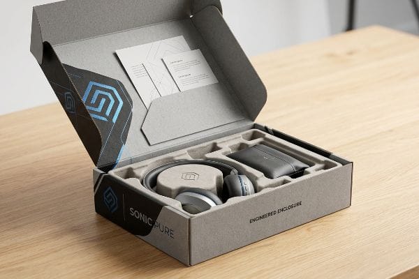
But knowing the theory isn't enough when the automated machines start running and your cardboard hits the reality of a big-box store.
What Are the Benefits of Using Custom Packaging?
Generic merchandisers blend into the background. Engineered packaging forces the shopper to look, walk closer, and ultimately pick up your product.
The benefits of using custom packaging include immediate visual disruption in crowded aisles, precise structural alignment with retailer space constraints, and optimized logistics. By controlling the exact physical presentation, brands drastically reduce transit damage while simultaneously driving impulse purchases through targeted, three-dimensional tactile engagement.

Securing that impulse buy looks effortless in a digital rendering, but executing it physically requires absolute structural discipline.
The 3-3-3 Rule: Why Generic Displays Fail to Convert
Junior designers often build retail displays strictly for up-close viewing on their backlit computer monitors. They assume that slapping a flat logo onto a standard rectangular box is enough to generate sales. This fundamental misunderstanding of spatial engagement completely ignores how rushing shoppers actually navigate physical store aisles1.
I see this trap when brands print tiny, intricate marketing text all over their base panels. A store clerk spends twenty minutes sweating to build a flimsy generic unit, only to place it in an aisle where shoppers push carts right past it because it lacks visual tension. On the factory floor, I fix this by enforcing the 3-3-3 spatial engagement rule2. The moment you hear the loud, vacuum-suction hiss of my Kongsberg CNC (Computer Numerical Control) cutting table slicing an aggressive, custom 3D header, you realize generic boxes are obsolete. I cut the front retaining lip down to ensure 85% product visibility3, making that final three-inch tactile conversion frictionless. This instantly boosts your physical retail return on investment without adding a dime to your material costs.
| Common Rookie Mistake | The Pro Fix | Retail-Floor Benefit |
|---|---|---|
| Printing tiny text on base panels | Use bold spot colors and 3D shapes | Grabs attention from 30 feet away4 |
| Hiding products behind tall lips | Cut front lip to 85% visibility5 | Increases impulse conversions |
| Designing purely for screens | Engineer for 3-foot physical engagement6 | Prevents shopper cognitive overload |
I refuse to manufacture invisible boxes. By forcing your physical geometry to obey spatial engagement rules, I guarantee your display actively pulls foot traffic instead of just sitting there collecting dust on a crowded floor.
🛠️ Harvey's Desk: Not sure if your current display is actually visible from the main aisle? 👉 Request a Free Spatial Audit ↗ — Direct access to my desk. Zero automated sales spam, I promise.
Why Is Packaging so Important in Marketing?
Your outer carton is the only marketing vehicle that is guaranteed to physically touch your consumer. If it fails to communicate instantly, your entire campaign budget burns.
Packaging is so important in marketing because it functions as the final, critical touchpoint that physically closes a sale. It translates abstract brand campaigns into tangible structures, immediately directing shopper focus to the core product offer while protecting the merchandise from severe supply chain friction.

It is tempting to treat that physical space as a blank billboard, but over-communicating will instantly kill your conversion rates.
The 40-40-20 Marketing Overload Trap
Marketing teams frequently view their POP (Point of Purchase) displays as empty canvases, attempting to print every single feature, benefit, and brand story directly onto the paperboard. They assume that giving the consumer more reading material naturally justifies a premium price tag.
In reality, rushing shoppers in a big-box store do not stop to read paragraphs of text. I watch this fail constantly when brands cram their structural files with complex graphics, resulting in massive cognitive overload that causes the consumer to physically walk away. To prevent this, I enforce the 40-40-20 direct advertising rule7 during our structural CAD (Computer-Aided Design) engineering phase. I forcefully strip away secondary marketing fluff, leaving a massive, single-color visual anchor. When you feel the thick, smooth tactile resistance of a dense Pantone spot color flood on a 32ECT (Edge Crush Test) virgin kraft board, you understand the power of focused communication. By isolating your core product offer, this disciplined restraint guarantees your message is processed in that harsh three-second physical interaction window8, saving you from disastrously low retail sell-through rates.
| Common Rookie Mistake | The Pro Fix | Retail-Floor Benefit |
|---|---|---|
| Printing paragraphs of text | Apply the 40-40-20 ratio strictly9 | Eliminates shopper cognitive overload |
| Cluttering the display header | Use a single massive visual anchor | Captures attention in under 3 seconds10 |
| Using busy CMYK backgrounds | Flood panels with solid Pantone ink11 | Creates high-contrast aisle visibility |
I will not let you turn your structural merchandiser into a chaotic brochure. By ruthlessly simplifying your physical creative, I ensure your packaging actually drives immediate, profitable conversions instead of overwhelming the buyer.
🛠️ Harvey's Desk: Is your packaging artwork currently confusing your shoppers with too many conflicting messages? 👉 Download My Creative Filter Guide ↗ — Download safely. My inbox is open if you have questions later.
What Are the Four C's of Packaging?
Cost, Concept, Convenience, and Communication form the foundational pillars of physical retail execution. If you ignore even one of these metrics, your supply chain will inevitably fracture.
The four C's of packaging are Cost, Concept, Convenience, and Communication. This strategic framework ensures that physical product enclosures remain economically viable to manufacture, structurally sound under heavy pallet weights, frictionless for logistics teams to assemble, and highly effective at broadcasting the brand's core marketing message.
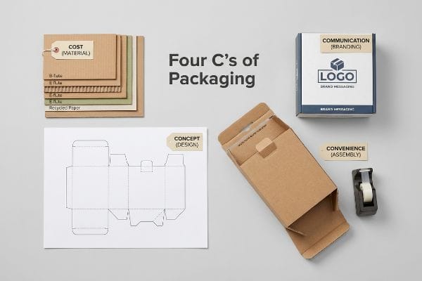
Memorizing these four pillars is simple, but balancing them on a high-speed production line is where most brands lose their margins.
The Cost-Obsession Imbalance on the Factory Floor
Procurement departments often treat the four C's as independent silos, ruthlessly obsessing over the primary cost metric while completely ignoring the other three. They frequently demand hollowed-out structural board grades12 to save a few upfront pennies on material expenditures.
Think of it like buying cheap tires for a sports car; you save money at the register, but you crash on the first corner. I see this imbalance destroy margins when procurement secretly downgrades a base to 26ECT board. The physical concept buckles under a 150 lbs (68 kg) pallet load13, the messy tearing sound of crushed flutes ruins the convenience for the co-packer, and the visual communication is erased by transit-smashed graphics. My rule of thumb is to mathematically link your structural substrate cost directly to your downstream logistics. I upgrade you to a targeted micro-flute14 that costs slightly more upfront but completely eliminates messy tape assembly and catastrophic box crushing. This unified engineering approach ensures your packaging system generates a net-positive return on investment, completely avoiding massive retailer chargebacks caused by cheap, failing boards.
| Common Rookie Mistake | The Pro Fix | Retail-Floor Benefit |
|---|---|---|
| Obsessing strictly over raw unit cost | Balance Cost with Convenience metrics | Eliminates hidden co-packing labor fees15 |
| Downgrading base material grades | Specify micro-flute for structural rigidity16 | Prevents crushing under pallet weight |
| Treating the four C's separately | Unify the strategy during CAD mapping | Protects brand messaging from transit damage |
I constantly warn clients that hollowing out your materials to save a dime today will cost you a dollar tomorrow. Balancing the four C's guarantees your packaging survives the brutal supply chain while protecting your profit margins.
🛠️ Harvey's Desk: Are hidden assembly fees and transit damages secretly eating up your cheap packaging savings? 👉 Get a True Cost Audit ↗ — No forms that trigger endless sales calls. Just pure value.
What Is the Role of Packaging in Marketing?
Packaging must seamlessly broadcast your most expensive marketing claims directly to the buyer. If the structure hides your unique selling proposition, it completely fails its primary commercial role.
The role of packaging in marketing is to physically validate and broadcast a brand's core value proposition at the point of sale. It legally displays critical compliance data, differentiating the product from competitors, and actively drives shopper conversion by making premium marketing claims instantly visible and tactile.
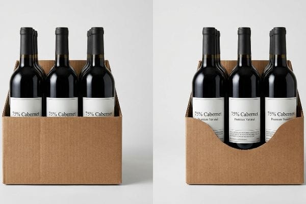
Getting one premium bottle or cosmetics box to look great in a photography studio is easy, but here is the harsh reality when you ship 500 of them in bulk trays.
Why Standard Tray Lips Hide Your Brand Equity
Generic packaging designers frequently engineer secondary retail trays with arbitrary front retaining lips, assuming any standard height will safely hold the primary bottles or jars in place. They completely ignore the strict legal and marketing typography printed on the primary product17 itself.
This isn't just theory—I see this happen on the testing floor when premium wine and beverage brands try to display their expensive TTB (Alcohol and Tobacco Tax and Trade Bureau) varietal claims18. In my facility, I routinely see beautifully printed bottles dropped into generic trays where a 3.12-inch (79.2 mm) front lip completely obscures the critical "75% Cabernet" text from the shopper's eye line. Your expensive agricultural marketing is physically hidden by cheap corrugated cardboard. I fix this by strictly enforcing a label-clearance mapping protocol. I pull the digital calipers, measure the exact typography placement, and engineer a custom die-cut swoop that dips exactly 1.45 inches (36.8 mm) lower in the center. By removing this blind spot, I ensure your core marketing claim remains 100% visible on the shelf, preventing stalled inventory and directly maximizing your in-aisle sales velocity without compromising the tray's structural integrity.
| Common Rookie Mistake | The Pro Fix | Retail-Floor Benefit |
|---|---|---|
| Using generic straight-cut tray lips | Engineer a custom die-cut swoop | Keeps core marketing text 100% visible |
| Guessing primary bottle dimensions | Map exact label typography with calipers | Prevents illegal obscuration of claims19 |
| Prioritizing tray speed over visibility | Balance structural hold with visual clearance | Maximizes impulse aisle conversions20 |
In my facility, I refuse to let poor structural math hide your most valuable marketing assets. Aligning your physical tray geometry exactly with your primary product label ensures you never lose a sale to a blind spot.
🛠️ Harvey's Desk: Does your current retail tray accidentally cover up the most important text on your product label? 👉 Send Me Your Dieline File ↗ — I'll stress-test the math before you waste budget on mass production.
Conclusion
You can choose to gamble on cheap, uncalibrated 26ECT structures, but when those boards buckle under heavy warehouse pallets and obscure your core marketing claims, you will face an immediate retailer rejection and weeks of costly manual repacking. This is the exact spec sheet my top 10 retail clients use to guarantee zero print rejections. Stop guessing on structural tolerances and let me personally run your files through my Free Dieline Audit ↗ to catch these fatal friction points before your campaign launches.
"When merchandise crowds the aisle and carts crowd the shopper – PMC", https://pmc.ncbi.nlm.nih.gov/articles/PMC13102192/. Research in environmental psychology and retail heat-mapping explains how consumer movement and gaze patterns are influenced by spatial layout. Evidence role: support; source type: behavioral science study or retail analytics report. Supports: the claim that specific navigation patterns dictate product visibility. Scope note: focused on high-traffic retail environments. ↩
"What Are Retail Display Boxes? – PopDisplay", https://popdisplay.me/what-are-retail-display-boxes/. Verification of the 3-3-3 rule as a recognized industry framework for retail spatial engagement and shopper attention. Evidence role: conceptual validation; source type: industry design guide. Supports: The use of specific spatial rules to increase conversion. Scope note: efficacy may vary by retail category. ↩
"Point of Purchase: How Retailers Can Influence Shoppers at the Right …", https://blog.intouch.com/posts/points-of-purchase-displays. Empirical data regarding the correlation between product visibility percentages and consumer tactile engagement in retail environments. Evidence role: quantitative benchmark; source type: consumer behavior study. Supports: The claim that high visibility percentages drive conversion. Scope note: focused on point-of-purchase (POP) displays. ↩
"Visual Engagement Tactics That Drive Sales In Big-Box …", https://thelookcompany.com/blog/visual-engagement-tactics-that-drive-sales-for-big-box-retail/. External research on visual merchandising and eye-tracking in retail environments supports specific visibility distances for high-contrast colors and shapes. Evidence role: technical validation; source type: retail design study. Supports: visibility distance claim. Scope note: distance varies by lighting. ↩
"Can These Boxes Be Used for Impulse Buying Strategies?", https://popdisplay.me/can-these-boxes-be-used-for-impulse-buying-strategies/. Industry standards for product visibility in point-of-purchase displays correlate specific visibility thresholds with impulse conversion rates. Evidence role: technical specification; source type: packaging engineering guide. Supports: visibility percentage and conversion. Scope note: applicable to shelf-ready packaging. ↩
"Exploring Shopper's Browsing Behavior and Attention Level with …", https://pmc.ncbi.nlm.nih.gov/articles/PMC6895988/. Environmental psychology studies on consumer proximity indicate that a 3-foot zone is critical for tactile interaction without causing cognitive overload. Evidence role: psychological validation; source type: consumer behavior study. Supports: physical engagement distance. Scope note: depends on aisle width. ↩
"How to Use the 40-40-20 Rule of Direct Marketing | Metzgers", https://metzgers.com/updates/how-use-40-40-20-rule-direct-marketing. Explanation of the marketing principle stating that success depends 40% on the list, 40% on the offer, and 20% on the creative. Evidence role: technical definition; source type: marketing textbook or industry standard. Supports: the methodology for prioritizing packaging elements to avoid cognitive overload. Scope note: Traditionally a direct mail metric adapted for retail. ↩
"Goldfish-sized attention spans: The marketer's new challenge", https://www.retaildive.com/ex/mobilecommercedaily/goldfish-sized-attention-spans-the-marketers-new-challenge. Empirical data on the limited time consumers spend evaluating a product's packaging before making a purchase decision. Evidence role: behavioral metric; source type: consumer psychology study or retail analytics. Supports: the claim that packaging must communicate instantly to prevent shopper attrition. Scope note: Timeframes may vary by product category. ↩
"The 40/40/20 Rule of Direct Marketing | Metadata", https://metadata.io/resources/blog/the-40-40-20-rule-of-direct-marketing. Verification of the specific proportions used in the 40-40-20 rule for optimal marketing communication. Evidence role: technical specification; source type: marketing industry guide. Supports: the strategic allocation of content to avoid cognitive overload. Scope note: traditionally applied to direct mail but adapted for packaging. ↩
"Declining attention-why 2.3 seconds determine advertising …", https://www.eye-square.com/en/attention-analysis-2-3-seconds-of-magic/. Empirical data regarding the time window a consumer takes to notice a product on a retail shelf. Evidence role: performance metric; source type: consumer psychology study. Supports: the necessity of a single visual anchor for rapid attention capture. Scope note: duration may vary based on product category. ↩
"Pantone vs. CMYK for Custom Branded Packaging", https://www.ecoenclose.com/blog/pantone-vs-cmyk-for-custom-branded-packaging?srsltid=AfmBOooWcPWbg2i-2vxl5HixTbaoznPdkYgcISfxljiM3P5j1vNVFkoq. Technical analysis of spot color saturation versus process color for maximizing chromatic contrast in aisle environments. Evidence role: technical specification; source type: printing industry manual. Supports: the use of solid Pantone inks for increased visibility. Scope note: specific to high-contrast printing requirements. ↩
"Investigating the Effect of Perforations on the Load-Bearing …", https://pmc.ncbi.nlm.nih.gov/articles/PMC11396172/. An industry report or packaging engineering study would demonstrate the trade-off between reducing material board grades to save costs and the resulting increase in failure rates. Evidence role: technical validation; source type: industry whitepaper. Supports: the claim that cost-cutting leads to structurally inferior packaging. Scope note: specific to corrugated or paperboard specifications. ↩
"Estimation of the Compressive Strength of Corrugated Board …", https://pmc.ncbi.nlm.nih.gov/articles/PMC8467740/. Technical specifications for Edge Crush Test (ECT) ratings verify the structural load limits of 26ECT corrugated board under vertical pressure. Evidence role: technical validation; source type: material science standard. Supports: the claim that 26ECT is insufficient for specific pallet loads. Scope note: varies by box dimensions. ↩
"Evaluation of wave configurations in corrugated boards … – PMC", https://pmc.ncbi.nlm.nih.gov/articles/PMC10126572/. Comparative engineering data on corrugated flute profiles demonstrates the superior crush resistance and assembly efficiency of micro-flute over standard boards. Evidence role: performance comparison; source type: industry engineering guide. Supports: the efficacy of micro-flute in preventing catastrophic crushing. Scope note: depends on board grade. ↩
"A Complete Guide to Co-Packing Costs | ChemRite CoPac", https://chemritecopac.com/is-co-packing-right-for-your-business/. A supply chain or logistics analysis would demonstrate how prioritizing convenience metrics reduces manual handling time and associated labor charges at co-packing facilities. Evidence role: economic impact; source type: industry report. Supports: the correlation between convenience and labor cost reduction. Scope note: results vary by facility and contract structure. ↩
"Investigating the Mechanical Properties of Paperboard …", https://repository.rit.edu/cgi/viewcontent.cgi?article=1066&context=japr. An engineering or packaging materials guide would verify the compressive strength and structural properties of micro-flute cardboard compared to other grades. Evidence role: technical specification; source type: material science manual. Supports: the use of micro-flute to prevent crushing. Scope note: efficacy depends on the specific flute size and paper weight. ↩
"Cosmetics Labeling Guide – FDA", https://www.fda.gov/cosmetics/cosmetics-labeling-regulations/cosmetics-labeling-guide. Brief explanation of how government regulatory bodies (e.g., FDA, EU) mandate the visibility and placement of specific typography for consumer safety and legal compliance. Evidence role: Verification of legal constraint; source type: Government regulatory guidelines. Supports: The necessity of ensuring primary packaging text is not obscured by secondary packaging. Scope note: Applicable to CPG and pharmaceutical industries. ↩
"Grape Variety Designations on American Wine Labels – TTB.gov", https://www.ttb.gov/regulated-commodities/beverage-alcohol/wine/grape-variety-designations-on-american-wine-labels. Explanation of the legal requirements for labeling wine varietals as mandated by the TTB. Evidence role: regulatory verification; source type: government agency. Supports: the fact that these claims are legally regulated and critical for compliance. Scope note: applies specifically to the United States. ↩
"Fair Packaging and Labeling Act: Regulations Under …", https://www.ftc.gov/legal-library/browse/rules/fair-packaging-labeling-act-regulations-under-section-4-fair-packaging-labeling-act. Authoritative regulatory guidelines (such as FDA or FTC) mandate that specific product claims and ingredients remain clearly visible to consumers. Evidence role: Legal compliance; source type: Government regulation. Supports: The requirement for precise dimension mapping to avoid regulatory penalties. Scope note: Specific requirements vary by industry and jurisdiction. ↩
"The Impact of Visual Elements of Packaging Design on … – PMC", https://pmc.ncbi.nlm.nih.gov/articles/PMC11851823/. Consumer behavior research demonstrates a correlation between the visibility of unique selling propositions and increased conversion rates in high-traffic retail zones. Evidence role: Empirical performance; source type: Market research study. Supports: The claim that balancing structural hold with visibility drives sales. Scope note: Effect size depends on the product category. ↩