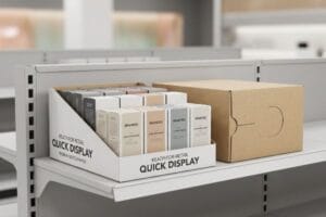
L'espace commercial coûte une fortune, et reléguer son produit sur une étagère standard, c'est le condamner à une mort lente. Il faut capter l'attention du consommateur au moment précis où il prend sa décision.
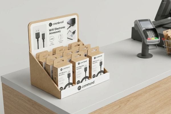
Les présentoirs PDQ sont particulièrement efficaces dans les zones à fort passage des commerces, comme les caisses, les têtes de gondole et les intersections d'allées principales. En occupant ces emplacements stratégiques, les marques incitent immédiatement aux achats impulsifs, optimisent la visibilité de leurs produits et tirent profit des précieuses dernières secondes avant que le client ne finalise son achat.
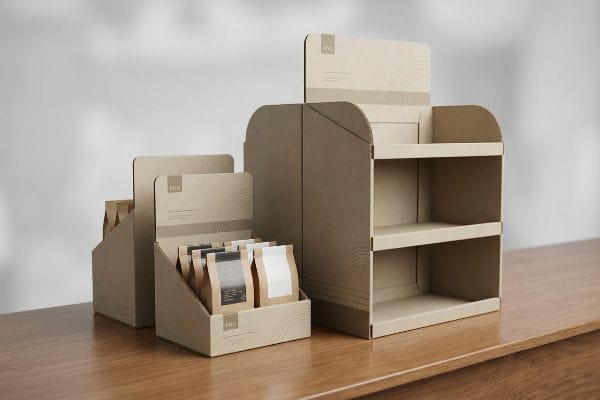
Obtenir cet emplacement immobilier de premier choix ne représente que la moitié du chemin ; le véritable défi consiste à s'assurer que la structure résiste effectivement à l'environnement commercial sans être démolie par le gérant du magasin.
Où se trouvent les présentoirs sur le lieu de vente ou les supports publicitaires sur le lieu de vente ?
Les consommateurs ne déambulent pas sans but ; ils suivent des schémas de circulation commerciale hautement sophistiqués, conçus pour maximiser leurs dépenses avant même d'arriver à la caisse.
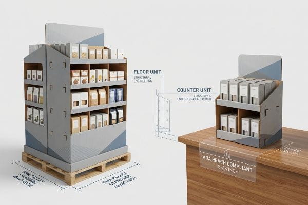
Les présentoirs sur le lieu de vente sont stratégiquement placés aux caisses, en tête de gondole et dans les zones de déchargement de palettes à fort passage. Les détaillants réservent ces emplacements précis afin de capter l'attention des clients en toute sécurité, sans enfreindre les règles strictes d'espacement des allées ni perturber la circulation des chariots.
Connaître ces zones est facile, mais concevoir un affichage qui s'y intègre légalement est là où la plupart des campagnes échouent.
Navigation dans les allées vs. Espace caisse
La plupart des responsables de marque partent du principe qu'il leur suffit de concevoir une belle structure de présentation et de l'adapter à l'emplacement souhaité par le gérant du magasin. Ils créent ainsi un présentoir imposant pour l'allée principale¹ et demandent simplement à leur fabricant de réduire de moitié ce même fichier pour l'installer près de la caisse² .
Cette stratégie de miniaturisation est un piège majeur qui entraîne un rejet immédiat de la part des détaillants. Dans le commerce de détail américain, les présentoirs de sol sont strictement conformes à la norme de palette GMA (Grocery Manufacturers Association) de 48 × 40 pouces (1219 × 1016 mm)pour le chargement dynamique des entrepôts. Or, dès qu'on s'approche d'une caisse, on entre dans le domaine de la conformité à l'ADA (Americans with Disabilities Act), qui impose une fenêtre d'accès avant de 15 à 48 pouces (381 à 1219 mm).Je constate constamment l'échec de cette approche. Un client tente de forcer un présentoir de sol réduit sur un comptoir de caisse, ignorant complètement son centre de gravité. J'ai vu une fois un vendeur essayer désespérément de faire tenir en équilibre un présentoir de sol surdimensionné et déséquilibré sur le rebord étroit d'une caisse, pour finalement le voir vaciller et basculer violemment en arrière. Pour remédier à cela, je sépare définitivement les chaînes de production : les présentoirs de sol sont liés à la logistique GMA, tandis que les présentoirs de comptoir sont mathématiquement liés aux ratios de portée ADA.
| Erreurs courantes des débutants | La solution pro | Avantage du magasin |
|---|---|---|
| Réduction des présentoirs de sol pour comptoirs | Ingénierie séparée des points de vente et des points de vente | Empêche le basculement vers le haut5 |
| Ignorer les limites de portée des magasins | Conception de fenêtres accessibles aux personnes handicapées6 | Garantit la conformité légale |
| Estimation des dimensions du sol | Ancrage aux empreintes de palettes GMA 7 | Garanties d'approbation des allées |
Je ne permets jamais à un client d'utiliser un modèle générique pour plusieurs zones commerciales. En adaptant précisément l'emprise au sol à la zone légale du détaillant, je garantis que le présentoir sera installé et non jeté.
🛠️ Le bureau de Harvey : Vous vous demandez si votre présentoir de comptoir respecte les limites de visibilité des détaillants ? 👉 Demandez une analyse spatiale ↗ — Accès direct à mon bureau. Zéro spam commercial automatisé, promis.
Qu'est-ce qu'un afficheur PDQ ?
La rapidité est la ressource la plus précieuse dans un magasin de détail très fréquenté.
Un présentoir PDQ est un présentoir léger, prêt à l'emploi, conçu pour un déploiement rapide sur les étagères ou les comptoirs de caisse des magasins. Signifiant « Pretty Darn Quick » (très rapide), ces présentoirs arrivent entièrement pré-assemblés ou pré-remplis, permettant aux employés de transférer instantanément le produit emballé directement du carton d'expédition au rayon.
Le concept paraît simple, mais c'est sur le terrain, lors de son exécution physique, que la définition de « rapide » est mise à rude épreuve.
La réalité « zéro frustration » des véritables PDQ
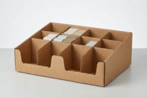
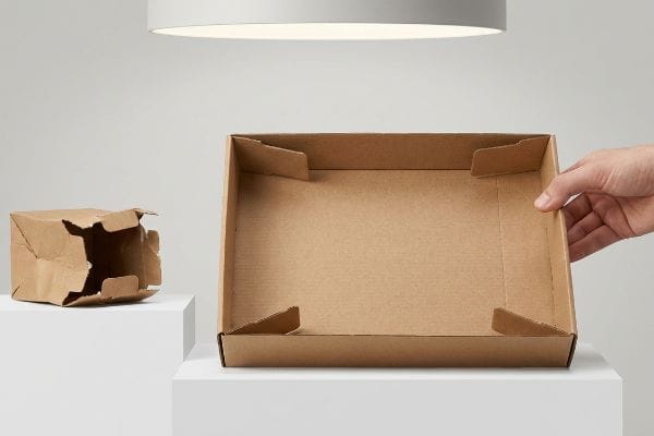
Les acheteurs utilisent souvent le terme PDQ (Pretty Darn Quick)8 pour décrire toute petite boîte de comptoir en carton ondulé, partant du principe que sa taille suffit à la rendre rapide à monter. De ce fait, ils approuvent des gabarits de découpe aux pliages complexes, façon origami, avec des languettes emboîtables et de multiples séparateurs, nécessitant un mode d'emploi rien que pour assembler le fond.
Les vendeurs détestent les pliages complexes. Si votre présentoir de comptoir met plus de 15 secondes à monter,ce n'est pas un présentoir de comptoir, c'est un handicap. J'ai vu des employés s'acharner pendant cinq minutes sur des languettes en papier avant de déchirer le carton brut, frustrés, et de recoller les coins avec du ruban adhésif transparent. L'image de marque est instantanément ruinée. Pour éviter cela, j'impose la norme « Zéro frustration » avec des plateaux modulaires pré-encollés. En appliquant l'adhésif directement dans mon usine, le présentoir est livré à plat mais se déplie instantanément en une boîte rigide dès que le vendeur tire sur les côtés. On entend littéralement le clic net et satisfaisant du système de verrouillage. Cela élimine le besoin de pliage manuel, réduit le temps de montage à trois secondeset garantit une image de marque toujours impeccable.
| Erreurs courantes des débutants | La solution pro | Avantage du magasin |
|---|---|---|
| languettes d'origami complexes | Plateaux modulaires pré-encollés en usine | S'ouvre en 3 secondes11 |
| cloisons internes amovibles | Structures de fond automatique intégrées12 | Empêche le produit de tomber |
| Se fier aux notices d'utilisation | Conceptions intuitives à verrouillage par tension13 | Élimine la frustration liée à l'assemblage |
Si un employé doit lire des instructions pour monter votre plateau, je considère cela comme un défaut de conception. Je conçois des solutions pour un déploiement instantané et infaillible afin de protéger votre présence en magasin.
🛠️ Harvey's Desk : Vos plateaux de comptoir sont-ils trop longs à assembler au sol ? 👉 Demandez une optimisation de la structure ↗ — Téléchargement sécurisé. Ma boîte de réception reste ouverte si vous avez des questions.
Comment les présentoirs attirent-ils les clients ?
Un design graphique brillant est totalement inutile s'il se trouve directement dans l'angle mort physique du consommateur.
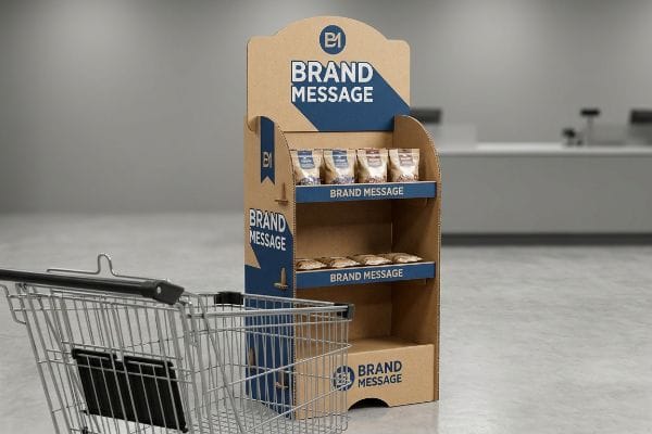
Les présentoirs attirent les clients en plaçant stratégiquement des messages de marque à fort contraste et les produits phares directement dans leur champ de vision. Grâce à des hauteurs ciblées, des formes découpées et incurvées et des bords transparents, ces présentoirs rompent la monotonie visuelle et interrompent le parcours machinalement du client pour susciter un intérêt immédiat.
Capter l'attention ne se résume pas à des couleurs vives ; c'est un jeu calculé de géométrie physique et d'ergonomie humaine.
Toucher la zone visuelle du consommateur
Les équipes marketing inexpérimentées traitent un présentoir de sol en carton ondulé comme un panneau d'affichage numérique plat, en y plaçant leurs visuels les plus chers et leurs logos principaux sur toute la partie inférieure. Elles supposent que les clients examinent l'ensemble de la structure de haut en basen poussant leur chariot dans l'allée.
Dans un magasin , les clients sont souvent comme aveugles; ils ne voient que ce qui se trouve juste devant eux. Placer votre visuel le plus important en bas, c'est comme enterrer votre logo. Je dois constamment corriger les visuels de mes clients qui placent des messages clés à 50 cm du sol. Quand on se place à côté de la maquette dans ma salle de test, on constate immédiatement que les chariots métalliques standards masquent complètement la moitié inférieure du présentoir. Je déplace donc automatiquement tous les messages principaux vers le haut, dans la « zone de concentration optimale » – précisément entre 1270 et 1371 mm du sol. En imposant cet alignement vertical, votre offre principale atteint le client à hauteur des yeux, captant son attention pendant les 3 secondes cruciales avant qu'il ne passe son chemin.
| Erreurs courantes des débutants | La solution pro | Avantage du magasin |
|---|---|---|
| Logos sur la base inférieure | Déplacer l'art vers la zone de frappe de 54 pouces17 | Contourne l'obstruction du chariot d'achat |
| En-têtes plats et rectangulaires | Ajout de formes supérieures incurvées et découpées à l'emporte-pièce | Rompt la monotonie visuelle des allées |
| lèvres avant hautes | Lèvres abaissées pour une visibilité de 85 %18 | Présente les produits réels |
Je refuse que les marques gaspillent leur budget d'impression sur du carton que personne ne voit. Mettre en valeur son message à la bonne hauteur est le moyen le plus rapide de booster les ventes impulsives.
🛠️ Le bureau d'Harvey : Votre mise en page actuelle masque-t-elle involontairement vos meilleurs atouts derrière un panier d'achat ? 👉 Demandez votre audit de gabarit ↗ — Pas de formulaires interminables qui vous incitent à passer des heures au démarchage. Uniquement de la valeur ajoutée.
Quels sont les quatre éléments les plus importants dans une machine virtuelle ?
Le merchandising visuel (VM) détermine la façon dont votre marque est perçue, en s'appuyant sur la couleur, la structure, l'emplacement et l'éclairage pour stimuler les conversions en magasin.
Les quatre éléments clés du merchandising visuel sont un contraste de couleurs saisissant, une structure solide, un placement stratégique des produits et un éclairage optimisé. Correctement appliqués en point de vente, ces principes contribuent à influencer le comportement du consommateur, à renforcer la valeur de la marque et à garantir la résistance aux aléas du commerce de détail.
Mais la connaissance de la théorie visuelle ne suffit pas lorsque les presses à imprimer se mettent en marche, surtout lorsqu'il s'agit de transposer des couleurs numériques parfaites sur du carton brut.
Pourquoi l'impression en processus standard échoue-t-elle en usine ?
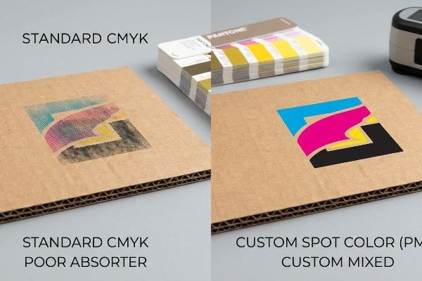
Les agences de marques soumettent généralement leurs illustrations d'affichage au format CMJN standard (Cyan, Magenta, Jaune, Noir), en supposant que l'impression en quadrichromie correspondra parfaitement aux couleurs vives qu'elles voient sur leurs écrans numériques rétroéclairés19.Elles s'attendent à ce que l'élément de merchandising visuel de la couleur se traduise automatiquement et parfaitement sur un présentoir de sol robuste20, tout comme sur la couverture glacée d'un magazine.
Il ne s'agit pas que de théorie : je le constate en test lorsque de magnifiques fichiers numériques sont imprimés sur papier ondulé. L'impression quadrichromique standard repose sur de minuscules points de trame qui se chevauchent. Lorsque ces points sont absorbés de manière inégale par les fibres du papier brut<sup>21</sup>, le mélange optique est complètement raté. Je retire une feuille de test de la presse offset et, au lieu d'un logo éclatant, je découvre un résultat granuleux, délavé et brouillé, car l'encre a pénétré physiquement dans les pores du papier. Pour y remédier, je supprime complètement le mélange CMJN standard pour les éléments principaux de la marque et j'applique un protocole strict d'encrage en tons directs. Je prépare une encre PMS (Pantone Matching System) très spécifique et opaque que j'applique sur tout le support. Ce traitement physique élimine totalement le grain des points. En imposant cette densité de pigment uniforme, je garantis une netteté optimale à l'identité visuelle de la marque, évitant ainsi une faible présence visuelle qui pourrait entraîner une baisse de 15 % du chiffre d'affaires prévisionnel de la campagne<sup>22</sup>.
| Erreurs courantes des débutants | La solution pro | Avantage du magasin |
|---|---|---|
| Impression CMJN pour les logos principaux | Inondation de couleur PMS Spot23 | Élimine les images de marque floues et granuleuses |
| S'appuyer sur des épreuves numériques | balayage du spectrophotomètre physique24 | Garantit une couleur fidèle à la réalité en magasin |
| Art sombre sur testliner brut | Appliquer d'abord une sous-couche blanche25 | Redonne de l'éclat aux lumières des magasins |
Dans mon atelier, je veille à ce que la théorie numérique ne compromette pas le lancement d'un produit physique. Je conçois la chimie de l'encre en fonction des fibres du papier, garantissant ainsi une présence visuelle optimale de votre marque en rayon.
🛠️ Le bureau d'Harvey : Savez-vous si votre graphiste a utilisé des points de quadrichromie ou des aplats de couleur pour votre logo principal ? 👉 Envoyez-moi votre fichier de découpe ↗ — Je vérifierai les calculs avant que vous n'investissiez dans une production en série.
Conclusion
Vous pouvez choisir un imprimeur qui reproduit aveuglément vos fichiers numériques, mais lorsque ces logos CMJN flous et granuleux arrivent en magasin, cela nuit gravement à l'image de votre marque, ralentit les achats impulsifs d'environ 20 % et compromet totalement le retour sur investissement de votre campagne. Plus de 500 responsables de marque utilisent ma checklist prépresse pour éviter précisément ces erreurs fatales en début de production. Ne vous demandez plus comment vos couleurs réagiront chimiquement au contact du papier brut : laissez-moi analyser personnellement vos fichiers grâce à mon Audit de découpe gratuit ↗ afin de détecter ces imperfections mécaniques invisibles avant le lancement de la production.
« Glossaire du merchandising en point de vente. – Premium Retail Services », https://premiumretail.com/retail-merchandising-glossary/ . [Les guides de référence en matière d'agencement de points de vente précisent que les allées principales à fort trafic sont des emplacements privilégiés pour les présentoirs de grande taille afin d'optimiser la visibilité des marques]. Rôle de la preuve : argument factuel ; type de source : manuel sectoriel. Apport : placement de grands supports PLV. Note relative à la portée : applicable aux grandes surfaces.
« Panneaux de vente sur le lieu de vente (PLV) : fonctionnement et impact sur le commerce de détail… », https://www.optisigns.com/post/point-of-purchase-pop-display-how-they-work-their-retail-impact. [Des études en psychologie du consommateur et en design de points de vente identifient la caisse comme la zone optimale pour les achats impulsifs]. Type de preuve : données factuelles ; type de source : étude scientifique. Éléments pris en compte : placement de petits panneaux PLV. Portée : environnements de vente au détail en général .
« Palettes GMA 48×40 » | Premier fabricant et fournisseur de palettes », https://www.palletone.com/products/gma-pallets/ . [Un manuel de logistique ou la documentation officielle de GMA confirme que 48×40 pouces est la dimension standard pour le chargement dans les entrepôts de vente au détail en Amérique du Nord ]. Preuve : spécification technique ; source : norme industrielle. Utilise : dimensions de référence pour l’affichage en magasin. Portée : marché de la vente au détail nord-américain uniquement.
« Chapitre 3 : Parties manipulables – Access-Board.gov », https://www.access-board.gov/ada/guides/chapter-3-operable-parts/ . [Les normes officielles de l’ADA relatives à la conception accessible précisent les portées maximales et minimales requises pour l’accessibilité aux comptoirs]. Rôle de la preuve : exigence légale ; type de source : réglementation gouvernementale. Appui : contraintes de conception des comptoirs de point de vente. Note de portée : concerne les lois américaines sur l’accessibilité.
« AG 1091A : Présentoirs de marchandises en zone frontale », https://www.seattle.gov/transportation/permits-and-services/permits/applicant-guides/ag-1091a. [Les directives de sécurité industrielle pour les agencements de vente au détail définissent les rapports base/hauteur requis pour prévenir les risques de basculement dans les zones à forte fréquentation]. Rôle de la preuve : Vérification de la sécurité ; type de source : Manuel de sécurité industrielle. Appui : Avantage structurel d’une conception distincte pour les présentoirs de point de vente (PLV) et les présentoirs publicitaires sur le lieu de vente (PDV). Note sur la portée : S’applique aux présentoirs de vente au détail autoportants .
« Normes d’accessibilité de l’ADA – Access-Board.gov », https://www.access-board.gov/ada/. [Les normes d’accessibilité de l’ADA, qui font autorité, définissent les hauteurs et profondeurs requises pour que le public puisse les atteindre et garantir ainsi l’accessibilité aux personnes handicapées]. Rôle de la preuve : Vérification réglementaire ; type de source : Loi/directive fédérale. Apport : Conformité légale des présentoirs en magasin. Remarque sur la portée : Concerne spécifiquement les normes américaines de l’ADA .
« Qu’est-ce qu’une palette GMA ? | La palette standard pour les chaînes d’approvisionnement américaines », https://www.olyforest.com/pallet-industry-news-blog/gma-pallet. [La Grocery Manufacturers Association (GMA) établit les dimensions standard des palettes utilisées par les détaillants pour déterminer l’encombrement autorisé des présentoirs dans les allées]. Rôle de la preuve : Vérification d’une norme industrielle ; type de source : Spécification d’une association professionnelle. Apport : Approbation des présentoirs sur palettes en allée. Note de portée : Norme principale pour la logistique nord-américaine .
« Qu'est-ce qu'un présentoir PDQ en carton ? | Utilisation et avantages », https://www.creativedisplaysnow.com/pdq-displays-lightning-quick-displays/. [Une source faisant autorité dans le secteur de l'emballage de détail confirme que l'acronyme PDQ signifie « Pretty Darn Quick » (très rapide) et décrit son objectif : un déploiement rapide]. Niveau de preuve : définition ; type de source : glossaire sectoriel. Appui : Définition du PDQ. Note de portée : Spécifique au merchandising de détail .
« Présentoirs PDQ : Tendances et avantages des emballages de vente au détail », https://www.xsjpackaging.com/news/industry-news/the-future-of-retail-packaging-how-pdq-display-boxes-are-revolutionizing-the-industry.html. [Les normes industrielles relatives aux emballages prêts à la vente spécifient le temps de préparation maximal acceptable pour qu'un présentoir soit considéré comme un présentoir PDQ]. Rôle de la preuve : référence technique ; type de source : norme industrielle. Contribue à : l'efficacité des présentoirs PDQ. Remarque : les seuils de temps peuvent varier selon le détaillant .
« Analyse des systèmes de travail du traitement stérile : assemblage – PubMed », https://pubmed.ncbi.nlm.nih.gov/33077512/ . [Les spécifications techniques des présentoirs pré-encollés pour la vente au détail démontrent des réductions significatives du temps de préparation par rapport aux méthodes de pliage manuel]. Type de preuve : indicateur de performance ; type de source : spécification du fabricant. Sujet : Efficacité des plateaux modulaires. Remarque: S’applique à des modèles spécifiques de boîtes rigides à ouverture par pression.
« Guide complet des présentoirs PDQ : définitions, types, conceptions… », https://www.hedarack.com/blogs-detail/pdq-display. [Les indicateurs de performance du secteur en matière d’efficacité des emballages de vente au détail permettraient de vérifier la rapidité de déploiement des plateaux modulaires pré-encollés par rapport à l’assemblage manuel]. Preuve : validation quantitative ; type de source : livre blanc sectoriel. Contribue à : la rapidité de déploiement en point de vente. Remarque : le délai varie selon les dimensions du présentoir .
« Types, utilisations et production des boîtes en carton ondulé – Répertoire IQS », https://www.iqsdirectory.com/articles/corrugated-boxes.html . [Les manuels d'ingénierie d'emballage définissent les structures de fond automatique et leur rôle dans la prévention des défaillances du fond et des chutes de produits]. Rôle de la preuve : spécification technique ; type de source : manuel d'ingénierie. Supports : intégrité structurelle des présentoirs de présentation. Note de portée : s'applique principalement aux présentoirs en carton ondulé.
« Principes de conception des supports de charge pour les présentoirs PLV en carton ondulé… », https://brownpackaging.com/load-bearing-design-principles-for-corrugated-pop-displays/ . [Les normes de conception d'emballage expliquent comment les mécanismes de verrouillage par tension facilitent l'assemblage sans nécessiter de notice écrite]. Niveau de preuve : principe de conception ; type de source : guide de conception d' emballage. Avantages : réduction des difficultés d'assemblage. Remarque : l'efficacité dépend de l'épaisseur du matériau.
« Utiliser les données d’oculométrie dans les études de terrain en vente au détail : un guide pratique », https://www.sciencedirect.com/science/article/pii/S002243592400006X. [Des études empiriques d’oculométrie en milieu commercial démontrent que le regard des consommateurs se concentre sur une « zone d’attention » spécifique et ignore fréquemment les parties inférieures des présentoirs au sol]. Rôle de la preuve : corroboration d’une affirmation factuelle ; type de source : étude du comportement du consommateur. Appuie : l’idée que le balayage visuel complet de la structure est une idée fausse. Remarque : les résultats peuvent varier en fonction de la taille du produit et des caractéristiques démographiques des consommateurs .
« [PDF] Directives pour les magasins d'alimentation au détail – Ergonomie pour… – OSHA », https://www.osha.gov/sites/default/files/publications/OSHA3192.pdf. [Les normes sectorielles en matière d'ergonomie et de merchandising visuel dans le commerce de détail définissent la hauteur optimale des yeux pour le client adulte moyen]. Niveau de preuve : spécification technique ; type de source : manuel de conception de points de vente. Appui : alignement vertical stratégique de la communication. Remarque : les mesures peuvent varier en fonction de la taille des groupes démographiques cibles .
« Exploration du comportement de navigation et du niveau d'attention des consommateurs avec… », https://pmc.ncbi.nlm.nih.gov/articles/PMC6895988/ . [Cette étude de psychologie du consommateur sur l'attention visuelle dans les environnements de vente au détail à fort trafic quantifie le court laps de temps dont dispose une marque pour interrompre le parcours d'un consommateur]. Type de preuve : indicateur comportemental ; type de source : étude de marché. Conclusion : nécessité d'une interaction visuelle immédiate. Précision: étude axée sur les achats impulsifs.
« Chapitre 2 : Choisir la hauteur d’affichage adaptée à vos clients », https://www.creativedisplaysnow.com/guides/understanding-the-retail-customer/chapter-2-how-to-choose-the-right-display-height-for-your-customers/. [Un manuel de conception de points de vente standard confirme que 54 pouces (137 cm) représente la hauteur de regard idéale pour les consommateurs adultes]. Type de preuve : spécification technique ; source : guide de conception de points de vente. Éléments à prendre en compte : hauteur optimale de placement des éléments graphiques. Remarque : Applicable aux consommateurs adultes en moyenne .
« Comment améliorer la visibilité des produits en point de vente grâce aux présentoirs », https://www.industrialpackaging.com/blog/increased-retail-visibility . [Une source de référence en merchandising fournirait des données sur la corrélation entre la hauteur du rebord du présentoir et le pourcentage de visibilité du produit pour le client]. Rôle de la preuve : indicateur de performance ; type de source : étude de merchandising. Objectif : optimisation de la visibilité des produits. Remarque : variable selon les dimensions des références.
« CMJN vs RVB : Guide d’achat des systèmes de couleurs pour l’impression commerciale », https://www.conquestgraphics.com/blog/conquest-graphics/2019/05/14/cmyk-vs-rgb-the-commercial-print-buyers-guide-to-color-systems?srsltid=AfmBOopCAxG452fZCQx_kGV1IWPbvJEU03sguE9oTDLLRXTqzRRInpkl . [Les manuels techniques de gestion des couleurs expliquent que l’espace colorimétrique additif RVB utilisé par les écrans est nettement plus étendu que l’espace soustractif CMJN utilisé en impression, ce qui entraîne une perte de vivacité]. Type de preuve : explication technique ; source : manuel de conception. Sujet : différence entre les couleurs numériques et imprimées. Remarque : concerne l’impression en quadrichromie.
« L’effet des propriétés du support sur les attributs d’impression pour… », https://scholarworks.wmich.edu/dissertations/823/?utm_source=scholarworks.wmich.edu%2Fdissertations%2F823&utm_medium=PDF&utm_campaign=PDFCoverPages. [Les normes de l’industrie de l’imprimerie documentent comment l’absorption du support et la finition de surface, comme la différence entre le carton ondulé et le papier glacé, modifient le rendu des couleurs final]. Rôle de la preuve : explication technique ; type de source : norme de l’industrie de l’imprimerie. Affirme : le manque d’homogénéité des couleurs sur différents matériaux. Note de portée : Spécifique aux variations de couleur dues au support .
« Adéquation des substrats à base de papier pour l’électronique imprimée – PMC », https://pmc.ncbi.nlm.nih.gov/articles/PMC8839088/. [La documentation technique sur l’interaction encre-substrat explique comment la porosité des fibres ondulées brutes provoque une absorption d’encre et un gain de point irréguliers, compromettant l’intégrité des trames]. Rôle de la preuve : mécanisme technique ; type de source : manuel technique d’impression. Appui : la défaillance mécanique du CMJN sur carton poreux. Note de portée : se concentre sur les matériaux ondulés non couchés .
« Quel est le lien entre le merchandising visuel et les conversions en ligne ? », https://twikit.com/what-is-the-relationship-between-visual-merchandising-and-online-conversion-rates/. [Des études de marché et d'analyse du commerce de détail quantifient la corrélation entre une présentation de marque de haute qualité et les taux de conversion des consommateurs, confirmant ainsi qu'une mauvaise exécution visuelle entraîne des pertes de revenus importantes]. Type de preuve : impact quantitatif ; source : rapport sectoriel. Constat : le risque financier lié à un merchandising visuel de faible qualité. Remarque : les pourcentages varient selon les secteurs du commerce de détail .
« PMS vs CMJN pour l'emballage : lequel est le meilleur ? », https://pax.solutions/corrugated-packaging/pms-vs-cmyk-for-packaging/. [Un guide d'impression de référence expliquerait comment les couleurs du Pantone Matching System (PMS) offrent une saturation précise et homogène, évitant ainsi l'effet de pointillé inhérent à l'impression quadrichromique (CMJN)]. Rôle de la preuve : validation technique ; type de source : norme de l'industrie de l'imprimerie. Appui : l'avantage des couleurs d'accompagnement par rapport aux couleurs quadri pour les logos. Note sur le champ d'application : applicable à l'impression offset et flexographique professionnelle .
« Comparaison des mesures numériques et spectrophotométriques de… », https://pubmed.ncbi.nlm.nih.gov/16512889/ . [La littérature scientifique sur la couleur démontre que les spectrophotomètres mesurent la distribution spectrale réelle d'une couleur, fournissant une mesure objective que les épreuves RVB des écrans numériques ne peuvent reproduire]. Rôle de la preuve : validation technique ; type de source : recherche colorimétrique. Appuie : l'affirmation selon laquelle la numérisation physique garantit des couleurs fidèles à la réalité. Remarque : nécessite un matériel calibré.
« Comment sérigraphier en CMJN sur une sous-couche blanche… – YouTube », https://www.youtube.com/watch?v=7StH-rP2DVI . [Les spécifications des matériaux d'emballage expliquent qu'une sous-couche blanche empêche l'absorption de l'encre par le support brun poreux, créant ainsi une couche réfléchissante qui rehausse l'éclat des couleurs]. Rôle de la preuve : validation technique ; type de source : manuel d'ingénierie des supports. Justifie : la nécessité d'une sous-couche pour une meilleure intensité des couleurs sur les supports recyclés. Remarque : Spécifique aux supports poreux non blancs.