Les marges des marques diminuent lorsque les couleurs des emballages en magasin passent de couleurs éclatantes sur les écrans à des teintes ternes en rayon. Si un présentoir paraît délavé sous un éclairage intense, les consommateurs passeront leur chemin.
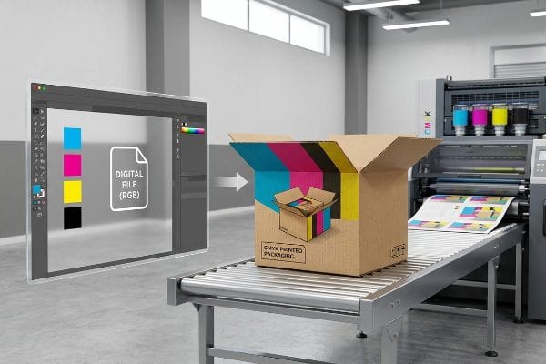
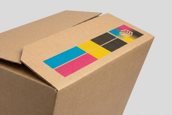
L'importance du CMJN réside dans sa capacité à mélanger directement les encres cyan, magenta, jaune et noire sur les supports d'emballage bruts. Ce modèle de synthèse soustractive garantit la vivacité des graphismes sur les présentoirs de vente au détail, contrairement aux formats numériques basés sur la lumière qui ne peuvent être reproduits sur les presses d'impression physiques.
Comprendre ces bases fondamentales de l'impression n'est que le début ; la véritable bataille logistique se déroule à l'usine, où les conceptions graphiques numériques se heurtent à la physique brutale du carton ondulé et de la lithographie automatisée.
Pourquoi le CMJN est-il important pour l'impression ?
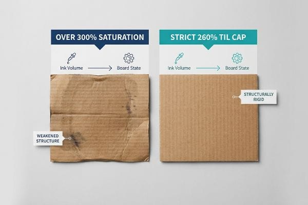
Lorsque les concepteurs repoussent aveuglément les limites de saturation de l'encre, la chimie humide qui en résulte détruit physiquement l'intégrité structurelle du carton avant même que le carton principal ne soit expédié.
Le procédé CMJN est essentiel en impression car il détermine le volume précis d'encre liquide déposée sur le support. La maîtrise de ce procédé quadrichromique évite la saturation excessive du matériau, garantissant ainsi que les fibres du papier ondulé restent sèches et suffisamment résistantes pour supporter le transport international et les charges importantes liées à la vente au détail.
Le mélange théorique des couleurs sur un écran d'ordinateur ignore complètement la manière dont les pigments chimiques liquides interagissent physiquement avec les fibres de papier poreuses sous la pression de fabrication à grande vitesse.
La menace structurelle de 260 % TIL
Même les graphistes les plus expérimentés négligent souvent ce point faible en surchargeant leurs fichiers d'emballage de noirs profonds et de fonds éclatants, du plus bel effet sur les écrans numériques. Ils partent du principe qu'un profil d'impression CMJN (Cyan, Magenta, Jaune, Noir) standard est universel et compatible avec tous les supports. Or, chaque point de pourcentage de couleur correspond à un volume d'encre réel qui entre en contact avec le carton. Lorsque la densité d'encre totale dépasse le seuil de résistance mécanique du support¹,les fibres du papier sont physiquement saturées, ce qui réduit considérablement la capacité de charge de l'ensemble de l'emballage.
Dans mon atelier, je constate régulièrement que les fichiers de prépresse présentent une couverture d'encre totale de 300 % ou plus. Lors des mesures effectuées en production, ce volume excessif d'encre empêche son séchage correct, provoquant d'importants décalages et bavures lors de la découpe automatisée et compromettant la résistance de base du carton ondulé (test de compression des bords 32ECT) . Pour éviter ce problème, j'applique une limite stricte de 260 % de couverture d'encre totale , intégrée au profil mathématique de notre logiciel RIP (processeur d'images raster). Cette courbe de réduction précise élimine l'excès d'encre dangereux sans sacrifier la densité visuelle. En appliquant cette limite de prépresse, je garantis la rigidité parfaite des feuilles de carton ondulé pour un pliage automatisé sans frottement, évitant ainsi les retouches manuelles fastidieuses et permettant à mes clients d'économiser environ 15 % sur les coûts de rebut de matériaux lors des lancements saisonniers critiques en magasin .
| Métrique | Impression générique | CMJN technique |
|---|---|---|
| Volume d'encre | > Limite de saturation de 300 %4 | Plafond strict de 260 %5 |
| État du conseil | Saturé et faible | Sec et structurellement rigide |
| Retour sur investissement de la production | Retards dus au blocage des machines | Découpe à grande vitesse sans frottement |
Je refuse qu'un mélange de couleurs numériques approximatif compromette la résistance des écrans. En limitant mathématiquement le volume d'encre avant même la gravure des plaques, mes écrans résistent au transport maritime en double empilement sans aucune dégradation structurelle.
🛠️ Le bureau d'Harvey : Vos fonds noirs profonds transforment-ils insidieusement vos présentoirs en amas informes et impossibles à plier sur la chaîne de montage ? 👉 Obtenez un audit gratuit de votre consommation d'encre prépresse ↗ — J'examine personnellement chaque fichier de présentation sous 24 h.
Les imprimeurs professionnels utilisent-ils le CMJN ou le RVB ?
Les machines d'impression commerciales utilisent un langage mathématique très spécifique, et l'envoi d'un format de couleur visuel incorrect entraîne la destruction active du produit final par les équipements automatisés.
Les imprimeurs professionnels utilisent exclusivement le CMJN pour la production d'emballages physiques destinés à la vente au détail, rejetant totalement les formats RVB numériques. Alors que le RVB repose sur l'émission de lumière pour les écrans d'ordinateur, le procédé soustractif CMJN détermine la façon dont les pigments liquides se combinent physiquement sur le carton pour reproduire fidèlement les couleurs de la marque lors des tirages lithographiques à grande vitesse.
Mais au-delà du simple mélange de couleurs esthétiques de marques, le véritable danger logistique survient lorsque les graphistes confondent les traits d'encre visuels avec des commandes mécaniques de machines.
Le piège des outils vectoriels CMJN
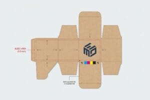
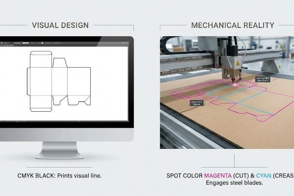
C’est un piège courant qui atteint même les équipes d’approvisionnement les plus expérimentées : elles reçoivent un fichier graphique de haute qualité où le concepteur a tracé les lignes de découpe et de pliage physiques à l’aide d’un trait noir CMJN standard. Elles supposent que l’équipement de fabrication séparera automatiquement et intelligemment le dessin du tracé structurel. Or, les tables de découpe automatisées et les graveuses laser pour plaques à découper ne lisent pas les lignes visuelles quadrichromiques standard ; elles nécessitent des couleurs d’accompagnement absolues associées à des tracés vectoriels précis⁶.Lorsqu’un fichier utilise du noir pour les repères structurels, le logiciel automatisé fusionne directement ces découpes mécaniques avec le calque graphique.
Dans mon atelier, je constate que cette hypothèse se révèle catastrophique lorsque des fichiers non testés arrivent au service de découpe. Les lames CNC (Commande Numérique par Calculateur) restent tout simplement inactives, car la machine interprète un graphique au lieu d'une commande mécanique<sup>7</sup>. Il en résulte une boîte de 1219,2 × 1016 mm (48 × 40 pouces) parfaitement imprimée, avec des contours noirs visibles, mais sans aucune découpe physique. Mes vingt années d'expérience m'ont appris à prévenir ce problème dès la prépresse. Je sépare mathématiquement les calques et convertis tous les traits structurels en couleurs d'accompagnement mécaniques absolues, en attribuant 100 % de magenta pour une découpe et 100 % de cyan pour un pliage<sup>8</sup>. Cette intervention précise en prépresse garantit un contact parfait des lames en acier avec le carton épais, réduisant le temps d'assemblage du conditionnement de 45 secondes par unité et évitant au client une facture exorbitante de 8 500 $ pour un lot de carton inutilisable et non découpé.
| Métrique | Conception visuelle | Réalité mécanique |
|---|---|---|
| Lignes de coupe | Noir CMJN standard | Couleur d'accompagnement Magenta9 |
| Action de la machine | Imprime une ligne continue | Enclenche des lames en acier10 |
| Impact sur le client | Lot mis au rebut à 100 % | Assemblage à grande vitesse sans défaut |
Je ne fais pas confiance aux fichiers de conception standard pour piloter mes machines de production. En contrôlant rigoureusement l'attribution des couleurs vectorielles, je m'assure que chaque fente et chaque languette se plie parfaitement en magasin.
🛠️ Le bureau d'Harvey : Vos traits de découpe CMJN cachés risquent-ils de provoquer une panne machine catastrophique lors de votre prochaine production en série ? 👉 Demandez une numérisation gratuite des couleurs d'accompagnement de vos traits de découpe ↗ — Confidentialité garantie à 100 %. Vos maquettes non commercialisées sont en sécurité.
Pourquoi les imprimantes utilisent-elles le mode CMJN et non le mode RVB ?
S'attendre à ce qu'un écran numérique rétroéclairé prédise avec précision la façon dont l'encre physique sèche sur du carton brut est la recette assurée d'un rejet massif en magasin.
Les imprimantes utilisent le CMJN plutôt que le RVB car la fabrication physique exige un modèle de couleur soustractif. Contrairement aux écrans RVB qui émettent activement de la lumière pour créer des couleurs, les presses industrielles doivent déposer physiquement des pigments cyan, magenta, jaune et noir qui absorbent et réfléchissent la lumière ambiante des points de vente sur le support brut.
La transposition d'un concept numérique lumineux en un affichage nécessite des tests mécaniques rigoureux, et non pas une confiance aveugle en un écran de smartphone.
Le désastre du camouflage de la correction automatique des smartphones
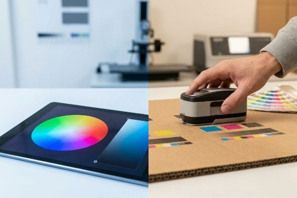
Les équipes marketing valident souvent les couleurs des emballages en se basant uniquement sur l'apparence d'un PDF affiché sur leurs smartphones haute définition, considérant la luminosité numérique RVB (Rouge Vert Bleu) comme une vérité technique absolue. Elles ignorent la réalité physique : les écrans émettent activement de la lumière, tandis que le carton ondulé brut l'absorbe passivement<sup>11</sup>. Lorsqu'elles appliquent ces attentes numériques à un environnement de production de masse exigeant, sans étalonnage physique adéquat, l'éclairage ambiant du magasin détruit complètement le contraste prévu, rendant les graphismes ternes, flous et illisibles en rayon.
Ce n'est pas qu'une théorie : j'en ai fait l'amère expérience en 2022, lorsque j'ai demandé à Mark, mon ingénieur packaging principal, de tester un nouvel présentoir pour une marque outdoor dans notre laboratoire de prépresse interne. Nous nous sommes fiés à une épreuve numérique pour un motif camouflage forestier complexe, en supposant qu'une conversion de couleur standard préserverait parfaitement les tons vert foncé. À la sortie des feuilles de test de la presse lithographique 6 couleurs, j'ai frotté le carton kraft vierge sous notre éclairage intense D50et j'ai immédiatement constaté le désastre. Les verts profonds avaient viré à un noir boueux et indistinct, faisant complètement disparaître l'identité visuelle de la marque, car l'encre avait été absorbée trop profondément par les fibres poreuses du papier. Nous avons immédiatement arrêté la presse, réalisé des échantillons physiques et recalibré la courbe de gain de point à l'aide d'un spectrophotomètrejusqu'à obtenir un contraste optimal sous la lumière naturelle. Je consacre du temps et de l'argent à mes tests en laboratoire pour que vous ne perdiez pas de profits en magasin. Ce réglage précis du spectrophotomètre n'a pas seulement permis de préserver l'image de marque ; il a également évité un important remboursement de la part du détaillant en garantissant que l'affichage corresponde parfaitement à l'emballage principal du produit sous des grandes surfaces .
| Variable | Écran numérique | Presse physique |
|---|---|---|
| Source lumineuse | Rétroéclairage actif | Éclairage passif pour commerces |
| Mélange de couleurs | Additif (léger)14 | Soustractif (Pigment)15 |
| Méthode de vérification | Affichage de l'écran | Spectrophotomètre D5016 |
Je ne laisse jamais un écran numérique lumineux dicter la réalité de mon atelier. Faire correspondre l'encre physique à la lumière numérique exige un étalonnage mécanique rigoureux avant même le chargement d'une seule palette.
🛠️ Le bureau de Harvey : Vos illustrations numériques éclatantes risquent-elles de se transformer en un amas illisible et flou sous l’éclairage agressif des grandes surfaces ? 👉 Demandez un test physique de rendu des couleurs ↗ — Pas d’intermédiaire. Vous échangez directement avec des ingénieurs en structure.
Pour l'impression, quel système CMJN ou Pantone est le meilleur ?
Le choix entre l'impression en quadrichromie standard et les couleurs d'accompagnement précises détermine si le logo de votre marque ressortira à 9,1 mètres de distance ou disparaîtra dans un amas flou et granuleux.
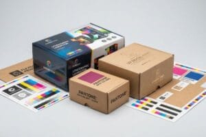
Le choix entre CMJN et Pantone dépend entièrement de la précision visuelle requise. Le CMJN est très économique pour l'impression d'images photographiques complexes grâce à l'utilisation de trames superposées, tandis que le Pantone garantit une constance absolue des couleurs grâce à ses encres d'accompagnement prémélangées, ce qui le rend indispensable pour la reproduction fidèle des logos d'entreprise.
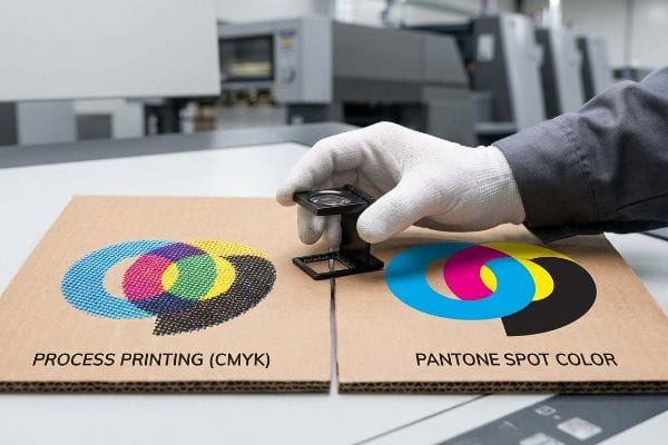
Bien qu'un procédé quadrichromique semble universellement efficace, son application aveugle à des éléments de marque haut de gamme sur du carton ondulé brut révèle une défaillance mécanique cachée.
Le piège du commerce de détail de la boue en demi-teintes
Les équipes d'approvisionnement cherchent souvent à optimiser leurs présentoirs en convertissant les logos d'entreprise en formats standard pour éviter l'achat d'une plaque d'impression supplémentaire. Elles partent du principe que l'impression en quadrichromie s'harmonisera parfaitement avec leurs écrans numériques, tout en économisant quelques centimes par unité sur la nomenclature. Ce qu'elles ignorent complètement, c'est la réalité technique de l'impression sur du carton ondulé brut et poreux. L'impression quadrichromique standard repose sur des millions de minuscules points de trame superposésun rendu optiquement déficient sur les supports non scellés et un aspect granuleux et délavé.
Dans mon atelier, je constate ce problème sur la ligne de test lorsqu'un client insiste pour utiliser un logo rouge dense composé uniquement de points cyan et magenta. Mesuré à 6,1 mètres (distance critique pour une visibilité optimale en rayon), le logo apparaît comme un écran de télévision brouillé et brouillé. J'ai relevé les mesures au micromètre et prouvé qu'il n'était pas nécessaire de remplacer l'ensemble du panneau par un coûteux support SBS (Solid Bleached Sulfate) entièrement couchépour corriger l'image de marque. J'ai donc opté pour un protocole d'impression en aplat de couleur, remplaçant le mélange optique de points par une plaque d'encre Pantone unique et précisément dosée.Une fois l'autorisation du service des achats obtenue pour modifier la nomenclature Excel, le matériau a assuré l'impression en aplat parfaitement homogène. Grâce à cette intégration Pantone précise, j'ai garanti une visibilité immédiate du panneau auprès des clients, évitant ainsi qu'il ne passe inaperçu et permettant au client d'économiser 15 % sur le coût du matériau.
| Fonctionnalité | Impression en procédé | Couleur Pantone Spot |
|---|---|---|
| Application | Points de demi-teintes superposés20 | Encre prémélangée individuelle21 |
| Clarté visuelle | Graineux sur planche brute | Net et parfaitement opaque22 |
| Impact de la marque | Éliminé à distance | Perturbation visuelle à contraste élevé |
Je refuse que l'impression en quadrichromie bon marché détruise l'atout le plus précieux d'une marque. L'utilisation d'une plaque de couleur dédiée est la seule méthode mathématique permettant de garantir des logos haute fidélité sur des supports ondulés robustes.
🛠️ Le bureau d'Harvey : Vos logos d'entreprise se transforment-ils en une bouillie floue et illisible sur les supports de vente bruts ? 👉 Obtenez un audit gratuit de la visibilité de votre marque ↗ — J'examine personnellement chaque fichier de structure sous 24 h.
Conclusion
Maîtriser les contraintes physiques liées aux limites d'encre, à la vectorisation des gabarits et aux aplats de couleurs Pantone est essentiel pour éviter que vos présentoirs en carton ondulé imprimés sur mesure ne se transforment en catastrophes illisibles et détrempés sur la chaîne de production. Le mois dernier, mon audit structurel a permis à trois marques d'éviter plus de 10 000 $ de pertes en stock mis au rebut et en retours de paiement de la part des distributeurs. Avant d'approuver une nouvelle épreuve numérique non testée qui risque de compromettre l'intégrité de votre emballage, laissez-moi réaliser un audit de tolérance structurelle prépresse gratuit ↗ afin de garantir sa résistance aux aléas des grandes surfaces.
« Emballages en carton ondulé de conception innovante pour une durabilité accrue… », https://bioresources.cnr.ncsu.edu/resources/corrugated-board-packaging-with-innovative-design-for-enhanced-durability-during-transport/. Les normes d’ingénierie de l’emballage définissent la limite totale d’encre (TIL) afin de prévenir la saturation des fibres et la perte de résistance à la compression des supports qui en résulte. Rôle de la preuve : Validation technique ; type de source : Manuel de science des matériaux. Appui : Corrélation entre le volume d’encre et la défaillance structurelle. Note de portée : S’applique aux supports poreux à base de papier .
« Nouvelle configuration du test de résistance à l'écrasement des bords améliorée avec un champ complet… », https://pmc.ncbi.nlm.nih.gov/articles/PMC8510352/. Une source faisant autorité en ingénierie de l'emballage expliquerait comment une saturation excessive d'encre compromet l'intégrité structurelle des fibres de cellulose, réduisant ainsi la note obtenue au test de résistance à l'écrasement des bords (ECT). Rôle de la preuve : validation technique ; type de source : manuel d'ingénierie de l'emballage. Appuie : le lien de causalité entre le volume d'encre et la défaillance structurelle. Note de portée : s'applique spécifiquement aux supports en carton ondulé .
« Quel est le meilleur procédé d'impression pour les emballages en carton ondulé ? », https://www.assetliquidity.net/blog/what-printing-process-is-best-for-corrugated-packaging. Les guides techniques de l'industrie de l'impression sur carton ondulé définissent un seuil de limite totale d'encre (TIL) afin d'éviter la saturation du substrat et d'assurer un séchage optimal. Preuve : validation d'une norme industrielle ; type de source : guide technique de l'industrie de l'impression. Appuie : la valeur de 260 % comme limite standard pour maintenir la rigidité du carton. Remarque : les limites peuvent varier en fonction de la qualité du carton et du type d'encre .
« Effet des conditions de fabrication du papier sur l’absorption d’encre et la surimpression… », https://bioresources.cnr.ncsu.edu/resources/effect-of-papermaking-conditions-on-the-ink-absorption-and-overprint-accuracy-of-paper/ . Recherche sur l’effet d’une couverture d’encre excessive sur la résistance des fibres de papier et les temps de séchage. Rôle de la preuve : vérification factuelle ; type de source : étude en science des matériaux. Appui : le risque de défaillance structurelle dans l’impression courante. Note de portée : se concentre sur l’application d’encre à grand volume.
« Résistance à la compression des emballages en carton ondulé… », https://pmc.ncbi.nlm.nih.gov/articles/PMC10054506/ . Documentation technique ou normes d’impression confirmant la limite d’encre totale (TIL) de 260 % comme seuil de maintien de l’intégrité du support. Type de preuve : spécification technique ; type de source : manuel de normes industrielles. Supporte : la limite spécifique pour l’impression CMJN. Note relative au champ d’application : s’applique à l’impression commerciale à haute saturation sur carton.
« [PDF] Spécifications de prépresse – Graphic Packaging International », https://www.graphicpkg.com/custom-content/uploads/2023/08/prepress-specifications-Eng.pdf. La documentation technique relative aux logiciels de prépresse et aux équipements de découpe CNC confirme que les tracés de découpe doivent être définis par des couleurs d'accompagnement pour être reconnus comme des trajectoires de découpe mécanique. Rôle de la preuve : Spécification technique ; type de source : Manuel industriel. Justifie : La nécessité des couleurs d'accompagnement pour l'outillage. Remarque concernant la portée : Spécifique aux environnements de production automatisés .
« Découpe laser – Découpe laser vectorielle vs raster | Operations », https://design.ncsu.edu/operations/510/laser-cutter-vector-vs-raster-laser-cutting/. Explication technique de la manière dont les contrôleurs CNC différencient les données raster visuelles des trajectoires d'outil vectorielles (code G/commandes). Rôle de la preuve : mécanisme technique ; type de source : documentation technique. Justifie : la raison de l'inactivité de la fraise lorsque les fichiers ne contiennent pas d'outils vectoriels. Remarque sur la portée : s'applique aux tables de découpe automatisées .
« Guide du processus complet de prépresse d'emballage – Esko », https://www.esko.com/en/blog/a-guide-to-the-full-packaging-prepress-process . Vérification de la pratique courante en conception d'emballages structurels consistant à utiliser des couleurs d'accompagnement spécifiques pour déclencher différentes trajectoires d'outils CNC. Preuve : spécification technique ; type de source : manuel industriel. Supporte : l' utilisation de commandes mécaniques à code couleur. Remarque : les normes peuvent légèrement varier selon l'éditeur du logiciel.
« CutContour et PerfCutContour — La norme de couleur d'accompagnement pour l'impression et la découpe », https://pb.pressria.com/blog/cut-contour-spot-color-standard/. Explication de la manière dont les traceurs et les découpeuses numériques utilisent des couleurs d'accompagnement spécifiques pour différencier les tracés de découpe de l'encre imprimable. Rôle de la preuve : Spécification technique ; type de source : Manuel de l'industrie de l'imprimerie. Supporte : L'utilisation des couleurs d'accompagnement pour l'outillage mécanique. Note de portée : Pratique standard pour la découpe vectorielle. ↩
« Découpe numérique vs. découpe à l'emporte-pièce : laquelle choisir pour votre projet ? | AMI », https://www.americanmicroinc.com/resources/digital-cutting-vs-die-cutting/. Description détaillée du processus mécanique où des attributs de trajectoire vectorielle spécifiques déclenchent le déploiement physique des outils de découpe. Rôle de la preuve : vérification du processus mécanique ; type de source : documentation du fabricant d'équipement. Supporte : la transition de la conception visuelle à l'action mécanique. Remarque sur la portée : spécifique aux matériels de traçage automatisés .
« Mélange soustractif des couleurs – Département de physique de l’Université du Wisconsin-Madison », https://www.physics.wisc.edu/ingersollmuseum/exhibits/opticscolor/subcolormix/. Explication technique de la différence entre les modèles de couleurs émissif (RVB) et soustractif (CMJN) concernant le comportement de la lumière. Rôle de la preuve : fondement technique ; type de source : manuel de colorimétrie ; Arguments : incompatibilité physique entre les aperçus numériques et les résultats imprimés. Note sur la portée : se concentre sur la physique de l’interaction de la lumière .
« Qu’est-ce que la norme ISO 3664:2009 ? », https://www.gtilite.com/2011/01/what-is-iso-3664-2009/. Une source faisant autorité sur les normes ISO 3664 définit la température de couleur D50 (5 000 K) comme la norme internationale pour la visualisation et l’évaluation des épreuves couleur afin de garantir la cohérence des couleurs dans différents environnements. Rôle de la preuve : Spécification technique ; type de source : Norme industrielle. Application : Utilisation d’un éclairage normalisé pour la précision des couleurs en prépresse. Note relative au champ d’application : Normalisée pour les industries des arts graphiques et de l’imprimerie .
« Modélisation mathématique et stratégies de compensation… – PMC », https://pmc.ncbi.nlm.nih.gov/articles/PMC12574880/. La documentation technique relative aux flux de production prépresse explique comment les spectrophotomètres mesurent l'étalement de l'encre (gain de point) sur les supports poreux afin d'ajuster la courbe d'impression et d'obtenir un meilleur contraste. Rôle de la preuve : Validation procédurale ; type de source : Manuel technique. Supporte : La méthode de correction de l'effondrement des couleurs et de la saturation sur le carton kraft vierge. Note de portée : Spécifique aux procédés d'impression lithographique et offset .
« Modèle de couleur RVB – Wikipédia », https://en.wikipedia.org/wiki/RGB_color_model . Les sources faisant autorité en matière de colorimétrie définissent le mélange additif comme le processus par lequel la lumière est ajoutée au noir pour créer des couleurs . Rôle de la preuve : définition technique ; type de source : manuel de colorimétrie. Appuie : le mécanisme de reproduction des couleurs sur écran numérique. Note de portée : S’applique aux écrans RVB.
« Mélange soustractif des couleurs : principes et applications pratiques », https://www.epackprinting.com/cmyk-subtractive-color-mixing/. Les normes de l’industrie de l’imprimerie expliquent le mélange soustractif comme l’absorption de longueurs d’onde lumineuses spécifiques par les pigments. Rôle de la preuve : définition technique ; type de source : manuel de l’industrie de l’imprimerie. Explique comment l’encre physique crée la couleur sur le papier. Note sur le champ d’application : s’applique à l’impression CMJN et aux couleurs d’accompagnement .
« Chaos des couleurs en cabine d'éclairage : pourquoi le D50 est votre… », https://www.linkedin.com/pulse/color-chaos-light-booth-why-d50-your-packaging-carmon-madison-6bb4e. Les normes ISO définissent le D50 comme l'illuminant standard pour les arts graphiques et l'épreuvage d'impression afin de garantir la cohérence des couleurs dans différents environnements de visualisation. Rôle de la preuve : spécification standard de l'industrie ; type de source : norme ISO. Appuie : l'utilisation de sources lumineuses D50 en spectrophotométrie professionnelle. Note de portée : normalisé pour la visualisation et la mesure des épreuves d'impression .
« Encres halochromiques appliquées sur carton pour la détection de la détérioration des aliments… », https://pmc.ncbi.nlm.nih.gov/articles/PMC9502810/. Explication technique du procédé d’impression en demi-teintes et de l’influence de l’absorption d’encre sur les supports non couchés sur la qualité visuelle. Type de preuve : Mécanisme technique ; type de source : Manuel de l’industrie de l’imprimerie ou ouvrage de science des matériaux. Justification : Explique les raisons physiques de l’échec de l’impression en quadrichromie sur les cartons non couchés. Note de portée : Cet article porte sur l’interaction entre les points de trame et les fibres poreuses du papier .
« Carton blanchi solide – Wikipédia », https://en.wikipedia.org/wiki/Solid_bleached_board. Définition technique et caractéristiques du carton blanchi solide au sulfate (SBS) en tant que support haut de gamme pour la reproduction des couleurs. Type de preuve : Spécifications du matériau ; type de source : Données techniques de l’industrie papetière. Sujet : Le rôle du SBS dans l’amélioration de la vivacité et de la précision des couleurs. Note de portée : Spécifications générales du matériau .
« CMJN vs. Couleurs d'accompagnement dans l'impression d'emballages : ce que les marques de produits de grande consommation doivent savoir… », https://meyers.com/meyers-blog/cmyk-vs-spot-colors-in-packaging-printing-what-cpg-brands-need-to-know/. Vérification technique démontrant que les couleurs d'accompagnement Pantone créent un aplat de pigment uniforme, contrairement au mélange de trames utilisé en CMJN. Type de preuve : Vérification technique ; source : Norme de l'industrie de l'impression. Ce document confirme : L'efficacité des couleurs d'accompagnement pour éliminer l'effet de « grain » ou de « boue » à l'œil nu. Précision : Ce document se concentre sur les applications de couleurs haute densité .
« Guide d'impression CMJN : Obtenez des couleurs éclatantes et précises – Epack Printing », https://www.epackprinting.com/support/understanding-cmyk/ . Brève explication du mécanisme technique par lequel l'impression quadrichromique crée des couleurs grâce à la superposition de points de trame cyan, magenta, jaune et noir. Rôle de la preuve : vérification factuelle ; type de source : manuel technique d'impression. Supporte : la méthode d'application de l'impression quadrichromique. Note sur la portée : se concentre sur le processus standard en 4 couleurs.
« Qu'est-ce qu'une couleur d'accompagnement ? Et quand faut-il l'utiliser ? », https://marcom.purdue.edu/?tips-of-the-week=whats-a-spot-color-and-when-should-you-use-one. Brève explication de l'impression en couleur d'accompagnement : utilisation d'une formule d'encre spécifique, mélangée avant l'impression. Niveau de preuve : définition technique ; type de source : norme industrielle (Pantone). Appui : méthode d'application des couleurs Pantone. Note relative au champ d'application : s'applique au système Pantone Matching System .
« Pantone vs CMJN pour les emballages personnalisés », https://www.ecoenclose.com/blog/pantone-vs-cmyk-for-custom-branded-packaging?srsltid . Explication succincte des avantages des couleurs d'accompagnement en termes d'opacité et de définition des contours par rapport à la transparence des trames de demi-teintes. Preuve : comparaison qualitative ; source : guide professionnel des arts graphiques. Argument : clarté visuelle de l'impression Pantone. Remarque: l'efficacité dépend du support.