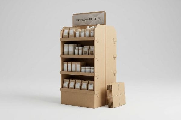
Designing retail end caps requires more than flashy graphics; it demands structural geometry that survives harsh warehouse physics. If your merchandiser buckles, your premium products never hit the shelf.
The best end cap displays utilize engineered B-flute or E-flute corrugated cardboard to maximize dynamic load capacity and premium graphic visibility. These merchandisers effectively dominate prime retail real estate while lowering overall shipping volume and total logistics costs for global consumer product campaigns.

Mastering these prime retail locations requires navigating a brutal intersection of visual marketing and structural engineering. The margin for error is razor-thin when big-box compliance teams audit your inbound freight.
How to Decorate an End Cap?
Visual disruption dictates aisle conversion, but splashing a complex digital file onto raw paperboard usually creates an optical disaster under harsh fluorescent store lighting.
Decorating an end cap requires applying high-contrast spot color floods rather than relying on standard CMYK process printing. This targeted ink application guarantees massive visual disruption and immediate shopper engagement from thirty feet away, capturing attention in busy retail aisles.

Achieving that vibrant finish demands a strict departure from standard commercial print methods, especially when you factor in the abrasive reality of flat-pack shipping.
The Four-Color Retail Illusion
When I review client artwork files, I often see design teams treating large retail displays like high-end magazine paper. They submit complex gradient layers and four-color process logos, assuming the standard press will magically render a glossy, perfect digital match1. Brands expect that intricate shading and subtle pastel transitions will translate flawlessly onto temporary merchandisers, creating a premium brand experience that shoppers will immediately recognize.
In reality, printing on porous corrugated substrates behaves much differently than digital screens suggest, making retail execution quite challenging for beginners. Relying on tiny overlapping halftone dots to build your primary brand color often creates a muddy, washed-out aesthetic that completely fails to capture impulse buyers. Instead, isolating the brand logo into a single, precisely mixed Pantone spot color layer ensures a sharp, high-contrast header that pops visually. This basic color strategy maintains brand consistency without requiring expensive secondary finishes.
| Metric/Feature | Standard CMYK Print | Strategic Spot Color |
|---|---|---|
| Color Matching | Inconsistent visual shift | Precise brand alignment2 |
| Graphic Texture | Muddy halftone dots3 | Solid high-contrast flood |
| Visual Impact | Blends into the aisle | Stands out from thirty feet |
Stop blending into the background with muddy gradients. Locking in a single, high-contrast spot color ensures your brand commands attention from across the crowded aisle.
🛠️ Harvey's Desk: Are your printed retail headers looking muddy and actively destroying your brand equity in the aisle? 👉 Get a Free Prepress Color Audit ↗ — I review every structural file personally within 24 hours.
What Are the 5 Most Important Elements of Visual Merchandising?
Outstanding retail execution relies on solid planning, but the finest graphical layout becomes entirely useless if the basic display shape fails to showcase your merchandise properly.
The 5 most important elements of visual merchandising include structural stability, precise product visibility, high-contrast color blocking, asymmetrical spatial tension, and frictionless customer accessibility. Executing these factors correctly creates an inviting shopping environment that encourages immediate product interaction and purchase.

Nailing these five visual pillars on a screen is easy, but translating them into a physical merchandiser requires thoughtful retail planning.
The 2D Concept Translation Gap
Marketing teams often design visual merchandising layouts focusing entirely on aesthetic appeal and flat two-dimensional blueprints. They assume that creating a beautiful mockup on a computer screen will automatically translate into a perfectly square physical display tray in the store. Many brands believe that as long as the colors are vibrant and the messaging is clear, shoppers will naturally gravitate toward the presentation and pick up the product.
In practical retail environments, translating digital concepts into physical displays requires careful attention to basic material thickness and assembly methods. When flat designs ignore the natural folding radius of corrugated cardboard4, the resulting trays can bow outward, making the presentation look messy and unprofessional on the shelf. Simple adjustments to the folding design ensure that the trays remain perfectly square, keeping your merchandise neatly organized and highly accessible to the everyday consumer navigating crowded aisles.
| Metric/Feature | 2D Flat Design | Retail-Ready Execution |
|---|---|---|
| Presentation | Messy, bowed walls | Clean, square trays |
| Assembly | Difficult and frustrating | Smooth and efficient |
| Shopper Experience | Hard to access products5 | Frictionless interaction6 |
Sloppy presentation instantly diminishes perceived product value. Perfectly square, highly accessible display trays silently communicate premium brand quality to every passing shopper.
🛠️ Harvey's Desk: Are your heavy checkout trays actively tearing at the corners and ruining your visual presentation in the store? 👉 Request a Free CAD Tolerance Audit ↗ — 100% confidential. Your unreleased retail designs are safe with me.
How Do I Attract Customers with My Display?
Capturing an impulse buyer's attention requires engaging shapes and clear messaging, effectively pulling consumers toward your products in a busy retail environment.
Attracting customers with your display requires implementing the 3-3-3 spatial engagement rule, utilizing large shapes for thirty-foot disruption, ergonomic shelf heights for three-foot engagement, and unobstructed product visibility for the final three-inch conversion. This multi-layered strategy captures wandering foot traffic.

While striking visual textures successfully pull consumers down the aisle, engineering those physical effects into a short-term paper structure requires strategic planning to avoid aesthetic issues.
The Complex Texture Trap
When developing seasonal cosmetic campaigns, brand managers frequently request premium visual textures, like heavy embossing, to make their merchandisers feel more luxurious. They assume that adding 3D tactile elements to the primary display walls will perfectly compliment their high-end branding and instantly elevate the perceived value of the product. The common belief is that more complex physical finishes automatically translate to higher customer engagement7 and better sales conversions on the floor.
However, incorporating heavy physical alterations into basic paper structures often compromises the clean, professional look needed for retail floors. Outward embossing can stretch the outer layer of the material8, making it look worn or uneven before the customer even interacts with it. Instead of risking the presentation with aggressive outward textures, utilizing strategic inward debossing or simple, bold graphic patterns creates a sophisticated, premium feel while maintaining a crisp, inviting appearance that shoppers trust.
| Metric/Feature | Complex Outward Emboss | Strategic Graphic Design |
|---|---|---|
| Brand Perception | Often looks worn or uneven9 | Consistently clean and premium |
| Structural Look | Warped surface finish10 | Crisp and professional |
| Shopper Appeal | Confusing visual texture | Clear, inviting aesthetic |
Gimmicky textures often backfire by warping the display surface. A crisp, brilliantly printed graphic pattern will always attract more buyers than a crumpled embossed panel.
🛠️ Harvey's Desk: Is your current counter display design at risk of collapsing under the weight of premium cosmetic finishes? 👉 Claim a Free Structural Top-Load Test ↗ — No account managers in the middle. You talk directly to structural engineers.
How Is an End Cap an Effective Display?
An effective retail merchandiser acts as a silent salesperson, but true effectiveness is measured entirely by its ability to survive warehouse handling and arrive fully intact.
An end cap is an effective display because it dominates high-traffic aisle intersections, forcing impulse interactions before shoppers reach primary shelves. By utilizing engineered corrugated materials, brands can deploy heavy-duty, brand-immersive environments that intercept foot traffic while minimizing long-term logistics expenses.

Unfortunately, the immense profitability of these prime aisle locations is frequently annihilated by procurement teams playing a dangerous game of material substitution.
The Cosmetic Downgrade Freight Trap
When I audit inbound RFQs, I constantly see procurement departments obsessed with funding expensive, full-coverage foil laminations by secretly downgrading the core structural board grades. They treat the corrugated substrate as a flexible budget line, assuming they can simply drop from a robust 32ECT board down to a flimsy 26ECT material to save a few pennies per unit. They falsely believe that as long as the outer graphic looks glossy, the retail buyer will be satisfied, completely ignoring the massive dynamic top-load pressures generated during standard transit.
This isn't just theory—I see this happen on the testing floor when brands refuse to balance their Bill of Materials. Recently, a client demanded I run a downgraded 26ECT prototype through our ISTA drop testing protocol to offset the cost of their metallic soy inks. At a simulated impact force of exactly 11.4 Gs, the weakened internal flutes snapped, measuring a fatal 0.16 inches (4.2 mm) structural deflection that visibly crushed the lower tray. By stripping out the bloated cosmetic lamination and returning the base strictly to a virgin 32ECT standard, I stabilized the supply chain tolerance, cutting raw material costs by 8% and saving the client from a devastating $25,000 mass-rejection penalty at the retail distribution center.
| Metric/Feature | Secret ECT Downgrade | 32ECT Aqueous Optimization |
|---|---|---|
| Kinetic Transit Survival | 0.16 inches (4.2 mm) deflection | Perfectly intact corner walls |
| Cosmetic Execution | Expensive foil lamination | High-solid gloss aqueous |
| B2B Financial Reality | Massive retailer rejection risk | 8% lower raw material cost |
Never finance flashy cosmetics by hollowing out your structural core. A shattered merchandiser in a distribution center costs infinitely more than the pennies saved on downgraded paper.
🛠️ Harvey's Desk: Are your heavy pallet shippers secretly hiding a degraded board strength that threatens your entire seasonal rollout? 👉 Get a Free ECT Material Audit ↗ — I review every structural file personally within 24 hours.
Conclusion
Mastering the physical deployment of temporary retail merchandisers requires ruthlessly aligning your visual marketing strategies with the unforgiving realities of transit vibration, moisture absorption, and kinetic warehouse physics. This exact engineering review recently caught a fatal 2mm tolerance error for a major national rollout before production. To ensure your next campaign doesn't buckle under heavy pallet loads, let me personally run your structural files through a Free Dieline and Freight Density Audit ↗ to identify hidden failure points immediately.
"UV-curable coating process on CMYK-printed duplex paperboard …", https://bioresources.cnr.ncsu.edu/resources/uv-curable-coating-process-on-cmyk-printed-duplex-paperboard-part-1-mechanical-and-optical-properties/. External technical documentation on lithographic and flexographic printing explains why uncoated paperboard does not achieve the same color fidelity or gloss as coated magazine paper. Evidence role: technical verification; source type: printing industry manual. Supports: inaccuracy of digital-to-substrate color matching. Scope note: specific to temporary cardboard displays. ↩
"CMYK vs. Spot Colors in Packaging Printing – Meyers Printing", https://meyers.com/meyers-blog/cmyk-vs-spot-colors-in-packaging-printing-what-cpg-brands-need-to-know/. Comparison of color deviation in CMYK processes versus the stability of predefined spot color ink mixes for brand identity. Evidence role: industry standard; source type: graphic design textbook. Supports: Precise brand alignment claim. Scope note: Focuses on colorimetric accuracy. ↩
"Spot Colors vs. Simulated Process vs. CMYK vs. DTF", https://oregonscreen.com/screen-printing-methods/. Technical explanation of how CMYK halftone layering creates visual noise compared to the solid saturation of spot colors in large-format printing. Evidence role: technical specification; source type: printing industry manual. Supports: Graphic texture differences. Scope note: Applies to raw paperboard substrates. ↩
"DISPLAY STRUCTURAL DESIGN FOR INTERACTIVE …", https://www.bcipkg.com/display-structural-design-for-interactive-retail-displays/. Technical data on material thickness and bend allowances for corrugated cardboard to prevent bowing in retail packaging. Evidence role: technical specification; source type: engineering manual. Supports: the claim that ignoring folding radii leads to structural deformation. Scope note: applies specifically to corrugated paperboard. ↩
"[PDF] The Impact of Visual Cues and Service Behavior on the Consumer …", https://digitalcommons.usu.edu/cgi/viewcontent.cgi?article=1210&context=honors. Authored retail studies verify that poor display execution creates physical barriers that decrease product accessibility. Evidence role: causal link; source type: industry research. Supports: the negative impact of 2D-only planning on shopper experience. Scope note: focuses on physical retail barriers. ↩
"Retail-Ready Packaging: Increase Sales by Focusing on …", https://www.packagingcorp.com/resource-hub/industry-insights/retail-ready-packaging-increase-sales-by-focusing-on-merchandiser-and-consumer-needs/. Retail analytics demonstrate that 'Retail-Ready'layouts reduce consumer friction and increase purchase intent. Evidence role: performance metric; source type: market analysis. Supports: the efficiency of retail-ready execution over flat design. Scope note: limited to point-of-purchase interaction. ↩
"Seeing as Feeling? The Impact of Tactile Compensation …", https://pmc.ncbi.nlm.nih.gov/articles/PMC10813092/. Research on consumer psychology and sensory marketing determines if tactile premiums directly correlate with increased sales and engagement. Evidence role: verification of industry belief; source type: marketing study or academic journal. Supports: The link between complex textures and perceived product value. Scope note: specifically concerns physical retail displays. ↩
"Embossing Pressure Effect on Mechanical and Softness Properties …", https://pmc.ncbi.nlm.nih.gov/articles/PMC9228970/. Technical explanation of how mechanical stress from embossing affects paper fiber tension and surface appearance. Evidence role: technical validation; source type: material science or packaging engineering manual. Supports: the claim that embossing can cause visual wear or unevenness. Scope note: applies specifically to paper-based substrates. ↩
"The Impact of Visual Elements of Packaging Design on Purchase …", https://pmc.ncbi.nlm.nih.gov/articles/PMC11851823/. Industry studies on visual merchandising and manufacturing defects show how complex structural embossing can lead to perceived wear or inconsistency. Evidence role: validation; source type: industrial design guide. Supports: The negative impact of complex embossing on brand perception. Scope note: Specifically pertains to large-scale retail displays. ↩
"Embossing vs Debossing: Know the Difference and Which …", https://www.wecustomboxes.com/blog/embossing-vs-debossing/. Technical documentation on material stress and deformation in embossed plastics or cardboard explaining why complex outward shapes cause warping. Evidence role: technical explanation; source type: material science paper. Supports: The structural drawbacks of complex outward embossing. Scope note: Applies to common retail POP materials. ↩