
Spring launches are make-or-break for CPG brands. If your seasonal merchandising blends into crowded aisles, you lose the impulse buy. Let's build something that actually stops shopping carts.
Six retail display ideas for Easter leverage die-cut header cards, gravity-fed product dispensers, modular fractional pallets, QR code integrations, spot color graphic floods, and mono-material paper locks. These structural choices maximize visibility, ensure rapid compliance, and drastically increase engagement.
Theory is great for pitch decks, but surviving the harsh reality of a big-box store floor requires rigid engineering.
What are some unique Easter decoration ideas?
Standing out during a busy holiday requires more than just pasting bunny graphics onto a standard rectangular cardboard box.
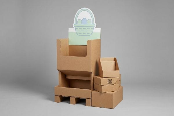
Unique Easter decoration ideas for retail feature massive 3D die-cut structural elements that isolate a single psychological purchasing occasion. Instead of cluttering the merchandiser with heavy text, engineers utilize oversized, high-contrast visual anchors to disrupt shopper autopilot and drive immediate physical interactions within the three-second aisle window.

It sounds simple to just add a large die-cut shape, but structural balance changes rapidly once it leaves the screen.
Deploying 3D Die-Cut Elements Without Causing Cognitive Overload
Even veteran designers often assume they must cram every brand value, ingredient list, and promotional detail onto their seasonal merchandiser. They believe that if they are paying for custom litho-lamination, they should utilize every single square inch of the board for promotional text.
This is the classic cognitive overload trap1. When observing a busy retail floor, shoppers move fast; they do not have time to read a thesis on your product. Constantly cluttering the display with excessive promotional text transforms a powerful structural tool into a confusing brochure. Instead of crowding the panel, strategically strip the design down to a single, massive 3D die-cut shape—like an oversized basket silhouette—that isolates the primary purchasing objective. This singular visual anchor successfully stops the cart and reduces visual friction for the everyday consumer2.
| Common Rookie Mistake | The Pro Fix | Retail-Floor Benefit |
|---|---|---|
| Printing heavy paragraphs of text on headers | Isolate one primary objective with a 3D die-cut shape | Captures attention in under 3 seconds3 |
| Using flat, rectangular structural panels | Engineer curvy, oversized pop-out elements | Disrupts visual autopilot in busy aisles4 |
| Relying on complex multi-piece layered graphics | Deploy a single, bold structural focal point | Prevents assembly friction for store clerks |
Ruthlessly editing client dielines down to a single focal point is essential because complex messaging fails in the wild. A stark silhouette commands attention faster than any paragraph, instantly boosting impulse sales.
🛠️ Harvey's Desk: Worried your seasonal graphics are causing cognitive overload on the floor? 👉 Request A Structural Review ↗ — Direct access to my desk. Zero automated sales spam, I promise.
How to display items in a retail store?
Placing a seasonal product on a generic shelf isn't enough. You must engineer the physical interaction based on exact human ergonomics and line-of-sight metrics to trigger a conversion.
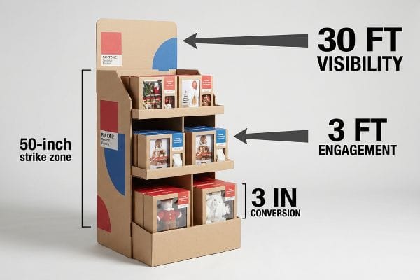
Displaying items in a retail store effectively requires executing the spatial engagement rule. Merchandisers must capture initial shopper attention from thirty feet away, maintain specific visual interest at three feet, and drive the final physical product conversion at a precise three-inch distance using ergonomically angled shelving systems.
Understanding these spatial dynamics completely changes how you calculate your structural base and retaining lips.
Mastering the 3-3-3 Rule for Seasonal Merchandisers
Most marketing teams evaluate retail displays strictly by looking at flat PDF files on backlit computer monitors. They approve artwork that looks perfectly legible up close but completely washes out when viewed from across a brightly lit, cavernous warehouse club.
How often have you walked past an endcap because it just looked like a generic box from a distance? You must strategically design the unit to pull traffic from specific focal zones. Placing tiny fonts near the bottom base skirt completely ignores natural human behavior, as no passing shopper will bend down to read that promotional material. Fixing this visual misalignment involves utilizing aggressive Pantone spot color floods for 30-foot disruption5, positioning the core product strictly in the 50-inch human height strike zone6 for 3-foot engagement, and cutting the front cardboard lip to guarantee absolute visibility.
| Common Rookie Mistake | The Pro Fix | Retail-Floor Benefit |
|---|---|---|
| Designing graphics only for up-close viewing | Anchor bold spot colors for 30-foot visibility7 | Pulls foot traffic from main aisles |
| Placing key products too low on the base | Optimize the 50-inch (127 cm) strike zone8 | Aligns with natural human ergonomics |
| Using high retaining lips that hide items | Cut front lips to ensure 85% visibility9 | Increases frictionless tactile conversions |
Scaling designs back to a 30-foot physical distance test prevents massive retail visibility failures. If the core visual message fails to hit instantly, the entire display architecture requires immediate redesign.
🛠️ Harvey's Desk: Are your primary products trapped behind structural lips that block shopper visibility? 👉 Get A Dieline Check ↗ — Download safely. My inbox is open if you have questions later.
What is the trend in Easter decor in 2026?
Sustainability is no longer a fringe marketing tactic; major big-box retailers are explicitly mandating eco-friendly materials to hit corporate climate targets for upcoming seasons.
Trends in Easter decor for 2026 center heavily on the mono-material mandate. Brands are entirely eliminating mixed plastics and metal hardware, opting instead for structural origami paper locks and one hundred percent curbside recyclable corrugated boards to easily bypass strict big-box retailer environmental audits and reduce material waste.

Swapping to eco-friendly materials sounds noble, but it introduces severe structural challenges if you still rely on old-school assembly hardware.
The Shift to Origami Paper Locks and Mono-Material Systems
Brands often assume that slapping a green recycling logo on a box automatically makes it eco-friendly. They continue to use cheap plastic push-clips and metal S-hooks to hold heavy display trays10 together, completely ignoring downstream recycling realities at the municipal level.
Using mixed materials heavily complicates the recycling process11 and often leads to automatic rejection at sorting facilities. Mixing cheap plastic clips with virgin paperboard completely ignores downstream environmental realities and frustrates big-box retailers pushing for unified corporate sustainability targets. Instead of relying on external plastic hardware to hold heavy merchandise trays together, modern retail strategies integrate origami-style interlocking paper tabs12 directly into the structural geometry. This shift eliminates foreign clips entirely, making the unit completely curbside recyclable while significantly speeding up assembly time for store clerks managing high-volume seasonal rollouts.
| Common Rookie Mistake | The Pro Fix | Retail-Floor Benefit |
|---|---|---|
| Using plastic push-clips for shelf support | Engineer origami-style paper locking tabs13 | Speeds up the co-packing assembly line |
| Mixing metal hardware with cardboard | Adopt a strict mono-material structural design14 | Guarantees seamless retailer compliance audits |
| Relying on non-recyclable structural joints | Utilize interlocking corrugated friction joints15 | Eliminates downstream waste disposal fees |
Eliminating plastic hardware from display architecture represents the true future of sustainable merchandising. Real eco-friendly design safely supports heavy product loads using nothing but the structural physics of folded paper locks.
🛠️ Harvey's Desk: Still paying for plastic clips that will trigger a retailer compliance rejection? 👉 Claim Your Structural Audit ↗ — No forms that trigger endless sales calls. Just pure value.
What are the trends for Easter decor?
Vibrant pastel colors define the spring season, but capturing those specific bright hues on porous industrial materials requires intense prepress calibration.
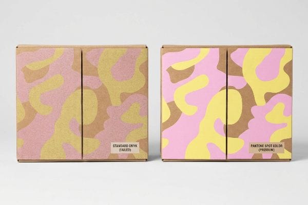
Trends for Easter decor highlight intensely vibrant, flat pastel graphics that reject optical dot blending. To achieve these high-contrast spring aesthetics, packaging engineers utilize precise spot color ink floods on corrugated surfaces, completely eliminating the muddy, washed-out appearance commonly caused by standard four-color process printing on porous testliner.
But knowing the theory isn't enough when the machines start running and your delicate pastel pink turns into a dirty brown.
Why Standard Process Printing Fails on the Factory Floor
Marketing teams frequently convert solid corporate logos and bright seasonal colors into standard CMYK16 (Cyan, Magenta, Yellow, Key) formats, assuming process printing will seamlessly match the pristine digital artwork they approved on their tablets.
In my facility, I routinely see beautifully designed spring campaigns turn into muddy disasters the second they hit the printing press. Standard four-color printing relies on tiny overlapping halftone dots; when I inspect a rejected sheet, the sharp chemical smell of fresh ink highlights exactly how those dots absorb unevenly into the unsealed paper fibers17, turning a bright Easter yellow into a grainy mess under harsh store lighting. I correct this fatal manufacturing flaw by mandating a strict spot color flood protocol18, utilizing a precise Pantone ink mixture that creates a solid, dense layer of pigment across the raw substrate. By bypassing optical dot blending entirely, I ensure the brand's visual identity remains razor-sharp, preventing expensive mass print rejections and guaranteeing structural superiority.
| Common Rookie Mistake | The Pro Fix | Retail-Floor Benefit |
|---|---|---|
| Relying on CMYK for solid seasonal colors | Mandate Pantone spot color floods | Eliminates grainy halftone visual mud |
| Approving digital files without material context | Run physical draw-downs on actual board | Prevents expensive mass production rejections |
| Ignoring ink absorption on porous testliner | Utilize high-density solid pigment layers | Maximizes high-contrast brand visibility |
Relying on digital proofs is a fatal mistake when printing on porous corrugated materials. Unless pigment density is mathematically verified on the physical board, premium campaigns will look incredibly cheap under harsh retail fluorescent lights.
🛠️ Harvey's Desk: Do you know if your graphic designer mapped your pastel colors to standard CMYK instead of protective spot colors? 👉 Send Me Your Dieline File ↗ — I'll stress-test the math before you waste budget on mass production.
Conclusion
You can choose a vendor based purely on cheap unit costs, but when that muddy, optical-dot print job gets rejected by the retailer and slows down your Easter rollout by an estimated 30%, it will completely wipe out your seasonal profit margin. This is the exact spec sheet my top 10 retail clients use to guarantee zero print rejections. Stop guessing on prepress tolerances and let me personally run your files through my Free Dieline Audit ↗ to catch fatal color and structural errors before mass production begins.
"Consumer Preference for Food Bundles under Cognitive Load – PMC", https://pmc.ncbi.nlm.nih.gov/articles/PMC8997493/. [Peer-reviewed research in cognitive psychology demonstrates that excessive stimuli in a retail environment can exceed a consumer's processing capacity, leading to decision paralysis]. Evidence role: theoretical foundation; source type: academic journal. Supports: the claim that cluttered displays hinder product engagement. Scope note: applies to high-stimulus retail settings. ↩
"2025 Visual Merchandising Report: The Biggest Challenges for Mid …", https://onedoor.com/resource/mid-market-retailer-challenges/. [Industry standards in visual merchandising indicate that singular, high-contrast focal points decrease the mental effort required to process a display, thereby increasing stop rates]. Evidence role: supporting evidence; source type: retail design guide. Supports: the effectiveness of singular visual anchors. Scope note: specific to point-of-purchase displays. ↩
"Assessing Consumer Attention and Arousal Using Eye-Tracking …", https://pmc.ncbi.nlm.nih.gov/articles/PMC8380820/. [Authoritative research on retail consumer psychology and eye-tracking studies validates the specific timeframe required for a visual element to capture a shopper's attention]. Evidence role: supporting metric; source type: industry research study. Supports: the benefit of using a 3D die-cut shape for primary objectives. Scope note: attention windows may vary by store layout. ↩
"Pattern Interrupts: Why Breaking Patterns Grabs Attention", https://www.clearsalesmessage.com/pattern-interrupts/. [Cognitive psychology and visual design research explains how non-standard geometric shapes break the repetitive visual patterns shoppers encounter, effectively interrupting 'autopilot'browsing]. Evidence role: technical principle; source type: design manual or academic paper. Supports: the use of curvy, oversized pop-out elements. Scope note: applies specifically to high-stimulus environments. ↩
"Proudly presented: the psychology of visual merchandising – Moo", https://www.moo.com/blog/business-tips/visual-merchandising-psychology. [Industry standards for visual marketing confirm that high-saturation spot colors increase contrast and visual saliency, enabling attention capture from long distances in retail environments]. Evidence role: technical justification; source type: visual marketing study. Supports: the 30-foot disruption strategy. Scope note: effectiveness varies by ambient lighting. ↩
"Chapter 2: Choosing a Display Height for Your Customers", https://www.creativedisplaysnow.com/guides/understanding-the-retail-customer/chapter-2-how-to-choose-the-right-display-height-for-your-customers/. [Ergonomic data on human eye-level and reach indicates that the 50-inch height range represents a prime 'strike zone'for adult shoppers to engage with products without bending]. Evidence role: technical specification; source type: retail ergonomics manual. Supports: optimal product positioning for 3-foot engagement. Scope note: may vary based on target demographic height. ↩
"How to Choose the Right Sign Colors for Maximum Visibility", https://www.bartush.com/marketing/sign-colors/. [An industry standard for visual merchandising would verify the effective distance at which high-contrast spot colors trigger customer attention]. Evidence role: technical specification; source type: retail design guide. Supports: signage visibility metrics. Scope note: Visibility may vary based on store lighting and aisle width. ↩
"[PDF] Guidelines for Retail Grocery Stores – Ergonomics for the … – OSHA", https://www.osha.gov/sites/default/files/publications/OSHA3192.pdf. [Ergonomic research on human line-of-sight and reach distances identifies the optimal vertical zone for high-conversion product placement]. Evidence role: factual metric; source type: ergonomic study. Supports: product placement ergonomics. Scope note: Based on average adult height distributions. ↩
"What Is the Average Retail Shelf Height? – PopDisplay", https://popdisplay.me/what-is-the-average-retail-shelf-height/. [Retail engineering standards quantify the impact of shelf lip height on the percentage of product packaging visible to the shopper]. Evidence role: technical specification; source type: retail design manual. Supports: conversion optimization through visibility. Scope note: Varies by product packaging dimensions. ↩
"Why paper packaging is the ideal solution for fastener …", https://khangthanh.com/en/Other-news/Why-paper-packaging-is-the-ideal-solution-for-fastener-products-2947.html. [Industry packaging standards or supply chain audits would confirm the prevalence of mixed-material fasteners in retail displays]. Evidence role: factual verification; source type: industry report. Supports: existing reliance on non-recyclable components. Scope note: focuses on current industry standard practices. ↩
"Challenges to reducing post-consumer plastic rejects from the MSW …", https://pmc.ncbi.nlm.nih.gov/articles/PMC8931185/. [An authoritative source on waste management explains how multi-material composites hinder automated sorting and increase contamination rates]. Evidence role: factual support; source type: industry report. Supports: the technical necessity of mono-materials. Scope note: focusing on curbside recycling facilities. ↩
"Sustainable Origami Packaging: A Creative Solution to …", https://base.binus.ac.id/product-design-engineering/2025/08/22/sustainable-origami-packaging-a-creative-solution-to-reduce-bubble-wrap-waste-through-student-innovation/. [Technical design guides or sustainability whitepapers demonstrate how structural folding replaces plastic fasteners in retail displays]. Evidence role: technical specification; source type: design manual/whitepaper. Supports: the shift to mono-material systems. Scope note: specifically regarding retail seasonal displays. ↩
"Packing and deploying Soft Origami to and from cylindrical volumes …", https://pmc.ncbi.nlm.nih.gov/articles/PMC5043326/. [Industry reports on sustainable packaging engineering would quantify the reduction in assembly time when replacing plastic clips with paper-based locking mechanisms]. Evidence role: technical validation; source type: industry white paper. Supports: efficiency of co-packing assembly. Scope note: specifically for retail display packaging. ↩
"What's New in Packaging Policy? Packaging Policy Roundup", https://sustainablepackaging.org/2026/05/21/packaging-policy-news/. [Corporate sustainability mandates from major big-box retailers would specify how mono-material designs streamline the auditing process for climate targets]. Evidence role: regulatory proof; source type: corporate policy document. Supports: seamless retailer compliance audits. Scope note: applies to corporate climate targets. ↩
"[PDF] EPA's Guide for Industrial Waste Management: Introduction", https://www.epa.gov/sites/default/files/2016-03/documents/industrial-waste-guide.pdf. [Waste management case studies would provide data on the cost savings achieved by eliminating non-recyclable structural joints in corrugated cardboard]. Evidence role: economic validation; source type: environmental study. Supports: elimination of downstream waste fees. Scope note: focuses on industrial waste disposal. ↩
"CMYK vs RGB: What color space should I work in? – Intranet | MCAD", https://intranet.mcad.edu/kb/cmyk-vs-rgb-what-color-space-should-i-work. [Authoritative color management standards detail the gamut mismatch between additive RGB digital displays and subtractive CMYK printing, confirming that many vibrant colors cannot be accurately reproduced via process printing]. Evidence role: technical explanation; source type: industry standard. Supports: The technical basis for why process printing fails to match digital artwork. Scope note: General color science principles regarding subtractive color models.] ↩
"[PDF] 1. Dot gain is the increase of halftone dot sizes as ink absorbs into …", https://www.coloradomesa.edu/art/documents/student-resources/study-guide-2019.pdf. [Technical literature on printing ink describes how porous substrates cause ink to bleed and halftone dots to absorb unevenly, resulting in dot gain and loss of image clarity.] Evidence role: Technical validation; source type: Printing engineering handbook. Supports: The cause of muddy prints on raw paper. Scope note: Limited to unsealed substrates. ↩
"Difference Between Spot Color and CMYK Color", https://www.deprintedbox.com/blog/spot-vs-process-color/. [Industry standards for packaging specify that spot color applications provide uniform pigment coverage, eliminating the granularity associated with optical dot blending in CMYK printing.] Evidence role: Technical comparison; source type: Graphic arts manual. Supports: The solution for achieving vibrant, flat colors on corrugated materials. Scope note: Specifically regarding high-contrast brand colors. ↩


