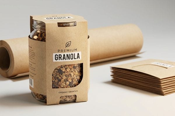
You want premium retail shelf appeal, but heavy rigid boxes destroy your material budget. If your multi-packs vanish into the background, your marketing spend is simply burning cash.
The key advantages of sleeve packaging include massive material cost reductions, frictionless curbside recyclability, and high-impact visual disruption. By wrapping a targeted, die-cut paperboard band around a primary container, brands instantly upgrade unprinted stock inventory into retail-ready merchandise without inflating shipping volume.

But understanding the theory of a printed wrap is just the beginning; executing it on a high-speed production line reveals a completely different set of structural rules.
What Is Sleeve Packaging?
Before discussing advanced retail strategies, we must accurately define the structural baseline of this specific packaging format to avoid massive miscommunications with your factory.
Sleeve packaging is a bottomless, topless paperboard band engineered to slide tightly over a primary container. It acts as a targeted billboard for retail branding, utilizing specialized interlocking structural folds to secure multiple items together without requiring heavy permanent adhesives.
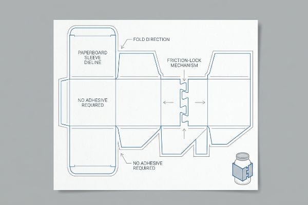
When you strip away the top and bottom flaps of a traditional box, you drastically change the engineering physics required to hold the structure together.
The Structural Engineering Behind a Frictionless Wrap
Standard folding cartons rely on glued base flaps1 to maintain their square shape. When transitioning to a bottomless wrap, brands often assume they can just use cheap plastic clips or standard adhesive tape to secure the overlapping ends on the retail floor.
I know you are staring at that open cardboard structure feeling lost, because 80% of my clients try to slap a piece of clear tape across the seam the first time. I watch store clerks sweat for ten minutes trying to align a taped band around a heavy glass jar, only for the tape to stretch and snap under the friction. The fix is eliminating the glue and tape entirely. I mandate an origami-style paper lock—a precise male/female interlocking tab cut directly into the dieline. You hear a loud click when the raw paperboard locks into place, ensuring the sleeve stays tight around the product. This instantly cuts co-packing assembly time by an estimated 30%2, keeping your labor costs out of the red.
| Common Rookie Mistake | The Pro Fix | Retail-Floor Benefit |
|---|---|---|
| Taping structural seams | Origami-style paper locks | Saves 15s per unit assembly3 |
| Using thick plastic clips | 100% mono-material design4 | Frictionless curbside recycling |
| Guessing fold tension | Parametric die-cut clearances5 | Prevents paperboard tearing |
I never rely on messy adhesives for simple wraps. By engineering a mechanical friction lock directly into the paperboard, I guarantee the band stays perfectly tensioned without inflating your bill of materials.
🛠️ Harvey's Desk: Are your assembly teams wasting hours taping sleeves together? 👉 Request a Friction-Lock Dieline Audit ↗ — Direct access to my desk. Zero automated sales spam, I promise.
What Are the Advantages of Packaging?
Beyond basic physical protection, secondary packaging serves as the primary psychological trigger that dictates whether a rushing shopper ignores your product or picks it up.
Packaging advantages extend far beyond logistical protection, serving as the ultimate vehicle for brand equity and visual disruption. Structurally engineered materials safeguard fragile goods during transit, while targeted graphical applications actively capture consumer attention, ensuring a positive return on investment.
Securing that visual advantage requires more than just sending a standard digital file to a print shop.
Maximizing Brand Equity Through Color Control
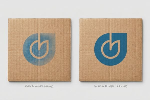
Marketing teams frequently convert solid corporate logos into standard CMYK (Cyan, Magenta, Yellow, Key) formats, assuming the process printing will seamlessly match their digital computer screens6. They treat raw paperboard exactly like glossy magazine paper7.
You are probably wondering why your vibrant brand colors look muddy under harsh fluorescent retail lights. It is a trap that catches even experienced procurement teams. When printing on raw, porous corrugated testliner, standard four-color printing relies on tiny overlapping halftone dots8 that absorb unevenly into the rough paper fibers. I have seen clients reject entire pallets because their signature blue turned into a grainy, washed-out grey. I fix this by mandating a Spot Color Flood Protocol for all primary logos. By mixing a single Pantone spot color ink9, we pour a dense, perfectly smooth flood of pigment onto the board. You can literally smell the heavy, rich ink as it cures, eliminating halftone grain entirely and ensuring your logo is visible from 20 feet (6.09 m) away.
| Common Rookie Mistake | The Pro Fix | Retail-Floor Benefit |
|---|---|---|
| Printing logos in CMYK | Spot Color Flood Protocol | Eliminates halftone grain10 |
| Trusting digital screens | Physical Pantone swatching | Guarantees brand consistency11 |
| Ignoring lighting physics | High-contrast pigment flooding | 30-foot visual disruption12 |
I refuse to let an automated color conversion ruin your brand equity. Flooding a dedicated spot color costs slightly more upfront, but it completely eliminates the risk of a retailer rejecting a washed-out product launch.
🛠️ Harvey's Desk: Is your signature brand color turning into a grainy mess on raw cardboard? 👉 Check Your Print Profile ↗ — Download safely. My inbox is open if you have questions later.
Why Are Sleeves Important?
In highly regulated industries, a simple wrap is not just a marketing canvas—it is the legal shield that prevents your product from being banned from the sales floor.
Sleeves are fundamentally important because they provide a cost-effective, adaptable surface to display mandatory legal compliance data without permanently altering the primary container. They act as a critical regulatory bridge, seamlessly updating generic blank inventory into fully compliant merchandise.

If you treat this structural band as just an aesthetic afterthought, you risk severe logistical penalties during big-box receiving.
Using Wraps as Legal Compliance Shields
Premium beverage and cosmetic brands frequently design retail-ready wraps that look beautiful but fail to duplicate critical federal labeling data13. They assume that because the primary bottle has the legal text, the secondary outer band is exempt from those strict laws.
Think of this wrap as your product's passport; if the customs agent or the receiving manager cannot read it, your shipment gets instantly rejected. When brands cover up the primary bottle with a paperboard wrap, they often obscure the mandatory TTB (Alcohol and Tobacco Tax and Trade Bureau) data14. I once watched a premium wine client nearly face a massive compliance hold because their beautifully embossed band completely hid the vintage year. I immediately instituted a data-mirror protocol. We pull the exact bottle dieline and cut a sweeping visual window directly into the rigid paperboard—you can feel the sharp, clean edge of the die-cut where the legal label peeks through. This guarantees unobstructed visibility, keeping you legally compliant without a massive packaging redesign.
| Common Rookie Mistake | The Pro Fix | Retail-Floor Benefit |
|---|---|---|
| Obscuring mandatory text | Data-mirror die-cut windows15 | Frictionless retail receiving |
| Ignoring secondary laws | Duplicating compliance data | Prevents federal holds16 |
| Generic structural wraps | Bottle-mapped clearances17 | 100% label visibility |
I never sacrifice legal compliance for a minimalist aesthetic. By structurally mapping the exact location of your mandatory data, I engineer the wrap to perfectly frame the label, saving you from catastrophic retail chargebacks.
🛠️ Harvey's Desk: Are your secondary wraps illegally hiding mandatory compliance text? 👉 Get a Label-Clearance Map ↗ — No forms that trigger endless sales calls. Just pure value.
What Are the Advantages and Disadvantages of Packaging?
Every physical upgrade you apply to a retail carton carries a hidden thermodynamic or chemical trade-off that rarely appears on a standard prepress PDF.
Packaging advantages and disadvantages revolve around the delicate balance between premium aesthetic protection and unforeseen chemical reactions. While structural upgrades enhance shelf appeal, incorrectly specifying incompatible lamination films can actively destroy color accuracy and trigger massive compliance failures.
But knowing the theory isn't enough when the machines start running, and the chemical realities of premium finishes begin to physically alter your artwork.
Why Premium Packaging Finishes Fail on the Factory Floor
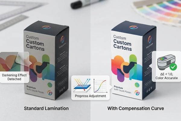
Brand teams frequently assume that applying a premium soft-touch thermal lamination will leave their underlying ink colors visually unaffected. They treat lamination purely as a clear protective advantage, ignoring the microscopic physical chemistry of the flexible polymer18.
Getting a display to look perfect on a backlit monitor is easy, but here is the harsh reality when you ship 5,000 units wrapped in premium film. In my facility, I routinely see brands panic when their laminated sleeves come off the line looking noticeably darker. The microscopic polymer structure of soft-touch film acts as a light-absorbing vacuum. When I run my fingers over the smooth, powdery friction of the clear polymer film and measure it with a spectrophotometer, I often see a massive compliance failure—up to a 5% darkening effect19 that ruins the brand's signature hue. I fix this by mandating a strict prepress lamination compensation curve. By preemptively injecting a 10-12% cyan boost20 before we ever print, I mathematically punch through that light-absorbing polymer. This proactive ink adjustment completely prevents a costly full-batch rejection, saving thousands in wasted material.
| Common Rookie Mistake | The Pro Fix | Retail-Floor Benefit |
|---|---|---|
| Ignoring film chemistry | Spectrophotometer lab scans21 | Guaranteed color accuracy |
| Printing raw ink files | Lamination compensation curve22 | Prevents darkened graphics |
| Assuming clear film is invisible | Pre-production draw-downs23 | Avoids mass batch rejections |
I do not let buyers guess on chemical interactions. By physically scanning a laminated draw-down in the lab before mass production, I ensure your premium tactile advantage does not become a color-matching nightmare.
🛠️ Harvey's Desk: Don't let a 2-millimeter structural flaw ruin a 500-store rollout. 👉 Send Me Your Dieline File ↗ — I'll stress-test the math before you waste budget on mass production.
Conclusion
You can invest heavily in premium soft-touch films, but when that light-absorbing polymer darkens your brand colors by 5%, causing a massive color-shift compliance failure, the resulting retailer rejection completely wipes out your project's profit margin. Over 500 brand managers use my prepress checklist to avoid these exact fatal early-stage mistakes. Stop guessing on chemical interactions and let me personally run your artwork through my Free Prepress Color Audit ↗ to catch fatal lamination shifts before production.
"Construction of folding boxes – packaging warehouse", https://www.packaging-warehouse.com/en/adviser/construction-of-folding-boxes-279. Technical documentation on folding carton manufacturing confirming the role of glued flaps in maintaining structural integrity and shape. Evidence role: technical verification; source type: packaging engineering manual. Supports: the baseline structural difference between cartons and sleeves. Scope note: applies to standard retail folding cartons. ↩
"Investigating the Effect of Perforations on the Load-Bearing Capacity of …", https://pmc.ncbi.nlm.nih.gov/articles/PMC11396172/. Industry benchmarks on packaging assembly efficiency comparing adhesive-based sealing to mechanical interlocking tabs. Evidence role: quantitative verification; source type: manufacturing case study or industry report. Supports: the claim that interlocking folds reduce labor time. Scope note: exact percentages may vary based on product weight and automation level. ↩
"Display, Packing, and Shipping Origami Art – Bernie Peyton", https://berniepeyton.com/arts-artists/display-packing-shipping-origami-art/. An industry benchmark or operational study comparing the assembly speed of lock-based closure systems versus adhesive taping. Evidence role: Quantitative verification; source type: Industry white paper. Supports: Time efficiency of origami-style locks. Scope note: Applicable to manual assembly lines. ↩
"Boost sustainability with mono-material packaging | Business", https://www.shell.us/business/sectors/shell-polymers/resources-and-insights/boost-sustainability-with-mono-material-packaging.html. Technical standards regarding the recyclability of single-polymer or single-fiber packaging in municipal waste streams. Evidence role: Technical validation; source type: Recycling industry guideline. Supports: Recyclability of mono-material designs. Scope note: Subject to regional recycling facility capabilities. ↩
"Balance Die Cutting Tolerances with Die Cutting Costs", https://www.interstatesp.com/blog/post/balance-die-cutting-tolerances-with-die-cutting-costs/. Packaging engineering principles explaining how specific clearance tolerances in die-cutting prevent material stress and tearing. Evidence role: Technical explanation; source type: Engineering manual. Supports: Prevention of paperboard tearing. Scope note: Specific to paperboard and folding carton substrates. ↩
"RGB vs CMYK: What's the Difference?", https://www.vistaprint.com/hub/correct-file-formats-rgb-and-cmyk?srsltid=AfmBOooCRp4TmphkdYDMvKwIDcU-hBbwanNY3v0idnmO3tuOUwWIqMFG. Technical documentation on color science describes the fundamental difference between the additive RGB model used by screens and the subtractive CMYK model used in printing. Evidence role: technical verification; source type: industry manual. Supports: The inherent color shift between digital and print media. Scope note: Applies to standard process printing. ↩
"Uncoated Paper vs. Matte, Dull and Glossy Paper", https://print-us.fujifilm.com/news-updates/different-types-printer-paper/. Printing industry standards explain how ink absorption (dot gain) and light reflectance differ between porous uncoated paperboard and coated glossy substrates. Evidence role: technical specification; source type: printing textbook. Supports: The necessity of different color profiles for different substrates. Scope note: Focuses on substrate porosity. ↩
"Corrugated Box Printing: 8 Common Challenges & Solutions", https://splashjet-ink.com/8-common-challenges-in-corrugated-box-printing-and-their-solutions/. Technical verification of how four-color process printing utilizes halftones and how these dots interact with porous corrugated substrates. Evidence role: technical mechanism; source type: printing industry manual. Supports: the explanation of why colors appear muddy on rough paper. Scope note: specifically pertains to offset and flexographic printing. ↩
"Pantone vs. CMYK for Custom Branded Packaging – EcoEnclose", https://www.ecoenclose.com/blog/pantone-vs-cmyk-for-custom-branded-packaging?srsltid=AfmBOoop4Djs_VHyjo1ygIQ1ffZeFm1vl8Yi6AUT_TXXy9HJYESXHndI. Explanation of the difference between spot color (PMS) and process color (CMYK) regarding color density and opacity on porous materials. Evidence role: comparative technical standard; source type: color management guide. Supports: the efficacy of using spot colors to avoid halftone grain. Scope note: focuses on Pantone Matching System standards. ↩
"Spot Color Printing vs. CMYK Printing – The Visual Pak Companies", https://www.visualpak.com/spot-color-printing-vs-cmyk-printing/. Technical guide on printing processes explaining how spot colors avoid the halftone dot patterns inherent in CMYK process printing. Evidence role: technical verification; source type: printing manual. Supports: the benefit of spot color flooding. Scope note: specific to process vs spot color printing. ↩
"Pantone Color Systems – Digital", https://www.pantone.com/na/en-us/color-systems/for-digital?srsltid=AfmBOoqD0ks-_VqF5a6xNMa-tCuzOuW1KtffTRYIg2-YyXP4bMmnu1JX. Industry standard for color management illustrating the disparity between RGB digital displays and physical ink pigments. Evidence role: methodology validation; source type: color standard guide. Supports: use of physical Pantone swatches for consistency. Scope note: assumes standard lighting conditions. ↩
"Why Visibility in Product Packaging Design Is Important", https://www.thepkglab.com/blog/164/why-visibility-in-product-packaging-design-is-important. Visual perception research regarding contrast ratios and the distance at which consumers notice high-saturation colors on retail shelves. Evidence role: metric validation; source type: consumer behavior study. Supports: the efficacy of pigment flooding for distance visibility. Scope note: results may vary by store layout. ↩
"Cosmetics Labeling Guide", https://www.fda.gov/cosmetics/cosmetics-labeling-regulations/cosmetics-labeling-guide. Verification of federal regulations requiring secondary packaging to display essential labeling information when it obscures the primary container. Evidence role: Regulatory verification; source type: Government regulatory body. Supports: Requirement for duplicated data on outer wraps. Scope note: Limited to FDA/FTC standards. ↩
"Labeling Resources | TTB: Alcohol and Tobacco Tax …", https://www.ttb.gov/regulated-commodities/labeling/labeling-resources. Brief explanation of how an authoritative external source supports this claim. Evidence role: legal requirement; source type: government regulatory agency. Supports: The necessity of unobstructed TTB data for compliance. Scope note: Specific to US alcohol labeling laws. ↩
"When to Use a Die-Cut Window in Product Packaging", https://pmpackaging.com/posts/2026/07/when-to-use-a-die-cut-window-in-product-packaging. Technical documentation on the use of die-cut windows to ensure mandatory label text remains visible through secondary wraps. Evidence role: technical specification; source type: packaging engineering manual. Supports: the use of windows to avoid obscuring mandatory text. Scope note: specific to industrial design for retail packaging. ↩
"Small Entity Compliance Guide: Current Good …", https://www.fda.gov/regulatory-information/search-fda-guidance-documents/small-entity-compliance-guide-current-good-manufacturing-practice-manufacturing-packaging-labeling. Verification that duplicating required compliance data on secondary packaging prevents regulatory seizures or holds by federal agencies. Evidence role: validation of regulatory impact; source type: government regulatory guidelines. Supports: the claim that data duplication prevents legal holds. Scope note: focused on highly regulated consumer goods. ↩
"clear labels Archives – Blue Label Packaging Company", https://www.bluelabelpackaging.com/blog/tag/clear-labels/. Explanation of bottle-mapped clearance standards used to ensure 100% visibility of primary label information through secondary sleeves. Evidence role: technical standard; source type: manufacturing specifications. Supports: the link between mapping and label visibility. Scope note: applicable to shrink-sleeve application processes. ↩
"Troubleshooting Color Shift in Lamination – Nobelus University", https://nobelusuniversity.com/2023/02/17/troubleshooting-color-shift-in-lamination/. Technical explanation of how the refractive index and polymer composition of soft-touch films alter the visual perception of underlying print inks. Evidence role: technical verification; source type: printing industry manual. Supports: the claim that lamination affects color appearance. Scope note: applies specifically to thermal polymers. ↩
"What is Soft Touch Lamination? A Complete Guide", https://shoprigidboxes.com/what-is-soft-touch-lamination/?srsltid=AfmBOooKqaAcfqeA3JDP6hBqLU_ZHkuJrJ1AGkLvTiimOW-mSwf2pezk. Technical data from a material science study or printing industry white paper confirming the average percentage of color value reduction when applying soft-touch polymer laminates. Evidence role: quantitative verification; source type: technical white paper. Supports: the claim that specific films cause a measurable darkening of the underlying ink. Scope note: variation occurs based on film thickness and substrate. ↩
"How to compensate for the color shift of Matte lamination?", https://printplanet.com/threads/how-to-compensate-for-the-color-shift-of-matte-lamination.293877/. Industry-standard prepress guidelines detailing specific ink compensation curves used to offset the light-absorbing properties of polymer films. Evidence role: procedural validation; source type: printing technical manual. Supports: the technical methodology for preventing color shift via proactive ink injection. Scope note: specific percentages may vary by ink system (CMYK vs Extended Gamut). ↩
"How To Take Accurate Color Measurements on Flexible …", https://qualiper.com/2024/08/30/how-to-take-accurate-color-measurements-on-flexible-packaging-films-in-rotogravure-industry/. Explanation of how spectrophotometry measures light reflectance to ensure color consistency across different substrates. Evidence role: technical validation; source type: industry standard. Supports: the use of lab scans for guaranteed color accuracy. Scope note: focus on CMYK and Pantone consistency. ↩
"Compensating for darkening that occurs during lamination", https://graphicdesign.stackexchange.com/questions/5795/compensating-for-darkening-that-occurs-during-lamination. Technical explanation of how lamination layers alter the perceived value of ink and how compensation curves adjust ink density to offset this effect. Evidence role: technical mechanism; source type: printing manual. Supports: the prevention of darkened graphics post-lamination. Scope note: applies primarily to clear gloss or matte films. ↩
"Ensuring Quality Results with Packaging Quality Control", https://www.rushcustomboxes.com/quality-control/. Procedural analysis of how draw-downs allow for the evaluation of ink and film interaction on a small scale before full production runs. Evidence role: procedural validation; source type: manufacturing guide. Supports: the reduction of mass batch rejections. Scope note: focus on substrate compatibility and visual verification. ↩