Has gastado una fortuna para que tu producto llegue a las grandes superficies, pero si las cajas no están diseñadas para una rápida distribución, los empleados, siempre ocupados, simplemente las tirarán al almacén.
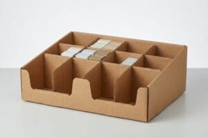
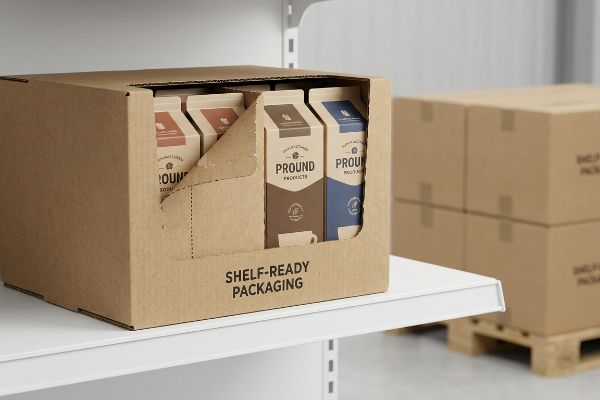
El embalaje listo para la venta es un contenedor de transporte de cartón corrugado diseñado para trasladar la mercancía directamente desde el palé de envío al estante de la tienda en un solo movimiento. Estas estructuras eliminan el desembalaje manual, reducen la fricción laboral y mantienen una presentación impecable de la marca dentro de las cadenas de suministro globales estándar.
La teoría suena muy bien en una sala de juntas, pero lograr esa transición perfecta de la caja al estante requiere matemáticas estructurales implacables.
¿Cuáles son las ventajas de los envases listos para la venta?
La ventaja obvia es la visibilidad, pero el verdadero beneficio reside en la rapidez operativa. Si tu caja dificulta el paso al dependiente, pierdes espacio en la estantería.
Entre las ventajas del empaque listo para la venta se incluyen una drástica reducción del tiempo de reposición, menos casos de falta de existencias y una perfecta alineación de la marca. Al minimizar la manipulación física por parte del personal de la tienda, estas unidades de merchandising precargadas garantizan que los productos lleguen al consumidor más rápido, evitando costosos daños durante el transporte.

Pero esas ventajas se esfuman en el instante en que un diseñador junior te entrega una plantilla de troquelado sin probar.
Cómo maximizar el retorno de la inversión mediante un ensamblaje sin frustraciones
Muchas marcas asumen que empaquetar cajas complejas de estilo origami en cajas planas les permitirá ahorrar en logística¹.Dejan el trabajo pesado al personal de reposición nocturna de la tienda, confiando en que descifren un proceso de plegado de varios pasos en un pasillo oscuro. Esto traslada la responsabilidad técnica a los empleados de la tienda, quienes no tienen el tiempo ni la paciencia para lidiar con el cartón.
Sé que estás mirando ese archivo estructural de paquete plano preguntándote por qué la tienda lo rechazó, porque el 80% de mis clientes subestiman el agotamiento de un empleado del turno de noche. He visto a empleados sudar la gota gorda con un complejo cierre de fricción durante diez segundos antes de simplemente arrancar el cartón crudo —literalmente se puede oír el fuerte sonido del desgarro— y pegar los lados con cinta adhesiva, destruyendo por completo el valor de la marca. Para evitar esto, exijo un sistema de bandejas con bases de cierre rápido que se encajan en su lugar al instante. Esto elimina la fricción del plegado, acelerando la línea de montaje en un 30% estimado²,lo que en última instancia protege la presentación impecable de tu marca en el estante físico.
| Error común de principiante | La solución profesional | Beneficio para el punto de venta |
|---|---|---|
| Pestañas de bloqueo por fricción complejas | Bases preencoladas con sistema de bloqueo automático | Ahorra 30 segundos por unidad |
| Confiar en empleados nocturnos | Co-empaquetado a nivel de fábrica | Garantiza la coherencia de la marca |
| Empaquetado plano de bandejas delicadas | Sistemas de apilamiento modular | Evita que las esquinas se aplasten |
Un mal diseño nunca debería arruinar el lanzamiento de tu producto. Al eliminar las dificultades de ensamblaje en la fábrica, este sistema garantiza que tu producto llegue a las tiendas tal como lo imaginaste.
🛠️ Oficina de Harvey: ¿Están bajando los índices de ejecución en sus tiendas porque a los empleados no les gusta armar las cajas? 👉 Obtenga una auditoría gratuita de troquelado ↗ — Acceso directo a mi oficina. Sin spam de ventas automatizado, lo prometo.
¿Qué significa "embalaje listo para la venta"?
Entender la definición es fácil, pero la ejecución de la mecánica de una capucha desmontable es donde la mayoría de las campañas fracasan por completo.
El embalaje listo para la venta se refiere a una caja de envío secundaria que se transforma en un expositor principal sin necesidad de cúteres. Esta clasificación estructural específica utiliza perforaciones diseñadas o mecanismos de apertura limpia, lo que permite a los reponedores retirar rápidamente la cubierta de transporte y exponer de inmediato la mercancía lista para la venta.

Abrir una caja limpiamente parece sencillo hasta que te das cuenta de que estás luchando contra la resistencia física de una pulpa de madera gruesa.
La física detrás de las perforaciones de desgarro limpio
Se suele suponer que con solo dibujar una línea punteada en Adobe Illustrator se conseguirá, por arte de magia, una rotura limpia en la planta de producción. Las marcas suelen solicitar embalajes protectores de alta resistencia y, a la vez, esperan que esas mismas paredes gruesas cedan sin esfuerzo cuando un empleado tire del panel frontal. Esto genera un grave conflicto estructural entre la resistencia a la compresión durante el transporte y la accesibilidad a nivel de estantería³ .
Cuando los clientes me preguntan por qué sus tapas desprendibles parecen haber sido mordidas por un perro, suele ser porque la proporción de muescas de perforación nunca se equilibró matemáticamente4 con el calibre de la flauta B. He sentido la rigidez del cartón kraft virgen al volver a su posición original cuando la proporción de corte a sujeción es demasiado ajustada, obligando al dependiente a cortarlo con un cúter y rebanar el producto principal del interior. Diseño una proporción de muescas específica, probada mediante vibración, para cada diseño, encontrando el umbral exacto en milímetros donde la caja resiste una prueba de caída de 91,4 cm (36 pulgadas)5 pero aún así cede suavemente al tacto. Esto evita la pérdida de inventario causada por daños accidentales a la cuchilla y garantiza un borde limpio y de primera calidad para el cliente.
| Error común de principiante | La solución profesional | Beneficio para el punto de venta |
|---|---|---|
| Líneas punteadas aleatorias de Illustrator | Relaciones de corte diseñadas6 | Garantiza un desgarro perfectamente recto |
| Tablas de tránsito excesivamente gruesas | Compresión de flauta equilibrada7 | Evita daños en el producto con cúter |
| Ignorando la física de la prueba de caída | Simulación de vibraciones8 | Resiste el transporte, se abre fácilmente |
Dejar al azar la resistencia al desgarro es un error costoso. Lograr un equilibrio entre la durabilidad durante el transporte y el fácil acceso a los estantes es una ciencia matemática precisa, no un detalle de diseño gráfico secundario.
🛠️ Harvey's Desk: ¿Tus cajas de embalaje desprendibles se ven deshilachadas y desordenadas una vez que llegan a la estantería de la tienda? 👉 Solicita una revisión estructural ↗ — Descarga de forma segura. Mi bandeja de entrada está abierta si tienes alguna pregunta más adelante.
¿Cuál es el envase más llamativo?
El impacto visual es el objetivo final, pero destacar en un pasillo abarrotado requiere mucho más que un simple logotipo llamativo.
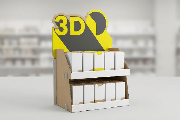
Los envases más llamativos rompen estructuralmente la monotonía visual de los pasillos de las tiendas mediante formas troqueladas agresivas y colores planos de alto contraste. En lugar de depender únicamente del texto impreso plano, estos innovadores vendedores aprovechan la arquitectura tridimensional para captar la atención del comprador desde cualquier punto de la tienda.
Pero tratar a tu tienda física como si fuera una valla publicitaria plana es la forma más rápida de volverte invisible.
Dominando la regla de interacción espacial 3-3-3
Los equipos de marketing junior suelen diseñar expositores exclusivamente para su visualización en monitores retroiluminados, ignorando la realidad física de cómo los compradores recorren los pasillos de la tienda. Amontonan una cantidad ingente de texto en el borde frontal, con la esperanza de informar al consumidor sobre cada característica del producto. Este enfoque plano y cargado de texto provoca una enorme sobrecarga cognitivaen un entorno dinámico.
Piensa en un comprador como en un conductor en la autopista; no leerá un párrafo denso a cien kilómetros por hora. Incluso los diseñadores más experimentados suelen pasar por alto este punto ciego, creando gráficos preciosos que se convierten en una imagen borrosa y confusa bajo la luz fluorescente intensa, vistos desde nueve metros de distancia. Yo aplico la regla 3-3-3: usa una forma troquelada tridimensional de gran tamaño para captar la atención desde nueve metros, colores llamativos para un metro y recorta el borde de retención bajo para la conversión final de siete centímetros. Cuando paso el pulgar por encima del barniz UV brillante de alto contraste en ese punto focal, sé que va a atraer miradas, impulsando las compras impulsivas y aumentando significativamente la velocidad de venta.
| Error común de principiante | La solución profesional | Beneficio para el punto de venta |
|---|---|---|
| Párrafos diminutos y con mucho texto | Disrupción visual 3D de 30 pies10 | Atrae el tráfico peatonal de pasillos distantes |
| Paneles planos estilo valla publicitaria | Encabezados troquelados agresivos11 | Rompe la monotonía de los estantes |
| Colores turbios de semitonos CMYK | colores directos Pantone12 | Resalta bajo la iluminación intensa de la tienda |
Los vendedores eficaces deben actuar como vendedores silenciosos en la tienda. Al diseñar estrategias para captar la atención del público en lugar de simplemente pegar gráficos en cartón, su campaña atraerá un gran número de clientes.
🛠️ Harvey's Desk: ¿Tu expositor actual se pierde entre el caos de una gran superficie comercial? 👉 Solicita tu revisión de diseño 3D ↗ — Sin formularios que generen interminables llamadas de ventas. Solo valor puro.
¿Qué es un ejemplo de envase listo para la venta?
El ejemplo clásico es una bandeja de vino de alta gama que se desliza sin problemas sobre una tapa, pero las plantillas estándar a menudo sabotean el principal atractivo de la botella.
Un ejemplo de embalaje listo para la venta es una bandeja de cartón corrugado para vino que transporta botellas de vidrio de forma segura y se coloca directamente en la tapa del estante. Estas bandejas especializadas utilizan bordes frontales troquelados a medida para asegurar el peso de la mercancía, garantizando al mismo tiempo que las etiquetas principales del producto permanezcan completamente visibles para el consumidor.

Lograr que una sola pantalla luzca perfecta en una maqueta digital es fácil, pero esta es la cruda realidad cuando se envían 500 de ellas a un entorno de grandes superficies altamente regulado.
La trampa de la ofuscación de etiquetas
Los equipos de compras suelen recurrir a plantillas genéricas para transportar botellas de vidrio pesadas, dando por sentado que cualquier soporte frontal estándar será suficiente. Se centran exclusivamente en evitar que las botellas se inclinen hacia adelante, dimensionando el borde frontal lo suficientemente alto para soportar el peso. Este error ignora por completo el estricto cumplimiento de las normas de comercialización de la TTB (Oficina de Impuestos y Comercio de Alcohol y Tabaco)¹³ que se exige para de vino premium .
En mi laboratorio, veo con frecuencia que los clientes envían archivos de arte donde un borde frontal estándar de 11,4 cm (4,5 pulgadas)oculta por completo la información varietal crucial impresa en la etiqueta de la botella. Esto no es solo una teoría: lo veo suceder en la planta de pruebas cuando cargamos los primeros prototipos físicos, y el principal valor de marketing simplemente desaparece tras una pared de papel marrón. Importo las líneas de troquelado digitales directamente a nuestro software CAD (Diseño Asistido por Computadora) y mapeo las dimensiones exactas de la botella, realizando un corte preciso de 5,8 cm (2,3 pulgadas) de profundidad en esa pared de contención. Al aplicar esta ventana de visibilidad microajustada, garantizo que la integridad estructural permanezca completamente intacta para una carga de 18,1 kg (40 libras)15, eliminando por completo el riesgo de rechazo por parte del minorista debido a etiquetas legales ocultas.
| Error común de principiante | La solución profesional | Beneficio para el punto de venta |
|---|---|---|
| Utilizando labios de bandeja altos genéricos | Mapeo de separación de etiquetas CAD personalizado16 | Muestra el 100% de la etiqueta de la botella |
| Ignorar las normas de comercialización de la TTB17 | Curvas troqueladas diseñadas | Evita las retenciones de cumplimiento por parte de los minoristas |
| Sacrificar la fuerza por la vista | Muros de contención sometidos a pruebas de carga18 | Sostiene vidrio pesado de forma segura |
Una pared de cartón genérica nunca debería ocultar su activo más valioso. El diseño adecuado de bandejas consiste en combinar una logística sólida con una presentación visual impecable para garantizar el cumplimiento.
🛠️ Oficina de Harvey: No permita que un defecto estructural de 2 milímetros arruine el lanzamiento de 500 tiendas. 👉 Envíeme su archivo de troquelado ↗ — Analizaré los cálculos antes de que malgaste su presupuesto en la producción en masa.
Conclusión
Puedes optar por un proveedor más económico, pero cuando ese borde frontal genérico eclipsa por completo las etiquetas de tu producto premium, provocando una grave obstrucción visual que lleva al rechazo inmediato del minorista, tu presupuesto de marketing se esfuma. Más de 500 gerentes de marca utilizan mi lista de verificación de preimpresión para evitar precisamente estos errores fatales en las primeras etapas. Deja de adivinar las tolerancias dimensionales y permíteme revisar personalmente tus archivos estructurales con mi Auditoría Gratuita de Troqueles ↗ para detectar conflictos de visibilidad antes de que pagues por la producción en masa.
"Flat Pack vs. Assembled Rigid Boxes: Which Shipping Method is …", https://www.linkedin.com/pulse/flat-pack-vs-assembled-rigid-boxes-which-shipping-method-ricky-fang-4m4oc. [Los datos de la industria sobre la utilización cúbica y la eficiencia del transporte respaldan la afirmación de que el flat pack reduce los costos de envío al maximizar la densidad de palés]. Función de la evidencia: respaldo fáctico; tipo de fuente: informe técnico sobre logística. Respalda: la justificación financiera de los diseños flat pack. Nota de alcance: analiza los costos de transporte excluyendo los gastos generales de mano de obra minorista. ↩
"Cajas con cierre automático | Caja con fondo automático – Smurfit Westrock", https://www.smurfitwestrock.com/products/packaging/corrugated/crashlock-boxes. [Los estudios de la industria sobre comercialización minorista y logística de embalaje proporcionan datos cuantitativos sobre el tiempo ahorrado al cambiar del plegado manual a los sistemas SRP de encaje a presión]. Función de la evidencia: verificación cuantitativa; tipo de fuente: informe de la industria. Apoya: la afirmación de ganancias de productividad específicas gracias al ensamblaje optimizado de SRP. Nota de alcance: los porcentajes de eficiencia pueden variar según la complejidad del embalaje. ↩
"Estudio comparativo de la resistencia a la compresión de…", https://repository.rit.edu/theses/285/. [Las normas de ingeniería de embalaje explican cómo aumentar la resistencia al calibrador o al estallido de un embalaje para mejorar su durabilidad durante el transporte incrementa la fuerza necesaria para romper las líneas perforadas]. Función de la evidencia: verificación técnica; tipo de fuente: manual de ingeniería de embalaje. Apoya: la relación entre durabilidad y facilidad de apertura. Nota de alcance: específicamente en relación con el cartón corrugado. ↩
"Investigación del efecto de las perforaciones en la capacidad de carga…", https://pmc.ncbi.nlm.nih.gov/articles/PMC11396172/. [Los manuales de ingeniería de embalaje detallan la relación matemática entre el espaciado de las perforaciones y el grosor del cartón para garantizar una calidad de desgarro uniforme]. Función de la evidencia: especificación técnica; tipo de fuente: manual de la industria. Apoya: la necesidad de equilibrar las relaciones de muesca con el calibre del material. Nota de alcance: Se aplica específicamente al cartón ondulado de flauta B. ↩
"[PDF] Directrices para la selección y el uso de los procedimientos de prueba ISTA® y…", https://ista.org/docs/ISTA_2017_Guidelines.pdf. [Los estándares de la industria, como los puntos de referencia ISTA, especifican alturas estandarizadas para las pruebas de caída con el fin de verificar la integridad estructural de los envases listos para la venta al por menor durante el transporte]. Función de la evidencia: validación métrica; tipo de fuente: estándar internacional. Apoya: la altura específica utilizada para las pruebas de durabilidad. Nota de alcance: Los requisitos pueden variar según el peso total de la unidad. ↩
"Endonucleasas de corte naturales y modificadas: desde la escisión…", https://pmc.ncbi.nlm.nih.gov/articles/PMC3017599/. [Las directrices de la industria sobre el diseño de cartón ondulado especifican las proporciones precisas de perforación a material sólido necesarias para garantizar trayectorias de desgarro lineales]. Función de la evidencia: especificación técnica; tipo de fuente: manual de ingeniería. Apoya: el mecanismo de desgarros rectos en SRP. Nota de alcance: Se aplica específicamente a sustratos de cartón ondulado. ↩
"Métodos de prueba y efectos del pandeo entre flautas – BioResources", https://bioresources.cnr.ncsu.edu/resources/overview-of-recent-studies-at-ipst-on-corrugated-board-edge-compression-strength-testing-methods-and-effects-of-interflute-buckling/. [Documentos técnicos sobre la mecánica del cartón corrugado explican cómo la optimización de la compresión de las flautas previene la penetración profunda accidental de la cuchilla durante el desembalaje]. Función de la evidencia: ciencia de los materiales; tipo de fuente: documento técnico de la industria. Apoya: la prevención de daños al producto por cúteres. Nota de alcance: Varía según el perfil de la flauta (por ejemplo, flauta B frente a flauta E). ↩
"Pruebas de vibración de embalajes: impacto por caída y vibración", https://vibrationresearch.com/packaging-industry/. [Normas como la ASTM D4169 detallan cómo la simulación de vibraciones identifica la fatiga estructural y los puntos de fallo con mayor precisión que las pruebas de caída estáticas]. Función de la evidencia: protocolo de prueba; tipo de fuente: norma técnica. Apoya: la eficacia de la simulación para la supervivencia durante el transporte. Nota de alcance: Se centra en entornos logísticos simulados. ↩
"Preferencia del consumidor por paquetes de alimentos bajo carga cognitiva – PMC", https://pmc.ncbi.nlm.nih.gov/articles/PMC8997493/. [Investigaciones en psicología cognitiva y comportamiento del consumidor indican que la densidad excesiva de información en entornos con alta estimulación conduce a una sobrecarga cognitiva, lo que reduce la efectividad de las comunicaciones de marketing]. Función de la evidencia: Soporte técnico; tipo de fuente: Revista académica revisada por pares; Apoya: La afirmación de que los diseños con mucho texto dificultan la participación del comprador. Nota de alcance: Se centra en entornos minoristas de ritmo acelerado. ↩
"Psicología del empaquetado: Entendiendo cómo piensan los compradores y…", https://kadence.com/en-us/knowledge/packaging-psychology-understanding-how-shoppers-think-and-behave/. [Investigación sobre psicología del comercio minorista y seguimiento ocular del consumidor determina la distancia específica a la que los elementos de empaquetado de alto contraste provocan por primera vez una respuesta de "parada" en el tránsito peatonal]. Rol de la evidencia: Métrica empírica; tipo de fuente: Estudio de psicología del comercio minorista. Apoya: La efectividad de las señales visuales de largo alcance. Nota de alcance: La efectividad de la distancia puede variar según el ancho del pasillo y las condiciones de iluminación. ↩
"Diseño de envases para visibilidad en el estante: la guía completa para…", https://confetti.design/blog/packaging-design-for-shelf-visibility. [Estudios de diseño sobre la 'interrupción de patrones' demuestran que romper la cuadrícula geométrica rectangular de un estante minorista mediante formas no estándar aumenta la duración de la mirada del consumidor]. Rol de la evidencia: Principio de diseño; tipo de fuente: Estudio de caso de diseño de envases. Apoyos: Uso de la disrupción estructural para romper la monotonía del estante. Nota de alcance: La efectividad es relativa a las formas utilizadas por las marcas de la competencia. ↩
"Diferencia entre color directo y color CMYK", https://www.deprintedbox.com/blog/spot-vs-process-color/. [Los estándares de la industria de la impresión explican cómo los colores directos proporcionan una cobertura de pigmento sólida y de alta saturación que evita la apariencia "turbia" de los puntos de semitono CMYK bajo la iluminación fluorescente de alta intensidad de las tiendas]. Función de la evidencia: Especificación técnica; tipo de fuente: Estándar de la industria de la impresión. Apoya: Uso de colores directos para una máxima viveza del color. Nota de alcance: Se aplica específicamente a los procesos de impresión offset y especiales. ↩
"Etiquetado del vino | TTB: Oficina de Impuestos y Comercio de Alcohol y Tabaco", https://www.ttb.gov/regulated-commodities/beverage-alcohol/wine/labeling. [Una fuente regulatoria gubernamental de la TTB especificaría los requisitos de etiquetado y visibilidad para los productos de vino a fin de garantizar el cumplimiento legal]. Función de la evidencia: verificación regulatoria; tipo de fuente: agencia gubernamental. Apoya: la afirmación de que existe un cumplimiento federal específico con respecto a la comercialización del vino. Nota de alcance: aplicable a la distribución de alcohol con sede en EE. UU.
"Caja para botellas de vino – Paquete de doce unidades listas para la venta – Bennett Packaging", https://bpkc.com/products/wine-mother-carton-twelve-pack-shelf-ready. [Las especificaciones de la industria para envases de cartón corrugado listos para la venta verificarían si 4,5 pulgadas es una altura de borde estándar para las bandejas de botellas de vino]. Función de la evidencia: verificación de hechos; tipo de fuente: estándar técnico de la industria. Apoyos: La frecuencia de la ocultación de etiquetas. Nota de alcance: Las dimensiones pueden variar según el tamaño de la botella y los requisitos del minorista. ↩
"Prueba de compresión modificada de bandeja de fruta de cartón corrugado – PMC", https://pmc.ncbi.nlm.nih.gov/articles/PMC9920484/. [Los datos de ingeniería o los informes de pruebas de carga para cartón corrugado verificarían la capacidad de peso de una bandeja SRP modificada]. Función de la evidencia: validación técnica; tipo de fuente: informe de ingeniería. Apoya: La seguridad de la modificación de curvatura de 2,3 pulgadas. Nota de alcance: La capacidad de carga depende del grado de cartón y del tipo de flauta utilizados. ↩
"Estudio exploratorio sobre soluciones de diseño de envases listos para la venta", https://www.academia.edu/117688592/An_Exploratory_Study_on_Shelf_Ready_Packaging_Design_Solutions. El diseño asistido por computadora (CAD) se utiliza en la ingeniería de envases para simular líneas de visión y garantizar que las etiquetas de los productos permanezcan visibles dentro de las limitaciones de los estantes de venta minorista. Función de la evidencia: metodología técnica; tipo de fuente: manual de ingeniería industrial. Apoya: la eficacia del mapeo de precisión sobre las plantillas genéricas. Nota de alcance: se refiere a la ergonomía visual .
"Anatomía de una etiqueta de vino", https://www.ttb.gov/regulated-commodities/beverage-alcohol/wine/anatomy-of-a-label. La Oficina de Impuestos y Comercio de Alcohol y Tabaco (TTB) aplica leyes estrictas de etiquetado y comercialización de bebidas alcohólicas para garantizar la protección del consumidor y el cumplimiento tributario. Función de la evidencia: verificación legal; tipo de fuente: agencia reguladora gubernamental. Apoya: la necesidad de un diseño de empaque orientado al cumplimiento. Nota de alcance: Aplicable principalmente a la ley federal de EE. UU .
"[PDF] Especificaciones de cartón corrugado – Fibre Box Association", https://www.fibrebox.org/assets/2025/09/Walmart_Corrugated-Board_Specifications_Automation_Packaging_Standards.pdf. Las normas industriales para materiales corrugados requieren pruebas de compresión y carga para garantizar que el embalaje pueda soportar el peso específico de botellas de vidrio pesadas sin colapsar. Función de la evidencia: especificación técnica; tipo de fuente: organización de normas de embalaje. Apoya: seguridad e integridad estructural del SRP. Nota de alcance: se centra en las métricas de resistencia del material. ↩