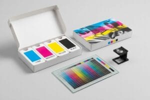
Staring at a physical prototype that looks completely different from your digital proofs is incredibly frustrating. But guessing is never a viable strategy when expensive retail space is involved.
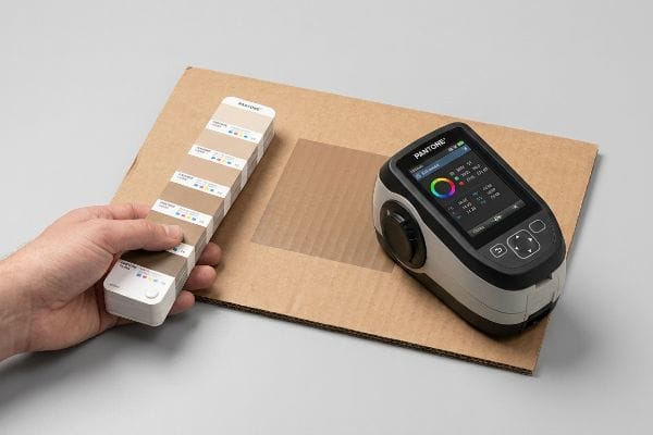
Getting an accurate color match requires abandoning visual guesswork and relying on mathematical pigment calibration. Factory experts use physical Pantone swatches, spectrophotometer readings under controlled D50 lighting, and strict spot color protocols to guarantee that branded packaging looks identical across every global production run without fading.
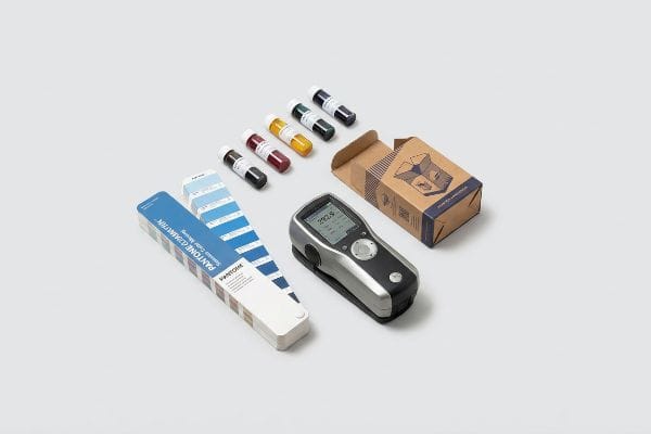
Let's step off the screen and onto the factory floor to see how we physically force ink to behave on raw corrugated board.
What is the most accurate way to match paint?
You cannot trust your eyes to judge pigment, especially when moving between different substrates. The secret to absolute precision is removing human perception entirely from the approval equation.
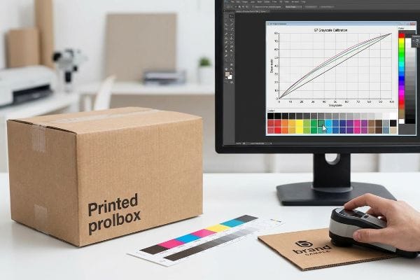
Matching paint most accurately requires implementing strict digital calibration standards. This scientific methodology aligns prepress digital files with physical press outputs using exact grayscale metrics, guaranteeing that the target brand colors translate flawlessly onto porous substrates like corrugated testliner without ever relying on subjective human visual perception.
Theory sounds great, but applying pigment to thick cardboard introduces a messy physical variable.
Why Visual Matching Fails on Corrugated
Brand managers often approve artwork on a bright, glossy computer monitor. They assume standard commercial printing methods will seamlessly reproduce those exact hues on bulk retail merchandisers. This visual-only approach ignores the foundational difference in material surface tension and absorbency1.
Even veteran designers fall into the trap of using a standard CMYK (Cyan, Magenta, Yellow, Black) mix for everything. When I walk the floor, I often smell the sharp odor of heavy wet ink sitting on top of virgin kraft board because the operator had to flood the sheet to compensate for an uncalibrated digital file. This forces the ink to pool and dry unevenly, completely altering the final hue. Instead of guessing, I mandate a strict G7 grayscale calibration curve2 in our prepress RIP (Raster Image Processor) software, effectively telling the press exactly how much the paper will absorb before the first sheet even drops.
| Common Rookie Mistake | The Pro Fix | Retail-Floor Benefit |
|---|---|---|
| Approving colors via monitor | G7 Grayscale prepress calibration | Ensures visual consistency |
| Relying on standard CMYK mixes | Formulating ink to material absorbency | Prevents muddy, washed-out logos |
| Ignoring lighting conditions | Standardized D50 lighting reviews | Eliminates fluorescent color shift |
Client approvals should never rely on screen brightness settings. Utilizing mathematical prepress calibration strips out the guesswork, actively preventing the costly color shifts that drag down retail sales velocity.
🛠️ Harvey's Desk: Not sure if your artwork is safely inside the bleed line? 👉 Send Me Your Flat Dieline File ↗ — Direct access to my desk. Zero automated sales spam, I promise.
Can I get an exact paint match?
The short answer is yes, but the definition of "exact" depends on how tightly you control the machinery tolerances and the testing environment before mass production begins.
Yes. An exact paint match is entirely possible when you rely on strict mathematical tolerance measurements. By utilizing advanced color management systems, manufacturers mathematically measure the distance between the approved digital target and the physical output, ensuring the deviation remains completely invisible to the human eye.
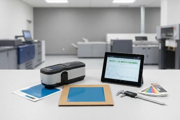
But bridging the gap between a perfect laboratory reading and high-speed manufacturing takes serious operational discipline.
The Reality of Delta-E in Retail Packaging
Many procurement teams demand a flawless match but fail to specify a quantifiable mathematical threshold. Without a shared numerical standard, "exact" becomes a subjective argument between the brand director and the print operator. Standard commercial printers might allow a wide variance3, which looks terrible under harsh retail lighting.
A frequent trap that catches even experienced procurement teams is signing off on a small, glossy proof and expecting the 48-inch (121.9 cm) tall floor display to match it perfectly. I once watched an entire pallet of displays get flagged because the blue hue drifted slightly during a long run; the gritty, physical friction of the printing plates against the rough 32ECT (Edge Crush Test) board had worn the pigment density down. To fix this, I enforce a strict Delta-E tolerance of under 2.04 using GMG Color Proofing systems, meaning the mathematical difference between the target and the print is so small that no shopper will ever notice the variance.
| Common Rookie Mistake | The Pro Fix | Retail-Floor Benefit |
|---|---|---|
| Subjective visual sign-offs | Hard Delta-E tolerance under 2.05 | Eliminates brand rejection risk |
| Approving glossy paper proofs | Proofing on actual corrugated stock | Guarantees accurate final appearance |
| Ignoring plate wear | Frequent density checks mid-run6 | Keeps bulk orders uniform |
Arguing about color matching using human eyes is a losing battle. Pulling the spectrophotometer data and proving the mathematical tolerance guarantees that brand equity remains intact across every single unit.
🛠️ Harvey's Desk: Wondering if your current supplier is secretly expanding their color tolerances to save money? 👉 Request A Color Audit ↗ — Download safely. My inbox is open if you have questions later.
How accurate is color matching?
Accuracy isn't just about hitting the right shade; it's about the mechanical delivery of the pigment. A hue can be mathematically correct but still look physically wrong on cardboard.
Color matching is highly accurate when utilizing specific spot ink formulations. While standard process printing struggles with porous materials, replacing blended dots with a single precisely mixed pigment guarantees vibrant, solid coverage without the grainy halftone blending that frequently compromises major brand identities on retail shelves.
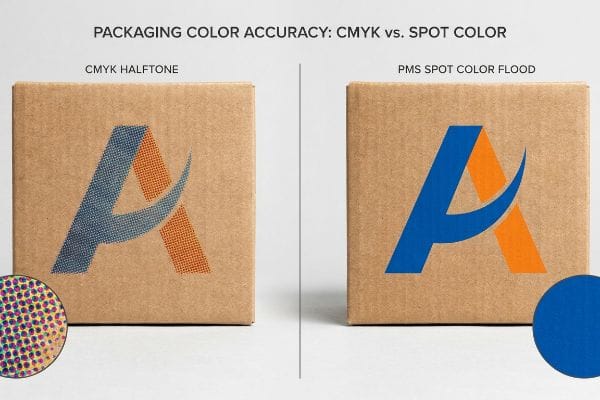
The biggest barrier to accuracy usually isn't the machine; it's the specific type of ink the graphic designer requested.
Surviving the CMYK Halftone Mud Trap
Brands often pitch full-scale retail campaigns using artwork files built purely in standard four-color process formatting. They assume the digital blend of cyan, magenta, yellow, and black will seamlessly recreate their bright corporate logo. However, this optical blending process relies on tiny overlapping dots that perform poorly on unsealed, highly porous substrates7.
Think of it like trying to paint a sharp masterpiece on a paper towel using watercolors. When those tiny process dots hit the raw testliner in my facility, I can hear the loud, rhythmic suction of the litho-lamination press, but the result is a grainy, washed-out mess. To solve this halftone mud issue, I mandate a spot color flood protocol for all primary logos, using a single, physically mixed PMS (Pantone Matching System) pigment8 that fills the paper fibers completely.
| Common Rookie Mistake | The Pro Fix | Retail-Floor Benefit |
|---|---|---|
| Using CMYK for solid logos | Dedicated PMS spot color plates9 | Maximizes high-contrast visibility |
| Printing directly on raw board | Applying a clay-coated top sheet10 | Sharpens text and graphic edges |
| Ignoring fiber absorbency | Increasing ink viscosity11 | Prevents color fading over time |
Ruining primary branding with cheap process dots is a totally preventable error. Switching to a dedicated spot color flood guarantees a dense, premium finish that actively demands shopper attention.
🛠️ Harvey's Desk: Are your brand logos looking washed out under harsh big-box fluorescent lights? 👉 Claim A Prepress Review ↗ — No forms that trigger endless sales calls. Just pure value.
Can I color match paint with my phone?
Mobile technology has advanced incredibly, but using a consumer lens to dictate industrial production is a recipe for absolute disaster. Your camera is lying to you.
No. Matching paint with phones is highly inaccurate. Smartphone cameras automatically apply artificial intelligence filters, white balance corrections, and dynamic contrast enhancements to every image. This hidden software manipulation completely destroys the raw physical pigment data required for precise manufacturing and strict industrial color replication standards.

But knowing the theory isn't enough when the machines start running and thousands of dollars of raw material are on the line.
Why Smartphone Color Matching Fails on the Factory Floor
It is incredibly common for a buyer to snap a quick photo of a competitor's shelf tray at a local store and email it to their supplier, demanding an exact match. They assume the pixels on their screen represent the actual physical pigment sitting on the cardboard.
This isn't just theory—I see this happen on the testing floor when clients complain that our initial test run looks too dark compared to their mobile photo. What they don't realize is their phone's software artificially brightened the shadows. When I measure the physical swatch against the client's printed board, pressing the heavy metallic lens of the spectrophotometer firmly against the paper to read exact light wavelengths down to 0.11 nanometers12, the math proves the pigment is a perfect match. By enforcing a physical D50 lighting review13 and discarding digital photos entirely, I strip out the auto-correct noise, saving the client an estimated 15% in wasted material costs from unnecessary press recalibrations.
| Common Rookie Mistake | The Pro Fix | Retail-Floor Benefit |
|---|---|---|
| Relying on phone photos | Physical swatch spectrophotometer scans14 | Prevents massive batch rejections |
| Ignoring ambient lighting | Controlled D50 light booths15 | Ensures true color accuracy |
| Trusting screen brightness | Hard data wavelength measurements16 | Speeds up approval timelines |
Calibrated factory equipment provides the only reliable baseline for production. Banishing smartphone photos from the approval workflow eliminates subjective arguments, prevents recalibration waste, and gets your campaign to market faster.
🛠️ Harvey's Desk: Do you know the exact Delta-E tolerance your current corrugated supplier is hitting on mass production runs? 👉 Get A Dieline Audit ↗ — I'll stress-test the math before you waste budget on mass production.
Conclusion
You can easily choose a vendor who just eyeballs an uncalibrated smartphone photo, but when that optical mismatch results in muddy CMYK halftones that trigger an immediate retailer rejection, you are looking at weeks of costly manual reprints and zero profit margin. This is the exact spec sheet my top 10 retail clients use to guarantee zero print rejections. Stop guessing on pigment behaviors and let me personally run your structural files through my Free Dieline Pre-Flight Audit ↗ to lock in your exact tolerances before the press even warms up.
"The effect of viscosity and surface tension on inkjet printed …", https://pmc.ncbi.nlm.nih.gov/articles/PMC9072721/. [Authoritative sources in print science explain how surface energy and ink absorption rates on porous substrates alter the final perceived color compared to non-absorbent screens]. Evidence role: technical validation; source type: technical manual or academic paper. Supports: the impact of substrate physics on color accuracy. Scope note: applies specifically to porous materials like corrugated cardboard. ↩
"[PDF] G7 Method for Indigo Press Calibration and Proofing", https://digitalcommons.calpoly.edu/cgi/viewcontent.cgi?article=1015&context=grc_fac. [An authoritative industry standard from Idealliance explains how G7 calibration ensures visual consistency by adjusting the grayscale balance to compensate for substrate-specific ink absorption]. Evidence role: Technical validation; source type: Industry certification standard. Supports: The efficacy of G7 calibration in eliminating subjective visual matching. Scope note: Applies specifically to G7-certified printing workflows. ↩
"Mastering Color Consistency with Quality Control Software – X-Rite", https://www.xrite.com/blog/mastering-color-consistency-with-quality-control-software. [Industry standards for commercial printing, such as ISO 12647, define permissible color deviations that may exceed the strict tolerances required for high-end brand consistency]. Evidence role: technical specification; source type: international standard. Supports: the claim that standard printing tolerances can be too broad for specific retail needs. Scope note: Variance thresholds vary by printing process (e.g., offset vs. digital). ↩
"Color difference – Wikipedia", https://en.wikipedia.org/wiki/Color_difference. [An authoritative colorimetry source should confirm that a Delta-E value below 2.0 is generally considered imperceptible to the average human observer in commercial print applications]. Evidence role: technical verification; source type: industry standard. Supports: the claim that this mathematical threshold ensures variance is invisible to shoppers. Scope note: Perceptibility may vary based on the color space and lighting conditions. ↩
"Best Practices for Delta E Tolerance Standards – Datacolor", https://www.datacolor.com/business-solutions/blog/best-practices-delta-e-tolerances/. [A colorimetric standard would define a Delta-E value under 2.0 as the threshold where color differences become barely perceptible to the human eye in commercial applications]. Evidence role: Technical specification; source type: Color science standard. Supports: The effectiveness of quantitative tolerances in reducing brand rejection. Scope note: Perceived difference can vary based on background contrast. ↩
"Color Inspection for Precision Printing – AVT Inc", https://www.avt-inc.com/when-color-matters-precision-is-non-negotiable/. [Industry standards for press quality control specify regular ink density measurements to compensate for plate wear and viscosity changes during a run]. Evidence role: Process validation; source type: Printing technical manual. Supports: The necessity of mid-run checks to keep bulk orders uniform. Scope note: Specific frequency depends on the print method used. ↩
"[PDF] 1. Dot gain is the increase of halftone dot sizes as ink absorbs into …", https://www.coloradomesa.edu/art/documents/student-resources/study-guide-2019.pdf. [A technical printing manual or ink chemistry guide explains how ink absorption and dot gain on uncoated surfaces lead to muddy colors and loss of vibrancy in process printing]. Evidence role: Technical validation; source type: Industry standard printing manual. Supports: The inherent failure of CMYK dot blends on porous materials. Scope note: Specifically applies to non-coated paper and cardboard. ↩
"CMYK vs. Spot Color: Which is Process is Best | Prime Line Packaging", https://www.primelinepackaging.com/blog/cmyk-spot-color/. [Industry technical guides on litho-lamination demonstrate that spot colors provide a solid ink film, reducing the dot-gain and saturation issues associated with halftone process dots on porous substrates]. Evidence role: technical verification; source type: industrial printing manual. Supports: the use of spot colors to ensure solid coverage on absorbent materials. Scope note: specific to high-absorbency substrates like raw testliner. ↩
"Using CMYK vs. Pantone (PMS) – School of the Art Institute of Chicago", https://sites.saic.edu/servicebureau/home/help_center/using-cmyk-vs-pantone-pms/. [An authoritative printing manual would explain how single-pigment spot colors provide higher saturation and color consistency than CMYK process blends]. Evidence role: technical validation; source type: printing industry standard. Supports: superior contrast of PMS colors. Scope note: applies to solid color blocks. ↩
"Choosing Between Printing With Uncoated Or Coated Paper", https://www.printindustry.com/blog/2020/05/choosing-between-printing-with-uncoated-or-coated-paper/. [Technical literature on paper substrates describes how clay coatings create a non-porous barrier that reduces ink penetration and dot gain]. Evidence role: technical validation; source type: materials science guide. Supports: sharpening of text and graphic edges. Scope note: focuses on substrate porosity. ↩
"Study on the quality and inkjet printing effect of the prepared … – PMC", https://pmc.ncbi.nlm.nih.gov/articles/PMC10116862/. [Scientific studies on ink rheology demonstrate how increasing viscosity controls the rate of ink absorption into porous substrates]. Evidence role: technical validation; source type: chemical engineering or printing textbook. Supports: prevention of ink sinking and fading. Scope note: pertains to pigment retention on raw board. ↩
"Compact Image Slicing Spectrometer (ISS) for hyperspectral … – PMC", https://pmc.ncbi.nlm.nih.gov/articles/PMC2749514/. [Technical specifications from high-end spectrophotometer manufacturers would verify the minimum spectral resolution and precision capabilities for measuring light wavelengths]. Evidence role: technical specification; source type: manufacturer datasheet. Supports: the extreme precision of industrial color measurement devices. Scope note: Resolution varies by device grade. ↩
"What is D50 for graphic arts & printing? – Waveform Lighting", https://www.waveformlighting.com/color-matching/what-is-d50-for-graphic-arts-printing. [The ISO 3664 standard defines D50 as the standard illuminant used for consistent color evaluation in the printing and paint industries]. Evidence role: industry standard; source type: ISO standard. Supports: the necessity of standardized lighting to eliminate ambient light interference. Scope note: specific to graphic arts and industrial coatings. ↩
"Comparative Analysis of Low-Cost Portable Spectrophotometers for …", https://pmc.ncbi.nlm.nih.gov/articles/PMC11679304/. [An authoritative source on colorimetry would explain how spectrophotometers measure light reflectance across the spectrum to prevent batch variance.] Evidence role: technical validation; source type: industry standard manual. Supports: the necessity of spectrophotometers for industrial consistency. Scope note: Applies to professional paint production. ↩
"Color Chaos at the Light Booth: Why D50 Is Your Packaging …", https://www.linkedin.com/pulse/color-chaos-light-booth-why-d50-your-packaging-carmon-madison-6bb4e. [Technical documentation on lighting standards defines D50 (5000K) as the international standard for color evaluation to avoid metamerism.] Evidence role: standard verification; source type: regulatory standard. Supports: the use of standardized lighting for true color accuracy. Scope note: Specific to controlled viewing environments. ↩
"Assessing RGB Color Reliability via Simultaneous Comparison with …", https://pmc.ncbi.nlm.nih.gov/articles/PMC13028574/. [Scientific literature on color science demonstrates that spectral wavelength data provides objective measurements independent of device-specific screen calibrations.] Evidence role: scientific proof; source type: scientific journal. Supports: the superiority of wavelength data over screen brightness. Scope note: Focuses on measurement objectivity. ↩