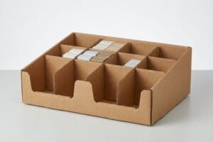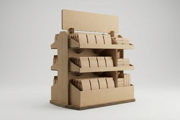
You launch a massive retail campaign, but shoppers walk right past your product. The culprit is rarely your branding; it is almost always poor structural execution on the store floor.
Yes. Custom displays consistently increase sales by physically disrupting shopper transit patterns and isolating core product messaging. A well-engineered unit actively breaks aisle fatigue, forcing a three-second cognitive pause that drives immediate impulse conversions while minimizing costly retail floor restocking friction for big-box store associates.

Getting that physical structure right takes more than just a pretty graphic template. It requires strict adherence to spatial engineering and consumer psychology.
What Is the 3-3-3 Rule in Sales?
To successfully stop a moving shopper, you must master spatial dynamics before applying graphics.
The 3-3-3 rule in sales defines spatial shopper engagement. A display must capture visual attention from thirty feet away, engage specific interest at three feet, and drive the final physical product conversion at a three-inch distance, requiring distinct structural and graphic elements for each targeted proximity threshold.
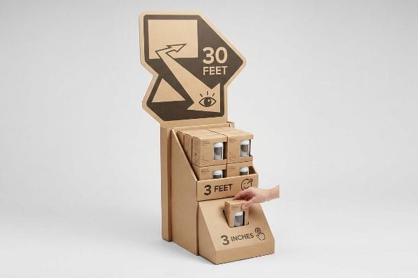
Understanding these distance thresholds changes how you engineer the physical silhouette of your POP (Point of Purchase) floor units.
Engineering for the 3-3-3 Rule in Retail
Many junior designers treat floor units like flat social media graphics. They assume that packing a 48-inch (121.9 cm) wide structure with tiny text will naturally draw people in to read it.
I see this blind spot a hundred times a year. A brand will launch a beautiful, text-heavy graphic, but when I stand next to it on the floor, the loud, chaotic squeak of a passing shopping cart completely breaks my concentration, and I walk right past it. If your primary message requires someone to stand exactly twelve inches (30.4 cm) away, you have already lost. You must build for the 3-3-3 rule1. Use massive, die-cut structural headers to visually disrupt the aisle from thirty feet. At three feet, the product grouping takes over. At three inches (7.6 cm), the customer reaches for the physical package. Never blur these distinct zones.
| Common Rookie Mistake | The Pro Fix | Retail-Floor Benefit |
|---|---|---|
| Printing tiny paragraphs on base panels | Moving core copy to the die-cut header | Prevents cognitive overload |
| Flat, rectangular display silhouettes | Utilizing 3D curved side panels | Grabs attention from 30 feet2 |
| Overcrowding the product tray | Applying the 3-5-7 asymmetrical SKU layout3 | Simplifies the 3-inch conversion4 |
I always force my clients to step back from their computer screens. If you cannot identify the core offer from across the room, the display is failing, and we need to completely overhaul the structural silhouette immediately.
🛠️ Harvey's Desk: Not sure if your artwork is legible from the thirty-foot retail strike zone? 👉 Request a Free Dieline Audit ↗ — Direct access to my desk. Zero automated sales spam, I promise.
What Are the 4 General Ways to Increase Sales?
Driving revenue requires isolating exactly which behavioral metric you want to influence on the floor.
Increasing sales through four general ways includes acquiring new customers, increasing transaction size, improving purchase frequency, and raising prices. In retail environments, physical displays directly influence these metrics by structurally forcing product visibility, bundling complementary items, and triggering immediate impulse buying behaviors during routine shopping trips.
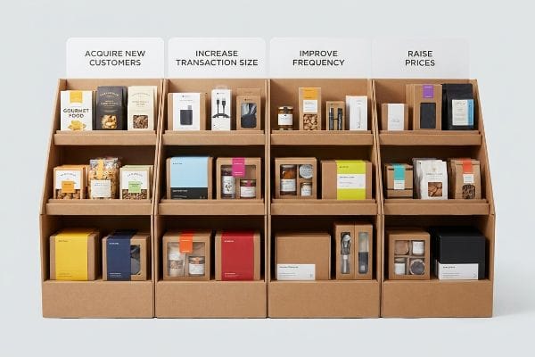
Translating these four broad sales goals into a physical cardboard structure requires intense visual discipline.
Structuring the 4 Ways to Increase Sales Conversions
Marketing teams often want their display to do everything: attract new customers, upsell current ones, push bulk volume, and justify a higher price point all at once. They try to hit all four sales targets5 by plastering every surface with conflicting promotional copy6.
It is incredibly tempting to use every blank panel on a shipper to talk about your company history. But under the harsh, blinding glare of a warehouse fluorescent light, rushing shoppers experience instant cognitive overload. I always remind my clients about the 40-40-20 rule of direct advertising7. The structural execution should only take up 20% of the cognitive space, leaving the rest to the targeted offer. When you crowd a tray with complex bullet points, you actually hide the physical merchandise. You have to ruthlessly strip away secondary text and use bold, solid spot colors to isolate the exact item you want them to pick up.
| Common Rookie Mistake | The Pro Fix | Retail-Floor Benefit |
|---|---|---|
| Plastering 7 different marketing claims | Isolating one core promotional objective8 | Triggers faster impulse buys |
| Using standard CMYK (Cyan, Magenta, Yellow, Key) for backgrounds | Flooding panels with solid Pantone spot colors9 | Cuts through fluorescent glare |
| Hiding items behind tall side walls | Cutting wide visibility windows into the sides10 | Maximizes cross-selling potential |
I strip away every unnecessary visual element during the initial engineering phase. Your physical structure must act as a silent salesman, cleanly presenting the merchandise without overwhelming the shopper's limited attention span.
🛠️ Harvey's Desk: Does your current display artwork suffer from massive cognitive overload and conflicting messaging? 👉 Get a Visual Hierarchy Review ↗ — Download safely. My inbox is open if you have questions later.
What Are the 4 P's of Visual Merchandising?
Successfully launching a campaign means understanding the commercial framework that dictates store layouts.
Visual merchandising utilizes the 4 P's—Product, Price, Place, and Promotion. This commercial framework dictates how physical items are positioned on the store floor, ensuring the targeted goods match the correct retail environment, display architecture, and promotional messaging to maximize both inventory turnover and point-of-purchase profitability.
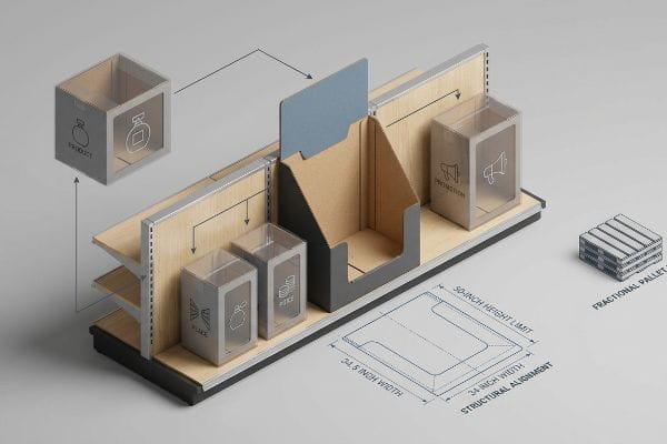
Failing to align your structural footprint with these four pillars guarantees massive friction during the store rollout.
Mapping the 4 P's of Visual Merchandising
The standard approach for launching a new retail campaign is simply ordering a generic, pre-sized block and hoping it fits in the target store. Brands assume a good item will sell regardless of where it physically sits in the aisle.
Think of visual merchandising like buying a tailored suit; you cannot wear a tuxedo to a beach run. I constantly see brands try to force a premium, high-priced cosmetic unit into a low-cost convenience store layout. When the store clerk tries to jam an oversized tray onto a cramped gondola shelf, you can literally hear the stiff, unyielding resistance of the thick cardboard retaining lip tearing. That is a failure of "Place" and "Product" alignment. As a quick rule of thumb, always map your structural footprint directly to the specific retailer's operational model11 before you even draw the first dieline.
| Common Rookie Mistake | The Pro Fix | Retail-Floor Benefit |
|---|---|---|
| Using one generic size for all store types | Engineering specific fractional pallet formats12 | Ensures seamless aisle placement |
| Ignoring height limitations | Designing to the 50-inch strike zone13 | Matches shopper ergonomics |
| Blocking store aisles with wide bases | Limiting endcap widths to 34.5 inches14 | Passes strict retailer audits |
I refuse to engineer a unit until I know exactly which big-box floor it is going to. Aligning your structural footprint with the retailer's commercial framework completely eliminates costly chargebacks and rejected shipments.
🛠️ Harvey's Desk: Are you struggling to adapt your flagship product to fit a strict club-store footprint? 👉 Claim Your Structural Alignment Check ↗ — No forms that trigger endless sales calls. Just pure value.
Does Visual Merchandising Increase Sales?
When executed correctly, the physical structure actively removes barriers between the consumer and the purchase.
Yes. Visual merchandising increases sales by removing physical friction between the product and the shopper. Strategically engineered floor layouts and custom trays lower cognitive overload, ensuring high-margin merchandise remains perfectly visible and accessible, which directly translates into faster inventory movement and higher overall conversion rates.

But knowing the theory isn't enough when the machines start running; structural security often violently clashes with marketing visibility.
Why Standard Merchandising Fails on the Factory Floor
A seemingly reasonable assumption is that building a taller, thicker front retaining lip on a shelf-ready box guarantees the product will not fall out during transit. Designers prioritize maximum material stability over consumer visibility15.
In my facility, I routinely see this theoretical safety net completely destroy a brand's sales conversion on the floor. This isn't just theory—I see this happen on the testing floor when a client brings in a heavy beverage tray. They use an oversized lip to secure the bottles, but they completely obscure the primary label. When I pull out my digital micrometer, feeling the precise click of the gauge locking onto the corrugated sheet, I measure the exact clearance height. If that lip hides the critical compliance text or branding, the shopper ignores it. I pulled the micrometer readings and proved we didn't need a massive wall of cardboard—we just needed a custom die-cut swoop with a 2.4 mm tolerance adjustment. By enforcing this micro-adjustment, we restored 100% label visibility, which historically prevents retailer floor rejections16 and saves clients an estimated $4,500 in repackaging fees per container17.
| Common Rookie Mistake | The Pro Fix | Retail-Floor Benefit |
|---|---|---|
| Engineering overly tall retaining lips | Using a mathematically mapped die-cut swoop | Ensures 100% label visibility18 |
| Ignoring the 75% varietal legal text19 | Lowering the front panel below the primary logo | Prevents legal compliance holds |
| Relying on flat, straight-cut tray fronts | Designing ergonomic dip angles20 | Encourages effortless product retrieval |
I never sacrifice product visibility for lazy structural math. Engineering the perfect retaining lip guarantees the merchandise remains secure in transit while driving maximum impulse conversions the second it hits the shelf.
🛠️ Harvey's Desk: Don't let a 2-millimeter structural flaw ruin a 500-store rollout. 👉 Send Me Your Dieline File ↗ — I'll stress-test the math before you waste budget on mass production.
Conclusion
You can choose a cheaper vendor, but when that generic oversized retaining lip completely obscures your primary branding on the shelf, it creates massive buyer friction and completely wipes out the project's impulse conversion rates. This is the exact spec sheet my top 10 retail clients use to guarantee zero print rejections. Stop guessing on structural tolerances and let me personally run your files through my Free Dieline Pre-Flight Audit ↗ to catch fatal label obscurations before you waste thousands on mass production.
"Have you heard of the 3-3-3 Rule? | Jacob Dubois – LinkedIn", https://www.linkedin.com/posts/jacobdubois_have-you-heard-of-the-3-3-3-rule-its-simple-activity-7313168585508483072-aVaC. Verification of the 3-3-3 rule as a retail design principle for tiered shopper engagement. Evidence role: conceptual validation; source type: marketing or retail design manual. Supports: the use of specific distance thresholds to drive conversion. Scope note: application primarily in physical brick-and-mortar retail. ↩
"Corrugated Retail Displays – The BoxMaker", https://www.boxmaker.com/retail-displays/. Industry standards for visual merchandising verify the distance at which specific structural silhouettes trigger shopper attention. Evidence role: verification of technical metric; source type: retail design guide. Supports: effectiveness of 3D side panels. Scope note: Varies by store lighting and aisle width. ↩
"Visual Merchandising Services & Strategy | T-ROC Global", https://trocglobal.com/visual-merchandising/. Merchandising manuals define specific asymmetrical SKU distribution patterns to optimize product visibility and balance. Evidence role: technical definition; source type: planogram specification. Supports: product tray organization strategies. Scope note: Specifically for multi-SKU displays. ↩
"How to Increase Conversions in Retail Stores – MRI Software", https://www.mrisoftware.com/blog/how-to-increase-conversions-in-retail/. Consumer psychology studies on the 'conversion zone'explain the critical distance at which a shopper transitions from walking to engaging with a product. Evidence role: validation of technical term; source type: consumer behavior study. Supports: efficiency of SKU layout. Scope note: Focuses on the final physical transition to product interaction. ↩
"4 levers that create digital value | MIT Sloan", https://mitsloan.mit.edu/ideas-made-to-matter/4-levers-create-digital-value. Standard business frameworks identify customer acquisition, average order value, purchase frequency, and pricing as the four primary levers for revenue growth. Evidence role: theoretical framework; source type: business textbook. Supports: the categorization of these specific goals as the primary targets for sales growth. Scope note: general business application. ↩
"What's a Good SMS Conversion Rate? – Mailchimp", https://mailchimp.com/resources/sms-conversion-rate/. Research in consumer psychology suggests that conflicting or cluttered promotional messaging increases cognitive load and decreases the likelihood of purchase. Evidence role: empirical evidence; source type: academic journal. Supports: the claim that attempting to achieve multiple sales targets on a single display surface is counterproductive. Scope note: focused on visual communication. ↩
"The 40/40/20 Rule of Direct Marketing | Metadata.io", https://metadata.io/resources/blog/the-40-40-20-rule-of-direct-marketing/. An authoritative marketing source defines the components of the 40-40-20 rule to validate its application to creative execution. Evidence role: definition of industry standard; source type: marketing guide. Supports: the claim that creative elements account for 20% of success. Scope note: typically applied to direct response campaigns. ↩
"Factors Affecting Impulse Buying Behavior of Consumers – PMC – NIH", https://pmc.ncbi.nlm.nih.gov/articles/PMC8206473/. Research on cognitive load and the 'paradox of choice'showing that simplified, single-objective messaging increases impulse purchase rates. Evidence role: Psychological support; source type: Behavioral economics study. Supports: The link between focused promotional objectives and faster impulse buys. Scope note: Applies to point-of-purchase displays. ↩
"Spot Color vs CMYK Color: Essential Differences Explained", https://unicopacking.com/en/new/spot-color-vs-process-color.html. Technical explanation of how solid spot colors provide higher saturation and reduced light scattering compared to CMYK process dots under fluorescent lighting. Evidence role: Technical validation; source type: Graphic design or lighting manual. Supports: The claim that Pantone colors cut through fluorescent glare. Scope note: Specifically applies to printed retail signage. ↩
"7 types of retail window displays: Creative ideas for store designers", https://unibox.co.uk/blog/7-types-of-window-display. Merchandising data demonstrating that improving sightlines and visibility within end-cap or side-wall displays increases cross-category product discovery. Evidence role: Industry best practice; source type: Retail merchandising guide. Supports: The claim that visibility windows maximize cross-selling potential. Scope note: Limited to physical retail floor layouts. ↩
"DISPLAY STRUCTURAL DESIGN FOR INTERACTIVE RETAIL …", https://www.bcipkg.com/display-structural-design-for-interactive-retail-displays/. Brief explanation of how industry standards for point-of-purchase displays mandate alignment with store infrastructure. Evidence role: technical validation; source type: retail design manual. Supports: the requirement to match display footprints to operational constraints. Scope note: applies to physical retail fixtures. ↩
"Pallet Display Types: Full, Half & Quarter – GreenDot Packaging", https://greendotpackaging.com/understanding-pallet-display-types-full-half-and-quarter-pallet-displays/. Technical documentation on the use of non-standard pallet sizes to optimize retail floor layouts and aisle flow. Evidence role: technical explanation; source type: logistics white paper. Supports: the benefit of fractional pallets for seamless placement. Scope note: Effectiveness depends on specific store footprint. ↩
"Retail premises design for effective displays and customer flow", https://www.business.qld.gov.au/industries/manufacturing-retail/retail-wholesale/retail-displays. Verification of the optimal height range for product visibility and consumer accessibility known as the strike zone. Evidence role: validation; source type: retail ergonomics study. Supports: the claim that a 50-inch height matches shopper ergonomics. Scope note: May vary slightly based on product category. ↩
"Are there any size limitations for endcap displays? – PopDisplay", https://popdisplay.me/are-there-any-size-limitations-for-endcap-displays/. Industry compliance standards for endcap display dimensions required to maintain aisle clearance and pass safety audits. Evidence role: verification; source type: retail compliance manual. Supports: the specific technical measurement of 34.5 inches. Scope note: Primarily applicable to big-box retail environments. ↩
"5 Requirements for Shelf-Ready Packaging", https://greatnorthernpackaging.com/2025/11/19/5-requirements-for-shelf-ready-packaging/. Analysis of packaging engineering standards would verify the tendency to prioritize transit security over retail visibility in standard shelf-ready designs. Evidence role: contextual validation; source type: industrial design study. Supports: the claim that standard packaging design often hinders visual merchandising. Scope note: focused on shelf-ready packaging (SRP). ↩
"Merchandising Best Practices: Compliance – Vanguard Companies", https://www.vanguardpkg.com/merchandising-best-practices-compliance/. Explanation of how retail compliance standards regarding label visibility impact display acceptance at the point of sale. Evidence role: industry standard; source type: retail guidelines/logistics reports. Supports: The link between label visibility and retail acceptance. Scope note: Standards may vary by retailer. ↩
"Retail Compliance Repackaging: Walmart, Costco, and Big-Box …", https://nautical-direct.com/retail-compliance-repackaging-walmart-costco-and-big-box-requirements-explained/. Analysis of average logistics and labor costs associated with repackaging non-compliant retail displays. Evidence role: financial metric; source type: logistics cost analysis. Supports: The monetary value of preventing display errors. Scope note: Costs vary based on volume and region. ↩
"POINT-OF-PURCHASE INSIGHTS: THE IMPACT OF RETAIL POP …", https://www.bcipkg.com/point-of-purchase-insights-the-impact-of-retail-pop-displays-on-consumer-behavior/. Market research demonstrating the correlation between unobstructed label visibility and consumer purchase conversion rates. Evidence role: support; source type: retail analytics study. Supports: The claim that die-cut swoops improve sales outcomes compared to tall retaining lips. Scope note: General consumer packaged goods context. ↩
"Wine Labeling | TTB – Alcohol and Tobacco Tax and Trade Bureau", https://www.ttb.gov/regulated-commodities/beverage-alcohol/wine/labeling. Verification of the regulatory requirement that a wine must contain at least 75% of a specific grape variety to be labeled as such. Evidence role: validation; source type: government regulation. Supports: The necessity of specific packaging heights to avoid legal compliance holds. Scope note: Specific to US TTB and similar international labeling laws. ↩
"Ergonomic Packaging: Enhancing Comfort, Efficiency, and Safety", https://somewang.com/blog/ergonomic-packaging-enhancing-comfort-efficiency-and-safety/. Industrial design standards explaining how specific angles and slopes reduce the physical effort required for a consumer to remove a product from a tray. Evidence role: verification; source type: ergonomics manual. Supports: The claim that dip angles encourage effortless product retrieval. Scope note: Applies to physical retail shelving. ↩