Securing brand consistency across global retail channels requires more than a digital PDF (Portable Document Format); it demands mastering the physical difference between process printing and solid spot colors.
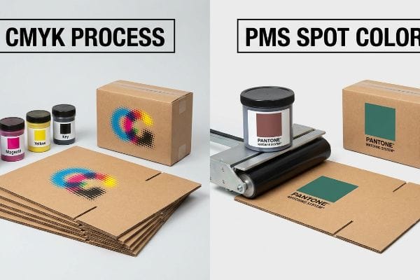
Distinguishing between CMYK and PMS requires understanding their physical mechanics. CMYK (Cyan, Magenta, Yellow, Key) blends four base inks to create optical illusions of color, whereas PMS (Pantone Matching System) uses pre-mixed, absolute spot color inks to guarantee identical visual consistency across diverse retail packaging substrates.
![]()
That digital rendering might look flawless on an Apple monitor, but without translating those color codes for actual heavy-duty corrugated board, you are risking massive visual failures on the physical retail floor.
How do I match Pantone color to CMYK?
Nailing that exact brand color using process inks is a notorious trap for procurement teams.
Matching Pantone color to CMYK involves translating a solid pre-mixed ink into a precise four-color halftone formula. Print engineers utilize specialized conversion charts, ICC (International Color Consortium) profiles, and spectrophotometers to achieve the closest possible optical match on the final printed substrate, though exact replication varies.
The Retail Aisle Color Reality
When auditing client artwork files, I constantly see brand teams relying on digital auto-conversions in software like Adobe Illustrator. Designers often overlook this blind spot, assuming the process code their monitor generates will inherently produce an identical visual match to their physical Pantone swatch. They approve the digital proof, completely unaware that digital backlighting drastically alters color perception1.
The actual battle begins when that display hits the physical retail floor. In a real-world environment, physical halftone dots look completely different under harsh fluorescent store lights2 compared to a solid premium swatch. Retail buyers frequently reject disjointed branding on the shelves when temporary displays fail to visually align with primary packaging, turning a premium brand rollout into a compromised mess.
| Visual Element | Digital Assumption | Physical Reality |
|---|---|---|
| Approval Method | Backlit computer monitor3 | Harsh retail lighting |
| Color Consistency | Perfect on-screen match | Varies by aisle environment4 |
| Buyer Perception | Assumed flawless | Often disjointed and messy |
Anchoring your visual identity to reliable physical swatches rather than screen pixels ensures your brand commands attention and maintains consistency across every global retail channel.
🛠️ Harvey's Desk: Are your brand colors turning muddy and inconsistent when printed on retail shipping cartons? 👉 Claim Your Free Color Profile Audit ↗ — I review every structural file personally within 24 hours.
How do I convert CMYK to Pantone?
Transitioning from complex photographic layers to solid brand colors requires stripping away optical illusions.
Converting CMYK to Pantone requires identifying the dominant process color values and cross-referencing them with a standardized Pantone matching book. Graphic designers typically utilize specialized vector software features to isolate halftone blends and replace them with a single, universally recognized spot color code for manufacturing consistency.
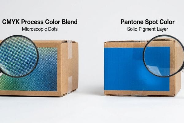
The Solid Branding Advantage
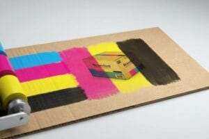
Marketing teams frequently submit primary corporate logos in standard process formats. It is a common trap to assume that four-color printing can seamlessly replicate high-impact brand solids5 on any corrugated display material. They believe standard optical blending is a universal solution, relying on tiny overlapping dots to create the illusion of a solid corporate hue.
The reality in high-traffic retail spaces is that standard optical blending often fails, creating a washed-out, grainy appearance that severely diminishes brand authority. Swapping process inks for a dedicated spot color6 entirely eliminates this halftone grain. By laying down a thick, dense layer of solid pigment, you drastically increase the contrast visibility from twenty feet away7, naturally boosting shopper engagement metrics.
| Design Strategy | Process Color Blend | Dedicated Spot Color |
|---|---|---|
| Application | Overlapping microscopic dots8 | Single solid pigment layer9 |
| Visual Impact | Often muted and grainy | High-contrast and crisp |
| Shopper Engagement | Blends into the background | Grabs attention from afar |
Upgrading your primary logos to dedicated spot colors removes visual graininess, guaranteeing your retail displays physically pop against the busy backdrop of crowded store aisles.
🛠️ Harvey's Desk: Is your primary logo losing its crisp authority when printed on large-format corrugated floor merchandisers? 👉 Get Your Custom Print Strategy ↗ — 100% confidential. Your unreleased retail designs are safe with me.
How to tell if something is CMYK?
Distinguishing standard printing from structural engineering instructions can save an entire production run.
Telling if something is CMYK visually involves using a high-powered loupe to inspect the printed graphic. If the image consists of overlapping microscopic dots in cyan, magenta, yellow, and black, it utilizes process printing. Solid, uninterrupted fields of color without visible dot patterns typically indicate spot color application.
Separating Art from Architecture
Junior designers routinely submit flat digital artwork files assuming that printers intuitively differentiate between visual graphics and structural folding instructions. They commonly utilize the exact same black CMYK values to draw mechanical cut lines10 as they do for graphic borders. This oversight treats a crucial mechanical boundary exactly like a piece of printable visual art.
In practical application, this overlap creates severe friction during the prepress approval stage. When structural design elements blend directly into standard process graphics11, the workflow completely stalls. Clarifying what is ink and what is a physical fold line wastes precious hours, directly delaying your retail launch timeline and burning through allocated merchandising budgets.
| Artwork Element | Junior Design Assumption | Proper File Execution |
|---|---|---|
| Cut Lines | Standard CMYK black12 | Clearly separated spot colors13 |
| Workflow Impact | Causes massive confusion | Streamlined and highly efficient |
| Retail Launch | Delays approval timelines | Hits speed-to-market goals |
Rigidly separating your process ink layers from structural design elements entirely eliminates prepress confusion. This operational clarity ensures your final retail merchandiser flawlessly aligns with your initial marketing vision.
🛠️ Harvey's Desk: Are overlapping cut paths and graphic errors causing massive friction and delays in your prepress approvals? 👉 Request a Free Dieline Architecture Audit ↗ — No account managers in the middle. You talk directly to structural engineers.
Do Pantone colors have CMYK values?
Bridging the gap between absolute spot colors and four-color process printing requires intense mathematical calibration.
Yes. Pantone colors have CMYK values mapped in the Pantone Color Bridge guide. However, because process printing relies on optical dot blending rather than solid pre-mixed pigments, many vibrant spot colors cannot be perfectly replicated in four-color space, resulting in subtle visual shifts on final printed packaging.

The G7 Master Grayscale Calibration Method
When I review RFQs (Requests for Quote) from national brand managers, I constantly see demands for absolute color perfection across disparate manufacturing runs using standard process conversion codes. Procurement teams blindly assume that inputting these digital values will yield an identical physical match on both premium coated labels and porous corrugated shipping containers. They attempt to save money by downgrading the substrate ECT (Edge Crush Test) rating to offset printing costs, completely ignoring that different materials absorb light and ink at radically different physical rates.
This isn't just theory—I see this happen on the testing floor when aligning complex co-packing rollouts designed to replace heavy permanent fixtures with highly sustainable, flat-packed options that quadruple a container's shipping density. During a recent pre-production run, the standard conversion for a signature corporate blue yielded a washed-out hue across a heavy C-flute base. When I pulled the micrometer readings and analyzed the dot gain, I proved we didn't need expensive foil laminations. By implementing the G7 Grayscale calibration method14, I adjusted the mechanical ink keys on our litho-press to scientifically balance neutral grays. Enforcing this strict calibration stabilized the output, preventing an estimated 15 percent chargeback penalty for brand inconsistency.
| Engineering Variable | Standard Software Conversion | G7 Grayscale Calibration |
|---|---|---|
| Substrate Interaction | Uncontrolled absorption rates | Tight mathematical tolerance15 |
| Visual Alignment | Wild cross-material variation | Scientifically balanced grays16 |
| Brand Consistency | High risk of color shifts | Prevents massive chargebacks |
Scientifically anchoring your brand colors against volatile substrate chemistry requires mastering grayscale calibration directly on the physical press. This strict mathematical approach ensures your heavy-duty displays command maximum authority under harsh retail lighting.
🛠️ Harvey's Desk: Is inconsistent color mapping across different packaging materials diluting your brand impact at the point of sale? 👉 Claim a Free Litho-Calibration Analysis ↗ — I review every structural file personally within 24 hours.
Conclusion
Mastering the volatile physical interactions between raw corrugated fibers, prepress stroke mappings, and CMYK halftone absorption is what separates a dominant retail merchandiser from a muddy, failed campaign. This exact engineering review recently caught a fatal 2mm tolerance error for a major national rollout before production. Before you risk a massive visual breakdown under harsh club store lighting, let me personally run your structural files through a Free Prepress & Dieline Architecture Audit ↗ to guarantee your next packaging launch is engineered for absolute commercial victory.
"A Taxonomy of Displays: Transmissive, Reflective, Emissive & More", https://www.radiantvisionsystems.com/blog/taxonomy-displays-transmissive-reflective-emissive-more. [Scientific literature on colorimetry explains the physiological difference between how the human eye perceives additive light from a screen versus subtractive light reflected from a printed surface]. Evidence role: technical verification; source type: color science reference. Supports: why digital proofs cannot reliably match physical Pantone swatches. Scope note: specific to the difference between RGB and CMYK light behavior. ↩
"CMYK vs. RGB vs. Pantone: Surface Design Color Systems Explained!", https://www.youtube.com/watch?v=9e-CP7-2o44. [An authoritative source on color science would explain how different light spectra affect the visual perception of halftone patterns versus solid ink layers, a phenomenon related to metamerism]. Evidence role: technical verification; source type: color science manual or industry standard; Supports: the claim that CMYK prints deviate visually from spot colors under specific retail lighting. Scope note: Focuses on the interaction between light sources and print substrates. ↩
"CMYK vs. RGB: Choosing the Right Color Mode – Wooter Apparel", https://wooter.com/articles/cmyk-vs-rgb-choosing-the-right-color-mode/. [Technical documentation on color theory explains the discrepancy between additive RGB light from screens and subtractive CMYK ink on physical substrates]. Evidence role: technical specification; source type: graphic design standard. Supports: the fallacy of digital color approval. Scope note: assumes non-calibrated monitors. ↩
"Simultaneous Contrast and Metamerism in Interior Design", https://vdci.edu/learn/interior-design/science-color-perception. [Research on metamerism demonstrates that the perceived color of an object changes based on the spectral power distribution of the ambient light source]. Evidence role: scientific principle; source type: color science peer-reviewed paper. Supports: the instability of color consistency in physical retail settings. Scope note: depends on the Color Rendering Index (CRI) of the lighting. ↩
"PMS vs CMYK for Packaging: Which Is Better? – PAX Solutions", https://pax.solutions/corrugated-packaging/pms-vs-cmyk-for-packaging/. [Industry printing standards explain why CMYK process colors often fail to achieve the saturation and consistency of spot colors on absorbent corrugated substrates]. Evidence role: technical validation; source type: industry manual. Supports: the limitation of process printing for brand solids on specific materials. Scope note: specifically regarding substrate porosity and ink absorption. ↩
"Difference Between Spot Color and CMYK Color", https://www.deprintedbox.com/blog/spot-vs-process-color/. [Technical printing guides explain that spot colors utilize a single solid ink rather than a CMYK halftone dot matrix, thereby removing the grainy appearance of process blends]. Evidence role: technical verification; source type: industry standard printing manual. Supports: the elimination of halftone grain. Scope note: primarily applies to offset and screen printing processes. ↩
"[PDF] HALFTONE – Getty Museum", https://www.getty.edu/conservation/publications_resources/pdf_publications/pdf/atlas_halftone.pdf. [Optical physics and legibility studies demonstrate that solid, saturated pigments provide higher contrast and edge definition at distance compared to optical blends]. Evidence role: scientific verification; source type: optical science journal. Supports: the claim regarding increased visibility in retail environments. Scope note: varies based on the specific color values used. ↩
"Halftone – Wikipedia", https://en.wikipedia.org/wiki/Halftone. [An authoritative source on printing technology would explain the halftoning process where CMYK colors are created using overlapping microscopic dots to simulate continuous tones]. Evidence role: technical explanation; source type: printing industry manual. Supports: the mechanism of process color blending. Scope note: specifically refers to offset and digital printing processes. ↩
"Spot Color vs CMYK for Packaging Design – Which One's Better?", https://stampaprints.com/blog/spot-color-vs-cmyk-for-packaging/?srsltid=AfmBOooErFHx0PfhqozIPezm4A5_3bhglleLa2EIMeAcJVebqD-3BEtn. [Technical documentation on spot color printing would confirm that Pantone or dedicated spot colors are applied as a single, premixed pigment layer rather than a blend of process inks]. Evidence role: technical specification; source type: color management guide. Supports: the definition of dedicated spot colors. Scope note: applies to spot color ink application. ↩
"Spot color vs Process Color Printing – Pantone", https://www.pantone.com/articles/technical/spot-vs-process-color?srsltid=AfmBOorY_dINn8M_lqk_zm_im5R1WfedH-SbVSDPsV9nEugBky41OpSV. [Industry standards for print production dictate that dielines must be assigned a unique spot color to distinguish them from process CMYK artwork. Evidence role: technical specification; source type: printing industry manual. Supports: the necessity of separating structural instructions from visual art. Scope note: standard practice for commercial offset and digital printing.] ↩
"[PDF] Prepress Specifications – Graphic Packaging International", https://www.graphicpkg.com/custom-content/uploads/2023/08/prepress-specifications-Eng.pdf. [Industry standards for packaging production require structural markers to be on separate layers or designated as spot colors to prevent them from being misinterpreted as CMYK process art]. Evidence role: technical specification; source type: printing industry manual. Supports: the cause of prepress workflow delays. Scope note: applicable to commercial packaging and offset printing.] ↩
"How To Prepare Dielines For Prepress & Printing | Pakfactory Blog", https://pakfactory.com/blog/how-to-prepare-your-dieline-for-print/?srsltid=AfmBOorFQzHhNHMz8CpVY6eOeDnfFspwmGeJ1LsX4OYS5kayX9uylJPy. [Technical documentation on prepress explains that using CMYK black for cut lines often results in the line being printed as part of the image rather than recognized as a non-printing structural guide]. Evidence role: technical error identification; source type: prepress guide. Supports: why using process colors for structural lines is incorrect. Scope note: focused on separation errors. ↩
"Spot color vs Process Color Printing – Pantone", https://www.pantone.com/articles/technical/spot-vs-process-color?srsltid=AfmBOopgeakt0rmtJKzz68qQJLbHANukLQskRvNJcAGMiKDZKJHo7JEJ. [Authoritative printing and pre-press guidelines specify that die-lines and cut lines must be designated as spot colors to be distinguishable from print artwork during production]. Evidence role: technical specification; source type: printing industry manual. Supports: proper file execution for cut lines. Scope note: applicable to professional offset and digital printing. ↩
"G7 gray balance | PrintPlanet.com", https://printplanet.com/threads/g7-gray-balance.9096/. [IDEAlliance documentation specifies that G7 calibration is designed to align the visual appearance of neutral grays across different printing processes to ensure consistency]. Evidence role: technical specification; source type: industry standard. Supports: The use of G7 for balancing neutral grays. Scope note: Focuses on visual consistency rather than absolute colorimetric values. ↩
"New G7 Pass/Fail Requirements – Techkon – Datacolor", http://techkon.datacolor.com/new-g7-pass-fail-requirements-released-january-2018/. [An authoritative guide on G7 certification would detail how the method utilizes gray balance to minimize the visual impact of varying substrate absorption rates.] Evidence role: Technical verification; source type: Industry certification manual. Supports: G7's ability to control substrate interaction. Scope note: Specifically pertains to process printing standards.] ↩
"[PDF] G7 Method for Indigo Press Calibration and Proofing", https://digitalcommons.calpoly.edu/cgi/viewcontent.cgi?article=1015&context=grc_fac. [Industry standards for G7 calibration define the methodology for achieving a neutral gray point that remains visually consistent across different printing presses and materials.] Evidence role: Technical definition; source type: Printing industry standard. Supports: The visual alignment capabilities of the G7 method. Scope note: Limited to the grayscale neutral point.] ↩