Verschwenden Sie nicht länger Ihr Marketingbudget für billige Verpackungen, die schon im Regal kaputtgehen. Hier erfahren Sie, was Sie brauchen, um in den Regalen der großen Supermärkte zu bestehen.
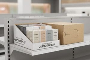
Kartonaufsteller sind freistehende oder auf der Theke platzierte Verkaufsdisplays aus Wellpappe, die Produkte im Einzelhandel präsentieren, bewerben und verkaufen. Diese stabilen Displays nutzen optimierte Faltmuster und hochwertige Grafiken, um die visuelle Wirkung zu maximieren und gleichzeitig erhebliche dynamische Lasten während des Transports sicher zu tragen.
Doch die Kenntnis der Definition wird Sie nicht vor den brutalen physikalischen Gesetzen eines Hochgeschwindigkeitslagers oder eines feuchten Schiffscontainers schützen.
Wo bekommt man kostenlos Kartons her?
Gründer neuer Marken versuchen häufig, ihre Logistik selbst zu gestalten, indem sie kostenlose Verpackungen von lokalen Lebensmittelgeschäften oder Recyclingcontainern aufspüren.
Kostenlose Kartons sind in Supermärkten, Recyclinghöfen und Online-Marktplätzen erhältlich. Die Verwendung dieser gebrauchten Materialien für den professionellen Versand im Einzelhandel birgt jedoch erhebliche strukturelle Risiken, da die Wellpappenfasern durch vorherige Transportbelastungen und Feuchtigkeitseinwirkung stark und unsichtbar gealtert sind.
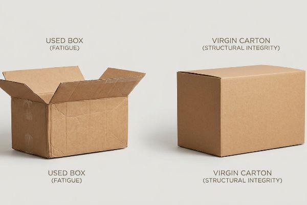
Die Wiederverwendung dieser kostenlosen Materialien mag wie ein cleverer finanzieller Trick erscheinen, bis man versteht, was mit Karton unter Druck tatsächlich passiert.
Die versteckten Kosten von „kostenlosem“ Versandmaterial
Startups, die sich selbst finanzieren, verwenden häufig eingehende B2C-E-Commerce-Versandkartons (Business-to-Consumer) für ausgehende B2B-Versandkartons (Business-to-Business) wieder, in der Annahme, dass ein optisch unbeschädigter Karton seine ursprüngliche Stabilität behält. Sie behandeln Standardverpackungen wie eine dauerhafte Plastikbox und ignorieren dabei völlig, dass die innere Rillenstruktur Stöße durch kontrollierte Verformung absorbiert .
Diese Anfängerfalle sehe ich ständig, wenn Gründer mir beschädigte Lieferungen bringen. Sie packen schwere Waren in alte Kartons, kleben sie zu und versenden sie per Stückgutfracht. Was sie nicht bedenken: Wellpappe wirkt wie mikroskopische Stoßdämpfer²;während des Transports absorbiert sie Vibrationen und Feuchtigkeit, die die Papierfasern dauerhaft schädigen. Drückt man mit dem Daumen auf eine Ecke eines gebrauchten Kartons, spürt man nicht den festen Widerstand eines neuen Kartons – er gibt einfach leise nach wie ein weicher Schwamm. Die Wiederverwendung solcher Kartons führt zu einem unsichtbaren Verlust der Druckfestigkeit, wodurch die unter schweren Paletten zusammenbrechen. Dies verlangsamt die Warenannahme um schätzungsweise 30³und führt zu massiven Rückbuchungen seitens der Händler.
| Häufiger Anfängerfehler | Die Profi-Lösung | Vorteil für die Verkaufsfläche |
|---|---|---|
| Verwendung kostenloser, gebrauchter Kartons | Neuwertige Wellpapp-Masterkartons4 | Verhindert Quetschschäden |
| Vernachlässigung der Flötenfaserermüdung | ISTA 6-Amazon SIOC-Test5 | Verhindert Rückbuchungen im Transit |
| Mischen von Kartons unterschiedlicher Größen | Standardisierte GMA-Palettengeometrie6 | Gewährleistet stabile Doppelstapelung |
Ich bestehe strikt auf der Verwendung von Neuware für alle ausgehenden B2B-Frachtsendungen. Fünfzig Cent für eine kostenlose, gebrauchte Box zu sparen, ist reine Verschwendung, wenn dadurch Tausende von Euro an Abschreibungen auf Lagerbestände entstehen, weil die gesamte Palette beim Seetransport beschädigt wird.
🛠️ Harveys Schreibtisch: Leiden Ihre Umkartons schon vor dem Versand unter unsichtbarer Faserermüdung? 👉 Verpackungsprüfung anfordern ↗ — Direkter Kontakt zu mir. Garantiert kein automatisierter Werbe-Spam.
Wie baut man einen Displayständer aus Pappe?
Marken wünschen sich sehnlichst, dass ihre nachhaltigen Verpackungen hochwertig aussehen, doch unbehandelter Karton stellt besondere ästhetische Herausforderungen dar.
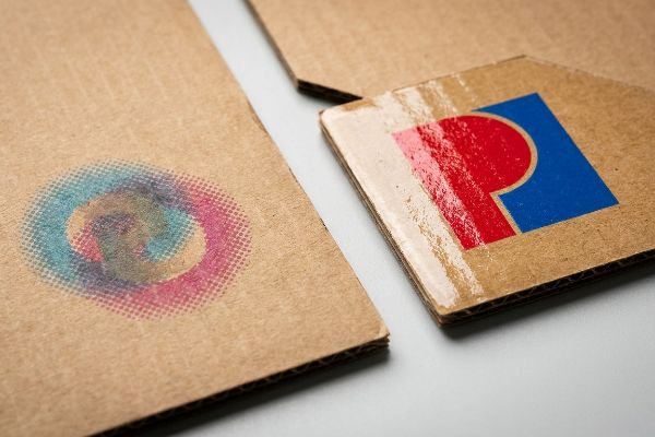
Um aus Kartonaufstellern ein besonders ansprechendes Design zu kreieren, verwenden Hersteller leuchtende Sonderfarben, spezielle Hochglanzlacke auf Wasserbasis und markante Stanzformen. Diese speziellen Druck- und Veredelungstechniken umgehen die matte, poröse Beschaffenheit des Rohkartons und erzeugen einen kontrastreichen, auffälligen Effekt, der die Aufmerksamkeit der Kunden sofort fesselt.
Auf einem hochauflösenden Bildschirm lassen sich die schönsten Kunstwerke entwerfen, doch die Übertragung dieser Brillanz auf Rohpapier erfordert eine strenge chemische Kontrolle.
Warum der CMYK-Druck auf Roh-Testliner fehlschlägt
Marketingteams konvertieren häufig Firmenlogos in das Standard-CMYK-Format (Cyan, Magenta, Gelb, Key) und gehen davon aus, dass der Standarddruck nahtlos mit ihren digitalen Monitoren übereinstimmt. Sie senden diese Dateien an die Druckerei, ohne zu berücksichtigen, dass unbehandelte, unversiegelte Wellpappe flüssige Tinte ganz anders aufnimmtals glänzendes Magazinpapier.
Ich habe unzählige junge Designer in Panik geraten sehen, als ihr erster Prototyp so gar nicht ihren Vorstellungen entsprach. Sie erwarteten ein leuchtend rotes Logo, bekamen aber stattdessen ein körniges, verwaschenes Ergebnis. Der Standard-Vierfarbdruck basiert auf winzigen, sich überlappenden Rasterpunkten<sup>8</sup>. Wenn diese Punkte auf rohes, poröses Papier treffen, verläuft die Farbe und breitet sich aus, wodurch ein verschwommener, matschiger Effekt entsteht. Man kann die schwere, nasse Farbsättigung förmlich in der Druckerei riechen, wenn die Drucker versuchen, dies durch einfach mehr Farbe auf dem Karton zu kompensieren. Ich behebe dieses Problem durch die Anwendung eines Spot-Color-Flood-Protokolls. Dabei wird die optische Punktmischung durch eine einzige, präzise gemischte PMS-Farbe (Pantone Matching System)<sup>9. Dies gewährleistet ein dichtes Pigment, das die Rasterkörnung vollständig eliminiert und die Sichtbarkeit des Kontrasts aus 6,09 m Entfernung deutlich verbessert.
| Häufiger Anfängerfehler | Die Profi-Lösung | Vorteil für die Verkaufsfläche |
|---|---|---|
| CMYK-Druck auf Rohkraftpapier | Pantone-Sonderfarben10 | Verhindert körnige, verwaschene Logos |
| Tintenabsorptionsraten vernachlässigen | Hochglänzende Beschichtungen mit hoher Deckkraft11 | Hält die Farben leuchtend |
| Verwendung von winziger Schrift auf braunem Karton | Fette, kontrastreiche Typografie12 | Erhöht die Lesereichweite |
Ich lasse nicht zu, dass meine Kunden ihr Budget für unpräzise Grafiken verschwenden. Die präzise Verwendung von Pantone-Sonderfarben direkt auf unbehandeltem Trägermaterial sorgt dafür, dass Ihre Markenidentität in der visuellen Reizüberflutung eines überfüllten Ladenregals hervorsticht.
🛠️ Harveys Schreibtisch: Sie sind sich nicht sicher, ob Ihre wunderschönen digitalen Kunstwerke auf Testlinern wie Matsch aussehen? 👉 Lassen Sie einen Farb-Preflight-Check durchführen ↗ – Sicher herunterladen. Bei Fragen können Sie mich gerne kontaktieren.
Lohnt sich die Anschaffung von Vitrinen?
Einkaufsteams diskutieren ständig über den Return on Investment für temporäre Verkaufsdisplays im Vergleich zur Standard-Regalplatzierung.
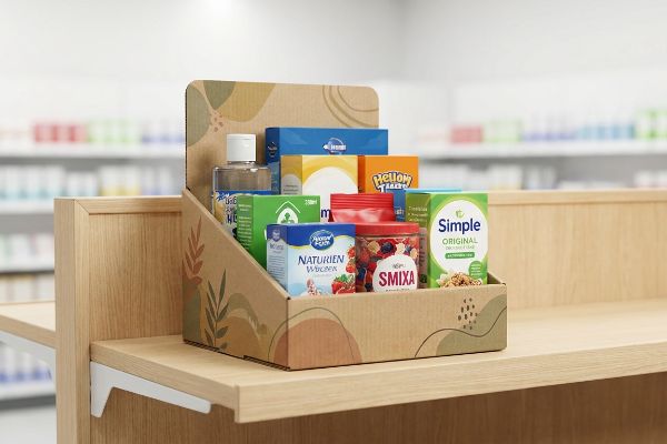
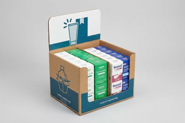
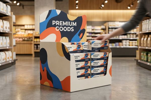
Ja. Displayboxen sind eine lohnende Investition, da sie die Produkte aus den oft überfüllten Regalen herausholen und direkt in stark frequentierte Impulskaufzonen platzieren. Richtig konzipiert, steigern diese Sekundärverpackungen den Absatz deutlich, indem sie die Aufmerksamkeit der Kunden außerhalb des Regals auf sich ziehen und Spontankäufe auslösen.
Allerdings garantiert das bloße Hineinstellen eines bedruckten Kartons mitten in einen Gang nicht automatisch einen profitablen Umsatzanstieg.
Die 3-3-3-Regel für den ROI im Einzelhandel
Junior-Marketingteams entwerfen Verkaufsdisplays häufig ausschließlich für die Nahansicht auf hintergrundbeleuchteten Computermonitoren und ignorieren dabei die physische Realität, wie sich Menschen tatsächlich in den Gängen eines Geschäfts bewegen13.Sie behandeln die Struktur wie eine Broschüre und überziehen sie mit winziger Schrift und subtilen Farbverläufen, die aus der Ferne völlig verschwinden.
Ein häufiges Problem, das ich beobachte, ist, dass Marken Unsummen für Produkte ausgeben, an denen Kunden schlichtweg achtlos vorbeigehen. Stellen Sie sich das wie eine Werbetafel an der Autobahn vor: Wenn man sie bei voller Fahrt nicht lesen kann, verfehlt sie ihren Zweck. Ich wende daher stets die 3-3-3-Regel für räumliche Interaktion9,14m Entfernung mit einer markanten, geschwungenen Form Aufmerksamkeit erregen, in 0,91 m Entfernung gezielt Interesse wecken und in 7,62 mm Entfernung zum Kauf animieren. Wenn ich Prototypen im Laden teste, ist die Haptik entscheidend – die glatte, kratzfeste, matte Oberfläche der Vorderkante muss sich hochwertig anfühlen, wenn der Kunde hineingreift. Ohne Berücksichtigung dieser unterschiedlichen Distanzen geht das Produkt in der Masse unter, was zu Ladenhütern und einem miserablen Marketing-ROI führt.
| Häufiger Anfängerfehler | Die Profi-Lösung | Vorteil für die Verkaufsfläche |
|---|---|---|
| Winzige, textlastige Grafiken | 30 Fuß hohe, auffällige visuelle Störung15 | Verhindert das Drängeln der Käufer |
| Symmetrische, langweilige Formen | Geschwungene, dynamische Stanzformen | Durchbricht die visuelle Monotonie |
| Hohe vordere Haltelippen | Mindestens 85 % Produktsichtbarkeit16 | Erleichtert das Greifen nach Gegenständen |
Ich sage jeder neuen Marke, dass ein Display nur dann den Karton wert ist, auf dem es gedruckt ist, wenn sich der ROI mathematisch nachweisen lässt. Die Entwicklung, die speziell auf die physische Annäherungsdistanz des Kunden abgestimmt ist, ist der entscheidende Faktor für den letztendlichen Kaufabschluss.
🛠️ Harveys Schreibtisch: Sind Ihre Grafiken so unübersichtlich, dass sie vielbeschäftigte Kunden abschrecken? 👉 Jetzt Layout-Check anfordern ↗ — Keine Formulare, die endlose Verkaufsanrufe auslösen. Einfach nur Mehrwert.
Wie nennt man ein Pappdisplay?
Die Einzelhandelsbranche ist von verwirrenden Akronymen überschwemmt, und Käufer verwenden häufig unterschiedliche Begriffe synonym.
Kartonaufsteller werden in der Branche unter verschiedenen Bezeichnungen geführt, darunter POP-Displays (Point of Purchase), POS-Displays (Point of Sale), FSDU-Displays (Free Standing Display Units) und PDQ-Displays (Pretty Darn Quick). Diese Kategorisierungen basieren ausschließlich auf ihrer Größe, der Montagegeschwindigkeit und der Platzierung im Verkaufsraum.

Doch die Theorie allein genügt nicht, wenn die Maschinen in Betrieb genommen werden und die Compliance-Teams der Einzelhändler mit Maßbändern auftauchen.
Warum die Verkleinerung einer POS-Einheit die Einhaltung der Vorschriften im Einzelhandel beeinträchtigt
Handelsunternehmen präsentieren häufig ein skalierbares Design, bei dem ein massives POS- Bodendisplay einfach um 50 Prozent verkleinert werden kann, um als kompakte POS-Thekeneinheit zu dienen. Käufer sind von dieser Idee begeistert, da sie davon ausgehen, dass eine einzige Stanzform perfekt für zwei völlig unterschiedliche Einzelhandelsumgebungen geeignet ist und gleichzeitig Kosten für die Werkzeugkonstruktion eingespart werden können .
In meiner Einrichtung erlebe ich regelmäßig, wie diese theoretische Skalierungsfalle bei unseren praktischen Belastungstests völlig zusammenbricht. Einen verkleinerten Karton auf einem Labortisch aufzustellen, ist einfach, aber die Realität sieht anders aus, wenn man 500 Stück versendet. Ein POS-Bodenregal ist strikt an die starren GMA-Palettenabmessungen (1219,2 × 1016 mm) von 48 × 40 Zoll( 1219,2 × 1016 mm) angepasst, um maximale dynamische Belastbarkeit zu gewährleisten. Verkleinert man diese Berechnungen einfach, verstößt man gegen die strengen ADA-Vorgaben (Americans with Disabilities Act) für Kassensysteme, die eine Reichweite von 381–1219,2 mm (15–48 Zoll) vorschreiben. Ich habe letzte Woche die CAD-Geometrien überprüft und nachgewiesen, dass eine mathematische Verkleinerung um 50 % die unterste Ebene komplett unzugänglich macht. Ich habe das Problem behoben, indem ich die technischen Leitungen dauerhaft getrennt und dem POS-Regal einen 60,96 mm (2,4 Zoll) hohen Zwischenboden hinzugefügt habe, um die Auflagefläche künstlich anzuheben. Durch die Entwicklung dieser spezifischen strukturellen Toleranzen stelle ich sicher, dass die Marke massive Rückbuchungen vollständig vermeidet und dass Filialleiter nicht konforme Kasseneinheiten nicht sofort ablehnen können.
| Häufiger Anfängerfehler | Die Profi-Lösung | Vorteil für die Verkaufsfläche |
|---|---|---|
| „Shrink-to-fit“-POP-Skalierung | Dedizierte POS-Engineering-Pipelines | Erfüllt die ADA-Richtlinien20 |
| Die Reichweitenbegrenzungen nach vorne werden ignoriert | 50 Zoll erhöhte Schlagzonen21 | Verhindert Ablehnung durch den Filialleiter |
| Verwendung schmaler, wackeliger Sockel | Erweiterte Fehlbodenflächen | Verhindert das Umkippen von Thekendisplays |
Ich weigere mich, zuzulassen, dass einfache, skalierbare Vorlagen die strengen Compliance-Vorschriften des nordamerikanischen Einzelhandels umgehen. Die Trennung der technischen Abläufe für Verkaufsfläche und Theke garantiert, dass Ihre Warenpräsentation genau dort funktioniert, wo der Einzelhändler es verlangt.
🛠️ Harveys Schreibtisch: Lassen Sie sich nicht von einem 2 Millimeter kleinen Konstruktionsfehler die Einführung in 500 Filialen vermasseln. 👉 Senden Sie mir Ihre Stanzdatei ↗ – ich prüfe die Berechnungen, bevor Sie Ihr Budget für die Massenproduktion verschwenden.
Abschluss
Sie können zwar nach günstigen, gebrauchten Versandmaterialien suchen, doch wenn die ausgeleierten Wellpappstücke in einem feuchten Lagerhaus unweigerlich einknicken, verlangsamt der daraus resultierende Einsturz der Basisschicht die Warenannahme um schätzungsweise 30 % und lässt Ihre Gewinnmargen sofort schrumpfen. Über 500 Markenmanager nutzen meine Checkliste für die Druckvorstufe, um genau diese fatalen Fehler in der Anfangsphase zu vermeiden. Hören Sie auf, über unsichtbare Fasertoleranzen zu raten, und lassen Sie mich Ihre Strukturdateien persönlich durch mein kostenloses Verpackungsrisiko-Audit führen, um Ihre Ladung vor Beginn der Massenproduktion abzusichern.
„[PDF] Untersuchung der mechanischen Eigenschaften von Kartonverpackungen …“, https://repository.rit.edu/cgi/viewcontent.cgi?article=1066&context=japr. [Eine maßgebliche Quelle im Bereich Verpackungstechnik würde erklären, wie die gewölbte Wellenstruktur von Wellpappe die Aufprallenergie durch strukturellen Kollaps absorbiert]. Nachweisfunktion: Technische Verifizierung; Quellentyp: Materialwissenschaftliches oder Handbuch der Verpackungsindustrie. Unterstützt: Die Behauptung, dass die strukturelle Integrität nach der ersten Verwendung beeinträchtigt ist. Anwendungsbereich: Gilt speziell für ein- und doppelwandige Wellpappe. ↩
„[PDF] Wellpappenverpackungen mit innovativem Design für verbesserte …“, https://bioresources.cnr.ncsu.edu/wp-content/uploads/2026/01/BioRes_21_1_2229_Tworzydlo_PSMPGG_Corrugated_Packaging_Design_Durability_Transport_25399.pdf. [Forschung im Bereich Verpackungstechnik erklärt, wie die Wellen in Wellpappe kinetische Energie absorbieren und wie Feuchtigkeit und Spannung zu dauerhaften Verformungen der Zellulosefasern führen]. Belegfunktion: technische Erklärung; Quellentyp: Lehrbuch der Ingenieurwissenschaften oder Fachzeitschrift für Materialwissenschaften. Unterstützt: die strukturelle Degradation gebrauchter Kartons. Anmerkung zum Anwendungsbereich: bezieht sich speziell auf die Mechanik von Wellpappe. ↩
„Wie die Wahl der Verpackung die Lagereffizienz beeinflusst“, https://www.southernpackaginglp.com/blog/packaging-choice-affects-warehouse-efficiency. [Logistik-Leistungsbenchmarks quantifizieren den Mehraufwand an Arbeit und die Zeitverzögerungen, die durch die Bearbeitung beschädigter oder zusammengefallener Versandbehälter bei der Warenannahme entstehen]. Nachweisfunktion: quantitative Kennzahl; Quellentyp: Bericht über die Lieferkettenbranche. Unterstützt: die Betriebskosten der Verwendung mangelhafter Verpackungen. Anmerkung zum Umfang: Geschätzter Wert basierend auf Daten zum Lagerdurchsatz. ↩
„[PDF] NEUHOLZ-VERSUS RECYCELTE KARTONS Von L. Lisa Zhao Eine Dissertation …“, https://vuir.vu.edu.au/18233/1/ZHAO_1993compressed.pdf. [Daten aus der Verpackungstechnik zeigen, dass Neuholzfasern eine höhere Berstfestigkeit und Stapeldruckfestigkeit aufweisen als Recyclingfasern, wodurch Quetschschäden reduziert werden]. Nachweisfunktion: Technischer Vergleich; Quellentyp: Materialwissenschaftliche Studie. Unterstützt: Die Behauptung, dass Neuholzkartons Quetschschäden verhindern. Anmerkung zum Untersuchungsbereich: Vergleicht neue Materialien mit wiederverwendeten oder minderwertigen Recyclingkartons. ↩
„[PDF] 6-amazon.com-sioc – International Safe Transit Association“, https://ista.org/docs/6AmazoncomSIOCOverview.pdf. [Die Branchenstandards der International Safe Transit Association (ISTA) definieren die SIOC-Testprotokolle, die erforderlich sind, um die Versandkriterien von Amazon zu erfüllen und Strafen wegen Nichteinhaltung zu vermeiden]. Nachweisfunktion: Technische Spezifikation; Quellentyp: Branchenstandard. Unterstützt: den Zusammenhang zwischen Zertifizierung und Vermeidung von Rückbuchungen. Anwendungsbereich: Spezifisch für die Amazon-Fulfillment-Richtlinien. ↩
„[PDF] 40-Zoll-GMA-Holzpaletten – Southern Research Station“, https://www.srs.fs.usda.gov/pubs/VT_Publications/05t10.pdf. [Technische Richtlinien der Grocery Manufacturers Association (GMA) legen Palettenabmessungen und Beladungsmuster fest, um die vertikale Stabilität und Sicherheit beim Doppelstapeln zu gewährleisten]. Nachweisfunktion: Faktenbasis; Quellentyp: Logistikstandard. Belegt: den Zusammenhang zwischen standardisierter Geometrie und Stapelstabilität. Anwendungsbereich: Hauptsächlich relevant für die nordamerikanische Logistik. ↩
„Gestrichenes vs. ungestrichenes Papier: Tintenaufnahme & Farbleitfaden“, https://www.ybj-printing.com/coated-vs-uncoated-paper-ink-absorption-color-guide/. [Technische Dokumentationen zur Substratporosität und Tintenaufnahmerate würden belegen, dass unversiegelter Karton die Barriereschicht von Glanzpapier nicht aufweist, was zu erhöhtem Tintendurchdringen und Farbverschiebungen führt]. Nachweisfunktion: Technische Verifizierung; Quellentyp: Handbuch der Druckindustrie oder Fachzeitschrift für Materialwissenschaften. Belege: Unterschied in der Substratabsorption. Anmerkung zum Untersuchungsbereich: Fokus auf das Verhalten flüssiger Tinte auf unversiegelten versus gestrichenen Oberflächen. ↩
„[PDF] 1. Punktzuwachs ist die Vergrößerung der Rasterpunktgröße durch das Eindringen von Tinte in …“, https://www.coloradomesa.edu/art/documents/student-resources/study-guide-2019.pdf. [Ein technisches Druckhandbuch würde erklären, wie beim Prozessdruck (CMYK) Rastermuster verwendet werden und wie poröse Substrate zu Tintenverlauf, dem sogenannten Punktzuwachs, führen]. Belegfunktion: technische Erklärung; Quellentyp: Lehrbuch der Druckindustrie. Unterstützung: die mechanische Ursache für die visuelle Verschlechterung auf unbeschichtetem Testliner. Anmerkung zum Untersuchungsbereich: Fokus auf unbeschichtete Substrate. ↩
„CMYK vs. Sonderfarben im Verpackungsdruck“, https://meyers.com/meyers-blog/cmyk-vs-spot-colors-in-packaging-printing-what-cpg-brands-need-to-know/. [Die Farbsystemdokumentation von Pantone zeigt, wie Sonderfarben im Gegensatz zur optischen Mischung von CMYK-Punkten eine deckende, deckende Pigmentschicht bilden.] Belegfunktion: Technische Spezifikation; Quellentyp: Herstellerdokumentation. Belegt: Die Behauptung, dass PMS-Farben die Rasterung eliminieren. Anmerkung zum Anwendungsbereich: Vergleich zwischen Prozess- und Sonderfarben. ↩
„Pantone vs. CMYK für individuelle Markenverpackungen – EcoEnclose“, https://www.ecoenclose.com/blog/pantone-vs-cmyk-for-custom-branded-packaging?srsltid=AfmBOoo3XbDFyAgSk-azmle9RkYkyrfu6M0-_OPUiLMFBjF8VDVQdNlw. [Technische Druckrichtlinien erklären, wie deckende Sonderfarben eine gleichmäßige Deckkraft auf braunen Untergründen gewährleisten, während transparente CMYK-Farben mit dem Hintergrund verschmelzen und so trübe Töne erzeugen]. Nachweisfunktion: Technische Validierung; Quellentyp: Handbuch der Druckindustrie. Unterstützung: Verwendung von Pantone zur Vermeidung von trüben Logos auf Kraftpapier. Anwendungsbereich: Gilt für nicht-weiße, saugfähige Kartonagen. ↩
„[PDF] FAKTOREN, DIE DIE OBERFLÄCHENFESTIGKEIT VON BESCHICHTETEN PAPIERN BEEINFLUSSEN …“, https://www.tappi.org/content/events/11papercon/documents/179.522%20doc.pdf. [Materialwissenschaftliche Daten zu Papierbeschichtungen zeigen, dass hochfeste Barrieren das Eindringen von Tinte in poröse Fasern reduzieren und so das Einsinken der Farbe verhindern und die Farbsättigung erhalten]. Nachweisfunktion: Materialwissenschaftliche Bestätigung; Quellentyp: Technisches Datenblatt des Beschichtungsherstellers. Unterstützt: Verwendung von Beschichtungen zur Erhaltung leuchtender Farben. Anmerkung: Die Wirksamkeit hängt von der Schichtdicke ab. ↩
„Einfluss von Farbe und Polarität auf die visuelle Auflösung bei variierenden …“, https://pmc.ncbi.nlm.nih.gov/articles/PMC9185210/. [Forschungen zur visuellen Ergonomie zeigen, dass die Lesbarkeit aus der Ferne durch höhere Kontrastverhältnisse und stärkere Schriftstärken auf strukturierten oder dunklen Untergründen deutlich verbessert wird]. Nachweisfunktion: Validierung eines Gestaltungsprinzips; Quellentyp: Studie zu Typografie und Barrierefreiheit. Belege: Erhöhter Leseabstand auf braunem Karton. Anmerkung: Die Ergebnisse variieren je nach Farbkontrastverhältnis. ↩
„Nutzung von Eye-Tracking-Daten in der Marktforschung im Einzelhandel: Ein praktischer Leitfaden“, https://www.sciencedirect.com/science/article/pii/S002243592400006X. [Forschung zum Konsumentenverhalten und Heatmaps im Einzelhandel liefert empirische Daten zu Blicklinien und Bewegungsmustern von Kunden in stationären Geschäften]. Evidenzfunktion: Verhaltensvalidierung; Quellentyp: Akademische Studie oder Marktforschungsbericht. Belege: Die Notwendigkeit, Ladeneinrichtungen auf Basis menschlicher Bewegungen und nicht digitaler Betrachtung zu gestalten. Anmerkung: Die Muster können je nach Geschäftskategorie variieren. ↩
„Die 80/20-Regel im Merchandising – Bloomreach“, https://www.bloomreach.com/en/library/guides/80-20-rule-of-merchandising. [Ein maßgeblicher Leitfaden für Ladengestaltung und Merchandising bestätigt die Wirksamkeit der 3-3-3-Regel, um die Aufmerksamkeit der Kunden aus unterschiedlichen Entfernungen zu gewinnen und so die Conversion-Rate zu steigern.] Nachweisfunktion: Technische Validierung; Quellentyp: Branchenstandard. Unterstützt: Die spezifischen Entfernungsschwellenwerte, die für die Kundenansprache im Einzelhandel erforderlich sind. Hinweis: Die Wirksamkeit kann je nach Kundenfrequenz und Beleuchtung im Geschäft variieren. ↩
„Gestaltung von Verkaufsflächen für effektive Warenpräsentation und Kundenführung“, https://www.business.qld.gov.au/industries/manufacturing-retail/retail-wholesale/retail-displays. Branchenstandards für die Gestaltung von Verkaufsflächen (POS-Materialien) legen die Entfernung fest, aus der ein Display lesbar sein muss, um die Aufmerksamkeit eiliger Kunden zu erregen. Nachweisfunktion: Technische Spezifikation; Quellentyp: Leitfaden für die Warenpräsentation im Einzelhandel. Unterstützt: Anforderungen an die Sichtbarkeitsentfernung. Hinweis: Kann je nach Gangbreite und Größe des Geschäfts variieren. ↩
„Wie maßgefertigte Displayboxen die Produktsichtbarkeit im Einzelhandel verbessern“, https://shipmaster.com/how-custom-display-boxes-can-increase-product-visibility-in-retail-stores/. Merchandising-Benchmarks legen den Mindestanteil der sichtbaren Produktfläche fest, der erforderlich ist, um die Greifrate der Kunden und die Zugänglichkeit zu optimieren. Nachweisfunktion: Branchenkennzahl; Quellentyp: Studie zum Konsumentenverhalten. Unterstützt: Optimale Produktsichtbarkeit. Anmerkung: Bezieht sich insbesondere auf die Höhe der vorderen Haltelippen. ↩
„Stanzform für Displaybox-Abmessungen, Größen & Vorlage – BoxesGen“, https://boxesgen.com/dieline-of-display-box-dimensions-sizes-template/?srsltid=AfmBOoqq7YES8LumvyWAe8S1zvxpUT9WHJsGikvQq3BUJiEbeR64MV3g. [Eine maßgebliche Quelle für die Herstellung von Einzelhandelsverpackungen würde detailliert beschreiben, wie die Verwendung einer einzigen Stanzform für verschiedene Größen die Kosten für die Herstellung physischer Stanzwerkzeuge reduziert]. Nachweisfunktion: Technische Validierung; Quellentyp: Industriestandard. Unterstützt: den wirtschaftlichen Anreiz für skalierbare Displaydesigns. Anmerkung zum Anwendungsbereich: Setzt Standard-Stanzverfahren voraus. ↩
„Standardpalettengrößen | Mit Tabelle – Kamps Pallets“, https://www.kampspallets.com/standard-pallet-sizes-with-chart/. [Die Dokumentation der Branchenstandards der Grocery Manufacturers Association bestätigt die 48×40-Zoll-Palette als nordamerikanischen Standard für die Logistik]. Nachweisfunktion: Faktenprüfung; Quellentyp: Branchenstandard; Berücksichtigt: Palettenabmessungen; Anwendungsbereich: hauptsächlich für den Inlandsversand in den USA. ↩
„Kapitel 3: Bedienbare Teile – Access-Board.gov“, https://www.access-board.gov/ada/guides/chapter-3-operable-parts/. [Die ADA-Standards für barrierefreies Design legen den erforderlichen Reichweitenbereich für bedienbare Teile fest, um die Zugänglichkeit für Rollstuhlfahrer zu gewährleisten]. Nachweisfunktion: Überprüfung der Einhaltung gesetzlicher Bestimmungen; Quellentyp: Rechtsnorm; Unterstützung: Einhaltung der Reichweitenvorgaben; Anwendungsbereich: spezifisch für Richtlinien zur physischen Zugänglichkeit. ↩
„ADA-Standards für barrierefreies Design, Titel III, Verordnung 28 CFR …“, https://www.ada.gov/law-and-regs/design-standards/1991-design-standards/. [Eine maßgebliche Quelle zum Americans with Disabilities Act (ADA) beschreibt die spezifischen Anforderungen an Gangbreiten und Reichweiten, die Verkaufsdisplays erfüllen müssen, um den Vorschriften zu entsprechen]. Nachweisfunktion: Rechtsnorm; Quellentyp: Regierungsverordnung. Unterstützt: den Zusammenhang zwischen der Skalierung von POS-Materialien und der ADA-Konformität. Anwendungsbereich: Gilt speziell für US-amerikanische Gesetze zur Barrierefreiheit. ↩
„Warum platzieren Einzelhändler Produkte auf Augenhöhe? – PopDisplay“, https://popdisplay.me/why-do-retailers-place-products-at-eye-level/. [Leitfäden für Ladengestaltung und Ergonomie legen optimale vertikale Bereiche für die Produktplatzierung fest, um die Sichtbarkeit und Reichweite für die Kunden zu maximieren]. Nachweisfunktion: Technische Spezifikation; Quellentyp: Branchenleitfaden. Unterstützt: die Verwendung von 50-Zoll-Zonen, um Ablehnungen zu vermeiden. Anmerkung: Optimale Höhen können je nach Ergonomie der Zielgruppe variieren. ↩