My display draws eyes, yet sales stay flat. The layout feels random. Deadlines press me. I will fix it with a simple system and fast checks.
Yes. Start with a clear goal, map shopper flow, pick the right cardboard grade, lock structure first, then graphics. Test with a 10-second rule, a wobble test, and a quick load check before print.

I will walk through the core steps I use in my factory and with global buyers. I will keep the words simple. I will show what to do next and why it works.
How can I improve my display?
I fix three things first: message, structure, and path to pick-up. I use short tests that fit tight timelines.
Focus one message, choose a proven structure, and guide the hand. Use floor, counter, or pallet formats based on store rules. Place the hero SKU at hand height. Show price and benefit in under 10 words.

Structure before style
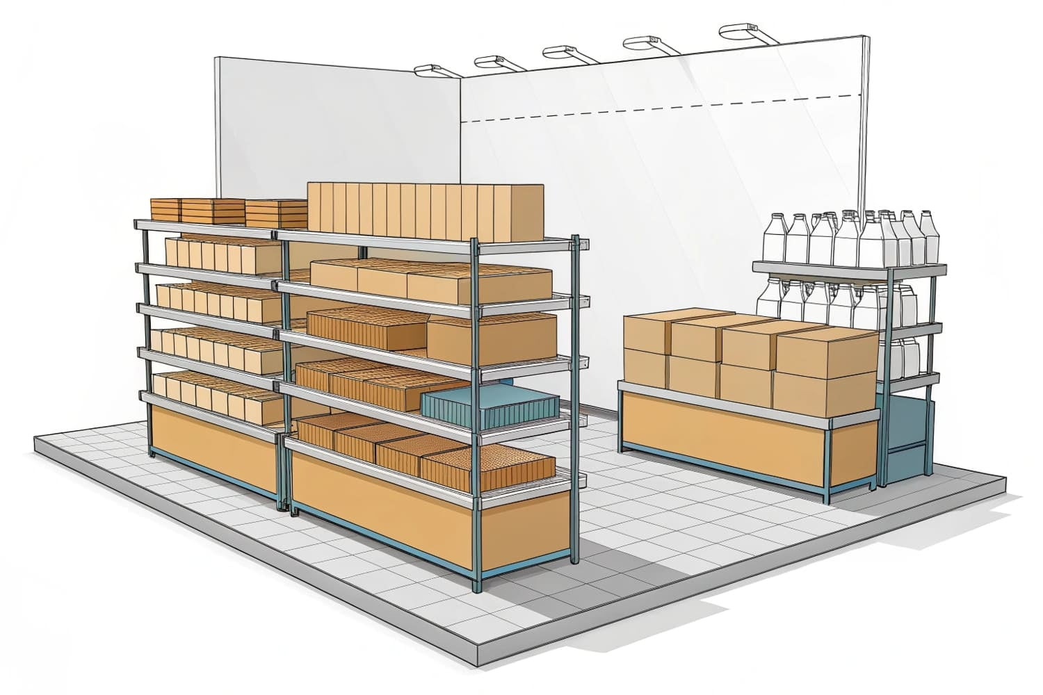
I improve results when I decide structure before artwork. I choose a display type that matches traffic and load. Floor displays keep growing fast because they hit the shopper in the aisle. Some reports show floor POP units near 43.7% share. I like them for new launches and big visuals. Counter units work near checkout for impulse items1. Pallet displays move bulk in clubs and save set-up time. I plan facings, shelf pitch, and bracing first. Then I place a short headline, a strong product image, and price. I keep copy short. I remove cute words that slow reading. In my first hunting-gear project, sales rose when I moved the broadhead packs up 10 cm and cut headline words by half.
Quick format chooser
| Format | When it wins | First design move |
|---|---|---|
| Floor | New launch, high impact2 | 1 message header + eye height hero SKU |
| Counter | Small packs, impulse3 | 2-3 facings + clean lip card |
| Pallet | Clubs, bulk | Corner bumpers + bold side panels |
How to check display quality?
I run simple checks that fit busy days. I do not wait for a lab every time. I use repeatable steps on the factory floor.
Use a 10-second read test, a wobble test, a load test, and a carton drop. Check color with a printed target. Confirm edges, tabs, and glue with a pull test.
Fast, repeatable tests that catch 80% of risks
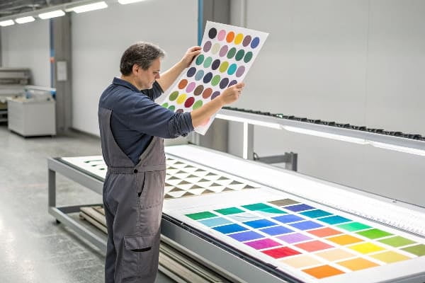
I start with the 10-second rule4. I ask a new eye to read the main promise in one glance. If they cannot, I cut words. Next I run a wobble test. I push the loaded unit 2 cm at the header. If it rocks, I add side gussets or a deeper base. I run a load test5 at 1.5× planned weight for 24 hours. If a shelf bows, I change flute or add ribs. I drop the master carton from knee height on three edges to mimic a short mishandle. If a corner crushes, I add corner posts. I check color by matching a control swatch. I aim for tight tolerance on the hero color. On a crossbow display, a dark green drifted dull. I caught it in this check and swapped to a different water-based ink.
Field checklist
| Check | Target | Fix if failed |
|---|---|---|
| Read time6 | ≤10 seconds | Shorten copy, boost contrast |
| Rocking | ≤5 mm sway | Add gusset, widen base |
| Load7 | 1.5× for 24 h | Upgrade flute, add ribs |
| Color | Visual match to swatch | Adjust ink density, re-profile press |
How to manage display settings?
I treat "settings" like a pilot's panel. I keep defaults for speed, then tune per buyer. This avoids missed details and keeps quotes clean.
Create a one-page settings sheet: SKU count, facings, load per shelf, flute, coating, print method, color targets, and pack-out. Use it to align design, cost, and lead time.

My simple "settings" that control cost and speed
I keep a standard sheet for every job. I set the business goal first. Is it awareness, trial, or volume? Then I set SKU count, facings, and load by shelf. I pick material by weight and climate. Single-wall works for many jobs. I add nano or water-resist coat only if needed. I choose print by run size. Digital suits short runs and art with many versions. Flexo or offset suits big runs and solid brand colors. I add sustainability fields8. I mark recycled content and FSC needs. This sheet saves time when tariffs or fiber costs move. It also helps my clients plan reorders with minimal changes.
Default settings (edit per project)
| Field | Default | Notes |
|---|---|---|
| Goal | Trial + awareness | Single message |
| Material | Single-wall corrugated9 | Upgrade for >15 kg per shelf |
| Digital for ≤2,000; Offset for >2,000 | Match art needs | |
| Coating | Water-based gloss10 | Matte for premium feel |
| Pack | Flat-pack with QR build guide | Cuts freight and damage |
There is no software button. I keep a one-page menu in the project folder and on the inside of the dieline PDF. My team can find it fast.
Put the settings menu at the top of your spec: first page of the PDF dieline and on the PO checklist. Mirror it in your brief and the QC sheet.

Make the menu easy to find and hard to miss
I put the settings table11 on page one of the dieline file. I repeat it on the purchase order and the QC checklist. I print a small copy on the master carton label. I add a QR code12 that links to the build video. Retail teams scan it during set-up. This simple habit removes confusion. It ends the long email threads that waste days. It also tracks updates when a buyer changes a deadline. In 2025, costs and rules moved fast. A clear menu kept my floor unit on schedule for a North America launch. The buyer got the club pallet in time, and we avoided late fees.
Settings menu placement map
| Location | Owner | Why it works |
|---|---|---|
| Dieline page 113 | Designer | Always seen during art sign-off |
| PO checklist14 | Buyer | Locks scope and price |
| QC sheet | Factory | Verifies build and color |
| Carton label + QR | Logistics | Guides store set-up |
How to get the best display on a monitor?
My team often approves art on screens. Good screen habits reduce color surprises and reprints that burn time.
Use sRGB monitors with basic calibration, view art at 100% scale, export proofs at 300 dpi in CMYK, and request a printed swatch for the hero color.
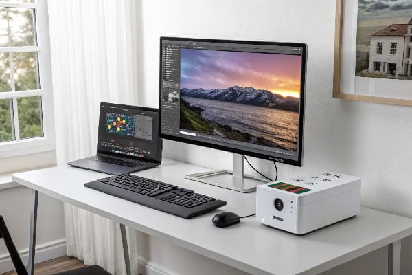
Screen-to-press alignment that avoids costly do-overs
I keep my review screens set to sRGB15 because many buyers use standard laptops. I run a quick calibration with a puck when I can, or a built-in tool when I cannot. I review dielines at 100% zoom so type size and barcodes make sense. I ask for proof exports at 300 dpi in CMYK16 with embedded profiles. I flag spot colors for logos. I request a small printed swatch of the hero color on real board, with the exact coating. This matters for water-based inks and matte coats. In one project, a dark camo green looked fine on a bright monitor, but it printed too flat. The swatch showed it early. We added a highlight tint and kept brand tone intact. This saved a week and a truckload of reprints.
Monitor proofing checklist
| Step | Target | Why |
|---|---|---|
| Color space17 | sRGB display; CMYK proof | Matches common screens; previews print |
| Zoom | 100% for text/barcodes | True size check |
| Proof file18 | 300 dpi PDF/TIFF | Sharp edges and logos |
| Swatch | Printed on real board | Confirms ink + coating |
Conclusion
Start with one message, lock structure, use a simple settings menu, and run fast tests. These habits lift sell-through and protect your timeline.
Learn strategies for maximizing sales of impulse items, especially near checkout, to increase overall revenue. ↩
Exploring this link will provide insights into how high impact strategies can elevate your marketing efforts. ↩
This resource will help you understand techniques to boost sales of impulse items effectively. ↩
Understanding the 10-second rule can enhance your testing process, ensuring clarity and effectiveness in your product's main promise. ↩
Learning about load tests can help you ensure your product's durability and reliability under stress, which is crucial for customer satisfaction. ↩
Explore this link to learn techniques that enhance readability and user engagement. ↩
Discover methods to enhance structural integrity and load capacity in your projects. ↩
Understanding sustainability fields can enhance your packaging strategy and align with eco-friendly practices. ↩
Explore this link to understand how Single-wall corrugated packaging can enhance your product's protection and sustainability. ↩
Learn about Water-based gloss coating to see how it can improve the visual appeal and durability of your packaging. ↩
Learn about the importance of a settings table in project management to enhance clarity and efficiency. ↩
Explore this link to understand how QR codes enhance customer engagement and streamline processes in retail. ↩
Understanding the role of Dieline page 1 can enhance your design workflow and ensure effective communication during art sign-off. ↩
Exploring the significance of a PO checklist can improve your project management skills by ensuring scope and price are locked effectively. ↩
Understanding sRGB is crucial for ensuring accurate color representation in digital and print media. ↩
Exploring the significance of 300 dpi in CMYK can help you achieve high-quality prints and avoid costly mistakes. ↩
Understanding color space is crucial for ensuring accurate color representation in both digital and print formats. ↩
A 300 dpi PDF/TIFF ensures high-quality prints, making it essential for sharp images and professional results. ↩


