যখন বড় বড় দোকানের তাকগুলো উপচে পড়ে, তখন একটি খুচরা পণ্য চালু করাটা জুয়া খেলার মতো মনে হয়। আপনার প্রদর্শন কৌশলের যদি বাস্তব প্রয়োগে ঘাটতি থাকে, তবে আপনার বিপণন বাজেট অপচয় হবে।.
রিটেইল মার্কেটিং স্ট্র্যাটেজি হলো একটি লক্ষ্য-ভিত্তিক পদ্ধতি, যা ক্রেতাদের সম্পৃক্ততা বাড়াতে, দোকানের জায়গার সর্বোচ্চ ব্যবহার করতে এবং পণ্যের বিক্রি বৃদ্ধি করতে ব্যবহৃত হয়। এর প্রধান উদাহরণগুলোর মধ্যে রয়েছে আংশিক প্যালেট সাইজিং, অপ্রতিসমভাবে পণ্য বিন্যাস এবং তিন-সেকেন্ডের ভিজ্যুয়াল ডিসরাপশন রুল, যা সম্মিলিতভাবে মস্তিষ্কের উপর অতিরিক্ত চাপ প্রতিরোধ করে এবং রিটেইলে সেরা স্থান নিশ্চিত করে।.
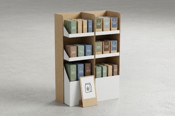
কিন্তু রিটেইল প্লেসমেন্টের তত্ত্ব বোঝা ততক্ষণ পর্যন্ত অর্থহীন, যতক্ষণ না আপনি বাস্তবে এই ক্যাম্পেইনগুলো তৈরি করার চেষ্টা করছেন। চলুন দেখে নেওয়া যাক, এই ধারণাগুলো বাস্তব কাঠামোতে কীভাবে রূপান্তরিত হয়।.
খুচরা ব্যবসার কৌশলের কিছু উদাহরণ কী কী?
একটি বিশাল খুচরা বিক্রেতার কাছে একঘেয়ে প্রস্তাবনা নিয়ে যাওয়া মানেই প্রত্যাখ্যাত হওয়ার নিশ্চিত পথ। টিকে থাকার জন্য আপনার স্থানিক নমনীয়তা প্রয়োজন।.
খুচরা বিক্রয় কৌশলের উদাহরণগুলির মধ্যে রয়েছে দোকানের সাধারণ নকশাকে ভগ্নাংশ আকারে ভাগ করা, যেমন অর্ধেক প্যালেট বা এক-চতুর্থাংশ প্যালেট। এই গাণিতিক বিভাজন ব্র্যান্ডগুলিকে ছোট ও অত্যন্ত লাভজনক পণ্য উপস্থাপনের সুযোগ দেয়, যা একটি সম্পূর্ণ করিডোর দখল না করেই জনবহুল দোকানের সংযোগস্থলে নিখুঁতভাবে স্থাপন করা যায় এবং এর ফলে ক্রেতার অনুমোদন অনেক সহজ হয়ে যায়।.
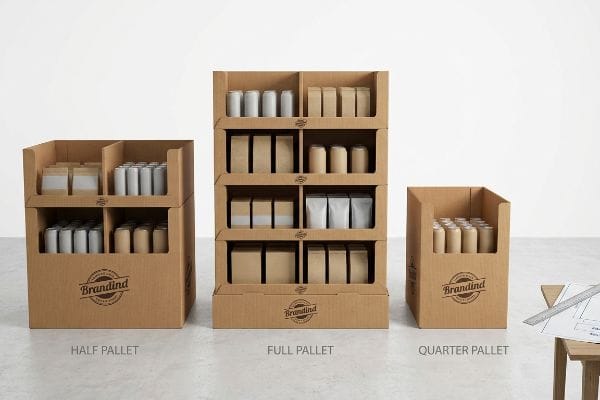
যখন আপনি মার্কেটিং প্রেজেন্টেশন থেকে সরে এসে দোকানের বাস্তব রূপটির দিকে তাকান, তখন জায়গার হিসাবই সবকিছু নির্ধারণ করে দেয়।.
ভগ্নাংশ জ্যামিতি খুচরা কৌশল
এমনকি অভিজ্ঞ ডিজাইনাররাও প্রায়শই বড় দোকানের করিডোরের স্থানিক বাস্তবতাকে উপেক্ষা করেন, এই ভেবে যে প্রতিটি নতুন পণ্য লঞ্চের জন্য একটি বিশাল ৪৮×৪০ ইঞ্চি (১২১৯×১০১৬ মিমি) পিওপি (পয়েন্ট অফ পারচেজ) ফ্লোর ডিসপ্লে।তারা তাদের স্ক্রিনে সুন্দর, বিস্তৃত ক্যাম্পেইন রেন্ডার তৈরি করেন। তবে, স্টোর ম্যানেজাররা কঠোরভাবে ফ্লোরের জায়গা সীমিত করেন, এবং একটি ছোটখাটো মৌসুমী লঞ্চের জন্য বিশাল আকারের ডিসপ্লের প্রস্তাব দিলে তা সাধারণত ক্রেতাদের কাছ থেকে তাৎক্ষণিক প্রত্যাখ্যানের কারণ হয়।
আমার প্রতিষ্ঠানে আমি নিয়মিতই দেখি, যখন কোনো খুচরা বিক্রেতা তাদের পুরো প্যালেটের প্রস্তাব প্রত্যাখ্যান করে, তখন ক্লায়েন্টরা আতঙ্কিত হয়ে পড়েন। এর বাস্তব সমাধান হলো ভগ্নাংশ প্যালেটে চলে যাওয়া —বিশেষ করে অর্ধেক (৪৮×২০ ইঞ্চি / ১২১৯×৫০৮ মিমি) বা এক- চতুর্থাংশ আকারের প্যালেট তৈরি করা। আমার একটি নির্দিষ্ট চালানের কথা মনে আছে, যেখানে একজন ক্লায়েন্ট একটি বিশেষ ধরনের প্রসাধনী পণ্যের জন্য পুরো একটি প্যালেট চেয়েছিলেন । যখন খুচরা বিক্রেতা এটি প্রত্যাখ্যান করল, তখন আমাকে আমার কংসবার্গ সি-সিরিজ টেবিলে প্রোটোটাইপটি হাতে কেটে ছোট করতে হয়েছিল। টেবিলের বিকট ভ্যাকুয়াম সাকশন বোর্ডটিকে ধরে রেখেছিল এবং দোদুল্যমান ব্লেডটি ভিত্তিটিকে নিখুঁতভাবে মাঝখান থেকে কেটে ফেলেছিল এটা প্রমাণ করার জন্য যে, এটি তখনও ওজন ধরে রাখতে সক্ষম। ভিত্তিটিকে গাণিতিকভাবে ভাগ করার মাধ্যমে, দুটি ভিন্ন ব্র্যান্ডের প্রচারণা একটিমাত্র কাঠের ডেক নিখুঁতভাবে ভাগ করে নিতে পারে। এই কাঠামোগত সমাধানটি নিশ্চিত করে যে খুচরা ক্রেতারা নির্বিঘ্নে তাদের ফ্লোর ডেনসিটি সর্বাধিক করতে পারবে, যা আপনার লজিস্টিক প্রত্যাখ্যানের হার কমিয়ে আনবে এবং একই সাথে পুরো কাঠামোটিকে পুরোপুরি স্থিতিশীল রাখবে।
| নতুনদের সাধারণ ভুল | প্রো ফিক্স | খুচরা-ফ্লোর সুবিধা |
|---|---|---|
| অতিরিক্ত বড় পূর্ণ প্যালেট স্থাপন করা | ইঞ্জিনিয়ারিং ভগ্নাংশ ৪৮×২০ একক৩ | অধিক ব্যবহৃত প্রান্তের ঢাকনাগুলো সুরক্ষিত করে |
| করিডোরের ফাঁকা জায়গা নষ্ট করা | সাধারণ কাঠের ভিত্তি ভাগ করে নেওয়া | ক্রেতার স্থান প্রত্যাখ্যান প্রতিরোধ করে |
| স্থানিক স্টোরের সীমা উপেক্ষা করা | মডিউলার কোয়ার্টার প্যালেট ডিজাইন করা ৪ | আবেগবশত স্থাপনের সম্ভাবনা বাড়ায় |
আমি ক্লায়েন্টদেরকে একটি ছোট আকারের বিকল্প পরিকল্পনা প্রস্তুত না রেখে কখনোই বিশাল পরিসরের কোনো পরিকল্পনা উপস্থাপন করতে দিই না। কাঠামোগত জ্যামিতি ছোট করলে তা আপনাকে বার্তার উপর মনোযোগ কেন্দ্রীভূত করতে বাধ্য করে, যা শেষ পর্যন্ত একটি ভিড়পূর্ণ স্থানেও আরও ভালোভাবে কার্যকর হয়।.
🛠️ হার্ভির ডেস্ক: আপনার বর্তমান ফ্লোর ডিসপ্লেগুলো কি করিডোরের অনেকটা জায়গা দখল করার কারণে কড়া রিটেইল ক্রেতাদের কাছে প্রত্যাখ্যাত হচ্ছে? 👉 একটি ফ্র্যাকশনাল প্যালেট টেমপ্লেটের জন্য অনুরোধ করুন ↗ — সরাসরি আমার ডেস্কে অ্যাক্সেস। কোনো স্বয়ংক্রিয় সেলস স্প্যাম থাকবে না, আমি কথা দিচ্ছি।
বিপণন কৌশলের কিছু বাস্তব জীবনের উদাহরণ কী কী?
একটি সুন্দর গ্রাফিক ডিজাইন করা অর্থহীন, যদি ক্রেতা তার পাশ দিয়ে সোজা হেঁটে চলে যায়। বাস্তব জীবনে সফলতার জন্য কাঠামোগত বিন্যাস প্রয়োজন।.
বিপণন কৌশলের বাস্তব উদাহরণগুলিতে স্থানিক সম্পৃক্ততার নিয়মটি ব্যবহার করা হয়, যা অনুযায়ী একটি ডিসপ্লেকে ত্রিশ ফুট দূর থেকে দৃষ্টি আকর্ষণ করতে হবে, তিন ফুট দূর থেকে তথ্য জোগাতে হবে এবং তিন ইঞ্চি দূর থেকে ক্রেতাকে আকৃষ্ট করতে হবে। এই নির্দিষ্ট ভৌত সীমাগুলো প্রয়োগ করার ফলে ভিড়যুক্ত দোকানগুলিতে ক্রেতারা ব্র্যান্ডের বার্তা লক্ষ্য না করেই পণ্যের পাশ দিয়ে হেঁটে চলে যেতে পারে না।.
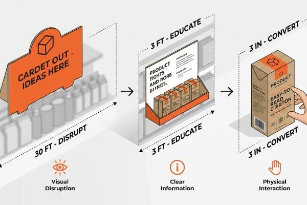
ডিজিটাল শিল্পকর্মকে বাস্তব কার্ডবোর্ডে রূপান্তর করার জন্য মানুষের দৃষ্টিশক্তি এবং হাঁটার গতির প্রতি সম্মান প্রদর্শন করতে হয়।.
কার্যক্ষেত্রে স্থানিক সম্পৃক্ততা কৌশল
ব্র্যান্ডগুলো প্রায়শই সরাসরি ব্যাকলিট কম্পিউটার মনিটরে তাদের রিটেইল ক্যাম্পেইন ডিজাইন করে, এই ভেবে যে গ্রাহক প্রতিটি শব্দ পড়ার জন্য একদম স্থির হয়ে দাঁড়াবে। তারা তাদের প্রিপ্রেস ফাইলগুলো ছোট ছোট অক্ষর এবং হালকা প্যাস্টেল রঙ ব্যবহার করে কারখানায় পাঠিয়ে দেয়। এটি শান্ত ডিজাইন স্টুডিও এবং ফ্লুরোসেন্ট আলোয় আলোকিত দোকানের বিশৃঙ্খল বাস্তবতার মধ্যে এক বিশাল ব্যবধান তৈরি করে।.
যখন আপনি কস্টকো বা ওয়ালমার্টের ফ্লোরে দাঁড়ান , তখন বুঝতে পারেন যে ক্রেতারা খুব দ্রুত চলাচল করে। যদি কোনো ডিসপ্লে ত্রিশ ফুট (৯.১ মিটার) দূর থেকে বিশাল পিএমএস (প্যান্টোন ম্যাচিং সিস্টেম) স্পট কালারের বন্যায় তাদের দৃষ্টি আকর্ষণ না করে , তবে তারা কখনোই সেদিকে যাবে না। আমি একবার একজন ক্লায়েন্টকে তাদের প্যাস্টেল-প্রধান প্রোটোটাইপটি আনবক্স করতে দেখেছিলাম, তিনি প্রিমিয়াম সফট-টাচ ল্যামিনেশনের উপর হাত বোলাচ্ছিলেন, কিন্তু তখনই বুঝতে পারলেন যে আমার টেস্টিং আইলের শেষ প্রান্ত থেকে লেখাগুলো অদৃশ্য ছিল। এর সমাধান হলো মানুষের চলার গতির সাথে মেলানোর জন্য এর বাহ্যিক কাঠামোকে কঠোরভাবে পরিবর্তন করা। চূড়ান্তভাবে পণ্য দেখার সময় ৮৫% দৃশ্যমানতা নিশ্চিত করতে আমরা সামনের ধারটি কেটে ছোট করেছি এবং হাই -কনট্রাস্ট বীকন হিসেবে কাজ করার জন্য আকর্ষণীয় ডাই-কাট হেডার তৈরি করেছি। দৃশ্যমান অঞ্চলগুলোকে কঠোরভাবে আলাদা করার মাধ্যমে, আপনি নিশ্চিত করেন যে মার্চেন্ডাইজার ভিড়ের মধ্যে মিশে না গিয়ে সক্রিয়ভাবে ক্রেতাদের আকর্ষণ করছে।
| নতুনদের সাধারণ ভুল | প্রো ফিক্স | খুচরা-ফ্লোর সুবিধা |
|---|---|---|
| হেডারে ছোট অক্ষর ব্যবহার করা | বিশাল ডাই-কাট আকার প্রয়োগ করা | দূর থেকে দৃষ্টি আকর্ষণ করে |
| ঠোঁটের আড়ালে পণ্য লুকানো | ৮৫% দৃশ্যমানতার জন্য ঠোঁট কাটা7 | ভৌত রূপান্তরকে ত্বরান্বিত করে |
| সূক্ষ্ম প্যাস্টেল টোনে প্রিন্টিং | ফ্লাডিং বোল্ড স্পট কালার | তীব্র আলোর নিচে পপস |
যদি আমি স্বাভাবিক গতিতে প্রোটোটাইপটির পাশ দিয়ে হেঁটে যাওয়ার সময় আপনার মূল সুবিধাটি বুঝতে না পারি, তাহলে ডিজাইনটি ব্যর্থ হয়েছে। বাস্তব খুচরা ব্যবসা একটি দ্রুতগতির পরিবেশ, যেখানে কাঠামোগত আমূল পরিবর্তনের প্রয়োজন হয়।.
🛠️ হার্ভির ডেস্ক: দোকানের তীব্র আলোতে আপনার বর্তমান রিটেইল আর্টওয়ার্কটি কি ত্রিশ ফুট দূর থেকে দৃষ্টি আকর্ষণের পরীক্ষায় উত্তীর্ণ হতে পারছে না? 👉 একটি প্রিপ্রেস কনট্রাস্ট চেক করিয়ে নিন ↗ — নিরাপদে ডাউনলোড করুন। পরবর্তীতে কোনো প্রশ্ন থাকলে আমার ইনবক্স খোলা আছে।
খুচরা বিক্রেতারা কোন পাঁচটি বিপণন কৌশল ব্যবহার করেন?
খুচরা বিক্রেতারা শুধু তাকের উপর পণ্য রাখেন না; তারা দৃশ্যগত উত্তেজনা তৈরি করতে এবং বিক্রি বাড়াতে পণ্যের বাহ্যিক বিন্যাসে কারসাজি করেন।.
খুচরা বিক্রেতারা যে পাঁচটি বিপণন কৌশল ব্যবহার করেন তার মধ্যে রয়েছে অপ্রতিসম পণ্য বিন্যাস, কৌশলগতভাবে শেষ প্রান্তে পণ্য স্থাপন, আংশিক প্যালেটে পণ্য প্রদর্শন, প্রিমিয়াম অনুভূতির জন্য স্পর্শযোগ্য এমবসিং এবং সম্পর্কিত পণ্যের ক্রস-মার্চেন্ডাইজিং। এই কৌশলগুলো সক্রিয়ভাবে প্রতিসম গ্রিড বিন্যাসকে ব্যাহত করে, যা মানুষের চোখকে থামতে, পণ্যগুলো বিশ্লেষণ করতে এবং তাৎক্ষণিক ক্রয়ের জন্য প্ররোচিত করতে বাধ্য করে।.
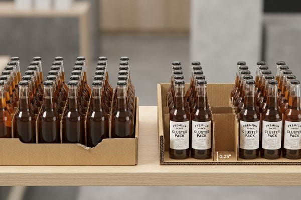
কিন্তু এই উন্নত পণ্য বিন্যাসগুলি কার্যকর করার জন্য সুনির্দিষ্ট কাঠামোগত প্রকৌশল প্রয়োজন, অন্যথায় পণ্য পুনরায় মজুত করার সময় ভৌত প্রদর্শনটি ব্যর্থ হবে।.
অপ্রতিসম মার্চেন্ডাইজিং কৌশল বাস্তবায়ন
অনেক ক্রয়কারী দল শিপিংয়ের পরিমাণ সর্বাধিক করার জন্য একটিমাত্র শেলফে পণ্যের একটি নিখুঁতভাবে প্রতিসম, অত্যন্ত ঘন বিন্যাস সাজানোর চেষ্টা করে। তারা ধরে নেয় যে ট্রে-তে আরও বেশি ইউনিট ঠাসাঠাসি করে রাখলে সরাসরি বিক্রির পরিমাণ বাড়বে। যদিও লজিস্টিকস স্প্রেডশিটে এটিকে অত্যন্ত কার্যকর বলে মনে হয়, কিন্তু একই রকম পণ্যের নিখুঁতভাবে সমান ব্লকগুলো দোকানের করিডোরে কোনো দৃশ্যগত আকর্ষণ তৈরি করে না ।
প্রতিসম অতিরিক্ত ভিড় একটি বিশাল ফাঁদ যা আমাকে ক্লায়েন্টের ফাইল থেকে ক্রমাগত সমাধান করতে হয়। তাড়াহুড়ো করা ক্রেতারা যে নিখুঁতভাবে সমান গ্রিডগুলো উপেক্ষা করে যায় তাই নয়, বরং শারীরিক ফাঁকা জায়গার অভাব দোকানের আসল কার্যক্রম চলাকালীন মারাত্মক সমস্যার সৃষ্টি করে। আমার মনে আছে, একবার এক ক্লায়েন্টের অতিরিক্ত ঠাসাঠাসি করা ট্রে-এর প্রোটোটাইপে একটি বোতল জোর করে ঢোকানোর চেষ্টা করার সময় আমি নতুন ক্রাফট বোর্ডের শক্ত প্রতিরোধ অনুভব করেছিলাম, যার ফলে শেষ পর্যন্ত কাঁচা কার্ডবোর্ডের ধারটি ছিঁড়ে গিয়েছিল। এর সমাধান হলো অপ্রতিসম গ্রুপিং নিয়ম, যেখানে আমি মডিউলার ঢেউখেলানো কার্ডবোর্ডের বিভাজক স্থাপন করি যা পণ্যগুলোকে স্বাভাবিকভাবে তিন, পাঁচ বা সাতটির গুচ্ছে9।এই অন্তর্নির্মিত কাঠামোগত ফাঁকা জায়গা ক্রেতার চোখকে বিন্যাসের সাথে যুক্ত হতে বাধ্য করে, এবং একই সাথে দোকানে তাড়াহুড়ো করে পণ্য পুনরায় সাজানোর সময় পেপারবোর্ড ছিঁড়ে যাওয়া সম্পূর্ণরূপে রোধ করার জন্য প্রয়োজনীয় সঠিক 0.25-ইঞ্চি (6.35 মিমি) শারীরিক ফাঁকা জায়গা10 , যা ব্র্যান্ডকে বিশ্রী, টেপ দিয়ে জোড়া লাগানো তাক থেকে বাঁচায়।
| নতুনদের সাধারণ ভুল | প্রো ফিক্স | খুচরা-ফ্লোর সুবিধা |
|---|---|---|
| জিনিসপত্রগুলো একদম আঁটসাঁট করে প্যাক করা। | ০.২৫-ইঞ্চি ক্লিয়ারেন্স যোগ করা11 | কার্ডবোর্ডের ঠোঁট ছিঁড়ে যাওয়া প্রতিরোধ করে |
| প্রতিসম গ্রিড তৈরি করা | বিজোড়-সংখ্যার ক্লাস্টারগুলিকে দলবদ্ধ করা12 | ক্রেতাদের দৃশ্যমান সম্পৃক্ততা বাড়াতে বাধ্য করে |
| পুনঃসরবরাহ শ্রম উপেক্ষা করা | ইঞ্জিনিয়ারিং মডুলার ডিভাইডার | দোকানের দৈনন্দিন কার্যক্রম দ্রুততর করে |
যখন কোনো ব্র্যান্ড প্রতি সারিতে একটি অতিরিক্ত ইউনিট ঠাসাঠাসি করে ঢোকানোর চেষ্টা করে, আমি সবসময় এর বিরোধিতা করি। পণ্যকে ভৌতভাবে শ্বাস ফেলার জায়গা দিলে তা কাঠামোগত ক্ষতি রোধ করে এবং প্রকৃতপক্ষে পণ্যটির অনুভূত মূল্য বাড়িয়ে তোলে।.
🛠️ হার্ভির ডেস্ক: আপনার দোকানের কর্মচারীরা কি শুধু পণ্য পুনরায় সাজাতে গিয়েই ট্রে-এর সামনের অংশ ছিঁড়ে ফেলছে? 👉 আপনার স্ট্রাকচারাল স্পেসিং গাইডটি সংগ্রহ করুন ↗ — এমন কোনো ফর্ম নেই যা অবিরাম সেলস কলের কারণ হয়। শুধু খাঁটি মূল্য।
খুচরা বিক্রেতাদের জন্য কিছু কার্যকরী বিপণন কৌশল কী কী?
কার্যকারিতা নির্ভর করে না আপনি কতটা তথ্য দিচ্ছেন তার উপর। বরং এটি নির্ভর করে অপ্রয়োজনীয় বিষয়গুলো কঠোরভাবে ছেঁকে ফেলে মূল প্রস্তাবটিকে আলাদা করার উপর।.
খুচরা বিক্রেতাদের জন্য কার্যকর বিপণন কৌশলগুলো কঠোর সৃজনশীলতা বণ্টনের উপর মনোযোগ দেয় এবং বিশৃঙ্খল গ্রাফিক উপস্থাপনার চেয়ে নির্দিষ্ট গ্রাহকগোষ্ঠী নির্ধারণ ও প্রধান পণ্যের অফারকে অধিক অগ্রাধিকার দেয়। ভৌত প্যাকেজিং থেকে গৌণ বার্তা কঠোরভাবে বাদ দিয়ে ব্র্যান্ডগুলো মানসিক অতিরিক্ত চাপ দূর করে এবং মাত্র তিন সেকেন্ডের ভৌত মিথস্ক্রিয়ার মধ্যেই সফলভাবে মনস্তাত্ত্বিক ক্রয়ের উদ্দীপকগুলোকে সক্রিয় করে তোলে।.
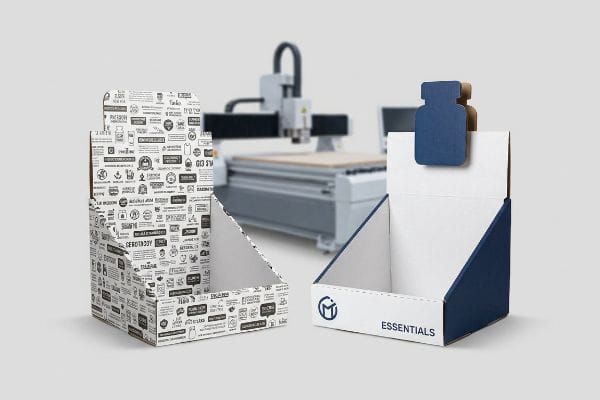
কিন্তু প্রিন্টিং মেশিনগুলো চালু হয়ে গেলে এই তত্ত্বটি জানাই যথেষ্ট নয়, কারণ জটিল নকশা প্রায়শই গভীর কাঠামোগত ত্রুটিগুলোকে ঢেকে দেয়।.
কারখানায় জটিল সৃজনশীল কৌশল কেন ব্যর্থ হয়
ব্র্যান্ড মার্কেটিং দলগুলো প্রায়শই ফিজিক্যাল করোগেটেড ডিসপ্লেগুলোকে তথ্যের জন্য একটি খালি ক্যানভাস হিসেবে বিবেচনা করে, এই ধারণার উপর ভিত্তি করে যে, যত বেশি লেখা থাকবে, বিনিয়োগের উপর তত ভালো রিটার্ন (ROI) পাওয়া যাবে। তারা তাদের সিজনাল ক্যাম্পেইনের, উপাদানের তালিকা এবং সোশ্যাল মিডিয়া হ্যান্ডেলগুলো পাশের প্যানেলগুলোতে ছাপানোর চেষ্টা করে। এই পদ্ধতিটি ইন্ডাস্ট্রিয়াল প্রিপ্রেস অপারেশনের কঠোর সীমাবদ্ধতা13 এবং ক্রেতার মনস্তত্ত্বের বাস্তবতা14-।
আমার প্রতিষ্ঠানে, আমি নিয়মিতই সুন্দর ও জটিল আর্টওয়ার্ক ফাইল দেখি যা নিখুঁতভাবে তৈরি করা শারীরিকভাবে অসম্ভব, অথবা আরও খারাপ, এগুলো শেষ ব্যবহারকারীর জন্য ব্যাপক মানসিক চাপ১৫।যখন একটি ডিসপ্লে বিশৃঙ্খল লেখায় ছেয়ে যায়, তখন এটি একটি বিলবোর্ডের মতো কাজ করে যা সক্রিয়ভাবে পণ্যটিকে আড়াল করে। আমি কারখানার ফ্লোরে সদ্য প্রিন্ট করা শীটগুলো থেকে কিছুটা দূরে দাঁড়িয়ে এটি পরীক্ষা করি; যদি মূল অফারটি তাৎক্ষণিকভাবে স্পষ্ট না হয়, তবে এটি দোকানে ব্যর্থ হবে। এটি ঠিক করার জন্য, আমি কঠোরভাবে সৃজনশীল বরাদ্দের একটি কঠোর সীমা প্রয়োগ করি, এবং CNC (কম্পিউটার নিউমেরিক্যাল কন্ট্রোল) কাটিং টেবিল ব্যবহার করে বিশাল আকারের ৩ডি ডাই-কাট উপাদান কেটে বের করি যা লেখার ব্লকগুলোকে প্রতিস্থাপন করে। আমি সম্প্রতি একটি বিশৃঙ্খল হেডারের মাইক্রোমিটার রিডিং নিয়েছিলাম এবং প্রমাণ করেছি যে আমার চার স্তরের বার্তার প্রয়োজন ছিল না—আমার কেবল একটি বোল্ড, উচ্চ-কন্ট্রাস্টের কাঠামোগত কেন্দ্রবিন্দু প্রয়োজন ছিল যা ভাঁজের রেখার ঠিক ০.৫ ইঞ্চি (১২.৭ মিমি) পরে কাটা হবে। মূল অফারটিকে আলাদা করার মাধ্যমে, আমরা মানসিক বাধা দূর করি এবং নিশ্চিত করি যে ইউনিটটি প্রকৃতপক্ষে দোকানে আসা ক্রেতাদের ক্রেতায় রূপান্তরিত করে, যা তাৎক্ষণিক বিক্রয়ে উল্লেখযোগ্য বৃদ্ধি ঘটায়১৬।
| নতুনদের সাধারণ ভুল | প্রো ফিক্স | খুচরা-ফ্লোর সুবিধা |
|---|---|---|
| জটিল অনুচ্ছেদ মুদ্রণ করা | একটি মূল পণ্য অফারকে বিচ্ছিন্ন করা | ক্রেতাদের মানসিক অতিরিক্ত চাপ প্রতিরোধ করে17 |
| সমতল তথ্যপূর্ণ দিক ব্যবহার করে | ইঞ্জিনিয়ারিং 3D ডাই-কাট হেডার | শারীরিক দৃষ্টিবিভ্রাট সৃষ্টি করে18 |
| ডিসপ্লেগুলোকে ব্রোশারের মতো করে বিবেচনা করা | গৌণ বার্তা অপসারণ করা | দ্রুত হঠকারী কেনাকাটার প্ররোচনা দেয়19 |
আমি ঘন নির্দেশিকা পুস্তিকার মতো দেখতে প্রিপ্রেস ফাইলগুলো সরাসরি প্রত্যাখ্যান করি। আপনি যদি আপনার সৃজনশীল কৌশলকে নির্মমভাবে সম্পাদনা করে একটিমাত্র জোরালো ধারণায় নামিয়ে না আনেন, তবে খুচরা বিক্রির পরিবেশ আপনার ডিসপ্লেটিকে আস্ত গিলে ফেলবে।.
🛠️ হার্ভির ডেস্ক: একটি ২-মিলিমিটার কাঠামোগত ত্রুটির কারণে ৫০০টি দোকানে পণ্য সরবরাহের পরিকল্পনা যেন ভেস্তে না যায়। 👉 আপনার ডাইলাইন ফাইলটি আমাকে পাঠান ↗ — গণ-উৎপাদনে বাজেট অপচয় করার আগে আমি এর গাণিতিক হিসাব স্ট্রেস-টেস্ট করে নেব।
উপসংহার
আপনি একটি রিটেইল মার্কেটিং ক্যাম্পেইনে হাজার হাজার টাকা খরচ করতে পারেন, কিন্তু যখন দোকানের কর্মচারীরা অতিরিক্ত ঠাসাঠাসি ও অপর্যাপ্ত ব্যবধানযুক্ত ট্রে -তে পণ্য ঢোকাতে গিয়ে কাঁচা ঢেউখেলানো কার্ডবোর্ডের ধারগুলো ছিঁড়ে ফেলেন , তখন তার ফলে তৈরি হওয়া বিশ্রী টেপের কাজটি দোকানের সারিতে আপনার ব্র্যান্ডের প্রিমিয়াম ভাবমূর্তিকে পুরোপুরি নষ্ট করে দেবে। আমার সেরা ১০ জন রিটেইল ক্লায়েন্ট প্রিন্ট বাতিল হওয়ার সম্ভাবনা শূন্যে নামিয়ে আনার নিশ্চয়তা দিতে ঠিক এই স্পেক শিটটিই ব্যবহার করেন। মিলিমিটারের ব্যবধান নিয়ে আন্দাজ করা বন্ধ করুন এবং ব্যাপক উৎপাদন শুরু হওয়ার আগেই মারাত্মক ব্যবধানের ত্রুটিগুলো ধরতে আমাকে ব্যক্তিগতভাবে আপনার ফাইলগুলো আমার ফ্রি ডাইলাইন অডিট ↗- এর মাধ্যমে পরীক্ষা করতে দিন।
"প্যালেট ডিসপ্লের প্রকারভেদ: পূর্ণ, অর্ধ ও চতুর্থাংশ – গ্রীনডট প্যাকেজিং", https://greendotpackaging.com/understanding-pallet-display-types-full-half-and-quarter-pallet-displays/। উত্তর আমেরিকার জিএমএ (GMA) প্যালেটের মাপের উপর ভিত্তি করে খুচরা দোকানের ফ্লোর ডিসপ্লের জন্য ৪৮×৪০ ইঞ্চি যে একটি আদর্শ মাপ, তার যাচাইকরণ। প্রমাণের ভূমিকা: প্রযুক্তিগত যাচাইকরণ; উৎসের ধরণ: খুচরা লজিস্টিকস বা ডিসপ্লে উৎপাদন মান। সমর্থন করে: এই নির্দিষ্ট আকারটি যে শিল্পের অনুমিত ভিত্তি, সেই দাবিকে। পরিধি সংক্রান্ত টীকা: প্রধানত উত্তর আমেরিকার বিগ-বক্স খুচরা ব্যবসার ক্ষেত্রে প্রযোজ্য। ↩
"হাফ প্যালেট: সংজ্ঞা, পরিমাপ, এবং প্রধান ব্যবহারসমূহ – ইন্টারলেক মেকালাক্স", https://www.interlakemecalux.com/blog/half-pallet। অর্ধেক আকারের রিটেইল প্যালেটের ফুটপ্রিন্টের জন্য শিল্প-মানসম্মত মাত্রার যাচাইকরণ। প্রমাণের ভূমিকা: প্রযুক্তিগত স্পেসিফিকেশন; উৎসের ধরণ: লজিস্টিকস বা প্যাকেজিং স্ট্যান্ডার্ড। সমর্থন করে: ভগ্নাংশ জ্যামিতির রিটেইল ডিসপ্লেতে ব্যবহৃত ভৌত পরিমাপসমূহ। পরিধি সংক্রান্ত টীকা: আঞ্চলিক প্যালেট স্ট্যান্ডার্ডের (ISO বনাম GMA) উপর ভিত্তি করে মাত্রা ভিন্ন হতে পারে। ↩
"১৪ ধরনের রিটেইল ডিসপ্লে | শিকাগো, আইএল", https://wertheimerbox.com/types-of-retail-displays/। একটি প্রামাণ্য বাহ্যিক উৎস কীভাবে এই দাবিকে সমর্থন করে তার সংক্ষিপ্ত ব্যাখ্যা। প্রমাণের ভূমিকা: প্রযুক্তিগত স্পেসিফিকেশন; উৎসের ধরন: লজিস্টিকস স্ট্যান্ডার্ড। সমর্থন করে: রিটেইল দক্ষতার জন্য সম্পূর্ণ প্যালেটের আংশিক বিকল্প হিসেবে ৪৮×২০ মাপের ব্যবহার। পরিধি নোট: উত্তর আমেরিকার প্যালেট ফুটপ্রিন্টের জন্য নির্দিষ্ট। ↩
"কোয়ার্টার প্যালেট ডিসপ্লের বিভিন্ন দিক – পপডিসপ্লে", https://popdisplay.me/aspects-of-a-quarter-pallet-display/। একটি নির্ভরযোগ্য বাহ্যিক উৎস কীভাবে এই দাবিকে সমর্থন করে তার সংক্ষিপ্ত ব্যাখ্যা। প্রমাণের ভূমিকা: শিল্পের সেরা অনুশীলন; উৎসের ধরণ: খুচরা পণ্য বিপণন নির্দেশিকা। সমর্থন করে: তাৎক্ষণিক পণ্য স্থাপনের সম্ভাবনা বাড়াতে কোয়ার্টার-প্যালেট মডুলারিটির কার্যকারিতা। পরিধি নোট: উচ্চ-ঘনত্বের খুচরা পরিবেশের জন্য প্রযোজ্য। ↩
"কার্যকরী ডিসপ্লে এবং গ্রাহক অভিজ্ঞতার জন্য খুচরা দোকানের নকশা...", https://www.business.qld.gov.au/industries/manufacturing-retail/retail-wholesale/retail-displays। ভিজ্যুয়াল মার্চেন্ডাইজিং এবং পরিবেশগত মনোবিজ্ঞানের উপর প্রামাণ্য উৎসগুলো বড় আকারের খুচরা দোকানে ক্রেতাদের মনোযোগ আকর্ষণ করার জন্য নির্দিষ্ট দূরত্বের সীমা ব্যবহারের সমর্থন করে। প্রমাণের ভূমিকা: প্রযুক্তিগত মান; উৎসের ধরণ: শিল্প নির্দেশিকা। সমর্থন: প্রাথমিক দৃষ্টিবিভ্রমের জন্য প্রয়োজনীয় দূরত্ব। পরিধি সংক্রান্ত টীকা: করিডোরের প্রস্থ এবং আলোর উপর ভিত্তি করে কার্যকর দূরত্ব পরিবর্তিত হতে পারে। ↩
"পয়েন্ট অফ পারচেজ: খুচরা বিক্রেতারা কীভাবে সঠিক সময়ে ক্রেতাদের প্রভাবিত করতে পারে...", https://blog.intouch.com/posts/points-of-purchase-displays। পয়েন্ট-অফ-পারচেজ ডিসপ্লে ইঞ্জিনিয়ারিংয়ের জন্য শিল্প মানদণ্ডগুলো চূড়ান্ত সরাসরি মিথস্ক্রিয়ার সময় রূপান্তর সর্বাধিক করার জন্য পণ্যের দৃশ্যমানতার সর্বোত্তম শতাংশ নির্দিষ্ট করে। প্রমাণের ভূমিকা: মেট্রিক যাচাইকরণ; উৎসের ধরণ: রিটেইল ডিজাইন ম্যানুয়াল। সমর্থন করে: রূপান্তরের জন্য পণ্যের দৃশ্যমানতার প্রান্তসীমা। পরিধি সংক্রান্ত টীকা: সাধারণত পণ্যের সম্মুখভাগের বাধাহীন দৃশ্যকে বোঝায়। ↩
"খুচরা দোকানের তাকের গড় উচ্চতা কত? – পপডিসপ্লে", https://popdisplay.me/what-is-the-average-retail-shelf-height/। পণ্যের দৃশ্যমানতা সর্বাধিক করার জন্য পয়েন্ট-অফ-পারচেজ ডিসপ্লের প্রান্তের উচ্চতার ক্ষেত্রে শিল্প মানদণ্ডের যাচাইকরণ। প্রমাণের ভূমিকা: প্রযুক্তিগত বিবরণ; উৎসের ধরণ: খুচরা দোকানের নকশা নির্দেশিকা। সমর্থন করে: এই দাবি যে নির্দিষ্ট কাটিং অনুপাত পণ্যের দৃশ্যমানতা উন্নত করে। পরিধি সংক্রান্ত টীকা: বাস্তব খুচরা দোকানের তাকের ক্ষেত্রে প্রযোজ্য। ↩
"আই-ট্র্যাকিং ব্যবহার করে ভোক্তার মনোযোগ এবং উদ্দীপনা মূল্যায়ন … – পিএমসি", https://pmc.ncbi.nlm.nih.gov/articles/PMC8380820/। ভিজ্যুয়াল সাইকোলজি এবং রিটেইল মার্চেন্ডাইজিং গবেষণা কীভাবে দেখায় যে, দৃষ্টিবিভ্রাটের অভাবে প্রতিসম নকশাগুলো প্রায়শই ভোক্তাদের দ্বারা উপেক্ষিত হয়, তার একটি সংক্ষিপ্ত ব্যাখ্যা। প্রমাণের ভূমিকা: তাত্ত্বিক ভিত্তি; উৎসের ধরণ: অ্যাকাডেমিক জার্নাল বা রিটেইল সাইকোলজি গাইড। সমর্থন করে: এই দাবি যে প্রতিসম গ্রিড মনোযোগ আকর্ষণ করতে ব্যর্থ হয়। পরিধি নোট: বিশেষভাবে দোকানের ভেতরের শেলফ ডিসপ্লের ক্ষেত্রে প্রযোজ্য। ↩
"ভিজ্যুয়াল মার্চেন্ডাইজিং ডিজাইনে 'তিনের নিয়ম'", https://visualmerchandisingdisplays.wordpress.com/2020/10/08/the-rule-of-three-in-visual-merchandising-design/। ভিজ্যুয়াল ডিজাইনে 'বিজোড় সংখ্যার নিয়ম' কীভাবে অপ্রতিসাম্য তৈরি করে ভোক্তার সম্পৃক্ততা বাড়ায় এবং দৃষ্টিবিভ্রম প্রতিরোধ করে, তার ব্যাখ্যা। প্রমাণের ভূমিকা: বৈধতা; উৎসের ধরণ: রিটেইল ডিজাইন গাইড। সমর্থন করে: বিজোড়-সংখ্যার গুচ্ছায়নের কৌশল। পরিধির টীকা: সাধারণ ডিজাইন নীতি। ↩
"কম... সহ ঢেউখেলানো পেপারবোর্ড প্যাকেজের সংকোচন শক্তি", https://pmc.ncbi.nlm.nih.gov/articles/PMC10054506/। পুনঃসংগ্রহের সময় কাঠামোগত ব্যর্থতা রোধ করার জন্য পেপারবোর্ড প্যাকেজিংয়ের ন্যূনতম সহনশীলতার প্রয়োজনীয়তার প্রযুক্তিগত যাচাইকরণ। প্রমাণের ভূমিকা: প্রযুক্তিগত যাচাইকরণ; উৎসের ধরণ: প্যাকেজিং ইঞ্জিনিয়ারিং স্ট্যান্ডার্ড। সমর্থন: নির্দিষ্ট ক্লিয়ারেন্স পরিমাপ। পরিধি টীকা: শিল্প ঢেউখেলানো বোর্ডের ক্ষেত্রে প্রযোজ্য। ↩
"আপনার রিটেইল শেলফের জায়গার সর্বোচ্চ ব্যবহার", https://qpsiusa.com/2019/12/26/maximizing-your-retail-shelf-space/। একটি নির্ভরযোগ্য বাহ্যিক উৎস কীভাবে এই দাবিকে সমর্থন করে তার সংক্ষিপ্ত ব্যাখ্যা। প্রমাণের ভূমিকা: প্রযুক্তিগত বিবরণ; উৎসের ধরণ: রিটেইল অপারেশন গাইড। সমর্থন করে: প্যাকেজিংয়ের ক্ষয় এড়ানোর জন্য নির্ভুল পরিমাপ। পরিধি সংক্রান্ত টীকা: কার্ডবোর্ডের প্রান্তের জন্য নির্দিষ্ট। ↩
"দ্য আর্ট অফ ভিজ্যুয়াল মার্চেন্ডাইজিং: স্ট্র্যাটেজিস ফর – টি-রক", https://trocglobal.com/visual-merchandising/। একটি প্রামাণ্য বাহ্যিক উৎস কীভাবে এই দাবিকে সমর্থন করে তার সংক্ষিপ্ত ব্যাখ্যা। প্রমাণের ভূমিকা: মনস্তাত্ত্বিক নীতি; উৎসের ধরন: ভিজ্যুয়াল মার্চেন্ডাইজিং পাঠ্যপুস্তক। সমর্থন: ক্রেতার মনোযোগ বাড়াতে অপ্রতিসাম্যের ব্যবহার। পরিধি টীকা: সাধারণ খুচরা ব্যবসার ক্ষেত্রে প্রযোজ্য। ↩
"উইসকনসিন করোগেটেড রিটেইল ডিসপ্লে – কোয়ালিটি প্যাকেজিং ইনকর্পোরেটেড", https://www.qpack.com/retail-displays/corrugated। করোগেটেড সাবস্ট্রেটে কালি শোষণ, রেজোলিউশন সীমা এবং রেজিস্ট্রেশন সংক্রান্ত চ্যালেঞ্জ সম্পর্কে প্রিন্টিং শিল্পের মান থেকে নেওয়া প্রযুক্তিগত বিবরণ। প্রমাণের ভূমিকা: প্রযুক্তিগত যাচাইকরণ; উৎসের ধরণ: শিল্প হ্যান্ডবুক। সমর্থন করে: এই দাবি যে করোগেটেড ডিসপ্লের জন্য উচ্চ-ঘনত্বের টেক্সট অবাস্তব। পরিধি নোট: বৃহৎ-আকারের রিটেইল প্রিন্টিং-এর উপর আলোকপাত করে। ↩
"সাহায্য নাকি বাধা? যখন সুপারিশমূলক সাইনেজ প্রসারিত হয়...", https://www.sciencedirect.com/science/article/abs/pii/S1057740812000940। খুচরা বিক্রয় পরিবেশে কগনিটিভ লোড তত্ত্ব এবং ভিজ্যুয়াল প্রসেসিং স্পিডের উপর পিয়ার-রিভিউড গবেষণা যা প্রমাণ করে যে অতিরিক্ত তথ্য কনভার্সন কমিয়ে দেয়। প্রমাণের ভূমিকা: মনস্তাত্ত্বিক বৈধতা; উৎসের ধরণ: অ্যাকাডেমিক জার্নাল। সমর্থন করে: এই দাবি যে উচ্চ পাঠ্য পরিমাণ ক্রয়ের প্রেরণাকে বাধা দেয়। পরিধি নোট: দ্রুত-বিক্রয়যোগ্য ভোগ্যপণ্য (FMCG) প্রেক্ষাপটে সীমাবদ্ধ। ↩
"ভোক্তার সিদ্ধান্তের উপর তথ্যের আধিক্যের প্রভাব...", https://onlinelibrary.wiley.com/doi/10.1111/joca.70031। কগনিটিভ লোড তত্ত্বের উপর একাডেমিক গবেষণা ব্যাখ্যা করে যে, খুচরা বিক্রয় পরিবেশে অতিরিক্ত চাক্ষুষ উদ্দীপনা কীভাবে একজন ভোক্তার তথ্য প্রক্রিয়াকরণ এবং ক্রয়ের সিদ্ধান্ত নেওয়ার ক্ষমতাকে ব্যাহত করে। প্রমাণের ভূমিকা: তাত্ত্বিক ভিত্তি; উৎসের ধরণ: পিয়ার-রিভিউড জার্নাল। সমর্থন করে: এই দাবি যে জটিল সৃজনশীল নকশা ব্যবহারকারীর বোধগম্যতাকে বাধাগ্রস্ত করে। পরিধি টীকা: বিশেষভাবে পয়েন্ট-অফ-পারচেজ ইন্টারঅ্যাকশনের ক্ষেত্রে প্রযোজ্য। ↩
"আবেগপ্রবণ ক্রয়ে উদ্দীপনা জোগাতে পণ্যের শব্দার্থ কি গুরুত্বপূর্ণ...", https://pmc.ncbi.nlm.nih.gov/articles/PMC8419358/। ভোক্তা আচরণ বিষয়ক গবেষণা থেকে দেখা যায় যে, গৌণ কোলাহল দূর করে মূল প্রস্তাবকে আলাদা করলে তা দ্রুত শনাক্ত করা যায় এবং আবেগপ্রবণ ক্রয়ের সম্ভাবনা বাড়ে। প্রমাণের ভূমিকা: ফলাফল যাচাই; উৎসের ধরণ: বিপণন শিল্প বিশ্লেষণ। সমর্থন করে: জ্ঞানীয় প্রতিবন্ধকতা হ্রাস এবং বিক্রয় রূপান্তর বৃদ্ধির মধ্যে সংযোগ। পরিধি টীকা: ভৌত খুচরা প্রদর্শনীর উপর আলোকপাত করে। ↩
"জ্ঞানীয় চাপের অধীনে খাদ্য প্যাকেজের প্রতি ভোক্তার পছন্দ", https://pmc.ncbi.nlm.nih.gov/articles/PMC8997493/। ভোক্তা মনোবিজ্ঞানের গবেষণা দেখায় যে কীভাবে তথ্যের জটিলতা হ্রাস করলে জ্ঞানীয় চাপ কমে যায়, যা দ্রুত সিদ্ধান্ত গ্রহণে সহায়তা করে। প্রমাণের ভূমিকা: তাত্ত্বিক সমর্থন; উৎসের ধরণ: অ্যাকাডেমিক জার্নাল। সমর্থন করে: একটি একক অফারকে আলাদা করার সুবিধা। পরিধি টীকা: বিশেষভাবে অধিক জনসমাগমপূর্ণ খুচরা পরিবেশের জন্য প্রযোজ্য। ↩
"ক্রয়-বিন্দুর অন্তর্দৃষ্টি: রিটেইল পপ-এর প্রভাব...", https://www.bcipkg.com/point-of-purchase-insights-the-impact-of-retail-pop-displays-on-consumer-behavior/। দৃশ্যমান সুস্পষ্টতার উপর করা গবেষণা ইঙ্গিত দেয় যে, ত্রিমাত্রিক উপাদানগুলো সাধারণ শেল্ফের দৃশ্যমান তলকে ভেঙে দিয়ে দৃষ্টি আকর্ষণের হার বৃদ্ধি করে। প্রমাণের ভূমিকা: গবেষণালব্ধ সমর্থন; উৎসের ধরণ: বিপণন গবেষণা। সমর্থন করে: ৩ডি ডাই-কাট হেডারের কার্যকারিতা। পরিধি সংক্রান্ত টীকা: পণ্যের বিভাগ অনুযায়ী এর প্রভাব ভিন্ন হতে পারে। ↩
"আবেগপ্রবণ ক্রয়ের উপর স্থানিক বিন্যাসের প্রভাব: আত্ম-ধারণা দ্বারা নিয়ন্ত্রিত", https://pmc.ncbi.nlm.nih.gov/articles/PMC10451481/। আচরণগত অর্থনীতি অনুযায়ী, সিদ্ধান্ত গ্রহণের গৌণ বাধা কমালে আবেগপ্রবণ ক্রয়ের রূপান্তরের গতি বৃদ্ধি পায়। প্রমাণের ভূমিকা: আচরণগত সমর্থন; উৎসের ধরণ: ভোক্তা আচরণ সমীক্ষা। সমর্থন: গৌণ বার্তা অপসারণ। পরিধি টীকা: নিম্ন থেকে মধ্যম মূল্যের পণ্যের মধ্যে সীমাবদ্ধ। ↩