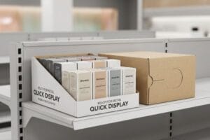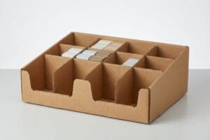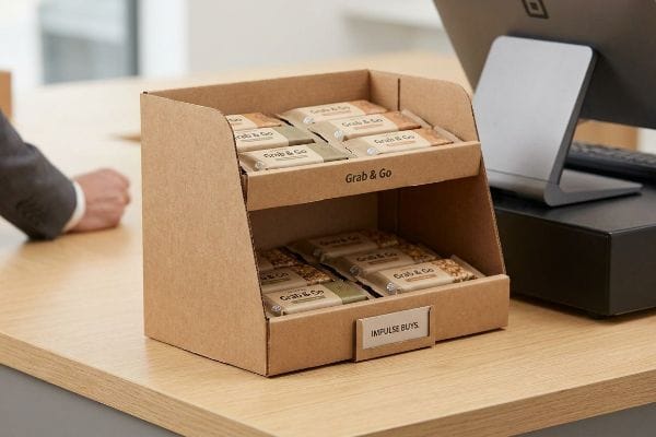
কনভেনিয়েন্স স্টোরের কাউন্টারগুলো অত্যন্ত মূল্যবান জায়গা, কিন্তু অগোছালো বিন্যাস তাৎক্ষণিক বিক্রি নষ্ট করে দেয়। যদি আপনার পণ্য পারিপার্শ্বিকতার সাথে মিশে যায়, তাহলে আপনি প্রতিদিন চেকআউটের মাধ্যমে হওয়া উচ্চ মুনাফার আয় হারাচ্ছেন।.
কার্ডবোর্ডের কাউন্টারটপ ডিসপ্লেগুলো কনভেনিয়েন্স স্টোরের জন্য আদর্শ, কারণ এগুলো সীমিত জায়গার মধ্যেও ক্রেতাদের তাৎক্ষণিক কেনাকাটা সর্বাধিক করতে সাহায্য করে। এই হালকা কাঠামোতে মাইক্রো-ফ্লুটেড উপাদান ব্যবহার করা হয়, যা সহজে চোখে পড়ার মতো ও সাশ্রয়ী পণ্যসজ্জার ব্যবস্থা করে। এটি পণ্যের দ্রুত আবর্তন এবং ক্যাশ রেজিস্টারের অত্যন্ত সীমিত জায়গার সাথে পুরোপুরি সামঞ্জস্যপূর্ণ।.
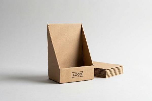
কিন্তু ক্যাশ রেজিস্টারের পাশে একটি সাধারণ কাগজের বাক্স রেখে দিলেই খুচরা বিক্রেতার অনুমোদন পাওয়া যায় না। চলুন, এই ছোট ইউনিটগুলোকে দোকানের মেঝেতে কার্যকরভাবে ব্যবহার করার কৌশলগুলো বিশ্লেষণ করা যাক।.
কার্ডবোর্ডের খাদ্য মোড়কের সুবিধাগুলো কী কী?
ব্র্যান্ড ম্যানেজাররা প্রায়শই ধরে নেন যে যেকোনো ঢেউখেলানো বোর্ডই ব্যবহার্য পণ্যের জন্য নিরাপদ, কিন্তু খাদ্যোপযোগী মান নিশ্চিতকরণ একটি বিশাল নিয়ন্ত্রক বাধা, যার জন্য নির্দিষ্ট রাসায়নিক বিবেচনার প্রয়োজন হয়।.
কার্ডবোর্ডের খাদ্য প্যাকেজিংয়ের সুবিধাগুলোর মধ্যে রয়েছে এর হালকা গঠন, সাশ্রয়ী মূল্য এবং PFAS-মুক্ত জল-ভিত্তিক ব্যারিয়ার কোটিংয়ের সাথে এর অভিযোজনযোগ্যতা। এই টেকসই উপাদানটি কাঠামোগত দৃঢ়তা প্রদানের পাশাপাশি ভোক্তাদের সুরক্ষার কঠোর মানদণ্ড নিশ্চিত করে, যা এটিকে অধিক জনসমাগমপূর্ণ খুচরা পরিবেশে দ্রুত বিক্রি হওয়া ভোগ্যপণ্যের জন্য একটি আদর্শ পছন্দ করে তোলে।.
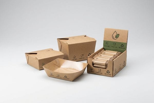
বড় পরিসরে খুচরা বিক্রির জন্য উৎপাদন বাড়ানোর আগে উপাদানের বৈশিষ্ট্যগুলো বোঝা কেবল প্রথম ধাপ।.
খাদ্য বিপণনে PFAS-মুক্ত নিয়মকানুন মেনে চলা
এমনকি অভিজ্ঞ ক্রয় দলগুলোও প্রায়শই মোড়কজাত স্ন্যাকস বা বেকড পণ্যের জন্য ডিজাইন করা কাউন্টারটপ ইউনিটে সাধারণ তরল-প্রতিরোধী আবরণ ব্যবহার করার ফাঁদে পড়ে । তারা মূলত তেল-প্রতিরোধ ক্ষমতা এবং নান্দনিক ঔজ্জ্বল্যের উপর মনোযোগ দেয়, এই ভেবে যে সাধারণ পলি-আবরণগুলো সর্বজনীনভাবে গ্রহণযোগ্য। এর ফলে নিরাপদ রাসায়নিক সংস্পর্শ প্রতিবন্ধক সম্পর্কিত দ্রুত কঠোর হতে থাকা ফেডারেল এবং খুচরা বিক্রেতাদের নির্দেশাবলী উপেক্ষা করা হয় ।
আমার প্রতিষ্ঠানে আমি নিয়মিত দেখি যে ক্লায়েন্টরা এমন পুরোনো আর্দ্রতা-রোধী আবরণ ব্যবহার করতে বলেন যা আধুনিক রিটেইলার অডিটে পুরোপুরি ব্যর্থ হয়। আমি একবার একটি ব্যাচ পরীক্ষা করেছিলাম যেখানে ক্লায়েন্ট একটি প্রচলিত কোটিং ব্যবহারের জন্য জোর দিয়েছিলেন; শুকানোর সময় পলিমারের তীব্র রাসায়নিক গন্ধটি একটি তাৎক্ষণিক সতর্ক সংকেত ছিল যে এটি রিটেইল পরিবেশকে দূষিত করবে। এর সমাধান হলো খাদ্যের কাছাকাছি থাকা যেকোনো ইউনিটের জন্য কঠোরভাবে PFAS-মুক্ত জলীয় কোটিং ব্যবহার করা। এর জন্য লিথো-ল্যামিনেশন লাইনে একটি সুনির্দিষ্ট সমন্বয়ের প্রয়োজন হয় যাতে জল-ভিত্তিক ফিনিশটি সম্পূর্ণ মসৃণভাবে শুকিয়ে যায়, কিন্তু এটি বিষাক্ত রাসায়নিক স্থানান্তরের ঝুঁকি সম্পূর্ণরূপে দূর করে,যা নিশ্চিত করে যে আপনার চালানটি কমপ্লায়েন্স সংক্রান্ত বাধা এড়িয়ে যাবে এবং মেঝেতে অবিলম্বে স্থাপন করা যাবে।
| নতুনদের সাধারণ ভুল | প্রো ফিক্স | খুচরা-ফ্লোর সুবিধা |
|---|---|---|
| খাবারের ট্রে-এর জন্য স্ট্যান্ডার্ড পলি-কোটিং ব্যবহার করা | PFAS-মুক্ত জলীয় আবরণ ৩ নির্দিষ্ট করুন | কঠোর খুচরা বিক্রেতার নিরাপত্তা নিরীক্ষায় উত্তীর্ণ হয় |
| কিউরিংয়ের সময় রাসায়নিক গন্ধ উপেক্ষা করা | জল-ভিত্তিক তরল প্রতিবন্ধকতা বাধ্যতামূলক করুন | ভোক্তাদের অভিযোগ দূর করে |
| উপাদানের পুনঃমজ্জাযোগ্যতা উপেক্ষা করা | একক উপাদানে তৈরি জল-ভিত্তিক ফিনিশ ব্যবহার করুন ৪ | রাস্তার ধার থেকে শতভাগ পুনর্ব্যবহারযোগ্যতা নিশ্চিত করে |
আমি খাদ্যোপযোগী ডিসপ্লেতে বিষাক্ত প্রতিবন্ধক ব্যবহার করতে অস্বীকার করি । আগেভাগেই আপনার রাসায়নিক সম্মতি নিশ্চিত করার মাধ্যমে, আমি খুচরা বিক্রেতাদের দ্বারা পণ্য প্রত্যাখ্যানের মতো মারাত্মক পরিস্থিতি প্রতিরোধ করি, যা আপনার পুরো মৌসুমী মজুদকে লোডিং ডকে আটকে দিতে পারে।
🛠️ হার্ভির ডেস্ক: আপনার বর্তমান ফুড ডিসপ্লেগুলো কি সর্বশেষ PFAS-মুক্ত রিটেইলার অডিট পাস করছে? 👉 একটি কেমিক্যাল কোটিং অডিটের জন্য অনুরোধ করুন ↗ — সরাসরি আমার ডেস্কে অ্যাক্সেস। কোনো স্বয়ংক্রিয় সেলস স্প্যাম থাকবে না, আমি কথা দিচ্ছি।
যেকোনো খুচরা বিক্রয় পরিবেশে ডিসপ্লে এত গুরুত্বপূর্ণ কেন?
একটি চমৎকার পণ্যকে খালি ধাতব তাকে রাখলে তাড়াহুড়ো করা ক্রেতাদের দ্বারা উপেক্ষিত হওয়ার সম্ভাবনা প্রায় নিশ্চিত। ভিড়ে ঠাসা করিডোরে ভৌত পণ্যসামগ্রী সক্রিয় মনস্তাত্ত্বিক উদ্দীপক হিসেবে কাজ করে।.
খুচরা বিক্রয়ের পরিবেশে ডিসপ্লে গুরুত্বপূর্ণ, কারণ এগুলো ক্রেতাদের স্বতঃস্ফূর্ত কেনাকাটায় জোরালোভাবে ব্যাঘাত ঘটায় এবং এমন এক দৃশ্যগত উত্তেজনা তৈরি করে যা তাদের তাৎক্ষণিক কেনাকাটায় উৎসাহিত করে। সুচিন্তিত কাঠামোগত জ্যামিতি এবং উচ্চ-বৈসাদৃশ্যপূর্ণ নির্দিষ্ট রঙের ব্যবহারের মাধ্যমে, একটি সঠিকভাবে ডিজাইন করা পয়েন্ট-অফ-পারচেজ ইউনিট ভোক্তার দৃষ্টিকে শারীরিকভাবে পরিচালিত করে এবং মূল পণ্যটিকে আলাদাভাবে তুলে ধরে।.
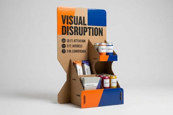
তবে, তাদের গুরুত্ব স্বীকার করার অর্থ এই নয় যে প্রতিটি উজ্জ্বল রঙের বাক্সই আসলেই ক্রেতাদের আকর্ষণ করবে।.
চেকআউট জোনগুলির জন্য ৩-৩-৩ স্থানিক সম্পৃক্ততা নিয়ম
এমনকি অভিজ্ঞ মার্কেটিং ডিরেক্টররাও প্রায়শই একটি ফাঁদে পড়েন, যারা শুধুমাত্র ব্যাকলিট কম্পিউটার মনিটরে ডিজিটাল রেন্ডারিং পর্যালোচনা করেন। তারা ঘন, পাঠ্য-বহুল গ্রাফিক্স অনুমোদন করেন যা কাছ থেকে দেখতে সুন্দর লাগে, এই ভেবে যে ক্রেতারা থেমে প্রতিটি বুলেট পয়েন্ট পড়বে। এটি দ্রুতগতির একটি কনভেনিয়েন্স স্টোরে মানুষ কীভাবে চলাচল করে, সেই বাস্তবতাকে সম্পূর্ণরূপে উপেক্ষা করে ।
সকালের কফি খাওয়ার সময় গ্রাহকদের একটি থিসিস স্টেটমেন্ট পড়ার মতো মানসিক ক্ষমতা থাকে না। আমি প্রতিদিন দোকানে এই শারীরিক মিথস্ক্রিয়া পরিমাপ করি, এবং আমি দেখেছি সুন্দরভাবে মুদ্রিত, লেখায় ভরা ডিসপ্লে একটিও দৃষ্টি আকর্ষণ করতে ব্যর্থ হয়েছে। আমি ৩-৩-৩ স্থানিক নিয়ম৬: আপনার কাঠামোকে অবশ্যই ত্রিশ ফুট দূর থেকে মনোযোগ আকর্ষণ করতে হবে, তিন ফুট দূর থেকে আগ্রহ জাগাতে হবে, এবং তিন ইঞ্চি দূর থেকে স্পর্শের মাধ্যমে ক্রেতায় রূপান্তরিত করতে হবে। অনুচ্ছেদের লেখা বাদ দিয়ে এবং একটি বিশাল ডাই-কাট হেডার ব্যবহার করে—যেখানে আপনি আক্ষরিক অর্থেই ডাবল-ওয়াল হেডারটি ব্যাক প্যানেলে আটকে যাওয়ার স্পষ্ট খটখট শব্দ শুনতে পান—আমরা তাৎক্ষণিক একটি চাক্ষুষ ব্যাঘাত তৈরি করি যা চেকআউটের সময়কার তাৎক্ষণিক বিক্রয় আনুমানিক ৩৫%৭।
| নতুনদের সাধারণ ভুল | প্রো ফিক্স | খুচরা-ফ্লোর সুবিধা |
|---|---|---|
| ছোট, ঘন বিপণন পাঠ্য মুদ্রণ করা | উচ্চ-কন্ট্রাস্ট, বড় আকারের স্পট কালার ব্যবহার করুন | ৩০ ফুট দূর থেকেও দৃষ্টি আকর্ষণ করে।8 |
| সমতল, প্রতিসম তাক কাঠামো | প্রকৌশলী অপ্রতিসম ডাই-কাট হেডার | মনস্তাত্ত্বিক চাক্ষুষ উত্তেজনা তৈরি করে9 |
| উচ্চ ধারণক্ষমতা সম্পন্ন ঠোঁট ব্লক করার পণ্য | ৮৫% পণ্য দৃশ্যমানতার জন্য সামনের ঠোঁট কাটুন ১০ | তাৎক্ষণিক স্পর্শজনিত রূপান্তর ঘটায় |
আমার ডিজাইন করা প্রতিটি ডাইলাইনে আমি গাণিতিকভাবে দৃশ্যমান বাহুল্য সীমিত রাখি। যদি আপনার ডিসপ্লে তিন সেকেন্ডের মধ্যে তার মূল বৈশিষ্ট্য তুলে ধরতে না পারে, তবে তা একটি অদৃশ্য কার্ডবোর্ডের টুকরোতে পরিণত হয়, যা কেবল মূল্যবান জায়গা দখল করে।.
🛠️ হার্ভির ডেস্ক: আপনার বর্তমান শিল্পকর্ম কি অতিরিক্ত মানসিক চাপ এবং লেখার জঞ্জালে জর্জরিত? 👉 আপনার ৩-৩-৩ ভিজ্যুয়াল অ্যাসেসমেন্টটি সংগ্রহ করুন ↗ — নিরাপদে ডাউনলোড করুন। পরবর্তীতে কোনো প্রশ্ন থাকলে আমার ইনবক্স খোলা আছে।
কাউন্টারটপ ডিসপ্লে বলতে কী বোঝায়?
চেকআউট মার্চেন্ডাইজার হলো অত্যন্ত বিশেষায়িত, ছোট আকারের কাঠামোগত সরঞ্জাম, যা বিশেষভাবে রেজিস্টার লেনদেনের তীব্র ঘর্ষণপূর্ণ পরিবেশে তাৎক্ষণিক কেনাকাটা আকর্ষণ করার জন্য ডিজাইন করা হয়েছে।.
কাউন্টারটপ ডিসপ্লে হলো একটি কম্প্যাক্ট, পয়েন্ট-অফ-সেল মার্চেন্ডাইজার যা বিশেষভাবে রিটেইল চেকআউট কাউন্টারের উপর রাখার জন্য ডিজাইন করা হয়েছে। এই হালকা ওজনের, মাইক্রো-ফ্লুটেড কাঠামোগুলো সীমিত জায়গার সর্বোত্তম ব্যবহার করে শেষ মুহূর্তের তাৎক্ষণিক কেনাকাটা আকর্ষণ করে। ক্যাশিয়ারের কাজে বাধা না দিয়ে সম্পূর্ণ স্থিতিশীলতা নিশ্চিত করার জন্য এতে সুনির্দিষ্ট ফ্রিকশন লক এবং ভরকেন্দ্রের হিসাব প্রয়োজন হয়।.
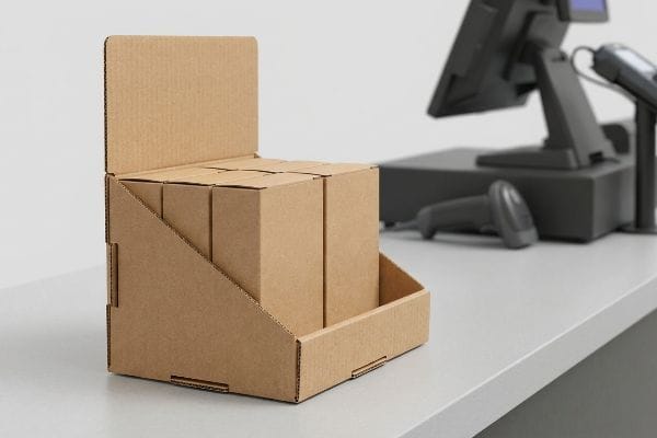
কিন্তু একটি মার্কেটিং ক্যাম্পেইনকে এই ছোট পরিসরে নামিয়ে আনার জন্য সম্পূর্ণ ভিন্ন কাঠামোগত হিসাবনিকাশ প্রয়োজন।.
কাউন্টারটপ ইউনিটের পেছনের মাইক্রো-ফ্লুট ইঞ্জিনিয়ারিং
ডিজাইন এজেন্সিগুলো প্রায়শই একটি সফল, মজবুত ফ্লোর মার্চেন্ডাইজার CAD (কম্পিউটার-এইডেড ডিজাইন) ফাইল নিয়ে সেটিকে কাউন্টারে বসানোর জন্য কেবল ৫০% ছোট করে ফেলে। তারা ডাইলাইনটিকে একটি সার্বজনীন ভেক্টর গ্রাফিকের মতো ব্যবহার করে, যাকে ইচ্ছামতো আকার পরিবর্তন করা যায়; এবং আশা করে যে মোটা বি-ফ্লুট বোর্ড১১ ক্ষুদ্রাকারেও জাদুকরীভাবে একই রকম আচরণ করবে।
এটাকে একটা মোটা শীতের কোটকে রেশমি রুমালের মতো একই ছোট্ট বর্গাকারে ভাঁজ করার চেষ্টার মতো করে ভাবুন। যখন আপনি মোটা ঢেউখেলানো ফ্লুটগুলোকে অতি ক্ষুদ্র অনুপাতে জোর করে ঢোকান, তখন কাগজের তন্তুগুলো প্রচণ্ডভাবে প্রতিরোধ করে। আমি উপরের লাইনারগুলো ভেঙে যাওয়ার কর্কশ শব্দ শুনেছি, কারণ কমে যাওয়া ইন্টারলকিং ট্যাবগুলো ঘন উপাদানের ব্যাসার্ধ ১২- কে কিছুতেই অতিক্রম করতে পারে না । এর সমাধান করতে, আমি একটি পাতলা ই-ফ্লুট বোর্ড ১৩ পর্যন্ত উপাদানের সম্পূর্ণ রূপান্তর বাধ্যতামূলক করি এবং একেবারে গোড়া থেকে ক্লিয়ারেন্স টলারেন্সগুলো পুনর্নির্মাণ করি। এটি নিশ্চিত করে যে কাঠামোগত লকগুলো অনায়াসে একসাথে স্লাইড করে, প্রতি ইউনিটে অ্যাসেম্বলির সময় ৪০ সেকেন্ড কমিয়ে দেয় এবং মুদ্রিত গ্রাফিক্সকে সম্পূর্ণ নিখুঁত রাখে।
| নতুনদের সাধারণ ভুল | প্রো ফিক্স | খুচরা-ফ্লোর সুবিধা |
|---|---|---|
| গাণিতিকভাবে মেঝে ডাইলাইন সঙ্কুচিত করা | মাইক্রো-ট্যাবগুলির জন্য টলারেন্স পুনঃপ্রকৌশল করুন14 | ভাঁজ করার সময় কাগজ ছিঁড়ে যাওয়া প্রতিরোধ করে। |
| ছোট ট্রে-এর জন্য মোটা বি-ফ্লুট ব্যবহার করা | উচ্চ-ঘনত্বের ই-ফ্লুট উপাদান ১৫-এর পিভট | স্পষ্ট ও ধারালো কোণার ভাঁজ নিশ্চিত করে |
| ছোট ছোট জোড়ের জন্য আঠার উপর নির্ভর করা | নির্ভুল ঘর্ষণ লক ডিজাইন করুন16 | কাউন্টারের উপর অগোছালো সমাবেশ দূর করে |
আমি রেজিস্টার মার্চেন্ডাইজারদের জন্য কখনো আকার ছোট করে ফেলার পদ্ধতি অনুমোদন করি না। কাগজের তন্তুর স্থিতিস্থাপকতার ভৌত সীমাবদ্ধতা মেনে চলার মাধ্যমে, আমি নিশ্চিত করি যে আপনার কম্প্যাক্ট ইউনিটগুলো রেজিস্টারের পাশে একদম সোজা এবং সুরক্ষিতভাবে বসে থাকবে।.
🛠️ হার্ভির ডেস্ক: আপনার ছোট লকিং ট্যাবগুলো কি ছিঁড়ে যাচ্ছে এবং জোড়া লাগানোর জন্য টেপের প্রয়োজন হচ্ছে? 👉 আপনার ফ্রিকশন-লকের টলারেন্স পরীক্ষা করিয়ে নিন ↗ — কোনো ফর্ম নয় যা অবিরাম সেলস কলের কারণ হয়। শুধু খাঁটি মূল্য।
সুবিধাকেন্দ্রের দোকানের সুবিধাগুলো কী কী?
ঘন ঘন ক্রেতাদের আনাগোনা এবং স্থানীয় ও তাৎক্ষণিক কেনাকাটার প্রবণতা এই ছোট ফরম্যাটগুলোকে সেইসব ব্র্যান্ডের জন্য অত্যন্ত লাভজনক করে তোলে, যারা বিশৃঙ্খল চেকআউট জোনে নিজেদের কৌশল খাপ খাইয়ে নিতে জানে।.
একটি কনভেনিয়েন্স স্টোরের সুবিধাগুলো মূলত এর অভূতপূর্ব দ্রুতগতির ক্রেতা সমাগম এবং স্থানীয়ভাবে তাৎক্ষণিক কেনাকাটার প্রবণতাকে কেন্দ্র করে গড়ে ওঠে। এই অনন্য ঘন খুচরা পরিবেশ ব্র্যান্ডগুলোকে দ্রুত তাদের মজুদ পণ্য বিক্রি করে ফেলার সুযোগ দেয়, যদি তাদের পণ্য সাজানোর কাঠামো ক্রেতাদের সাথে অবিরাম যোগাযোগের ফলে সৃষ্ট তীব্র শারীরিক ঘর্ষণ সহ্য করতে পারে।.
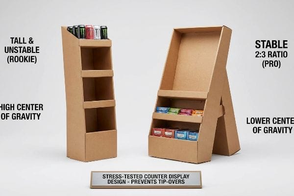
কিন্তু যখন মেশিনগুলো চলতে শুরু করে এবং ইউনিটগুলো প্রকৃতপক্ষে বিশৃঙ্খল রেজিস্টার জোনে প্রবেশ করে, তখন উচ্চ ট্র্যাফিকের তত্ত্ব জানাটাই যথেষ্ট নয়।.
কারখানার মেঝেতে কেন ভরকেন্দ্রের প্রচলিত গণিত ব্যর্থ হয়
ব্র্যান্ডগুলো প্রায়শই ধরে নেয় যে, যেহেতু একটি কনভেনিয়েন্স স্টোরের কাউন্টারে দিনে হাজার হাজার দ্রুত লেনদেন হয় 17 , তাই একটি সংকীর্ণ জায়গায় কেবল পণ্যগুলোকে উঁচু করে সাজালেই তাদের লাভ সর্বাধিক হবে। তারা ভিত্তির জায়গা বাঁচাতে উল্লম্ব টাওয়ার তৈরি করে, এবং কেনাকাটার ব্যস্ততম সময়ে কাঠামোটিকে স্থির রাখতে সম্পূর্ণরূপে পণ্যের স্থিতিশীল ওজনের উপর নির্ভর করে 18 ।
আমার প্রতিষ্ঠানে, আমি নিয়মিতভাবে দেখি যে এই ভারি উপরের অংশের ডিজাইনগুলো ডাইনামিক টিল্ট টেস্টিংয়ের সময় পুরোপুরি ব্যর্থ হয়। যখন আমি ১৫ পাউন্ড (৬.৮ কেজি) এনার্জি ড্রিংকস বোঝাই একটি সরু ৬-ইঞ্চি (১৫২.৪ মিমি) বেসের উপর কাইনেটিক শিয়ার ফোর্স পরিমাপ করি, তখন একটি সিমুলেটেড শপিং কার্ট কাউন্টারে ধাক্কা দেওয়ার মুহূর্তেই ইউনিটটি অনিবার্যভাবে উল্টে যায়। আমি সমস্ত রেজিস্টার ইউনিটের জন্য একটি কঠোর ২:৩ গভীরতা-থেকে-উচ্চতার অনুপাত১৯।পেছনের ইজেল সাপোর্টকে গাণিতিকভাবে প্রসারিত করে এবং কাঠামোগত ভরকেন্দ্রকে নিচে নামিয়ে, আমি নিশ্চিত করি যে একজন তাড়াহুড়ো করা গ্রাহক উপরের স্তর থেকে সজোরে একটি পণ্য টেনে নামিয়ে নিলেও ডিসপ্লেটি সম্পূর্ণরূপে মাটিতে স্থির থাকে। এই সূক্ষ্ম সমন্বয় হঠাৎ উল্টে যাওয়া প্রতিরোধ করে, যা আপনাকে ঝামেলাপূর্ণ দায়বদ্ধতার দাবি এবং হতাশ স্টোর ম্যানেজারদের আপনার ইউনিটটি মেঝে থেকে পুরোপুরি তুলে ফেলার হাত থেকে রক্ষা করে।
| নতুনদের সাধারণ ভুল | প্রো ফিক্স | খুচরা-ফ্লোর সুবিধা |
|---|---|---|
| ইঞ্জিনিয়ারিং লম্বা, সরু কাউন্টার ইউনিট | গভীরতা ও উচ্চতার কঠোর ২:৩ অনুপাত প্রয়োগ করুন।20 | ভয়াবহ উল্টে যাওয়া প্রতিরোধ করে |
| স্থিতিশীলতার জন্য পণ্যের ওজনের উপর নির্ভর করা | বর্ধিত পিছনের ইজেল সাপোর্ট যোগ করুন | শারীরিক ধাক্কা থেকে ইউনিটটিকে সুরক্ষিত রাখে |
| ভারী তরল পদার্থ উপরের স্তরে রাখা | ইউনিটটির ভরকেন্দ্র নিচে নামান21 | খুচরা বিক্রয়কেন্দ্রের দায়বদ্ধতার ঝুঁকি হ্রাস করে |
আমি প্রতিটি কাউন্টার ডিজাইনকে কঠোর ভৌত মিথস্ক্রিয়ার মানদণ্ড দিয়ে পরীক্ষা করি। যদি জ্যামিতিক গাণিতিক হিসাব চাপের মুখেও এর স্থিতিশীল অবস্থান নিশ্চিত না করে, তবে আমি ফাইলটি ডাই-কাটিং মেশিনে পাঠাই না।.
🛠️ হার্ভির ডেস্ক: একটি ২-মিলিমিটার কাঠামোগত ত্রুটির কারণে ৫০০টি দোকানে পণ্য সরবরাহের পরিকল্পনা যেন ভেস্তে না যায়। 👉 আপনার ডাইলাইন ফাইলটি আমাকে পাঠান ↗ — গণ-উৎপাদনে বাজেট অপচয় করার আগে আমি এর গাণিতিক হিসাব স্ট্রেস-টেস্ট করে নেব।
উপসংহার
আপনি একজন সাধারণ বিক্রেতা বেছে নিতে পারেন, কিন্তু সকালের ব্যস্ত সময়ে যখন সেই ভারি কাউন্টার ইউনিটটি উল্টে গিয়ে পণ্য ছড়িয়ে পড়ে, তখন এর ফলে সৃষ্ট দায় এবং দোকান পর্যায়ে বাতিল হওয়ার ঘটনা আপনার প্রকল্পের লাভের অংশ পুরোপুরি শেষ করে দেবে। আমার সেরা ১০ জন রিটেইল ক্লায়েন্ট প্রিন্ট বাতিল হওয়ার সম্ভাবনা শূন্যে নামিয়ে আনার নিশ্চয়তা দিতে ঠিক এই স্পেক শিটটিই ব্যবহার করেন। জটিল ভরকেন্দ্রের সহনশীলতা নিয়ে অনুমান করা বন্ধ করুন এবং ব্যাপক উৎপাদন শুরু হওয়ার আগেই মারাত্মক জ্যামিতিক ত্রুটিগুলো ধরার জন্য আমাকে ব্যক্তিগতভাবে আপনার ফাইলগুলো আমার বিনামূল্যের কাঠামোগত স্থিতিশীলতা নিরীক্ষার (Freatuural Stability Audit) মাধ্যমে পরীক্ষা করতে দিন।
"খাদ্য সংস্পর্শে ব্যবহৃত সামগ্রীতে PFAS-এর অনুমোদিত ব্যবহার – FDA", https://www.fda.gov/food/process-contaminants-food/authorized-uses-pfas-food-contact-applications। খাদ্য সংস্পর্শে ব্যবহৃত সামগ্রীতে PFAS এবং অন্যান্য বিপজ্জনক রাসায়নিকের উপর বর্তমান মার্কিন FDA এবং রাজ্য-স্তরের নিষেধাজ্ঞার বিশদ বিশ্লেষণ, যার মধ্যে খুচরা টেকসইতার প্রয়োজনীয়তাও অন্তর্ভুক্ত। প্রমাণের ভূমিকা: যাচাইকরণ; উৎসের ধরণ: নিয়ন্ত্রক সংস্থা/শিল্প প্রতিবেদন। সমর্থন করে: এই দাবি যে খাদ্য প্যাকেজিংয়ে রাসায়নিক প্রতিবন্ধকতার জন্য নিয়মকানুন আরও কঠোর হচ্ছে। পরিধি টীকা: উত্তর আমেরিকার নিয়মকানুনের উপর দৃষ্টি নিবদ্ধ করে। ↩
"খাদ্য প্যাকেজিং-এ পার- এবং পলিফ্লুরোঅ্যালকাইল পদার্থ: স্থানান্তর...", https://pmc.ncbi.nlm.nih.gov/articles/PMC10993423/। প্রচলিত পলিমারের তুলনায় PFAS-মুক্ত জলীয় আবরণ কীভাবে খাদ্যপণ্যে ক্ষতিকারক রাসায়নিকের মিশ্রণ প্রতিরোধ করে, তার প্রযুক্তিগত যাচাইকরণ। প্রমাণের ভূমিকা: যাচাইকরণ; উৎসের ধরণ: নিয়ন্ত্রক সুরক্ষা প্রতিবেদন বা পিয়ার-রিভিউড বস্তু বিজ্ঞান গবেষণা। সমর্থন করে: জল-ভিত্তিক প্রতিবন্ধকের সুরক্ষা কার্যকারিতা। পরিধি টীকা: খাদ্য-সংলগ্ন উপাদানের জন্য নির্দিষ্ট। ↩
"খাদ্য প্যাকেজিং-এ PFAS মূল্যায়নের জন্য একটি ঝুঁকি ম্যাট্রিক্সের উন্নয়ন", https://pmc.ncbi.nlm.nih.gov/articles/PMC13074049/। প্রচলিত পলি-কোটিং-এর তুলনায় PFAS-মুক্ত জলীয় কোটিং খাদ্য নিরাপত্তা নিয়ন্ত্রক মান পূরণ করে এবং খুচরা বিক্রেতার নিরীক্ষায় উত্তীর্ণ হয়, তার যাচাইকরণ। প্রমাণের ভূমিকা: প্রযুক্তিগত বৈধতা; উৎসের ধরণ: নিয়ন্ত্রক নির্দেশিকা। সমর্থন করে: নিরাপত্তা সম্মতির জন্য নির্দিষ্ট কোটিং-এর ব্যবহার। পরিধি টীকা: আঞ্চলিক খাদ্য নিরাপত্তা আইন অনুসারে সম্মতি ভিন্ন হতে পারে। ↩
"ওয়াকি এবং ডাও পুনর্ব্যবহারযোগ্য একক-উপাদানের এমডিও-পিই তৈরি করেছে...", https://www.walki.com/case-stories/mono-material-mdo-pe-packaging-walki-dow/। প্রযুক্তিগতভাবে এটি নিশ্চিত করা হয়েছে যে, একক-উপাদানের জল-ভিত্তিক ফিনিশ কাগজের প্যাকেজিংকে রাস্তার পাশে পুনর্ব্যবহারের জন্য সম্পূর্ণরূপে পুনঃমণ্ডযোগ্য করে তোলে। প্রমাণের ভূমিকা: প্রযুক্তিগত বিবরণ; উৎসের ধরণ: বর্জ্য ব্যবস্থাপনা মান। সমর্থন করে: রাস্তার পাশে ১০০% পুনর্ব্যবহারযোগ্যতার দাবি। পরিধি সংক্রান্ত টীকা: পুনর্ব্যবহারযোগ্যতা স্থানীয় পৌরসভার প্রক্রিয়াকরণ ক্ষমতার উপর নির্ভর করে। ↩
"Exploring Shopper's Browsing Behavior and Attention Level with an …", https://pmc.ncbi.nlm.nih.gov/articles/PMC6895988/। পরিবেশগত মনোবিজ্ঞান এবং খুচরা ভোক্তা আচরণের উপর গবেষণা ব্যাখ্যা করে যে কীভাবে উচ্চ-চলাচলের পরিবেশ নির্বাচনী মনোযোগ এবং 'অটোপাইলট' নেভিগেশনকে উদ্দীপিত করে, যার ফলে ক্রেতারা ঘন লেখা উপেক্ষা করে। প্রমাণের ভূমিকা: বাস্তব দাবি সমর্থন করা; উৎসের ধরণ: একাডেমিক গবেষণা বা শিল্প প্রতিবেদন। সমর্থন করে: ডিসপ্লেতে লেখা-বহুল গ্রাফিক্সের পরিবর্তে চাক্ষুষ সরলতার প্রয়োজনীয়তা। পরিধি নোট: বিশেষভাবে উচ্চ-গতির খুচরা পরিবেশের জন্য প্রযোজ্য। ↩
"আপনার কাস্টম স্টোর ডিসপ্লের জন্য ৩-এর নিয়মের গুরুত্ব", https://mcintyredisplays.com/blog/custom-store-displays/। রিটেইল ভিজ্যুয়াল মার্চেন্ডাইজিংয়ের জন্য ইন্ডাস্ট্রির মানদণ্ড ক্রেতা সম্পৃক্ততার জন্য নির্দিষ্ট দূরত্ব-ভিত্তিক কাঠামোটিকে বৈধতা দেবে। প্রমাণের ভূমিকা: বৈধতা; উৎসের ধরণ: পেশাদার মার্চেন্ডাইজিং ম্যানুয়াল। সমর্থন করে: ৩০ ফুট-৩ ফুট-৩ ইঞ্চি সম্পৃক্ততার ক্রম। পরিধি সংক্রান্ত নোট: স্টোরের বিন্যাস অনুযায়ী প্রয়োগ ভিন্ন হতে পারে। ↩
"আবেগপ্রবণ ক্রয়ের উপর স্থানিক বিন্যাসের প্রভাব: আত্ম-ধারণা দ্বারা নিয়ন্ত্রিত", https://pmc.ncbi.nlm.nih.gov/articles/PMC10451481/। ভোক্তা আচরণ সমীক্ষা বা খুচরা বিশ্লেষণ প্রতিবেদনগুলো ক্রয়ের স্থানে উচ্চ-বৈসাদৃশ্যপূর্ণ চাক্ষুষ বিঘ্নের ফলে সৃষ্ট গড় বিক্রয় বৃদ্ধির পরিমাণ নির্ণয় করে। প্রমাণের ভূমিকা: পরিমাণ নির্ণয়; উৎসের ধরণ: বাজার গবেষণা সমীক্ষা। সমর্থন করে: আবেগপ্রবণ বিক্রয় বৃদ্ধির সুনির্দিষ্ট সংখ্যাগত দাবি। পরিধি টীকা: পণ্যের বিভাগের উপর ভিত্তি করে ফলাফল ভিন্ন হতে পারে। ↩
"দূর থেকে দেখার জন্য সেরা চিহ্ন কোনটি?", https://adamsigns.com/what-is-the-best-sign-to-be-seen-from-a-distance/। ভিজ্যুয়াল মার্চেন্ডাইজিং-এর একটি নির্ভরযোগ্য উৎস সেই কার্যকর দূরত্বটি যাচাই করবে, যেখান থেকে উচ্চ-কন্ট্রাস্টের, বড় আকারের লেখা ক্রেতার মনোযোগ আকর্ষণ করে। প্রমাণের ভূমিকা: তথ্যগত সমর্থন; উৎসের ধরণ: রিটেইল সাইকোলজি গবেষণা। সমর্থন করে: এই দাবি যে স্পট কালার দূর থেকে দৃশ্যমানতা বাড়ায়। পরিধি সংক্রান্ত টীকা: পারিপার্শ্বিক আলো এবং ফন্টের আকারের উপর ভিত্তি করে দূরত্ব পরিবর্তিত হতে পারে। ↩
"ভিজ্যুয়াল মার্চেন্ডাইজিং সার্ভিসেস অ্যান্ড স্ট্র্যাটেজি | টি-রক গ্লোবাল", https://trocglobal.com/visual-merchandising/। ডিজাইন সাইকোলজির সাহিত্য ব্যাখ্যা করে যে কীভাবে অপ্রতিসাম্যতা ভিজ্যুয়াল প্যাটার্ন ভেঙে উত্তেজনা তৈরি করে এবং দৃষ্টি আকর্ষণ করে। প্রমাণের ভূমিকা: তাত্ত্বিক সমর্থন; উৎসের ধরণ: ডিজাইন তত্ত্বের পাঠ্যপুস্তক। সমর্থন: ক্রেতাদের আকৃষ্ট করতে অপ্রতিসম ডাই-কাট হেডারের ব্যবহার। পরিধি নোট: প্রভাব অপ্রতিসাম্যতার মাত্রার উপর নির্ভর করে। ↩
"খুচরা দোকানের তাকের গড় উচ্চতা কত? – পপডিসপ্লে", https://popdisplay.me/what-is-the-average-retail-shelf-height/। টেকনিক্যাল মার্চেন্ডাইজিং নির্দেশিকাগুলো এই বিষয়ে মেট্রিক প্রদান করে যে, তাকের ধারক প্রান্ত পরিবর্তন করলে গ্রাহকের কাছে দৃশ্যমান পণ্যের শতাংশ কীভাবে প্রভাবিত হয়। প্রমাণের ভূমিকা: প্রযুক্তিগত স্পেসিফিকেশন; উৎসের ধরণ: খুচরা শিল্পের মান। সমর্থন করে: সামনের প্রান্ত কেটে ফেলার ফলে দৃশ্যমানতার নির্দিষ্ট বৃদ্ধি। পরিধি সংক্রান্ত নোট: পণ্যের বিভাগ অনুযায়ী শতাংশের হার ভিন্ন হতে পারে। ↩
"কোরুগেটেড বক্সের চূড়ান্ত নির্দেশিকা – শোর প্যাকেজিং", https://www.shorr.com/resources/blog/ultimate-guide-corrugated-boxes/। বি-ফ্লুট কোরুগেটেড কার্ডবোর্ডের পুরুত্বের নিশ্চিতকরণ এবং স্ট্রাকচারাল ফ্লোর ডিসপ্লেতে এর সাধারণ ব্যবহার। প্রমাণের ভূমিকা: প্রযুক্তিগত স্পেসিফিকেশন; উৎসের ধরণ: উৎপাদন মান। সমর্থন করে: বি-ফ্লুটকে একটি হেভি-ডিউটি উপাদান হিসেবে শ্রেণিবিন্যাস, যা ছোট আকারের ইউনিটের জন্য অনুপযুক্ত। পরিধি নোট: স্ট্যান্ডার্ড কোরুগেটেড ফ্লুটের মাত্রা। ↩
"একটি পাঁচ-স্তরবিশিষ্ট কাঠামোর নমন দৃঢ়তার বিশ্লেষণাত্মক নির্ধারণ...", https://pmc.ncbi.nlm.nih.gov/articles/PMC8777652/। ঢেউখেলানো কাগজের প্যাকেজিং-এ ভাঁজ করার ট্যাবের জন্য ন্যূনতম বাঁকের ব্যাসার্ধ এবং প্রয়োজনীয় ফাঁকা স্থানের উপর উপাদানের পুরুত্ব (ক্যালিপার) কীভাবে প্রভাব ফেলে, তার প্রযুক্তিগত ব্যাখ্যা। প্রমাণের ভূমিকা: প্রকৌশল নীতি; উৎসের ধরণ: প্যাকেজিং ডিজাইন ম্যানুয়াল। সমর্থন করে: কম্প্যাক্ট ডিজাইনে পুরু ফ্লুটের যান্ত্রিক ব্যর্থতা। পরিধি টীকা: ভাঁজের জ্যামিতির উপর আলোকপাত করে। ↩
"[পিডিএফ] করোগেটেড বোর্ড স্পেসিফিকেশন – ফাইবার বক্স অ্যাসোসিয়েশন", https://www.fibrebox.org/assets/2025/09/Walmart_Corrugated-Board_Specifications_Automation_Packaging_Standards.pdf। এর পাতলা প্রোফাইল এবং উন্নত প্রিন্ট সারফেসের কারণে কমপ্যাক্ট POS ডিসপ্লেতে ই-ফ্লুটের শিল্প-মান প্রয়োগের যাচাইকরণ। প্রমাণের ভূমিকা: প্রযুক্তিগত স্পেসিফিকেশন; উৎসের ধরণ: প্যাকেজিং শিল্পের মান। সমর্থন: মাইক্রো-অনুপাতের জন্য ই-ফ্লুটের উপযুক্ততা। পরিধি নোট: করোগেটেড ফাইবারবোর্ডের সাথে সম্পর্কিত। ↩
"আমার ডিসপ্লে প্যাকেজিং বক্সগুলো কীভাবে ডিজাইন করা উচিত? – পপডিসপ্লে", https://popdisplay.me/how-should-i-design-my-display-packaging-boxes/। ডাইলাইন টলারেন্স সামঞ্জস্য করার মাধ্যমে কীভাবে ক্ষুদ্রাকৃতির ট্যাবে উপাদানের উপর চাপ এবং ছিঁড়ে যাওয়া প্রতিরোধ করা হয়, তার প্রযুক্তিগত বিবরণ। প্রমাণের ভূমিকা: প্রকৌশলের সর্বোত্তম অনুশীলন; উৎসের ধরণ: শিল্প নকশা ম্যানুয়াল। সমর্থন: কাগজ ছিঁড়ে যাওয়া প্রতিরোধের জন্য নির্দিষ্ট টলারেন্সের প্রয়োজনীয়তা। পরিধি টীকা: মাইক্রো-ফ্লুট স্ট্রাকচারাল ইঞ্জিনিয়ারিং-এর ক্ষেত্রে প্রযোজ্য। ↩
"কোরুগেটেড শিপিং বক্সের পুরুত্বের বিকল্প নির্দেশিকা – জিএমএস ইন্ডাস্ট্রিজ", https://feeds.gmsindustries.com/blog/corrugated-shipping-box-cardboard-thickness-options। বি-ফ্লুটের তুলনায় ই-ফ্লুটে কীভাবে কম ফ্লুট উচ্চতা আরও স্পষ্ট ভাঁজের ব্যাসার্ধ এবং উচ্চতর মুদ্রণ গুণমান প্রদান করে তার ব্যাখ্যা। প্রমাণের ভূমিকা: প্রযুক্তিগত স্পেসিফিকেশন; উৎসের ধরণ: প্যাকেজিং ইঞ্জিনিয়ারিং হ্যান্ডবুক। সমর্থন: ছোট ট্রে-এর কোণার জন্য ই-ফ্লুটের শ্রেষ্ঠত্ব। পরিধি নোট: মাইক্রো-ফ্লুট কোরুগেটেড বোর্ডের জন্য নির্দিষ্ট। ↩
"ফোল্ডিং কার্টন বক্সের বিকল্প ও বৈশিষ্ট্য | দ্য বক্স কো-অপ", https://www.boxcoop.com/folding-carton-options। দ্রুত খুচরা অ্যাসেম্বলির জন্য যান্ত্রিক ফ্রিকশন-ফিট জয়েন্ট বনাম রাসায়নিক আঠার তুলনামূলক বিশ্লেষণ। প্রমাণের ভূমিকা: অ্যাসেম্বলি পদ্ধতির তুলনা; উৎসের ধরণ: উৎপাদন নির্দেশিকা। সমর্থন করে: আঠালো অ্যাসেম্বলির ঝামেলা দূর করতে ফ্রিকশন লকের ব্যবহার। পরিধি নোট: পয়েন্ট-অফ-পারচেজ (POP) ডিসপ্লে ইউনিটের উপর দৃষ্টি নিবদ্ধ। ↩
"মার্কিন কনভেনিয়েন্স স্টোরের বিক্রি ৮৬০ বিলিয়ন ডলারে পৌঁছেছে – NACS", https://www.convenience.org/stay-current/news/2024/april/4/1-us-c-store-sales-hit-860-billion_research। খুচরা শিল্প প্রতিবেদন যা কনভেনিয়েন্স স্টোরগুলির জন্য গড় দৈনিক লেনদেনের পরিমাণ প্রদান করে। প্রমাণের ভূমিকা: পরিমাণগত যাচাইকরণ; উৎসের ধরণ: শিল্প প্রতিবেদন। সমর্থন করে: উচ্চ লেনদেন ঘনত্বের দাবি। পরিধি নোট: স্টোরের আকার এবং অবস্থান অনুসারে ডেটা ভিন্ন হতে পারে। ↩
"স্থির বনাম গতিশীল ভার: রুফ র্যাক এবং ট্রাক বেডের জন্য এর অর্থ কী...", https://backwoodsadventuremods.com/blogs/news/static-vs-dynamic-load-what-it-means-for-roof-racks-and-truck-bed-racks?srsltid=AfmBOooOSNnw1LdCR68MDXOaNkzK4L3zvXAVNd-5oMqbx5ARsxfOkkFF। স্থির ভরের উপর নির্ভরশীল সরু-ভিত্তির উল্লম্ব ডিসপ্লের অস্থিতিশীলতা সম্পর্কিত রিটেইল ফিক্সচার ইঞ্জিনিয়ারিংয়ের প্রযুক্তিগত সাহিত্য। প্রমাণের ভূমিকা: প্রযুক্তিগত যাচাইকরণ; উৎসের ধরণ: ইঞ্জিনিয়ারিং ম্যানুয়াল। সমর্থন: নোঙর করার জন্য স্থির ওজনের উপর নির্ভর করার ঝুঁকি। পরিধি নোট: ভরকেন্দ্র গণনার উপর আলোকপাত করে। ↩
"অধ্যায় ২: আপনার গ্রাহকদের জন্য ডিসপ্লের উচ্চতা নির্বাচন", https://www.creativedisplaysnow.com/guides/understanding-the-retail-customer/chapter-2-how-to-choose-the-right-display-height-for-your-customers/। স্ব-স্থিতিশীল রিটেইল ডিসপ্লের জন্য প্রামাণ্য প্রকৌশল মানদণ্ডগুলো গতিশীল ভারের অধীনে উল্টে যাওয়া রোধ করতে ন্যূনতম গভীরতা-থেকে-উচ্চতার অনুপাত নির্দিষ্ট করে। প্রমাণের ভূমিকা: প্রযুক্তিগত স্পেসিফিকেশন; উৎসের ধরণ: শিল্প নিরাপত্তা মান। সমর্থন করে: স্থিতিশীলতার জন্য ২:৩ অনুপাতের কার্যকারিতা। পরিধি সংক্রান্ত টীকা: ওপরের দিকে ভারী পয়েন্ট-অফ-পারচেজ ডিসপ্লের ক্ষেত্রে প্রযোজ্য। ↩
"১৪ ধরনের রিটেইল ডিসপ্লে | শিকাগো, আইএল – ভার্টহাইমার বক্স", https://wertheimerbox.com/types-of-retail-displays/। একটি ইন্ডাস্ট্রিয়াল ডিজাইন বা রিটেইল সেফটি ম্যানুয়াল স্বতন্ত্র ইউনিটগুলোকে উল্টে যাওয়া থেকে রক্ষা করার জন্য প্রয়োজনীয় নির্দিষ্ট অনুপাতটি যাচাই করবে। প্রমাণের ভূমিকা: প্রযুক্তিগত স্পেসিফিকেশন; উৎসের ধরণ: ডিজাইন স্ট্যান্ডার্ড। সাপোর্ট: কাউন্টার ইউনিটের জন্য নির্দিষ্ট স্থিতিশীলতার অনুপাত। পরিধি সংক্রান্ত টীকা: সংকীর্ণ রিটেইল ফিক্সচারের ক্ষেত্রে প্রযোজ্য। ↩
"স্থিতিশীলতা এবং সুরক্ষার জন্য পরীক্ষার উপর গুরুত্বকেন্দ্রের কেস স্টাডির আলোকপাত", https://www.interfaceforce.com/center-of-gravity-case-study-highlights-testing-for-stability-and-safety/। বাণিজ্যিক ফিক্সচারের জন্য পদার্থবিদ্যা এবং সুরক্ষা বিধিমালা প্রমাণ করে যে, ভরকেন্দ্র নিচে নামালে তা উল্টে যাওয়ার সম্ভাবনা এবং এর সাথে সম্পর্কিত আঘাতজনিত দায় হ্রাস পায়। প্রমাণের ভূমিকা: সুরক্ষা নীতি; উৎসের ধরণ: সুরক্ষা বিধিমালা। সমর্থন করে: খুচরা বিক্রয়কেন্দ্রে দায়ের ঝুঁকি হ্রাস। পরিধি টীকা: পণ্য প্রদর্শনে পদার্থবিদ্যার সাধারণ প্রয়োগ। ↩