ব্র্যান্ডগুলো ক্রমাগত উৎকৃষ্ট মানের রিটেইল নান্দনিকতার পেছনে ছোটে, কিন্তু ভুল স্পর্শযোগ্য ফিনিশ বেছে নিলে প্রায়শই বাক্সের মারাত্মক ব্যর্থতা ঘটে। কোনো পৃষ্ঠকে উঁচু করা বা নিচু করার মধ্যকার পার্থক্যই আপনার কাঠামোগত টিকে থাকাকে নির্ধারণ করে।.
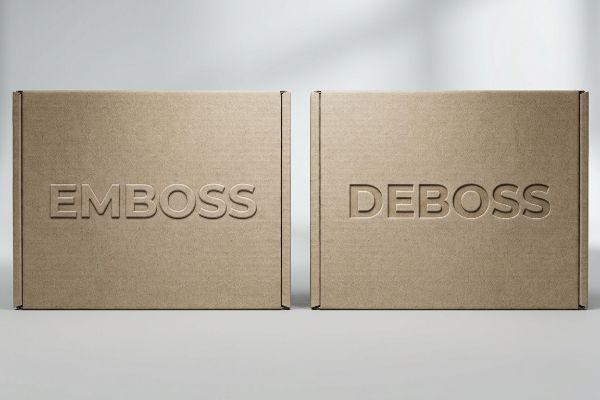
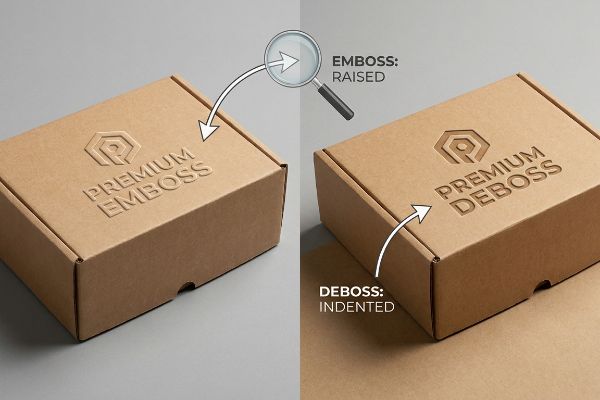
এমবসিং এবং ডিবসিং হলো দুটি স্বতন্ত্র স্পর্শ-ভিত্তিক ফিনিশিং। এমবসিং পেপারবোর্ডের পৃষ্ঠকে উপরের দিকে তুলে একটি ত্রিমাত্রিক চূড়া তৈরি করে, অন্যদিকে ডিবসিং নকশাটিকে ভেতরের দিকে সাবস্ট্রেটের মধ্যে চেপে দেয়। উভয় পদ্ধতিই রিটেইল প্যাকেজিংয়ের সৌন্দর্য বৃদ্ধি করে, কিন্তু ভারী প্যালেটের ওপরের চাপে ডিবসিং করোগেটেড ফ্লুটের কাঠামোগত অখণ্ডতা অনেক ভালোভাবে রক্ষা করে।.
গ্রাফিক ডিজাইনাররা এই কৌশলগুলোকে সাধারণ দৃশ্যগত উন্নতি হিসেবে দেখলেও, কারখানার মেঝেতে আমার অভিজ্ঞতা আরও অনেক বেশি বিপজ্জনক এক গল্প বলে। চলুন দেখে নেওয়া যাক, কীভাবে কাগজের তন্তুগুলোকে ভুল দিকে চালনা করা আপনার পণ্য পরিবহন ব্যবস্থাকে পুরোপুরি ধ্বংস করে দিতে পারে।.
ডিবসিং নাকি এমবসিং বেশি ভালো?
সর্বোত্তম রূপ নির্বাচন করা একটি মূল খুচরা কৌশলগত সিদ্ধান্ত। সঠিক স্পর্শানুভূতি আপনার ব্র্যান্ডকে দোকানের ভিড়ভরা তাকগুলিতেও তাৎক্ষণিকভাবে ক্রেতার মনোযোগ আকর্ষণ করতে সাহায্য করে।.
এটা নির্ভর করে। এমবসিং একটি সুস্পষ্ট, উঁচু আকৃতি তৈরি করে যা হালকা ওজনের প্রসাধনী বাক্সের প্রতি দৃষ্টি আকর্ষণ করার জন্য চমৎকার। ডিবসিং একটি সূক্ষ্ম, নিচু ছাপ দেয় যা ন্যূনতম নকশার জন্য একটি মসৃণ ও প্রিমিয়াম অনুভূতি প্রদান করে এবং পাশের কার্টনে না আটকে মসৃণভাবে বাক্সগুলো স্তূপ করা নিশ্চিত করে।.
লোগো উঁচু নাকি নিচু হবে, এই নিয়ে আলোচনা সাধারণত ডিজাইন স্টুডিওতেই হয়ে থাকে, কিন্তু এর দৃশ্যগত ফলাফলই নির্ধারণ করে দেয় যে ভোক্তারা আপনার ব্র্যান্ডের মূল্যকে কীভাবে দেখবে।.
স্পর্শভিত্তিক পছন্দের পেছনের খুচরা কৌশল
নতুন কোনো পণ্য বাজারে আনার পরিকল্পনা করার সময়, বিপণনকারীরা প্রায়শই ধরে নেন যে একটি উচ্চমানের খুচরা উপস্থিতি প্রতিষ্ঠা করার একমাত্র উপায় হলো বাইরের দিকে নকশা খোদাই করা। তারা একটি উঁচু লোগোকে বিলাসিতার চূড়ান্ত প্রতীক হিসেবে গণ্য করেন এবং বিশ্বাস করেন যে নকশাটিকে বাইরের দিকে ঠেলে দিলে প্যাকেজিংটি স্বয়ংক্রিয়ভাবে আরও দামী বলে মনে হয়। এই ধারণার ফলে অনেক ব্র্যান্ড সামগ্রিক নান্দনিকতা বা তাকের প্রেক্ষাপট বিবেচনা না করেই প্রতিটি বাক্সে জোর করে ঊর্ধ্বমুখী নকশা তৈরি করে।.
তবে, খুচরা বিক্রয় কৌশলের দৃষ্টিকোণ থেকে, ডিবসিং প্রায়শই আরও পরিশীলিত একটি দৃশ্যমান প্রভাব প্রদান করে। লোগোটিকে ভিত্তির মধ্যে বসিয়ে দেওয়ার মাধ্যমে এটি গভীর, মার্জিত ছায়া তৈরি করে, যা দোকানের তীব্র আলোর নিচে গতিশীলভাবে পরিবর্তিত হয়। এই ভেতরের দিকে দেবে যাওয়া অংশটি প্যাকেজিংকে একটি পরিমার্জিত ও আধুনিক নান্দনিকতা দেয়, যা বিচক্ষণ ক্রেতাদের কাছে সহজাতভাবেই উৎকৃষ্ট মানের বলে মনে হয়। অধিকন্তু, এর সমতল বাহ্যিক গঠন বাক্সগুলোকে দোকানের তাকের ওপর একে অপরের সাথে মসৃণভাবে স্লাইড করতে সাহায্য করে, ফলে সূক্ষ্ম উঁচু ফয়েলগুলো আটকে যায় না বা তাতে দাগ পড়ে না।
| খুচরা বৈশিষ্ট্য | এমবসিং অ্যাপ্লিকেশন | ডিবসিং অ্যাপ্লিকেশন |
|---|---|---|
| ভিজ্যুয়াল ইমপ্যাক্ট | সাহসী, বহির্মুখী প্রক্ষেপণ | সূক্ষ্ম, অন্তর্মুখী ছায়া |
| সেরা অনুভূতি | ক্লাসিক বিলাসিতা | আধুনিক ন্যূনতমবাদ |
| শেলফ ঘর্ষণ | পাশের বাক্সগুলিতে ঘষা লাগতে পারে2 | শেলফে মসৃণভাবে স্লাইড করে3 |
সঠিক স্পর্শানুভূতির দিক নির্বাচন করলে আপনার বাক্সটি দোকানের আলোতেও নিখুঁত দেখায়। আমি ব্র্যান্ডগুলোকে ঠিক সেই রূপটি দিতে পথ দেখাই, যা তাদের নির্দিষ্ট নান্দনিকতাকে আরও উন্নত করে তোলে।.
🛠️ হার্ভিস ডেস্ক: আপনার ভারী চেকআউট ট্রেগুলো কি দোকানে পৌঁছানোর আগেই আপনার শিপিংয়ের ROI (বিনিয়োগের উপর আয়) কমিয়ে দিচ্ছে? 👉 একটি বিনামূল্যে ফ্রেট ডেনসিটি অডিটের জন্য অনুরোধ করুন ↗ — আমি ২৪ ঘণ্টার মধ্যে প্রতিটি স্ট্রাকচারাল ফাইল ব্যক্তিগতভাবে পর্যালোচনা করি।
এমবসড নাকি এমব্রয়ডারি করা, কোনটি বেশি ভালো?
ব্র্যান্ডগুলো মাঝে মাঝে এমবসড লোগোর সাথে তুলনা করে এমব্রয়ডারি করা প্যাচের মতো নরম জিনিসপত্রকে শক্ত ডিসপ্লেতে যুক্ত করার চেষ্টা করে। এটি সাধারণ খুচরা বিক্রয় কার্যক্রমের জন্য একটি অপ্রয়োজনীয় জটিলতা তৈরি করে।.
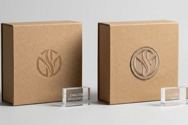
পেপারবোর্ড প্যাকেজিংয়ের জন্য এমবসড ফিনিশ বেশি ভালো, কারণ এগুলো সরাসরি মূল উপাদানের সাথে মিশে গিয়ে একটি নিখুঁত ও প্রিমিয়াম উপস্থাপনা তৈরি করে। পোশাকের জন্য এমব্রয়ডারি করা উপাদান চমৎকার, কিন্তু বাক্সে আঠা দিয়ে লাগালে তা দেখতে অসংলগ্ন লাগে এবং ক্রেতাদের কাছে প্যাকেজিংটিকে কম সুসংহত মনে হয়।.
ছাঁচে তৈরি কাগজের টেক্সচার এবং এর সাথে লাগানো কাপড়ের প্যাচের মধ্যে একটিকে বেছে নেওয়াকে একটি চতুর বিপণন কৌশল বলে মনে হতে পারে, কিন্তু এটি আপনার উপস্থাপনার কৌশলকে মৌলিকভাবে বদলে দেয়।.
সমন্বিত ব্র্যান্ড উপস্থাপনার গুরুত্ব
সৃজনশীল দলগুলো কখনও কখনও ফোল্ডিং কার্টনের উপর সরাসরি এমব্রয়ডারি করা কাপড়ের প্যাচ আঠা দিয়ে লাগিয়ে এক অনন্য স্পর্শানুভূতির প্রস্তাব দেয়। তারা কল্পনা করে যে, শক্ত পেপারবোর্ডের সাথে নরম টেক্সটাইলের মিশ্রণ একটি অত্যন্ত স্মরণীয় আনবক্সিং অভিজ্ঞতা তৈরি করবে, যা পোশাক এবং প্যাকেজিংয়ের মধ্যকার ব্যবধান ঘুচিয়ে দেবে। একটি ডিজিটাল মকআপে, এই মিশ্র-মাধ্যম পদ্ধতিটিকে অবিশ্বাস্যভাবে উদ্ভাবনী এবং সুস্পষ্টভাবে উচ্চমানের বলে মনে হয়।
বাস্তব খুচরা বিক্রির পরিবেশে, আঠা দিয়ে লাগানো এমব্রয়ডারি করা প্যাচগুলোকে প্রায়শই সমন্বিত ডিজাইন উপাদানের পরিবর্তে সস্তা ও দায়সারা গোছের দেখায়। ক্রেতারা বাক্সটি নাড়াচাড়া করলে কাপড়ের কিনারা ছিঁড়ে বা উঠে যেতে পারে , যা শেলফের নিখুঁত সৌন্দর্য নষ্ট করে দেয়। এর পরিবর্তে, গভীর এমবসড ফিনিশ বেছে নিয়ে ব্র্যান্ডগুলো পেপারবোর্ড ব্যবহার করেই সেই কাঙ্ক্ষিত প্রিমিয়াম টেক্সচার অর্জন করে । এটি নিশ্চিত করে যে ত্রিমাত্রিক উপাদানটি প্যাকেজের সামগ্রিক ডিজাইনের সাথে পুরোপুরি একীভূত থাকে, যা আরও পরিচ্ছন্ন ও অভিজাত একটি নান্দনিকতা প্রদান করে।
| খুচরা বৈশিষ্ট্য | এমবসড প্যাকেজিং | এমব্রয়ডারি করা প্যাচ |
|---|---|---|
| ব্র্যান্ড ইন্টিগ্রেশন | নির্বিঘ্ন এবং একীভূত | বিচ্ছিন্ন এবং আঠা দিয়ে লাগানো |
| শেলফের স্থায়িত্ব | অত্যন্ত ঘর্ষণ-প্রতিরোধী6 | খোসা ওঠা এবং ছিঁড়ে যাওয়ার প্রবণতা7 |
| ভোক্তার মনোভাব | সুসংহত বিলাসবহুল ব্র্যান্ড | অভিনব মিশ্র-মাধ্যম ধারণা |
আপনার টেক্সচারগুলিকে মূল উপাদানের সাথে একীভূত রাখলে উপস্থাপনা অগোছালো হয় না। আমি ব্র্যান্ডগুলিকে এমন প্রিমিয়াম ৩ডি এফেক্ট তৈরি করতে সাহায্য করি যা শেলফে নিখুঁতভাবে সামঞ্জস্যপূর্ণ দেখায়।.
🛠️ হার্ভির ডেস্ক: বাস্তব রিটেইল ব্যবসার চাপে আপনার বর্তমান কাউন্টার ডিসপ্লে ডিজাইনটি কি ভেঙে পড়ার ঝুঁকিতে আছে? 👉 আপনার স্ট্রাকচারাল ডাইলাইন অডিট দাবি করুন ↗ — ১০০% গোপনীয়। আপনার অপ্রকাশিত রিটেইল ডিজাইনগুলো আমার কাছে সুরক্ষিত।
এমবসড এবং ডিবসড এর মধ্যে পার্থক্য কী?
এই দুটি ফিনিশের মধ্যকার মৌলিক দৃশ্যগত পার্থক্য বোঝা বিপণনকারীদের জন্য অত্যন্ত গুরুত্বপূর্ণ। এর উপরেই নির্ভর করে দোকানের আলো আপনার প্যাকেজিং ডিজাইনের সাথে কীভাবে কাজ করবে।.
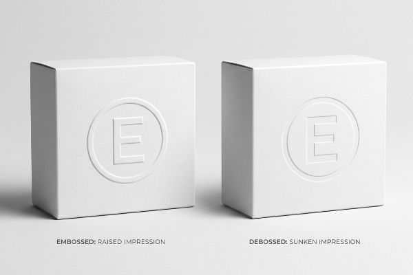
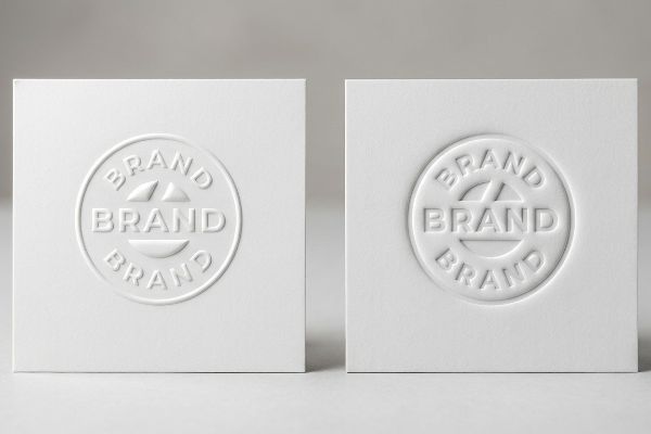
টেক্সচারের দৃশ্যমান অভিমুখেই পার্থক্যটি নিহিত। এমবসিং পেপারবোর্ডকে বাইরের দিকে ঠেলে একটি উঁচু, উত্তল চূড়া তৈরি করে যা আলোকে প্রতিফলিত করে। অন্যদিকে, ডিবসিং উপাদানটিকে ভেতরের দিকে চেপে একটি নিচু, অবতল গর্ত তৈরি করে যা চমৎকার ছায়া ধারণ করে।.
যদিও উভয় পদ্ধতিই একটি অনস্বীকার্য প্রিমিয়াম অনুভূতি প্রদান করে, একটি সফল রিটেইল ডিসপ্লে কৌশল তৈরির প্রথম ধাপ হলো এদের দৃশ্যগত পার্থক্যগুলো আয়ত্ত করা।.
খুচরা দোকানের জন্য আলো ও ছায়ার নকশা
অনেক নবীন প্যাকেজিং ডিজাইনার 'এমবসড' এবং 'ডিবসড' শব্দ দুটিকে অদলবদল করে ব্যবহার করেন, এই ভেবে যে যেকোনো টেক্সচারযুক্ত লোগো হুবহু একই রকম দৃশ্যমান ফলাফল দেয়। তারা প্রায়শই একটি এমবসড ফিনিশের অনুরোধ করেন, কারণ এটি ইন্ডাস্ট্রিতে একটি বহুল প্রচলিত শব্দ এবং তারা একটি সর্বজনীন বিলাসবহুল আপগ্রেডের প্রত্যাশা করেন। এই ধারণাটি উপেক্ষা করে যে একটি রিটেইল আইলের দিকনির্দেশক আলো আসলে ত্রিমাত্রিক কাগজের আকারের সাথে কীভাবে মিথস্ক্রিয়া করে8।
আসল পার্থক্যটা সম্পূর্ণরূপে আলো এবং ছায়ার অবস্থানের উপর নির্ভরশীল। একটি এমবস করা, উঁচু পৃষ্ঠ একটি ছোট স্পটলাইটের মতো কাজ করে , যা উপরের রিটেইল লাইটিংকে তার চূড়ায় প্রতিফলিত করে লোগোটিকে ভোক্তার কাছে সুস্পষ্টভাবে ফুটিয়ে তোলে। একটি ডিবস করা, নিচু পৃষ্ঠ এর বিপরীত কাজ করে, যা তার খাঁজগুলোর মধ্যে গভীর ছায়া ধরে রেখে একটি শান্ত ও আরও পরিশীলিত বৈসাদৃশ্য তৈরি করে। এই পার্থক্যটি বুঝতে পারলে একটি ব্র্যান্ড ইচ্ছাকৃতভাবে তাদের স্পর্শযোগ্য ফিনিশকে শেলফে তাদের কাঙ্ক্ষিত বৈশিষ্ট্যের সাথে মেলাতে পারে।
| চাক্ষুষ দিক | এমবসিং ফলাফল | ডিবসিং ফলাফল |
|---|---|---|
| টেক্সচার দিকনির্দেশনা | বাইরের দিকে তোলা11 | ভিতরের দিকে ডুবে গেছে12 |
| হালকা মিথস্ক্রিয়া | চূড়াগুলিতে হাইলাইটগুলি ধরে।13 | খাঁজের মধ্যে ছায়া ধারণ করে |
| খুচরা ব্যবসার আমেজ | উচ্চস্বরে এবং সুস্পষ্ট | শান্ত এবং পরিশীলিত |
আলো ও ছায়ার পারস্পরিক ক্রিয়ায় দক্ষতা অর্জন একটি সাধারণ বাক্সকে এক আকর্ষণীয় বিক্রয় অভিজ্ঞতায় রূপান্তরিত করে। আমি নিশ্চিত করি যে আপনার নির্বাচিত রূপটি ক্রেতার মনোযোগ নিখুঁতভাবে আকর্ষণ করে।.
🛠️ হার্ভিস ডেস্ক: আপনার পেপারবোর্ডটি তার সংকোচন শক্তি না হারিয়ে ঠিক কোন ধরনের স্পর্শ-সহনশীল ফিনিশ নিতে পারবে, তা নিয়ে কি আপনি আন্দাজ করছেন? 👉 বিনামূল্যে মেটেরিয়াল টলারেন্স রিভিউ করিয়ে নিন ↗ — মাঝখানে কোনো অ্যাকাউন্ট ম্যানেজার নেই। আপনি সরাসরি স্ট্রাকচারাল ইঞ্জিনিয়ারদের সাথে কথা বলবেন।
এমবসিংকে কি বিলাসবহুল প্রিন্টিং হিসেবে গণ্য করা হয়?
হ্যাঁ, এটি খুচরা বাজারে নিঃসন্দেহে একটি সেরা উপস্থিতি তৈরি করে, কিন্তু এটিকে শুধুমাত্র একটি বাহ্যিক উন্নতি হিসেবে বিবেচনা করা একটি বিপজ্জনক ব্যয় সংকোচনের ফাঁদকে আড়াল করে, যা আপনার সম্পূর্ণ পণ্য পরিবহন ব্যবস্থাকেই ঝুঁকির মধ্যে ফেলে দেয়।.
হ্যাঁ। এমবসিংকে বিলাসবহুল প্রিন্টিং হিসেবে বিবেচনা করা হয়, কারণ একটি চমৎকার ত্রিমাত্রিক (3D) এফেক্ট তৈরি করতে এতে বিশেষভাবে তৈরি ধাতব ডাই এবং সুনির্দিষ্ট যান্ত্রিক চাপের প্রয়োজন হয়। এই উন্নত কৌশলটি ব্র্যান্ডের অনুভূত মূল্য বাড়িয়ে তোলে, যার ফলে এটি উচ্চমানের রিটেইল প্যাকেজিং এবং প্রিমিয়াম ক্রীড়া সামগ্রীর ডিসপ্লের জন্য অত্যন্ত আকাঙ্ক্ষিত।.
যদিও ভোক্তারা এই উঁচু গঠনকে নিখুঁত বিলাসিতা হিসেবে দেখেন, কিন্তু এই নান্দনিকতার পেছনে অর্থায়নের আর্থিক বাস্তবতা প্রায়শই এক বিধ্বংসী সরবরাহ শৃঙ্খল বিপর্যয় ডেকে আনে।.
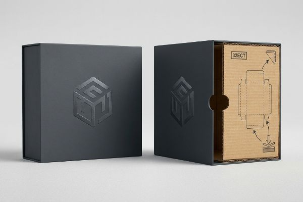
‘কসমেটিক ইসিটি ডাউনগ্রেড’ ফাঁদ
আমার প্রতিষ্ঠানে আমি নিয়মিতই এমন RFQ (Request for Quote) দেখি, যেখানে বাজেটের মধ্যে থেকে শুধুমাত্র দামী ও বিলাসবহুল এমবসিং করানোর জন্য নির্বিচারে স্ট্রাকচারাল বোর্ডের গ্রেড কমিয়ে দেওয়া হয়। ক্রয়কারী দলগুলো এটিকে একটি নিরীহ অভ্যন্তরীণ হিসাবরক্ষণের কারসাজি হিসেবে দেখে। তারা নীরবে মূল উপাদানটিকে একটি মজবুত 32ECT থেকে একটি দুর্বল 26ECT14-, এই ভেবে যে এর চকচকে, স্পর্শযোগ্য উপরের স্তরটি কোনোভাবে জাদুবলে একটি সাধারণ GMA (Grocery Manufacturers Association) প্যালেটের ওপর রাখা ভারী খুচরা পণ্যের ওজন বহন করতে পারবে।
এটা শুধু তত্ত্ব নয়—আমি পরীক্ষার ফ্লোরে এটা ঘটতে দেখি যখন এই বাজেট-সমন্বিত বাক্সগুলো একটি সাধারণ BCT (বক্স কম্প্রেশন টেস্ট)-এর সম্মুখীন হয় এবং ন্যূনতম চাপে সাথে সাথে বেঁকে গিয়ে ফ্লুটগুলোকে চূর্ণ করে ফেলে। একবার আমি BOM (বিল অফ মেটেরিয়ালস) সংশোধন করে মাইক্রোমিটার রিডিং নিলে, আমি প্রমাণ করি যে আমাদের বিলাসবহুল ফিনিশটি বাদ দেওয়ার প্রয়োজন নেই—আমাদের শুধু একটি আরও সূক্ষ্ম 0.5mm (0.02 ইঞ্চি) ডাই-কাটিং টলারেন্স এবং ভার্জিন 32ECT কোর 15- এর পুনরুদ্ধার প্রয়োজন। অতিরিক্ত-ইঞ্জিনিয়ার করা প্লাস্টিকের সাপোর্ট ক্লিপগুলো সরিয়ে ফেললে স্বাভাবিকভাবেই আরও শক্তিশালী সাবস্ট্রেটের ভিত্তি তৈরি হয়। এই ডেটা-চালিত সংশোধন ডায়নামিক লোড ক্যাপাসিটি 2,500 lbs (1,134 kg) 16- এ পুনরুদ্ধার করে , যা সমুদ্রপথে কন্টেইনার লোডের সময় ট্রানজিট ক্ষতি দূর করে।
| মেট্রিক/বৈশিষ্ট্য | বাজেট সমঝোতা | প্রকৌশলগত বাস্তবতা |
|---|---|---|
| উপাদান কৌশল | ইসিটি রেটিং অবনমন করা হয়েছে17 | 32ECT কোর পুনরুদ্ধার করে18 |
| ব্যয় বরাদ্দ | প্লাস্টিকের ক্লিপে খরচ করে | সুনির্দিষ্ট সহনশীলতায় বিনিয়োগ করে |
| মাল পরিবহনের ফলাফল | উচ্চ ট্রানজিট ক্ষতির হার19 | ভারী কন্টেইনারের ভার সহ্য করে |
আমি নিশ্চিত করি যে বিলাসবহুল ফিনিশিং যেন আপনার কাঠামোগত বাজেটকে ক্ষতিগ্রস্ত না করে, যার মাধ্যমে আমি আপনার ব্র্যান্ডের সুনাম রক্ষা করি। নিখুঁত ইঞ্জিনিয়ারিং টলারেন্স নিশ্চিত করে যে আপনার মাস্টার কার্টনগুলো পরিবহনের বাস্তব প্রতিকূলতা অক্ষত অবস্থায় সহ্য করতে পারে।.
🛠️ হার্ভির ডেস্ক: আপনার দামী বিলাসবহুল ফিনিশিংগুলো কি গোপনে একটি ডাবল-স্ট্যাকড সমুদ্রগামী কন্টেইনারে আপনার বাক্সটির টিকে থাকার ক্ষমতাকে নষ্ট করে দিচ্ছে? 👉 আপনার বিনামূল্যে স্ট্রাকচারাল অডিট দাবি করুন ↗ — আমি ২৪ ঘন্টার মধ্যে প্রতিটি স্ট্রাকচারাল ফাইল ব্যক্তিগতভাবে পর্যালোচনা করি।
উপসংহার
ভারী প্যালেটের ওপরের চাপে আপনার রিটেইল প্যাকেজিং যাতে মারাত্মকভাবে থেঁতলে না যায়, তার একমাত্র উপায় হলো ফাইবারের বাইরের দিকে প্রসারণ এবং ভুলবশত বাহ্যিক মানের অবনতি রোধ করা। এই নির্দিষ্ট ইঞ্জিনিয়ারিং পর্যালোচনাটি সম্প্রতি উৎপাদনের আগে একটি বড় জাতীয় পণ্য উন্মোচনের জন্য একটি মারাত্মক ২ মিমি টলারেন্স ত্রুটি ধরে ফেলেছে। আপনার ৩ডি টেক্সচারগুলো যেন আপনার কাইনেটিক ফ্রেট টিকে থাকার ক্ষমতাকে নষ্ট না করে, তা নিশ্চিত করতে আমাকে ব্যক্তিগতভাবে আপনার স্ট্রাকচারাল ফাইলগুলো আমার ফ্রি মেটেরিয়াল টলারেন্স অডিট ↗- এবং আপনার সাপ্লাই চেইনের অন্ধ স্থানগুলো স্থায়ীভাবে দূর করুন।
"এমবসিং বনাম ডিবসিং: পার্থক্য জানুন এবং কোনটি ভালো?", https://www.wecustomboxes.com/blog/embossing-vs-debossing/। [প্যাকেজিং ইঞ্জিনিয়ারিং স্ট্যান্ডার্ড এবং রিটেইল লজিস্টিকস গাইড সমর্থন করে যে, রিসেসড ফিনিশ শেল্ফিংয়ের সময় ঘর্ষণ কমায় এবং পৃষ্ঠের ক্ষতি প্রতিরোধ করে]। প্রমাণের ভূমিকা: প্রযুক্তিগত যাচাইকরণ; উৎসের ধরণ: ইন্ডাস্ট্রি ম্যানুয়াল। সমর্থন করে: রিটেইল লজিস্টিকসের জন্য ডিবসিংয়ের কার্যকরী সুবিধা। পরিধি নোট: উচ্চ-ঘনত্বের শেল্ফিং পরিবেশে প্রযোজ্য। ↩
"পণ্যে এমবসড এবং ডিবসড ডিজাইন উপাদানের ব্যবহার...", https://www.gprinting.com/blog/product-packaging/uses-of-embossed-and-debossed-design-elements-in-product-packaging। [প্যাকেজিং ইঞ্জিনিয়ারিংয়ের জন্য শিল্প মানগুলি বর্ণনা করে যে কীভাবে প্রসারিত এমবসড উপাদানগুলি পরিবহন বা শেলফে রাখার সময় পার্শ্ববর্তী পাত্রের পৃষ্ঠে ঘর্ষণ সৃষ্টি করতে পারে]। প্রমাণের ভূমিকা: প্রযুক্তিগত যাচাইকরণ; উৎসের ধরণ: প্যাকেজিং ইঞ্জিনিয়ারিং নির্দেশিকা। সমর্থন করে: এমবসিংয়ের ভৌত ঝুঁকি। পরিধি নোট: ফলাফল উপাদান এবং চাপের উপর নির্ভর করে পরিবর্তিত হয়। ↩
"প্যাকেজিং-এ ডিবসিং: সুবিধা, ব্যবহার এবং প্রতিবন্ধকতা", https://packhit.com/packaging/finishes/debossing/। [লজিস্টিকস এবং প্যাকেজিং গবেষণা থেকে জানা যায় যে, খাঁজকাটা ডিবসড উপাদানগুলো বাইরের দিকে বেরিয়ে থাকা অংশকে কমিয়ে আনে, যার ফলে খুচরা দোকানের শেলফে পণ্য সরানোর সময় ঘর্ষণজনিত প্রতিরোধ কমে যায়]। প্রমাণের ভূমিকা: প্রযুক্তিগত যাচাইকরণ; উৎসের ধরণ: বস্তু বিজ্ঞান বা প্যাকেজিং ম্যানুয়াল। সমর্থন: ডিবসিং-এর লজিস্টিক্যাল সুবিধা। পরিধি সংক্রান্ত টীকা: সাধারণ শেলফের পৃষ্ঠতলের জন্য প্রযোজ্য। ↩
"কেন টেপ এবং আঠা আপনার প্যাকেজিংয়ের অখণ্ডতাকে ক্ষতিগ্রস্ত করছে", https://www.idealstitcher.com/blogs/8638/the-weak-link-why-tape-and-glue-are-sabotaging-your-packaging-integrity। [উপাদান বন্ধনের উপর প্রযুক্তিগত নথি নিশ্চিত করে যে, ব্যবহারের সময় যান্ত্রিক ঘর্ষণের কারণে টেক্সটাইল-টু-পেপারবোর্ড আঠার প্রান্ত ফেটে যাওয়া এবং ছিঁড়ে যাওয়ার প্রবণতা থাকে]। প্রমাণের ভূমিকা: প্রযুক্তিগত যাচাইকরণ; উৎসের ধরণ: বস্তু বিজ্ঞান নির্দেশিকা। সমর্থন করে: কাপড়ের প্যাচের স্থায়িত্ব সম্পর্কিত দাবি। পরিধির টীকা: আঠার গ্রেড অনুযায়ী পরিবর্তিত হয়। ↩
"প্যাকেজিং অলঙ্করণের মাধ্যমে উপলব্ধিকে শক্তিশালী করা", https://www.packagingimpressions.com/article/powering-perception-packaging-embellishments/। [স্পর্শভিত্তিক উপলব্ধির উপর গবেষণা থেকে জানা যায় যে, এমবসিং-এর মতো সমন্বিত কাঠামোগত টেক্সচার, বাহ্যিকভাবে প্রয়োগ করা উপাদানের তুলনায় উচ্চতর অনুভূত মূল্য এবং ব্র্যান্ডের সামঞ্জস্যের সাথে সম্পর্কিত]। প্রমাণের ভূমিকা: ভোক্তা মনোবিজ্ঞান; উৎসের ধরণ: বিপণন গবেষণা। সমর্থন করে: এই দাবি যে এমবসিং একটি প্রিমিয়াম অনুভূতি তৈরি করে। পরিধির টীকা: ভোক্তার জনমিতির উপর নির্ভরশীল। ↩
"রূপান্তর এবং প্রলিপ্ত প্যাকেজিংয়ের প্রতিবন্ধক বৈশিষ্ট্যের উপর এর প্রভাব...", https://bioresources.cnr.ncsu.edu/resources/converting-and-its-effects-on-barrier-properties-of-coated-packaging-materials-a-review/। এমবস করা পৃষ্ঠতলের কাঠিন্য এবং ঘর্ষণ সহগের উপর প্রযুক্তিগত বিবরণ পৃষ্ঠতলের ক্ষয় প্রতিরোধের বিষয়টি যাচাই করবে। প্রমাণের ভূমিকা: প্রযুক্তিগত যাচাইকরণ; উৎসের ধরণ: বস্তু বিজ্ঞান বা প্যাকেজিং শিল্পের নির্দেশিকা। সমর্থন করে: এমবসিংয়ের স্থায়িত্ব। পরিধির টীকা: কার্যকারিতা মূল পৃষ্ঠতলের উপাদানের উপর নির্ভর করে। ↩
"অত্যন্ত মজবুত এবং মানানসই সিল্ক-ভিত্তিক আঠালো প্যাচ … এর জন্য – পিএমসি", https://pmc.ncbi.nlm.nih.gov/articles/PMC12271796/। অনমনীয় পৃষ্ঠে আঠা দিয়ে লাগানো সূচিকর্ম করা বস্ত্রের দীর্ঘমেয়াদী আসঞ্জন এবং প্রান্তের ক্ষয় সংক্রান্ত শিল্প তথ্য এই ব্যর্থতার ধরণগুলোকে নিশ্চিত করবে। প্রমাণের ভূমিকা: কার্যকারিতা যাচাই; উৎসের ধরণ: গুণমান নিয়ন্ত্রণ বা খুচরা বিক্রয় প্রতিবেদন। সমর্থন: সূচিকর্ম করা সংযুক্তির ভঙ্গুরতা। পরিধি সংক্রান্ত টীকা: আঠার গ্রেড এবং পরিবেশের উপর নির্ভরশীল। ↩
"পৃষ্ঠের গঠনবিন্যাস কীভাবে প্যাকেজিং উপলব্ধিকে প্রভাবিত করে", https://www.nisshametallizing.com/en/3-attractivess-packaging। [প্যাকেজিং ডিজাইন বা আলোকবিজ্ঞানের একটি নির্ভরযোগ্য উৎস ব্যাখ্যা করবে কীভাবে দিকনির্দেশক আলো উঁচু পৃষ্ঠে আলোকচ্ছটা এবং নিচু অংশে ছায়া তৈরি করে]। প্রমাণের ভূমিকা: প্রযুক্তিগত যাচাইকরণ; উৎসের ধরণ: প্যাকেজিং ডিজাইন ম্যানুয়াল। ভিত্তি: গঠনবিন্যাসযুক্ত কাগজের সাথে আলোর মিথস্ক্রিয়া। পরিধি সংক্রান্ত টীকা: বিশেষভাবে খুচরা বিক্রয় পরিবেশের আলোকসজ্জার ক্ষেত্রে প্রযোজ্য। ↩
"পথপ্রদর্শন: গুণমান এবং … এর জন্য খুচরা ব্যবসায় ভবিষ্যতের প্যাকেজিং প্রবণতা", https://www.milliken.com/en-us/chemicals/blogs/lighting-the-way–future-packaging-trends-in-retail-for-quality-and-sustainability। [মুদ্রণ উৎপাদন বা শিল্প নকশার উপর একটি নির্ভরযোগ্য উৎস ব্যাখ্যা করবে কিভাবে উত্তল, উঁচু পৃষ্ঠতল সরাসরি আলোর নিচে প্রতিবিম্বিত আলোকচ্ছটা এবং কেন্দ্রবিন্দু তৈরি করে]। প্রমাণের ভূমিকা: প্রযুক্তিগত যাচাইকরণ; উৎসের ধরণ: নকশার পাঠ্যপুস্তক। ভিত্তি: এমবসিং-এর চাক্ষুষ প্রভাব। পরিধি সংক্রান্ত টীকা: মাথার উপর থেকে আসা আলোর উৎস ধরে নেওয়া হয়েছে। ↩
"এমবসিং এবং ডিবসিং | প্রিন্টিং ও ফিনিশিং কৌশল", https://www.sourceful.com/explore/printing-types-and-finishes/embossing-debossing। [প্রিন্ট ফিনিশের একটি পেশাদার নির্দেশিকায় বর্ণনা করা থাকে কীভাবে অবতল গর্তগুলো আলোকে আটকে রেখে উচ্চ-কন্ট্রাস্টের ছায়া এবং গভীরতা তৈরি করে]। প্রমাণের ভূমিকা: প্রযুক্তিগত যাচাইকরণ; উৎসের ধরণ: প্রিন্ট প্রোডাকশন ম্যানুয়াল। সহায়ক: ডিবসিং-এর দৃশ্যমান প্রভাব। পরিধিগত টীকা: কন্ট্রাস্টের তীব্রতা গর্তের গভীরতার উপর নির্ভর করে। ↩
"এমবসিং: সংজ্ঞা, প্রক্রিয়া, উপকরণ এবং প্রকারভেদ – জোমেট্রি", https://www.xometry.com/resources/sheet/embossing/। [একটি প্রযুক্তিগত মুদ্রণ বা গ্রাফিক ডিজাইন ম্যানুয়ালে এমবসিংকে কোনো পৃষ্ঠতলে একটি উঁচু চিত্র তৈরির প্রক্রিয়া হিসেবে বর্ণনা করা হয়েছে]। প্রমাণের ভূমিকা: সংজ্ঞা; উৎসের ধরণ: প্রযুক্তিগত ম্যানুয়াল। সমর্থন: এমবসিংয়ের প্রযুক্তিগত পার্থক্য। পরিধি টীকা: শিল্পের প্রচলিত পরিভাষা। ↩
"ডিবসিং: দ্য সানকেন ইম্প্রেশন টেকনিক – প্যাকলাভ", https://mypacklove.com/blogs/patches/debossing-the-sunken-impression-technique?srsltid=AfmBOoprGmSvLImYvalIxxxk8Ub0yFL6CvQdRDye50TkBZ0VHC5FgZ_e. [একটি টেকনিক্যাল প্রিন্টিং বা গ্রাফিক ডিজাইন ম্যানুয়ালে ডিবসিংকে একটি অবনমিত বা অবতল চিত্র তৈরির প্রক্রিয়া হিসাবে বর্ণনা করা হয়েছে]। প্রমাণের ভূমিকা: সংজ্ঞা; উৎসের ধরণ: টেকনিক্যাল ম্যানুয়াল। সমর্থন করে: ডিবসিং-এর প্রযুক্তিগত পার্থক্য। পরিধির টীকা: প্রচলিত শিল্প পরিভাষা। ↩
"আপনার প্যাকেজিং-এ ২০টি প্রিন্টিং ফিনিশ এবং এফেক্ট কৌশল", https://www.johnsbyrne.com/blog/20-premium-packaging-finishes-a-guide-to-elevating-your-brand-experience/। [প্যাকেজিং ডিজাইন নির্দেশিকা ব্যাখ্যা করে কিভাবে ত্রিমাত্রিক উঁচু পৃষ্ঠতল দিকনির্দেশক রিটেইল লাইটিং-এর সাথে মিথস্ক্রিয়া করে স্পেকুলার হাইলাইট তৈরি করে]। প্রমাণের ভূমিকা: প্রযুক্তিগত ব্যাখ্যা; উৎসের ধরণ: ডিজাইন গাইড। সমর্থন: আলোর সাথে এমবসিং-এর চাক্ষুষ মিথস্ক্রিয়া। পরিধি নোট: আলোর কোণ অনুযায়ী প্রভাব পরিবর্তিত হয়। ↩
"কোরুগেটেড বক্সের শক্তি নির্দেশিকা: ফ্লুট গ্রেড, ইসিটি রেটিং এবং দেয়াল...", https://anchorbox.com/corrugated-box-strength/। [কোরুগেটেড প্যাকেজিং প্রস্তুতকারকদের প্রযুক্তিগত স্পেসিফিকেশন ৩২ ইসিটি এবং ২৬ ইসিটি গ্রেডের মধ্যে স্ট্যাকিং শক্তি এবং ভারবহন ক্ষমতার উল্লেখযোগ্য পার্থক্যকে বৈধতা দেবে]। প্রমাণের ভূমিকা: প্রযুক্তিগত বৈধতা; উৎসের ধরণ: শিল্প স্পেসিফিকেশন শিট। সমর্থন করে: এই দাবি যে ইসিটি গ্রেড কমালে কাঠামোগত অখণ্ডতা ক্ষুণ্ণ হয়। পরিধি সংক্রান্ত টীকা: তুলনাটি স্ট্যান্ডার্ড ফ্লুট প্রোফাইল ধরে করা হয়েছে। ↩
"[পিডিএফ] করোগেটেড বোর্ড স্পেসিফিকেশন – ফাইবার বক্স অ্যাসোসিয়েশন", https://www.fibrebox.org/assets/2025/09/Walmart_Corrugated-Board_Specifications_Automation_Packaging_Standards.pdf। [এজ ক্রাশ টেস্ট (ECT) রেটিং-এর জন্য প্রযুক্তিগত স্পেসিফিকেশন করোগেটেড কোরে পুনর্ব্যবহৃত উপাদানের তুলনায় ভার্জিন ফাইবারের ভারবহন ক্ষমতার সুবিধা যাচাই করে]। প্রমাণের ভূমিকা: প্রযুক্তিগত স্পেসিফিকেশন; উৎসের ধরণ: প্যাকেজিং ইঞ্জিনিয়ারিং স্ট্যান্ডার্ড। সমর্থন করে: বিলাসবহুল প্যাকেজিংয়ের জন্য উচ্চতর গ্রেডের সাবস্ট্রেটের প্রয়োজনীয়তা। পরিধি সংক্রান্ত টীকা: ফ্লুট প্রোফাইল অনুসারে ফলাফল ভিন্ন হতে পারে। ↩
"২০০ বনাম ৩২ ইসিটি বক্সের মধ্যে নির্বাচন | ইউক্যানপ্যাক", https://www.ucanpack.com/blog/post/200-vs-32-ect। [বক্স কম্প্রেশন টেস্ট (বিসিটি)-এর ইঞ্জিনিয়ারিং ডেটা শিটগুলো ডাইনামিক শিপিং অবস্থার অধীনে নির্দিষ্ট ইসিটি রেটিং-এর জন্য সংশ্লিষ্ট লোড ধারণক্ষমতা প্রদান করে]। প্রমাণের ভূমিকা: পারফরম্যান্স মেট্রিক; উৎসের ধরণ: শিল্প পরীক্ষার মান। সমর্থন করে: কাঠামোগত অখণ্ডতার পরিমাণগত পুনরুদ্ধার। পরিধি নোট: প্রকৃত ধারণক্ষমতা বক্সের মাত্রা এবং স্ট্যাকিং প্যাটার্নের উপর নির্ভর করে। ↩
"ঢেউখেলানো কার্ডবোর্ডের বাক্সের সংকোচন শক্তির প্রাক্কলন...", https://pmc.ncbi.nlm.nih.gov/articles/PMC8467740/। [প্যাকেজিং ইঞ্জিনিয়ারিং স্ট্যান্ডার্ড ব্যাখ্যা করে যে কীভাবে এজ ক্রাশ টেস্ট (ECT) রেটিং কমালে শিপিং কন্টেইনারের উল্লম্ব সংকোচন শক্তি সরাসরি কমে যায়]। প্রমাণের ভূমিকা: প্রযুক্তিগত কার্যকারণ; উৎসের ধরণ: ইঞ্জিনিয়ারিং ম্যানুয়াল। সমর্থন করে: উপাদান কৌশলে ব্যয়-সংকোচনের কাঠামোগত ঝুঁকি। পরিধি নোট: শুধুমাত্র ঢেউখেলানো কার্ডবোর্ড সাবস্ট্রেটের জন্য নির্দিষ্ট। ↩
"শিপিং বক্সের শক্তি বোঝা – ইকোএনক্লোজ", https://www.ecoenclose.com/blog/understanding-shipping-box-strength/?srsltid=AfmBOoq12WVGzOup1wql4V4t7SFKzGYe3lEAy5M9w4-NbBSxI9qDwHAN। [কোরুগেটেড উপকরণের জন্য শিল্প স্পেসিফিকেশন অনুযায়ী, মাঝারি-ভারী শিপিং এবং খুচরা প্যাকেজিংয়ের জন্য ৩২ ECT-কে একটি আদর্শ শক্তির মানদণ্ড হিসেবে সংজ্ঞায়িত করা হয়েছে]। প্রমাণের ভূমিকা: প্রযুক্তিগত স্পেসিফিকেশন; উৎসের ধরণ: শিল্প মান। সমর্থন করে: মাল পরিবহনের সময় টিকে থাকা নিশ্চিত করার জন্য একটি নির্দিষ্ট শক্তির সীমার প্রয়োজনীয়তা। পরিধি সংক্রান্ত টীকা: এজ ক্রাশ টেস্ট পরিমাপকে বোঝায়। ↩
"ECT রেটিং-এর ব্যাখ্যা: আপনার করোগেটেড কার্ডের জন্য এর অর্থ কী...", https://epackagesupply.com/blogs/packaging-guide/ect-ratings-explained-what-they-mean-for-your-corrugated-packaging?srsltid=AfmBOopeQgXEFaDqrLsX1UHkrp-2Ry3bABpfiMruxzWZ_tbzbuIbipm4। [লজিস্টিকস এবং সাপ্লাই চেইন সমীক্ষা থেকে দেখা যায় যে, স্ট্যাকিং উচ্চতার জন্য প্যাকেজিং-এর সংকোচন শক্তি অপর্যাপ্ত হলে পণ্যের ক্ষতি পরিমাপযোগ্যভাবে বৃদ্ধি পায়]। প্রমাণের ভূমিকা: গবেষণালব্ধ ফলাফল; উৎসের ধরণ: লজিস্টিকস সমীক্ষা। সমর্থন করে: বাজেট সমঝোতা কৌশলের নেতিবাচক ফলাফল। পরিধির টীকা: মাল পরিবহন এবং কন্টেইনার লোড ঘনত্বের উপর ভিত্তি করে পরিবর্তিত হয়। ↩