I know your brochures work hard. Messy counters and weak stands waste traffic. I solve this with simple, strong, branded holders that ship flat, set up fast, and sell.
Custom cardboard brochure holders cut clutter, carry your brand, and boost take rates. They print rich color, ship flat to save cost, assemble in seconds, and meet retail rules. They are recyclable, fast to prototype, and strong enough when we engineer structure and coatings right.
I run a B2B factory in Shenzhen with three lines. My team designs, prototypes, tests load, and then scales. I give free design tweaks until you like the sample. I keep color tight. I ship on time because launches cannot slip.
What is a brochure holder?
Your brochure gets ignored when it lies flat. It needs a stage. A holder lifts it, angles it, and repeats your logo. It turns a paper stack into a brand touchpoint.
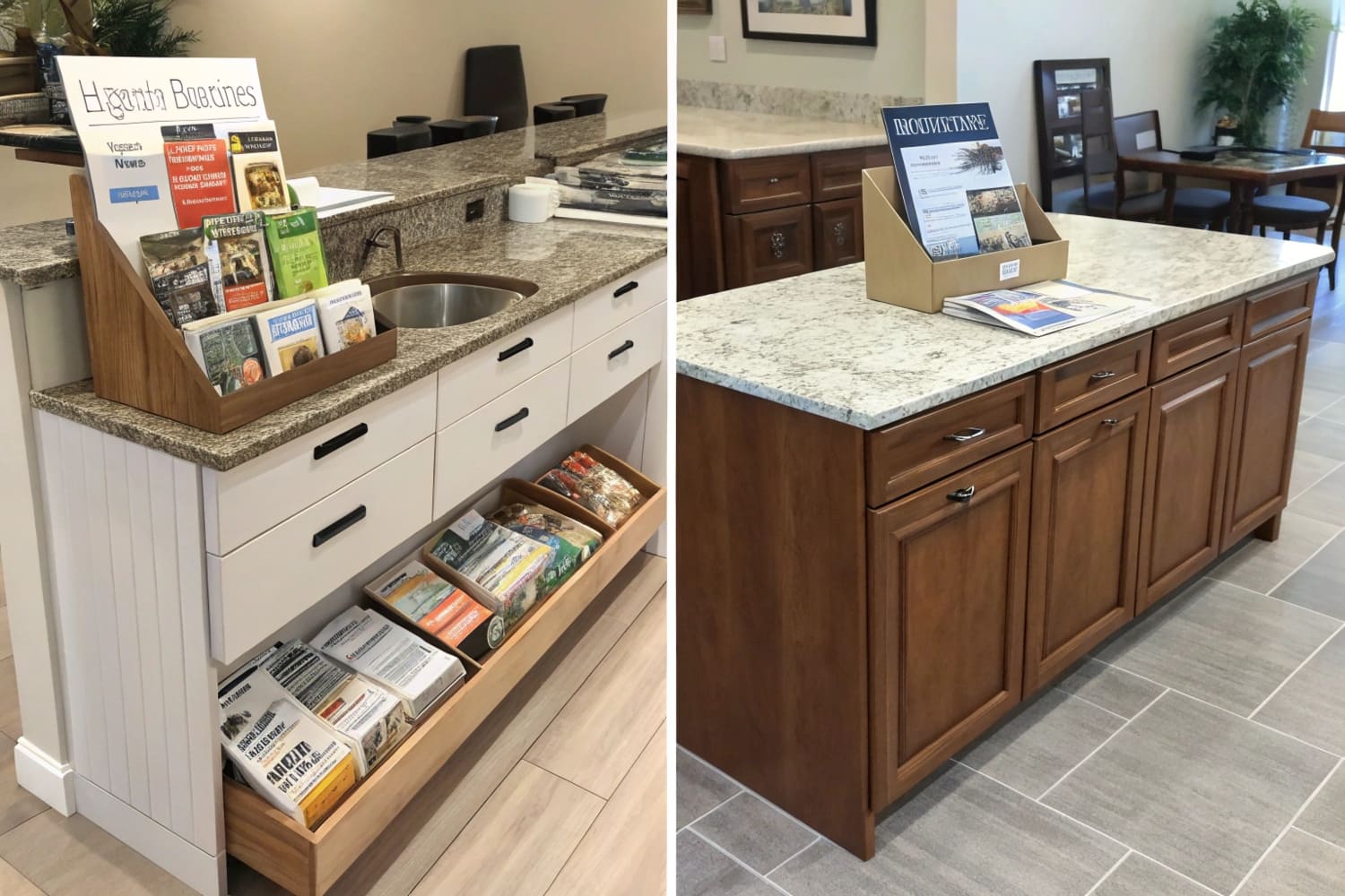
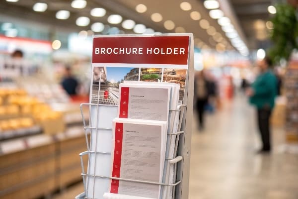
A brochure holder is a small display that organizes and presents brochures at reach height, keeps them upright, shows your message at a glance, and guides the hand to take one.
How a holder earns its space
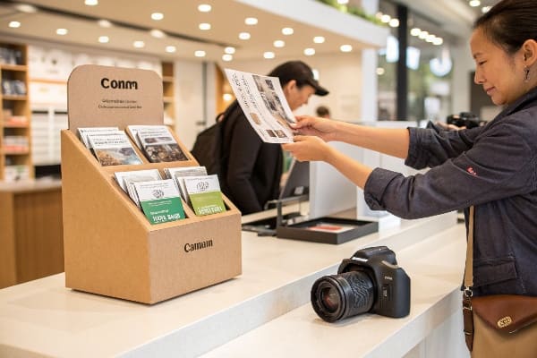
A good holder does four things. It frames the cover, controls the take-out flow, protects edges, and invites action. I tune pocket width so brochures slide but do not slump. I set angles so glare drops and headlines sit in the sight line. I add a header for the one big idea. When a U.S. hunting brand asked for crossbow spec cards1 at launch, I used a compact countertop holder near the optics aisle. Store staff told me shoppers grabbed specs first, then handled bows. The holder made the path clear and safe. I used a tear-away refill guide2 on the back panel to reduce empty pockets. It kept the unit tidy for weeks.
Common holder formats and when to use them
| Format | Best For | Why I pick it |
|---|---|---|
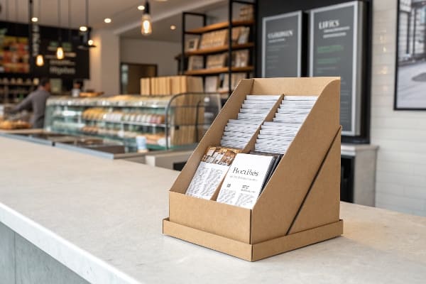
| Countertop3 | Demos, checkout zones | Eye-level, fast install |
| Wall-mount4 | Narrow aisles, compliance walls | No floor use, fixed height |
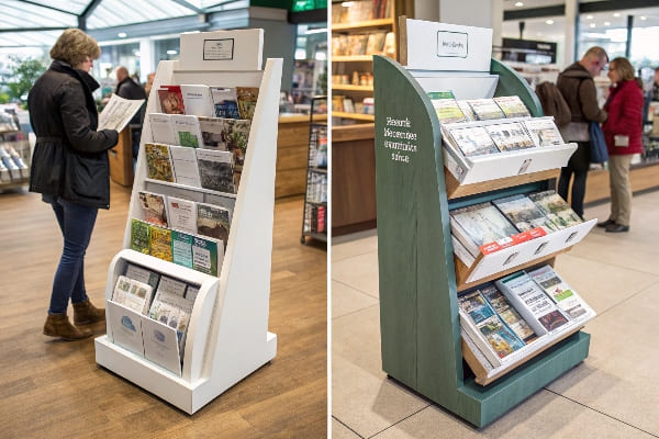
| Floor stand | New product storytelling | Header space, hero graphics |
| Pallet add-on | Warehouse clubs | Bulk refill, quick set |
| PDQ tray | Multi-SKU cards or mini guides | Ships ready, easy restock |
What are the advantages of cardboard packaging?
Budgets are tight. Schedules move fast. Teams ask for greener options. Cardboard answers all three without looking cheap when we print and engineer well.
Cardboard gives lower cost, faster turnaround, lighter weight, rich print, and easier recycling. It ships flat, assembles without tools, and scales from small tests to big runs without large tooling costs.
Why cardboard5 wins on cost, speed, and sustainability
I reduce spend because cardboard needs no expensive metal tooling. I move fast because I cut and print in days, not weeks. I keep freight low because units ship flat. I hit sustainability goals because the board is recyclable and can use recycled fiber. I boost durability6 with smart structure and optional water-based coatings. For outdoor or high-touch zones, I add a clear edge guard and a discreet belly tab to stop dog-eared brochures. I run strength tests on every new design. I stack samples in a ship-test carton, then drop and shake. I use simple pass/fail rules that buyers understand. If the pocket walls hold shape and the header stays square, we pass and move.
Advantage-to-action cheat sheet
| Advantage | What it means in practice | My move to lock it in |
|---|---|---|
| Cost | No metal tooling, less freight | Flat-pack design, nested blanks |
| Speed | Fast dielines, digital print | 24–72h prototypes, free revisions |
| Sustainability7 | Recyclable, PCR options | FSC sources, water-based inks |
| Print quality8 | High-impact color | Full-bleed CMYK with spot brand tones |
| Logistics | Small cube, quick store set | One-piece auto-lock bases, clear guides |
| Strength | Enough for daily use | Cross-grain walls, hidden gussets |
What makes a brochure stand out?
A crowded shelf steals attention. A brochure must speak fast. One big promise wins. The holder must support that promise with angle, light, and clean feed.
A standout brochure shows one big idea, clear hierarchy, sharp color, strong proof, and a simple call to action. The holder amplifies this with eye-line placement, tidy edges, and brand consistency.
My simple formula for standout brochures and holders
I start with "one idea per space9." I put the idea in the header and on the brochure cover. I use a bold line for the benefit, not the feature. I keep supporting copy to three bullets, max. I test the five-second read. If a passerby cannot say the promise in five seconds, I cut. I manage color with print profiles and signed drawdowns. I match brand orange within a small tolerance so the shelf looks consistent. For an outdoor launch, I used matte lamination10 to kill glare under LED strips. I placed QR codes on the holder side wall so the front stayed clean. The code led to a short demo. Store staff could restock from the back with a finger notch. Shoppers saw a crisp face every time.
Standout checklist you can copy
| Element | Why it matters | My action |
|---|---|---|
| Big idea | Fast promise recall | 6–9 word header on holder and cover |
| Visual hierarchy11 | Guides the eye | Large header, mid-size subhead, small body |
| Color accuracy | Brand trust | ICC-managed CMYK, spot hits if needed |
| CTA12 | Drives action | One clear verb near hand reach |
| Proof | Reduces doubt | Seal, rating, or short spec box |
| Clean feed | Keeps face fresh | Back-fill slot, hidden stops, no curl |
What is the brochure rule?
Teams ask for rules. Rules keep design decisions simple. I use a few that work in the real world and inside retail guardrails.
The brochure rule is: one big idea, five-second clarity, one action to take, and no friction to take it. I design the holder and the brochure to pass these four points.
Four rules I apply on every job
I follow the Rule of One13. One idea, one audience, one action. I run the Five-Second Test14. I cover the headline and reveal it. If the message is not clear in five seconds, I rewrite. I set the Z-pattern for Western readers. I place the logo top left or top center, the message across the top, proof at mid-right, and CTA at bottom right near the hand. I borrow the Rule of Thirds for photos so the product sits on a strong line. I add a tactile cue. A small thumb cut or a soft-touch spot makes the "take" feel easy. I also keep compliance in mind. Some chains need specific sizes or materials. I design inside those specs so approvals move fast.
How I build the rules into production
| Rule | Built-in design choice | Quick check before ship |
|---|---|---|
| Rule of One15 | Single-message header and CTA | Read card aloud in 5 seconds |
| Five-Second | Big type, short words | Aisle walk test with store staff |
| Z-pattern | Header → image → proof → CTA | Finger-trace path on print proof |
| Rule of Thirds | Product on a third line | Grid overlay check |
| No friction16 | Thumb notch, smooth pocket, QR on side | "Take one" test with gloves and without |
Conclusion
Cardboard brochure holders win when they are simple, strong, on-brand, and fast. I design, test, and ship them so your message is clear, your shelf is tidy, and your launch stays on time.
Explore this link to understand the significance of crossbow spec cards in enhancing customer experience and sales. ↩
Discover how a tear-away refill guide can keep your display organized and appealing, ensuring a better shopping experience. ↩
Explore how countertop displays can enhance visibility and sales in retail environments. ↩
Learn about the advantages of wall-mount displays for maximizing space and compliance. ↩
Explore this link to understand how cardboard's recyclability and use of recycled fibers contribute to sustainability. ↩
Learn about the various design elements that enhance cardboard's durability, ensuring it meets high standards. ↩
Explore this link to understand how recyclable materials can enhance your brand's sustainability efforts. ↩
Discover the advantages of full-bleed CMYK printing for creating eye-catching and effective packaging designs. ↩
Understanding this concept can greatly enhance your brochure design, making it more effective and engaging for your audience. ↩
Exploring the advantages of matte lamination can help you improve the visual appeal and durability of your brochures. ↩
Understanding visual hierarchy is crucial for effective design, guiding the viewer's attention and enhancing communication. ↩
Exploring effective CTAs can significantly improve engagement and conversion rates in your marketing efforts. ↩
Understanding the Rule of One can enhance your marketing strategy by focusing on clarity and effectiveness. ↩
Exploring the Five-Second Test can help you improve your messaging and ensure it captures attention quickly. ↩
Understanding the Rule of One can enhance your design strategy by focusing on clarity and impact. ↩
Exploring frictionless design principles can significantly improve user satisfaction and engagement. ↩


