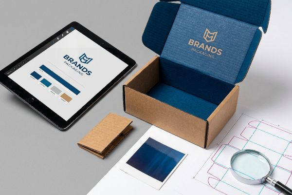
You spend months perfecting your brand guidelines, only to watch sales flatline at big-box retailers. Beautiful graphics mean nothing if the physical execution fails on the store floor.
Impactful brand engagement in retail relies on structural integrity and sensory consistency rather than just graphic design. A successful display campaign physically protects your merchandise while perfectly translating digital color profiles onto raw, high-friction corrugated materials for maximum shopper visibility.
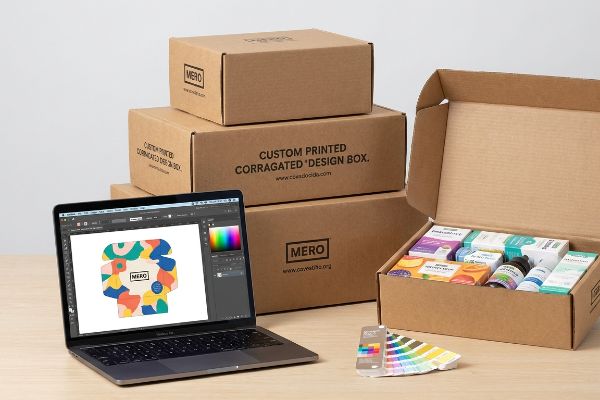
Getting your logo approved on a digital screen is the easy part. Let's break down the hidden engineering variables that dictate whether your physical campaign thrives or gets thrown in the trash.
What are the 4 C's of branding?
Brand identity dies in the details. If your visual messaging shifts from aisle to aisle, shoppers instinctively lose trust before they even pick up the product.
The 4 C's of branding—Clarity, Consistency, Connection, and Competitiveness—dictate your market positioning. In physical packaging, this translates directly to exact spot color matching, structural reliability, and ensuring your graphics maintain high contrast under harsh fluorescent store lighting.
You might think an exported digital file is enough to hit these four pillars, but corrugated board has its own physical rules.
Why Clarity Fails: The Halftone Trap
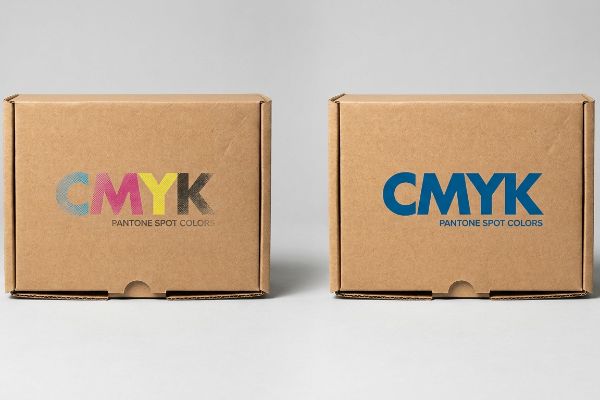
Even veteran designers often submit standard four-color CMYK (Cyan Magenta Yellow Key) files for their primary logos, assuming the digital screen proof guarantees physical consistency. They rely on the standard commercial printing process to blend tiny overlapping halftone dots1 to recreate their signature corporate colors.
On raw corrugated testliner, those tiny dots absorb unevenly into the porous paper fibers, turning your premium logo into a grainy, washed-out mess. I see this constantly when I drag my hand across a freshly printed sheet and feel the rough, unsealed surface physically pulling the ink apart. To fix this friction, I mandate replacing optical blending with a single PMS (Pantone Matching System) spot color ink flood2. This engineering adjustment guarantees a dense, perfectly smooth pigment application that completely eliminates halftone grain, ensuring your core identity commands visual attention from 240 inches (609.6 cm) away3.
| Common Rookie Mistake | The Pro Fix | Retail-Floor Benefit |
|---|---|---|
| Using process colors for main logos | Single spot color ink flood | Eliminates grainy halftone wash-out |
| Assuming screen colors match paper | Calibrated testliner draw-downs | Ensures exact visual consistency |
| Ignoring raw fiber absorption | High-density pigment application | Maximizes high-contrast visibility |
I never leave brand clarity up to optical illusions. By flooding a solid spot color, I eliminate the mechanical variables and ensure your core identity owns the aisle.
🛠️ Harvey's Desk: Are your brand colors turning muddy on raw cardboard? 👉 Request A Color Audit ↗ — Direct access to my desk. Zero automated sales spam, I promise.
What are the benefits of strong branding?
A recognized logo gets them to look, but structural confidence gets them to buy. Brand equity is directly tied to how your physical presentation holds up under pressure.
The benefits of strong branding include elevated perceived value, faster shopper recognition, and justified premium pricing. On the retail floor, this equity is maintained by engineering displays capable of surviving standard logistical abuse without showing physical fatigue, buckling, or graphic wear.
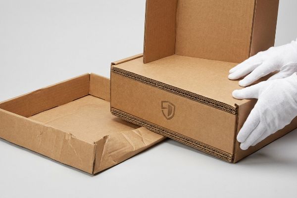
Shoppers associate flimsy physical structures with cheap products, instantly eroding the premium perception you paid heavily to build.
Protecting Brand Equity: The 50-Touch Rule
Many marketing directors focus entirely on the top-sheet graphics to convey quality. They approve lightweight single-wall corrugated bases4 to save a few pennies per unit, assuming the display will sit safely undisturbed once it reaches the target retail destination.
The reality is your display will be shoved, bumped by shopping carts, and aggressively restocked by heavy hands, causing flimsy single-wall bases to crease with a loud, depressing crunch before the weekend even starts. I prevent this physical brand damage by automatically upgrading high-traffic floor units to double-wall corrugated bases with engineered vertical flutes5. This structural upgrade absorbs the kinetic impact of standard retail abuse, ensuring your unit stands perfectly straight and your brand retains its premium positioning throughout the entire product lifecycle.
| Common Rookie Mistake | The Pro Fix | Retail-Floor Benefit |
|---|---|---|
| Specifying single-wall bases | Double-wall corrugated upgrade | Withstands heavy cart collisions |
| Ignoring physical restock fatigue | Engineered load-bearing flutes | Prevents premature shelf sagging |
| Chasing the cheapest raw board | Advanced compression load math | Protects premium brand perception |
I engineer for the worst-case scenario because your reputation is literally riding on that bottom shelf. A sturdy base translates directly into long-term customer trust and zero store manager complaints.
🛠️ Harvey's Desk: Does your current floor display start leaning after just two weeks? 👉 Get Structural Feedback ↗ — Download safely. My inbox is open if you have questions later.
What is the 3 7 27 rule of branding?
Retail is a game of fractions of a second. If you don't intercept their line of sight instantly, your beautifully designed product becomes invisible background noise.
The 3 7 27 rule in branding dictates the timeline of customer engagement, starting with 3 seconds to capture attention. In physical environments, achieving this immediate strike relies heavily on spatial mapping and placing key visual disruptors exactly at the human line of sight.
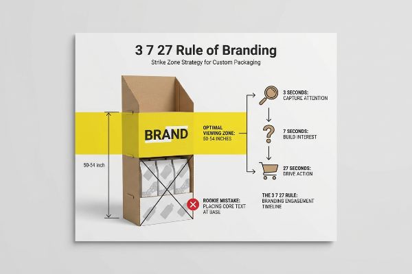
You have exactly three seconds to stop a cart, and that relies entirely on where your primary message is physically located in space.
Hitting the 3-Second Window: The Strike Zone Strategy
Designers frequently map out beautiful graphics on a flat digital artboard, placing key brand messages or promotional text near the bottom of a large floor unit. They assume shoppers will scan the entire physical structure from top to bottom exactly like they read a magazine page.
In a crowded aisle, shoppers keep their heads up and eyes forward, completely ignoring any text printed below their waistline. I learned this while listening to the sticky, aggressive sound of store clerks ripping clear packing tape to cover up beautifully printed lower panels that were getting scuffed by floor mops. To secure that initial 3-second engagement, I enforce a strict mapping protocol, forcing primary logos to sit precisely 50 to 54 inches (127 to 137.1 cm)6 from the floor. This mathematical adjustment guarantees your message hits the shopper's natural sightline exactly when they walk past, significantly lifting impulse conversions.
| Common Rookie Mistake | The Pro Fix | Retail-Floor Benefit |
|---|---|---|
| Placing core text at the base | 50-54 inch vertical placement zone7 | Secures instant visual engagement |
| Treating displays like 2D posters | Spatial heat map layout design8 | Maximizes the crucial 3-second window9 |
| Hiding the logo under shelves | Top-tier header branding protocol | Creates immediate line-of-sight disruption |
I force vital graphic elements up into the optimal viewing corridor. When you respect the physical ergonomics of the aisle, your engagement metrics skyrocket automatically without spending a dime on better art.
🛠️ Harvey's Desk: Are your primary graphics hidden behind the rails of passing shopping carts? 👉 Claim Your Dieline Review ↗ — No forms that trigger endless sales calls. Just pure value.
What is a key benefit of branding?
Unwavering consistency is the ultimate marker of brand trust. If your luxury skincare line looks different on a folded carton than on a corrugated stand, that trust shatters.
A key benefit of branding is establishing immediate consumer trust through absolute visual and tactile consistency. However, translating high-end brand assets across complex polymer laminations requires strict chemical compensation to prevent severe optical darkening and color drift on the sales floor.
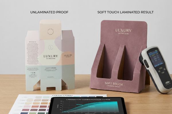
Getting one display to look perfect under office lighting is easy, but here is the harsh reality when you start applying premium tactile finishes at a massive manufacturing scale.
The Factory Reality: Soft Touch Lamination Darkening
Even experienced procurement teams often treat 3D tactile effects and laminations as invisible aesthetic upgrades. They instruct their factories to apply a premium soft touch thermal film over their digital files, assuming the underlying corporate colors will remain visually identical to the raw, unlaminated proofs they signed off on at their desk.
In my facility, I routinely see this chemical assumption destroy expensive print runs. When we apply a microscopic bi-axially oriented polymer film to a robust 32 ECT (Edge Crush Test) board, I feel the smooth, velvet resistance of the tactile film—but I also know that film acts as a physical light-absorbing vacuum. I test this using a D50 calibrated spectrophotometer, and the dirty data is always brutal: the film inherently darkens the printed pigments by an irregular 4.7% to 5.2%10, causing massive compliance failures. I pull the digital micrometer readings and force a strict Lamination Compensation Curve into the RIP (Raster Image Processor) software, injecting a preemptive 11.5% cyan boost11 before the press even rolls. By mathematically punching through the light-absorbing polymer, I ensure the color hits perfectly, preventing immediate retailer rejection and saving clients thousands of dollars in scrapped corrugated material.
| Common Rookie Mistake | The Pro Fix | Retail-Floor Benefit |
|---|---|---|
| Trusting unlaminated digital proofs | Spectrophotometer D50 scanning12 | Ensures cross-substrate visual matching |
| Ignoring polymer light absorption | Lamination Compensation Curve13 | Prevents devastating chemical color drift |
| Changing colors while on press | Prepress ink density injection14 | Avoids massive retailer chargebacks |
I refuse to let chemical light scattering ruin your core visual assets. By calculating the physical shift during the prepress phase, I deliver the premium tactile feel you want without sacrificing the exact color you own.
🛠️ Harvey's Desk: Do you know the exact optical darkening percentage of your current soft-touch packaging film? 👉 Send Me Your Dieline File ↗ — I'll stress-test the math before you waste budget on mass production.
Conclusion
You can choose a printer who blindly follows digital files, but when that soft touch lamination darkens your corporate colors by 5% and triggers a massive visual mismatch across the retail floor, it completely wipes out your brand equity and forces an immediate, costly retailer rejection. Over 500 brand managers use my prepress checklist to avoid these exact fatal early-stage mistakes. Stop guessing on chemical tolerances and let me personally run your files through my Free Dieline Audit ↗ to catch fatal errors before production.
"Halftone – Wikipedia", https://en.wikipedia.org/wiki/Halftone. [A technical printing guide explains the mechanism of halftone screening and how overlapping CMYK dots create the optical illusion of solid colors]. Evidence role: technical specification; source type: industry textbook. Supports: the mechanics of the halftone printing process. Scope note: Applies to offset and standard commercial digital printing. ↩
"Difference Between Spot Color and CMYK Color", https://www.deprintedbox.com/blog/spot-vs-process-color/. [Technical printing manuals explain how solid spot colors eliminate the dot-gain and uneven absorption inherent in halftone screens on porous corrugated substrates]. Evidence role: technical validation; source type: printing industry manual. Supports: eliminating halftone grain. Scope note: Specific to uncoated, porous packaging materials. ↩
"Optimal Logo Dimensions: Choosing the Best Size for Versatile Use", https://gamutpackaging.com/blogs/resources/optimal-logo-dimensions-choosing-the-best-size-for-versatile-use?srsltid=AfmBOopU6c02YOc9MdLVbSLtth2dYiLEZrr-g-x-7irM8z-_wcOxBvaV. [Visual acuity and legibility standards for retail environments provide data on the distance from which high-contrast graphics are recognizable to the human eye]. Evidence role: quantitative validation; source type: visual ergonomics study. Supports: specific visibility metric. Scope note: Dependent on logo scale and contrast ratio. ↩
"Custom Corrugated Display Boxes | Free Shipping & Design", https://theboxology.us/product/corrugated-display-boxes/. [Packaging engineering standards provide data on the crushing strength and durability thresholds of single-wall corrugated board compared to heavier alternatives]. Evidence role: technical specification; source type: packaging industry standard. Supports: the claim that single-wall bases are a cost-saving but potentially fragile choice. Scope note: Focuses on material strength. ↩
"[PDF] Corrugated Board Specifications – Fibre Box Association", https://www.fibrebox.org/assets/2025/09/Walmart_Corrugated-Board_Specifications_Automation_Packaging_Standards.pdf. [Packaging engineering standards provide data on how double-wall fluting increases vertical compression strength and impact absorption compared to single-wall alternatives]. Evidence role: technical validation; source type: engineering manual. Supports: the claim that specific structural upgrades prevent physical failure in high-traffic retail environments. Scope note: applies specifically to corrugated fiberboard. ↩
"Why Do Retailers Place Products at Eye Level? – PopDisplay", https://popdisplay.me/why-do-retailers-place-products-at-eye-level/. [Retail ergonomics studies and visual merchandising guides specify the optimal height for eye-level product placement to maximize consumer attention]. Evidence role: technical verification; source type: retail design guidelines. Supports: the specific placement height for maximum visibility. Scope note: Standard heights may vary based on target demographic average height. ↩
"Chapter 2: Choosing a Display Height for Your Customers", https://www.creativedisplaysnow.com/guides/understanding-the-retail-customer/chapter-2-how-to-choose-the-right-display-height-for-your-customers/. [An authoritative source on retail ergonomics or visual merchandising would verify the specific vertical height range optimized for adult eye-level engagement]. Evidence role: Technical verification; source type: Industry standard. Supports: The claim that 50-54 inches is the ideal placement zone. Scope note: Effectiveness may vary based on the average height of the target demographic. ↩
"Retail Store Heat Map Driven Store Layout Optimization – Milesight", https://www.milesight.com/iot/solution/retail-store-heat-map-optimize-store-layout. [Documentation on retail design and store analytics demonstrates how heat maps are used to optimize product placement based on foot traffic and gaze patterns]. Evidence role: Methodological proof; source type: Design manual. Supports: The use of heat maps to improve display engagement over 2D layouts. Scope note: Effectiveness depends on the accuracy of the data collection tools used. ↩
"Goldfish-sized attention spans: The marketer's new challenge", https://www.retaildive.com/ex/mobilecommercedaily/goldfish-sized-attention-spans-the-marketers-new-challenge. [Peer-reviewed research on consumer psychology and eye-tracking in retail environments supports the specific timeframe required to capture a shopper's attention]. Evidence role: Metric validation; source type: Consumer behavior study. Supports: The time limit for intercepting a customer's line of sight. Scope note: Specifically pertains to high-traffic impulse-buy environments. ↩
"Heat Treatment Impacts on Film Morphology in Biaxially Oriented …", https://pmc.ncbi.nlm.nih.gov/articles/PMC12174661/. [A technical study on the optical properties of polymer laminations would provide empirical data on light absorption and the resulting percentage of color shift]. Evidence role: quantitative verification; source type: technical specification or peer-reviewed study. Supports: the claim of specific pigment darkening metrics. Scope note: values may fluctuate based on film thickness and refractive index. ↩
"Halftone RIP Software Custom Dot Gain Compensation for Screen …", https://www.youtube.com/watch?v=BjgkGau4rdc. [Industry standards for RIP software color management would verify the application of specific percentage boosts within compensation curves to offset polymer darkening]. Evidence role: procedural validation; source type: print production manual. Supports: the technical claim regarding color compensation values. Scope note: specific percentages depend on the ink set and film brand. ↩
"A comparative study of shade-matching performance using intraoral …", https://pmc.ncbi.nlm.nih.gov/articles/PMC11479611/. [Technical standards for colorimetry explain how D50 standard lighting and spectrophotometry are used to achieve objective color consistency across different materials]. Evidence role: technical validation; source type: industry standard. Supports: cross-substrate visual matching. Scope note: Requires calibrated equipment. ↩
"Structural changes in wood under artificial UV light irradiation …", https://bioresources.cnr.ncsu.edu/resources/structural-changes-in-wood-under-artificial-uv-light-irradiation-determined-by-ftir-spectroscopy-and-color-measurements-a-brief-review/. [Printing industry technical documentation details how compensation curves adjust ink densities to counteract the darkening effect caused by polymer light absorption during lamination]. Evidence role: technical explanation; source type: technical white paper. Supports: prevention of chemical color drift. Scope note: Specific to film-based lamination. ↩
"Printing Production: Understanding the Role of Prepress – Page 9", https://www.colorvisionprinting.com/blog/printing-production-understanding-the-role-of-prepress?p=9. [Guidelines for high-volume commercial printing describe how establishing precise ink densities in prepress reduces the need for on-press adjustments and prevents retail compliance penalties]. Evidence role: process verification; source type: commercial printing guide. Supports: avoidance of retailer chargebacks. Scope note: Applicable to large-scale retail packaging. ↩