لا يكفي مجرد امتلاك منتج جيد للتميز في ممرات متاجر التجزئة الكبيرة. بل يجب أن يعكس تغليف منتجاتك وطريقة عرضها رسالتك الأساسية بوضوح للمتسوقين المارين.
تُعدّ مبادئ العلامة التجارية الثلاثة - الوضوح، والاتساق، والثبات - ركائز أساسية تُحدد كيفية إدراك المستهلكين لعلامتك التجارية. يضمن الوضوح سهولة فهم رسالتك، ويحافظ الاتساق على هوية بصرية موحدة عبر جميع المنصات، بينما يبني الثبات ثقة طويلة الأمد من خلال تفاعلات إيجابية متكررة وموثوقة مع عبوات منتجاتك.
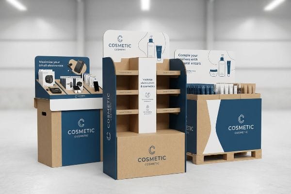
إن فهم هذه المفاهيم المجردة أمر سهل، لكن تنفيذها بشكل مثالي في أرضية مصنع صاخبة يمثل تحديًا مختلفًا تمامًا.
ما هي العناصر الثلاثة الأساسية للعلامة التجارية؟
يتطلب الحفاظ على سلامة العلامة التجارية للمواد الخام انضباطاً صارماً وضوابط تصنيع دقيقة.
تعتمد عناصر العلامة التجارية الثلاثة بشكل كبير على التناسق المادي في بيئات البيع بالتجزئة. ويتطلب تحويل عناصر العلامة التجارية الرقمية إلى عروض مادية من الكرتون المموج مطابقة دقيقة للألوان ووضوحًا هيكليًا. عندما تظل الهوية البصرية لعلامتك التجارية ثابتة في جميع مواقع المتاجر، يكتسب المتسوقون ثقة فورية وولاءً طويل الأمد للعلامة التجارية.
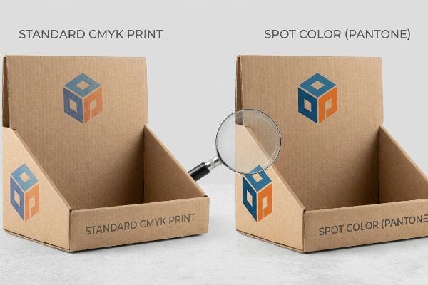
لكن تحقيق هذا التناسق البصري يتطلب أكثر من مجرد إرسال ملف فني قياسي إلى الشركة المصنعة.
طباعة الأحرف الثلاثة C: فخ ترجمة CMYK
حتى فرق التسويق ذات الخبرة غالباً ما تحوّل شعاراتها المؤسسية المتينة إلى تنسيقات الطباعة القياسية بأربعة ألوان، ظنّاً منها أن طابعات المصانع ستُحاكي شاشاتها الرقمية بدقة متناهية . 1 ويعتمدون على نماذج فنية أساسية للتحقق من الهوية البصرية الرئيسية لعلامتهم التجارية. لسوء الحظ، لا يُراعي هذا النهج القياسي في الطباعة التجارية الطبيعة المادية لعبوات الكرتون الخام . 2
تتأثر جودة الطباعة بسهولة بمسامية ورق الطباعة المموج القياسي. شاهدتُ ذات مرة علامة تجارية رائدة في مجال السلع الاستهلاكية المعبأة تُطلق حملة إعلانية ضخمة على منصات نقالة ، لأجد أن شعارها الرقمي الواضح قد تحول إلى ضبابية باهتة تحت إضاءة الفلورسنت القوية في متاجر البيع بالتجزئة. تمتص نقاط الحبر الصغيرة المتداخلة من نظام CMYK (الأزرق السماوي والأرجواني والأصفر) بشكل غير متساوٍ في ألياف الورق الخام ، مما يُنتج ملمسًا خشنًا يبدو سيئًا من مسافة 6.09 متر. ولحل هذه المشكلة، أعتمد بروتوكولًا خاصًا لتغطية جميع عناصر العلامة التجارية الأساسية بلون واحد، وذلك بمزج لون واحد من ألوان بانتون (PMS) لإنشاء طبقة كثيفة وناعمة تمامًا من الصبغة. هذا التغيير البسيط في الحبر يُزيل التحبب البصري ويضمن بقاء وضوح علامتك التجارية فائقًا.
| أخطاء شائعة للمبتدئين | الحل الاحترافي | فوائد أرضية البيع بالتجزئة |
|---|---|---|
| استخدام نظام الألوان CMYK القياسي للشعارات | تطبيق ألوان بانتون الموضعية5 | يمنع إعادة إنتاج الشعار بشكل غير واضح |
| تجاهل امتصاص ألياف الورق | تغليف الورق المقوى مسبقًا أو استخدام حبر كثيف6 | يحافظ على ألوان العلامة التجارية النابضة بالحياة |
| الموافقة على نسخ PDF الرقمية فقط | يتطلب سحب الحبر فعليًا7 | يضمن تناسقًا دقيقًا للألوان |
أحرص دائمًا على مطابقة الألوان على الورق المقوى المموج قبل بدء الإنتاج بكميات كبيرة. لا يمكنك الحفاظ على اتساق علامتك التجارية إذا اعتمدت بشكل أعمى على شاشة كمبيوتر بإضاءة خلفية للتنبؤ بكيفية تفاعل الحبر مع الورق الخام.
🛠️ مكتب هارفي: هل تبدو ألوان علامتك التجارية الأساسية باهتة عند الطباعة على ورق مقوى خام؟ 👉 احصل على تدقيق ألوان القوالب ↗ — تواصل مباشر مع مكتبي. أعدك بعدم تلقي أي رسائل تسويقية آلية مزعجة.
ما مدى فعالية التسويق البصري وعروض واجهات المتاجر في جذب العملاء؟
تُعدّ عملية عرض البضائع المادية بمثابة الفلتر البصري الأخير قبل أن يتخذ المتسوق قرار الشراء النهائي.
تُعدّ العروض المرئية وواجهات المتاجر من الوسائل الفعّالة للغاية في جذب الزبائن وتحويلهم إلى مشترين عفويين. فالهياكل المصممة هندسيًا بشكل جيد تكسر الرتابة البصرية في الممرات المزدحمة، وتجذب انتباه المستهلكين بقوة، وتساهم في نمو الإيرادات بشكل ملموس عند مواءمتها بشكل صحيح مع مناطق التفاعل النفسي للزبائن واستراتيجيات البيع بالتجزئة المكانية.

يبدو جذب الانتباه أمراً بسيطاً في قاعة اجتماعات مجلس الإدارة، لكن تنفيذه في متجر كبير فوضوي يتطلب حسابات مكانية دقيقة.
قاعدة 3-3-3 للتشويش البصري
غالباً ما تصمم فرق العلامات التجارية عروض نقاط البيع (POP) الخاصة بها وهي تحدق في شاشة الكمبيوتر. إذ تملأ اللوحات العلوية والجانبية بنصوص كثيفة ورسومات معقدة، على أمل تثقيف المشتري حول كل ميزة من ميزات المنتج. تتجاهل فلسفة التصميم هذه، التي تركز على التفاصيل الدقيقة، الواقع المادي لكيفية تنقل البشر في ممرات المتاجرالواسعة.
يجب أن يعتمد العرض الفعال للغاية على التدرج المكاني 3-3-3 ، لكنني أرى في كثير من الأحيان علامات تجارية تفشل في تحقيق أول خطوة. راجعتُ مؤخرًا عرضًا مطبوعًا بشكل جميل، لكنه اندمج تمامًا مع الخلفية لأن المصممين لم يضيفوا أي أشكال هيكلية بارزة ومقطوعة بشكل واضح لجذب الانتباه من مسافة 9.14 متر. بدون هذا التأثير البصري الأولي، يمر المتسوقون المتسرعون ببساطة، مما يُقلل بشكل كبير من عائد الاستثمار للعرض. أصمم عروضًا مادية تُؤثر على ثلاثة مسافات محددة: قطع بارزة لجذب الانتباه من مسافة 9.2 متر، وارتفاعات أرفف مريحة في منطقة جذب الانتباه 127 سم لجذب الانتباه من مسافة متر واحد، وحواف ناعمة ضحلة لتحقيق التفاعل اللمسي النهائي من مسافة 7.62 سم. هذه الحسابات المكانية تُحفز التفاعل المادي.
| أخطاء شائعة للمبتدئين | الحل الاحترافي | فوائد أرضية البيع بالتجزئة |
|---|---|---|
| تصميم مخصص للقراءة عن قرب | باستخدام عناوين ثلاثية الأبعاد جريئة مقطوعة بالقالب | يلفت الانتباه من مسافة 30 قدمًا11 |
| ازدحام الشاشة بالنصوص | عزل عرض المنتج الأساسي | يمنع الإرهاق المعرفي للمتسوق12 |
| منتجات حجب الشفاه الأمامية | قصّ حواف التثبيت إلى ارتفاع 15%13 | يحفز الاندفاعات الفورية |
أرفض السماح للعلامات التجارية بإهدار أموالها على صناديق مسطحة وغير مرئية لا تجذب الزبائن. تصميم شاشات عرض تتناسب مع مسافات تفاعل محددة هو الطريقة الوحيدة المؤكدة لتحقيق زيادة هائلة في مبيعات التجزئة.
🛠️ مكتب هارفي: هل يندمج عرض منتجاتك الحالي مع خلفية المتجر من مسافة ثلاثين قدمًا؟ 👉 اطلب تقييمًا هيكليًا ↗ — حمّل الملف بأمان. صندوق رسائلي مفتوح إذا كانت لديك أي أسئلة لاحقًا.
كيفية إيصال غاية العلامة التجارية؟
يتطلب إيصال قيمك الأساسية توافقاً تاماً بين رسالتك التسويقية والمواد المادية.
يتطلب إيصال رسالة العلامة التجارية دمج قيمها الأساسية مباشرةً في مواد التغليف المادية. فإذا كانت شركتكم تُشجع الاستدامة، فإن استخدام ألواح الكرتون المموجة القابلة لإعادة التدوير بالكامل والطلاءات المائية الصديقة للبيئة يُعزز رسالتكم البيئية بشكل ملموس، مما يُتيح للمستهلكين تجربة رسالتكم الحقيقية من خلال عروض بيع بالتجزئة ملموسة ومتوافقة مع المعايير.
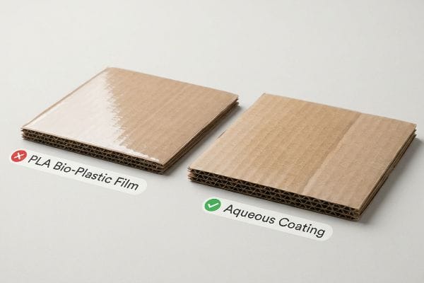
لسوء الحظ، تقوم العديد من العلامات التجارية بتخريب غرضها عن طريق الخطأ من خلال اختيار التركيبة الكيميائية الخاطئة للتصنيع.
الأصالة وفخ البلاستيك الحيوي PLA
تُلزم إدارات التسويق بشكل متزايد باستخدام عبوات صديقة للبيئة للتعبير عن التزامها بالاستدامة البيئية. وغالبًا ما تُحدد هذه الإدارات استخدام رقائق بلاستيكية حيوية مصنوعة من حمض البوليلاكتيك (PLA)14، على افتراض أن هذه المادة المصنوعة من الذرة تضمن تلقائيًا الامتثال لمتطلبات إعادة التدوير لدى متاجر التجزئة الكبرى15.نظريًا، يبدو هذا وكأنه الطريقة المثلى لإيصال رسالة العلامة التجارية الخضراء إلى المستهلكين المهتمين بالبيئة.
الحقيقة المُرّة هي أن هذا الخيار الكيميائي يُدمّر فعلياً إمكانية إعادة تدوير الشاشة10,000 وحدة باستخدام غشاء PLA لأن أحواض إعادة تدوير الكرتون المموج القديم (OCC) القياسية ترفض هذه الطبقة البلاستيكية الصلبة، مما يُحوّل الدفعة بأكملها إلى مكب النفايات ويُعرّض العلامة التجارية لانتقادات لاذعة بسبب مزاعم التضليل البيئي. يُشكّل الاحتكاك اللزج لمحاولة تقشير هذا الغشاء الصلب عن الكرتون الخام كابوساً حقيقياً لعمال مراكز إعادة التدوير. بدلاً من ذلك، أُطبّق بصرامة بروتوكول طلاء مائي سائل على هذه الأغشية الصلبة. يذوب هذا الطلاء المائي بسلاسة أثناء إعادة التدوير،مما يضمن بقاء شاشتك قابلة لإعادة التدوير بنسبة 100%، ويُثبت في الوقت نفسه الهدف البيئي لعلامتك التجارية.
| أخطاء شائعة للمبتدئين | الحل الاحترافي | فوائد أرضية البيع بالتجزئة |
|---|---|---|
| تحديد مواصفات أغشية البلاستيك الحيوي PLA الصلبة | التحول إلى الطلاءات المائية السائلة | يضمن إمكانية إعادة التدوير بنسبة 100% من خلال خدمة إعادة التدوير المنزلية18 |
| باستخدام مشابك بلاستيكية مصنوعة من مواد مختلطة | أقفال ورقية مصممة على طراز الأوريغامي | يزيل التزامات الحوكمة البيئية والاجتماعية والمؤسسية الخطرة |
| تجاهل التخلص في نهاية العمر الافتراضي | تصميم الهياكل أحادية المادة19 | يجتاز عمليات التدقيق الصارمة للاستدامة لدى تجار التجزئة |
أحرص على أن يتطابق كل مكون مادي مع الادعاء التسويقي المطبوع على رأس الصفحة. عندما تُواءم كيمياء التصنيع الهيكلي مع أهدافك البيئية المعلنة، فإنك تبني ثقة راسخة لدى جمهورك المستهدف.
🛠️ مكتب هارفي: هل تُفسد طبقات التغليف البلاستيكية المخفية مزاعم علامتك التجارية بشأن الاستدامة؟ 👉 اطلب تقرير تدقيق المواد الخاص بك ↗ — لا توجد استمارات تُسبب مكالمات مبيعات لا تنتهي. قيمة حقيقية فقط.
لماذا يُعد عرض المنتجات مهماً؟
لا تكون الشاشة ذات قيمة إلا إذا نجت بالفعل من سلسلة التوريد العالمية سليمة.
يُعدّ عرض المنتجات أمراً بالغ الأهمية لأنه يُمثّل الهيكل الأساسي لعرض بضائعك وحمايتها. فإلى جانب الجانب الجمالي، تمتصّ الوحدات الكرتونية المموجة المصممة هندسياً الصدمات الناتجة عن النقل، مما يضمن وصول حملاتك التسويقية القيّمة إلى المتاجر سليمة تماماً وجاهزة لتحقيق إيرادات فورية في صالة العرض.
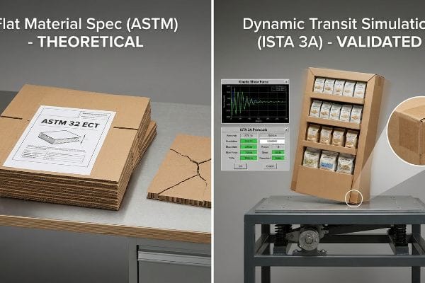
لكن معرفة النظرية لا تكفي عندما تبدأ الآلات بالعمل وتبدأ حاويات الشحن البحري بالاهتزاز.
لماذا تفشل مواصفات المواد القياسية ASTM في أرضية المصنع؟
كثيراً ما تعتمد فرق المشتريات في الموافقة على حملات إطلاق منتجاتها في متاجر التجزئة على مواصفات المواد الخام فقط. فهم ينظرون إلى وثائق المورد التي تُظهر تصنيفاً عالياً وفقاً لمعايير الجمعية الأمريكية لاختبار المواد (ASTM)، مثل لوح حاصل على تصنيف 32 في اختبار مقاومة الحواف (ECT) ، ويفترضون أن هذه القوة النظرية تضمن تلقائياً عرضاً آمناً ومتيناً للمنتج . إنهم يثقون بأن جودة الكرتون الخام تعني جودة الهيكل النهائي.
في منشأتي، أشهد بشكل روتيني انهيار هذه الافتراضات النظرية بشكل مفاجئ أثناء اختبارات ما قبل الإنتاج. فمعرفة حد الانضغاط الساكن لألياف الورق المسطحلا قيمة لها عندما تتعرض شاشة عرض ثلاثية الأبعاد محملة بالكامل للقص الديناميكي تحت تأثير اهتزازات متعددة المحاور لشاحنة متحركة. عندما أضع هذه التصاميم المصنفة على أنها مسطحة على طاولات الاهتزاز الخاصة بي وفقًا لمعايير ISTA (الرابطة الدولية للنقل الآمن)، غالبًا ما أسجل قوة قص حركية مدمرة تبلغ 85.04 كجم (187.5 رطل) تتسبب في انبعاج تموجات القاعدة، مما يؤدي إلى تمزق شديد في رسومات الورقة العلوية. ولحل هذه المشكلة، أفرض عملية تحقق ثنائية المراحل تتجاوز فحوصات ASTM الساكنة لتشمل محاكاة النقل الديناميكي الكاملة وفقًا لمعيار ISTA 3A.من خلال تعزيز الزوايا المحددة التي تفشل على طاولة الاختبار رياضيًا، أتخلص من التقوس المجهري الذي يسبب الإجهاد الهيكلي. بتطبيق بروتوكول الاختبار الديناميكي هذا، أضمن بقاء حملتك الإعلانية سليمة حتى مع الشحنات المكدسة فوق بعضها، مما يوفر على العملاء آلاف الدولارات من البضائع التالفة ويمنع عمليات رد الأموال الباهظة من تجار التجزئة.
| أخطاء شائعة للمبتدئين | الحل الاحترافي | فوائد أرضية البيع بالتجزئة |
|---|---|---|
| بالاعتماد فقط على تصنيفات المواد المسطحة وفقًا لمعيار ASTM | إلزام إجراء عمليات محاكاة كاملة لوسائل النقل وفقًا لمعيار ISTA 3A23 | يمنع انهيار الشحنات الكارثي |
| تجاهل اهتزازات العبور متعددة المحاور24 | تقوية القص الحركي الهندسي | يحافظ على قواعد العرض مربعة تمامًا |
| شحن كراتين رئيسية محملة غير مختبرة | اختبار الشكل الهندسي المُجمَّع بالكامل | يلغي عمليات رد المبالغ المدفوعة من قبل تجار التجزئة25 |
أعتمد على بيانات اختبارات قاسية وحركية للتحقق من صحة كل هيكل قبل مغادرته من منصتي. إن أي شاشة عرض تصبح عديمة القيمة تمامًا لعلامتك التجارية إذا وصلت إلى المتجر محطمة أو مائلة أو متضررة بشكل كارثي.
🛠️ مكتب هارفي: لا تدع عيبًا هيكليًا بحجم 2 مليمتر يُفسد إطلاقًا ضخمًا لـ 500 متجر. 👉 أرسل لي ملف تصميم القالب ↗ — سأُجري اختبارات دقيقة للحسابات قبل أن تُهدر ميزانيتك على الإنتاج الضخم.
خاتمة
يمكنك الاعتماد على التقييمات النظرية للمواد، ولكن عندما تتعرض لوحة 32ECT غير المختبرة للاهتزازات أثناء الشحن، ستواجه رفضًا فوريًا من تجار التجزئة وخسائر مالية فادحة. هذه هي ورقة المواصفات الدقيقة التي يستخدمها أفضل 10 عملاء تجزئة لديّ لضمان عدم رفض أي منتج. توقف عن التخمين بشأن التفاوتات الهيكلية، ودعني أُجري شخصيًا تدقيقًا مجانيًا لخط الطباعة ↗ لاكتشاف أي عيوب حركية قاتلة قبل بدء الإنتاج بكميات كبيرة.
"RGB مقابل CMYK: دليل 2026 لألوان الطباعة المثالية"، https://www.jukeboxprint.com/blog/rgb-vs-cmyk-for-print?srsltid=AfmBOoqPuLP41U3qaTkTDGGzP8FmatNMLVMtjT2qdXPttLZ5IkF7K8Qd. شرحٌ لاختلاف نطاق الألوان بين نموذجي RGB (الشاشة) وCMYK (الطباعة)، مما يحول دون الحصول على نسخ مثالية للألوان. دور الدليل: التحقق من صحة المعلومات؛ نوع المصدر: دليل علم الألوان. يدعم: الادعاء بأن الألوان الرقمية لا يمكن نسخها بدقة تامة في الطباعة. ملاحظة النطاق: نظرية الطباعة العامة. ↩
شرح الفرق بين ألوان RGB وCMYK | We Custom Boxes، https://www.wecustomboxes.com/blog/rgb-vs-cmyk-color/. تحليل فني لكيفية تأثير مسامية الركيزة واللون الأساسي للكرتون المموج الخام على امتصاص الحبر وتغير اللون. دور الدليل: التحقق الفني؛ نوع المصدر: دليل صناعة التغليف. يدعم: الادعاء بأن عمليات CMYK القياسية غير كافية للكرتون الخام. ملاحظة النطاق: ينطبق على الركائز غير المطلية. ↩
"النمذجة الرياضية واستراتيجيات التعويض لطباعة النقاط..."، https://pmc.ncbi.nlm.nih.gov/articles/PMC12574880/. شرح تقني لكيفية تفاعل نقاط الطباعة النصفية في الطباعة مع الركائز المسامية، مما يؤدي إلى زيادة حجم النقاط وامتصاصها بشكل غير متساوٍ. دور الدليل: التحقق التقني؛ نوع المصدر: معايير صناعة الطباعة. يدعم: الادعاء بأن نظام ألوان CMYK يؤدي إلى تدهور جودة الصورة على الورق المقوى الخام. ملاحظة النطاق: يتعلق بالمواد المموجة غير المطلية. ↩
مقارنة بين نظامي بانتون وCMYK لتغليف العلامات التجارية المخصصة - EcoEnclose، https://www.ecoenclose.com/blog/pantone-vs-cmyk-for-custom-branded-packaging?srsltid=AfmBOopV9cbW9sYAQETufZfcIpziaGFjy2XIGhmK85ZHbr0H91_tbpI- مقارنة بين تغطية الحبر الصلب (البقعي) وألوان عملية الطباعة النصفية من حيث كثافة الصبغة وشفافيتها على الورق الخام. دور الدليل: التحقق من صحة الحل التقني؛ نوع المصدر: دليل فنون الطباعة. يدعم: الادعاء بأن حبر PMS يوفر طبقة أكثر نعومة وكثافة. ملاحظة النطاق: خاص بالألوان الموضعية عالية الصبغة. ↩
"الطباعة بالألوان الموضعية مقابل الطباعة بالألوان الأساسية - بانتون"، https://www.pantone.com/articles/technical/spot-vs-process-color?srsltid=AfmBOoot7J6wms0SoC0jk11E81RwDT6JgzPYskrHHf9PtdpcPJjgPSQK. شرح تقني لسبب تجنب الألوان الموضعية لمشاكل مزج الأحبار وتغيرات الألوان المتأصلة في الطباعة بالألوان الأساسية CMYK. دور الدليل: التحقق التقني؛ نوع المصدر: دليل صناعة الطباعة. يدعم: تفوق الألوان الموضعية في الحفاظ على اتساق العلامة التجارية. ملاحظة النطاق: ينطبق بشكل أساسي على الطباعة الأوفست والطباعة بالشاشة الحريرية الاحترافية. ↩
"تأثير ظروف صناعة الورق على امتصاص الحبر والطباعة المتراكبة..."، https://bioresources.cnr.ncsu.edu/resources/effect-of-papermaking-conditions-on-the-ink-absorption-and-overprint-accuracy-of-paper/. تحليل لكيفية تأثير مسامية الركيزة على تشبع الصبغة وفعالية عوامل منع التسرب في منع امتصاص الحبر. دور الدليل: التحقق من صحة علم المواد؛ نوع المصدر: دليل هندسة التغليف. يدعم: طرق الحفاظ على حيوية اللون على المواد المسامية. ملاحظة النطاق: خاص بركائز مثل الورق المقوى المموج أو الورق المعاد تدويره. ↩
[ملف PDF] التدقيق الافتراضي في صناعة التغليف، https://digitalcommons.calpoly.edu/cgi/viewcontent.cgi?article=1039&context=grcsp. مقارنة بين تمثيلات الألوان على الشاشة والتطبيق الفعلي للصبغة على سطح محدد لضمان الدقة. دور الدليل: معيار مراقبة الجودة؛ نوع المصدر: معايير مهنية في فنون التصميم الجرافيكي. يدعم: ضرورة وجود نماذج مادية لمطابقة الألوان بدقة. ملاحظة النطاق: يقتصر على متطلبات هوية العلامة التجارية عالية الدقة. ↩
"تقييم انتباه المستهلك وإثارته باستخدام تتبع حركة العين..."، https://pmc.ncbi.nlm.nih.gov/articles/PMC8380820/. يشرح بحثٌ موثوق في علم النفس البيئي وتصميم متاجر التجزئة كيف تؤثر خطوط الرؤية والإدراك القائم على المسافة على تفاعل المستهلك مع المعروضات. دور الدليل: التحقق التقني؛ نوع المصدر: مجلة أكاديمية. يدعم: الادعاء بأن التصميم القريب يتجاهل حقائق التنقل المكاني. ملاحظة النطاق: يركز على حركة المتسوقين ونقاط التركيز. ↩
"أهمية قاعدة الثلاثة في تصميمات متاجركم المخصصة"، https://mcintyredisplays.com/blog/custom-store-displays/. تأكيد صحة إطار عمل 3-3-3 كاستراتيجية مكانية معترف بها في التسويق البصري لتعزيز تفاعل المستهلكين على مستويات متعددة. دور الدليل: إطار نظري؛ نوع المصدر: دليل تصميم متاجر التجزئة أو معيار صناعي. يدعم: النهج النظامي للتأثير البصري القائم على المسافة. ملاحظة: قد تختلف إمكانية التطبيق باختلاف تصميم المتجر. ↩
[ملف PDF] إرشادات لمحلات البقالة بالتجزئة - بيئة العمل المريحة لـ... - إدارة السلامة والصحة المهنية (OSHA)، https://www.osha.gov/sites/default/files/publications/OSHA3192.pdf. التحقق من أن ارتفاع 50 بوصة هو الارتفاع الأمثل من الناحية المريحة لتفاعل المستهلكين البالغين مع المنتجات. دور الدليل: التحقق القياسي؛ نوع المصدر: دراسة بيئة العمل المريحة أو تحليل مكاني لمحلات البيع بالتجزئة. يدعم: ادعاء التفاعل على مسافة 3 أقدام. ملاحظة النطاق: بناءً على متوسط مدى وصول الإنسان ومستوى نظره. ↩
[PDF] 546 1 مسافة الرؤية عند التقاطعات - وزارة النقل بولاية فلوريدا، https://www.fdot.gov/docs/default-source/roadway/ds/13/idx/00546.pdf. شرح موجز لكيفية دعم مصدر خارجي موثوق لهذا الادعاء. دور الدليل: داعم؛ نوع المصدر: دراسة تصميم متاجر التجزئة. يدعم: فعالية اللافتات ثلاثية الأبعاد واسعة النطاق لتحسين الرؤية من مسافات بعيدة. ملاحظة: يختلف النطاق باختلاف حجم اللافتة والإضاءة المحيطة. ↩
"تفضيل المستهلكين لحزم الطعام في ظل عبء معرفي - PMC"، https://pmc.ncbi.nlm.nih.gov/articles/PMC8997493/. شرح موجز لكيفية دعم مصدر خارجي موثوق لهذا الادعاء. دور الدليل: داعم؛ نوع المصدر: دراسة في علم النفس السلوكي. يدعم: العلاقة بين تقليل الفوضى البصرية وانخفاض الإجهاد الذهني لدى المتسوقين. ملاحظة النطاق: يركز على بيئات البيع بالتجزئة ذات الحركة المرورية العالية. ↩
"تأثير ترتيب المساحة على الشراء الاندفاعي: تعديله بواسطة التصور الذاتي"، https://pmc.ncbi.nlm.nih.gov/articles/PMC10451481/. شرح موجز لكيفية دعم مصدر خارجي موثوق لهذا الادعاء. دور الدليل: داعم؛ نوع المصدر: دليل فني للتسويق. يدعم: الارتفاعات المثلى لحواف الرفوف لزيادة سهولة الوصول إلى المنتج وجذب الشراء الاندفاعي. ملاحظة النطاق: ينطبق تحديدًا على عروض نقاط البيع. ↩
مراجعة نقدية لحمض البوليلاكتيك: الخصائص، البنية، المعالجة...، https://pmc.ncbi.nlm.nih.gov/articles/PMC9228835/. يؤكد مصدر موثوق التركيب الكيميائي لحمض البوليلاكتيك (PLA) باعتباره مادة لدنة حرارية قابلة للتحلل الحيوي مشتقة من موارد متجددة. دور الدليل: التحقق التقني؛ نوع المصدر: مجلة علوم المواد. يدعم: التحديد الواقعي للمادة. ملاحظة النطاق: يشير إلى بنية بوليمر حمض البوليلاكتيك. ↩
"البلاستيك الحيوي من أجل اقتصاد دائري - PMC - NIH"، https://pmc.ncbi.nlm.nih.gov/articles/PMC8771173/. من شأن مصدر موثوق أن يوضح ما إذا كان حمض البولي لاكتيك (PLA) متوافقًا مع إعادة التدوير البلدية القياسية أم أنه يتطلب التسميد الصناعي، مما يُشكك في افتراض الامتثال الإلزامي. دور الدليل: تصحيح الحقائق/وضعها في سياقها؛ نوع المصدر: إرشادات صناعة إدارة النفايات. يدعم: فرضية "فخ حمض البولي لاكتيك" فيما يتعلق بإخفاقات إعادة التدوير. ملاحظة النطاق: يركز على الفجوة بين قابلية التحلل البيولوجي والبنية التحتية الفعلية لإعادة التدوير. ↩
"تقييم دورة حياة حمض البوليلاكتيك (PLA) لجعله منخفض..."، https://pmc.ncbi.nlm.nih.gov/articles/PMC8199738/. تحليل فني لكيفية تأثير أغشية PLA على إعادة تدوير عبوات الكرتون المموج القديمة (OCC). دور الدليل: التحقق من الحقائق؛ نوع المصدر: تقرير علمي بيئي. يدعم: التأثير السلبي لـ PLA على إعادة تدوير الكرتون. ملاحظة النطاق: معايير المرافق البلدية. ↩
[ملف PDF] إمكانية إعادة تدوير الورق المقوى المموج المطلي - TAPPI.org، https://imisrise.tappi.org/download.aspx?key=91OCT079. معايير صناعية تؤكد تحلل الطلاءات المائية أثناء عملية اللب المائي. دور الدليل: التحقق الفني؛ نوع المصدر: شهادة التغليف. يدعم: إمكانية إعادة تدوير التشطيبات المائية. ملاحظة النطاق: مسارات إعادة تدوير الورق القياسية. ↩
"طلاء ورقي قابل لإعادة التدوير والتحلل الحيوي مع مواد وظيفية..."، https://pmc.ncbi.nlm.nih.gov/articles/PMC11948148/. تؤكد إرشادات إدارة النفايات المعتمدة أن الطلاءات المائية السائلة متوافقة مع عمليات إعادة تدوير الورق القياسية، بينما يتطلب حمض البولي لاكتيك (PLA) غالبًا التسميد الصناعي. دور الدليل: التحقق الفني؛ نوع المصدر: معيار إدارة النفايات. يدعم: إمكانية إعادة تدوير الطلاءات المائية مقارنةً بحمض البولي لاكتيك (PLA). ملاحظة النطاق: يخضع ذلك لإمكانيات المرافق البلدية المحلية. ↩
"تعزيز الاستدامة باستخدام التغليف أحادي المادة | أعمال - شل"، https://www.shell.us/business/sectors/shell-polymers/resources-and-insights/boost-sustainability-with-mono-material-packaging.html. تُظهر معايير صناعة التغليف أن التصاميم أحادية المادة تُقلل من التلوث في عمليات إعادة التدوير، وتُعدّ معيارًا أساسيًا لشهادات الاستدامة. دور الدليل: التحقق الفني؛ نوع المصدر: ورقة عمل صناعية. يدعم: الربط بين المواد الأحادية والامتثال للتدقيق. ملاحظة النطاق: يركز على التوافق مع مرافق استعادة المواد (MRF). ↩
"تكوين جديد لاختبار سحق الحواف مُحسَّن بإجهاد المجال الكامل..."، https://pmc.ncbi.nlm.nih.gov/articles/PMC8510352/. يُعرّف مصدر موثوق في مجال اختبار المواد تصنيف 32 ECT ودوره في قياس قوة تكديس ألواح الألياف المموجة. دور الدليل: المواصفات الفنية؛ نوع المصدر: معيار صناعي. يدعم: المقياس الصناعي المحدد المستخدم للتحقق من صحة قوة المواد. ملاحظة النطاق: يقتصر على عبوات الكرتون المموج. ↩
"قوة الضغط لعبوات الورق المقوى المموج مع..."، https://pmc.ncbi.nlm.nih.gov/articles/PMC10054506/. شرح موجز لكيفية دعم مصدر خارجي موثوق لهذا الادعاء. دور الدليل: تعريف تقني؛ نوع المصدر: معيار علوم المواد. يدعم: المنهجية القياسية لقياس الضغط الساكن في ألياف الورق. ملاحظة النطاق: يشير عادةً إلى اختبارات الضغط وفقًا لمعايير ASTM أو ISO. ↩
"اختبارات تغليف ISTA - إنترتك"، https://www.intertek.com/performance-testing/packaging/ista/. شرح موجز لكيفية دعم مصدر خارجي موثوق لهذا الادعاء. دور الدليل: مواصفات فنية؛ نوع المصدر: معيار صناعي. يدعم: استخدام بروتوكولات ISTA 3A لمحاكاة إجهادات النقل الديناميكية. ملاحظة النطاق: ينطبق تحديدًا على بيئات توصيل الطرود. ↩
[ملف PDF] ISTA 3A - الرابطة الدولية للنقل الآمن، https://ista.org/docs/3Aoverview.pdf. شرح موجز لكيفية دعم مصدر خارجي موثوق لهذا الادعاء. دور الدليل: مواصفات فنية؛ نوع المصدر: معيار صناعي. يدعم: استخدام بروتوكولات ISTA 3A لمحاكاة ضغوط الشحن الواقعية لمنع الانهيار الهيكلي. ملاحظة النطاق: يركز على نقل الطرود والشحنات الجزئية. ↩
"تقنية اختبار الاهتزاز متعدد المحاور للأقمار الصناعية القائمة على المتجهات..."، https://www.extrica.com/article/22959. شرح موجز لكيفية دعم مصدر خارجي موثوق لهذا الادعاء. دور الدليل: مبدأ هندسي؛ نوع المصدر: دليل فني. يدعم: كيف يُولّد الاهتزاز عبر محاور متعددة قصًا حركيًا يؤثر سلبًا على هندسة الشاشة. ملاحظة النطاق: ينطبق على الشاشات الصلبة المموجة والبلاستيكية. ↩
"ما هي أخطاء التغليف التعاقدي التي تؤدي إلى مطالبات استرداد الأموال من تجار التجزئة؟"، https://www.industrialpackaging.com/blog/copacker-mistakes-retailer-chargebacks. شرح موجز لكيفية دعم مصدر خارجي موثوق لهذا الادعاء. دور الدليل: ممارسات القطاع؛ نوع المصدر: ورقة بحثية في مجال الخدمات اللوجستية. يدعم: العقوبات المالية التي يفرضها تجار التجزئة على الموردين لتسليمهم بضائع تالفة أو معبأة بشكل غير صحيح. ملاحظة نطاق البحث: يخضع ذلك لاتفاقيات محددة بين المورد وتاجر التجزئة. ↩