You spend months perfecting a retail launch, only to watch cheap displays collapse under pallet weight or get rejected by big-box compliance teams. It's time to stop guessing.
Mastering POP display design, production, and shipping requires aligning your structural engineering with strict retail compliance, precision logistics, and dynamic material tolerances. It bridges flat graphic artwork with physical retail realities, ensuring zero-damage transit and frictionless in-store assembly across massive big box retail ecosystems globally.
Knowing the theory of a great campaign is one thing, but translating that concept into thousands of flawless physical units requires a seasoned manufacturing mindset.
What Are Some Attention-Getting Features That Make Displays More Effective?
Capturing a hurried shopper's eye isn't about slapping more logos onto a box; it's about engineering intentional visual tension directly into the structure.
Attention-getting features include aggressive die-cut profiles, high-contrast PMS (Pantone Matching System) spot color floods, and dynamic product visibility zones. These structural elements actively disrupt a shopper's visual routine, replacing muddy halftone graphics with multi-dimensional focal points that pull foot traffic from across the store aisle.
But designing these bold features on a digital screen is vastly different from manufacturing them to survive a crowded retail aisle.
Implementing the 3-3-3 Spatial Engagement Rule
Most brand teams design their graphics strictly for up-close viewing on backlit computer monitors. They assume that if a logo looks crisp from two feet away in an office, it will naturally command the same authority in a massive warehouse club. This flat approach completely ignores the physical reality of how humans actually navigate sprawling retail environments1.
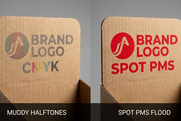
I constantly see brands rely on standard CMYK (Cyan, Magenta, Yellow, and Key/Black) printing for their bold attention-grabbing headers. But when you print standard CMYK on raw, porous corrugated testliner, the tiny overlapping halftone dots absorb unevenly into the paper fibers2. The result is a muddy, washed-out logo that completely fails to engage shoppers from 30 feet away. Instead of blending optical dots, I mandate a spot color flood using a precisely mixed Pantone ink. The first time you run your thumb across that dense, perfectly smooth layer of pigment on the press sheet, you can physically feel the difference. It eliminates the visual grain and forces the human eye to lock onto the unit, pulling traffic directly to your merchandise and significantly bumping your impulse conversion rates3.
| Common Rookie Mistake | The Pro Fix | Retail-Floor Benefit |
|---|---|---|
| Relying on standard CMYK halftone dots for primary logos. | Mandating a dense Pantone spot color ink flood4. | Creates crisp, 30-foot visual disruption. |
| Symmetrical, flat header profiles. | Engineering custom die-cut header shapes5. | Breaks visual monotony in the aisle. |
| Designing only for up-close reading. | Applying the 3-3-3 spatial engagement zones6. | Pulls foot traffic from across the store. |
I refuse to let muddy halftones ruin a massive retail rollout. If your display doesn't visually disrupt the aisle from thirty feet away, the up-close details simply do not matter because the shopper will never stop walking.
🛠️ Harvey's Desk: Not sure if your primary brand colors will turn muddy on raw corrugated board? 👉 Let Me Check Your Color Profile ↗ — Direct access to my desk. Zero automated sales spam, I promise.
How to Design a Product Display?
Creating a functional merchandiser demands more than drawing flat lines in graphic software; you have to calculate physical volume and material resistance.
Designing a product display requires integrating structural bend allowances, specific material thicknesses, and dynamic weight capacities into your initial CAD (Computer-Aided Design) files. This mathematical foundation prevents parts from bowing, tearing, or failing to interlock when flat cardboard is physically folded into three-dimensional retail fixtures.
A flat template looks perfect on a screen, but the paperboard fundamentally changes shape the second you fold it.
Mastering Caliper Compensation in Structural Dielines
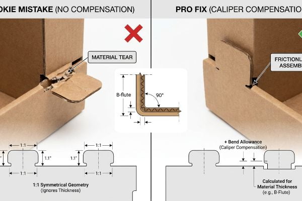
Even veteran graphic artists often build interlocking tabs and folding slots in their vector software at the exact same width as the mating panel. They assume a 3-inch (76.2 mm) tab naturally fits into a 3-inch (76.2 mm) slot. This perfectly symmetrical geometry works flawlessly for digital rendering, but it completely ignores the physical thickness of the corrugated material itself7.
When you fold a 3mm (0.11 inches) thick B-flute board8 90 degrees, that fold physically consumes material. If you don't manually widen the receiving slot on the dieline to compensate for that outer bend radius, the physical parts will violently clash. I've watched store clerks sweat and curse, desperately trying to force a tab into a slot that is mathematically too tight. You hear the sickening rip of raw paperboard as the flutes crush, and the clerk inevitably grabs ugly clear tape to hold the broken pieces together, ruining your premium brand image. To fix this, I inject a strict caliper compensation algorithm into the CAD file, automatically adding bend allowances9 so the pre-filled trays assemble with zero friction.
| Common Rookie Mistake | The Pro Fix | Retail-Floor Benefit |
|---|---|---|
| Drawing 1:1 symmetrical slots and tabs. | Adding mathematical caliper compensation10. | Ensures frictionless, 10-second assembly. |
| Ignoring the physical thickness of B-flute11. | Widening receiving slots for the bend radius. | Eliminates torn paperboard during setup. |
| Relying purely on flat vector art. | Verifying structural geometry in ArtiosCAD12. | Prevents clerks from using ugly tape. |
I always remind clients that corrugated board has a physical memory and volume. If your dieline doesn't respect the thickness of the paper fibers, your display will fight the store clerk and eventually lose.
🛠️ Harvey's Desk: Are your interlocking tabs secretly engineered to tear when folded on the retail floor? 👉 Request a Caliper Audit ↗ — Download safely. My inbox is open if you have questions later.
What Is POP Display Design?
Understanding the foundational boundaries of retail environments is the only way to avoid immediate big-box stockroom rejections.
POP (Point of Purchase) display design is the specialized engineering of retail fixtures that physically house and market consumer goods directly in the aisle. It strictly balances aggressive visual communication with rigid logistical footprint standards, maximizing product density while ensuring safe shopper accessibility in stores.
But understanding the theoretical definition of a display won't save you if you design it for the wrong physical store zone.
Navigating the POS versus POP Retail Constraints
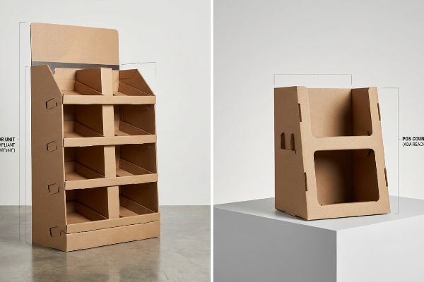
Many trading companies pitch a scalable, one-size-fits-all concept where a large floor unit can simply be scaled down by 50% to serve as a countertop register unit. They treat physical space as a fluid digital canvas. This generic approach ignores the strict legal and logistical rules that completely separate these two distinct retail zones in the US market13.
You cannot just shrink a floor shipper and place it near a cash register. Floor displays are strictly anchored to the heavy-duty 48×40 inch (121.9×101.6 cm) GMA (Grocery Manufacturers Association) pallet limit14 for warehouse logistics and dynamic load capability. Conversely, countertop POS (Point of Sale) units must strictly adhere to the ADA (Americans with Disabilities Act) 15-48 inch (38.1-121.9 cm) forward reach15 compliance window so all shoppers can physically access the product. When clients try to force a "shrink-to-fit" crossover, I've seen store managers outright refuse the non-compliant units, leaving the brand's expensive inventory stuck in the backroom. I always separate the engineering pipelines permanently—if it goes on the floor, we engineer for heavy pallet survival; if it goes on the counter, we engineer for strict ergonomic reach.
| Common Rookie Mistake | The Pro Fix | Retail-Floor Benefit |
|---|---|---|
| Shrinking floor units to fit on counters. | Engineering distinct POS and POP pipelines. | Prevents store manager rejections. |
| Ignoring legal forward reach limits. | Designing strictly within ADA compliance windows16. | Ensures accessibility for all shoppers. |
| Overhanging the standard footprint. | Locking the base to GMA pallet dimensions17. | Survives rough warehouse logistics. |
I never let brands guess on retailer spatial constraints. By rigidly anchoring your structural math to actual store compliance rules, you guarantee your campaign actually makes it out of the stockroom and onto the floor.
🛠️ Harvey's Desk: Are your countertop units secretly violating big-box ADA reach compliance zones? 👉 Get Your Blueprint Verified ↗ — No forms that trigger endless sales calls. Just pure value.
What Is an Example of POP Marketing?
Seeing a successful merchandiser in action provides clarity, but executing it flawlessly requires navigating invisible regulatory traps.
An example of POP marketing is a freestanding corrugated wine display strategically positioned at a grocery store end-cap. This temporary merchandiser visually interrupts the shopper's routine, physically holds heavy inventory outside the standard aisle, and leverages bold colors to trigger high-margin impulse purchases right before checkout.
Getting one display to stand up straight in a pristine design lab is easy, but here is the harsh reality when you ship 500 of them into a heavily regulated retail ecosystem.
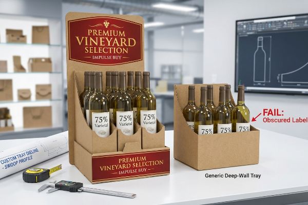
Why Generic Tray Depths Fail on the Factory Floor
It is a common trap that catches even experienced procurement teams: they assume that as long as the corrugated tray physically holds the bottle, the job is done. They reuse a standard deep-wall tray dieline to safely transport premium wine bottles to the store. It seems incredibly logical because deep retaining walls offer excellent transit protection against kinetic shifting18.
In my facility, I routinely see brands fail completely during pre-production testing when they apply generic deep-wall dielines to heavily regulated beverages. Premium wine is governed by strict federal TTB (Alcohol and Tobacco Tax and Trade Bureau) rules19 dictating that varietal claims must be visible. When I measure these generic retaining lips, they often hit 3.25 inches (82.5 mm) high, physically obscuring the lower 40% of the bottle where the critical "75% varietal" text lives. The display functions structurally, but it actively hides the primary legal and marketing equity from the consumer, causing massive friction and completely wiping out the project's profit margin when the retailer pulls the non-compliant units off the floor. I fix this by importing the physical bottle's exact label dieline directly into my CAD system and engineering a custom die-cut swoop in the front lip. By ruthlessly enforcing a precise 1.85-inch (46.9 mm) drop in the center profile, I guarantee 100% unobstructed label visibility while maintaining lateral transit stability. This micro-adjustment prevents immediate retailer chargebacks and secures a flawless, highly visible commercial rollout.
| Common Rookie Mistake | The Pro Fix | Retail-Floor Benefit |
|---|---|---|
| Using generic, deep-wall retaining trays. | Engineering custom die-cut front lip swoops20. | Guarantees maximum product visibility. |
| Obscuring critical federal label data21. | CAD mapping the physical bottle label placement22. | Prevents costly compliance rejections. |
| Prioritizing transit safety over marketing. | Balancing structural integrity with visual access. | Drives high-margin impulse conversions. |
I strip out over-engineered front panels that hide your product. If the display protects the merchandise but actively hides your primary value proposition, it isn't a marketing tool—it's just a shipping box.
🛠️ Harvey's Desk: Does your current front-lip geometry accidentally obscure your most important label data? 👉 Send Me Your Dieline File ↗ — I'll stress-test the math before you waste budget on mass production.
Conclusion
You can choose a generic vendor, but when an over-engineered front lip obscures your mandatory regulatory data, it triggers immediate retailer rejections that wipe out your entire campaign margin. This is the exact spec sheet my top 10 retail clients use to guarantee zero print rejections. Stop guessing on structural dimensions and let me personally run your artwork through my Free Dieline Audit ↗ to catch fatal visibility errors before mass production begins.
"[PDF] Navigation bar design effects on consumer visual processing", https://digitalcommons.kennesaw.edu/cgi/viewcontent.cgi?article=1773&context=ama_proceedings. Brief explanation of how environmental psychology and retail design research document specific visual scanning and navigation behaviors in warehouse-scale stores. Evidence role: conceptual validation; source type: academic study or retail industry whitepaper. Supports: The assertion that monitor-centric design ignores spatial navigation realities. Scope note: Applies specifically to large-format retail settings. ↩
"[PDF] 1. Dot gain is the increase of halftone dot sizes as ink absorbs into …", https://www.coloradomesa.edu/art/documents/student-resources/study-guide-2019.pdf. Technical explanation of ink absorption and dot gain characteristics of halftone printing on uncoated corrugated substrates. Evidence role: technical validation; source type: printing industry manual or materials science study. Supports: the claim that CMYK leads to muddy graphics on raw testliner. Scope note: applicable to non-coated corrugated paper. ↩
"Relationship between time pressure and consumers'impulsive …", https://pmc.ncbi.nlm.nih.gov/articles/PMC10750050/. Empirical evidence linking visual contrast and high-saturation color usage in point-of-purchase displays to increased shopper engagement and conversion. Evidence role: performance metric; source type: consumer psychology or retail marketing research. Supports: the link between spot color visibility and sales growth. Scope note: results may vary by product category. ↩
"PMS vs CMYK for Packaging: Which Is Better? – PAX Solutions", https://pax.solutions/corrugated-packaging/pms-vs-cmyk-for-packaging/. Technical explanation of why spot colors offer superior saturation and edge definition compared to CMYK halftones for long-distance visibility. Evidence role: technical specification; source type: printing industry manual. Supports: the claim that spot colors create visual disruption. Scope note: applies specifically to large format printing. ↩
"Assessing Consumer Attention and Arousal Using Eye-Tracking …", https://pmc.ncbi.nlm.nih.gov/articles/PMC8380820/. Analysis of how breaking symmetrical patterns with custom silhouettes increases visual salience in repetitive environments. Evidence role: cognitive design principle; source type: environmental psychology study. Supports: the claim that die-cut shapes break visual monotony. Scope note: effectiveness depends on the contrast with surrounding shelving. ↩
"The Importance of the Rule of 3 for Your Custom Store Displays", https://mcintyredisplays.com/blog/custom-store-displays/. Verification of the 3-3-3 spatial rule as a recognized strategy for capturing consumer attention at varying distances. Evidence role: professional methodology; source type: visual merchandising guide. Supports: the use of tiered zoning to pull foot traffic. Scope note: common in high-traffic retail environments. ↩
"RSC Tolerances for Case Erectors and Packers – AICC Now", https://now.aiccbox.org/rsc-tolerances-for-case-erectors-and-packers/. Technical documentation on packaging engineering explaining why material caliper necessitates specific tolerances in tab-and-slot dimensions to ensure a functional fit. Evidence role: technical validation; source type: engineering manual. Supports: the necessity of accounting for material thickness in structural design. Scope note: applies to corrugated and thick-board materials. ↩
"Corrugated Board and Material Grades – Packaging Strategies", https://www.packagingstrategies.com/articles/96269-corrugated-board-and-material-grades. Verification of standard B-flute corrugated cardboard thickness to confirm industry norms. Evidence role: technical specification; source type: material data sheet. Supports: initial material dimension claim. Scope note: thicknesses may vary slightly by manufacturer. ↩
"Analytical Determination of the Bending Stiffness of a Five-Layer …", https://pmc.ncbi.nlm.nih.gov/articles/PMC8777652/. Technical explanation of how bend allowance prevents material stress and assembly failure in corrugated packaging. Evidence role: structural principle; source type: packaging engineering textbook. Supports: the necessity of dieline compensation. Scope note: applies to fold-based structural design. ↩
"Structural Packaging Design: Key Elements and Process", https://www.arkay.com/resources/structural-packaging-design. Authoritative packaging engineering guides explain how accounting for material thickness (caliper) prevents fitment issues. Evidence role: technical standard; source type: engineering manual. Supports: necessity of caliper compensation for assembly. Scope note: applicable to corrugated materials. ↩
"[PDF] Specifications for Corrugated Paperboard – National Archives", https://www.archives.gov/files/preservation/storage/pdf/corrugated-board.pdf. Industry standards for corrugated board define the specific thickness and flute profile of B-flute material. Evidence role: technical specification; source type: material data sheet. Supports: the physical properties of B-flute. Scope note: standard measurements may vary slightly by manufacturer. ↩
"package design software (structure) – Core77 Discussion Boards", https://boards.core77.com/t/package-design-software-structure/17140. Documentation on ArtiosCAD demonstrates its capacity for 3D folding and structural validation of dielines to ensure physical fit. Evidence role: software capability; source type: technical documentation. Supports: use of CAD for structural verification. Scope note: specific to packaging design software. ↩
"ADA Accessibility Standards – Access-Board.gov", https://www.access-board.gov/ada/. Verification of US retail industry standards and legal requirements, such as ADA accessibility and fire safety codes, that differentiate aisle (POP) and checkout (POS) placements. Evidence role: Technical validation; source type: Industry regulation/legal guide. Supports: The claim that separate rules govern different retail zones. Scope note: Focuses on US market regulations. ↩
"48×40" GMA Pallets | Largest Pallet Manufacturer & Supplier", https://www.palletone.com/products/gma-pallets/. Verification of the standardized GMA pallet dimensions used in North American retail logistics. Evidence role: technical specification; source type: industry standard. Supports: logistical footprint constraints for floor displays. Scope note: primarily North American market. ↩
"ADA Standards for Accessible Design Title III Regulation 28 CFR …", https://www.ada.gov/law-and-regs/design-standards/1991-design-standards/. Confirmation of the ADA regulatory requirements for forward reach ranges to ensure accessibility for individuals with disabilities. Evidence role: legal regulatory requirement; source type: government regulation. Supports: POS unit ergonomic constraints. Scope note: US federal law. ↩
"Chapter 3: Protruding objects", https://www.access-board.gov/ada/guides/chapter-3-protruding-objects/. Technical standards from the ADA regarding maximum reach height and protrusion limits for store fixtures to ensure accessibility. Evidence role: Legal specification; source type: Government regulation. Supports: Requirement for display accessibility. Scope note: Specific to US federal law. ↩
"Standard pallet sizes — 48×40 GMA and 6 other common dimensions", https://www.wearewarp.com/standard-pallet-sizes. Industry specifications for standard pallet dimensions used in North American logistics to ensure compatibility with warehouse equipment. Evidence role: Technical standard; source type: Industry association. Supports: Logistic stability and warehouse compatibility. Scope note: Primarily applicable to North American markets. ↩
"Estimation of the Compressive Strength of Corrugated Board Boxes …", https://pmc.ncbi.nlm.nih.gov/articles/PMC8467740/. Technical explanation of how wall depth in corrugated packaging mitigates product movement during transit. Evidence role: technical validation; source type: packaging engineering guide. Supports: the effectiveness of deep-wall trays for transport. Scope note: focused on heavy item stability. ↩
"Wine Labeling | TTB – Alcohol and Tobacco Tax and Trade Bureau", https://www.ttb.gov/regulated-commodities/beverage-alcohol/wine/labeling. Verification of TTB regulations regarding the visibility and placement of varietal claims on wine labels. Evidence role: regulatory verification; source type: government statute. Supports: the claim that federal rules dictate label visibility. Scope note: Specific to US federal law. ↩
"POINT-OF-PURCHASE INSIGHTS: THE IMPACT OF RETAIL POP …", https://www.bcipkg.com/point-of-purchase-insights-the-impact-of-retail-pop-displays-on-consumer-behavior/. Brief explanation of how specific die-cut geometries in point-of-purchase trays optimize product visibility for consumers. Evidence role: design principle; source type: merchandising guide. Supports: the benefit of custom tray depths over generic ones. Scope note: Applicable to physical retail shelf trays. ↩
"Regulations Under Section 4 of the Fair Packaging and Labeling Act", https://www.ftc.gov/legal-library/browse/rules/fair-packaging-labeling-act-regulations-under-section-4-fair-packaging-labeling-act. Brief explanation of how federal regulations mandate the visibility of mandatory label data on retail displays. Evidence role: legal requirement; source type: regulatory agency. Supports: the risk of compliance rejections. Scope note: Focuses on FDA and FTC consumer labeling standards. ↩
"2026 Retail Compliance Labeling & Packaging Guide", https://www.warehousequote.com/resources/retail-compliance-labeling-packaging-guide. Brief explanation of how Computer-Aided Design (CAD) is used to verify spatial clearances for mandatory labeling. Evidence role: process validation; source type: industry technical manual. Supports: the efficacy of CAD in preventing compliance errors. Scope note: Specific to bottle and container packaging. ↩