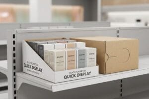
تقضي شهورًا في إتقان منتجك، لتجده في النهاية مُلقى على قاعدة خشبية متصدعة في ممر متجر كبير. هذا التناقض البصري يُدمر فورًا قيمة علامتك التجارية المتميزة.
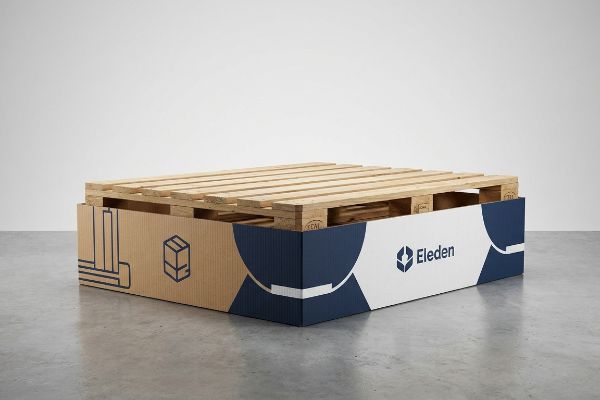
تتضمن عملية تحسين تجربة التسوق باستخدام أغطية منصات التحميل تغليف قواعد النقل الخشبية المكشوفة بمواد مموجة مطبوعة حسب الطلب. تُحوّل هذه الاستراتيجية البصرية الفعّالة مساحات النقل الصناعية إلى وجهات تسوق متكاملة، إذ تُخفي الكتل الخشبية الزرقاء غير الجذابة، وتُعظّم في الوقت نفسه مساحة الإعلانات القيّمة في الطابق الأرضي المخصص للمستهلك.
إن سد الفجوة بين الخدمات اللوجستية للمستودعات وجماليات البيع بالتجزئة الراقية يتطلب أكثر من مجرد طباعة شعار جميل على قطعة من الورق.
كيف تجعل متجر البيع بالتجزئة أكثر جاذبية؟
إن جذب انتباه المستهلكين في ممر مزدحم هو حرب نفسية شرسة.
يتطلب جعل متجر البيع بالتجزئة جذابًا إحداث تغيير بصري من خلال التغليف الهيكلي الاستراتيجي. فبدلاً من الاعتماد على الصناديق المربعة التقليدية، يُضفي استخدام أشكال العرض المنحنية والمقطوعة بشكل مميز لمسة جمالية على الممرات الخطية الرتيبة، ويجذب أنظار المستهلكين بشكل طبيعي نحو منتجاتك، مما يزيد بشكل ملحوظ من معدلات الشراء العفوي عند الدفع.
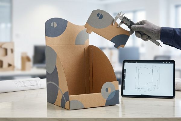
إن التصميم المرئي الرائع على شاشة الكمبيوتر لا فائدة منه إذا فشل في الصمود فعلياً في أرضية المتجر.
سيكولوجية التشويش البصري والسرعة
يعتقد المصممون المبتدئون غالبًا أن مجرد وضع ألوان زاهية على صناديق الشحن المستطيلة القياسية كافٍ للتميز. فهم يصممون منصات عرض أرضية مربعة الشكل تمامًا لأن الخطوط المسطحة سهلة التصميم رياضيًا. يتجاهل هذا النهج المبسط للغاية كيفية معالجة الدماغ البشري للتباين البيئي في مساحات البيع بالتجزئةالضخمة.
أرى باستمرار فرق التسويق محبطة عندما يندمج صندوق منتجاتهم الفاخر مع خلفية فوضى متاجر الجملة. عندما تسير في ممر، تتجاهل عيناك الخطوط المستقيمة.أكسر هذا العمى البصري بتصميم أشكال منحنية مقطوعة مسبقًا تعمل كمطبات مادية للعين. في الأسبوع الماضي، شاهدت بائعًا يكافح لتجميع لوحة علوية منحنية معقدة، فمزق الورق المقوى الخام عن طريق الخطأ لأن نقاط الاحتكاك كانت ضيقة جدًا. قمت على الفور بتعديل دقة التصميم بمساعدة الحاسوب، موسعًا الفتحات بمقدار 1 ملم فقط لضمان سماع صوت طقطقة القفل عند تثبيته. هذا التعديل الهيكلي البسيط وفر 30 ثانية من وقت التجميع لكل وحدة، وحقق التأثير البصري الذي كانت العلامة التجارية في أمس الحاجة إليه.
| أخطاء شائعة للمبتدئين | الحل الاحترافي | فوائد أرضية البيع بالتجزئة |
|---|---|---|
| رؤوس مربعة مسطحة | أشكال منحنية مقطوعة بالقالب3 | يوقف حركة المرور في الممرات على الفور |
| أقفال احتكاك محكمة | فتحات قابلة للتعديل بواسطة الفرجار | يوفر 30 ثانية من وقت التجميع4 |
| تجاهل التباين المحيط | أشكال هيكلية عالية التباين5 | يعزز التفاعل الاندفاعي |
أرفض السماح لضعف الحسابات الهيكلية بإفساد فكرة تسويقية رائعة. من خلال تصميم أقفال سلسة، أضمن تنفيذ تصاميمك المبتكرة بشكل صحيح على أرض الواقع.
🛠️ مكتب هارفي: هل أنت غير متأكد مما إذا كانت منحنيات القطع الخاصة بك تُسبب احتكاكًا أثناء التجميع؟ 👉 احصل على فحص لخطوط القطع ↗ — تواصل مباشر مع مكتبي. أعدك بعدم تلقي أي رسائل تسويقية آلية مزعجة.
ما هي تنورة الباليت؟
تُعد منصات الشحن أدوات صناعية، وليست أصولاً تسويقية.
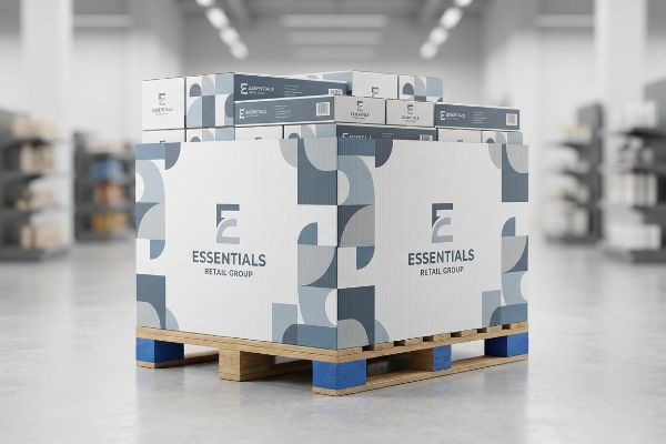
غطاء المنصة عبارة عن غلاف مموج مطبوع مصمم لإخفاء قاعدة النقل الخشبية لعرض المنتجات بكميات كبيرة على الأرض. هذا التمويه الهيكلي يخفي الشظايا والأوساخ والمنصات الخشبية غير الجذابة، مما يرفع فوراً من القيمة المتصورة للبضائع ويؤمن مساحة تسويقية إضافية على مستوى الأرض.
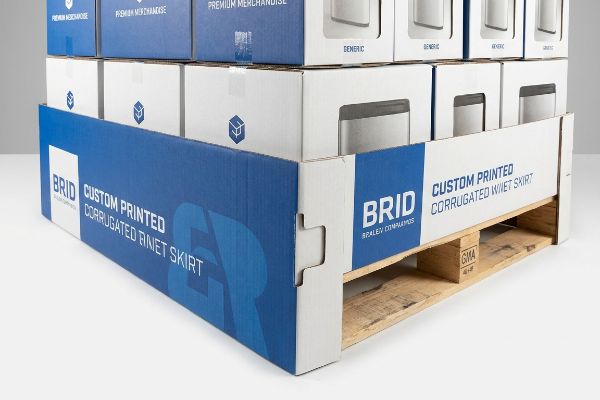
إن معرفة التعريف أمر سهل، لكن في الواقع يكمن الخلل في وضع تلك الكرتونة حول قاعدة خشبية متشققة.
بروتوكول التمويه باللوحة الزرقاء
كثيرًا ما يفترض المشترون أن بإمكانهم طباعة شريط طويل من الورق المقوى الرقيق ولصقه حول الجزء السفلي من منصة العرض. فهم يصممون أبعادًا عامة دون مراعاة التباين المادي للأخشاب الخام في المستودعات.وهذا يؤدي إلى ترهل الرسومات وتعرضها للركل والتمزق في غضون ساعات من افتتاح المتجر.
أرى علامات تجارية فاخرة لمستحضرات التجميل تُفسد صورة متاجرها بالكامل لأنها تترك الحواف الخشنة لمنصة نقل زرقاء مكشوفة تمامًا تحت منتجاتها الفاخرة. هذا يُدمر صورة العلامة التجارية فورًا. يجب التعامل مع القاعدة كتمويه هيكلي، وتثبيت الحافة مباشرةً بنظام الصواني بدلًا من الاعتماد على شريط لاصق مزدوج ضعيف يتقشر في البيئات الرطبة. أسوأ ما في الأمر هو رؤية أحد مندوبي المبيعات يحاول جاهدًا تثبيت حافة رخيصة حول زاوية خشبية ملتوية، لينتهي الأمر ببقايا شريط لاصق لزجة تُلطخ شعار العلامة التجارية. أحل هذه المشكلة باستخدام ألسنة تثبيت ذاتية القفل، ذكر وأنثى، تُحيط بسلاسة بقاعدة GMA (رابطة مصنعي البقالة) القياسية بقياس 48 بوصة (1219 مم) × 40 بوصة (1016 مم)،مما يُعطي واجهة رسومية مشدودة تمامًا تتحمل صدمات عربات التسوق.
| أخطاء شائعة للمبتدئين | الحل الاحترافي | فوائد أرضية البيع بالتجزئة |
|---|---|---|
| أغلفة من الورق المقوى الرقيق | مادة مموجة 32ECT8 | يقاوم الصدمات الناتجة عن عربات التسوق |
| بالاعتماد على شريط لاصق مزدوج الجوانب | ألسنة قفل تلقائي للذكور/الإناث9 | يمنع التقشير في الرطوبة العالية |
| مقاسات اللفائف العامة | تسجيل النقاط من الزاوية خاص بـ GMA10 | يضمن وجهًا مشدودًا وجذابًا |
أتعامل مع المظهر الجمالي للأرضية بنفس الاحترام الذي أتعامل به مع المنتج الرئيسي على الرف العلوي. إخفاء المظهر الصناعي غير الجذاب أمر لا غنى عنه لتحقيق النجاح في مجال البيع بالتجزئة.
🛠️ مكتب هارفي: هل تُعرض منتجاتك حاليًا على قواعد خشبية مكشوفة ومتسخة؟ 👉 اطلب مراجعة هيكلية ↗ — حمّل الملف بأمان. صندوق رسائلي مفتوح إذا كانت لديك أي أسئلة لاحقًا.
ما هي منصات التخزين ثلاثية الاتجاهات القابلة للتسوق؟
يكره تجار التجزئة المساحات الفارغة والممرات المسدودة.
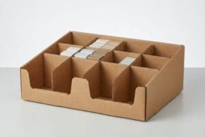
تُعدّ منصات العرض ثلاثية الاتجاهات وحدات عرض أرضية مصممة خصيصًا لتوفير وصول المستهلكين إلى المنتجات من ثلاثة جوانب مختلفة. يُحسّن هذا التصميم كفاءة أرضية المتجر إلى أقصى حد من خلال السماح بالتفاعل متعدد الاتجاهات، وعادةً ما يستخدم دعامة داخلية بدلاً من الجدران الخارجية الصلبة للحفاظ على رؤية البضائع بشكل كامل من تقاطعات الممرات الرئيسية.
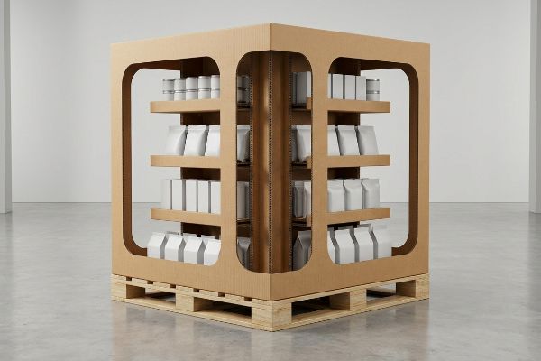
إن تأمين العقارات المتميزة عند تقاطع طرق يُعد مكسبًا هائلاً، ولكنه يتطلب هندسة هيكلية صارمة لمنع الانهيار.
ميزة تصميم المتجر من خلال
كثيراً ما تقترح العلامات التجارية على متاجر التجزئة الكبرى استخدام لوحات إعلانية ضخمة صلبة، ظناً منها أن لوحة إعلانية عملاقة هي الاستخدام الأمثل للمساحة. فتبني هذه العلامات جدراناً من الورق المقوى تحجب الرؤية تماماً في أرجاء المتجر. لكن سرعان ما يرفض مديرو متاجر التجزئة هذه الوحدات لأنها تخلق زوايا مغلقة خانقة تعيق حركة المتسوقين الطبيعية .
تخيل عرض منتجاتك كجزيرة لا كحصن. يجب أن يتمكن المتسوقون من الوصول إلى المنتجات والحصول عليها دون إعاقة الممر الرئيسي. أنصح عملائي دائمًا باستخدام دعامات زجاجية لخلق نفاذية بصرية، تسمح بمرور الضوء والعين عبر الهيكل بالكامل. سبق لي أن راجعت حاوية تخزين كبيرة بجدران صلبة، حيث كان العملاء يمزقون الزوايا المموجة للوصول إلى المنتجات المخفية في منطقة الظل الخلفية. قمت بإعادة تصميم خط القطع بالكامل ليشمل أقواسًا تسمح بمرور المنتجات، مما أزال الوزن الزائد للجدران الصلبة، مع توجيه الحمل الديناميكي إلى عمود فقري مركزي مزدوج الجدار قادر على تحمل 907 كيلوغرامات .
| أخطاء شائعة للمبتدئين | الحل الاحترافي | فوائد أرضية البيع بالتجزئة |
|---|---|---|
| جدران خارجية صلبة | أقواس زجاجية تسمح بدخول الزبائن إلى المحلات13 | يحافظ على خطوط الرؤية داخل المتجر |
| قدرة تحمل الأحمال على المحيط | العمود الفقري الهيكلي المركزي14 | يسمح بالوصول متعدد الاتجاهات |
| مناطق الظل العميق | هندسة ثلاثية الاتجاهات مفتوحة15 | يعزز ظهور المنتجات الطبيعية |
لا أريد أبدًا أن تبقى بضائعك مخفية في الظلام. من خلال فتح الجدران الهيكلية، أضمن أن منتجك سيجذب الانتباه من كل زاوية ممكنة في المتجر.
🛠️ مكتب هارفي: هل تُرفض عروضك الترويجية لتجار التجزئة بسبب حجمها الكبير؟ 👉 احصل على تحسين تصميم قوالب الطباعة ↗ — لا مزيد من النماذج التي تُسبب مكالمات مبيعات لا تنتهي. قيمة حقيقية فقط.
كيف يمكنك تطوير صورة قوية للمتجر من خلال التسويق البصري؟
تبدو رسومات التغليف عالية الجودة رائعة على شاشة الكمبيوتر المحمول ذات الإضاءة الخلفية.
يتطلب بناء صورة مميزة للمتجر ترجمة ألوان العلامة التجارية الرقمية إلى واقع مادي دقيق. وتستلزم استراتيجية التسويق البصري هذه تحديدًا دقيقًا لملامح الألوان قبل الإنتاج وبروتوكولات صارمة لتوزيع الحبر لمنع بهتان الرسومات، مما يضمن أن تعكس شاشات العرض المموجة مكانة مرموقة وثباتًا تامًا حتى في بيئات البيع بالتجزئة ذات الإضاءة الفلورية القوية.
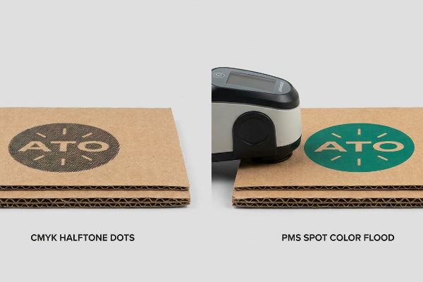
لكن معرفة النظرية لا تكفي عندما تبدأ الآلات بالعمل وتبدأ المواد الخام بالتفاعل.
لماذا تفشل الطباعة بنظام CMYK القياسي في أرضية المصنع؟
كثيراً ما تُزوّد وكالات التسويق حملاتها التسويقية في نقاط البيع بملفات رقمية قياسية بنظام ألوان CMYK (سماوي، أرجواني، أصفر، أبيض)، متوقعةً تطابقاً تاماً مع هويتها المؤسسية. وتفترض هذه الوكالات أن قواعد الطباعة التجارية المستخدمة في الكتيبات اللامعة تنطبق مباشرةً على عبوات التجزئة المتينة. إلا أن هذا التوقع الساذج يتجاهل الواقع الكيميائي القاسي لتطبيق الحبر السائل على الركائز الصناعيةالمسامية.
في منشأتي، أرى باستمرار ملفات مصممة ببراعة تتحول إلى كوارث باهتة لأن المشترين يثقون بمعاينات الشاشة الرقمية أكثر من ثقتهم بالخصائص الفيزيائية للمواد. فعند طباعة حبر الطباعة القياسي رباعي الألوان على ورق مقوى مموج غير محكم الإغلاق ، تمتص نقاط التظليل النصفية الصغيرة المتداخلة بشكل غير متساوٍ وتتداخل بصريًا . أختبر ذلك باستخدام مطياف ضوئي، وعند قياس الكثافة الضوئية، غالبًا ما يظهر اللون الأسود القياسي في نظام CMYK كلون رمادي فحمي باهت، مما يُفسد صورة المتجر الفاخرة. أحل هذه المشكلة بتطبيق بروتوكول صارم لتوزيع لون PMS (نظام مطابقة ألوان بانتون) على جميع الشعارات الأساسية، وذلك بمزج صبغة واحدة كثيفة تتجاوز تمامًا مزج النقاط الضوئية. من خلال تطبيق هذا التناسق المطلق للصبغة، أضمن ظهور ألوان علامتك التجارية بوضوح تام من مسافة 609 سم، مما يزيل تمامًا أي اعتراض من تجار التجزئة على المواد الترويجية غير المتناسقة .
| أخطاء شائعة للمبتدئين | الحل الاحترافي | فوائد أرضية البيع بالتجزئة |
|---|---|---|
| شعارات CMYK القياسية | ألوان PMS الموضعية | يزيل حبيبات النقاط النصفية19 |
| الثقة بشاشات أجهزة الكمبيوتر المحمولة | معايرة جهاز قياس الطيف الضوئي20 | يضمن اتساق العلامة التجارية |
| الطباعة على الألياف الخام | صفائح التغليف الليثوغرافي المطلية21 | يُضفي لمسة نهائية فاخرة |
أرفض السماح لألياف الورق المسامية بتقليل قيمة علامتك التجارية. إن هندسة التركيبة الكيميائية الدقيقة للحبر تضمن أن تحظى شاشات العرض المادية الخاصة بك بالاهتمام الذي تحظى به إعلاناتك الرقمية.
🛠️ مكتب هارفي: هل تعلم ما إذا كانت طابعتك الحالية تستخدم نقاط CMYK بدلاً من ألوان موضعية حقيقية لشعارك؟ 👉 أرسل لي ملف تصميم القالب ↗ — سأقوم باختبار الحسابات قبل أن تُهدر ميزانيتك على الإنتاج بكميات كبيرة.
خاتمة
يمكنك السماح لطابع غير متمرس بطباعة ملفات CMYK القياسية على ورق مقوى خام، ولكن عندما تتسبب تلك الرسومات الباهتة والمشوشة في رفض فوري من قبل تجار التجزئة، فإنها تقضي تمامًا على هامش ربح حملتك. هذه هي ورقة المواصفات الدقيقة التي يستخدمها أفضل 10 عملاء تجزئة لديّ لضمان عدم رفض أي طباعة. توقف عن المخاطرة بقيمة علامتك التجارية بسبب كيمياء الحبر الرديئة، ودعني شخصيًا أراجع ملفات تصميمك من خلال خدمة تدقيق القوالب المجانية ↗ لاكتشاف أخطاء ما قبل الطباعة القاتلة قبل وصولها إلى أرضية المصنع.
"التسوق من منظور التحيز الانتباهي"، https://web.colby.edu/cogblog/2022/04/28/visual-attention-and-consumer-behavior/. [يتناول بحثٌ موثوق في علم النفس البيئي بالتفصيل كيفية تصفية الدماغ البشري للأنماط الرتيبة واستجابته للاضطرابات البصرية عالية التباين في البيئات المكانية المعقدة]. دور الدليل: أساس نظري؛ نوع المصدر: مجلة أكاديمية. يدعم: الأساس النفسي لاستراتيجيات التشويش البصري. ملاحظة النطاق: يركز على الانتباه البصري اللاواعي والتعرف على الأنماط. ↩
"تقييم انتباه المستهلك وإثارته باستخدام تتبع حركة العين..."، https://pmc.ncbi.nlm.nih.gov/articles/PMC8380820/. [تشير الأبحاث الأكاديمية في مجال الإدراك البصري إلى أن الأنماط الخطية المتكررة تُحفز التعود، مما يُقلل من استثارة الانتباه ويجعل المُشاهدين يتجاهلون التفاصيل]. دور الدليل: أساس نظري؛ نوع المصدر: مجلة علم نفس مُحكّمة. يدعم: فعالية استخدام التشويش البصري غير الخطي لجذب الانتباه. ملاحظة النطاق: يشير إلى المعالجة المعرفية البشرية العامة. ↩
"رؤى حول نقاط البيع: تأثير عناصر العرض في متاجر التجزئة..."، https://www.bcipkg.com/point-of-purchase-insights-the-impact-of-retail-pop-displays-on-consumer-behavior/. [يُمكن لمصدر موثوق في مجال التسويق البصري أو علم النفس البيئي أن يُبيّن كيف تُعطّل الأشكال غير الخطية عملية المسح البصري، مما يُؤدي إلى توقف حركة المتسوقين]. دور الدليل: التحقق من الحقائق؛ نوع المصدر: دراسة قطاعية. يدعم: فعالية الأشكال المنحنية في تعطيل تجربة التسوق. ملاحظة: قد تختلف الفعالية باختلاف فئة المنتج. ↩
"مشاكل وحلول شائعة لفرامل V"، https://www.youtube.com/watch?v=Tz-Kw_NHglg. [سيُوفر دليل فني أو دراسة لكفاءة التشغيل بيانات تجريبية حول تقليل الوقت الذي تُحققه الفتحات المُعدّلة بدقة مقارنةً بأقفال الاحتكاك]. دور الدليل: التحقق الكمي؛ نوع المصدر: المواصفات الفنية. يدعم: كفاءة الوقت للأجهزة الاحترافية. ملاحظة النطاق: خاص بتجهيزات البيع بالتجزئة المعيارية. ↩
"تحليل دور تجارب العملاء وعواطفهم... - PMC"، https://pmc.ncbi.nlm.nih.gov/articles/PMC12052140/. [يمكن لأبحاث محكمة في سلوك المستهلك أو التسويق العصبي أن تؤكد كيف يحفز التباين الهيكلي الانتباه اللاواعي ويزيد من التفاعل الاندفاعي]. دور الدليل: دعم تجريبي؛ نوع المصدر: مجلة أكاديمية. يدعم: وجود صلة بين التباين البصري والتفاعل. ملاحظة: تعتمد النتائج على إضاءة المتجر المحيطة. ↩
[ملف PDF] المعيار الموحد لمنصات التحميل الخشبية - غودوين روبنز، https://www.goodwinrobbins.com/images/resources/wood_pallets_std_2012.pdf. [يُفصّل مصدر في مجال الخدمات اللوجستية الصناعية أو التصنيع التفاوتات القياسية في الأبعاد والاختلافات الكامنة في منصات التحميل الخشبية غير المصقولة]. دور الدليل: مواصفات فنية؛ نوع المصدر: معيار صناعي. يدعم: الادعاء بأن الأبعاد العامة غير دقيقة بسبب عدم اتساق منصات التحميل. ملاحظة النطاق: يركز على عدم التجانس في الأخشاب غير الدقيقة. ↩
"منصة خشبية معالجة حرارياً من نوع GMA - 48 × 40 بوصة H-1260 - ULINE"، https://www.uline.com/Product/Detail/H-1260/Pallets/Heat-Treated-Wood-GMA-Pallet-48-x-40. [تُعرّف أدلة اللوجستيات الرسمية والإرشادات الصناعية الأبعاد القياسية لمنصات GMA بأنها 48 × 40 بوصة]. دور الدليل: المواصفات الفنية؛ نوع المصدر: معيار صناعي. يدعم: أبعاد المنصة. ملاحظة النطاق: ينطبق على منصات النقل القياسية في أمريكا الشمالية. ↩
"فهم قوة صناديق الشحن - EcoEnclose"، https://www.ecoenclose.com/blog/understanding-shipping-box-strength/?srsltid=AfmBOorfStmjCl0iocpbPOLyhhLCqgUUGlzsHquDyjNZM1SepE8Bwdjg. [توفر معايير الصناعة لاختبار مقاومة السحق للحواف (ECT) بيانات تجريبية حول مقاومة الثقب والسحق لكرتون 32ECT في بيئات البيع بالتجزئة]. دور الدليل: المواصفات الفنية؛ نوع المصدر: معيار هندسة التغليف. يدعم: متانة المواد ضد الصدمات. ملاحظة النطاق: قد يختلف الأداء بناءً على حجم التموج. ↩
"كيف تتغير قوة التصاق الشريط اللاصق مع تغير درجة الحرارة والرطوبة"، https://www.ppmindustries.com/en/news/articoli/how-tape-adhesion-changes-with-temperature-and-humidity. [أظهرت الدراسات أن أدوات التثبيت الميكانيكية، مثل الألسنة المتشابكة، تحافظ على سلامتها الهيكلية في ظروف الرطوبة العالية، حيث تفشل المواد اللاصقة الحساسة للضغط عادةً]. دور الدليل: مقارنة الأداء؛ نوع المصدر: دليل علوم المواد. يدعم: الثبات بدون استخدام مواد لاصقة. ملاحظة: يعتمد على دقة القطع بالقالب. ↩
دليل أبعاد المنصات القياسية | أحجام منصات الشحن - فليت ووركس، https://www.fleetworks.ai/resources/pallet-dimensions-standard. [تُحدد جمعية مصنعي المواد الغذائية (GMA) أبعاد المنصات القياسية التي تتطلب أنماط قطع محددة لضمان ملاءمة مثالية للأغلفة الكرتونية المموجة]. دور الدليل: معيار صناعي؛ نوع المصدر: معيار لوجستي. يدعم: ملاءمة وشد حواف المنصات. ملاحظة النطاق: ينطبق تحديدًا على معايير جمعية مصنعي المواد الغذائية في أمريكا الشمالية. ↩
"7 سمات لعرض تجاري مؤثر - سمورفيت ويستروك"، https://www.smurfitwestrock.com/blog/7-features-of-a-high-impact-retail-display. [توفر الدراسات الأكاديمية حول تصميم متاجر التجزئة وحركة المشاة بيانات حول كيفية تسبب العروض الضخمة والمعتمة في اختناقات مرورية وإعاقة حركة العملاء]. دور الدليل: التحقق الفني؛ نوع المصدر: دراسة تصميم متاجر التجزئة. يدعم: الادعاء بأن العروض الصلبة تؤثر سلبًا على تدفق حركة المرور. ملاحظة النطاق: ينطبق تحديدًا على بيئات متاجر التجزئة الكبيرة ذات الحجم الكبير. ↩
[ملف PDF] مواصفات الكرتون المموج - رابطة صناديق الألياف، https://www.fibrebox.org/assets/2025/09/Walmart_Corrugated-Board_Specifications_Automation_Packaging_Standards.pdf. [يُمكن التحقق من حد الوزن للدعامات الهيكلية ذات الجدار المزدوج من خلال مواصفات هندسية أو معيار صناعي لقدرات تحمل الكرتون المموج]. دور الدليل: التحقق الفني؛ نوع المصدر: دليل هندسي أو ورقة مواصفات الشركة المصنعة. الدعامات: السلامة الهيكلية للمنصات القابلة للتخزين. ملاحظة النطاق: تعتمد قدرة التحمل على درجة الكرتون ونوع التموج. ↩
"سبعة أنواع من عروض واجهات المتاجر: أفكار إبداعية لمصممي المتاجر"، https://unibox.co.uk/blog/7-types-of-window-display. [تشرح معايير تصميم متاجر التجزئة كيف تمنع العناصر المعمارية ذات الأقواس المفتوحة في عروض المنتجات الكبيرة إعاقة الرؤية وتحافظ على خط رؤية واضح للمتسوقين]. دور الدليل: التحقق الفني؛ نوع المصدر: دليل تصميم متاجر التجزئة. يدعم: فائدة الأقواس التي تسمح بمرور المتسوقين من خلالها على خطوط الرؤية. ملاحظة النطاق: خاص بعروض المنصات كبيرة الحجم. ↩
"أنواع عرض المنصات: كاملة، نصف، وربع - GreenDot Packaging"، https://greendotpackaging.com/understanding-pallet-display-types-full-half-and-quarter-pallet-displays/. [تُظهر المواصفات الهندسية لتجهيزات البيع بالتجزئة أن وجود دعامة مركزية حاملة للأحمال يُغني عن الحاجة إلى دعامات محيطية، مما يُتيح وصول العملاء من اتجاهات متعددة]. دور الدليل: التحقق الهيكلي؛ نوع المصدر: مواصفات هندسية. الدعامات: فائدة الدعامات المركزية في تسهيل الوصول. ملاحظة النطاق: ينطبق على منصات التسوق الثقيلة. ↩
"عروض منصات نقالة مخصصة لمتاجر التجزئة في ويسكونسن: تعزيز رؤية المنتجات"، https://www.qpack.com/retail-displays/pallet. [تشير أبحاث التسويق البصري إلى أن التكوينات المفتوحة ثلاثية الجوانب تقلل من مناطق الظل وتزيد من تعرض المنتجات لإضاءة المتجر الطبيعية]. دور الدليل: مقياس أداء؛ نوع المصدر: دراسة تسويقية. يدعم: العلاقة بين الهندسة ثلاثية الاتجاهات ورؤية المنتجات. ملاحظة النطاق: يركز على تأثيرات الإضاءة الطبيعية والمحيطة. ↩
"مدى ملاءمة الركائز الورقية للإلكترونيات المطبوعة - PMC"، https://pmc.ncbi.nlm.nih.gov/articles/PMC8839088/. [يشرح دليل تقني حول ركائز الطباعة كيف يختلف امتصاص الحبر وتضخم النقاط اختلافًا كبيرًا بين الأوراق اللامعة المطلية والمواد الصناعية المسامية مثل الكرتون المموج]. دور الدليل: شرح تقني؛ نوع المصدر: دليل صناعة الطباعة؛ يدعم: الادعاء بأن قواعد الطباعة القياسية لا تفي بالغرض على الركائز المسامية. ملاحظة النطاق: يركز على مسامية الركيزة وتسرب الحبر. ↩
"إتقان طباعة CMYK: تجنب تضخم النقاط - تيك توك"، https://www.tiktok.com/@screenprinting.com/video/7618672358554930446. [يؤكد دليل فني في علم الطباعة كيف تؤدي مسامية الورق المقوى المموج غير المطلي إلى امتصاص مفرط للحبر وتضخم النقاط، مما ينتج عنه تداخل الألوان]. دور الدليل: التحقق الفني؛ نوع المصدر: دليل الطباعة الصناعية؛ الدعم: فشل طباعة CMYK على ركائز الورق المقوى المموج الخام؛ ملاحظة النطاق: ينطبق تحديدًا على المواد غير المطلية. ↩
"CMYK مقابل الألوان الموضعية: أيهما أفضل؟ - برايم لاين باكيدجينج"، https://www.primelinepackaging.com/blog/spot-color-vs-cmyk-understanding-the-differences-and-choosing-the-right-method-for-your-packaging/. [تُظهر معايير الصناعة لإدارة الألوان أن الألوان الموضعية توفر عتامة وتناسقًا أعلى على الركائز المسامية باستخدام صبغة واحدة ممزوجة مسبقًا بدلًا من نقاط التظليل النصفية المضافة]. دور الدليل: التحقق التقني؛ نوع المصدر: معيار صناعة الطباعة؛ يدعم: فعالية ألوان نظام بانتون للأسمدة (PMS) لتعزيز قوة العلامة التجارية؛ ملاحظة النطاق: التركيز على الشعارات الأساسية عالية التشبع. ↩
"الفرق بين الألوان الموضعية وألوان CMYK"، https://www.deprintedbox.com/blog/spot-vs-process-color/. [دليل طباعة موثوق يشرح كيف تتجنب ألوان بانتون الموضعية الصلبة أنماط التظليل الوردية المتأصلة في طباعة CMYK]. دور الدليل: التحقق الفني؛ نوع المصدر: معيار صناعة الطباعة؛ يدعم: التفوق البصري لألوان بانتون لعناصر العلامة التجارية الصلبة. ملاحظة النطاق: ينطبق تحديدًا على عمليات الطباعة الأوفست والطباعة بالشاشة الحريرية. ↩
"كيفية استخدام مطياف ضوئي لمطابقة الألوان في الطباعة - تيككون"، http://techkon.datacolor.com/how-to-use-a-spectrophotometer-for-color-matching-in-print/. [توضح الوثائق الفنية المتعلقة بقياس الألوان كيف توفر المطيافات الضوئية قياسًا موضوعيًا لانعكاس الضوء لضمان مطابقة دقيقة للألوان عبر مختلف المواد]. دور الدليل: المواصفات الفنية؛ نوع المصدر: دليل هندسي؛ يدعم: ضرورة المعايرة الموضوعية بدلًا من المعاينة الذاتية على الشاشة. ملاحظة النطاق: يركز على أنظمة إدارة الألوان الصناعية. ↩
"حجم سوق التغليف المصفح بتقنية الطباعة الحجرية، والاتجاهات، والتوقعات حتى عام 2035"، https://www.gminsights.com/industry-analysis/litho-laminated-packaging-market. [توضح أدلة مواد التغليف بالتفصيل كيف تمنع عملية التغليف امتصاص الحبر في ألياف الكرتون المموج الخام، مما ينتج عنه تشبع لوني أعلى وسطح أملس]. دور الدليل: علم المواد؛ نوع المصدر: دليل صناعة التغليف؛ يدعم: الادعاء بأن التغليف ينتج عنه نتيجة بصرية أكثر تميزًا. ملاحظة النطاق: خاص بتطبيقات الكرتون المموج المطبوع. ↩