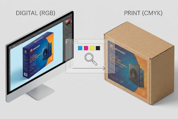
تقضي أسابيع في إتقان تصميم علامتك التجارية على شاشة رقمية نقية، لتشاهد في النهاية وصول العروض المادية النهائية إلى بائع التجزئة وهي تبدو باهتة ومتسخة ورخيصة.
يتحكم اختيار نموذج اللون المناسب في كيفية ارتباط الأصباغ الفيزيائية بالركائز المموجة. تعتمد التصاميم الرقمية على شاشات مضيئة، بينما يتطلب التصنيع تركيبات دقيقة من الأحبار. يمنع اختيار التنسيق الصحيح أخطاء الإنتاج المكلفة، مما يضمن بقاء هوية علامتك التجارية متسقة عبر منصات البيع بالتجزئة العالمية.
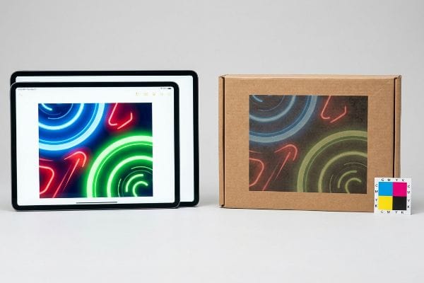
إن فهم الفجوة بين وحدات البكسل المتوهجة والورق المقوى الخام هو الطريقة الوحيدة لحماية ميزانية التسويق الخاصة بك من حالات فشل الطباعة الكارثية.
لماذا من المهم معرفة نظرية الألوان؟
إن تصميم العبوات دون فهم آليات الألوان يضمن حدوث انفصال في أرضية البيع بالتجزئة.
يُعدّ فهم نظرية الألوان أساسيًا لأنّ المواد الخام تمتص الحبر بشكل مختلف عن طريقة عرضه على الشاشات الرقمية. تطبيق منطق الشاشة على الورق المقوى المسامي يُسبب مشاكل كبيرة في مزج الألوان. إتقان هذه المبادئ يمنع تشوّه الرسومات، ويضمن اتساق العلامة التجارية، ويؤكد قدرة شاشات العرض في نقاط البيع على جذب انتباه المتسوقين من مسافة بعيدة.
يمكنك أن تمتلك أفضل تصميم هيكلي في الممر، ولكن إذا فشل التنفيذ البصري، فسيمر المتسوقون بجانبه مباشرة.
مصيدة المزج البصري CMYK
يقوم معظم مصممي الجرافيك المبتدئين بإنشاء ملفات التغليف الخاصة بهم بالكامل بتنسيقات CMYK القياسية (السماوي، الأرجواني، الأصفر، الأسود)1.ويفترضون أنه إذا بدا شعار الشركة واضحًا ونابضًا بالحياة على شاشة مكتبهم المعايرة، فإن مطبعة المصنع ستكرر بسهولة نفس اللون على صندوق الشحن النهائي أو صينية البيع بالتجزئة.
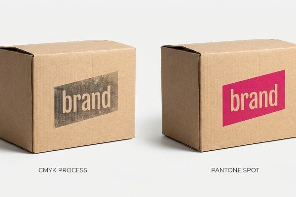
ألاحظ هذا الخطأ الشائع باستمرار في المصانع. يقوم فريق التسويق بتقديم عرض باستخدام طباعة رباعية الألوان لعلامتهم التجارية الأساسية. مع ذلك، تعتمد طباعة CMYK على نقاط نصفية مجهرية متداخلةلخلق وهم اللون الموحد. عند تطبيق هذا الملف على ورق مقوى مموج غير محكم الإغلاق، تمتص ألياف الورق المسامية الحبر السائل بشكل غير متساوٍ.أشعر بوضوح بملمس الورق الخشن والمحبب الذي يتداخل مع بنية النقاط. يفشل المزج البصري تمامًا، مما يحول الشعار إلى صورة باهتة وغير واضحة تحت إضاءة الفلورسنت القوية في المتجر. هذا التدهور البصري يقلل بشكل كبير من قيمة علامتك التجارية ويقضي فعليًا على قدرة عرضك على تحفيز المبيعات الفورية من مسافة 6.1 متر.
| أخطاء شائعة للمبتدئين | الحل الاحترافي | فوائد أرضية البيع بالتجزئة |
|---|---|---|
| طباعة الشعارات بنظام الألوان CMYK القياسي | استخدم أحبار بانتون الموضعية الممزوجة مسبقًا4 | يضمن رؤية عالية التباين |
| الاعتماد على مزج النقاط البصرية5 | فرض تدفق كثيف للحبر | يزيل الرسومات المحببة والباهتة |
| مع تجاهل امتصاص الورق المقوى6 | ختم اللوحة قبل الطباعة | يمنع بهتان اللون تحت أضواء المتجر |
أُلزم بشدة باستخدام لون بانتون واحد مُسبق الخلط لشعارات العلامات التجارية الرئيسية بدلاً من الاعتماد على النقاط المطبوعة. يضمن هذا التغيير الهندسي البسيط أعلى كثافة للصبغة ويقضي تماماً على بهتان الألوان في صالات العرض.
🛠️ مكتب هارفي: هل تتحول ألوان علامتك التجارية إلى فوضى باهتة على ورق مقوى خام؟ 👉 احصل على تقييم مجاني لأعمالك الفنية ↗ — تواصل مباشر مع مكتبي. أعدك بعدم تلقي أي رسائل تسويقية آلية مزعجة.
ما هي أهم خمس فوائد للألوان؟
لا تقتصر وظيفة الألوان على كونها جميلة فحسب؛ بل إنها تعمل كنظام تشغيل لوجستي ونفسي صامت.
تتضمن أهمية الألوان خمسة عناصر أساسية: تعزيز الوعي بالعلامة التجارية، والتأثير النفسي العاطفي، وإحداث تشتيت بصري في الممرات المزدحمة، وتحديد القيمة المتصورة للمنتج، وتوجيه المتسوقين بدقة. ويؤدي تطبيق هذه العناصر بشكل استراتيجي في عروض البيع بالتجزئة إلى جذب انتباه المستهلكين خلال ثلاث ثوانٍ فقط، مما يحول حركة المرور السلبية إلى معاملات بيع ملموسة.
في حين أن تحديد هذه العناصر الخمسة أمر سهل على السبورة البيضاء، فإن إنتاجها فعلياً عبر طرحها في 500 متجر يمثل لعبة مختلفة تماماً.
وهم مقاومة الهواتف الذكية
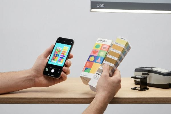
عند التحقق من دقة الألوان لحملة إعلانية قادمة، تعتمد فرق المشتريات غالبًا على نماذج PDF رقمية تُرسل عبر البريد الإلكتروني. ويفترضون أن فحص الملف على جهاز لوحي أو هاتف ذكي عالي الدقةيُمثل بدقة أداء عناصر الألوان الخمسة الأساسية بعد تصنيعها وعرضها في بيئة بيع بالتجزئة فعلية.
حتى المشترون ذوو الخبرة يقعون ضحية هذا التمويه الناتج عن التصحيح التلقائي. قد يوافق العميل على ملف رقمي، متجاهلاً تماماً أن شاشات الهواتف المحمولة تزيد تشبع البكسلات في الإضاءة الخلفية بشكل مصطنع.وعندما تُطبع تلك الأوراق المطبوعة، تبدو الألوان باهتة تماماً بالمقارنة. ولإثبات هذا التناقض، أضع الورقة المطبوعة مباشرةً تحت وهج مصابيح الفحص D50الساطع بجانب عينة ألوان PMS (نظام مطابقة ألوان بانتون). لقد كذبت الشاشة الرقمية. الاعتماد على شاشات غير معايرة بدلاً من عمليات المسح الطيفي الضوئي يؤدي إلى عدم اتساق فوري للعلامة التجارية، مما يتسبب غالباً في رفض الشحنة بالكامل من قبل متاجر التجزئة الكبرى، ويؤدي إلى أسابيع من إعادة العمل اليدوي المكلف.
| أخطاء شائعة للمبتدئين | الحل الاحترافي | فوائد أرضية البيع بالتجزئة |
|---|---|---|
| الموافقة على الألوان على شاشات الهواتف المحمولة | مراجعات عينات العينات المادية | يمنع رفض المنتجات في الإنتاج الضخم |
| تجاهل الإضاءة المحيطة في متاجر البيع بالتجزئة | تم الاختبار في ظروف إضاءة D5010 | يضمن وضع العلامة التجارية بدقة داخل المتجر |
| تخطي معايرة ما قبل الطباعة | استخدم تشخيصات مطياف الضوء11 | يوفر أسابيع من إعادة العمل المكلفة |
أحرص دائماً على أن يبتعد العملاء عن شاشاتهم ويوافقوا على معايرة الألوان عملياً تحت إضاءة مضبوطة. إنّ مواءمة التركيب الكيميائي مع التوقعات البصرية هي السبيل الوحيد لحماية استثمارك.
🛠️ مكتب هارفي: هل ما زلتَ تُوافق على حملاتك التسويقية العالمية عبر ملف PDF على هاتفك؟ 👉 اطلب عينة ألوان مطبوعة ↗ — حمّلها بأمان. صندوق رسائلي مفتوحٌ إذا كانت لديك أي أسئلة لاحقًا.
ما هو أحد العوامل التي يجب مراعاتها عند اختيار الألوان للعميل؟
إن اختيار لوحة الألوان ليس سوى الخطوة الأولى؛ يجب عليك مراعاة الطلاءات المادية المطبقة فوقها.
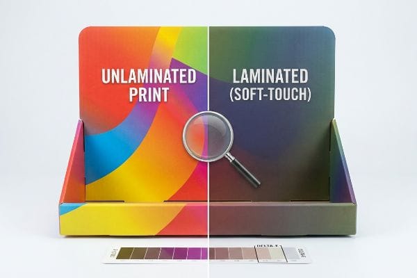
أحد العوامل التي يجب مراعاتها عند اختيار الألوان هو كيفية تأثير طبقات التغليف الملموسة كيميائيًا على المظهر النهائي. فإضافة أغشية بوليمرية واقية فوق الركائز المطبوعة يؤدي بطبيعته إلى تشتيت إضاءة المتاجر وتغميق الألوان. لذا، فإن توقع هذا التغير المادي يضمن مطابقة العبوة النهائية المنتجة بكميات كبيرة بدقة مع دليل أسلوب العلامة التجارية المعتمد من قبل العميل.
إذا لم تقم بتعديل ملفاتك الرقمية رياضياً للتعويض عن كيمياء التصنيع، فسوف يفشل منتجك النهائي في فحوصات الامتثال.
كيمياء التعتيم اللمسي
كثيراً ما تطلب العلامات التجارية خامات فاخرة لشاشات العرض في نقاط البيع، وتتعامل مع الخيارات الجمالية كطبقات رسومية مسطحة. فهي تختار لوناً مميزاً ونابضاً بالحياة لعلامتها التجارية، ثم تطلب بشكل منفصل تغليفاً حرارياً ناعم الملمس لإضفاء لمسة فاخرة على الشاشة، على افتراض أن هاتين الميزتين لن تتداخلا.
أضطر باستمرار للتدخل عندما يتجاهل العملاء الجوانب الفيزيائية والكيميائية للتغليف. يعمل التركيب البوليمري ثنائي المحور المجهري للفيلم ذي الملمس الناعم كمكنسة ضوئية حقيقية. بمجرد وضع هذا الفيلم، وتمرير إبهامي على سطحه المخملي غير اللامع، أعرف أن الصبغة الأساسية قد ازدادت قتامةً بنسبة 5% تقريبًا.إذا لم تُعزز كثافتي اللونين السماوي والأرجواني في مرحلة ما قبل الطباعة بشكل دقيق لاختراق هذا البوليمر، فلن يفي المنتج النهائي بمعايير التفاوت المسموح به (Delta-E).هذا الإغفال البسيط يُسبب تباينًا بصريًا كبيرًا على الرفوف، مما يؤدي إلى مطالبة ضخمة من تجار التجزئة تُبدد هامش ربح حملتك التسويقية بالكامل.
| أخطاء شائعة للمبتدئين | الحل الاحترافي | فوائد أرضية البيع بالتجزئة |
|---|---|---|
| تجاهل تشتت الضوء الناتج عن التغليف | قم بتطبيق منحنى تعويض ما قبل الطباعة14 | يحافظ على ألوان العلامة التجارية النابضة بالحياة |
| التعامل مع الطلاءات على أنها غير مرئية | زيادة كثافة الحبر الأساسي بنسبة 10%15 | يجتاز عمليات التدقيق الصارمة لدى تجار التجزئة |
| تخمين ناتج اللون النهائي | قم بإجراء اختبار على رقعة مغلفة | يحمي هوامش ربح المشروع |
أقوم ببرمجة منحنى تعويض دقيق في برنامج معالجة الصور قبل الطباعة (RIP) لكل عملية تغليف. من خلال زيادة تشبع الحبر الأساسي بشكل استباقي، أضمن ظهور الشاشة النهائية المغلفة بدقة ألوان مثالية.
🛠️ مكتب هارفي: هل وصل إليك آخر عرض مميز لديك بلون أغمق بنسبة 5% من دليل علامتك التجارية؟ 👉 احصل على دليل طلاء ما قبل الطباعة ↗ — لا توجد استمارات تُسبب مكالمات مبيعات لا تنتهي. قيمة خالصة فقط.
ما هي فوائد تحليل الألوان؟
يُعد إجراء التشخيصات الفنية للألوان الحاجز الوحيد الذي يفصل بين إطلاق منتج تجزئة مثالي وفشل ذريع في سلسلة التوريد.
تشمل فوائد تحليل الألوان التخلص من انحرافات التسجيل المكلفة، ومنع التشبع الزائد للحبر حسابيًا، وضمان استنساخ دقيق للصبغة في مختلف عمليات الطباعة. وباستخدام تشخيصات مطيافية ضوئية دقيقة، تتجنب العلامات التجارية تمامًا الشحنات المرفوضة بصريًا، وتضمن اجتياز منتجاتها الكرتونية المموجة لعمليات تدقيق الامتثال الصارمة في متاجر التجزئة الكبرى بنجاح تام.
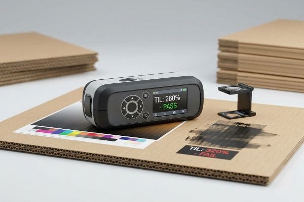
لكن تحليل الألوان لا يقتصر فقط على جعل الرسومات تبدو واضحة؛ بل يتعلق الأمر أساسًا بمنع الانهيار الهيكلي المادي على خط الإنتاج.
فشل نظام الحد الأقصى للحبر بالكامل
في منشأتي، أرى بشكل روتيني ملفات رسومية يقوم المصممون فيها برفع قنوات الألوان بشكل مصطنع إلى نسبة هائلة تصل إلى 320% من الحد الأقصى للحبر (TIL)16 لمجرد جعل الظلال الرقمية تبدو أعمق على شاشاتهم. إنهم يتعاملون مع اللون كعنصر بصري بحت، منفصل تمامًا عن فيزياء تطبيق الصبغة السائلة على ورق مقوى سميك 32ECT (اختبار مقاومة الحواف للكسر)17.
هذا ليس مجرد كلام نظري، بل أراه يحدث فعلاً في مختبر الاختبار عندما ترفض هذه الأوراق الكبيرة الحجم (48 بوصة، 121.9 سم) المغلفة بالطباعة الحجرية أن تجف. تتشبع ألياف الورق المسامية بالحبر السائل لدرجة أنه يتجمع على السطح بدلاً من امتصاصه. عندما أُدخل هذه الأوراق المبللة في آلة القطع الآلية، أحصل على لطخة لزجة مبللة من حبر سماوي غير معالج تنتقل مباشرة إلى شفرات القطع الفولاذية ويدي المشغل. يتسبب احتكاك الحبر المبلل في تعطل الآلة بشدة. باستخدام تحليل الألوان لفرض حد قطع صارم بنسبة 260% قبل الطباعة،أتخلص من هذا الخلل في التوتر السطحي، مما يمنع حدوث أعطال خطيرة في الآلة ويقلل وقت تجميع التغليف النهائي بنسبة 30%تقريبًا.
| أخطاء شائعة للمبتدئين | الحل الاحترافي | فوائد أرضية البيع بالتجزئة |
|---|---|---|
| تجاوز حدود الحبر بنسبة 300%20 | فرض نسبة صارمة تبلغ 260% من وقت الوصول21 | يمنع انتقال الحبر بشكل فوضوي |
| تجاهل معدلات امتصاص الورق | قم بإجراء فحص تشخيصي للكثافة | يقضي على حالات ازدحام خطوط الإنتاج الآلية |
| التضحية بسرعة الإنتاج | كثافة ظلال الغطاء في مرحلة ما قبل الطباعة | يُسرّع عملية التجميع بنسبة 30%22 |
أقوم بإزالة الألوان الزائدة المخفية بدقة متناهية في مرحلة التشخيص قبل الطباعة، وذلك قبل طباعة أي لوحة. تساهم إدارة كميات الحبر في حماية سلامة اللوحة والحفاظ على خط التجميع يعمل بأقصى سرعة.
🛠️ مكتب هارفي: لا تدع عيبًا هيكليًا بحجم 2 مليمتر يُفسد إطلاقًا ضخمًا لـ 500 متجر. 👉 أرسل لي ملف تصميم القالب ↗ — سأُجري اختبارات دقيقة للحسابات قبل أن تُهدر ميزانيتك على الإنتاج الضخم.
خاتمة
يمكنك اختيار مطبعة أرخص، ولكن عندما يرفض حبر مشبع بنسبة 320% الجفاف، يتسبب ذلك في أعطال جسيمة في الآلات، مما يُبطئ خط تجميع التعبئة والتغليف بنسبة تُقدر بـ 30%. هذه هي المواصفات الدقيقة التي يستخدمها أفضل 10 عملاء لديّ في قطاع التجزئة لضمان عدم رفض أي منتج. توقف عن التخمين بشأن دقة الطباعة قبل البدء، ودعني أُجري شخصيًا تدقيقًا مجانيًا لخطوط الطباعة على تصميمك ↗ لاكتشاف أخطاء تشبع الألوان الخطيرة قبل بدء الإنتاج بكميات كبيرة.
نموذج ألوان CMYK، https://en.wikipedia.org/wiki/CMYK_color_model. شرح موجز لكيفية دعم مصدر خارجي موثوق لهذا الادعاء. دور الدليل: التعريف؛ نوع المصدر: دليل فني. يدعم: مكونات ووظيفة نموذج ألوان CMYK الطرحي في الطباعة. ملاحظة النطاق: معيار صناعي عام. ↩
"التنقيط النصفي"، https://en.wikipedia.org/wiki/Halftone. شرح تقني لعملية الألوان الطرحية وتقنية التنقيط النصفي المستخدمة لمحاكاة التدرجات اللونية المتصلة في الطباعة التجارية. دور الدليل: تعريف تقني؛ نوع المصدر: دليل صناعة الطباعة. يدعم: آلية إنشاء الألوان في نظام CMYK. ملاحظة النطاق: ينطبق على الطباعة الأوفست والرقمية القياسية. ↩
"النمذجة الرياضية واستراتيجيات التعويض للطباعة..."، https://pmc.ncbi.nlm.nih.gov/articles/PMC12574880/. تحليل علم المواد لمسامية الركيزة وانتشار الحبر الناتج (زيادة حجم النقاط) على الورق المقوى المموج الخام. دور الدليل: المواصفات الفنية؛ نوع المصدر: ورقة بحثية في صناعة الورق. يدعم: سبب التدهور البصري على الركائز غير المطلية. ملاحظة النطاق: التركيز على ألياف السليلوز غير المطلية. ↩
"الطباعة بالألوان الموضعية مقابل الطباعة بالألوان المعالجة"، https://www.pantone.com/na/en-us/articles/technical/spot-vs-process-color?srsltid=AfmBOore-qzBDSPyVZ4IwZbVJhP2iHHXZnhjLDsTT-GC3XM0aFYfzwBM. وثائق فنية حول اتساق وتشبع الألوان الموضعية مقارنةً بالطباعة بالألوان المعالجة CMYK. دور الدليل: مواصفات فنية؛ نوع المصدر: معيار صناعي. يدعم: الادعاء بأن الأحبار الموضعية تضمن تباينًا أعلى. ملاحظة النطاق: خاص بعمليات الطباعة التجارية. ↩
"مقارنة بين نظام CMYK والألوان الموضعية في طباعة التغليف: ما تحتاج إليه العلامات التجارية لمنتجات المستهلك..."، https://meyers.com/meyers-blog/cmyk-vs-spot-colors-in-packaging-printing-what-cpg-brands-need-to-know/. تحليل لكيفية تكوين أنماط النقاط النصفية للألوان المرئية، والفرق البصري عند استبدالها بطبقات حبر صلبة. دور الدليل: مبدأ تقني؛ نوع المصدر: دليل الطباعة. يدعم: التأكيد على أن طبقات الحبر الصلبة تقضي على التحبب. ملاحظة النطاق: ينطبق على طباعة التغليف عالية الدقة. ↩
"تأثير ظروف صناعة الورق على امتصاص الحبر و..."، https://bioresources.cnr.ncsu.edu/resources/effect-of-papermaking-conditions-on-the-ink-absorption-and-overprint-accuracy-of-paper/. شرحٌ علميٌّ لمسامية الركيزة وكيفية تأثير امتصاص الحبر على خصائص انعكاس الضوء للألوان. دور الدليل: علم المواد؛ نوع المصدر: ورقة بحثية تقنية. يدعم: الادعاء بأن الامتصاص يؤدي إلى بهتان اللون. ملاحظة النطاق: يتعلق بشكل أساسي بالركائز غير المطلية. ↩
"ألوان الطباعة مقابل ألوان الشاشة: دليل للطباعة الدقيقة"، https://us.ktcplay.com/blogs/technology-hub/why-printed-colors-dont-match-screen?srsltid=AfmBOorgasAO38w6wJEelOUMso4Qjc0CA–32jXw6TGyx4-URMkeDHjM. تحليل فني للاختلافات بين نطاقات ألوان شاشة RGB ومخرجات CMYK أو Pantone الفعلية في بيئات البيع بالتجزئة. دور الدليل: دحض فني؛ نوع المصدر: بحث في علم الألوان. يدعم: مغالطة الاعتماد على شاشات الأجهزة المحمولة لدقة الألوان. ملاحظة النطاق: ينطبق على الأجهزة الاستهلاكية غير المعايرة. ↩
"ألوان الطباعة مقابل ألوان الشاشة: دليل للطباعة الدقيقة"، https://us.ktcplay.com/blogs/technology-hub/why-printed-colors-dont-match-screen?srsltid=AfmBOoqlhrSSXPqVtr-P6PbeK1jLox1RE8t9OyQuz70bJP9958OYMvR5. شرح موجز لكيفية اختلاف ضوء RGB المنبعث من شاشات الهواتف المحمولة عن ألوان الطباعة CMYK العاكسة، مما يؤدي إلى فجوات تشبع ملحوظة. دور الدليل: التحقق التقني؛ نوع المصدر: دراسة في علم الألوان. يدعم: التباين بين النسخ الرقمية والمطبوعة. ملاحظة النطاق: ينطبق على الأجهزة الاستهلاكية غير المعايرة. ↩
"فحص الألوان باستخدام D50 في فنون الطباعة | JUST-Normlicht"، https://www.just-normlicht.com/us/d50-color-checking-graphic-arts.html. التحقق من معيار D50 (5000 كلفن) كمعيار دولي لعرض الألوان ومطابقتها في صناعات الطباعة وفنون الطباعة. دور الدليل: معيار فني؛ نوع المصدر: معيار ISO/ANSI. يدعم: صلاحية استخدام مصابيح D50 للتحقق النهائي من الألوان. ملاحظة النطاق: خاص ببيئات فحص الطباعة الاحترافية. ↩
"فوضى الألوان في غرفة الإضاءة: لماذا يُعدّ D50 ميزةً خارقةً في تغليف منتجاتك؟"، https://www.linkedin.com/pulse/color-chaos-light-booth-why-d50-your-packaging-carmon-madison-6bb4e. شرح لمعيار ISO D50 لإضاءة ضوء النهار، المستخدم لتقييم الألوان بشكلٍ متسقٍ في مختلف الصناعات. دور الدليل: معيار تقني؛ نوع المصدر: معيار صناعي (ISO). يدعم: متطلبات الإضاءة الموحدة لضمان دقة العلامة التجارية. ملاحظة النطاق: يتعلق تحديدًا بالفنون الرسومية وإدارة الألوان. ↩
"مقياس الطيف الضوئي"، https://www.che.utah.edu/teaching_module/spectrophotometer/. تفاصيل حول كيفية قياس مقاييس الطيف الضوئي للانعكاس الطيفي لضمان دقة الألوان أثناء معايرة ما قبل الطباعة. دور الدليل: المواصفات الفنية؛ نوع المصدر: دليل فني. يدعم: استخدام أجهزة دقيقة لمنع أخطاء الإنتاج. ملاحظة النطاق: يركز على سير العمل الاحترافي في الطباعة. ↩
"التغليف ذو الملمس الناعم مقابل التغليف غير اللامع"، https://packwo.com/blog/soft-touch-vs-matte-lamination-for-packaging/. تُؤكد البيانات الفنية المتعلقة بالخصائص البصرية لأغشية البوليمر ثنائية المحور النسبة المئوية المتوسطة لتغميق الصبغة. دور الدليل: التحقق الواقعي؛ نوع المصدر: ورقة بيانات فنية أو دراسة علمية للألوان. يدعم: الادعاء المحدد بانحراف بصري بنسبة 5%. ملاحظة: قد تختلف القيمة بناءً على سُمك الغشاء وشفافية الركيزة. ↩
"ما هي دقة الألوان في التغليف؟ مطابقة ألوان بانتون..."، https://3dcolor.com/what-is-color-accuracy-in-packaging-pantone-matching-delta-e-and-why-brand-color/. تحدد معايير الصناعة لـ Delta-E الحد المقبول لانحراف اللون في عبوات البيع بالتجزئة. دور الدليل: معيار فني؛ نوع المصدر: ISO أو دليل جودة الصناعة. يدعم: الادعاء بأن التغليف بدون تعديلات الكثافة يؤدي إلى عدم الامتثال. ملاحظة النطاق: تختلف مستويات التسامح حسب دليل أسلوب العلامة التجارية. ↩
"التأثير البصري للتغليف"، https://www.diva-portal.org/smash/get/diva2:652943/FULLTEXT01.pdf. تشرح هذه الوثيقة التقنية كيفية تعديل منحنيات التعويض لمستويات الحبر لموازنة تشتت الضوء وتحولات الألوان الناتجة عن الطلاءات الفيزيائية. دور الدليل: التحقق من المنهجية؛ نوع المصدر: كتاب مدرسي في فنون الطباعة. يدعم: استخدام المنحنيات لتصحيح التغليف. ملاحظة النطاق: خاص بسير عمل إدارة الألوان في مرحلة ما قبل الطباعة. ↩
"ما هي كثافات الحبر القياسية؟"، https://printplanet.com/threads/standard-ink-densities.618/. تحدد معايير الصناعة لإدارة الألوان الزيادة اللازمة في كثافة الحبر للتعويض عن تأثير التعتيم البصري الناتج عن التغليف. دور الدليل: المواصفات الفنية؛ نوع المصدر: دليل صناعة الطباعة. يدعم: ادعاء تعديل الكثافة بنسبة 10%. ملاحظة النطاق: قد يختلف بناءً على سمك الطلاء ومادته. ↩
"إدارة تغطية الحبر في تصميم الطباعة: دليل للألوان الانتقائية..."، https://www.printing.org/content/2024/04/23/adjustinginklimits.april2024. إرشادات فنية حول الحد الأقصى المسموح به لإجمالي كمية الحبر (TIL) لمنع فشل التجفيف وانتقال الألوان على الركائز الماصة. دور الدليل: عتبة فنية؛ نوع المصدر: دليل صناعة الطباعة. يدعم: الادعاء بأن 320% حد مفرط وإشكالي. ملاحظة: تختلف العتبات باختلاف نوع الحبر وعملية الطباعة. ↩
"فهم قوة صناديق الشحن - EcoEnclose"، https://www.ecoenclose.com/blog/understanding-shipping-box-strength/?srsltid=AfmBOooFyGHBI0zLtD5alHNXqEUgfwBE1fsKHgMgFVXdg9PTs4hQ2yun. التحقق من اختبار سحق الحافة (ECT) كمعيار لقياس قوة تكديس الكرتون المموج وعلاقته بتشبع الحبر. دور الدليل: المواصفات الفنية؛ نوع المصدر: معيار صناعة التغليف. يدعم: الخصائص الفيزيائية للمادة الأساسية. ملاحظة النطاق: خاص بمعايير الكرتون المموج في أمريكا الشمالية. ↩
"فهم التغليف المصفح بتقنية الطباعة الحجرية والوجه الواحد..."، https://pmpackaging.com/posts/2025/03/understanding-litho-laminated-packaging. التحقق من حد الحبر الكلي (TIL) البالغ 260% كمعيار تقني لتجنب تشبع الحبر على الركائز المموجة. دور الدليل: المواصفات الفنية؛ نوع المصدر: دليل معايير صناعة الطباعة. يدعم: استخدام حد قطع محدد لـ TIL لمنع فشل التجفيف. ملاحظة النطاق: قد تختلف الحدود باختلاف التركيب الكيميائي للحبر ومسامية الورق. ↩
"تحليل تأثير الإدارة السليمة للحبر على الأداء العام... - PMC"، https://pmc.ncbi.nlm.nih.gov/articles/PMC11330467/. تحليل لتأخيرات الإنتاج الناتجة عن أعطال معالجة الحبر، وما يترتب عليها من تحسين في الكفاءة بفضل حدود الحبر المُثلى. دور الدليل: مقياس أداء؛ نوع المصدر: دراسة حالة في مجال التصنيع. يدعم: الادعاء بأن تقليل تلطخات الحبر يزيد من إنتاجية التجميع. ملاحظة: تعتمد النسب المئوية للزيادة على أحجام الإنتاج المحددة. ↩
"خطأ × تغطية الحبر أكثر من 300%"، https://community.adobe.com/questions-652/error-x-ink-coverage-over-300-819461. وثائق فنية تشرح سبب تسبب تغطية الحبر التي تتجاوز 300% في انتقال الحبر، وتلطيخه، وعدم جفافه. دور الدليل: علاقة سببية فنية؛ نوع المصدر: دليل فني للفنون الرسومية. يدعم: تحديد 300% كعتبة حرجة للفشل. ملاحظة النطاق: يعتمد على معدلات امتصاص الورق. ↩
"فهم مواصفات صناعة الطباعة؛ الحد الأقصى المسموح به للحبر؛ إجمالي الحبر..."، https://www.colourphil.co.uk/gcr-ucr-total-ink.shtml. التحقق من حد 260% لإجمالي الحبر (TIL) كمعيار مهني لمنع تشبع الحبر ومشاكل الجفاف. دور الدليل: المواصفات الفنية؛ نوع المصدر: دليل صناعة الطباعة. يدعم: فعالية تطبيق حد 260% لإجمالي الحبر بدقة. ملاحظة: قد تختلف الحدود المحددة بناءً على نوع الركيزة والحبر. ↩
"تأثير سرعة الطباعة على الأداء الميكانيكي للطباعة ثلاثية الأبعاد..."، https://pmc.ncbi.nlm.nih.gov/articles/PMC12028823/. بيانات تجريبية أو دراسات حالة تُظهر الزيادة الكمية في كفاءة الإنتاج عند تحديد كثافة الظلال في مرحلة ما قبل الطباعة. دور الدليل: مقياس كمي؛ نوع المصدر: تقرير أداء الإنتاج. يدعم: العلاقة بين تحسين مرحلة ما قبل الطباعة وسرعة التجميع. ملاحظة: قد تختلف النسبة المئوية بناءً على الآلات. ↩