عند التجول في ممرات المتاجر، تبدو معظم الحملات التسويقية متشابهة. ولكن وراء هذه الرسومات، تحدد عوامل البقاء الهيكلية أي العلامات التجارية تستحوذ على مبيعات عفوية وأيها ينتهي بها المطاف في طي النسيان.
تُعدّ أفضل أنواع العروض التسويقية للمنتجات في متاجر التجزئة هي تلك التي تُعزز ظهورها مع الالتزام التام بلوائح المتجر. تشمل هذه الأنواع منصات عرض البضائع، ووحدات العرض الطرفية، ووحدات العرض الأرضية، ورفوف العرض على الطاولات، وكلها مصممة لتحقيق التوازن بين سعة التحميل والتصميم الهيكلي لضمان الحصول على أفضل مساحة في الممرات.

إن الحصول على موافقة المشتري على عملك الفني ليس سوى الخطوة الأولى. أما الاختبار الحقيقي لحملة تسويقية في قطاع التجزئة فيكمن في اجتياز سلسلة التوريد المعقدة والتركيب بسلاسة في بيئة المتجر المزدحمة.
ما هي أنواع عروض البيع بالتجزئة المختلفة؟
لا يقتصر تصنيف المتاجر على اختيار الأشكال من الكتالوج فحسب، بل يتعلق بفهم القوانين المكانية الصارمة التي تحكم المناطق المختلفة داخل متجر المستودعات.
تُصنّف أنواع عروض البيع بالتجزئة المختلفة بشكل أساسي حسب مناطق وضعها المادية. تشمل الأشكال القياسية هياكل المنصات الكبيرة للممرات المركزية، والوحدات القائمة بذاتها للأرفف الطرفية، وصواني العرض المدمجة لمناطق نقاط البيع، ويتطلب كل منها تصميمًا هندسيًا خاصًا لتحمل حركة المتسوقين المتغيرة وصعوبة إعادة التخزين.
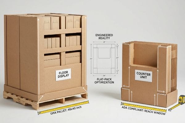
قد يؤدي تصميم يبدو مثالياً على شاشة الكمبيوتر إلى عمليات استرداد ضخمة من قبل تجار التجزئة إذا انتهك قيود الممرات المادية.
القيود المكانية لقانون الأمريكيين ذوي الإعاقة مقابل قانون إدارة الموارد البشرية
عند تدقيقي لتصاميم منتجات العملاء، ألاحظ باستمرار أن العلامات التجارية تروج لتصميم "قابل للتطوير" حيث يتم ببساطة تقليص حجم شاشة عرض كبيرة في نقاط البيع بنسبة 50% لتصبح وحدة عرض على منضدة نقاط البيع. حتى فرق المشتريات المخضرمة غالباً ما تتجاهل هذه الثغرة، معتقدةً أن ملف التصميم بمساعدة الحاسوب (CAD) الموحد يعمل على جميع الأبعاد. إنهم يتجاهلون القواعد القانونية واللوجستية الصارمة التي تحدد هاتين المنطقتين المنفصلتين تماماً،معتقدين خطأً أن التناسب الرياضي يضمن الامتثال.
في منشأتي، ألاحظ بشكل متكرر أن هذا العمل النظري المكتبي يتسبب في انهيار الواقع المادي أثناء التحقق من صحة ما قبل الإنتاج. قدّم مدير مشتريات مؤخرًا وحدة أرضية مصغّرة مخصصة لعدادات الدفع. عندما قستُ النموذج المادي مقابل نافذة الامتثال لمعيار ADA 15-48 بوصة (381-1219.2 مم) للوصول الأمامي ، وجدتُ أن الرف العلوي يبلغ 51.4 بوصة (1305.5 مم) بالضبط، مما يجعله مخالفًا للقانون بشكل فوري. لم يكن الحل تجميليًا فحسب؛ بل كان عليّ فصل مسارات الهندسة بشكل دائم. ربطتُ ملفات الأرضية رياضيًا بحدّ GMA الصارم 48×40 بوصة (1219.2×1016 مم) لحمولة المستودع، وأعدتُ تصميم الحسابات الهيكلية لوحدة العداد بالكامل . من خلال تثبيت قاعدة العرض بدقة على أبعاد 24×12 بوصة (609.6×304.8 مم)، تمكنتُ من تقليل وقت تجميع التغليف المشترك بمقدار 38 ثانية لكل وحدة، مما قضى تمامًا على مخاطر رفض مديري المتاجر للمنتجات، ووفر للعملاء ما يُقدّر بنحو 15% من تكاليف المواد المهدرة. علاوة على ذلك، فإن الحفاظ على هذه الهياكل الكرتونية المموجة مُسطّحة يعني أن حاوية شحن واحدة تُغني عن أربع حاويات من البدائل البلاستيكية الصلبة المُجمّعة مسبقًا، مما يُحقق ميزة كبيرة في كثافة الشحن.
| ميزة مترية | التوسع العام | الواقع المُهندس |
|---|---|---|
| قاعدة الأرضية | تحديد الحجم بشكل عشوائي | قفل GMA صارم4 |
| ارتفاع المنضدة | تخفيض مباشر بنسبة 50% | متوافق مع معايير ADA5 |
| كثافة الشحن | حجم فراغ كبير | تحسين عملية التعبئة المسطحة |
أرفض السماح لأي افتراضات خاطئة حول قابلية التوسع بإفساد إطلاق منتجك. أعتمد في تصميم كل خطوة على أسس رياضية دقيقة تتوافق مع معايير البيع بالتجزئة ، مما يضمن أن مساحة منتجك الفعلية تتناسب مع قياسات مدير المتجر.
🛠️ مكتب هارفي: هل تُخالف وحدات العرض المصغّرة لديكم معايير الوصول سرًا وتُعرّضكم لخطر الرفض الفوري من قِبل تجار التجزئة؟ 👉 احصلوا على تدقيق مجاني للقيود المكانية ↗ — أقوم بمراجعة كل ملف هيكلي شخصيًا خلال 24 ساعة.
ما هي الأنواع الأربعة الأساسية للشاشات؟
تستطيع معظم العلامات التجارية تسمية التكوينات الأربعة الأساسية، لكن القليل منها فقط يفهم فيزياء المواد المجهرية اللازمة للحفاظ عليها ثابتة تحت وزن المنتج الثقيل.
تتضمن أنواع العرض الأساسية الأربعة منصات أرضية، ووحدات عرض على الطاولات، ووحدات عرض البضائع على منصات نقالة، ووحدات عرض جانبية في نهاية الممرات. ويخدم كل نوع منها وظيفة تسويقية محددة، تتراوح بين تخزين المنتجات بكميات كبيرة في الممرات الرئيسية، وتحفيز عمليات الشراء السريعة والعفوية بالقرب من مناطق الدفع ذات الحركة الكثيفة.
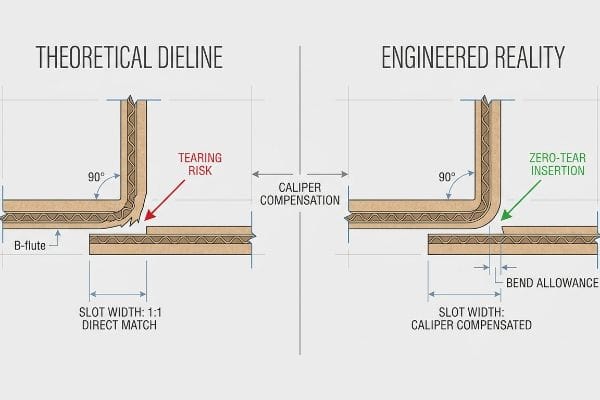
إن معرفة أسماء هذه الأشكال لا تعني شيئاً إذا تمزقت ألياف الورق المقوى الأساسية أثناء التجميع.
واقع تعويض الفرجار
عند مراجعة التصاميم الواردة، ألاحظ كثيراً وجود خطوط قطع مسطحة متجهة لحوامل الأرضيات والوحدات الجانبية ، تتجاهل تماماً سُمك الكرتون المموج. حتى المصممون ذوو الخبرة يرسمون ألسنة وفتحات متشابكة بنفس عرض اللوحة المقابلة، متعاملين مع لوح الكرتون المموج السميك(6) كما لو كان ورقة طباعة مسطحة. هذا الخطأ المنهجي يفترض أن خطاً مستقيماً بسيطاً في البرنامج سيتحول بسلاسة إلى طية بزاوية 90 درجة في خط التجميع.
هذا ليس مجرد كلام نظري، بل أراه يحدث فعلاً في قسم الاختبارات عند تشغيل عينات ما قبل الإنتاج. في الشهر الماضي، أرسل أحد العملاء ملفًا قياسيًا لحامل أرضي، حيث كان من المفترض أن تُطوى لوحة بسمك 3.04 مم (0.12 بوصة) وتُثبّت في فتحة بنفس السمك. ولأنهم لم يأخذوا في الحسبان لوح E-flute7، فقد استهلك نصف قطر الطي جزءًا من المادة، مما جعل الفتحة ضيقة للغاية. حاول عامل التعبئة والتغليف إدخالها بالقوة، مما تسبب في تمزق مدمر بطول 15.2 مم (0.6 بوصة) على طول الطبقة العلوية. علمتني خبرتي التي تمتد لعشرين عامًا في هذا المجال كيفية إصلاح هذا الخلل دون إعادة تصميم اللوحة بالكامل. استخدمت البرنامج وطبقت تلقائيًا خوارزمية تعويض السُمك البارامترية، موسعًا فتحات الاستقبال بمقدار 1.01 مم (0.04 بوصة) بالضبط لإنشاء مساحة انحناء مثالية8. بفضل هذا التصحيح الرياضي الدقيق، تم تجميع الوحدات المعبأة مسبقًا بسلاسة تامة، مما قلل وقت العمل اليدوي بمقدار 45 ثانية لكل وحدة، وحافظ على هامش ربح المشروع قبل بدء الإنتاج الضخم. وعند الجمع بين سرعة التجميع هذه وحقيقة أن هذه الهياكل تُشحن مسطحة تمامًا، يتم خفض تكاليف العمالة والشحن البحري بشكل كبير.
| القياس الهيكلي | خط القطع النظري | الواقع المُهندس |
|---|---|---|
| عرض الفتحة | تطابق مباشر بنسبة 1:1 | مُعَوَّضَة الكَايْبِر9 |
| احتكاك التجميع | خطر تمزق مرتفع | إدخال بدون تمزق10 |
| الخدمات اللوجستية | إنجاز بطيء | التعبئة والتغليف السريع |
لا أثق أبدًا بملف متجه مسطح حتى أحسب سمك اللوحة الفعلي. أصمم انحناءات دقيقة في كل طية حتى لا يواجه فريق التجميع أي مشكلة مع الرسومات الممزقة.
🛠️ مكتب هارفي: هل تتسبب هوامش الطي غير المحسوبة في تمزق الرسومات المطبوعة بتقنية الطباعة الحجرية أثناء عمليات التجميع في المستودع؟ 👉 اطلب فحصًا مجانيًا لهوامش ثني خط القطع ↗ — سرية تامة. تصاميمك غير المنشورة في مجال البيع بالتجزئة في أمان تام معي.
كيفية عرض المنتجات في متاجر البيع بالتجزئة؟
إن تأمين مساحة في الممر يُعد انتصاراً هائلاً، ولكن الطريقة التي ترتب بها البضائع فعلياً على الصينية هي التي تحدد ما إذا كان المتسوقون سيتفاعلون معها بالفعل.
لعرض المنتجات بشكل مناسب في متاجر البيع بالتجزئة، يجب على العلامات التجارية ترتيب البضائع استراتيجياً لتحقيق أقصى قدر من التشويق البصري وتقليل صعوبة إعادة التخزين. يتضمن ذلك استخدام فواصل معيارية، وضمان رؤية المنتجات بوضوح، وتصميم مسافات فيزيائية محددة تسمح لموظفي المتجر بإعادة تحميل المنتجات بسهولة دون إتلاف الأجزاء الهيكلية.
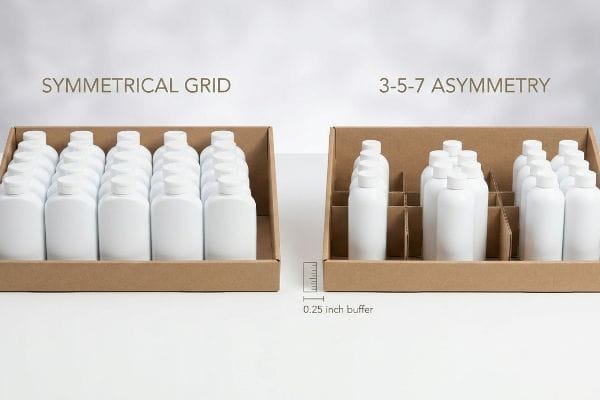
قد يبدو تصميم المنتج المتناظر تمامًا رائعًا في العرض ثلاثي الأبعاد، ولكنه غالبًا ما يخلق اختناقات مادية كارثية أثناء عمليات البيع بالتجزئة الفعلية.
بروتوكول إعادة التخزين غير المتماثل 3-5-7
ألاحظ باستمرار محاولات بعض العلامات التجارية لتكديس كميات هائلة من المنتجات الثقيلة على رفوف عرض واحدة، بشكل متناسق ومتدرج. وينطلقون من فرضية أن زيادة الكثافة تؤدي بطبيعة الحال إلى زيادة حجم المبيعات لكل قدم مربع. إلا أن هذا النهج المكتظ يُسبب احتكاكًا كبيرًا أثناء عمليات إعادة التخزين،مما يدفع البائعين المتسرعين إلى حشر المنتجات في المساحات المخصصة لها.
هذا ليس مجرد كلام نظري، فقد تعلمت هذا الدرس بطريقة قاسية الشهر الماضي أثناء اختبار تصميم جديد لصينية PDQ عالية الكثافة. في عام ٢٠٢٢، طلبت من كبير مهندسي التغليف، مارك، التحقق من صحة تصميم شبكي مُحكم باستخدام قالب ECT (اختبار سحق الحواف) ذي قاعدة ١٢ من نوع B-flute 32. خلال محاكاة إعادة التعبئة اليدوية، حاول مارك ضغط زجاجة بعرض ١٠٤٫١ ملم (٤٫١ بوصة) في فجوة ١٠٥٫٤ ملم (٤٫١٥ بوصة). كان الاحتكاك شديدًا لدرجة أن الزجاجة علقت بالبطانة الداخلية، مما تسبب في انفصال حافة التثبيت الأمامية وانبعاجها تحت ضغط جانبي بسيط لا يتجاوز ٦٫٥ كجم (١٤٫٥ رطل). اضطررنا على الفور إلى إعادة تشكيل قالب B-flute وتعديل خط القطع مباشرةً على طاولة CNC (التحكم الرقمي بالحاسوب). فرضتُ استخدام فواصل معيارية تفصل البضائع تلقائيًا إلى مجموعات ذات أرقام فردية، مع تطبيق مسافة فاصلة صارمة تبلغ 6.35 ملم (0.25 بوصة) حول كل منتج. هذه المسافة الهيكلية قضت تمامًا على تمزق الورق المقوى أثناء عمليات إعادة التخزين المكثفة في المتاجر، مما أدى إلى إطالة عمر الصينية بنسبة 40% تقريبًا، ووفر على العميل تكاليف استبدال باهظة في منتصف الحملة. أبذل قصارى جهدي وأستثمر الوقت والمال في مختبري التجريبي لضمان عدم تأثر أرباحك في المتجر.
| مقياس التخطيط | شبكة متناظرة | عدم التناظر 3-5-7 |
|---|---|---|
| فجوة إعادة التخزين | لا يوجد تصريح دخول | حاجز 0.25 بوصة14 |
| التوتر البصري | يمتزج في | يلفت انتباه المتسوقين |
| سلامة الشفاه | خطر تمزق مرتفع15 | إعادة تعبئة بدون احتكاك16 |
أصمم منتجاتي لتناسب احتياجات البائع المرهق تمامًا كما أصممها للمتسوق. من خلال هندسة فواصل دقيقة، أضمن أن تتحمل هياكلكم عمليات إعادة التخزين اليومية المكثفة دون أي تلف هيكلي.
🛠️ مكتب هارفي: هل يتسبب تصميم العرض المتناظر عالي الكثافة في تمزق حواف الصواني قبل بيع المنتجات؟ 👉 احصل على تدقيق مجاني لتصميم عرض منتجاتك ↗ — لا يوجد وسطاء. تتحدث مباشرةً مع مهندسين متخصصين.
ما هي العناصر الأربعة الأساسية للتسويق البصري؟
إن تحقيق التوازن بين المنتج والسعر والمكان والترويج يتطلب انضباطاً مالياً صارماً، لكن العلامات التجارية غالباً ما تخرب حملاتها الخاصة من خلال سوء تخصيص ميزانية المواد المادية.
تُشابه عناصر المزيج التسويقي الأربعة (المنتج، السعر، المكان، الترويج) عادةً عناصر التسويق التقليدي. إلا أن تطبيق هذه العناصر النظرية على أرض الواقع في متاجر التجزئة يتطلب مواءمة أهداف الحملة الترويجية مع القيود اللوجستية الصارمة، والتأكد من قدرة منطقة العرض المخصصة على تحمل وزن المنتج.
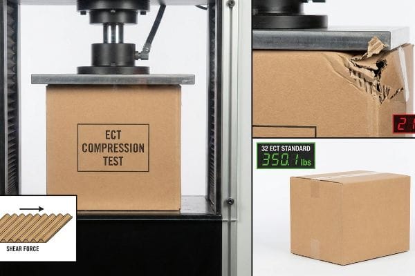
عندما تقوم فرق المشتريات بعزل مقياس "السعر"، فإنها غالباً ما تقدم تنازلات هيكلية كارثية تدمر التنفيذ الترويجي الشامل.
فخ التدهور في علاجات ECT التجميلية
عند تقييم طلبات عروض الأسعار من العملاء، ألاحظ في كثير من الأحيان أن فرق المشتريات تتعامل مع التشطيبات التجميلية باهظة الثمن، مثل التغليف الكامل برقائق معدنية، على أنها متطلبات تسويقية لا تقبل المساومة. وللتعويض عن هذه التكاليف البصرية الباهظة، يقومون بتخفيض تصنيف اختبار مقاومة السحق للحواف للكرتون المموج الأساسي من 32 إلى 26 درجة،وذلك لتوفير بضعة سنتات فقط لكل وحدة. ويفترضون خطأً أن المظهر الخارجي اللامع سيخفي تجويفًا داخليًا متضررًا من حيث البنية تحت تأثير الأحمال العلويةالثقيلة.
في منشأتي، أرى باستمرار استراتيجية نقل التكاليف هذه تنتهي بكارثة كاملة في قسم الاختبارات. خلال اختبار ضغط الصناديق (BCT) الأخير، انبعجت قاعدة صندوق عميل مغلفة برقائق معدنية من فئة 26 ECT بشكل واضح تحت وزن محاكاة لمنصة نقالة يبلغ 96.3 كجم فقط. ببساطة، افتقرت قنوات اللب إلى كثافة ألياف الورق الكافية لمقاومة قوة القص الهابطة، مما أدى إلى انضغاطها للداخل بمقدار 29.2 مم. قمت بقياسات الميكرومتر وأثبتنا أننا لسنا بحاجة إلى أغشية رقائق معدنية باهظة الثمن لجذب انتباه المستهلك؛ كل ما نحتاجه هو استعادة الأساس الهيكلي. بمجرد أن سمح لي فريق المشتريات بتعديل قائمة مكونات Excel، قمت بترقية اللب إلى معيار 32 ECT الأصليواستبدلت الرقائق المعدنية باهظة الثمن بطبقة مائية لامعة عالية الصلابة65%، مما يضمن سلامة الشحنات دون أي تلف مع خفض تكلفة المواد للوحدة الواحدة بنسبة 8%. من خلال الاعتماد على قوة الكرتون المموج القابل للطي بدلاً من التضخم التجميلي الهش، يمكنك شحن منتجات أكثر كثافة وقوة وأرخص بكثير.
| مقياس الأداء | التركيز التجميلي | الواقع المُهندس |
|---|---|---|
| ركيزة ECT | تم تخفيض 26 وحدة دراسية معتمدة21 | فيرجن 32 إي سي تي22 |
| تشطيب السعر | فيلم رقائق معدنية باهظ الثمن | طبقة لامعة مائية23 |
| النجاة أثناء النقل | سحق كارثي | حمل ديناميكي عالي |
أرفض التضحية بسلامة هيكلك الداخلي من أجل غلاف خارجي لامع. أوازن بين مبادئ الفيزياء الأساسية لقوة الضغط وتقنيات الطباعة المتطورة لضمان أقصى قدر من المتانة.
🛠️ مكتب هارفي: هل تُجبر التشطيبات التجميلية باهظة الثمن فريق المشتريات لديكم سرًا على تقليص جودة ألواحكم الإنشائية الأساسية؟ 👉 احصل على اختبار ضغط المواد ECT مجانًا ↗ — أراجع كل ملف إنشائي شخصيًا خلال 24 ساعة.
خاتمة
سواءً كان الأمر يتعلق بمنع الصواني غير المتوازنة من التأثير سلبًا على هوامش الربح عند الدفع، أو منع تمزق الرسومات المطبوعة بتقنية الطباعة الحجرية على خط التجميع نتيجةً لعدم دقة حسابات الطي، فإن نجاح متاجر التجزئة يتطلب حسابات هيكلية دقيقة. في الشهر الماضي وحده، ساعدت مراجعتي الهيكلية ثلاث علامات تجارية على تجنب خسائر تزيد عن 10,000 دولار أمريكي في المخزون التالف ورسوم استرداد التكاليف من تجار التجزئة. لا تدع العمل النظري المكتبي يُعيق إطلاق منتجاتك في المتاجر؛ دعني أُجري شخصيًا مراجعة هيكلية مجانية لتغليف منتجات التجزئة ↗ لضمان سلامتها خلال مراحل سلسلة التوريد الصعبة.
معايير إمكانية الوصول وفقًا لقانون الأمريكيين ذوي الإعاقة (ADA) - Access-Board.gov، https://www.access-board.gov/ada/. يُظهر مصدر موثوق يُفصّل معايير إمكانية الوصول وفقًا لقانون الأمريكيين ذوي الإعاقة (ADA) وقوانين السلامة من الحرائق أن عروض الأرضيات ووحدات الطاولات تخضع لأنظمة مكانية وأنظمة إمكانية وصول مختلفة. دور الدليل: التحقق من الحقائق؛ نوع المصدر: معيار تنظيمي. يدعم: الادعاء بأن المناطق المنفصلة لها متطلبات قانونية متميزة. ملاحظة النطاق: يركز على قانون الأمريكيين ذوي الإعاقة (ADA) وقوانين السلامة في الولايات المتحدة. ↩
معايير قانون الأمريكيين ذوي الإعاقة (ADA) للتصميم المُيسّر، الباب الثالث، اللائحة 28 CFR...، https://www.ada.gov/law-and-regs/design-standards/1991-design-standards/. التحقق من إرشادات قانون الأمريكيين ذوي الإعاقة (ADA) فيما يتعلق بأقصى وأدنى نطاقات الوصول للعناصر المُيسّرة. دور الدليل: التحقق الفني؛ نوع المصدر: لائحة حكومية. يدعم: الامتثال القانوني لارتفاعات العرض. ملاحظة النطاق: ينطبق تحديدًا على نطاقات الوصول الأمامي. ↩
منصات نقالة "48×40" من جمعية مصنعي البقالة (GMA) | أكبر مصنّع ومورّد لمنصات النقل، https://www.palletone.com/products/gma-pallets/. تأكيد على أبعاد منصات النقل القياسية المعتمدة من قبل جمعية مصنعي البقالة (GMA) والمستخدمة كمعيار لوجستي في أمريكا الشمالية. دور الدليل: التحقق من صحة معايير الصناعة؛ نوع المصدر: وثائق منظمة تجارية. يدعم: حدود هندسة أحمال المستودعات. ملاحظة النطاق: يشير إلى البصمة القياسية لمنصات النقل في أمريكا الشمالية. ↩
[ملف PDF] منصات خشبية بقياس 40 بوصة على طراز GMA - محطة الأبحاث الجنوبية، https://www.srs.fs.usda.gov/pubs/VT_Publications/05t10.pdf. شرح موجز لكيفية تحديد معايير جمعية مصنعي البقالة (GMA) لأبعاد محددة لمنصات التخزين وقواعد العرض لضمان كفاءة المستودعات. دور الدليل: معيار فني؛ نوع المصدر: مواصفات صناعية. يدعم: متطلبات تحديد حجم قاعدة الأرضية. ملاحظة النطاق: ينطبق بشكل أساسي على الخدمات اللوجستية في أمريكا الشمالية. ↩
الفصل التاسع: العناصر المدمجة - Access-Board.gov، https://www.access-board.gov/ada/chapter/ch09/. شرح موجز لمتطلبات قانون الأمريكيين ذوي الإعاقة (ADA) فيما يتعلق بأقصى ارتفاعات أسطح العمل ونطاقات الوصول لضمان سهولة الوصول. دور الدليل: متطلب قانوني؛ نوع المصدر: لائحة حكومية. يدعم: مواصفات ارتفاع أسطح العمل. ملاحظة النطاق: ينطبق على القانون الفيدرالي الأمريكي. ↩
"أنواع التموجات في الصناديق الكرتونية المموجة: دليل مقارنة A وB وC وE وF"، https://packccp.com/flute-types-in-corrugated-boxes/. شرح موجز لكيفية دعم مصدر خارجي موثوق لهذا الادعاء. دور الدليل: المواصفات الفنية؛ نوع المصدر: معيار صناعة التغليف. يدعم: حقيقة أن مادة التموجات من النوع B لها سُمك محدد يتطلب تعويضًا في تصميم الفتحات واللسانات. ملاحظة النطاق: يركز على سماكات ألواح الكرتون المموج القياسية في الصناعة. ↩
[ملف PDF] مواصفات الورق المقوى المموج - رابطة صناديق الألياف، https://www.fibrebox.org/assets/2025/09/Walmart_Corrugated-Board_Specifications_Automation_Packaging_Standards.pdf. تحدد المواصفات الصناعية القياسية للورق المقوى المموج من نوع E سمكه (باستخدام مقياس السماكة). دور الدليل: المواصفات الفنية؛ نوع المصدر: ورقة بيانات المواد. يدعم: حقيقة أن للورق المقوى المموج من نوع E سمكًا قياسيًا قابلًا للقياس. ملاحظة: توجد اختلافات طفيفة بين الشركات المصنعة. ↩
"التحليل التحليلي لتحديد صلابة الانحناء لخمس طبقات..."، https://pmc.ncbi.nlm.nih.gov/articles/PMC8777652/. تُعرّف معايير هندسة التغليف بدل الانحناء بأنه المادة الإضافية اللازمة لمراعاة نصف قطر الطية. دور الدليل: مبدأ هندسي؛ نوع المصدر: دليل تصميم التغليف. يدعم: ضرورة تعويض عرض الفتحات للمواد المطوية. ملاحظة نطاق التطبيق: يختلف التطبيق باختلاف نوع الورق المقوى. ↩
"تغليف الكرتون المموج بتصميم مبتكر لتحسين المتانة..."، https://bioresources.cnr.ncsu.edu/resources/corrugated-board-packaging-with-innovative-design-for-enhanced-durability-during-transport/. التحقق من العملية التقنية التي يتم فيها تعديل عرض الفتحات بناءً على سمك المادة (باستخدام مقياس السماكة) لضمان الملاءمة الصحيحة. دور الدليل: تعريف تقني؛ نوع المصدر: دليل هندسة التغليف. يدعم: متطلبات إجراء تعديلات خاصة بالمواد في التصميم الهيكلي. ملاحظة النطاق: ينطبق بشكل أساسي على مواد الكرتون المموج والصلب. ↩
"دليل باينبيري للمشترين: مغذيات الاحتكاك لصناعة التغليف"، https://www.pineberryinc.com/pineberry-buyers-guide-friction-feeders-for-the-packaging-industry/. دليل على أن الهندسة الدقيقة للتفاوتات تقلل من احتكاك التجميع لمنع تمزق المواد أثناء إعداد العرض. دور الدليل: مواصفات الأداء؛ نوع المصدر: معيار التصنيع. يدعم: الادعاء بأن الواقع الهندسي يمنع الفشل الهيكلي أثناء التجميع. ملاحظة النطاق: يشير إلى الواجهة بين الألسنة والفتحات المتشابكة. ↩
"7 سمات لعرض منتجات عالي التأثير في متاجر التجزئة - سمورفيت ويستروك"، https://www.smurfitwestrock.com/blog/7-features-of-a-high-impact-retail-display. يشرح بحث موثوق في عمليات البيع بالتجزئة كيف أن كثافة المنتجات المفرطة تزيد من وقت العمل والجهد البدني للموظفين أثناء إعادة تعبئة المخزون. دور الدليل: تأكيد؛ نوع المصدر: تقرير بحثي في القطاع. يدعم: العلاقة السببية بين تصميم العرض وصعوبة إعادة التخزين. ملاحظة النطاق: يركز على الجانب التشغيلي لتجارة التجزئة. ↩
"فهم قوة صناديق الشحن - EcoEnclose"، https://www.ecoenclose.com/blog/understanding-shipping-box-strength/?srsltid=AfmBOopMuXnNubyOVC81QSfnYKE0DKB2wyKCaV-z5A3LQa3suNXAjyn3. التحقق من قدرة تحمل الأحمال والخصائص الهيكلية للكرتون المموج من نوع ECT 32 B-flute في تغليف منتجات التجزئة. دور الدليل: المواصفات الفنية؛ نوع المصدر: دليل هندسة التغليف. يدعم: اختيار المواد لصواني PDQ عالية الكثافة. ملاحظة: قد تختلف القوة بناءً على الرطوبة. ↩
"فهم تغليف PDQ في قطاع التجزئة - لينكدإن"، https://www.linkedin.com/pulse/understanding-pdq-packaging-retail-moss-tvthc. معايير صناعية لتفاوتات الخلوص في تغليف التجزئة لتقليل الاحتكاك ومنع انفصال الطبقات أثناء إعادة التخزين. دور الدليل: دليل تصميم؛ نوع المصدر: معيار تصميم صناعي. يدعم: فعالية التباعد المادي المحدد لكفاءة إعادة التخزين. ملاحظة النطاق: ينطبق على تصميمات التغليف الصلبة. ↩
"هل يُمكنني طلب عينة من شاشة العرض قبل طلب كمية كبيرة؟" https://popdisplay.me/can-i-order-a-sample-of-the-pop-display-before-placing-a-bulk-order/. التحقق من القياسات الفنية المطلوبة لتصميم العرض غير المتماثل 3-5-7 لضمان كفاءة إعادة التخزين. دور الدليل: المواصفات الفنية؛ نوع المصدر: دليل عرض المنتجات بالتجزئة. يدعم: متطلبات التباعد الدقيقة لفجوة إعادة التخزين. ملاحظة النطاق: ينطبق على صواني البيع بالتجزئة القياسية. ↩
"ما الذي يجعل عرض المنتجات في متاجر التجزئة فعالاً حقاً؟ - PopDisplay"، https://popdisplay.me/what-makes-a-retail-display-truly-effective/. شرح فني لكيفية تسبب محاذاة المنتجات المتناظرة في نقاط ضغط مركزة على حافة صينية العرض. دور الدليل: تفسير سببي؛ نوع المصدر: تقرير في علم المواد أو التغليف الصناعي. يدعم: الادعاء بأن الشبكات المتناظرة تُضعف سلامة الحافة. ملاحظة نطاق البحث: يعتمد على مادة صينية العرض. ↩
[ملف PDF] "السياسات والإجراءات والبروتوكولات والملاحق لعام 2023"، https://emergency-medicine.ecu.edu/wp-content/pv-uploads/sites/151/2023-ECU-EMS-Policy-Protocol-Proc-Med-guide-110123pdf.pdf. تحليل مقارن لسرعات إعادة التخزين وسهولة التوزيع بين ترتيبات المنتجات المتناظرة وغير المتناظرة. دور الدليل: مقياس أداء؛ نوع المصدر: دراسة حالة لعمليات البيع بالتجزئة. يدعم: الادعاء بالكفاءة التشغيلية في بروتوكول 3-5-7. ملاحظة النطاق: تم القياس مقابل تخطيطات الشبكة القياسية. ↩
"فهم قوة صناديق الشحن - EcoEnclose"، https://www.ecoenclose.com/blog/understanding-shipping-box-strength/?srsltid=AfmBOorQstFdREDSLcsdmavNvKWwRAL8wJPijQ7CvhUXtX1RqdVr3BP0. توضح المواصفات الفنية من معايير صناعة التغليف الفرق الدقيق في قدرة تحمل الأحمال بين تصنيفي ECT 32 و26. دور الدليل: مواصفات فنية؛ نوع المصدر: معيار صناعي. يدعم: الادعاء بأن خفض تصنيف ECT يقلل من القوة الهيكلية. ملاحظة النطاق: ينطبق تحديدًا على الكرتون المموج. ↩
"تقدير مقاومة سحق الحواف للكرتون المموج باستخدام..."، https://pmc.ncbi.nlm.nih.gov/articles/PMC9961700/. توضح البيانات الهندسية كيف أن انخفاض تصنيفات مقاومة سحق الحواف (ECT) يزيد من قابلية لب التموجات للانبعاج تحت الضغط الرأسي. دور الدليل: برهان فني؛ نوع المصدر: دليل علوم المواد. يدعم: خطر الفشل الهيكلي بغض النظر عن التشطيب الخارجي. ملاحظة النطاق: التركيز على حالات فشل مقاومة الضغط. ↩
دليل قوة الصناديق الكرتونية المموجة: درجات التموج، وتصنيفات اختبار مقاومة الحواف (ECT)، والجدار...، https://anchorbox.com/corrugated-box-strength/. شرح فني لكيفية تحسين مقاومة الضغط الرأسي للكرتون المموج بزيادة قيمة اختبار مقاومة الحواف (ECT) من 26 إلى 32. دور الدليل: التحقق الفني؛ نوع المصدر: معيار هندسة التغليف. يدعم: الادعاء بأن تصنيفات اختبار مقاومة الحواف (ECT) الأعلى تزيد من قدرة تحمل الأحمال الهيكلية. ملاحظة: تعتمد القدرة الفعلية على شكل الصندوق. ↩
"ما هو الطلاء المائي للطباعة والتغليف؟"، https://www.customboxmakers.com/what-is-aqueous-coating/?srsltid=AfmBOopCgjY–QLti3AMf5f-WAHD4uoWhMtcT8OTvBz9cVlqTFhjl9qj. تحليل فعالية التكلفة والخصائص الفيزيائية للطلاءات المائية عالية الصلابة مقارنةً برقائق الألومنيوم في تغليف منتجات التجزئة. دور الدليل: مقارنة تكلفة المواد؛ نوع المصدر: دليل الطباعة الصناعية. يدعم: الادعاء بأن الطلاءات المائية يمكن أن تقلل من تكاليف المواد مع الحفاظ على المظهر الجذاب. ملاحظة: يختلف أداء الطلاء باختلاف محتوى المواد الصلبة. ↩
"فهم قوة صناديق الشحن - EcoEnclose"، https://www.ecoenclose.com/blog/understanding-shipping-box-strength/?srsltid=AfmBOore1Cbze_qb28YQJUXb0WoBz7SkvvQIEXTIy5GzZYNiq4iXzyMy. تحدد معايير التغليف الفنية قدرة تحمل 26 مادة من مواد اختبار سحق الحواف (ECT) وتأثيرات تقليل قوة الركيزة. دور الدليل: المواصفات الفنية؛ نوع المصدر: دليل هندسي. يدعم: درجة المادة المحددة المستخدمة في تغليف مستحضرات التجميل منخفضة الأداء. ملاحظة النطاق: يقتصر على قياسات الكرتون المموج. ↩
[ملف PDF] دراسة الخصائص الميكانيكية لتغليف الورق المقوى...، https://repository.rit.edu/cgi/viewcontent.cgi?article=1066&context=japr. توفر المواصفات الصناعية لألياف 32 ECT البكر بيانات مرجعية للسلامة الهيكلية وقوة الضغط في شاشات العرض في متاجر البيع بالتجزئة. دور الدليل: مواصفات فنية؛ نوع المصدر: معيار تصنيع. يدعم: المتانة الفائقة لركائز الواقع المعزز. ملاحظة النطاق: خاص بالكرتون المصنوع من الألياف البكر. ↩
"ما هو الطلاء المائي؟ فوائده، تطبيقاته، وأهميته..."، https://millionpack.com/aqueous-coating/. تُقارن أدلة الطباعة والتشطيب تكلفة وسرعة تطبيق ومتانة الطلاءات المائية مقابل رقائق التغليف. دور الدليل: معيار صناعي؛ نوع المصدر: دليل إنتاج الطباعة. يدعم: كفاءة وأداء التشطيبات السطحية المُهندسة. ملاحظة النطاق: مقارنة بين طلاءات الطباعة التجارية. ↩