
I open every new shop project with the same quiet worry: will the shelves pull shoppers in, or push them away? A tight, tested plan removes that fear.
Use a clear theme, balance products left-to-right, keep eye-level hot, add one spotlight prop, and leave breathing gaps; this turns bare wall shelving into a silent sales guide.
The right layout keeps shoppers moving. The wrong one stops them cold. Read on and keep them walking toward checkout.
How do you stage a shelving unit?
I once spent a whole night swapping fishing gear for crossbows until the racks finally felt right. The lesson was clear: staging wins time on site, not just sales.
Plan a story, group by use, layer heights, repeat shapes, finish with a focal piece; this simple order stages any shelving unit fast.
Strip It Down, Build It Up
| Step | Action | Why It Matters |
|---|---|---|
| 1 | Clear the bay1 | Empty space exposes flaws and dust. |
| 2 | Sketch a story | A theme links every item; shoppers relax. |
| 3 | Sort products by use2 | Logical flow ends search fatigue. |
| 4 | Layer heights | Tall back, medium middle, small front add depth. |
| 5 | Mirror shapes | Rhythmic lines calm the eye. |
| 6 | Drop a hero item3 | One bold piece centers attention. |
When I stage, I start by wiping the wall and shelf edges. Clean surfaces reflect more light. I stand back, hold my phone camera, and snap a “before” shot. That image becomes my control. Next I sketch a rough ladder plan: heavy items lowest, fragile highest. I group by function—broadheads to the left, strings to the right—so hunters see what they need without scanning every peg. I keep three color zones at most; more hues equal noise. Then I layer depth. Cardboard risers at the rear lift small blister packs into view. Finally, I crown the unit with one lit crossbow. The beam hits the camo limbs, draws all eyes up, and sells the story that Barnett leads the hunt. When the layout feels complete, I photograph again; the “after” shot should tell the product tale in three seconds. If not, I swap and shoot until it does. Patience here saves costly daily resets later.
What is retail shelving display?
I still remember my first trade show. My booth walls were blank, and buyers walked past me like I was air. That day taught me what a display really is.
A retail shelving display is a purpose-built shelf system that arranges goods to guide sightlines, spark desire, and drive planned sales targets.
Components, Goals, Metrics
| Component | Core Role | Success Metric |
|---|---|---|
| Structure | Holds weight safely | Zero collapses |
| Graphics | Tell brand promise | Recall rate |
| Layout | Directs eyes | Dwell time |
| Lighting | Adds focus | Conversion lift |
| Signage | Gives quick info | Assisted sales |
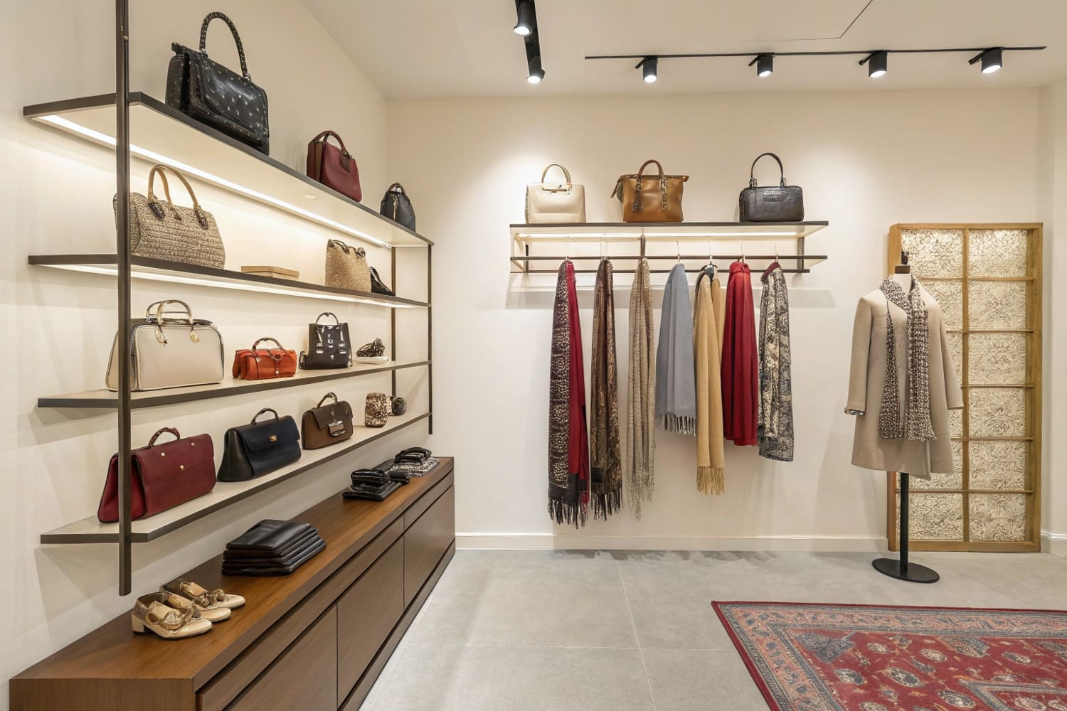
A retail shelving display4 is more than metal uprights and brackets. It is part theater set, part silent salesperson. I design each unit to answer three shopper questions without words: What is this? Why do I need it? How do I buy it? Structure comes first. My factory welds brackets rated above expected load by 30 %. I test by stacking sandbags, not foam. Next comes graphics. Corrugated prints show crisp deer silhouettes because hunters trust images more than copy. Layout follows the “inverted pyramid.” Wide bow limbs at base, slimmer arrows in mid, small wax tins up top. Lighting seals the mood. A warm 3000 K strip across the header makes camo tones look natural, not washed. Signage finishes the job. Price tabs sit front and level; no shopper should bend or strain. I measure success by dwell time5 on overhead cameras and by repeat orders from chain buyers. When conversion dips, I tweak one variable at a time, starting with graphics brightness. This framework turns static racks into living revenue assets.
How to set up retail store displays?
Opening week of a new chain branch is chaos. Boxes everywhere, clocks racing. I reduce that chaos with a setup checklist that never fails.
Lock layout on paper, prep tools, build heavy zones first, anchor signage, light, then load products; follow this sequence to set up retail displays on schedule.

Checklist and Timetable
| Time Slot | Task | People | Notes |
|---|---|---|---|
| Day -2 AM | Mark floor plan | 1 | Tape outlines, verify power points |
| Day -2 PM | Assemble fixtures | 3 | Use torque driver, check level |
| Day -1 AM | Mount graphics | 2 | Peel-stick panels, no bubbles |
| Day -1 PM | Install lighting | 1 electrician | Test on generator backup |
| Launch Day AM | Stock products | 4 | FIFO6, scan codes |
| Launch Day PM | Final clean | 2 | Microfiber wipe, photo log |
I start setup two days before launch because freight may slip. First, I tape the floor. Orange tape shows shelf edges, blue marks traffic aisles. This visual map7 keeps my team from dragging units twice. I pre-stage tools: torque driver, spirit level, zip ties, spare shelf pins. We build the heaviest wall sections first. They anchor the lighter gondolas and prevent late obstruction. Next, graphics go on while units are still empty; applying vinyl around stocked goods only invites scuffs. My electrician wires light bars with quick-connect harnesses I source in Guangzhou, cutting install time by half. Product loading is last and must follow planograms. I print each shelf’s SKU list, laminate it, and clip it to the unit. This stops random swaps that break visual flow. As team leader, I walk the aisle with a tablet, shooting photos that auto-upload for client sign-off. Distances from shelf edge to first product box must match spec within five millimeters. On launch day afternoon, I wipe every face panel. Clean acrylic reflects the ceiling LEDs and makes colors pop. The store doors open, and shoppers walk into a cohesive stage, not a rushed patchwork.
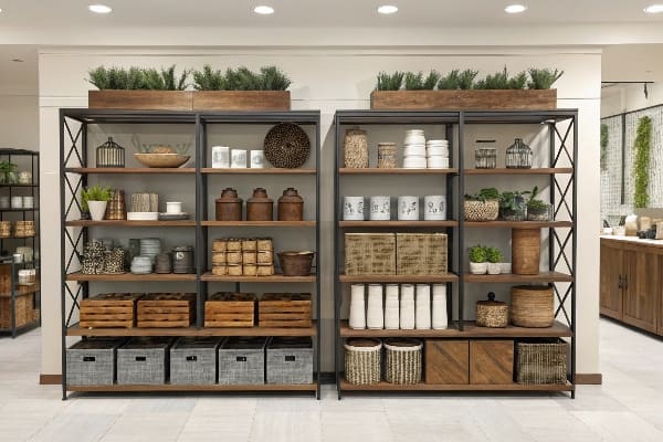
How do you display items on shelves?
Years ago a buyer scolded me: “You just stacked boxes, you didn’t display them.” That sting still guides my shelf work every day.
Group by story, use odd numbers, face front, vary height, leave 20 % empty space; these rules display shelf items so shoppers pick up and buy.
Guiding the Shopper Eye
| Rule | Description | Quick Test |
|---|---|---|
| Story Blocks8 | Related items sit in one block | Does the block answer one need? |
| Odd Counts | 3 or 5 units look natural | Remove one; does it feel right? |
| Front Facing | Labels square to aisle | Can I read at a glance? |
| Height Rhythm9 | Tall-short-medium pattern | Do peaks repeat smoothly? |
| White Space10 | One-fifth of shelf clear | Does the space feel calm? |
I begin by deciding the story: “Range Ready,” “Silent Hunt,” or “Quick Repair.” Each story gets its own shelf block framed by a thin cardboard riser that matches brand red. Odd counts create movement; three quivers on the left, five wax tins on the right. I face every label dead on. If the angle drifts, shoppers think stock is old. Height rhythm matters. I may slip a clear acrylic step under smaller items to peek them above the shelf lip. White space is the silent hero. It lets eyes rest and makes premium goods feel exclusive. I check spacing with my phone’s ruler app: one hand width between blocks meets the 20 % rule. Lighting pins it all down. A narrow 12-degree beam washes the hero product, while softer backlights fill shadows, avoiding glare on glossy clamshells. Weekly, I audit with a two-minute “touch test.” If an item sits untouched, I move it near the focal point or raise it to eye level. This small ritual keeps shelves fresh without full resets. My client brands thank me with repeat orders because the displays breathe confidence and sell through cleanly.
Conclusion
Good wall shelving is not luck; it is planned steps, tested rules, and patient tweaks that keep shoppers moving toward purchase.
Exploring this resource will reveal how clearing space can enhance product visibility and improve customer experience. ↩
This link will provide insights into how logical product organization can reduce customer search fatigue and boost sales. ↩
Discover how a hero item can draw attention and enhance storytelling in retail displays, making your layout more effective. ↩
Explore this resource to learn effective strategies for creating impactful retail shelving displays that boost sales and customer engagement. ↩
Understanding dwell time can help you optimize your retail space for better customer engagement and sales performance. ↩
Exploring FIFO principles can optimize your inventory processes, ensuring freshness and reducing waste in your operations. ↩
Understanding visual maps can enhance your project planning and execution, ensuring clarity and efficiency in your tasks. ↩
Discover how story blocks can effectively organize products and enhance shopper engagement in retail environments. ↩
This link will provide insights into creating visually appealing displays that attract customers and boost sales. ↩
Exploring this resource will help you understand how white space enhances product visibility and shopper experience. ↩